
The preceding example illustrates a common survey instrument, which is used to ascertain the relative importance of one requirement versus another using a scale of five to nine points from the lowest degree to the highest. This tool is also often used in conjunction with a rank order scale, which asks customers to rank each requirement from 1-N so the company can identify the highest-ranking requirements.
The problem with this methodology is two fold. In many circumstances, the customers will say virtually every requirement is important or very important to them. There is no downside to ranking virtually everything as important or very important.
The other problem with this tool is there is no way to know which and how many requirements absolutely have to be in the product. Nor is there any way to know which requirements will be competitive differentiators and will delight the customer, resulting in them buying your product rather than the competition's.
These questions can be difficult to answer, but thankfully there is a tool to help us understand what functions or features need to be in a product, as well as which functions or features will delight our customers. This tool is called the Kano model.
Dr. Noriaki Kano, a Japanese professor and international consultant, first developed the Kano model. In the late 1970s and early 1980s, he laid the foundation for an approach to quality creation. Dr. Kano questioned the traditional ideal of customer satisfaction that more is better—that the better you perform on each product or service attribute or criteria, the more satisfied your customers will be. Instead, Dr. Kano held that performance in all product and service attributes is not necessarily equal in the eyes of customers. Better performance in certain categories of attributes produces higher levels of satisfaction than other categories. He wanted to explain and demonstrate how different classifications/categories of customer requirements and features have the ability to satisfy customers in different ways. By better understanding how customer requirements impact customer satisfaction, we can do a better job of taking the feedback we've received from our customers, and find the best features that will increase their satisfaction, thereby resulting in their choosing our product over the competition.
Before we discuss how to incorporate the Kano model into your customer VoC process, it is necessary to understand the components of the Kano model and how it helps us define needs and delighters.
The model begins with looking at customer satisfaction or perception. The Kano model draws customer satisfaction on the vertical axis and goes from total satisfaction or delight, to total dissatisfaction or frustration. The following image is a representation of the scale on this axis:
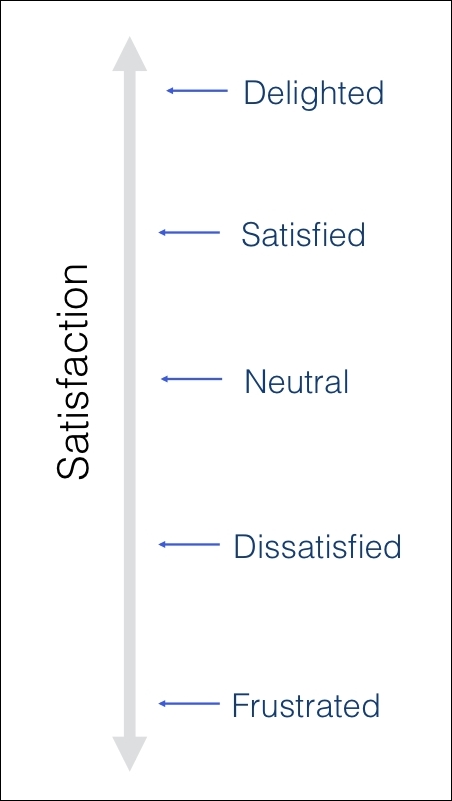
Figure 8.2: Kano model satisfaction axis
You may see this and think you must always be at the top of that scale in the Delighted area of the graph. While this is a noble goal, you will find it is a whole lot harder than you may think to occupy that space in a customer's mind, especially in a consistent way.
The horizontal axis represents the functionality the product delivers, or what the user gets when evaluating customer perception. You can also look at the horizontal scale as a function of how much effort a company put in to develop the product, the level of investment in the development of the product, or how well the functionality has been implemented in the product:
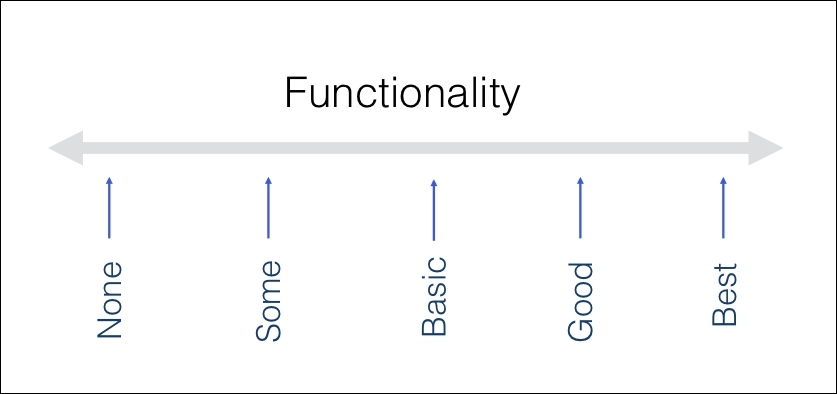
Figure 8.3: Kano model functionality axis
Together, the level of customer satisfaction versus the level of functionality gives us a good understanding of how our customers feel about out product's features. Let's see these features in detail:
- Performance: When we talk about product features, many people believe most or all of the features are based on a linear curve, as shown in the yellow line in Figure 8.4. The more we get of any one feature, the happier we are with the product—things like the mileage we get with our automobiles, the life of our cell phone battery, or the speed of our internet connection. The more we get, the higher our satisfaction and the better we feel about the product or company (assuming it doesn't cost us more to get it). Conversely, the less these requirements are satisfied, the more dissatisfaction the customer feels. Examples of this include such things as price, noise, space in an airline seat, and many more:
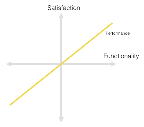
Figure 8.4: Performance curve
As you can see, this a linear function and there is a direct correlation between how much additional functionality is added (say, mileage), and the level of our satisfaction. These too are often the product features that customers think about when describing an ideal product. They are likely to say they want a car with better mileage, a phone with a better battery, or internet speed that is faster. These are considered spoken needs.
It is worth noting, however, that higher levels of functionality also typically equate to the level of resources or investment that must be made to deliver it:
- Must-Be: These are the features that the customer expects to get and are often taken for granted or assumed to be in the product. These are the obvious expectations your customers have for the product, and if it does not have them, it will be considered to be incomplete, or just wrong or bad. These features are called Must-Bes or Basic Expectations. These are going to be the same features that all your major competitors also have in their products. Having these features in your products will not make the customers more satisfied; they just won't be dissatisfied. Our cars should have brakes and windshield wipers; our hotel rooms should have windows and running water, and be clean. When booking a hotel, you do not request a clean room. You just expect that it will be clean. If this basic need isn't met, you are disappointed. As these are expected features, a customer rarely articulates them and they are considered "unspoken" needs.
You can see this curve in Figure 8.5. Notice how it is very easy to add a little investment to increase customer satisfaction, but it is also worth noting that satisfaction never crosses into the positive side of the graph, regardless of how much more is invested. Once a basic level of satisfaction is met, it is impossible to increase customer satisfaction by an additional amount, regardless of the resources or time investment:
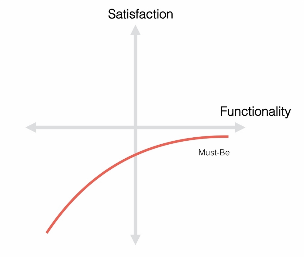
Figure 8.5: Must-Be curve
- Indifferent: In terms of these features, most customers simply do not care whether they are present in our product or not. Customer satisfaction remains neutral in either case. It really doesn't matter how much effort we put into these features—customers don't care. Another way to think about these features is these are the features that we really should avoid working on or committing resources to. For the vast majority of customers, we will never get payback for the money or effort expended. Good examples of Indifferent features would be the advanced features on our phone that most people never use—even if they could find them:
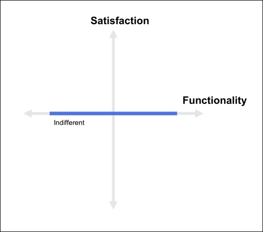
Figure 8.6: Indifferent curve
- Attractive: These are arguably some of the most important features you can put into a product. These are the unexpected features that, when a customer experiences them, create a positive reaction. This curve might be called delighters or exciters instead of attractive. This is the curve where many product innovations lie and where you can find your Competitive Differentiators or Unique Selling Propositions (USPs). They tend to delight a customer when they are present, but as the customer is not "expecting" them to be present, when they are not there the customer is not disappointed with the product. Examples of delighters include things such as the first iPhone or the Nest smoke detector. When it first came out, the iPhone had a totally new interface and offered music, a phone, and a mini computer all in one package. The Next smoke detector has the ability to be silenced by simply waving your hand at it. Consumers did not expect these things, so the needs were never "spoken," but once they were introduced to the market, customers loved the new functionality.
This effect can be shown on the curve in Figure 8.7. You can see how incremental investments into functionality can have a large effect on customer satisfaction. Of course, you can also see that additional investments beyond a certain point may not even fall on the curve and you could be making investments that will yield no additional return.
Exciters don't have to be a whole new platform or product that changes the landscape the way the iPhone did. I remember taking a drive with my fiancée, who had just purchased a Range Rover. It was March, and the clocks had just changed to Daylight Savings Time. My fiancée asked me to change the two clocks in her car—both the analog clock and the digital time readout—while she was taking me to the airport. Since the car was new and neither of us knew how to change the clocks, or were willing to read the manual, I thought I'd tackle the digital dashboard display as I was pretty confident I could navigate the menu structure to make that change. The analog clock I was less confident about, as there appeared to be no dials or switches to advance the time.
As suspected, I was able to navigate the menus and make the changes to the dashboard time readout without looking through the manual. Much to my amazement, when I changed the time reading on the digital display, the analog clock hands magically moved forward on the face of the clock to mirror the time that was on the digital display. This is a good example, as it shows something does not need to radically change the way we use or interact with a product; it just has to be something that, when exposed to it, customers would say, "Wow… that is really nice!" Of course, if the exciter is for a whole new platform or product category, and ends up being a big innovation, this can also yield explosive results for a company, like the iPhone did for Apple:
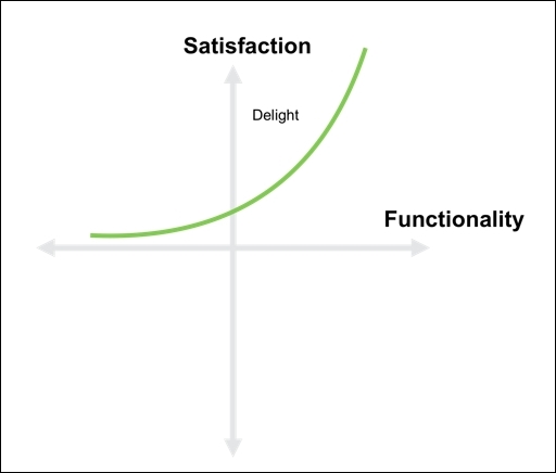
Figure 8.7: Delighter curve
- Reverse: There is another category that is not part of the traditional Kano model, but it is one you should be aware of. It is the Reverse category, and it is something you want to ensure is not a part of your offering. These are the features that cause dissatisfaction with customers when they are present, and satisfaction or indifference when they are not.
Examples of this are the little additional programs that are often packaged with a new PC, or the Microsoft paperclip helper, Clippy. Most people did not like the little assistant and found it especially annoying as there was not an easy way to turn him off:
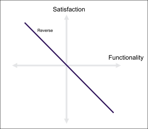
Figure 8.8: Reverse curve
Figure 8.9 shows the complete Kano model. No doubt, if you were able to question customers on where your current product features lie, you would be able to see that many probably fall into the Performance and Must-Be categories. Hopefully, you don't have many that fall into the Indifferent category, and you have none that would fall into the Reverse category:
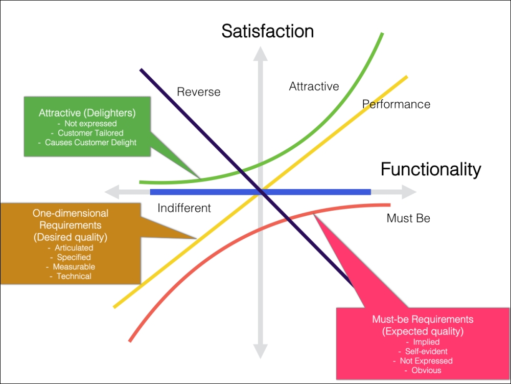
Figure 8.9: Complete Kano model
- Delight decays over time: When contemplating the Kano model, it is important to understand that what delights customers today will be asked for tomorrow and expected the next day. Delight only lasts a short time, and continuous innovation must be introduced to keep your innovative status in the open market. There are countless examples of new innovations that, when introduced, were completely novel or revolutionary. Again, think back to the first time you saw an iPhone with its swipe interface and the introduction of the App Store, where you could download programs that turned your phone into something altogether different from a phone. Shortly after the iPhone was introduced, people started asking for similar features in competitive phones, and now a smartphone without the same capabilities as the original iPhone doesn't stand a chance in the market. Of course, the iPhone is but one example. Think about power steering and anti-lock brakes in your car, wireless internet in your hotel room, a remote control for your TV, and many more. These were all innovative features when first introduced, but now if you buy a car without power steering, book a hotel without internet, or purchase a TV without a remote, you would consider the product to be inferior.
You can see in Figure 8.10 how delight decays over time. The key point to remember is that any analysis you do at any given point in time is simply a snapshot of today's reality. The market does not stand still, and customer expectations are ever-changing. The more time that passes after the snapshot you create today, the less valid it will be:
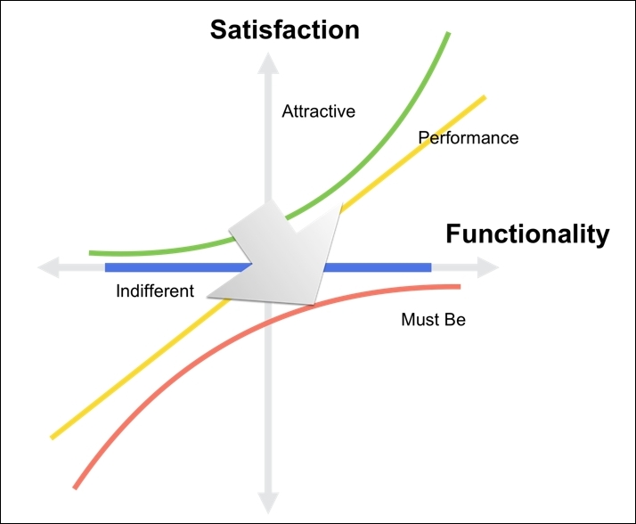
Figure 8.10: Delight decays over time
Now that we understand the components of the Kano model, the question is, how do we use it as part of our VoC process, and how can we plot our current and future products on the Kano model to understand our current position in the market, as well as those things that will delight our future customers?
In order to uncover our customers' perceptions of the features we have in our product, or are contemplating for a future release, we use a Kano questionnaire, also known as a Kano survey. The way a Kano questionnaire works is we construct a pair of questions for each feature or function we wish to evaluate. The first asks our customers how they would feel if they had this feature (a functional question) and the second asks them how they would feel if they did not have the feature (a dysfunctional question). For each of these questions, the customer has to choose from five possible responses to each question:
- I like it that way
- I expect it that way
- I am neutral
- I can live with it that way
- I dislike it that way
Let's use an example to illustrate the point. The following might be the types of responses we have gotten from potential customers for a set of downhill snow skis:
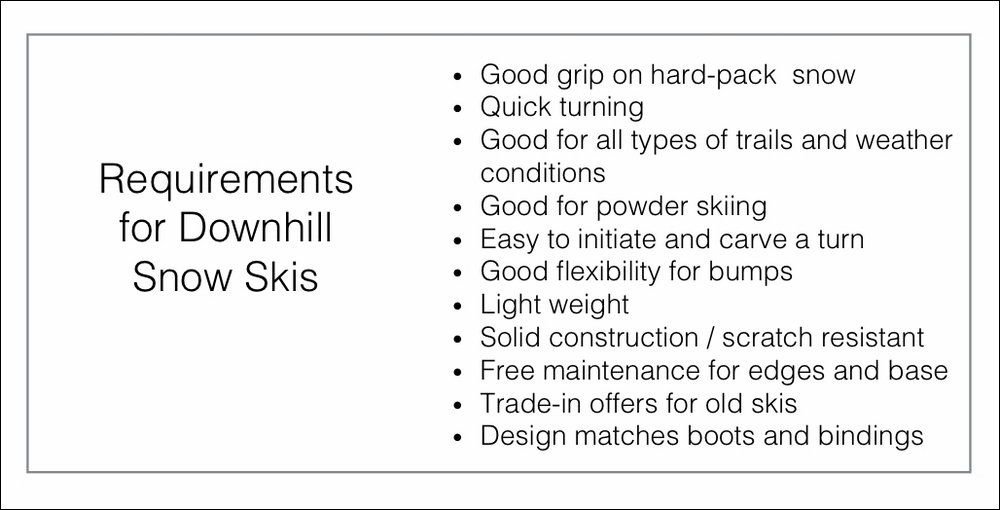
Figure 8.11: Requirements for downhill skis
Taking the first customer request, Good grip on hard-pack snow, we could turn this request/feature into two questions we could ask other customers. The first functional question would be something like this: "If the edges of your skis grip the snow well on hard-packed ski runs, how do you feel?" The second dysfunctional question would be: "If the edges of your skis don't always grip the snow well on hard-packed ski runs, how do you feel?" The customer would then choose one of the five responses for each question:
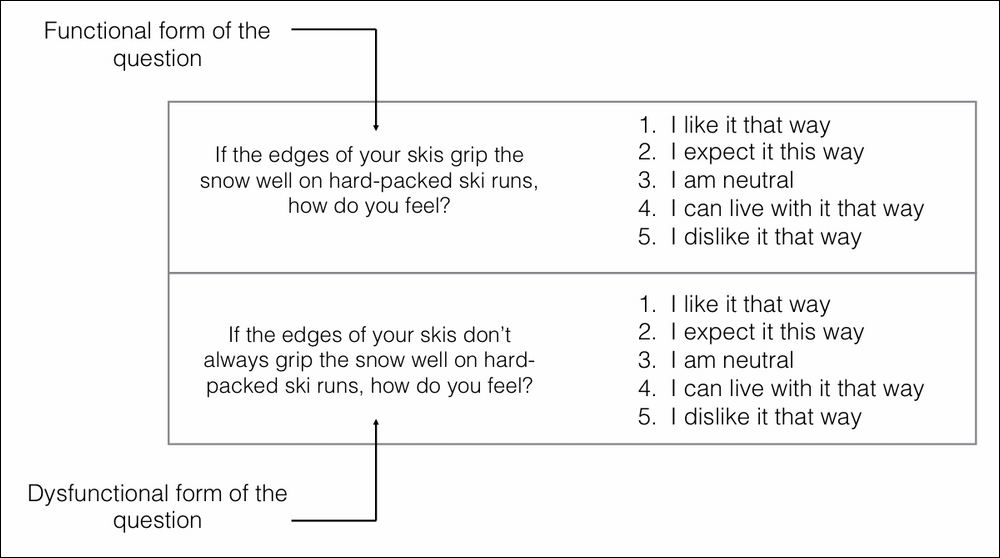
Figure 8.12: Functional/dysfunctional questions
How the functional and dysfunctional questions are answered tells us a lot about customer attitudes and preferences. If the customer answers the functional question with an "I expect it that way" response and the dysfunctional question with an "I dislike it that way" response, it is something that must be in the product. If the customer answers a functional question with an "I like it that way" response and the dysfunctional question with an "I expect it that way" or a "neutral" or an "I can live with it that way" response, is it something the customer is not expecting and would be a delightful feature in the product. If someone says they dislike the functional question and likes the dysfunctional question, they are clearly not interested in what we are offering and probably wish for the opposite. This is a new category, and it is called Reverse. If you get a large number of people responding with Reverse responses, you may wish to switch your functional and dysfunctional questions around.
It is also worth noting that you may sometimes get conflicting responses to some of your questions. As an example, if your customer responds "like" to both the functional and dysfunctional question, these answers are clearly suspect and you would have a "questionable" answer. Some of these are to be expected, but if you are getting too many, you probably need to re-evaluate your question text.
The following is what a traditional Kano matrix would look like:
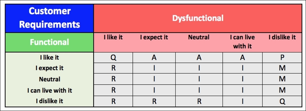
Figure 8.13: Kano matrix
The Kano matrix provides an evaluation table that combines the functional and dysfunctional answers in rows and columns to get to a specific Kano category. Every answer pair leads to one of these categories. The keys for each of the cells in Figure 8.13 are as follows:
- A: Attractive or delight
- M: Must-Be
- I: Indifferent
- P: Performance (one-dimensional)
- R: Reversal
- Q: Questionable result
While this is the traditional model, I find the model put forth by Fred Pouliot makes a little more sense and adds two additional questionable answers at locations (2,2) and (4,4), which looks like the following:
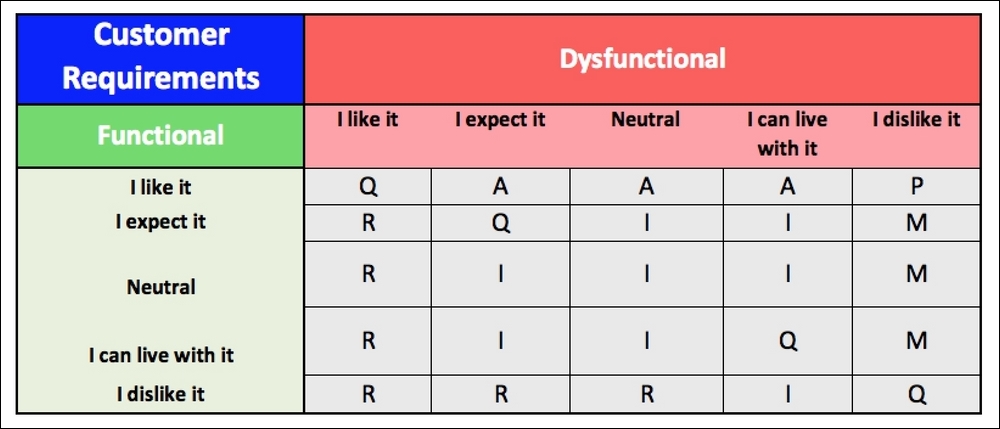
Figure 8.14: Pouliot's Kano model
I believe it is important to have a baseline understanding of how each category is derived from each pair of customer responses:
- Must-Be features are features that a customer will dislike if they are not present.
- Attractive or delight features are identified when a customer likes having a feature they did not expect.
- Performance features are the ones that a customer likes having and dislikes not having. Typically, a customer feels more is better.
- Indifferent features are ones where the customer would respond that they can take it or leave it. You will have a hard time getting customers to pay for features that are in this category.
- Questionable features are ones where a customer contradicts the functional and dysfunctional form of the question (for example, liking both). This is often indicative that the question was phrased incorrectly, or the customer misunderstood the question, or they simply made a mistake when answering.
- Reverse features are ones that a customer likes not having or dislikes having. As an example, when booking a holiday travel package, some customers want a completely planned itinerary, while other customers would prefer few to no pre-planned events.
In addition to answering the Kano questionnaire, I find it is also helpful for the customer to rank the individual feature/requirement to determine the relative importance of this feature versus the others as part of the questionnaire. This will aid in establishing customer priorities, as well as understanding the level of satisfaction each feature brings to the customer.