
7
Control Charts for Variables
- 7-1 Introduction and chapter objectives
- 7-2 Selection of characteristics for investigation
- 7-3 Preliminary decisions
- 7-4 Control charts for the mean and range
- 7-5 Control charts for the mean and standard deviation
- 7-6 Control charts for individual units
- 7-7 Control charts for short production runs
- 7-8 Other control charts
- 7-9 Risk-adjusted control charts
- 7-10 Multivariate control charts
- Summary
| Symbols | |||
| μ | Process (or population) mean | ki | Standardized value for range of sample number i |
| σ | Process (or population) standard deviation | σ0 | Target or standard value of process standard deviation |
| Estimate of process standard deviation | Standard deviation of the sample mean | ||
| Sample average | |||
| R | Sample range | Sm | Cumulative sum at sample number m |
| s | Sample standard deviation | w | Span, or width, in calculation of moving average |
| n | Sample or subgroup size | ||
| Xi | ith observation | Mean of sample means | |
| W | Relative range | Mean of sample ranges | |
| g | Number of samples or subgroups | Gt | Geometric moving average at time t |
| Target or standard value of process mean | Mt | Arithmetic moving average at time t | |
| Hotelling's T2 multivariate statistic | |||
| Zi | Standardized value for average of sample number i | MR | Moving range |
| pn | Predicted pre-operative mortality risk for patient n | Wn | Risk-adjusted weight function for patient n |
7-1 Introduction and Chapter Objectives
In Chapter 6 we introduced the fundamentals of control charts. In this chapter we look at the details of control charts for variables—quality characteristics that are measurable on a numerical scale. Examples of variables include length, thickness, diameter, breaking strength, temperature, acidity, viscosity, order-processing time, time to market a new product, and waiting time for service. We must be able to control the mean value of a quality characteristic as well as its variability. The mean gives an indication of the central tendency of a process, and the variability provides an idea of the process dispersion. Therefore, we need information about both of these statistics to keep a process in control.
Let's consider Figure 7-1. A change in the process mean of a quality characteristic (say, length of a part) is shown in Figure 7-1a, where the mean shifts from μ0 to μ1. It is, of course, important that this change be detected because if the specification limits are as shown in Figure 7-1a, a change in the process mean would change the proportion of parts that do not meet specifications. Figure 7-1b shows a change in the dispersion of the process; the process standard deviation has changed from σ0 to σ1, with the process mean remaining stationary at μ0. Note that the proportion of the output that does not meet specifications has increased. Control charts aid in detecting such changes in process parameters.
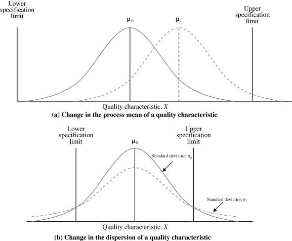
Figure 7-1 Changes in the mean and dispersion of a process.
Variables provide more information than attributes. Attributes deal with qualitative information such as whether an item is nonconforming or what the number of nonconformities in an item is. Thus, attributes do not show the degree to which a quality characteristic is nonconforming. For instance, if the specifications on the length of a part are 40 ± 0.5 mm and a part has length 40.6 mm, attribute information would indicate as nonconforming both this part and a part of length 42 mm. The degree to which these two lengths deviate from the specifications is lost in attribute information. This is not so with variables, however, because the numerical value of the quality characteristic (length, in this case) is used in creating the control chart.
The cost of obtaining variable data is usually higher than that for attributes because attribute data are collected by means such as go/no-go gages, which are easier to use and therefore less costly. The total cost of data collection is the sum of two components: the fixed cost and the variable unit cost. Fixed costs include the cost of the inspection equipment; variable unit costs include the cost of inspecting units. The more units inspected, the higher the variable cost, whereas the fixed cost is unaffected. As the use of automated devices for measuring quality characteristic values spreads, the difference in the variable unit cost between variables and attributes may not be much. However, the fixed costs, such as investment costs, may increase.
In health care applications, the severity of illness of patients and consequently the pre-operative mortality rate for surgical patients, say, in an intensive care unit may vary from patient to patient. Risk-adjusted control charts are introduced in this concept. Some of the charts discussed are the risk-adjusted cumulative sum chart, the risk-adjusted sequential probability ratio test, the risk-adjusted exponentially weighted moving-average chart, and the variable life-adjusted display chart.
7-2 Selection of Characteristics for Investigation
In small organizations as well as in large ones, many possible product and process quality characteristics exist. A single component usually has several quality characteristics, such as length, width, height, surface finish, and elasticity. In fact, the number of quality characteristics that affect a product is usually quite large. Now multiply such a number by even a small number of products and the total number of characteristics quickly increases to an unmanageable value. It is normally not feasible to maintain a control chart for each possible variable.
Balancing feasibility and completeness of information is an ongoing task. Accomplishing it involves selecting a few vital quality characteristics from the many candidates. Selecting which quality characteristics to maintain control charts on requires giving higher priority to those that cause more nonconforming items and that increase costs. The goal is to select the “vital few” from among the “trivial many.” This is where Pareto analysis comes in because it clarifies the “important” quality characteristics.
When nonconformities occur because of different defects, the frequency of each defect can be tallied. Table 7-1 shows the Pareto analyses for various defects in an assembly. Alternatively, the cost of producing the nonconformity could be collected. Table 7-1 shows that the three most important defects are the inside hub diameter, the hub length, and the slot depth.
Table 7-1 Pareto Analysis of Defects for Assembly Data
| Defect Code | Defect | Frequency | Percentage |
| 1 | Outside diameter of hub | 30 | 8.82 |
| 2 | Depth of keyway | 20 | 5.88 |
| 3 | Hub length | 60 | 17.65 |
| 4 | Inside diameter of hub | 90 | 26.47 |
| 5 | Width of keyway | 30 | 8.82 |
| 6 | Thickness of flange | 40 | 11.77 |
| 7 | Depth of slot | 50 | 14.71 |
| 8 | Hardness (measured by Brinell hardness number) | 20 | 5.88 |
Using the percentages given in Table 7-1, we can construct a Pareto diagram like the one shown in Figure 7-2. The defects are thus shown in a nonincreasing order of occurrence. From the figure we can see that if we have only enough resources to construct three variable charts, we will choose inside hub diameter (code 4), hub length (code 3), and slot depth (code 7).

Figure 7-2 Pareto diagram for assembly data.
Once quality characteristics for which control charts are to be maintained have been identified, a scheme for obtaining the data should be set up. Quite often, it is desirable to measure process characteristics that have a causal relationship to product quality characteristics. Process characteristics are typically controlled directly through control charts. In the assembly example of Table 7-1, we might decide to monitor process variables (cutting speed, depth of cut, and coolant temperature) that have an impact on hub diameter, hub length, and slot depth. Monitoring process variables through control charts implicitly controls product characteristics.
7-3 Preliminary Decisions
Certain decisions must be made before we can construct control charts. Several of these were discussed in detail in Chapter 6.
Selection of Rational Samples
The manner in which we sample the process deserves our careful attention. The sampling method should maximize differences between samples and minimize differences within samples. This means that separate control charts may have to be kept for different operators, machines, or vendors.
Lots from which samples are chosen should be homogeneous. As mentioned in Chapter 6, if our objective is to determine shifts in process parameters, samples should be made up of items produced at nearly the same time. This gives us a time reference and will be helpful if we need to determine special causes. Alternatively, if we are interested in the nonconformance of items produced since the previous sample was selected, samples should be chosen from items produced since that time.
Sample Size
Sample sizes are normally between 4 and 10, and it is quite common in industry to have sample sizes of 4 or 5. The larger the sample size, the better the chance of detecting small shifts. Other factors, such as cost of inspection or cost of shipping a nonconforming item to the customer, also influence the choice of sample size.
Frequency of Sampling
The sampling frequency depends on the cost of obtaining information compared to the cost of not detecting a nonconforming item. As processes are brought into control, the frequency of sampling is likely to diminish.
Choice of Measuring Instruments
The accuracy of the measuring instrument directly influences the quality of the data collected. Measuring instruments should be calibrated and tested for dependability under controlled conditions. Low-quality data lead to erroneous conclusions. The characteristic being controlled and the desired degree of measurement precision both have an impact on the choice of a measuring instrument. In measuring dimensions such as length, height, or thickness, something as simple as a set of calipers or a micrometer may be acceptable. On the other hand, measuring the thickness of silicon wafers may require complex optical sensory equipment.
Design of Data Recording Forms
Recording forms should be designed in accordance with the control chart to be used. Common features for data recording forms include the sample number, the date and time when the sample was selected, and the raw values of the observations. A column for comments about the process is also useful.
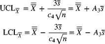
7-4 Control Charts for the Mean and Range
Development of the Charts
- Step 1: Using a pre-selected sampling scheme and sample size, record on the appropriate forms the measurements of the quality characteristic selected.
- Step 2: For each sample, calculate the sample mean and range using the following formulas:
(7-1)
 (7-2)
(7-2)
where Xi represents the ith observation, n is the sample size, Xmax is the largest observation, and Xmin is the smallest observation.
- Step 3: Obtain and draw the centerline and the trial control limits for each chart. For the
 -
chart, the centerline
-
chart, the centerline  is given by
(7-3)
is given by
(7-3)
where g represents the number of samples. For the R-chart, the centerline
 is found from(7-4)
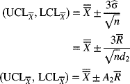
Conceptually, the 3σ control limits for the
 -chart are
Rather than compute σ
 from the raw data, we can use the relation between the process standard deviation σ (or the standard deviation of the individual items) and the mean of the ranges
  . Multiplying factors used to calculate the centerline and control limits are given in Appendix A-7. When sampling from a population that is normally distributed, the distribution of the statistic W = R/σ (known as the relative range) is dependent on the sample size n. The mean of W is represented by d2 and is tabulated in Appendix A-7. Thus, an estimate of the process standard deviation is
The control limits for an
 -chart are therefore estimated as
where
 and is tabulated in Appendix A-7. Equation (7-7) is the working equation for determining the
  -chart control limits, given
  .
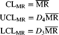
.The control limits for the R-chart are conceptually given by
(7-8)
Since R = σW, we have σR = σσw. In Appendix A-7, σw is tabulated as d3. Using eq. (7-6), we get

The control limits for the R-chart are estimated as
where

Equation (7-9) is the working equation for calculating the control limits for the R-chart. Values of D4 and D3 are tabulated in Appendix A-7.
- Step 4: Plot the values of the range on the control chart for range, with the centerline and the control limits drawn. Determine whether the points are in statistical control. If not, investigate the special causes associated with the out-of-control points (see the rules for this in Chapter 6) and take appropriate remedial action to eliminate special causes.
Typically, only some of the rules are used simultaneously. The most commonly used criterion for determining an out-of-control situation is the presence of a point outside the control limits.
An R-chart is usually analyzed before an
 -chart to determine out-of-control situations. An R-chart reflects process variability, which should be brought into control first. As shown by eq. (7-7), the control limits for an
  -chart involve the process variability and hence
  . Therefore, if an R-chart shows an out-of-control situation, the limits on the
  -chart may not be meaningful.
Let's consider Figure 7-3. On the R-chart, sample 12 plots above the upper control limit and so is out of control. The
 -chart, however, does not show the process to be out of control. Suppose that the special cause is identified as a problem with a new vendor who supplies raw materials and components. The task is to eliminate the cause, perhaps by choosing a new vendor or requiring evidence of statistical process control at the vendor's plant.
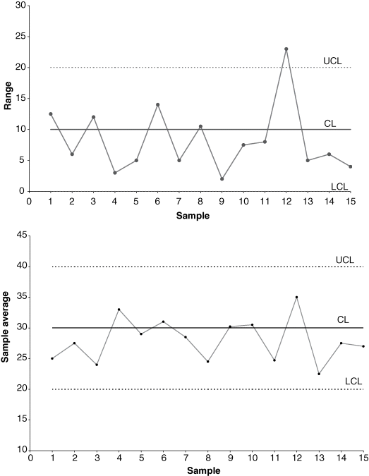
Figure 7-3 Plot of sample values on
 - and R-charts.
 - Step 5: Delete the out-of-control point(s) for which remedial actions have been taken to remove special causes (in this case, sample 12) and use the remaining samples (here they are samples 1–11 and 13–15) to determine the revised centerline and control limits for the
 - and R-charts.
These limits are known as the revised control limits. The cycle of obtaining information, determining the trial limits, finding out-of-control points, identifying and correcting special causes, and determining revised control limits then continues. The revised control limits will serve as trial control limits for the immediate future until the limits are revised again. This ongoing process is a critical component of continuous improvement.
A point of interest regarding the revision of R-charts concerns observations that plot below the lower control limit, when the lower control limit is greater than zero. Such points that fall below LCLR are, statistically speaking, out of control; however, they are also desirable because they indicate unusually small variability within the sample which is, after all, one of our main objectives. It is most likely that such small variability is due to special causes.
If the user is convinced that the small variability does indeed represent the operating state of the process during that time, an effort should be made to identify the causes. If such conditions can be created consistently, process variability will be reduced. The process should be set to match those favorable conditions, and the observations should be retained for calculating the revised centerline and the revised control limits for the R-chart.
- Step 6: Implement the control charts.

The ![]() - and R-charts should be implemented for future observations using the revised centerline and control limits. The charts should be displayed in a conspicuous place where they will be visible to operators, supervisors, and managers. Statistical process control will be effective only if everyone is committed to it—from the operator to the chief executive officer.
- and R-charts should be implemented for future observations using the revised centerline and control limits. The charts should be displayed in a conspicuous place where they will be visible to operators, supervisors, and managers. Statistical process control will be effective only if everyone is committed to it—from the operator to the chief executive officer.
Variable Sample Size
So far, our sample size has been assumed to be constant. A change in the sample size has an impact on the control limits for the ![]() - and R-charts. It can be seen from eqs. (7-7) and (7-9) that an increase in the sample size n reduces the width of the control limits. For an
- and R-charts. It can be seen from eqs. (7-7) and (7-9) that an increase in the sample size n reduces the width of the control limits. For an ![]() -chart, the width of the control limits from the centerline is inversely proportional to the square root of the sample size. Appendix A-7 shows the pattern in which the values of the control chart factors A2, D4, and D3 decrease with an increase in sample size.
-chart, the width of the control limits from the centerline is inversely proportional to the square root of the sample size. Appendix A-7 shows the pattern in which the values of the control chart factors A2, D4, and D3 decrease with an increase in sample size.
Standardized Control Charts
When the sample size varies, the control limits on an ![]() - and an R-chart will change, as discussed previously. With fluctuating control limits, the rules for identifying out-of-control conditions we discussed in Chapter 6 become difficult to apply—that is, except for Rule 1 (which assumes a process to be out of control when an observation plots outside the control limits). One way to overcome this drawback is to use a standardized control chart. When we standardize a statistic, we subtract its mean from its value and divide this value by its standard deviation. The standardized values then represent the deviation from the mean in units of standard deviation. They are dimensionless and have a mean of zero. The control limits on a standardized chart are at ±3 and are therefore constant. It's easier to interpret shifts in the process from a standardized chart than from a chart with fluctuating control limits.
- and an R-chart will change, as discussed previously. With fluctuating control limits, the rules for identifying out-of-control conditions we discussed in Chapter 6 become difficult to apply—that is, except for Rule 1 (which assumes a process to be out of control when an observation plots outside the control limits). One way to overcome this drawback is to use a standardized control chart. When we standardize a statistic, we subtract its mean from its value and divide this value by its standard deviation. The standardized values then represent the deviation from the mean in units of standard deviation. They are dimensionless and have a mean of zero. The control limits on a standardized chart are at ±3 and are therefore constant. It's easier to interpret shifts in the process from a standardized chart than from a chart with fluctuating control limits.
Let the sample size for sample i be denoted by ni, and let ![]() and si denote its average and standard deviation, respectively. The mean of the sample averages is found as
and si denote its average and standard deviation, respectively. The mean of the sample averages is found as

An estimate of the process standard deviation, ![]() , is the square root of the weighted average of the sample variances, where the weights are 1 less the corresponding sample sizes. So,
, is the square root of the weighted average of the sample variances, where the weights are 1 less the corresponding sample sizes. So,

Now, for sample i, the standardized value for the mean, Zi, is obtained from
where ![]() and
and ![]() are given by eqs. (7-10) and (7-11), respectively. A plot of the Zi-values on a control chart, with the centerline at 0, the upper control limit at 3, and the lower control limit at −3, represents a standardized control chart for the mean.
are given by eqs. (7-10) and (7-11), respectively. A plot of the Zi-values on a control chart, with the centerline at 0, the upper control limit at 3, and the lower control limit at −3, represents a standardized control chart for the mean.
To standardize the range chart, the range Ri for sample i is first divided by the estimate of the process standard deviation, ![]() , given by eq. (7-11), to obtain
, given by eq. (7-11), to obtain
The values of ri are then standardized by subtracting its mean d2 and dividing by its standard deviation d3 (Nelson 1989). The factors d2 and d3 are tabulated for various sample sizes in Appendix A-7. So, the standardized value for the range, ki, is given by
These values of ki are plotted on a control chart with a centerline at 0 and upper and lower control limits at 3 and −3, respectively.
Control Limits for a Given Target or Standard
Management sometimes wants to specify values for the process mean and standard deviation. These values may represent goals or desirable standard or target values. Control charts based on these target values help determine whether the existing process is capable of meeting the desirable standards. Furthermore, they also help management set realistic goals for the existing process.
Let ![]() and σ0 represent the target values of the process mean and standard deviation, respectively. The centerline and control limits based on these standard values for the
and σ0 represent the target values of the process mean and standard deviation, respectively. The centerline and control limits based on these standard values for the ![]() -chart are given by
-chart are given by
Let ![]() . Values for A are tabulated in Appendix A-7. Equation (7-15) may be rewritten as
. Values for A are tabulated in Appendix A-7. Equation (7-15) may be rewritten as

For the R-chart, the centerline is found as follows, Since ![]() , we have
, we have
where d2 is tabulated in Appendix A-7. The control limits are
where D2 = d2 + 3d3 (Appendix A-7) and σR = d3σ.
Similarly,
where D1 = d2 − 3d3 (Appendix A-7).
We must be cautious when we interpret control charts based on target or standard values. Sample observations can fall outside the control limits even though no special causes are present in the process. This is because these desirable standards may not be consistent with the process conditions. Thus, we could waste time and resources looking for special causes that do not exist.
On an ![]() -chart, plotted points can fall outside the control limits because a target process mean is specified as too high or too low compared to the existing process mean. Usually, it is easier to meet a desirable target value for the process mean than it is for the process variability. For example, adjusting the mean diameter or length of a part can often be accomplished by simply changing controllable process parameters. However, correcting for R-chart points that plot above the upper control limit is generally much more difficult.
-chart, plotted points can fall outside the control limits because a target process mean is specified as too high or too low compared to the existing process mean. Usually, it is easier to meet a desirable target value for the process mean than it is for the process variability. For example, adjusting the mean diameter or length of a part can often be accomplished by simply changing controllable process parameters. However, correcting for R-chart points that plot above the upper control limit is generally much more difficult.
An R-chart based on target values can also indicate excessive process variability without special causes present in the system. Therefore, meeting the target value σ0 may involve drastic changes in the process. Such an R-chart may be implying that the existing process is not capable of meeting the desired standard. This information enables management to set realistic goals.
Interpretation and Inferences from the Charts
The difficult part of analysis is determining and interpreting the special causes and selecting remedial actions. Effective use of control charts requires operators who are familiar with not only the statistical foundations of control charts but also the process itself. They must thoroughly understand how the different controllable parameters influence the dependent variable of interest. The quality assurance manager or analyst should work closely with the product design engineer and the process designer or analyst to come up with optimal policies.
In Chapter 6 we discussed five rules for determining out-of-control conditions. The presence of a point falling outside the 3σ limits is the most widely used of those rules. Determinations can also be made by interpreting typical plot patterns. Once the special cause is determined, this information plus a knowledge of the plot can lead to appropriate remedial actions.
Often, when the R-chart is brought to control, many special causes for the-![]() -chart are eliminated as well. The
-chart are eliminated as well. The ![]() -chart monitors the centering of the process because
-chart monitors the centering of the process because ![]() is a measure of the center. Thus, a jump on the
is a measure of the center. Thus, a jump on the ![]() -chart means that the process average has jumped and an increasing trend indicates the process center is gradually increasing. Process centering usually takes place through adjustments in machine settings or such controllable parameters as proper tool, proper depth of cut, or proper feed. On the other hand, reducing process variability to allow an R-chart to exhibit control is a difficult task that is accomplished through quality improvement.
-chart means that the process average has jumped and an increasing trend indicates the process center is gradually increasing. Process centering usually takes place through adjustments in machine settings or such controllable parameters as proper tool, proper depth of cut, or proper feed. On the other hand, reducing process variability to allow an R-chart to exhibit control is a difficult task that is accomplished through quality improvement.
Once a process is in statistical control, its capability can be estimated by calculating the process standard deviation. This measure can then be used to determine how the process performs with respect to some stated specification limits. The proportion of nonconforming items can be estimated. Depending on the characteristic being considered, some of the output may be reworked, while some may become scrap. Given the unit cost of rework and scrap, an estimate of the total cost of rework and scrap can be obtained. Process capability measures are discussed in more detail in Chapter 9. From an R-chart that exhibits control, the process standard deviation can be estimated as
where ![]() is the centerline and d2 is a factor tabulated in Appendix A-7. If the distribution of the quality characteristic can be assumed to be normal, then given some specification limits, the standard normal table can be used to determine the proportion of output that is nonconforming.
is the centerline and d2 is a factor tabulated in Appendix A-7. If the distribution of the quality characteristic can be assumed to be normal, then given some specification limits, the standard normal table can be used to determine the proportion of output that is nonconforming.
Control Chart Patterns and Corrective Actions
A nonrandom identifiable pattern in the plot of a control chart might provide sufficient reason to look for special causes in the system. Common causes of variation are inherent to a system; a system operating under only common causes is said to be in a state of statistical control. Special causes, however, could be due to periodic and persistent disturbances that affect the process intermittently. The objective is to identify the special causes and take appropriate remedial action.
Western Electric Company engineers have identified 15 typical patterns in control charts. Your ability to recognize these patterns will enable you to determine when action needs to be taken and what action to take (AT&T 19841984). We discuss 9 of these patterns here.
Natural Patterns
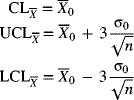
A natural pattern is one in which no identifiable arrangement of the plotted points exists. No points fall outside the control limits, the majority of the points are near the centerline, and few points are close to the control limits. Natural patterns are indicative of a process that is in control; that is, they demonstrate the presence of a stable system of common causes. A natural pattern is shown in Figure 7-8.
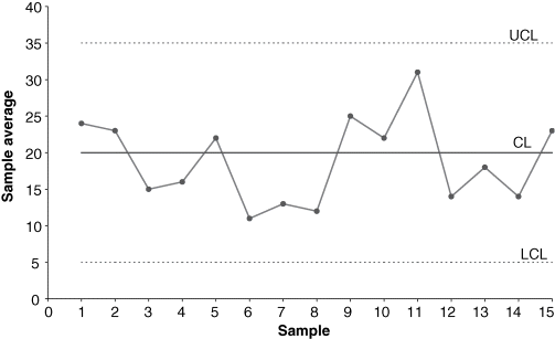
Figure 7-8 Natural pattern for an in-control process on an  -chart.
Sudden Shifts in the Level
Many causes can bring about a sudden change (or jump) in pattern level on an ![]() - or R-chart. Figure 7-9 shows a sudden shift on an
- or R-chart. Figure 7-9 shows a sudden shift on an ![]() -chart. Such jumps occur because of changes—intentional or otherwise—in such process settings as temperature, pressure, or depth of cut. A sudden change in the average service level, for example, could be a change in customer waiting time at a bank because the number of tellers changed. New operators, new equipment, new measuring instruments, new vendors, and new methods of processing are other reasons for sudden shifts on
-chart. Such jumps occur because of changes—intentional or otherwise—in such process settings as temperature, pressure, or depth of cut. A sudden change in the average service level, for example, could be a change in customer waiting time at a bank because the number of tellers changed. New operators, new equipment, new measuring instruments, new vendors, and new methods of processing are other reasons for sudden shifts on ![]() - and R-charts.
- and R-charts.

Figure 7-9 Sudden shift in pattern level on an  -chart.
Gradual Shifts in the Level
Gradual shifts in level occur when a process parameter changes gradually over a period of time. Afterward, the process stabilizes. An ![]() -chart might exhibit such a shift because the incoming quality of raw materials or components changed over time, the maintenance program changed, or the style of supervision changed. An R-chart might exhibit such a shift because of a new operator, a decrease in worker skill due to fatigue or monotony, or a gradual improvement in the incoming quality of raw materials because a vendor has implemented a statistical process control system. Figure 7-10 shows an
-chart might exhibit such a shift because the incoming quality of raw materials or components changed over time, the maintenance program changed, or the style of supervision changed. An R-chart might exhibit such a shift because of a new operator, a decrease in worker skill due to fatigue or monotony, or a gradual improvement in the incoming quality of raw materials because a vendor has implemented a statistical process control system. Figure 7-10 shows an ![]() -chart exhibiting a gradual shift in the level.
-chart exhibiting a gradual shift in the level.
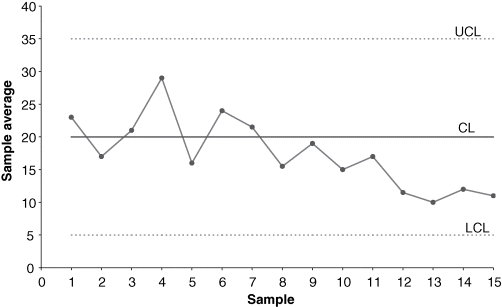
Figure 7-10 Gradual shift in pattern level on an  -chart.
Trending Pattern
Trends differ from gradual shifts in level in that trends do not stabilize or settle down. Trends represent changes that steadily increase or decrease. An ![]() -chart may exhibit a trend because of tool wear, die wear, gradual deterioration of equipment, buildup of debris in jigs and fixtures, or gradual change in temperature. An R-chart may exhibit a trend because of a gradual improvement in operator skill resulting from on-the-job training or a decrease in operator skill due to fatigue. Figure 7-11 shows a trending pattern on an
-chart may exhibit a trend because of tool wear, die wear, gradual deterioration of equipment, buildup of debris in jigs and fixtures, or gradual change in temperature. An R-chart may exhibit a trend because of a gradual improvement in operator skill resulting from on-the-job training or a decrease in operator skill due to fatigue. Figure 7-11 shows a trending pattern on an ![]() -chart.
-chart.
Figure 7-11 Trending pattern on an  -chart.
Cyclic Patterns
Cyclic patterns are characterized by a repetitive periodic behavior in the system. Cycles of low and high points will appear on the control chart. An ![]() -chart may exhibit cyclic behavior because of a rotation of operators, periodic changes in temperature and humidity (such as a cold-morning startup), periodicity in the mechanical or chemical properties of the material, or seasonal variation of incoming components. An R-chart may exhibit cyclic patterns because of operator fatigue and subsequent energization following breaks, a difference between shifts, or periodic maintenance of equipment. Figure 7-12 shows a cyclic pattern for an
-chart may exhibit cyclic behavior because of a rotation of operators, periodic changes in temperature and humidity (such as a cold-morning startup), periodicity in the mechanical or chemical properties of the material, or seasonal variation of incoming components. An R-chart may exhibit cyclic patterns because of operator fatigue and subsequent energization following breaks, a difference between shifts, or periodic maintenance of equipment. Figure 7-12 shows a cyclic pattern for an ![]() -chart. If samples are taken too infrequently, only the high or the low points will be represented, and the graph will not exhibit a cyclic pattern. If control chart users suspect cyclic behavior, they should take samples frequently to investigate the possibility of a cyclic pattern.
-chart. If samples are taken too infrequently, only the high or the low points will be represented, and the graph will not exhibit a cyclic pattern. If control chart users suspect cyclic behavior, they should take samples frequently to investigate the possibility of a cyclic pattern.
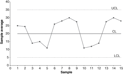
Figure 7-12 Cyclic pattern on an  -chart.
Wild Patterns
Wild patterns are divided into two categories: freaks and bunches (or groups). Control chart points exhibiting either of these two properties are, statistically speaking, significantly different from the other points. Special causes are generally associated with these points.
Freaks are caused by external disturbances that influence one or more samples. Figure 7-13 shows a control chart exhibiting a freak pattern. Freaks are plotted points too small or too large with respect to the control limits. Such points usually fall outside the control limits and are easily distinguishable from the other points on the chart. It is often not difficult to identify special causes for freaks. You should make sure, however, that there is no measurement or recording error associated with the freak point. Some special causes of freaks include sudden, very short-lived power failures; the use of a new tool for a brief test period; and the failure of a component.
Figure 7-13 Freak pattern on an -chart.
Bunches, or groups, are clusters of several observations that are decidedly different from other points on the plot. Figure 7-14 shows a control chart pattern exhibiting bunching behavior. Possible special causes of such behavior include the use of a new vendor for a short period time, use of a different machine for a brief time period, and new operator used for a short period.

Figure 7-14 Bunching pattern on an -chart.
Mixture Patterns (or the Effect of Two or More Populations)
A mixture pattern is caused by the presence of two or more populations in the sample and is characterized by points that fall near the control limits, with an absence of points near the centerline. A mixture pattern can occur when one set of values is too high and another set too low because of differences in the incoming quality of material from two vendors. A remedial action would be to have a separate control chart for each vendor. Figure 7-15 shows a mixture pattern. On an ![]() -chart, a mixture pattern can also result from overcontrol. If an operator chooses to adjust the machine or process every time a point plots near a control limit, the result will be a pattern of large swings. Mixture patterns can also occur on both
-chart, a mixture pattern can also result from overcontrol. If an operator chooses to adjust the machine or process every time a point plots near a control limit, the result will be a pattern of large swings. Mixture patterns can also occur on both ![]() - and R-charts because of two or more machines being represented on the same control chart. Other examples include two or more operators being represented on the same chart, differences in two or more pieces of testing or measuring equipment, and differences in production methods of two or more lines.
- and R-charts because of two or more machines being represented on the same control chart. Other examples include two or more operators being represented on the same chart, differences in two or more pieces of testing or measuring equipment, and differences in production methods of two or more lines.

Figure 7-15 Mixture pattern on an -chart.
Stratification Patterns
A stratification pattern is another possible result when two or more population distributions of the same quality characteristic are present. In this case, the output is combined, or mixed (say, from two shifts), and samples are selected from the mixed output. In this pattern, the majority of the points are very close to the centerline, with very few points near the control limits, Thus, the plot can be misinterpreted as indicating unusually good control. A stratification pattern is shown in Figure 7-16. Such a plot could have resulted from plotting data for samples composed of the combined output of two shifts, each different in its performance. It is possible for the sample average (which is really the average of parts chosen from both shifts) to fluctuate very little, resulting in a stratification pattern in the plot. Remedial measures in such situations involve having separate control charts for each shift. The method of choosing rational samples should be carefully analyzed so that component distributions are not mixed when samples are selected.

Figure 7-16 Stratifications pattern on an -chart.
Interaction Patterns
An interaction pattern occurs when the level of one variable affects the behavior of other variables associated with the quality characteristic of interest. Furthermore, the combined effect of two or more variables on the output quality characteristic may be different from the individual effect of each variable. An interaction pattern can be detected by changing the scheme for rational sampling. Suppose that in a chemical process the temperature and pressure are two important controllable variables that affect the output quality characteristic of interest. A low pressure and a high temperature may produce a very desirable effect on the output characteristic, whereas a low pressure by itself may not have that effect. An effective sampling method would involve controlling the temperature at several high values and then determining the effect of pressure on the output characteristic for each temperature value. Samples composed of random combinations of temperature and pressure may fail to identify the interactive effect of those variables on the output characteristic. The control chart in Figure 7-17 shows interaction between variables. In the first plot, the temperature was maintained at level A; in the second plot, it was held at level B. Note that the average level and variability of the output characteristic change for the two temperature levels. Also, if the R-chart shows the sample ranges to be small, information regarding the interaction could be used to establish desirable process parameter settings.

Figure 7-17 Interaction pattern between variables on an -chart.
Control Charts for Other Variables
The control chart patterns described in this section also occur in control charts besides ![]() - and R-charts. When found in other types of control charts, these patterns may indicate different causes than those we discussed in this section, but similar reasoning can be used to determine them. Furthermore, both the preliminary considerations and the steps for constructing control charts described earlier also apply to other control charts.
- and R-charts. When found in other types of control charts, these patterns may indicate different causes than those we discussed in this section, but similar reasoning can be used to determine them. Furthermore, both the preliminary considerations and the steps for constructing control charts described earlier also apply to other control charts.
7-5 Control Charts for the Mean and Standard Deviation
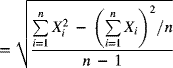
Although an R-chart is easy to construct and use, a standard deviation chart (s-chart) is preferable for larger sample sizes (equal to or greater than 10, usually). As mentioned in Chapter 4, the range accounts for only the maximum and minimum sample values and consequently is less effective for large samples. The sample standard deviation serves as a better measure of process variability in these circumstances. The sample standard deviation is given by

If the population distribution of a quality characteristic is normal with a population standard deviation denoted by σ, the mean and standard deviation of the sample standard deviation are given by
respectively, where c4 is a factor that depends on the sample size and is given by
Values of c4 are tabulated in Appendix A-7.
No Given Standards
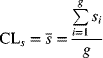
The centerline of a standard deviation chart is
where g is the number of samples and si is the standard deviation of the ith sample. The upper control limit is
In accordance with eq. (7-41), an estimate of the population standard deviation σ is
Substituting this estimate of ![]() in the preceding expression yields
in the preceding expression yields
where ![]() and is tabulated in Appendix A-7. Similarly,
and is tabulated in Appendix A-7. Similarly,
where ![]() and is also tabulated in Appendix A-7. Thus, the 3σ control limits are
and is also tabulated in Appendix A-7. Thus, the 3σ control limits are
The centerline of the chart for the mean ![]() is given by
is given by

The control limits on the ![]() -chart are
-chart are
Using eq. (7-26) to obtain ![]() , we find the control limits to be
, we find the control limits to be
where ![]() and is tabulated in Appendix A-7.
and is tabulated in Appendix A-7.
The process of constructing trial control limits, determining special causes associated with out-of-control points, taking remedial actions, and finding the revised control limits is similar to that explained in the section on ![]() - and R-charts. The s-chart is constructed first. Only if it is in control should the
- and R-charts. The s-chart is constructed first. Only if it is in control should the ![]() -chart be developed, because the standard deviation of
-chart be developed, because the standard deviation of ![]() is dependent on
is dependent on![]() . If the s-chart is not in control, any estimate of the standard deviation of
. If the s-chart is not in control, any estimate of the standard deviation of ![]() will be unreliable, which will in turn create unreliable control limits for
will be unreliable, which will in turn create unreliable control limits for ![]() .
.
Given Standard
If a target standard deviation is specified as σ0, the centerline of the s-chart is found by using eq. (7-22) as
The upper control limit for the s-chart is found by using eq. (7-23) as
where ![]() and is tabulated in Appendix A-7. Similarly, the lower control limit for the s-chart is
and is tabulated in Appendix A-7. Similarly, the lower control limit for the s-chart is
where ![]() and is tabulated in Appendix A-7. Thus, the control limits for the s-chart are
and is tabulated in Appendix A-7. Thus, the control limits for the s-chart are
If a target value for the mean is specified as ![]() , the centerline is given by
, the centerline is given by
Equations for the control limits will be the same as those given by eq. (7-16) in the section on ![]() - and R-charts:
- and R-charts:
where ![]() and is tabulated in Appendix A-7.
and is tabulated in Appendix A-7.
7-6 Control Charts for Individual Units
For some situations in which the rate of production is low, it is not feasible for a sample size to be greater than 1. Additionally, if the testing process is destructive and the cost of the item is expensive, the sample size might be chosen to be 1. Furthermore, if every manufactured unit from a process is inspected, the sample size is essentially 1. Service applications in marketing and accounting often have a sample size of 1.
In a control chart for individual units—for which the value of the quality characteristic is represented by X—the variability of the process is estimated from the moving range (MR), found from two successive observations. The moving range of two observations is simply the result of subtracting the lesser value. Moving ranges are correlated because they use common rather than independent values in their calculations. That is, the moving range of observations 1 and 2 correlates with the moving range of observations 2 and 3. Because they are correlated, the pattern of the MR-chart must be interpreted carefully. Neither can we assume, as we have in previous control charts, that X-values in a chart for individuals will be normally distributed. So we must first check the distribution of the individual values. To do this, we might conduct an initial analysis using frequency histograms to identify the shape of the distribution, its skewness, and its kurtosis. Alternatively, we could conduct a test for normality. This information will tell us whether we can make the assumption of a normal distribution when we establish the control limits.
No Given Standards
An estimate of the process standard deviation is given by
where ![]() is the average of the moving ranges of successive observations. Note that if we have a total of g individual observations, there will be g − 1 moving ranges. The centerline and control limits of the MR-chart are
is the average of the moving ranges of successive observations. Note that if we have a total of g individual observations, there will be g − 1 moving ranges. The centerline and control limits of the MR-chart are
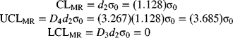
For n = 2, D4 = 3.267, and D3 = 0, the control limits become
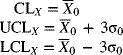
The centerline of the X-chart is
The control limits of the X-chart are
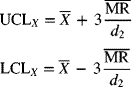
where (for n = 2) Appendix A-7 gives d2 = 1.128.
Given Standard
The preceding derivation is based on the assumption that no standard values are given for either the mean or the process standard deviation. If standard values are specified as ![]() and σ0, respectively, the centerline and control limits of the X-chart are
and σ0, respectively, the centerline and control limits of the X-chart are
Assuming n = 2, the MR-chart for standard values has the following centerline and control limits:
One advantage of an X-chart is the ease with which it can be understood. It can also be used to judge the capability of a process by plotting the upper and lower specification limits on the chart itself. However, it has several disadvantages compared to an ![]() -chart. An X-chart is not as sensitive to changes in the process parameters. It typically requires more samples to detect parametric changes of the same magnitude. The main disadvantage of an X-chart, though, is that the control limits can become distorted if the individual items don't fit a normal distribution.
-chart. An X-chart is not as sensitive to changes in the process parameters. It typically requires more samples to detect parametric changes of the same magnitude. The main disadvantage of an X-chart, though, is that the control limits can become distorted if the individual items don't fit a normal distribution.
7-7 Control Charts for Short Production Runs
Organizations, both manufacturing and service, are faced with short production runs for several reasons. Product specialization and being responsive to customer needs are two important reasons. Consider a company that assembles computers based on customer orders. There is no guarantee that the next 50 orders will be for a computer with the same hardware and software features.
 - and R-Charts for Short Production Runs
Where different parts may be produced in the short run, one approach is to use the deviation from the nominal value as the modified observations. The nominal value may vary from part to part. So, the deviation of the observed value Oi from the nominal value N is given by
The procedure for the construction of the ![]() - and R-charts is the same as before using the modified observations, Xi. Different parts are plotted on the same control chart so as to have the minimum information (usually, at least 20 samples) required to construct the charts, even though for each part there are not enough samples to justify construction of a control chart.
- and R-charts is the same as before using the modified observations, Xi. Different parts are plotted on the same control chart so as to have the minimum information (usually, at least 20 samples) required to construct the charts, even though for each part there are not enough samples to justify construction of a control chart.
Several assumptions are made in this approach. First, it is assumed that the process standard deviation is approximately the same for all the parts. Second, what happens when a nominal value is not specified (which is especially true for characteristics that have one-sided specifications, such as breaking strength)? In such a situation, the process average based on historical data may have to be used.
Z-MR Chart
When individuals' data are obtained on the quality characteristic, an approach is to construct a standardized control chart for individuals (Z-chart) and a moving-range (MR) chart. The standardized value is given by
The moving range is calculated from the standardized values using a length of size 2. Depending on how each group (part or product) is defined, the process standard deviation for group i is estimated by
where ![]() represents the average moving range for group i and d2 is a control chart factor found from Appendix A-7. Minitab provides several options for selecting computation of the process mean and process standard deviation. For each group (part or product), the mean of the observations in that group could be used as an estimate of the process mean for that group. Alternatively, historical values of estimates may be specified as an option.
represents the average moving range for group i and d2 is a control chart factor found from Appendix A-7. Minitab provides several options for selecting computation of the process mean and process standard deviation. For each group (part or product), the mean of the observations in that group could be used as an estimate of the process mean for that group. Alternatively, historical values of estimates may be specified as an option.
In estimating the process standard deviation for each group (part or product), Minitab provides options for defining groups as follows: by runs; by parts, where all observations on the same part are combined in one group; constant (combine all observations for all parts in one group); and relative to size (transform the original data by taking the natural logarithm and then combine all into one group).
The relative-to-size option assumes that variability increases with the magnitude of the quality characteristic. The natural logarithm transformation stabilizes the variance. A common estimate (![]() ) of the process standard deviation is obtained from the transformed data. The constant option that pools all data assumes that the variability associated with all groups is the same, implying that product or part type or characteristic size has no influence. This option must be used only if there is enough information to justify the assumption. It produces a single estimate (
) of the process standard deviation is obtained from the transformed data. The constant option that pools all data assumes that the variability associated with all groups is the same, implying that product or part type or characteristic size has no influence. This option must be used only if there is enough information to justify the assumption. It produces a single estimate (![]() ) of the common process standard deviation. The option of pooling by parts assumes that all runs of a particular part have the same variability. It produces an estimate (
) of the common process standard deviation. The option of pooling by parts assumes that all runs of a particular part have the same variability. It produces an estimate (![]() ) of the process standard deviation for each part group. Finally, the option of pooling by runs assumes that part variability may change from run to run. It produces an estimate of the process standard deviation for each run, independently.
) of the process standard deviation for each part group. Finally, the option of pooling by runs assumes that part variability may change from run to run. It produces an estimate of the process standard deviation for each run, independently.
7-8 Other Control Charts
In previous sections we have examined commonly used control charts. Now we look at several other control charts. These charts are specific to certain situations. Procedures for constructing ![]() - and R-charts and interpreting their patterns apply to these charts as well, so they are not repeated here.
- and R-charts and interpreting their patterns apply to these charts as well, so they are not repeated here.
Cumulative Sum Control Chart for the Process Mean
In Shewhart control charts such as the ![]() - and R-charts, a plotted point represents information corresponding to that observation only. It does not use information from previous observations. On the other hand, a cumulative sum chart, usually called a cusum chart, uses information from all of the prior samples by displaying the cumulative sum of the deviation of the sample values (e.g., the sample mean) from a specified target value.
- and R-charts, a plotted point represents information corresponding to that observation only. It does not use information from previous observations. On the other hand, a cumulative sum chart, usually called a cusum chart, uses information from all of the prior samples by displaying the cumulative sum of the deviation of the sample values (e.g., the sample mean) from a specified target value.
The cumulative sum at sample number m is given by
where ![]() is the sample mean for sample i and μ0 is the target mean of the process.
is the sample mean for sample i and μ0 is the target mean of the process.
Cusum charts are more effective than Shewhart control charts in detecting relatively small shifts in the process mean (of magnitude ![]() to about
to about ![]() ). A cusum chart uses information from previous samples, so the effect of a small shift is more pronounced. For situations in which the sample size n is 1 (say, when each part is measured automatically by a machine), the cusum chart is better suited than a Shewhart control chart to determining shifts in the process mean. Because of the magnified effect of small changes, process shifts are easily found by locating the point where the slope of plotted cusum pattern changes.
). A cusum chart uses information from previous samples, so the effect of a small shift is more pronounced. For situations in which the sample size n is 1 (say, when each part is measured automatically by a machine), the cusum chart is better suited than a Shewhart control chart to determining shifts in the process mean. Because of the magnified effect of small changes, process shifts are easily found by locating the point where the slope of plotted cusum pattern changes.
There are some disadvantages to using cusum charts, however. First, because the cusum chart is designed to detect small changes in the process mean, it can be slow to detect large changes in the process parameters. Because a decision criterion is designed to do well under a specific situation does not mean that it will perform equally well under different situations. Details on modifying the decision process for a cusum chart to detect large shifts can be found in Hawkins , Lucas (1976, 1982), and Woodall and Adams 1993. Second, the cusum chart is not an effective tool in analyzing the historical performance of a process to see whether it is in control or to bring it in control. Thus, these charts are typically used for well-established processes that have a history of being stable.
Recall that for Shewhart control charts the individual points are assumed to be uncorrelated. Cumulative values are, however, related. That is, Si−1 and Si are related because ![]() . It is therefore possible for a cusum chart to exhibit runs or other patterns as a result of this relationship. The rules for describing out-of-control conditions based on the plot patterns of Shewhart charts may therefore not be applicable to cusum charts. Finally, training workers to use and maintain cusum charts may be more costly than for Shewhart charts.
. It is therefore possible for a cusum chart to exhibit runs or other patterns as a result of this relationship. The rules for describing out-of-control conditions based on the plot patterns of Shewhart charts may therefore not be applicable to cusum charts. Finally, training workers to use and maintain cusum charts may be more costly than for Shewhart charts.
Cumulative sum charts can model the proportion of nonconforming items, the number of nonconformities, the individual values, the sample range, the sample standard deviation, or the sample mean. In this section we focus on their ability to detect shifts in the process mean.
Suppose that the target value of a process mean when the process is in control is denoted by μ0. If the process mean shifts upward to a higher value μ1, an upward drift will be observed in the value of the cusum Sm given by eq. (7-42) because the old lower value μ0 is still used in the equation even though the X-values are now higher. Similarly, if the process mean shifts to a lower value μ2, a downward trend will be observed in Sm. The task is to determine whether the trend in Sm is significant so that we can conclude that a change has taken place in the process mean.
In the situation where individual observations (n = 1) are collected from a process to monitor the process mean, eq. (7-42) becomes

where S0 = 0.
Tabular Method
Let us first consider the case of individual observations (Xi) being drawn from a process with mean μ0 and standard deviation σ. When the process is in control, we assume that ![]() . In the tabular cusum method, deviations above μ0 are accumulated with a statistic S+, and deviations below μ0 are accumulated with a statistic S−. These two statistics, S+ and S−, are labeled one-sided upper and lower cusums, respectively, and are given by
. In the tabular cusum method, deviations above μ0 are accumulated with a statistic S+, and deviations below μ0 are accumulated with a statistic S−. These two statistics, S+ and S−, are labeled one-sided upper and lower cusums, respectively, and are given by
where S0+ = S0− = 0.
The parameter K in eqs. (7-44) and (7-45) is called the allowable slack in the process and is usually chosen as halfway between the target value μ0 and the shifted value μ1 that we are interested in detecting. Expressing the shift (δ) in standard deviation units, we have ![]() , leading to
, leading to
Thus, examining eqs. (7-44) and (7-45), we find that Sm+ and Sm− accumulate deviations from the target value μ0 that are greater than K. Both are reset to zero upon becoming negative. In practice, K = kσδ, where k is in units of standard deviation. In eq. (7-46), k = 0.5.
A second parameter in the decision-making process using cusums is the decision interval H, to determine out-of-control conditions. As before, we set H = hσ, where h is in standard deviation units. When the value of Sm+ or Sm− plots beyond H, the process will be considered to be out of control. When k = 0.5, a reasonable value of h is 5 (in standard deviation units), which ensures a small average run length for shifts of the magnitude of one standard deviation that we wish to detect (Hawkins 1993). It can be shown that for a small value of β, the probability of a type II error, the decision interval is given by
Thus, if sample averages are used to construct cusums in the above procedures, σ2 will be replaced by σ2/n in eq. (7-47), assuming samples of size n.
To determine when the shift in the process mean was most likely to have occurred, we will monitor two counters, N+ and N−. The counter N+ notes the number of consecutive periods that Sm+ is above 0, whereas N− tracks the number of consecutive periods that Sm− is above zero. When an out-of-control condition is detected, one can count backward from this point to the time period when the cusum was above zero to find the first period in which the process probably shifted. An estimate of the new process mean may be obtained from
or from
V-Mask Method
In the V-mask approach, a template known as a V-mask, proposed by Barnard (1959)1959, is used to determine a change in the process mean through the plotting of cumulative sums. Figure 7-23 shows a V-mask, which has two parameters, the lead distance d and the angle θ of each decision line with respect to the horizontal. The V-mask is positioned such that point P coincides with the last plotted value of the cumulative sum and line OP is parallel to the horizontal axis. If the values plotted previously are within the two arms of the V-mask—that is, between the upper decision line and the lower decision line—the process is judged to be in control. If any value of the cusum lies outside the arms of the V-mask, the process is considered to be out of control.

Figure 7-23 V-mask for making decisions with cumulative sum charts.
In Figure 7-23, notice that a strong upward shift in the process mean is visible for sample 5. This shift makes sense given the fact that the cusum value for sample 1 is below the lower decision line, indicating an out-of-control situation. Similarly, the presence of a plotted value above the upper decision line indicates a downward drift in the process mean.
Determination of V-Mask Parameters
The two parameters of a V-mask, d and θ, are determined based on the levels of risk that the decision maker is willing to tolerate. These risks are the type I and type II errors described in Chapter 6. The probability of a type I error, α, is the risk of concluding that a process is out of control when it is really in control. The probability of a type II error, β, is the risk of failing to detect a change in the process parameter and concluding that the process is in control when it is really out of control. Let ![]() denote the amount of shift in the process mean that we want to be able to detect and
denote the amount of shift in the process mean that we want to be able to detect and ![]() denote the standard deviation of
denote the standard deviation of ![]() . Next, consider the equation
. Next, consider the equation
where δ represents the degree of shift in the process mean, relative to the standard deviation of the mean, that we wish to detect. Then, the lead distance for the V-mask is given by
If the probability of a type II error, β, is selected to be small, then eq. (7-51) reduces to
The angle of decision line with respect to the horizontal is obtained from
where k is a scale factor representing the ratio of a vertical-scale unit to a horizontal-scale unit on the plot. The value of k should be between ![]() and
and ![]() , with a preferred value of
, with a preferred value of ![]() .
.
One measure of a control chart's performance is the average run length (ARL). (We discussed ARL in Chapter 6.) This value represents the average number of points that must be plotted before an out-of-control condition is indicated. For a Shewhart control chart, if p represents the probability that a single point will fall outside the control limits, the average run length is given by
For 3σ limits on a Shewhart ![]() -chart, the value of p is about 0.0026 when the process is in control. Hence, the ARL for an
-chart, the value of p is about 0.0026 when the process is in control. Hence, the ARL for an ![]() -chart exhibiting control is
-chart exhibiting control is
The implication of this is that, on average, if the process is in control, every 385th sample statistic will indicate an out-of-control state. The ARL is usually larger for a cusum chart than for a Shewhart chart. For example, for a cusum chart with comparable risks, the ARL is around 500. Thus, if the process is in control, on average, every 500th sample statistic will indicate an out-of-control situation, so there will be fewer false alarms.
Table 7-8 Cumulative Sum of Data for Calcium Content
| Sample, i | Deviation of Sample Mean from Target, |
Cumulative Sum, Si | Sample, i | Deviation of Sample Mean from Target, |
Cumulative Sum, Si |
| 1 | −1.0 | −1.0 | 9 | −0.1 | −1.4 |
| 2 | −0.5 | −1.5 | 10 | −0.2 | −1.6 |
| 3 | 0.1 | −1.4 | 11 | 0.4 | −1.2 |
| 4 | 0.3 | −1.1 | 12 | 1.3 | 0.1 |
| 5 | 1.0 | −0.1 | 13 | −0.3 | −0.2 |
| 6 | −0.6 | −0.7 | 14 | 0.3 | 0.1 |
| 7 | 0.5 | −0.2 | 15 | 0.1 | 0.2 |
| 8 | −1.1 | −1.3 |
Designing a Cumulative Sum Chart for a Specified ARL
The average run length can be used as a design criterion for control charts. If a process is in control, the ARL should be long, whereas if the process is out of control, the ARL should be short. Recall that δ is the degree of shift in the process mean, relative to the standard deviation of the sample mean, that we are interested in detecting; that is, ![]() . Let L(δ) denote the desired ARL when a shift in the process mean is on the order of δ. An ARL curve is a plot of δ versus its corresponding average run length, L(δ). For a process in control, when δ = 0, a large value of L(0) is desirable, For a specified value of δ, we may have a desirable value of L(δ). Thus, two points on the ARL curve, [0, L(0)] and [δ, L(δ)], are specified. The goal is to find the cusum chart parameters d and θ that will satisfy these desirable goals.
. Let L(δ) denote the desired ARL when a shift in the process mean is on the order of δ. An ARL curve is a plot of δ versus its corresponding average run length, L(δ). For a process in control, when δ = 0, a large value of L(0) is desirable, For a specified value of δ, we may have a desirable value of L(δ). Thus, two points on the ARL curve, [0, L(0)] and [δ, L(δ)], are specified. The goal is to find the cusum chart parameters d and θ that will satisfy these desirable goals.
Bowker and Lieberman (1987)1982 provide a table (see Table 7-9) for selecting the V-mask parameters d and θ when the objective is to minimize L(δ) for a given δ. It is assumed that the decision maker has a specified value of L(0) in mind. Table 7-9 gives values for ![]() and d, and the minimum value of L(δ) for a specified δ. We use this table in Example 7-9.
and d, and the minimum value of L(δ) for a specified δ. We use this table in Example 7-9.
Table 7-9 Selection of Cumulative Sum Control Charts Based on Specified ARL
| δ = Deviation from Target Value | L(0) = Expected Run Length When Process Is in Control | ||||||
| (standard deviations) | 50 | 100 | 200 | 300 | 400 | 500 | |
| 0.25 | 0.125 | 0.195 | 0.248 | ||||
| d | 47.6 | 46.2 | 37.4 | ||||
| L(0.25) | 28.3 | 74.0 | 94.0 | ||||
| 0.50 | 0.25 | 0.28 | 0.29 | 0.28 | 0.28 | 0.27 | |
| d | 17.5 | 18.2 | 21.4 | 24.7 | 27.3 | 29.6 | |
| L(0.5) | 15.8 | 19.0 | 24.0 | 26.7 | 29.0 | 30.0 | |
| 0.75 | 0.375 | 0.375 | 0.375 | 0.375 | 0.375 | 0.375 | |
| d | 9.2 | 11.3 | 13.8 | 15.0 | 16.2 | 16.8 | |
| L(0.75) | 8.9 | 11.0 | 13.4 | 14.5 | 15.7 | 16.5 | |
| 1.0 | 0.50 | 0.50 | 0.50 | 0.50 | 0.50 | 0.50 | |
| d | 5.7 | 6.9 | 8.2 | 9.0 | 9.6 | 10.0 | |
| L(1.0) | 6.1 | 7.4 | 8.7 | 9.4 | 10.0 | 10.5 | |
| 1.5 | 0.75 | 0.75 | 0.75 | 0.75 | 0.75 | 0.75 | |
| d | 2.7 | 3.3 | 3.9 | 4.3 | 4.5 | 4.7 | |
| L(1.5) | 3.4 | 4.0 | 4.6 | 5.0 | 5.2 | 5.4 | |
| 2.0 | 1.0 | 1.0 | 1.0 | 1.0 | 1.0 | 1.0 | |
| d | 1.5 | 1.9 | 2.2 | 2.4 | 2.5 | 2.7 | |
| L(2.0) | 2.26 | 2.63 | 2.96 | 3.15 | 3.3 | 3.4 | |
| Source: A. H. Bowker and G. J. Lieberman, Engineering Statistics, 2nd ed.,1987. Reprinted by permission of Pearson Education, Inc. Upper Saddle River, NJ. | |||||||
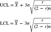
Cumulative Sum for Monitoring Process Variability
Cusum charts may also be used to monitor process variability as discussed by Hawkins (1981)1981. Assuming that Xi ∼ N(μ0, σ), the standardized value Yi is obtained first as Yi = (Xi − μ0)/σ. A new standardized quantity (Hawkins 1993) is constructed as follows:
where it is suggested that the vi are sensitive to both variance and mean changes. For an in-control process, vi is distributed approximately N(0, 1). Two one-sided standardized cusums are constructed as follows to detect scale changes:
where ![]() . The values of h and k are selected using guidelines similar to those discussed in the section on cusum for the process mean. When the process standard deviation increases, the values of
. The values of h and k are selected using guidelines similar to those discussed in the section on cusum for the process mean. When the process standard deviation increases, the values of ![]() in eq. (7-56) will increase. When
in eq. (7-56) will increase. When ![]() exceeds h, we will detect an out-of-control condition. Similarly, if the process standard deviation decreases, values of
exceeds h, we will detect an out-of-control condition. Similarly, if the process standard deviation decreases, values of ![]() will increase.
will increase.
Moving-Average Control Chart
As mentioned previously, standard Shewhart control charts are quite insensitive to small shifts, and cumulative sum charts are one way to alleviate this problem. A control chart using the moving-average method is another. Such charts are effective for detecting shifts of small magnitude in the process mean. Moving-average control charts can also be used in situations for which the sample size is 1, such as when product characteristics are measured automatically or when the time to produce a unit is long. It should be noted that, by their very nature, moving-average values are correlated.
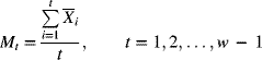
Suppose that samples of size n are collected from the process. Let the first t sample means be denoted by ![]() . (One sample is taken for each time step.) The moving average of width w (i.e., w samples) at time step t is given by
. (One sample is taken for each time step.) The moving average of width w (i.e., w samples) at time step t is given by
At any time step t, the moving average is updated by dropping the oldest mean and adding the newest mean. The variance of each sample mean is
where σ2 is the population variance of the individual values. The variance of Mt is
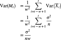
The centerline and control limits for the moving-average chart are given by
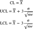
From eq. (7-60), we can see that as w increases, the width of the control limits decreases. So, to detect shifts of smaller magnitudes, larger values of w should be chosen.
For the startup period (when t < w), the moving average is given by
The control limits for this startup period are
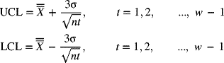
Since these control limits change at each sample point during this startup period, an alternative procedure would be to use the ordinary ![]() -chart for t < w and use the moving-average chart for t ≥ w.
-chart for t < w and use the moving-average chart for t ≥ w.
Exponentially Weighted Moving-Average or Geometric Moving-Average Control Chart
The preceding discussion showed that a moving-average chart can be used as an alternative to an ordinary ![]() -chart to detect small changes in process parameters. The moving-average method is basically a weighted-average scheme. For sample t, the sample means
-chart to detect small changes in process parameters. The moving-average method is basically a weighted-average scheme. For sample t, the sample means ![]() are each weighted by 1/w [see eq. (7-58)], while the sample means for time steps less than t − w + 1 are weighted by zero. Along similar lines, a chart can be constructed based on varying weights for the prior observations. More weight can be assigned to the most recent observation, with the weights decreasing for less recent observations. A geometric moving-average control chart, also known as an exponentially weighted moving-average (EWMA) chart, is based on this premise. One of the advantages of a geometric moving-average chart over a moving-average chart is that the former is more effective in detecting small changes in process parameters. The geometric moving average at time step t is given by
are each weighted by 1/w [see eq. (7-58)], while the sample means for time steps less than t − w + 1 are weighted by zero. Along similar lines, a chart can be constructed based on varying weights for the prior observations. More weight can be assigned to the most recent observation, with the weights decreasing for less recent observations. A geometric moving-average control chart, also known as an exponentially weighted moving-average (EWMA) chart, is based on this premise. One of the advantages of a geometric moving-average chart over a moving-average chart is that the former is more effective in detecting small changes in process parameters. The geometric moving average at time step t is given by
where r is a weighting constant (0 < r ≤ 1) and G0 is ![]() . By using eq. (7-63) repeatedly, we get
. By using eq. (7-63) repeatedly, we get
Equation (7-64) shows that the weight associated with the ith mean from ![]() is r (1 − r)i. The weights decrease geometrically as the sample mean becomes less recent. The sum of all the weights is 1. Consider, for example, the case for which r = 0.3. This implies that, in calculating Gt, the most recent sample mean
is r (1 − r)i. The weights decrease geometrically as the sample mean becomes less recent. The sum of all the weights is 1. Consider, for example, the case for which r = 0.3. This implies that, in calculating Gt, the most recent sample mean ![]() has a weight of 0.3, the next most recent observation
has a weight of 0.3, the next most recent observation ![]() has a weight of (0.3)(1 − 0.3) = 0.21, the next observation
has a weight of (0.3)(1 − 0.3) = 0.21, the next observation ![]() has a weight of 0.3(1 − 0.3)2 = 0.147, and so on. Here, G0 has a weight of (1 − 0.3)t. Since these weights appear to decrease exponentially, eq. (7-64) describes what is known as the exponentially weighted moving-average model.
has a weight of 0.3(1 − 0.3)2 = 0.147, and so on. Here, G0 has a weight of (1 − 0.3)t. Since these weights appear to decrease exponentially, eq. (7-64) describes what is known as the exponentially weighted moving-average model.
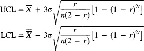
If the sample means![]() are assumed to be independent of each other and if the population standard deviation is σ, the variance of Gt is given by
are assumed to be independent of each other and if the population standard deviation is σ, the variance of Gt is given by
For large values of t, the standard deviation of Gt is
The upper and lower control limits are
For small values of t, the control limits are found using eq. (7-65) to be
A geometric moving-average control chart is based on a concept similar to that of a moving-average chart. By choosing an adequate set of weights, however, where recent sample means are more heavily weighted, the ability to detect small changes in process parameters is increased. If the weighting factor r is selected as
where w is the moving-average span, the moving-average method and the geometric moving-average method are equivalent. There are guidelines for choosing the value of r. If our goal is to detect small shifts in the process parameters as soon as possible, we use a small value of r (say, 0.1). If we use r = 1, the geometric moving-average chart reduces to the standard Shewhart chart for the mean.
Modified Control Chart
In our discussions of all the control charts, we have assumed that the process spread (6σ) is close to and hopefully less than the difference between the specification limits. That is, we hope that 6σ<(USL − LSL). Now we assume that the natural process spread of 6σ is significantly less than the difference between the specification limits: that is, the process capability ratio = (USL − LSL)/6σ >> 1. Figure 7-27 depicts this situation.

Figure 7-27 Process with a capability ratio much greater than 1.
So far, the specification limits have not been placed on ![]() -charts. One reason for this is that the specification limits correspond to the conformance of individual items. If the distribution of individual items is plotted, it makes sense to show the specification limits on the X-chart, but a control chart for the mean
-charts. One reason for this is that the specification limits correspond to the conformance of individual items. If the distribution of individual items is plotted, it makes sense to show the specification limits on the X-chart, but a control chart for the mean ![]() deals with averages, not individual values. Therefore, plotting the specification limits on an
deals with averages, not individual values. Therefore, plotting the specification limits on an ![]() -chart is not appropriate. For a modified control chart, however, the specification limits are shown.
-chart is not appropriate. For a modified control chart, however, the specification limits are shown.
Our objective here is to determine bounds on the process mean such that the proportion of nonconforming items does not exceed a desirable value δ. The focus is not on detecting the statistical state of control, because a process can drift out of control and still produce parts that conform to specifications. In fact, we assume that the process variability is in a state of statistical control. An estimate of the process standard deviation σ is obtained from either the mean (![]() ) of the R-chart or the mean (
) of the R-chart or the mean (![]() ) of the s-chart. Furthermore, we assume that the distribution of the individual values is normal and that a change in the process mean can be accomplished without much difficulty. Our aim in constructing a modified control chart is to determine whether the process mean μ is within certain acceptable limits such that the proportion of nonconforming items does not exceed the chosen value δ.
) of the s-chart. Furthermore, we assume that the distribution of the individual values is normal and that a change in the process mean can be accomplished without much difficulty. Our aim in constructing a modified control chart is to determine whether the process mean μ is within certain acceptable limits such that the proportion of nonconforming items does not exceed the chosen value δ.
Let's consider Figure 7-28a, which shows a distribution of individual values at two different means: one the lowest allowable mean (μL) and the other the highest allowable mean (μU). Suppose that the process standard deviation is σ. If the distribution of individual values is normal, let zδ denote the standard normal value corresponding to a tail area of δ. By the definition of a standard normal value, zδ represents the number of standard deviations that LSL is from μL and that USL is from μU. So the distance between LSL and μL is zδσ, which is also the same as the distance between USL and μU. The bounds within which the process mean should be contained so that the fraction nonconforming does not exceed δ are μL ≤ μ ≤ μU. From Figure 7-28a,

Figure 7-28 Determination of modified control chart limits.
Suppose that a type I error probability of α is chosen. The control limits are placed such that the probability of a type I error is α, as shown in Figure 7-28b. The control limits are placed at each end to show that the sampling distribution of the sample mean can vary over the entire range. Figure 7-28b shows the distribution of the sample means. Given the sampling distribution of ![]() , with standard deviation
, with standard deviation ![]() , the upper and lower control limits as shown in Figure 7-28b are
, the upper and lower control limits as shown in Figure 7-28b are
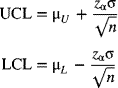
By substituting for μL and μU, the following equations are obtained:
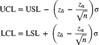
If the process standard deviation σ is to be estimated from an R-chart, then ![]() is substituted for σ in eq. (7-71). Alternatively, if σ is to be estimated from an s-chart,
is substituted for σ in eq. (7-71). Alternatively, if σ is to be estimated from an s-chart, ![]() is used in place of σ in eq. (7-71).
is used in place of σ in eq. (7-71).
Acceptance Control Chart
In the preceding discussion we outlined a procedure for obtaining the modified control limits given the sample size n, the proportion nonconforming δ, and the acceptable level of probability of type I error, α. In this section we discuss a procedure to calculate the control chart limits when the sample size is known and when we have a specified level of proportion nonconforming (γ) that we desire to detect with a probability of (1 − β). Such a control chart is known as an acceptance control chart. The same assumptions are made here as for modified control charts. That is, we assume that the inherent process spread (6σ) is much less than the difference between the specification limits, the process variability is in control, and the distribution of the individual values is normal.
Figure 7-29a shows the distribution of the individual values and the borderline locations of the process mean so that the proportion nonconforming does not exceed the desirable level of γ. From Figure 7-29a we have

Figure 7-29 Determination of acceptance control chart limits.
Figure 7-29b shows the distribution of the sample mean and the bounds within which the process mean must lie for the probability of detecting a nonconformance proportion of γ to be 1 − β. From Figure 7-29b we have
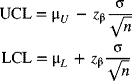
Substituting from eq. (7-72), we get

If an R-chart is used to control the process variability, σ is estimated by ![]() . If an s-chart is used, σ is estimated by
. If an s-chart is used, σ is estimated by ![]() . These estimates are then used in eq. (7-74).
. These estimates are then used in eq. (7-74).
The principles of modified control charts and acceptance control charts can be combined to determine an acceptable sample size n for chosen levels of δ, α, γ, and β. By equating the expressions for the UCL in eqs. (7-71) and (7-74), we have
which yields
Some examples of variables control chart applications in the service sector are shown in Table 7-13. Note that the size of the subgroup in the data collected will determine, in many instances, the use of the X-MR chart (for individuals' data), ![]() and R (when the subgroup size is small, usually less than 10), and
and R (when the subgroup size is small, usually less than 10), and ![]() and s (when the subgroup size is large, usually equal to or greater than 10).
and s (when the subgroup size is large, usually equal to or greater than 10).
Table 7-13 Applications of Control Charts for Variables in the Service Sector
| Quality Characteristic | Control Chart |
| Response time for correspondence in a consulting firm or financial institution | |
| Waiting time in a restaurant | |
| Processing time of claims in an insurance company | |
| Waiting time to have cable installed | |
| Turnaround time in a laboratory test in a hospital | I and MR (n = 1) |
| Use of electrical power or gas on a monthly basis | Moving average; EWMA |
| Admission time into an intensive care unit | I and MR (n = 1) |
| Blood pressure or cholesterol ratings of a patient over time | I and MR (n = 1) |
7-9 Risk-Adjusted Control Charts
In health care applications, certain adjustments are made to the construction of variable control charts based on variation in the severity of illness or risk associated with patients from whom data are collected and monitored. When regular variable control charts are developed for manufacturing or service applications, an assumption made is that the sampled units are independent and identically distributed when the process is in control. However, such is not the case when monitoring health care operations. For instance, in monitoring heart surgical outcomes, a performance measure of the surgeon and the associated team could be mortality. Such outcomes are influenced not only by the performance level of the surgeon and the support team but also by the pre-operative severity of risk inherent to the patient. Furthermore, such risk levels do not necessarily remain constant from patient to patient. Thus, the need arises to create risk-adjusted control charts that incorporate the pre-operative severity of risk associated with the patient.
In addition to outcome measures such as mortality or morbidity for critically ill patients in intensive care units (ICUs) or similar measures for patients undergoing cardiac surgery, another measure could be the duration of ICU stay following cardiac surgery. A few systems for stratification of pre-operative risk associated with patients exist in health care. Such systems usually incorporate the use of a logistic regression model (see Chapter 13) to predict, for example, mortality based on a number of patient characteristics. One system of risk stratification for surgical outcomes in acquired heart disease is the Parsonnet score (Geissler et al. 2000; Lawrence et al. 2000; Parsonnet et al. 1989). This scale incorporates patient characteristics such as gender, age, obesity, blood pressure, presence of diabetes, cholesterol level, family history, Mitral valve disease, and left ventricular ejection fraction, among others. Scores usually range from 0 to 100, with low scores representing smaller risks. Another scoring system utilizes the APACHE (Acute Physiology and Chronic Health Evaluation) score. This is calculated using patient characteristics such as age, arterial pressure, heart rate, respiratory rate, sodium (serum) level, potassium (serum) level, creatinine, and white blood cell count, among others. The APACHE system has been refined over the years, with the APACHE III system that measures severity of disease from 20 physiologic variables with scores ranging from 0 to 299 (Knaus et al. 1985, 1991). A fourth-generation APACHE IV scoring system has been found to perform well in predicting mortality in the ICU (Zimmerman et al. 2006; Keegan et al. 2011).
Risk-Adjusted Cumulative Sum (RACUSUM) Chart
Using the regular cusum chart, as discussed earlier, one could monitor the cumulative sum of the number of deaths for each successive patient given by
where Wn denotes the weight applied to the nth observation, in this case the outcome associated with the nth patient. Here, Wn = 1 if the nth patient dies and Wn = 0 if the nth patient survives. The control chart may be designed to signal if Cn > h, where h is a bound selected on the basis of a chosen false-alarm rate or, equivalently, an in-control ARL. The drawback of this traditional cumulative sum chart is that it does not take into account the variation in the pre-operative risk of mortality from patient to patient.
The risk-adjusted cumulative sum chart incorporates patient characteristics based on some aggregate risk score, such as the Parsonnet score or the APACHE score. Using such a score, the predicted risk of mortality is found from a logistic regression model and is given by
where pn denotes the pre-operative predictive mortality for patient n whose aggregate risk score is given by RSCn and a and b are estimated parameters of the logistic regression model. The above expression may be re-expressed to estimate the predicted risk of mortality as
The risk-adjusted chart repeatedly tests the null and the alternative hypothesis given by
The odds ratio is the ratio of the probability of mortality to the probability of survival. Two cumulative sums may be computed, one to detect increases in the mortality rate (Ra > R0) through an upper limit h+ and the other to detect decreases in the mortality rate (Ra < R0) through a lower limit h−.
Let us denote ![]() and
and ![]() as the upper and lower cumulative sum values. The risk-adjusted weight function (Wn) for patient n is utilized in computing the corresponding risk-adjusted cumulative sum values given as follows (Steiner et al. 2000):
as the upper and lower cumulative sum values. The risk-adjusted weight function (Wn) for patient n is utilized in computing the corresponding risk-adjusted cumulative sum values given as follows (Steiner et al. 2000):

where

The values of the control limits, h+ and h−, are selected based on chosen values of R0, Ra, and the associated risks of a false alarm and the probability of a type II error. The chart signals if ![]() or
or ![]() . In order to compare surgical performance based on pre-operative prediction, R0 may be chosen to be 1. To detect a deterioration in performance, Ra may be selected, for example, as 2, that is, a doubling of the odds ratio. On the other hand, to detect an improvement in the performance, Ra may be selected to be less than 1, for example, 0.5. By selecting the cumulative sum functions given by eqs. (7-78) and (7-79), the absorbing barrier is at the zero line so that the chart resets itself any time this barrier is reached.
. In order to compare surgical performance based on pre-operative prediction, R0 may be chosen to be 1. To detect a deterioration in performance, Ra may be selected, for example, as 2, that is, a doubling of the odds ratio. On the other hand, to detect an improvement in the performance, Ra may be selected to be less than 1, for example, 0.5. By selecting the cumulative sum functions given by eqs. (7-78) and (7-79), the absorbing barrier is at the zero line so that the chart resets itself any time this barrier is reached.
Risk-Adjusted Sequential Probability Ratio Test (RASPRT)
The resetting risk-adjusted sequential probability ratio test is quite similar to the RACUSUM chart. The null hypothesis is that the risk of mortality is accurately predicted by the chosen risk adjustment prediction equation. In this case, we assume that pn, given by eq. (7-77) based on an aggregate risk score, is accurate. The alternative hypothesis is that the probability of mortality is better predicted by a different probability.
The RASPRT statistic is given by
where the risk-adjusted weight for patient n is given by eq. (7-79). Thresholds for decision making are given by bounds e and f. The upper bound e is chosen based on a selected level of a type I error, α (false-alarm rate), where one may incorrectly conclude, for example, a doubling of the mortality rate if Rn > e. Both bounds are influenced by the chosen levels α and β, the probability of a type II error, and are given by
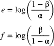
Risk-Adjusted Exponentially Weighted Moving-Average (RAEWMA) Chart
The regular EWMA chart introduced previously in the chapter weights observations based on how recent they are. More weight is assigned to the most recent observation with the weights decreasing sequentially in a geometric manner for observations as they go back in history.
In the risk-adjusted EWMA chart, the computation of the charting statistic is similar to that discussed previously. This is given by
where λ is the weighting constant and Yn represents the observed outcome. If the patient survives, Yn = 0, while it is 1 if the patient dies.
However, the control limits are based on risk adjustment associated with the varying degree of severity of illness of the patients. As in the risk-adjusted cusum chart, the predicted risk of mortality may be found from a re-expressed logistic regression model, of the type given by eq. (7-77), based on the aggregate risk score of the patient. The centerline for patient n, using risk adjustment, is given by
where λ is the selected weighting constant (0 < λ ≤ 1) and pn is found from eq. (7-77). Equation (7-82) may be re-expressed as
where, for ![]() , the starting estimate of the predicted mortality risk, one may use the value of p1.
, the starting estimate of the predicted mortality risk, one may use the value of p1.
The control limits of the risk-adjusted EWMA chart may be found by calculating the estimated variance of ![]() :
:
Since Var(pk) = pk(1 − pk), k = 1, 2,…, n, we have
Assuming a normal approximation, the risk-adjusted control limits, using eqs. (7-83) and (7-84), are given by
where zα/2 is the standard normal variate for a chosen type I error rate of α.
The risk-adjusted EWMA chart is able to detect small and gradual changes in the mortality rate. Further, an appropriate choice of the smoothing factor λ based on the anticipated change helps the RAEWMA chart to signal quickly in the event of a change.
Variable Life-Adjusted Display (VLAD) Chart
Another control chart for monitoring mortality is the VLAD chart that displays the cumulative difference between observed and predicted deaths plotted against the patient sequence number. The predicted number of deaths incorporates the severity of illness of the patient. As discussed previously, a composite measure such as the Parsonnet score or the APACHE score may be used to predict the risk of mortality for a patient using a logistic regression model. Equation (7-77) shows a reduced form of the model.
The VLAD chart is a form of the cumulative sum control chart. For each operation performed on a patient by the surgeon, the chart statistic accrues a value equal to the predicted risk, which represents the expected number of deaths that incorporates the patients' severity of illness, minus the observed outcome, which represents the actual number of deaths. The statistic represents the net lives saved when adjusted for the patient's pre-operative risk on a cumulative basis. Hence, for a surgeon performing at the predicted level of risk, the statistic will approach the value of zero. For those performing at a level better than that predicted, as influenced by the patients' risk level, a positive score will result for the VLAD statistic. On the contrary, for a surgeon not performing at the predicted level, the VLAD statistic will show a downward trend and eventually yield a negative value.
Suppose that the predicted risk of mortality for patient n is given by pn, as given by eq. (7-77). The statistic for patient n is obtained as
where on = 1 if patient n dies and on = 0 if the patient survives. For a sequence of operations, the cumulative sum of the VLAD statistic after operation t is given by
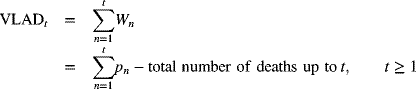
7-10 Multivariate Control Charts
The control charts mentioned thus far have dealt with controlling one characteristic. However, in real-world situations, we often deal with two or more variables simultaneously. For instance, we may want to simultaneously control both the length and the inside diameter of a pipe. In other words, both the length and the inside diameter must be acceptable for the pipe to be usable. Controlling both characteristics separately may not yield a product in which both variables are acceptable.
Controlling Several Related Quality Characteristics
Suppose we have two quality characteristics that must both be in control for the process to be in control. If control charts for the averages of these two characteristics are kept independently, the result is a rectangular control region on a two-dimensional plot. The boundaries of this region are basically the upper and lower control limits of the two quality characteristics and are calculated using eq. (7-5). If the bivariate observation of sample means (![]() ) plots within the control limits, the process would seem to be in control.
) plots within the control limits, the process would seem to be in control.
Such rectangular boundaries, however, can often be incorrect. An actual control region for two characteristics is elliptic in nature (see Figure 7-32). The equation of a statistic that incorporates two characteristics is an ellipse, as we will see in eq. (7-89). If the two characteristics are independent of each other, the major and minor axes of the ellipse are parallel to the respective plot axes (see ellipse A in Figure 7-32). If the pair of sample means (![]() ) falls within the boundary of the ellipse, the process is said to be in control. If two characteristics are negatively correlated, the shape of the control ellipse will be similar to that of ellipse B. If the two variables are positively correlated, the control ellipse will be similar to that of ellipse C.
) falls within the boundary of the ellipse, the process is said to be in control. If two characteristics are negatively correlated, the shape of the control ellipse will be similar to that of ellipse B. If the two variables are positively correlated, the control ellipse will be similar to that of ellipse C.
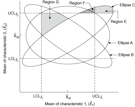
Figure 7-32 Elliptical control region.
Figure 7-32 shows that if the variables are positively correlated and we use the rectangular region erroneously as the control region, we draw various incorrect conclusions. For instance, if (![]() ) falls in region E or region F, the process is in control even though the point falls outside the rectangular region. A point in region G, on the other hand, is within the rectangular region, but the process is nonetheless out of control.
) falls in region E or region F, the process is in control even though the point falls outside the rectangular region. A point in region G, on the other hand, is within the rectangular region, but the process is nonetheless out of control.
The degree of correlation between the variables influences the magnitude of the errors encountered in making inferences. If a separate ![]() -chart is constructed for each characteristic based on a type I error probability of α and a rectangular control region is used, then for independent variables the probability of a type I error for the joint control procedure is
-chart is constructed for each characteristic based on a type I error probability of α and a rectangular control region is used, then for independent variables the probability of a type I error for the joint control procedure is
where p represents the number of jointly controlled variables. The probability of all p sample means plotting within the rectangular region is (1 − α)p.
Moderate or large values of p have a major impact on the errors associated with inference making. Suppose that individual control chart limits are constructed using a type I error probability of 0.0026. If we have four independent characteristics (i.e., p = 4), the overall type I error probability (α′) for the joint control procedure is
If the variables are not independent, the magnitude of the type I error will be difficult to obtain. In practice, a control ellipse should be chosen so that the probability of the sample means being plotted within the elliptical region when the process is in control is 1 − α, where α is the desired overall probability of a type I error.
Hotelling's T2 Control Chart and Its Variations
Suppose that we have two quality characteristics, X1 and X2, distributed jointly according to a bivariate normal distribution. Assume that the target mean values of the characteristics are represented by ![]() and
and ![]() , respectively. Let the sample means be
, respectively. Let the sample means be ![]() and
and ![]() , with sample variances
, with sample variances ![]() and
and ![]() , and the covariance between the two variables be represented by s12 for a sample of size n. Under these conditions, the statistic
, and the covariance between the two variables be represented by s12 for a sample of size n. Under these conditions, the statistic
is distributed according to Hotelling's T2-distribution with 2 and (n − 1) degrees of freedom (Hotelling 1947). The 2 in this case comes from the two characteristics being considered, and the (n − 1) is the degrees of freedom associated with the sample variance. If the calculated value of T2 given by eq. (7-89) exceeds ![]() , the point on the T2- distribution such that the proportion to the right is α, then at least one of the characteristics is out of control.
, the point on the T2- distribution such that the proportion to the right is α, then at least one of the characteristics is out of control.
This procedure can be shown graphically. Equation (7-89) represents the control ellipses shown in Figure 7-32. If the variables are independent, the covariance between them is zero (i.e., s12 = 0), the control ellipse is A, and the joint control region is represented by the area within the control ellipse A. If a plot of the bivariate means (![]() ) falls within this control region, we can assume a state of statistical control. If the two variables are positively correlated, then s12 > 0, and the control ellipse is similar to ellipse C. If the variables are negatively correlated, then s12 < 0, and the control ellipse will be similar to ellipse B.
) falls within this control region, we can assume a state of statistical control. If the two variables are positively correlated, then s12 > 0, and the control ellipse is similar to ellipse C. If the variables are negatively correlated, then s12 < 0, and the control ellipse will be similar to ellipse B.
Hotelling's control ellipse procedure has several disadvantages. First, the time sequence of the plotted points (![]() ) is lost. This implies that we cannot check for runs in the plotted pattern as with control charts. Second, the construction of the control ellipse becomes quite difficult for more than two characteristics. To overcome these disadvantages, the values of T2 given by eq. (7-89) are plotted on a control chart on a sample-by-sample basis to preserve the time order in which the data values are obtained. Such a control chart has an upper control limit of
) is lost. This implies that we cannot check for runs in the plotted pattern as with control charts. Second, the construction of the control ellipse becomes quite difficult for more than two characteristics. To overcome these disadvantages, the values of T2 given by eq. (7-89) are plotted on a control chart on a sample-by-sample basis to preserve the time order in which the data values are obtained. Such a control chart has an upper control limit of ![]() , where p represents the number of characteristics. Patterns of nonrandom runs can be investigated in such plots.
, where p represents the number of characteristics. Patterns of nonrandom runs can be investigated in such plots.
Values of Hotelling's T2 percentile points can be obtained from the percentile points of the F-distribution given in Appendix A-6 by using the relation
where ![]() represents the point on the F-distribution such that the area to the right is α, with p degrees of freedom in the numerator and (n − p) degrees of freedom in the denominator.
represents the point on the F-distribution such that the area to the right is α, with p degrees of freedom in the numerator and (n − p) degrees of freedom in the denominator.
If more than two characteristics are being considered, the value of T2 given by eq. (7-89) for a sample can be generalized as
where ![]() represents the vector of sample means of p characteristics for a sample of size n,
represents the vector of sample means of p characteristics for a sample of size n, ![]() represents the vector of target values for each characteristic, and ∑ denotes the variance–covariance matrix of the p quality characteristics.
represents the vector of target values for each characteristic, and ∑ denotes the variance–covariance matrix of the p quality characteristics.
Phase 1 and Phase 2 Charts
In multivariate control charts, the process of determining control limits from an in-control process and, thereby, using those control limits to detect a change in the process parameter, for example, the process mean, is usually conducted in two phases. In phase 1, assuming that special causes do not exist upon taking remedial actions, if necessary, based on the observations from the in-control process, estimates of the process mean μ0 and process variance–covariance matrix Σ are obtained.
Suppose that, for an in-control process, we have m samples, each of size n, with the number of characteristics being p. The vector of sample means is given by
where ![]() represents the sample mean of the ith characteristic for the jth sample and is found from
represents the sample mean of the ith characteristic for the jth sample and is found from

where ![]() represents the value of the kth observation of the ith characteristic in the jth sample. The sample variances for the ith characteristic in the jth sample are given by
represents the value of the kth observation of the ith characteristic in the jth sample. The sample variances for the ith characteristic in the jth sample are given by
The covariance between characteristics i and h in the jth sample is calculated from
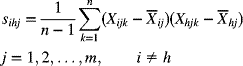
The vector μ0 of the process means of each characteristic for m samples is estimated as
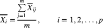
The elements of the variance–covariance matrix Σ in eq. (7-91) are estimated from the following average for m samples:

and

Finally, the matrix Σ is estimated using S as follows (only the upper diagonal part is shown because the matrix is symmetric):
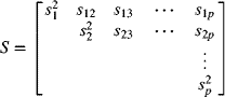
Phase 1 Control Limits
The upper control limit of the T2-chart given by eq. (7-90) can be modified to take the following form (Alt 1982):
where m represents the number of samples, each of size n, used to estimate ![]() and S. The value of T2 for each of the m samples is calculated using the estimated statistic
and S. The value of T2 for each of the m samples is calculated using the estimated statistic
and is then compared to the UCL given by eq. (7-99). If the value of T2 for the jth sample (i.e., ![]() ) is above the UCL, it is treated as an out-of-control point, and investigative action is begun.
) is above the UCL, it is treated as an out-of-control point, and investigative action is begun.
Phase 2 Control Limits
After out-of-control points, if any, are deleted assuming adequate remedial actions are taken, the procedure is repeated until all retained observations are in control.
Now, phase 2 of the procedure is used for monitoring future observations from the process. Let us denote the number of samples retained at the end of phase 1 by m, each containing n observations. The upper control limit for the T2 control chart in phase 2 is given by
Usage and Interpretations
A Hotelling's control chart is constructed using the upper control limit and the plotted values of T2 for each sample given by eq. (7-100), where the vector ![]() and the matrix S are found using the preceding procedure. A sample value of T2 above the upper control limit indicates an out-of-control situation. How do we determine which quality characteristic caused the out-of-control state?
and the matrix S are found using the preceding procedure. A sample value of T2 above the upper control limit indicates an out-of-control situation. How do we determine which quality characteristic caused the out-of-control state?
Even with only two characteristics (p = 2), the situation can be complex. If the two quality characteristics are highly positively correlated, we expect the averages for each characteristic in the sample to maintain the same relationship relative to the process average ![]() . For example, in the jth sample, if
. For example, in the jth sample, if ![]() , we could expect
, we could expect ![]() . Similarly, if
. Similarly, if ![]() , we would expect
, we would expect ![]() , which would confirm that the sample averages for each characteristic move in the same direction relative to their means.
, which would confirm that the sample averages for each characteristic move in the same direction relative to their means.
If the two characteristics are highly positively correlated and ![]() , we would not expect that
, we would not expect that ![]() . However, should this occur, this sample may show up as an out-of-control point in Hotelling's T2 procedure, thereby indicating that the bivariate process is out of control. This same inference can be made using individual 3σ control limit charts constructed for each characteristic if
. However, should this occur, this sample may show up as an out-of-control point in Hotelling's T2 procedure, thereby indicating that the bivariate process is out of control. This same inference can be made using individual 3σ control limit charts constructed for each characteristic if ![]() exceeds
exceeds ![]() or
or ![]() exceeds
exceeds ![]() . However, individual quality characteristic means can plot within the control limits on separate control charts even though the T2 plots above the UCL on the joint control chart. Using joint control charts for characteristics that need to be considered simultaneously is thus advantageous. However, note that an individual chart for a quality characteristic can sometimes indicate an out-of-control condition when the joint control chart does not.
. However, individual quality characteristic means can plot within the control limits on separate control charts even though the T2 plots above the UCL on the joint control chart. Using joint control charts for characteristics that need to be considered simultaneously is thus advantageous. However, note that an individual chart for a quality characteristic can sometimes indicate an out-of-control condition when the joint control chart does not.
In general, larger sample sizes are needed to detect process changes with positively correlated characteristics than with negatively correlated characteristics. Furthermore, for highly positively correlated characteristics, larger sample sizes are needed to detect large positive shifts in the process means than to detect small positive shifts.
Generally speaking, if an out-of-control condition is detected by a Hotelling's control chart, individual control intervals are calculated for each characteristic for that sample. If the probability of a type I error for a joint control procedure is α, then for sample j, the individual control interval for the ith quality characteristic is
where ![]() and
and ![]() are given by eqs. (7-95) and (7-96), respectively. If
are given by eqs. (7-95) and (7-96), respectively. If ![]() falls outside this interval, the corresponding characteristic should be investigated for a lack of control. If special causes are detected, the sample that contains information relating to all the characteristics should be deleted when the upper control limit is recomputed.
falls outside this interval, the corresponding characteristic should be investigated for a lack of control. If special causes are detected, the sample that contains information relating to all the characteristics should be deleted when the upper control limit is recomputed.
As described previously, even though the T2 control chart is useful in detecting shifts in the process mean vector, it does not identify which specific variables(s) are responsible. One approach, in this context, is the T2 decomposition method. The concept is to determine the individual contributions of each of the p variables, or combinations thereof, to the overall T2-statistic. These individual contributions or partial T2-statistics are found as follows:
where ![]() denotes the T2-statistic when the ith variable is left out. Large values of Di will indicate a significant impact of variable i for the particular observation under investigation.
denotes the T2-statistic when the ith variable is left out. Large values of Di will indicate a significant impact of variable i for the particular observation under investigation.
Individual Observations with Unknown Process Parameters
The situation considered previously dealt with subgroups of data, where the sample size (n) for each subgroup exceeds 1. In this section we consider individual observations and assume that the process parameters, mean vector or the elements of the variance–covariance matrix, are unknown. As before, we use the two-phase approach, where in phase 1 we use the preliminary data to retain observations in control.
The value of T2, when individual observations are obtained, is given by
In eq. (7-104), the process mean vector is estimated from the observations by ![]() , while the process variance–covariance matrix is estimated, using the data, by S. The upper control limit in this situation, in phase 1, is given by
, while the process variance–covariance matrix is estimated, using the data, by S. The upper control limit in this situation, in phase 1, is given by
where ![]() denotes the upper αth quantile of the beta distribution with parameters p/2 and (m − p − 1)/2.
denotes the upper αth quantile of the beta distribution with parameters p/2 and (m − p − 1)/2.
If an observation vector has a value of T2, given by eq. (7-104), that exceeds the value of UCL, given by eq. (7-105), it is deleted from the preliminary data set. Revised estimates of the process mean vector and variance–covariance matrix elements are found using the remaining observations and the process is repeated until no further observations are deleted. We now proceed to phase 2 to monitor future observations. The estimates ![]() and S obtained at the end of phase 1 are used to calculate T2, using eq. (7-104), for new observations. Assuming that the number of observations retained at the end of phase 1 is given by m, the upper control limit for phase 2 is obtained as
and S obtained at the end of phase 1 are used to calculate T2, using eq. (7-104), for new observations. Assuming that the number of observations retained at the end of phase 1 is given by m, the upper control limit for phase 2 is obtained as
Hence, values of T2 for new observations will be compared with the UCL given by eq. (7-106) to determine out-of-control conditions.
Generalized Variance Chart
The multivariate control charts discussed previously dealt with monitoring the process mean vector. Here, we introduce a procedure to develop a multivariate dispersion chart to monitor process variability based on the sample variance–covariance matrix S. A measure of the sample generalized variance is given by |S|, the determinant of the sample variance–covariance matrix.
Denoting the mean and variance of |S| by E(|S|) and V(|S|), respectively, and using the property that most of the probability distribution of |S| is contained in the interval ![]() , expressions for the parameters of the control chart for |S| may be obtained. It is known that
, expressions for the parameters of the control chart for |S| may be obtained. It is known that
where Σ represents the process variance–covariance matrix, and

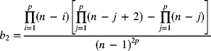
Since Σ is usually unknown, it is estimated based on sample information. From eq. (7-107), an unbiased estimator of |Σ| is |S|/b1. Using eqs. (7-107) and (7-108), the centerline and control limits for the |S| chart are given by
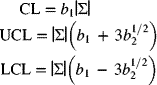
When a target value for Σ, say Σ0, is specified, |Σ| is replaced by |Σ0| in eq. (7-111). Alternatively, the sample estimate of |Σ| given by |S|/b1 will be used to compute the centerline and control limits in eq. (7-111). In the event that the LCL from eq. (7-111) is computed to be less than zero, it is converted to zero.
For a given sample j, |Sj|, the determinant of the variance–covariance matrix for sample j, is computed and plotted on the generalized variance chart. If the plotted value of |Sj| is outside the control limits, we flag the process and look for special causes.
Even though the generalized sample variance chart is useful, as it aggregates the variability of several variables into one index, it has to be used with caution. This is because many different Sj matrices may give the same value of |Sj|, while the variance structure could be quite different. Hence, a univariate range (R) chart or standard deviation (s) chart may help us understand the variables that contribute to make the combined impact on the generalized variance to be significant.
Summary
This chapter has introduced different types of control charts that can be used with quality characteristics that are variables (i.e., they are measurable on a numerical scale). Details as to the construction, analysis, and interpretation of each chart have been presented. Guidelines were provided for the appropriate settings in which each control chart may be used. The rationale behind each type of control chart has been discussed. A set of general considerations that deserve attention prior to the construction of a control chart was given. Statistical process control by means of control charts for variables is the backbone of many processes. Procedures to construct and maintain these control charts were discussed at length.
General guidelines are presented for selection of the type of control chart based on the nature of the data collected. When the subgroup size is 1, a control chart for individuals and moving range (I – MR) is used. For small subgroups (n < 10), charts for the mean and range (![]() and R) are used; for larger subgroups (n ≥ 10), charts for the mean and standard deviation (
and R) are used; for larger subgroups (n ≥ 10), charts for the mean and standard deviation (![]() and s) are appropriate. When it is of interest to detect small deviations of a process from a state of control, the cumulative sum chart is an option. We also discussed multivariate control charts where more than one product or process variables are of interest. A T2-chart for controlling the process mean vector and a generalized variance chart for monitoring the process variability are presented.
and s) are appropriate. When it is of interest to detect small deviations of a process from a state of control, the cumulative sum chart is an option. We also discussed multivariate control charts where more than one product or process variables are of interest. A T2-chart for controlling the process mean vector and a generalized variance chart for monitoring the process variability are presented.
An important concept in health care applications is that of risk-adjusted control charts. This is necessitated due to the varying degree of severity of illness or risk associated with patients. Hence, computation of predicted outcomes, such as mortality or length of stay in the facility, and the associated control limits need to be adjusted based on the risk of each individual patient.
Key Terms
- attribute
- average run length
- causes
- common
- special
- centerline
- control chart patterns
- bunches/groups
- cyclic
- freaks
- gradual shift in level
- interaction
- mixture or the effect of two or more populations
- natural
- stratification
- sudden shift in level
- trend
- wild
- control charts for variables
- acceptance control chart
- cumulative sum chart (cusum chart)risk-adjusted cusum chart
- generalized variance chart
- geometric moving-average chartrisk-adjusted EWMA chart
- Hotelling's T2 control chart
- modified control chart
- moving-average chart
- R-chartrisk-adjusted sequential probability ratio test
- short production runs
- s-chart
- standardized
- variable life-adjusted (VLAD) chart
 -chart
 -chart
- Z-MR chart
- control limits
- lower
- revised limits
- trial limits
- upper
- F-distribution
- geometric moving average
- exponentially weighted moving
- average
- weighting factor
- moving average
- span
- moving range
- multivariate control charts
- control region
- out of control
- rules
- Pareto analysis
- principle of least squares
- process
- mean
- shift in mean
- standard deviation
- process capability
- proportion nonconforming
- range
- remedial actions
- sample
- frequency of rational selection of size
- specification limits
- standard deviation
- population
- sample
- sample mean
- standardized control chart
- statistical control
- target value
- 3σ control limits
- type I error
- overall rate
- type II error
- V-mask
- lead distance
- angle of decision line
- variable
Exercises
Discussion Questions
- 7-1 What are the advantages and disadvantages of using variables rather than attributes in control charts?
- 7-2 Describe the use of the Pareto concept in the selection of characteristics for control charts.
- 7-3 Discuss the preliminary decisions that must be made before you construct a control chart. What concepts should be followed when selecting rational samples?
- 7-4 Discuss specific characteristics that could be monitored through variable control charts, the form of data to collect, and the appropriate control chart in the following situations:
- Waiting time to check in baggage at an airport counter
- Product assembly time in a hardware company
- Time to develop a proposal based on customer solicitation
- Emission level of carbon monoxide for a certain model of automobile
- Detection of a change in average response time to customer queries when the degree of change is small
- Changes in blood pressure of a patient over a period of time
- Acceptance of products manufactured in batches, where batch means of the characteristic selected are determined, with the ability to detect a set proportion nonconformance with a desired level of probability
- Mortality rate of cardiac surgery patients adjusting for individual patient risk
- Time to respond to customer queries received at a call center
- Downtime of Internet service provider to individual customers
- 7-5 What are some considerations in the interpretation of control charts based on standard values? Is it possible for a process to be in control when its control chart is based on observations from the process but to be out of control when the control chart is based on a specified standard? Explain.
- 7-6 A start-up company promoting the development of new products can afford only a few observations from each product. Thus, a critical quality characteristic is selected for monitoring from each product. What type of control chart would be suitable in this context? What assumptions are necessary?
- 7-7 Patient progress in a health care facility is monitored over time for a certain diagnosis-related group according to a few vital characteristics (systolic blood pressure, diastolic blood pressure, total cholesterol, weight). The characteristics, however, are not independent of each other. Target values for each characteristic are specified. What is an appropriate control chart in this context?
- 7-8 Explain the difference in interpretation between an observation falling below the lower control limit on an
 -chart and one falling below the lower control limit on an R-chart. Discuss the impact of each on the revision of control charts in the context of response time to fire alarms.
 - 7-9 A new hire has been made in a management consulting firm and data are monitored on response time to customer queries. Discuss what the patterns on an
 - and R-chart might look like as learning on the job takes place.
 - 7-10 A financial institution wants to improve proposal preparation time for its clients. Discuss the actions to be taken in reducing the average preparation time and the variability of preparation times.
- 7-11 Control charts are maintained on individual values on patient recovery time for a certain diagnosis-related group. What precautions should be taken in using such charts and what are the assumptions?
- 7-12 Explain the concept of process capability and when it should be estimated. What is its impact on nonconformance? Discuss in the context of project completion time of the construction of an office building.
- 7-13 What are the advantages and disadvantages of cumulative sum charts compared to Shewhart control charts?
- 7-14 What are the conditions under which a moving-average control chart is preferable? Compare the moving-average chart with the geometric moving-average chart.
- 7-15 Discuss the importance of risk adjustment in monitoring mortality and related measures in a health care setting.
- 7-16 Discuss the appropriate setting for using a modified control chart and an acceptance control chart. Compare and contrast the two charts.
- 7-17 What is the motivation behind constructing multivariate control charts? What advantages do they have over control charts for individual characteristics?
- 7-18 Lung congestion may occur in illness among infants. However, it is not easily verifiable without radiography. To monitor an ill infant to predict whether lung opacity will occur on a radiograph, data are kept on age, respiration rate, heart rate, temperature, and pulse oximetry. Target values for each variable are identified. What control chart should you use in this context?
Problems
- 7-19 A soft drink bottling company is interested in controlling its filling operation. Random samples of size 4 are selected and the fill weight is recorded. Table 7-19 shows the data for 24 samples. The specifications on fill weight are 350 ± 5 grams (g). Daily production rate is 20,000 bottles.
Sample Observations (g) Sample Observations (g) 1 352 348 350 351 13 352 350 351 348 2 351 352 351 350 14 356 351 349 352 3 351 346 342 350 15 353 348 351 350 4 349 353 352 352 16 353 354 350 352 5 351 350 351 351 17 351 348 347 348 6 353 351 346 346 18 353 352 346 352 7 348 344 350 347 19 346 348 347 349 8 350 349 351 346 20 351 348 347 346 9 344 345 346 349 21 348 352 351 352 10 349 350 352 352 22 356 351 350 350 11 353 352 354 356 23 352 348 347 349 12 348 353 346 351 24 348 353 351 352 - Find the trial control limits for the
 - and R-charts.
 - Assuming special causes for out-of-control points, find the revised control limits.
- Assuming the distribution of fill weights to be normal, how many bottles are nonconforming daily?
- If the cost of rectifying an underfilled bottle is $0.08 and the lost revenue of an overfilled bottle is $0.03, what is monthly revenue lost on average?
- If the process average shifts to 342 g, what is the probability of detecting it on the next sample drawn after the shift?
- What proportion of the output is nonconforming at the level of process average indicated in part (e)?
- Find the trial control limits for the
- 7-20 A major automobile company is interested in reducing the time that customers have to wait while having their car serviced with one of the dealers. They select four customers randomly each day and find the total time that each customer has to wait (in minutes) while his or her car is serviced. From these four observations, the sample average and range are found. This process is repeated for 25 days. The summary data for these observations are
- Find the
 - and R-chart control limits
 - Assuming that the process is in control and the distribution of waiting time is normal, find the percentage of customers who will not have to wait more than 50 minutes.
- Find the 2σ control limits.
- The service manager is developing a promotional program and is interested in reducing the average waiting time to 30 minutes by employing more mechanics. If the plan is successful, what proportion of the customers will have to wait more than 40 minutes? More than 50 minutes?
- Find the
- 7-21 Flight delays are of concern to passengers. An airline obtained observations on the average and range of delay times of flights (in minutes), each chosen from a sample of size 4, as shown in Table 7-20. Construct appropriate control charts and comment on the performance level. What are the chances of meeting a goal of no more than a 10-minute delay?
Observation AverageDelay Range Observation AverageDelay Range 1 6.5 2.1 14 9.2 3.5 2 11.1 3.8 15 7.8 2.2 3 15.8 4.6 16 10.6 4.1 4 10.9 4.2 17 10.7 4.2 5 11.2 4.0 18 8.8 3.8 6 5.6 3.5 19 9.8 3.6 7 10.4 4.1 20 10.2 3.6 8 9.8 2.0 21 9.0 4.2 9 7.7 3.2 22 8.5 3.3 10 8.6 3.8 23 9.8 4.0 11 10.5 4.2 24 7.7 2.8 12 10.2 3.8 25 10.5 3.2 13 10.5 4.0 - 7-22 In a textile company, it is important that the acidity of the solution used to dye fabric be within certain acceptable values. Data values are gathered for a control chart by randomly taking four observations from the solution and determining the average pH value and range. After 25 such samples, the following summary information is obtained:

The specifications for the pH value are 7.5 ± 0.5.
- Find the
 - and R-chart control limits.
 - Find the 1σ and 2σ
 -chart limits.
 - What fraction of the output is nonconforming (assuming a normal distribution of pH values)?
- Find the
- 7-23 The bore size on a component to be used in assembly is a critical dimension. Samples of size 4 are collected and the sample average diameter and range are calculated. After 25 samples, we have

The specifications on the bore size are 4.4 ± 0.2 mm. The unit costs of scrap and rework are $2.40 and $0.75, respectively. The daily production rate is 1200.
- Find the
 - and R-chart control limits.
 - Assuming that the process is in control, estimate its standard deviation.
- Find the proportion of scrap and rework.
- Find the total daily cost of scrap and rework.
- If the process average shifts to 4.5 mm, what is the impact on the proportion of scrap and rework produced?
- Find the
- 7-24 The time to be seated at a popular restaurant is of importance. Samples of five randomly selected customers are chosen and their average and range (in minutes) are calculated. After 30 such samples, the summary data values are
- Find the
 - and R-chart control limits.
 - Find the 1σ and 2σ
 -chart limits.
 - The manager has found that customers usually leave if they are informed of an estimated waiting time of over 10.5 minutes. What fraction of customers will this restaurant lose? Assume a normal distribution of waiting times.
- Find the
- 7-25 The thickness of sheet metal (mm) used for making automobile bodies is a characteristic of interest. Random samples of size 4 are taken. The average and standard deviation are calculated for each sample and are shown in Table 7-21 for 20 samples. The specification limits are 9.95 ± 0.3 mm.
Sample Sample Average, 
SampleStandard Deviation, s Sample Sample Average, 
SampleStandard Deviation, s 1 10.19 0.15 11 10.18 0.16 2 9.80 0.12 12 9.85 0.15 3 10.12 0.18 13 9.82 0.06 4 10.54 0.19 14 10.18 0.34 5 9.86 0.14 15 9.96 0.11 6 9.45 0.09 16 9.57 0.09 7 10.06 0.16 17 10.14 0.12 8 10.13 0.18 18 10.08 0.15 9 9.82 0.14 19 9.82 0.09 10 10.17 0.13 20 10.15 0.12 - Find the control limits for the
 - and s-charts. If there are out-of-control points, assume special causes and revise the limits.
 - Estimate the process mean and the process standard deviation.
- If the thickness of sheet metal exceeds the upper specification limit, it can be reworked. However, if the thickness is less than the lower specification limit, it cannot be used for its intended purpose and must be scrapped for other uses. The cost of rework is $0.25 per linear foot, and the cost of scrap is $0.75 per linear foot. The rolling mills are 100 feet in length. The manufacturer has four such mills and runs 80 batches on each mill daily. What is the daily cost of rework? What is the daily cost of scrap?
- If the manufacturer has the flexibility to change the process mean, should it be moved to 10.00?
- What alternative courses of action should be considered if the product is nonconforming?
- Find the control limits for the
- 7-26 Light bulbs are tested for their luminance, with the intensity of brightness desired to be within a certain range. Random samples of five bulbs are chosen from the output, and the luminance is measured. The sample mean
 and the standard deviation s are found. After 30 samples, the following summary information is obtained:

The specifications are 90 ± 15 lumens.
- Find the control limits for the
 - and s-charts.
 - Assuming that the process is in control, estimate the process mean and process standard deviation.
- Comment on the ability of the process to meet specifications. What proportion of the output is nonconforming?
- If the process mean is moved to 90 lumens, what proportion of output will be nonconforming? What suggestions would you make to improve the performance of the process?
- Find the control limits for the
- 7-27 The advertised weight of frozen food packages is 16 oz and the specifications are 16 ± 0.3 oz. Random samples of size 8 are selected from the output and weighed. The sample mean and standard deviation are calculated. Information on 25 such samples yields the following:
- Determine the centerlines and control limits for the
 - and s-charts.
 - Estimate the process mean and standard deviation, assuming that the process is in control.
- Find the 1σ and 2σ control limits for each chart.
- What proportion of the output is nonconforming? Is the process capable?
- What proportion of the output weighs less than the advertised weight?
- If the manufacturer is interested in reducing potential complaints and lawsuits from customers who feel that they have been cheated by packages weighing less than what is advertised, what action should the manufacturer take?
- Determine the centerlines and control limits for the
- 7-28 The baking time of painted corrugated sheet metal is of interest. Too much time will cause the paint to flake, and too little time will result in an unacceptable finish. The specifications on baking time are 10 ± 0.2 minutes. Random samples of size 6 are selected and their baking times noted. The sample means and standard deviations are calculated for 20 samples with the following results:
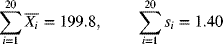
- Calculate the centerline and control limits for the
 - and s-charts.
 - Estimate the process mean and standard deviation, assuming the process to be in control.
- Is the process capable? What proportion of the output is nonconforming?
- If the mean of the process can be shifted to 10 minutes, would you recommend such a change?
- If the process mean changes to 10.2 minutes, what is the probability of detecting this change on the first sample taken after the shift? Assume that the process variability has not changed.
- Calculate the centerline and control limits for the
- 7-29 The level of dissolved oxygen in water was measured every 2 hours in a river where industrial plants discharge processed waste. Each observation consists of four samples, from which the sample mean and range of the amount of dissolved oxygen in parts per million are calculated. Table 7-27 shows the results of 25 such observations. Discuss the stability of the amount of dissolved oxygen. Revise the control limits, if necessary, assuming special causes for the out-of-control points. Suppose that environmental standards call for a minimum of 4 ppm of dissolved oxygen. Are these standards being achieved? Discuss.
Observation Average Level of Dissolved Oxygen Range Observation Average Level of Dissolved Oxygen Range 1 7.4 2.1 14 4.3 2.0 2 8.2 1.8 15 5.8 1.4 3 5.6 1.4 16 5.4 1.2 4 7.2 1.6 17 8.3 1.9 5 7.8 1.9 18 8.0 2.3 6 6.1 1.5 19 6.7 1.5 7 5.5 1.1 20 8.5 1.3 8 6.0 2.7 21 5.7 2.4 9 7.1 2.2 22 8.3 2.1 10 8.3 1.8 23 5.8 1.6 11 6.4 1.2 24 6.8 1.8 12 7.2 2.1 25 5.9 2.1 13 4.2 2.5 Sample Octane Rating Sample Octane Rating Sample Octane Rating Sample Octane Rating 1 89.2 6 87.5 11 85.4 16 90.3 2 86.5 7 92.6 12 91.6 17 85.6 3 88.4 8 87.0 13 87.7 18 90.9 4 91.8 9 89.8 14 85.0 19 82.1 5 90.3 10 92.2 15 91.5 20 85.8 Sample Sample Average,  (%)
(%)Sample Range, R (%) Sample Sample Average,  (%)
(%)Sample Range, R (%) 1 23.0 1.9 14 23.6 2.0 2 20.0 2.3 15 20.8 1.6 3 24.0 2.2 16 20.2 2.1 4 19.6 1.6 17 19.5 2.3 5 20.5 1.8 18 22.7 2.5 6 22.8 2.4 19 21.2 1.9 7 19.3 2.3 20 22.9 2.2 8 21.6 2.0 21 20.6 2.1 9 20.3 2.1 22 23.5 2.4 10 19.6 1.7 23 21.6 1.8 11 24.2 2.3 24 22.6 2.3 12 21.9 1.8 25 20.5 2.2 13 20.6 1.8 - 7-30 In a gasoline-blending plant, the quality of the output as indicated by its octane rating is measured for a sample taken from each batch. The observations from 20 such samples are shown in Table 7-28. Construct a chart for the moving range of two successive observations and a chart for individuals.
Sample Tensile Strength (1000 kg) Diameter (cm) 1 66 70 68 72 16 18 15 20 2 75 60 70 75 17 22 18 19 3 65 70 70 65 20 18 15 18 4 72 70 75 65 19 20 15 17 5 73 74 72 70 21 21 23 19 6 72 74 73 74 21 19 20 18 7 63 62 65 66 22 20 24 22 8 75 84 75 66 22 20 20 22 9 65 69 77 71 18 16 18 18 10 70 68 67 67 18 17 19 18 11 80 75 70 69 24 18 20 22 12 68 65 80 50 20 21 20 22 13 74 80 76 74 19 17 20 21 14 76 74 75 73 20 17 18 18 15 71 70 74 73 18 16 17 18 16 68 67 70 69 18 16 19 20 17 72 76 75 77 22 19 23 20 18 76 74 75 77 19 23 20 21 19 72 74 73 75 20 18 20 19 20 72 68 74 70 21 19 18 20 - 7-31 Automatic machines that fill packages of all-purpose flour to a desired standard weight need to be monitored closely. A random sample of four packages is selected and weighed. The average weight is then computed. Observations from 15 such samples are shown in Table 7-24. The desired weight of packages is 80 oz. Historical information on the machine reveals that the standard deviation of the weights of individual packages is 0.2 oz. Assume an acceptable type I error rate of 0.05. Also assume that it is desired to detect shifts in the process mean of 0.15 oz. Construct a cumulative sum chart and determine whether the machine needs to be adjusted to meet the target weight.
Sample Average Weight Sample Average Weight Sample Average Weight Sample Average Weight 1 80.2 5 80.1 9 79.7 13 79.8 2 80.0 6 80.4 10 79.5 14 80.4 3 79.6 7 79.5 11 80.3 15 80.2 4 80.3 8 79.4 12 80.5 - 7-32 The bending strength of the poles is a consideration to a manufacturer of fiberglass fishing rods. Samples are chosen from the process, and the average bending strength of four samples is found. The target mean bending strength is 30 kg, with a process standard deviation of 0.8 kg. Suppose that it is desired to detect a shift of
 from the target value. If the process mean is not significantly different from the target value, it is also desirable for the average run length to be 300. Find the parameters of an appropriate V-mask. If the manufacturer desires that the average run length not exceed 13 so as to detect shifts of the magnitude indicated, what will be the parameters of a V-mask if there is some flexibility in the allowable ARL when the process is in control?
 - 7-33 The average time (minutes) that a customer has to wait for the arrival of a cab after calling the company has been observed for random samples of size 4. The data for 20 such samples are shown in Table 7-25. Previous analysis gave the upper and lower control limits for an
 -chart when the process was in control as 10.5 and 7.7 minutes, respectively. What is your estimate of the standard deviation of the waiting time for a customer? Construct a moving-average control chart using a span of 3. What conclusions can you draw from the chart?
Sample Average Waiting Time Sample Average Waiting Time Sample Average Waiting Time Sample Average Waiting Time 1 8.4 6 9.4 11 8.8 16 9.9 2 6.5 7 10.2 12 10.0 17 10.2 3 10.8 8 8.1 13 9.5 18 8.3 4 9.7 9 7.4 14 9.6 19 8.6 5 9.0 10 9.6 15 8.3 20 9.9 - 7-34 Consider Exercise 7-33, which deals with the average wait time for the arrival of a cab. Using the data in Table 7-25, construct a geometric moving-average control chart. Use a weighting factor of 0.10. What conclusions can you draw from the chart? How is it different from the moving-average control chart constructed in Exercise 7-33?
- 7-35 Consider the data on purchase order processing time for customers shown in Table 4-6. Construct an individuals and a moving-range chart on the data before process improvement changes are made and comment on process stability.
- 7-36 Consider the data on the waiting time (seconds) of customers before speaking to a representative at a call center, shown in Exercise 5-9. The data, in sequence, are to be read across the row, before moving to the next row.
- Construct an individuals and moving-range chart and comment on the process.
- Construct a moving-average chart, with a window of 3, and comment on the process.
- Construct an exponentially weighted moving-average chart, with a weighting factor of 0.2, and comment on the process.
- Construct a cumulative sum chart, with a target value of 30 seconds, and comment on the process. Assume a type I error level of 0.05.
- 7-37 The time from product inception and design to marketing and sales is important for application software in mobile devices. For the last 20 products, Table 7-26 shows such times (in weeks) for a software organization. Construct an appropriate control chart and comment on the organization's responsiveness to market needs.
Table 7-26 Time to Market Software
Product Time Product Time Product Time 1 12.5 8 10.5 15 22.0 2 8.0 9 12.0 16 17.5 3 14.5 10 16.0 17 15.0 4 23.0 11 19.5 18 13.5 5 20.0 12 10.0 19 18.5 6 35.5 13 8.5 20 16.0 7 18.5 14 13.5 - 7-38 The percentage of potassium in a compound is expected to be within the specification limits of 18–35%. Samples of size 4 are selected, and the mean and range of 25 such samples are shown in Table 7-27. It is desirable for the process nonconformance to be within 1.5%. If the acceptable level of type I error is 0.05, find the modified control limits for the process mean.
- 7-39 Refer to Example 7-12 and the data for the nitrogen content in a certain fertilizer mix. If it is desired that the proportion nonconforming be within 0.5% and the level of type I error be limited to 0.025, find the modified control limits for the process mean.
- 7-40 Refer to Exercise 7-38 and the data for the percentage of potassium content in a compound. Suppose that we wish to detect an out-of-control condition with a probability of 0.90 if the process is producing at a nonconformance rate of 4%. Determine the acceptance control chart limits.
- 7-41 Refer to Example 7-13. If the nonconformance production rate is 2% and we wish to detect this with a probability of 0.98, what should be the acceptance control chart limits?
- 7-42 A component to be used in the assembly of a transmission mechanism is manufactured in a process for which the two quality characteristics of tensile strength (X1) and diameter (X2) are of importance. Twenty samples, each of size 4, are obtained from the process. For each component, measurements on the tensile strength and diameter are taken and are shown in Table 7-28. Construct a multivariate Hotelling's T2 control chart using an overall type I error probability of 0.01.
- 7-43 It is desired to monitor project completion times by analysts in a consulting company. The magnitude and complexity of the project influence the completion time. It is also believed that the variability in completion time increases with the magnitude of the completion time. Table 7-29 shows recent project completion times (days) along with their complexity. Complexity is indicated by letters A, B, and C, with complexity increasing from A to B and B to C. Construct an appropriate control chart and comment on the process.
Project Complexity Completion Time Project Complexity Completion Time 1 B 80 14 A 36 2 B 65 15 C 190 3 A 22 16 C 150 4 C 135 17 C 220 5 B 90 18 B 85 6 A 34 19 B 75 7 A 42 20 B 60 8 A 38 21 B 72 9 C 120 22 A 32 10 B 70 23 A 44 11 B 60 24 A 38 12 A 40 25 C 160 13 A 35 - 7-44 Consider the data on the parameters in a chemical process of temperature, pressure, proportion of catalyst, and pH value of mixture as indicated in Table 3-15.
- Construct a Hotelling's T2-chart and comment on process stability. Which process parameters, if any, would you investigate further?
- Analyze process variability through a generalized variance chart.
- 7-45 Consider the data on 25 patients, of a certain diagnosis-related group, on systolic blood pressure, blood glucose level, and total cholesterol level as shown in Table 4-5. The table shows values on these variables before and after administration of a certain drug. Assume that these variables are not independent of each other. What is an appropriate control chart to use?
- Construct a Hotelling's T2-chart using data before drug administration and comment on patient stability.
- Construct an individuals and a moving-range chart for blood glucose level before drug administration and comment. Are the conclusions from parts (a) and (b) consistent? Explain.
- 7-46 The time to evaluate and make a decision on mortgage loan applications is being examined in a financial institution. Twenty-five mortgage applications are selected from the previous month and the decision-making times, in days, are shown in Table 7-30. Construct an appropriate control chart and comment on the timeliness of the decision-making process. Revise the chart, if necessary, assuming special causes for out-of-control points. What is the expected time to make a decision? What is your estimate of the standard deviation of the time to make a decision?
Table 7-30 Time to Make Decisions on Mortgage Applications
Application Time (days) Application Time (days) Application Time (days) 1 16.5 10 34.5 19 19.0 2 8.0 11 20.0 20 14.5 3 14.0 12 16.0 21 18.0 4 22.0 13 13.5 22 15.0 5 24.5 14 12.0 23 13.5 6 15.0 15 20.5 24 12.5 7 18.5 16 18.5 25 16.0 8 10.5 17 16.5 9 14.5 18 14.0 - 7-47 Refer to Exercise 7-46. Demonstrate if the existing process in making a decision on loan applications is capable of meeting a goal value of 12 weeks. Assuming a normal distribution of the decision-making time, what proportion of the applications will not meet this goal value?
- 7-48 Refer to Exercise 7-46. Construct an exponentially weighted moving-average chart using a weighting constant of 0.2 for the decision-making process and comment. Is the existing process capable of meeting a goal value of 12 weeks?
- 7-49 An investment bank is interested in monitoring the weekly amount (in millions of dollars) invested in volatile stocks so as to maintain a stable rate of return on a selected fund. Table 7-31 shows 25 consecutive weeks of the amount invested ($M) in the fund. Construct appropriate control charts and comment on the stability of investment. Revise the chart, if necessary, assuming special causes for out-of-control points. What is your estimate of the standard deviation of the weekly amount invested?
Table 7-31 Weekly Investment in Volatile Stocks
Week Investment ($M) Week Investment ($M) Week Investment ($M) 1 16.2 10 12.9 19 16.3 2 10.8 11 28.5 20 14.2 3 18.9 12 23.3 21 21.5 4 14.4 13 20.2 22 18.6 5 15.7 14 19.3 23 20.9 6 25.3 15 14.8 24 22.4 7 20.4 16 18.7 25 21.8 8 22.6 17 20.4 9 17.8 18 21.2 - 7-50 Refer to Exercise 7-49 and the revised process. Is this process capable of meeting a goal value of $1.5M for the standard deviation of the weekly amount invested? Construct an appropriate chart and discuss.
- 7-51 Refer to Exercise 7-49. Construct an exponentially weighted moving-average chart using a weighting constant of 0.2 for the weekly amount invested. Comment on the process. If it is desired to have a goal value of $1.5M for the standard deviation, using the constructed chart, comment on the ability of the process to achieve this goal.
- 7-52 The predicted mortality of cardiac surgery patients in an intensive care unit, based on their APACHE score, is found based on a logistic regression model applied to patients over a four-year period. Table 7-32 shows the predictive pre-operative mortality for 25 recent patients, along with the observed outcome after surgery, where a value of 0 indicates that the patient survived while a value of 1 indicates that the patient died. Construct a risk-adjusted cumulative sum chart for patient mortality to determine if there has been an improvement. (Use the odds ratio under the alternative hypothesis to be Ra = 0.6.) Comment on the performance of the surgical team.
Table 7-32 Predicted and Observed Mortality of Patients
Patient Number Predicted Mortality Observed Mortality Patient Number Predicted Mortality Observed Mortality 1 0.28 0 14 0.44 0 2 0.62 0 15 0.58 0 3 0.45 1 16 0.32 0 4 0.36 0 17 0.75 0 5 0.72 0 18 0.84 0 6 0.84 1 19 0.69 0 7 0.26 0 20 0.82 1 8 0.54 0 21 0.72 0 9 0.40 0 22 0.64 0 10 0.74 1 23 0.62 0 11 0.49 0 24 0.73 0 12 0.55 0 25 0.82 0 13 0.37 0 - 7-53 Refer to Exercise 7-52 and the data in Table 7-32 on cardiac surgery patients. Conduct a risk-adjusted sequential probability ratio test using a false-alarm rate of 0.005. Assume that the chance of failing to detect a decrease in the odds ratio of mortality from 1 to 0.6 is 0.05.
- 7-54 For the patient data in Exercise 7-52 as shown in Table 7-32, construct a risk-adjusted exponentially weighted moving average (RAEWMA) chart using a weighting constant of 0.2 and a false-alarm rate of 0.10. Comment on the performance of the surgical team.
References
- Alt, F. B. (1982). “Multivariate Quality Control: State of the Art,” American Society for Quality Control Annual Quality Congress Transactions, pp.886–893.
- AT&T (1984). Statistical Quality Control Handbook. New York: AT&T.
- Barnard, G. A. (1959). “Control Charts and Stochastic Processes,” Journal of the Royal Statistical Society, Series B: 21, 239–257.
- Bowker, A. H., and G. J. Lieberman (1987). Engineering Statistics, 2nd ed. Upper Saddle River, NJ: Pearson Education, Inc.
- Geissler, H. J., P. Hölzl, S. Marohl, F. Kuhn-Régnier, U. Mehlhorn, M. Südkamp, and E. R. de Vivie (2000). “Risk Stratigication in Heart Surgery: Comparison of Six Score Systems,” European Journal of Cardio-Thoracic Surgery, 17: 400–406.
- Hawkins, D.M. (1981). “A Cusum for a Scale Parameter,” Journal of Quality Technology, 13 (4): 228–231.
- –––(1993). “Cumulative Sum Control Charting: An Underutilized SPC Tool,” Quality Engineering, 5(3):463–477.
- Hotelling, H. (1947). “Multivariate Quality Control.” In Techniques of Statistical Analysis, C. Eisenhart, M. W. Hastny, and W. A. Wallis (Eds.). New York: McGraw-Hill.
- Keegan, M. T., O. Gajic, and B. Afessa (2011). “Severity of Illness Scoring Systems in the Intensive Care Unit,” Critical Care Medicine, 39(1):163–169.
- Knaus, W. A., E. A. Draper, D. P. Wagner, and J. E. Zimmerman (1985). “APACHE II: A Severity of Disease Classification System,” Critical Care Medicine, 13(10):818–829.
- Knaus, W. A. , et al. (1991). “The APACHE III Prognostic System: Risk Prediction of Hospital Mortality for Critically Ill Hospitalized Adults,” Chest, 100(6):1619–1636.
- Lawrence, D. R., O. Valencia, E. E. J. Smith, A. Murday, and T. Treasure (2000). “Parsonnet Score Is a Good Predictor of the Duration of Intensive Care Unit Stay Following Cardiac Surgery,” Heart, 83: 429–432.
- Lucas, J. M. (1976). “The Design and Use of V-Mask Control Schemes”, Journal of Quality Technology, 8 (1): 1–12.
- –––(1982). “Combined Shewhart–Cusum Quality Control Schemes,” Journal of Quality Technology, 14(2):51–59.
- Minitab, Inc. (2014). Release 17. State College, PA: Minitab.
- Nelson, L. S. (1989). “Standardization of Control Charts,” Journal of Quality Technology, 21(4): 287–289.
- Parsonnet, V., D. Dean, and A. D. Bernstein (1989). “A Method of Uniform Stratification of Risk for Evaluating the Results of Surgery in Acquired Adult Heart Disease,” Circulation, 79(Suppl. I):I-3–I-12.
- Steiner, S. H., R. J. Cook, V. T. Farewell, and T. Treasure (2000). “Monitoring Surgical Performance Using Risk-adjusted Cumulative Sum Charts,” Biostatistics, 1(4): 441–452.
- Woodall, W. H., and B. M. Adams (1993). “The Statistical Design of Cusum Charts,” Quality Engineering, 5 (4): 559–570.
- Zimmerman, J. E., A. A. Kramer, D. S. McNair , and F. M. Malila (2006). “Acute Physiology and Chronic Health Evaluation (APACHE) IV: Hospitality Mortality Assessment for Today's Critically Ill Patients,” Critical Care Medicine, 34(5):1297–1309.