8
Control Charts for Attributes
- 8-1 Introduction and Chapter Objectives
- 8-2 Advantages and Disadvantages of Attribute Charts
- 8-3 Preliminary Decisions
- 8-4 Chart for Proportion Nonconforming: p-Chart
- 8-5 Chart for Number of Nonconforming Items: np-Chart
- 8-6 Chart for Number of Nonconformities: c-Chart
- 8-7 Chart for Number of Nonconformities Per Unit: u-Chart
- 8-8 Chart for Demerits Per Unit: u-Chart
- 8-9 Charts for Highly Conforming Processes
- 8-10 Operating Characteristic Curves for Attribute Control Charts
- Summary
| Symbols | |||
| n | Constant sample size | c | Population mean number of nonconformities |
| ni | Sample size of ith sample | Sample average number of nonconformities | |
| g | Number of samples or subgroups | c0 | Specified goal or standard for the number of nonconformities |
| p | Population proportion nonconforming | u | Population mean number of nonconformities per unit |
| Sample proportion nonconforming |
|
Sample average number of nonconformities per unit | |
| Standard deviation of |
D | Number of demerits for a sample | |
|
|
Sample average proportion nonconforming | U | Demerits per unit for a sample |
| p0 | Specified goal or standard for proportion nonconforming | σU | Standard deviation of U |
|
|
Revised process average proportion nonconforming | β | Probability of a type II error |
|
|
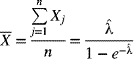
Predicted mortality for patient j in subgroup i | λ | Constant rate of occurrence of nonconformities |
| λij | Rate of nonconformance for patient j in subgroup i |
8-1 Introduction and Chapter Objectives
In Chapter 7 we discussed statistical process control using control charts for variables. In this chapter we examine control charts for attributes. An attribute is a quality characteristic for which a numerical value is not specified. It is measured on a nominal scale; that is, it does or does not meet certain guidelines or it is categorized according to a scheme of labels. For instance, the taste of a certain dish is labeled as acceptable or unacceptable or is categorized as exceptional, good, fair, or poor. Our objective is to present various types of control charts for attributes.
A quality characteristic that does not meet certain prescribed standards (or specifications) is said to be a nonconformity (or defect). For example, if the length of steel bars is expected to be 50 ± 1.0 cm, a length of 51.5 cm is not acceptable. A product with one or more nonconformities such that it is unable to meet the intended standards and is unable to function as required is a nonconforming item (or defective). It is possible for a product to have several nonconformities without being classified as a nonconforming item.
The different types of control charts considered in this chapter are grouped into three categories. The first category includes control charts that focus on proportion: the proportion of nonconforming items (p-chart) and the number of nonconforming items (np-chart). These two charts are based on binomial distributions. The second category deals with two charts that focus on the nonconformity itself. The chart for the total number of nonconformities (c-chart) is based on the Poisson distribution. The chart for nonconformities per unit (u-chart) is applicable to situations in which the size of the sample unit varies from sample to sample. In the third category, the chart for demerits per unit (U-chart) deals with combining nonconformities on a weighted basis, such that the weights are influenced by the severity of each nonconformity. The concept of risk adjustment in attribute charts, especially as appropriate to health care applications, is discussed. Since the severity of risk varies from patient to patient, risk-adjusted p-charts and risk-adjusted u-charts are presented. In the situation when nonoccurrence of nonconformities are not observable, a modified c-chart is introduced. Finally, we include a section on charts for highly conforming processes. In this context, a control chart for the time or cases between successive occurrences of a nonconforming item is presented through a g-chart.
8-2 Advantages and Disadvantages of Attribute Charts
Advantages
Certain quality characteristics are best measured as attributes. For instance, the taste of a food item is specified as acceptable or not. There are circumstances in which a quality characteristic can be measured as a variable but is instead measured as an attribute because of limited time, money, worker availability, or other resources. Let's consider the inside diameter of a hole. This characteristic could be measured with an inside micrometer, but it may be more convenient and cost-effective to use a go/no-go gage. Of course, the assumption is that attribute information is sufficient; otherwise, the quality characteristic may have to be dealt with as a variable.
In most manufacturing and service operations there are numerous quality characteristics that can be analyzed. If a variable chart (such as an ![]() - or R-chart) is selected, one variable chart is needed for each characteristic. The total number of control charts being constructed and maintained can be overwhelming. A control chart for attributes can provide overall quality information at a fraction of the cost.
- or R-chart) is selected, one variable chart is needed for each characteristic. The total number of control charts being constructed and maintained can be overwhelming. A control chart for attributes can provide overall quality information at a fraction of the cost.
Let's consider a simple component for which the three quality characteristics of length L, width W, and height H are important. If variable charts are constructed, we will need three charts. However, we can get by with one attribute chart if an item is simply classified as nonconforming when the length, width, or height does not conform to specifications. The attribute chart thus summarizes the information for all three characteristics. An attribute chart can also be used to summarize information about several components that make up a product.
Attributes are encountered at all levels of an organization: the company, plant, department, work center, and machine (or operator) level. Variable charts are typically used at the lowest level, the machine level. When we do not know what is causing a problem, it is sensible to start at a general level and work to the specific. For example, we know that a high proportion of nonconforming items is being detected at the company level, so we keep an attribute chart at the plant level to determine which plants have high proportions of nonconforming items. Once we have identified these plants, we might use an attribute chart for output at the departmental level to pinpoint problem areas. When the particular work center thought to be responsible for the increase in the production of nonconforming items is identified, we could then focus on the machine or operator level and try to further pinpoint the source of the problem. Attribute charts assist in going from the general to a more focused level. Once the lowest problem level has been identified, a variable chart is then used to determine specific causes for an out-of-control situation.
Disadvantages
Attribute information indicates whether a certain quality characteristic is within specification limits. It does not state the degree to which specifications are met or not met. For example, the specification limits for the diameter of a part are 20 ± 0.1 mm. Two parts, one with diameter 20.2 mm and the other with diameter 22.3 mm, are both classified as nonconforming, but their relative conformance to the specifications is not noted on attribute information.
Variable information, on the other hand, indicates the level of the data values. Variable control charts thus provide more information on the performance of a process. Specific information about the process mean and variability can be obtained. Furthermore, for out-of-control situations, variable plots generally provide more information as to the potential causes and hence make identification of remedial actions easier.
If we can assume that the process is very capable (i.e., its inherent variability is much less than the spread between the specification limits), variable charts can forewarn us when the process is about to go out of control. This, of course, allows us to take corrective action before any nonconforming items are produced. A variable chart can indicate an upcoming out-of-control condition even though items are not yet nonconforming.
Figure 8-1 depicts this situation. Suppose that the target value of the process mean is at A, the process is very capable (note the wide spread between the distribution and the specification limits), and the process is in control. The process mean now shifts to B. The variable chart indicates an out-of-control condition. Because of the wide spread of the specification limits, no nonconforming items are produced when the process mean is at B, even though the variable chart is indicating an out-of-control process. The attribute chart, say, a chart for the proportion of nonconforming items, does not detect a lack of control until the process parameters are sufficiently changed such that some nonconforming items are produced. Only when the process mean shifts to C does the attribute chart detect an out-of-control situation. However, were the specifications equal to or tighter than the inherent variability of the process, attribute charts would indicate an out-of-control process in a time frame similar to that for the variable chart.
Figure 8-1 Forewarning of a lack of process control as indicated by a variable chart.

Attribute charts require larger sample sizes than variable charts to ensure adequate protection against a certain level of process changes. Larger sample sizes can be problematic if the measurements are expensive to obtain or the testing is destructive.
8-3 Preliminary Decisions
The choice of sample size for attribute charts is important. It should be large enough to allow nonconformities or nonconforming items to be observed in the sample. For example, if a process has a nonconformance rate of 2.5%, a sample size of 25 is not sufficient because the average number of nonconforming items per sample is only 0.625. Thus, misleading inferences might be made, since no nonconforming items would be observed for many samples. We might erroneously attribute a better nonconformance rate to the process than what actually exists. A sample size of 100 here is satisfactory, as the average number of nonconforming items per sample would thus be 2.5.
For situations in which summary measures are required, attribute charts are preferred. Information about the output at the plant level is often best described by proportion-nonconforming charts or charts on the number of nonconformities. These charts are effective for providing information to upper management. On the other hand, variable charts are more meaningful at the operator or supervisor level because they provide specific clues for remedial actions.
What is going to constitute a nonconformity should be properly defined. This definition will depend on the product, its functional use, and customer needs. For example, a scratch mark in a machine vise might not be considered a nonconformity, whereas the same scratch on a television cabinet would. One-, two-, or three-sigma zones and rules pertaining to these zones (discussed in Chapter 6) will not be used because the underlying distribution theory is nonnormal.
8-4 Chart for Proportion Nonconforming: p-Chart
A chart for the proportion of nonconforming items (p-chart) is based on a binomial distribution. For a given sample, the proportion nonconforming is defined as
where x is the number of nonconforming items in the sample and n represents the sample size.
For a binomial distribution to be strictly valid, the probability of obtaining a nonconforming item must remain constant from item to item. The samples must be identical and are assumed to be independent.
Recall from Chapter 4 that the distribution of the number of nonconforming items in a sample, as given by a binomial distribution, is
where p represents the probability of getting a nonconforming item on each trial or unit selected. Given the mean and standard deviation of X, the mean of the sample proportion nonconforming is
and the variance of ![]() is
is
These measures are used to determine the centerline and control limits for p-charts.
A p-chart is one of the most versatile control charts. It is used to control the acceptability of a single quality characteristic (say, the width of a part), a group of quality characteristics of the same type or on the same part (the length, width, or height of a component), or an entire product. Furthermore, a p-chart can be used to measure the quality of an operator or machine, a work center, a department, or an entire plant. A p-chart provides a fair indication of the general state of the process by depicting the average quality level of the proportion nonconforming. It is thus a good tool for relating information about the average quality level to top management.
For that matter, a p-chart can be used as a measure of the performance of top management. For instance, the performance of the chief executive officer of a company can be evaluated by considering the proportion of nonconforming items produced at the company level. Comparing this information with historical values indicates whether improvements for which the CEO can take credit have occurred. Values of the proportion nonconforming can also serve as a benchmark against which to compare future output.
A p-chart can provide a source of information for improving product quality. It can be used to develop new concepts and ideas. Current values of the proportion nonconforming indicate whether a particular idea has been successful in reducing the proportion nonconforming.
Use of a p-chart may, as a secondary objective, identify the circumstances for which ![]() - and R-charts should be used. Variable charts are more sensitive to variations in process parameters and are useful in diagnosing causes; a p-chart is more useful in locating the source of the difficulty. The p-charts are based on the normal approximation to the binomial distribution. For approximately large samples, for a process in control, the average run length is approximately 385 for 3σ control charts.
- and R-charts should be used. Variable charts are more sensitive to variations in process parameters and are useful in diagnosing causes; a p-chart is more useful in locating the source of the difficulty. The p-charts are based on the normal approximation to the binomial distribution. For approximately large samples, for a process in control, the average run length is approximately 385 for 3σ control charts.
Construction and Interpretation
The general procedures from Chapters 6 and 7 for the construction and interpretation of control charts apply to control charts for attributes as well. They are summarized here.
- Step 1: Select the objective. Decide on the level at which the p-chart will be used (i.e., the plant, the department, or the operator level). Decide to control either a single quality characteristic, multiple characteristics, a single product, or a number of products.
- Step 2: Determine the sample size and the sampling interval. An appropriate sample size is related to the existing quality level of the process. The sample size must be large enough to allow the opportunity for some nonconforming items to be present on average. The sampling interval (i.e., the time between successive samples) is a function of the production rate and the cost of sampling, among other factors.
A bound for the sample size, n, can be obtained using these guidelines. Let
 represent the process average nonconforming rate. Then, based on the number of nonconforming items that you wish to be represented in a sample—say five, on average—the bound is expressed as(8-5)
- Step 3:Obtain the data and record on an appropriate form. Decide on the measuring instruments in advance.
A typical data sheet for a p-chart is shown in Table 8-1. The data and time at which the sample is taken, along with the number of items inspected and the number of nonconforming items, are recorded. The proportion nonconforming is found by dividing the number of nonconforming items by the sample size. Usually, 25–30 samples should be taken prior to performing an analysis.
Table 8-1 Data for a p-Chart
Sample Date Time Number of Items Inspected, n Number of Nonconforming Items, x Proportion Nonconforming, 
Comments 1 10/15 9:00 A.M. 400 12 0.030 2 10/15 9:30 A.M. 400 10 0.025 3 10/15 10:00 A.M. 400 14 0.035 New vendor . . . . . . . . . . . . . . . . . . . . . - Step 4:Calculate the centerline and the trial control limits. Once they are determined, draw them on the p-chart. Plot the values of the proportion nonconforming
 for each sample on the chart. Examine the chart to determine whether the process is in control.
The rules for determining out-of-control conditions are the same as those we discussed in Chapters 6 and 7, so are not repeated in this chapter. As usual, the most common criterion for an out-of-control condition is the presence of a point plotting outside the control limits. The means of calculating the centerline and control limits are as follows.
No Standard Specified
When no standard or target value of the proportion nonconforming is specified, it must be estimated from the sample information. Recall that for each sample, the sample proportion nonconforming ![]() is given by eq. (8-1). The average of the individual sample proportion nonconforming is used as the centerline (CLp). That is,
is given by eq. (8-1). The average of the individual sample proportion nonconforming is used as the centerline (CLp). That is,

where g represents the number of samples. The variance of ![]() is given by eq. (8-4). Since the true value of p is not known, the value of
is given by eq. (8-4). Since the true value of p is not known, the value of ![]() given by eq. (8-6) is used as an estimate. In accordance with the concept of 3σ limits discussed in previous chapters, the control limits are given by
given by eq. (8-6) is used as an estimate. In accordance with the concept of 3σ limits discussed in previous chapters, the control limits are given by

Standard Specified
If the target value of the proportion of nonconforming items is known or specified, the centerline is selected as that target value. In other words, the centerline is given by
where p0 represents the standard or target value. The control limits in this case are also based on the target value. Thus,
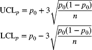
If the lower control limit for p turns out to be negative for eq. (8-7) or (8-9), the lower control limit is simply counted as zero because the smallest possible value of the proportion nonconforming is zero.
- Step 5:Calculate the revised control limits. Analyze the plotted values of
 and the pattern of the plot for out-of-control conditions. Typically, one or a few of the rules are used concurrently. On detection of an out-of-control condition, identify the special cause and propose remedial actions. The out-of-control point or points for which remedial actions have been taken are then deleted, and the revised process average
  is calculated from the remaining number of samples.
The investigation of special causes must be conducted in an objective manner. If a special cause cannot be identified or a remedial action not implemented for an out-of-control sample point, that sample is not deleted in the calculation of the new average proportion nonconforming.
The revised centerline and control limits are given by
(8-10)
For p-charts based on a standard p0, the revised limits do not change from those given by eq. (8-9).
-
Step 6: Implement the chart. Use the revised centerline and control limits of the p-chart for future observations as they become available. Periodically revise the chart using guidelines similar to those discussed for variable charts.
A few unique features are associated with implementing a p-chart. First, if the p-chart continually indicates an increase in the value of the average proportion nonconforming, management should investigate the reasons behind this increase rather than constantly revising upward the centerline and control limits. If such an upward movement of the centerline is allowed to persist, it will become more difficult to bring down the level of nonconformance to the previously desirable values. Only if you are sure that the process cannot be maintained at the present average level of nonconformance given the resource constraints should you consider moving the control limits upward.
Possible reasons for an increased level of nonconforming items include a lower incoming quality from vendors or a tightening of specification limits. An increased level of nonconformance can also occur because existing limits are enforced more stringently.
Since the goal is to seek quality improvement continuously, a sustained downward trend in the proportion nonconforming is desirable. Management should revise the average proportion-nonconforming level downward when it is convinced that the proportion nonconforming at the better level can be maintained. Revising these limits provides an incentive not only to maintain this better level but also to seek further improvements.
Variable Sample Size
There are many reasons why samples vary in size. In processes for which 100% inspection is conducted to estimate the proportion nonconforming, a change in the rate of production may cause the sample size to change. A lack of available inspection personnel and a change in the unit cost of inspection are other factors that can influence the sample size.
A change in sample size causes the control limits to change, although the centerline remains fixed. As the sample size increases, the control limits become narrower. As stated previously, the sample size is also influenced by the existing average process quality level. For a given process proportion nonconforming, the sample size should be chosen carefully so that there is ample opportunity for nonconforming items to be represented. Thus, changes in the quality level of the process may require a change in the sample size.
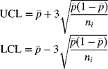
Control Limits for Individual Samples
Control limits can be constructed for individual samples. If no standard is given and the sample average proportion nonconforming is ![]() , the control limits for sample i with size ni are
, the control limits for sample i with size ni are
Standardized Control Chart
Another approach to varying sample size is to construct a chart of normalized or standardized values of the proportion nonconforming. The value of the proportion nonconforming for a sample is expressed as the sample's deviation from the average proportion nonconforming in units of standard deviations. In Chapter 4 we discussed the sampling distribution of a sample proportion nonconforming ![]() . It showed that the mean and standard deviation of
. It showed that the mean and standard deviation of ![]() are given by
are given by
respectively, where p represents the true process nonconformance rate and n is the sample size. In practice, p is usually estimated by ![]() , the sample average proportion nonconforming. So, in the working versions of eqs. (8-12) and (8-13), p is replaced by
, the sample average proportion nonconforming. So, in the working versions of eqs. (8-12) and (8-13), p is replaced by ![]() .
.
The standardized value of the proportion nonconforming for the ith sample may be expressed as
where ni is the size of ith sample. One of the advantages of a standardized control chart for the proportion nonconforming is that only one set of control limits needs to be constructed. These limits are placed ±3 standard deviations from the centerline. Additionally, tests for runs and pattern recognition are difficult to apply to circumstances in which individual control limits change with each sample. They can, however, be applied in the same manner as with other variable charts when a standardized p-chart is constructed. The centerline on a standardized p-chart is at 0, the UCL is at 3, and the LCL is at –3.
Risk-Adjusted p-Charts in Health Care
In health care applications, situations arise where the proportion of adverse outcomes is to be monitored. Examples include the proportion of mortality in patients who undergo surgery for heart disease, proportion of morbidity in patients undergoing cardiac surgery, and proportion of Caesarian sections for newborn deliveries in a hospital. Uniquely different from the manufacturing or service sector, the product units studied (in this case patients) are not homogeneous. Patients differ in their severity of illness on admission. This inherent difference between patients could impact the observed adverse outcomes, which are above and beyond process-related issues. Hence, an adjustment needs to be made in the construction of p-charts that incorporates such differences between patients in impacting the risk of adverse outcomes.
Several measures could be used for the development of risk-adjusted p-charts. One method of stratification of risk for open-heart surgery results in adults is through the use of a Parsonnet score (Parsonnet et al. 1987). For patients on admission to a hospital, the Parsonnet score is calculated based on numerous patient characteristics such as age, gender, level of obesity, degree of hypertension, presence of diabetes, level of reoperation, dialysis dependency, and other rare circumstances such as paraplegia, pacemaker dependency, and severe asthma, among others. The higher the Parsonnet score, the more the severity of risk associated with the patient. A typical range of the Parsonnet scores of patients could be 0–80. Using such patient-related factors, a logistics regression model (see Chapter 13) is used to predict postoperative mortality or morbidity. Such a prediction will vary from patient to patient based on the severity of risk related to the particular patient.
As a simple model, the predicted mortality (![]() ) for patient j in subgroup i, based on severity of illness, could be given by
) for patient j in subgroup i, based on severity of illness, could be given by
where a and b are estimated regression coefficients and PSij represents the Parsonnet score of the particular patient. Hence, the centerline and the control limits on the risk-adjusted p-chart will be influenced by the severity of risk of the patients. The observed mortality or morbidity rate will be compared to such risk-adjusted control limits (expected rate) to make an inference on the performance of the process; in this case it could be for a selected health care facility or a chosen surgeon.
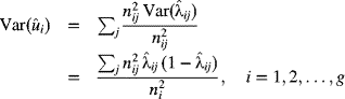
Suppose that there are i subgroups, across time, each of size denoted by ni patients, where i = 1, 2, …, g. As previously stated, the subgroup sizes should be large enough to observe adverse outcomes. The expected number of adverse outcomes, say mortality, should be at least five for each subgroup. Based on the Parsonnet score for patient j in subgroup i, let the predicted (or expected) mortality, based on the patient's identified risk prior to the operation, be denoted by ![]() . This is usually found from a logistic regression model that utilizes the Parsonnet score of the patient. For an individual patient j in subgroup i, the variance in the predicted mortality is given by
. This is usually found from a logistic regression model that utilizes the Parsonnet score of the patient. For an individual patient j in subgroup i, the variance in the predicted mortality is given by
The predicted (or expected) mortality for all patients in subgroup i, based on the severity of illness, which also represents the centerline for the ith subgroup, is

The variance in predicted mortality for all patients in subgroup i, assuming that the patients are independent of each other, is given by

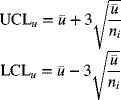
Hence, for large sample sizes, the control limits for the predicted proportion of mortality, for subgroup i, are given by

where zα/2 represents the standard normal variate based on a chosen type I error (or false-alarm rate) of α.
Note that for each patient j, in subgroup i, the observed value of the adverse event (say, mortality) is
For subgroup i, the observed mortality is
and the corresponding proportion of mortality is
On a risk-adjusted p-chart, for each subgroup, the observed proportion of mortality, as given by eq. (8-22), is compared to the control limits, based on the predicted risk of individual patients in that subgroup, given by eq. (8-19). If the observed proportion of mortality falls above the upper control limit, one would look for special causes in the process (i.e., the health care facility, its staff, or the surgeon) to determine possible remedial actions that might reduce the mortality proportion. On the other hand, for a surgeon who handles high-risk patients, if the observed mortality proportion is below the lower control limit, this indicates better performance than expected when adjustment is made for the risk of severity in illness associated with the patients.
It is easy to ascertain the importance of risk adjustment in the health care environment. If an ordinary p-chart were constructed to monitor proportion of mortality, a high observed proportion of mortality may indeed be a reflection of the criticality of illness of the patients and not necessarily a measure of the goodness of the facility and its processes or the surgeon and the technical staff. A wrong inference could be made on the process. A risk-adjusted p-chart, on the other hand, makes an equitable comparison between the observed proportion of mortality and the predicted proportion, wherein an adjustment is made to incorporate the severity of illness of the patients.
Special Considerations for p-Charts
Necessary Assumptions
Recall that the proportion of nonconforming items is based on a binomial distribution. With this distribution, the probability of occurrence of nonconforming items is assumed to be constant for each item, and the items are assumed to be independent of each other with respect to meeting the specifications. The latter assumption may not be valid if products are manufactured in groups. Let's suppose that for a steel manufacturing process a batch produced in a cupola does not have the correct proportion of an additive. If a sample steel ingot chosen from that batch is found to be nonconforming, other samples from the same batch are also likely to be nonconforming, so the samples are not independent of each other. Furthermore, the likelihood of a sample chosen from the bad batch being nonconforming will be different from that of a sample chosen from a good batch.
Observations Below the Lower Control Limit
The presence of points that plot below the lower control limit on a p-chart, even though they indicate an out-of-control situation, are desirable because they also indicate an improvement in the process. Once the special causes for such points have been identified, these points should not be deleted. In fact, the process should be set to the conditions that led to these points in the first place. We must be certain, however, that errors in measurement or recording are not responsible for such low values.
Comparison with a Specified Standard
Management sometimes sets a standard value for the proportion nonconforming (p0). When control limits are based on a standard, care must be exercised in drawing inferences about the process. If the process yields points that fall above the upper control limit, special causes should be sought. Once they have been found and appropriate actions have been taken, the process performance may again be compared to the standard. If the process is still out of control even though no further special causes can be located, management should question whether the existing process is capable of meeting the desired standards. If resource limitations prevent management from being able to implement process improvement, it may not be advisable to compare the process to the desirable standards. Only if the standards are conceivably attainable should the control limits be based on them.
Impact of Design Specifications
Since a nonconforming product means that its quality characteristics do not meet certain specifications, it is possible for the average proportion nonconforming to be too high even though the process is stable and in control. Only a fundamental change in the design of the product or in the specifications can reduce the proportion nonconforming in this situation. Perhaps tolerances should be loosened; this approach should be taken only if there is no substantial deviation in meeting customer requirements. Constant feedback between marketing, product/process design, and manufacturing will ensure that customer needs are met in the design and manufacture of the product.
Information About Overall Quality Level
A p-chart is ideal for aggregating information. For a plant with many product lines, departments, and work centers, a p-chart can combine information and provide a measure of the overall product nonconformance rate. It can also be used to evaluate the effectiveness of managers and even the chief executive officer.
8-5 Chart for Number of Nonconforming Items: np-Chart
As an alternative to calculating the proportion nonconforming, we can count the number of nonconforming items in samples and use the count as the basis for the control chart. Operating personnel sometimes find it easier to relate to the number nonconforming than to the proportion nonconforming. The assumptions made for the construction of proportion-nonconforming charts apply to number-nonconforming charts as well. The number of nonconforming items in a sample is assumed to be given by a binomial distribution. The same principles apply to number-nonconforming charts also, and constructing an np-chart is similar to constructing a p-chart.
There is one drawback to the np-chart: If the sample size changes, the centerline and control limits change as well. Making inferences in such circumstances is difficult. Thus, an np-chart should not be used when the sample size varies.
No Standard Given
The centerline for an np-chart is given by
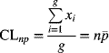
where xi represents the number nonconforming for the ith sample, g is the number of samples, n is the sample size, and ![]() is the sample average proportion nonconforming. Since the number of nonconforming items is n times the proportion nonconforming, the average and standard deviation of the number nonconforming are n times the corresponding value for the proportion nonconforming. Thus, the standard deviation of the number nonconforming is
is the sample average proportion nonconforming. Since the number of nonconforming items is n times the proportion nonconforming, the average and standard deviation of the number nonconforming are n times the corresponding value for the proportion nonconforming. Thus, the standard deviation of the number nonconforming is
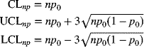
The control limits for an np-chart are
If the lower control limit calculation yields a negative value, it is converted to zero.
Standard Given
Let's suppose that a specified standard for the number of nonconforming items is np0. The centerline and control limits are given by
8-6 Chart for Number of Nonconformities: c-Chart
A nonconformity is defined as a quality characteristic that does not meet some specification. A nonconforming item has one or more nonconformities that make it nonfunctional. It is also possible for a product to have one or more nonconformities and still conform to standards. The p- and np-charts deal with nonconforming items. A c-chart is used to track the total number of nonconformities in samples of constant size. When the sample size varies, a u-chart is used to track the number of nonconformities per unit.
In constructing c- and u-charts, the size of the sample is also referred to as the area of opportunity. The area of opportunity may be single or multiple units of a product (e.g., 1 TV set or a collection of 10 TV sets). For items produced on a continuous basis, the area of opportunity could be 100 m2 of fabric or 50 m2 of paper. As with p-charts, we must be careful about our choice of area of opportunity. When both the average number of nonconformities per unit and the area of opportunity are small, most observations will show zero nonconformities, with one nonconformity showing up occasionally and two or more nonconformities even less frequently. Such information can be misleading, so it is beneficial to choose a large enough area of opportunity so that we can expect some nonconformities to occur. If the average number of nonconformities per TV set is small (say, about 0.08), it would make sense for the sample size to be 50 sets rather than 10.
The occurrence of nonconformities is assumed to follow a Poisson distribution. This distribution is well suited to modeling the number of events that happen over a specified amount of time, space, or volume. Certain assumptions must hold for a Poisson distribution to be used. First, the opportunity for the occurrence of nonconformities must be large, and the average number of nonconformities per unit must be small. An example is the number of flaws in 100 m2 of fabric. Theoretically, this number could be quite large, but the average number of flaws in 100 m2 of fabric is not necessarily a large value. The second assumption is that the occurrences of nonconformities must be independent of each other. Suppose that 100 m2 of fabric is the sample size. A nonconformity in a certain segment of fabric must in no way influence the occurrence of other nonconformities. Third, each sample should have an equal likelihood of the occurrence of nonconformities; that is, the prevailing conditions should be consistent from sample to sample. For instance, if different rivet guns are used to install the rivets in a ship, the opportunity for defects may vary for different guns, so the Poisson distribution would not be strictly applicable.
Because the steps involved in the construction and interpretation of c-charts are similar to those for p-charts, we only point out the differences in the formulas. If x represents the number of nonconformities in the sample unit and c is the mean, then the Poisson distribution yields (as discussed in Chapter 4)
where p(x) represents the probability of observing x nonconformities. Recall that in the Poisson distribution the mean and the variance are equal.
No Standard Given
The average number of nonconformities per sample unit is found from the sample observations and is denoted by ![]() . The centerline and control limits are
. The centerline and control limits are

If the lower control limit is found to be less than zero, it is converted to zero.
Standard Given
Let the specified goal for the number of nonconformities per sample unit be c0. The centerline and control limits are then calculated from
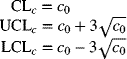
Many of the special considerations discussed for p-charts, such as observations below the lower control limit, comparison with a specified standard, impact of design specifications, and information about overall quality level, apply to c-charts as well.
Probability Limits
The c-chart is based on the Poisson distribution. Thus, for a chosen level of type I error [i.e., the probability of concluding that a process is out of control when it is in control (a false alarm)], the control limits should be selected using this distribution.
The 3σ limits, shown previously, are not necessarily symmetrical. This means that the probability of an observation falling outside either control limit may not be equal. Appendix A-2 lists cumulative probabilities for the Poisson distribution for a given mean. Suppose that the process mean is c0 and symmetrical control limits are desired for type I error of α. The control limits should then be selected such that
Since the Poisson distribution is discrete, the upper control limit is found from the smallest integer x+ such that
Similarly, the lower control limit is found from the largest integer x− such that
Applications in Health Care When Nonoccurrence of Nonconformities Are Not Observable
In certain health care applications, if no nonconformities or defects occur, the outcome is not observable. Examples could be the number of needle sticks, the number of medical errors, or the number of falls, where it is assumed that the sample size or area of opportunity remains constant from sample to sample.
Assuming that the number of occurrences of nonconformities still follows the Poisson distribution, in this situation, the value X = 0 is not observable. If λ represents the constant rate of occurrence of nonconformities, we have, for the positive or zero-truncated Poisson distribution, the probability mass function given by
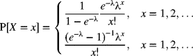
It can be shown that the mean and variance of X are given by
respectively. Hence, if a sample of n independent and identically distributed observations X1, X2, … Xn is observed, the maximum-likelihood estimator (![]() ) of λ is obtained from
) of λ is obtained from
Equation 8-36 may be solved numerically to obtain an estimate ![]() , given by
, given by
An approximate bound for ![]() , given by Kemp and Kemp (2012), is
, given by Kemp and Kemp (2012), is
Once an estimate ![]() has been obtained, the center line on a c-chart is
has been obtained, the center line on a c-chart is
Probability limits, using previously described concepts and eq. (8-33) with ![]() found from eq. (8-37), may be found for a chosen false-alarm rate α. The upper control limit is found as the smallest integer x+ such that
found from eq. (8-37), may be found for a chosen false-alarm rate α. The upper control limit is found as the smallest integer x+ such that
The lower control limit is found as the largest integer x−, such that
8-7 Chart for Number of Nonconformities Per Unit: u-Chart
A c-chart is used when the sample size is constant. If the area of opportunity changes from one sample to another, the centerline and control limits of a c-chart change as well. For situations in which the sample size varies, a u-chart is used. For companies that inspect all items produced or services rendered for the presence of nonconformities, the output per production run can vary because of fluctuating supplies of labor, machinery, and raw material; consequently, the number inspected per production run changes, thus causing varying sample sizes. When the sample size varies, a u-chart is constructed to monitor the number of nonconformities per unit. Even though the control limits change as the sample size varies, the centerline of a u-chart remains constant, which permits meaningful comparisons between the samples.
Variable Sample Size and No Specified Standard
When the sample size varies, the number of nonconformities per unit for the ith sample is given by
where ci is the number of nonconformities in the ith sample and ni is the size of the ith sample. Note that the sample size ni need not always be an integer. Let's suppose the number of weaving nonconformities is being counted from finished pieces of cloth such that 100 m2 represents 1 unit. If three samples of 250, 100, and 350 m2 are inspected, the corresponding values of the sample size are 2.5, 1, and 3.5 units, respectively.
The average number of nonconformities per unit ![]() , which is also the centerline of a u-chart, is given by
, which is also the centerline of a u-chart, is given by

The control limits are given by
It can been seen from eq. (8-44) that the control limits draw closer as the sample size increases. The same behavior is observed for p-charts for variable sample sizes. Thus, the options discussed previously for p-charts with variable sample sizes apply to u-charts as well. Equation (8-44) provides control limits that vary based on each sample size. Note that if ni = 1, all formulas for u-charts equal those for c-charts.
Risk-Adjusted u-Charts in Health Care
As discussed in the context of p-charts, risk adjustments may be made in creating c-charts or u-charts since patients differ in their severity of illness. An example could be the occurrence of pressure ulcers in hospitalized patients. When the area of opportunity for occurrence of nonconformities, say, for example, patient-days, remains constant from one subgroup to another, the c-chart may be utilized. However, if the area of opportunity varies from subgroup to subgroup, the u-chart is appropriate. The procedure followed could be similar to the risk-adjusted p-chart, where for each patient the expected number of nonconformities (say pressure ulcers) is computed based on the risk level for that particular patient.
Based on patient characteristics such as mobility, the ability to change and control body position, the degree of physical activity, sensory perception indicating the ability to respond to pressure-related discomfort, tissue tolerance consisting of intrinsic factors such as nutrition and arterial pressure, and extrinsic factors such as moisture, friction, and shear, a pressure score such as the Braden score (Bergstrom et al. 1994; Braden and Bergstrom 1987) could be developed. The Braden score ranges from 6 to 23, with lower values implying a higher risk for development of pressure ulcers. Typically, values above 18 represent low risk, values between 15 and 18 represent mild risk, values between 13 and 14 represent moderate risk, values between 10 and 12 represent high risk, and values ≤9 represent very high risk. Utilizing a logistic regression model (see Chapter 13), the predicted probability or rate of nonconformance (![]() ) for patient j in subgroup i could be given by
) for patient j in subgroup i could be given by
where a and b are estimated regression coefficients and BSij represents the Braden pressure score for that particular patient. The value ![]() , estimated from eq. (8-45), is therefore the risk-adjusted probability for the particular patient.
, estimated from eq. (8-45), is therefore the risk-adjusted probability for the particular patient.
The centerline and the control limits for each subgroup i will be influenced by the severity of risk of the patients in that subgroup. Suppose that there are i subgroups, across time, each consisting of ni patients, where i = 1, 2, …, g. To demonstrate the computations, suppose the number of days spent in the health care facility by patient j in subgroup i is nij. The expected number of nonconformities, for example, pressure ulcers, is given by
assuming that the occurrence of nonconformities for that patient is influenced by the number of days spent in the facility by that patient. Hence, for subgroup i, the centerline representing the expected number of nonconformities per unit, accounting for the severity of risk for each patient, is given by
where
represents the area of opportunity, for example, total number of days spent by all the patients in subgroup i, that is, the size of the subgroup. The variance of ![]() that incorporates an individual patient's risk is given by
that incorporates an individual patient's risk is given by
For large subgroup sizes, approximate control limits for subgroup i are given by
where zα/2 represents the standard normal variate for a tail area of α/2, where α is the chosen level of type I error. The observed number of nonconformities per unit for subgroup i is obtained from
where cij represents the observed number of nonconformities for patient j in subgroup i. For subgroup i, ui is compared to the risk-adjusted control limits given by eq. (8-50) and an inference is made on that subgroup.
8-8 Chart for Demerits Per Unit: u-Chart
The regular c- and u-charts treat all types of nonconformities equally regardless of their degree of severity. Let's suppose that in inspecting computer monitors we find that one monitor has trouble retaining consistent color and a second monitor has five scratch marks on its surface. Using either a c- or u-chart, the relative importance of monitor 2's defects, in terms of the number of nonconformities, is five times as great as that of monitor 1. However, the single defect associated with monitor 1 is much more serious than monitor 2's scratch marks. An alternative approach assigns weights to nonconformities according to their relative degree of severity (Besterfield 2012). This quality rating system, which rates demerits per unit and is called the U-chart, thus overcomes the deficiency of the c- and u-charts. These are often helpful in service applications.
Classification of Nonconformities
Several systems classify nonconformities according to their degree of seriousness. A defect that causes severe injury compared to that which may lead to minor problems in the functioning of a product is obviously of different degrees of importance. Using this analogy, defects may be classified into the categories of critical, serious, major, or minor as an example. The definition for each of these categories will be influenced by the product/service and the user who makes a determination of the severity of each type of defect.
Once a classification of defects or nonconformities has been established, demerits per unit are assigned to each class. Control charts are then constructed for demerits per unit. The definitions of the classes are not rigid; users adapt them as they see fit. The classification system mentioned here is but one example. The number of categories and the definitions of each should relate specifically to the problem environment. One organization may have three categories of nonconformities—critical, major, and minor—each with its own definitions. Another organization may define nonconformities as either serious or not serious. The assigned weights for defects from each category is user dependent. For example, a weight system of 100, 50, 10, and 1 could be chosen for the categories of very serious, serious, major, and minor, respectively.
Construction of a U-Chart a
Suppose that we have four categories of nonconformities. In general, the procedure described in this section can be applied to any given number of categories. Let the sample size be n, and let c1, c2, c3, and c4 denote the total number of nonconformities in a sample for the four categories. Let w1, w2, w3, and w4 denote the weights assigned to each category. We assume that nonconformities in each category are independent of defects in the other categories. We'll also assume that the occurrence of nonconformities in any category is represented by a Poisson distribution. The applicability of a Poisson distribution to such circumstances is discussed in Section 8.7 (c-charts).
For a sample of size n, the total number of demerits is given by
The demerits per unit for the sample are given by
where the quantity U is a linear combination of independent Poisson random variables. The centerline of the U-chart is given by
where ![]() represent the average number of nonconformities per unit in their respective classes. Computation of
represent the average number of nonconformities per unit in their respective classes. Computation of ![]() is similar to the calculation of
is similar to the calculation of ![]() discussed in Section 8.7. If the control limits are based on standard values, those values (say
discussed in Section 8.7. If the control limits are based on standard values, those values (say ![]() ) should be substituted for
) should be substituted for ![]() in each category.
in each category.
The estimated standard deviation of U is given by
The control limits for the U-chart are given by
If the lower control limit is calculated to be less than zero, it is converted to zero.
8-9 Charts for Highly Conforming Processes
The p-chart for proportion nonconforming, discussed previously, was based on the normal distribution as an approximation to the binomial distribution. When p is neither too large nor too small and n is large such that np ≥ 5, the normal distribution serves as an adequate approximation. So, the 3σ limits based on the normal distribution restrict the type I error to about 0.0027. When p is very small, say in the parts-per-million (ppm) range and n is not very large, the normal distribution is not a good approximation to the binomial. Thus, for highly conforming processes, an alternative to the p-chart is necessary. Similarly, for monitoring nonconformities (as in a c- or u-chart) for processes with very low defect rates, an alternative is desirable. Other drawbacks of the traditional p- or u-chart for highly conforming processes include an increased false-alarm rate (type I error) and an increased probability of failing to detect a process change (type II error). Further, when the proportion nonconforming is very small, the calculated lower control limit may turn out to be negative, which is then converted to zero. In such cases, an observation cannot fall below the lower control limit. This leads to an inability to detect process improvement if in fact one does occur. Given the drawbacks of a p-, c-, or u-chart for very good processes, a few alternative approaches are suggested.
Transformation to Normality
Suppose we assume that the occurrence of nonconforming items or nonconformities is modeled by a Poisson distribution with a constant rate of occurrence. It is known that the times between the occurrences of events (in this case, between the occurrence of nonconforming items or nonconformities) are independent and exponentially distributed. The number of conforming items produced between occurrences of nonconforming items will be the variable to be monitored. This variable, which has an exponential distribution, can be transformed into a Weibull distribution, which resembles a normal distribution. Denoting Xi as the number of conforming items produced between successive nonconforming items, it has been shown (Nelson 1994a,b) that the power transformation
yields values of Y that are approximately normally distributed. Hence, an individuals and moving-range chart for the Y-values could be monitored. If we denote the mean of Y by ![]() and the mean of the moving ranges of the Y-values with a window of 2 by
and the mean of the moving ranges of the Y-values with a window of 2 by ![]() , the centerline and control limits on an individuals chart for Y are (for n = 2, d2 = 1.128)
, the centerline and control limits on an individuals chart for Y are (for n = 2, d2 = 1.128)
Note that values of Y above the upper control limit indicate an improvement in quality, while values of Y below the lower control limit indicate a deterioration in quality.
Use of Exponential Distribution for Continuous Variables
When the process under consideration is continuous, an alternative under the assumption that the occurrence of nonconformities conforms to a Poisson process with mean λ is to monitor the time or number of items required (Q) to observe exactly one nonconformity. It is known that the distribution of Q is exponential with parameter λ (mean = 1/λ). Hence, the probability of observing Q units in order to observe a defect is
Probability limits may be calculated based on a chosen type I error rate, α. Here, because the exponential distribution is not symmetrical, probability limits rather than 3σ limits for Q are preferred. The centerline and control limits are given as
In monitoring Q, which is either the time or number of items to observing a nonconformity, we can detect process improvement as well as deterioration. When Q > UCL, a likely improvement has taken place. Any time that a nonconformity is detected, the quantity Q is reset to zero, to keep track of the subsequent conforming items prior to a nonconformity being observed. When the process mean is not known, it may be estimated from prior samples as the average of observed Q values.
Use of Geometric Distribution for Discrete Variables
For a highly conforming process, nonconforming items are few and far between. This implies that monitoring the number of nonconforming items will yield most observations with values of zero, which prevents the detection of a change in the nonconformance rate. An alternative is to monitor the number of items until a nonconforming item is found, sometimes referred to as the number of trials up to the first success (X). When a nonconforming item is found, the count starts anew. The discrete variable X, as defined, has a geometric distribution given by
where p represents the probability of success (nonconforming item) on each trial. The mean and variance of X, which counts the number of trials to the first success, including the trial when the success occurs, are given by
Probability Limits
Let us assume that the probability of a type I error (α) will be divided equally on both sides of the control limits. The centerline and control limits for the count to a nonconforming item are given by (Xie et al. 2002)

These control limits are highly asymmetric, and a logarithmic scale for the vertical axis for monitoring X is recommended. Detection of improvement in the process is usually associated with a value of X falling above the UCL.
A bound can be established for the minimum sample size (n) necessary to detect improvement if the current level of proportion nonconforming is p. The probability of no nonconforming items in a sample of size n is
Assuming that a one-sided limit is being used to detect improvement, with a type I error of α, we have a lower bound for n given by
Applications in Health Care of Low-Occurrence Nonconformities
In certain health care applications, the rate of occurrence of nonconformities such as surgical wound infections, pneumonia, catheter infections, or gastrointestinal infections may be quite low. In such situations, the variable to be monitored is the number of events or surgeries or days between infections, not counting the day on which the next infection occurs. Such a random variable is modeled by the geometric distribution, whose probability mass function is given by
where p represents the probability of “success” (or a nonconforming item) on each trial (such as surgeries). The mean and variance of the random variable X are given by
Since the distribution of the random variable X for small values of p is quite asymmetric, rather than create control limits that are equidistant from the centerline, such limits are calculated using the concept of probability limits, discussed earlier, based on a chosen level of false alarm, α. The cumulative distribution function of X is given by
The upper and lower control limits, using eq. (8-70), are obtained as
In the event that a target occurrence rate (p0) of a nonconforming item is specified, the centerline is
and the control limits are found from eqs. 8-71 and 8-72 by using the specified value p0. When such a target value is not specified, it is usually estimated from sample values of the number of cases or time between successive occurrences of the nonconforming item, for example, infection. Here, an estimate of p is obtained, based on ![]() , the average time or cases between successive infections, say, and is given by
, the average time or cases between successive infections, say, and is given by
Control limits may be found using eqs. 8-71 and 8-72, where the estimate ![]() is used. A control chart for the time or cases between successive occurrence of a nonconforming item is often referred to as a
g
-chart. A point above the upper control limit may signal an improvement in the process.
is used. A control chart for the time or cases between successive occurrence of a nonconforming item is often referred to as a
g
-chart. A point above the upper control limit may signal an improvement in the process.
8-10 Operating Characteristic Curves for Attribute Control Charts
An operating characteristic (OC) curve plots the probability of incorrectly concluding that a process is in control as a function of a process parameter. In other words, it is a graph of the probability of a type II error (denoted by β) versus the value of a process parameter.
The choice of process parameter depends on the type of attribute chart under consideration. For a p-chart, the parameter of interest is usually the true process proportion nonconforming (p). An OC curve represents a measure of goodness of a control chart. It can be used to gauge the ability of a chart to detect changes in the process parameter values (Wadsworth et al. 2001). The probability of a change in a process parameter not being detected is related to the probability of a plotted point falling within the control limits. An OC curve is a measure of the sensitivity of a control chart in detecting small changes in process parameters.
The location of the control limits influences the probability of a type I error α, which is the probability of incorrectly concluding that a process is out of control when it is really in control. A type I error is thus a false alarm. For a process in control, a measure of goodness of the control chart is a large value of the average run length as discussed in Chapter 6. In this situation, ARL = 1/α. So choosing a small value of α and widening the control limits will increase the ARL. For example, if α is 0.05, the ARL is 20. If such a small value of ARL is not acceptable and we reduce α to 0.005 by making the control limits wider, the ARL increases to 200. This implies that with these wider control limits, on average, 1 out of every 200 samples will plot outside the control limits and indicate an out-of-control condition.
For a p-chart, if the process proportion nonconforming is some value p, the probability of a type II error is
where n is the sample size, ![]() is the sample proportion nonconforming, and X represents the number of nonconforming items. Recall that X is a binomial random variable with parameters n and p. The probability values needed for eq. (8-75) are found from the binomial tables in Appendix A-1. Since X has to be an integer and neither nUCL nor nLCL are necessarily integers, an adjustment must be made. Let r1 and r2 be defined as follows:
is the sample proportion nonconforming, and X represents the number of nonconforming items. Recall that X is a binomial random variable with parameters n and p. The probability values needed for eq. (8-75) are found from the binomial tables in Appendix A-1. Since X has to be an integer and neither nUCL nor nLCL are necessarily integers, an adjustment must be made. Let r1 and r2 be defined as follows:
where ![]() denotes the largest integer less than or equal to nUCL and
denotes the largest integer less than or equal to nUCL and ![]() denotes the smallest integer greater than or equal to nLCL. The probability of a type II error may then be expressed as
denotes the smallest integer greater than or equal to nLCL. The probability of a type II error may then be expressed as
Summary
This chapter has introduced a variety of control charts for attributes. Although attribute charts do not provide as much information as variable charts for the same sample size, they have certain advantages. They are a good tool for summarizing information and for providing data at the aggregate level. Attribute charts are useful when starting a quality control program. They provide guidance as to where variable charts can eventually be used.
Three main categories of attribute charts have been discussed in this chapter. The first deals with products or services that are nonconforming. The p-chart for the proportion nonconforming and the np-chart for the number nonconforming are in this category. The second category involves the number of nonconformities, or defects, and includes the c-chart for the number of nonconformities and the u-chart for the number of nonconformities per unit. For highly conforming processes, a p-chart or c-chart may not be appropriate since the majority of the samples will have no nonconforming items or no nonconformities. In this context, a chart for the number of items until a nonconforming item is found is introduced. The third category involves a weighting scheme for classifications of nonconformities based on their severity. The U-chart for demerits per unit was discussed in this section.
The concept of risk adjustment, especially in the context of applications in health care, is very appropriate and is dealt with in several attribute charts. Since patients vary in their severity of illness, adequate adjustments to the p-, c-, and u-charts are demonstrated. Further, for health care processes where defects occur few and far between, the application of the g-chart is presented.
When making inferences from any control chart, there is always the risk of incorrectly declaring a process to be out of control (a type I error) or incorrectly declaring a process to be in control (a type II error). For a process in control, a measure of goodness of a control chart is the probability of a type I error or, implicitly, the average run length, which is the reciprocal of the probability of a type I error. Another measure of goodness of a control chart's performance is its operating characteristic curve, which shows the probability of a type II error as a function of the value of a process parameter such as the process proportion nonconforming or the process average number of nonconformities.
Key Terms
- attribute
- binomial distribution
- control chart
- attributes
- c-chart when 0 defects are not observable
- demerits per unit (U-chart)
- highly conforming processesg-chart
- number of nonconformities (c-chart)
- number of nonconformities per unit (u-chart)
- risk-adjusted u-chart
- number of nonconforming items (np-chart)
- proportion nonconforming (p-chart)
- risk-adjusted p-chart
- standardized p-chart
- variables
- defect
- major
- minor
- serious
- very serious
- defective
- demerits
- exponential distribution geometric distribution
- nonconformance classification
- nonconforming item
- nonconformity
- operating characteristic curve
- Poisson distribution
- probability limits
- standard or target
- weights for defects
Exercises
Discussion Questions
- 8-1 Distinguish between a nonconformity and a nonconforming item. Give examples of each in the following contexts:
- Financial institution
- Hospital
- Microelectronics manufacturing
- Law firm
- Nonprofit organization
- 8-2 What are the advantages and disadvantages of control charts for attributes over those for variables?
- 8-3 Discuss the significance of an appropriate sample size for a proportion-nonconforming chart.
- 8-4 The CEO of a company has been charged with reducing the proportion nonconforming of the product output. Discuss which control charts should be used and where they should be placed.
- 8-5 How does changing the sample size affect the centerline and the control limits of a p-chart?
- 8-6 What are the advantages and disadvantages of the standardized p-chart as compared to the regular proportion-nonconforming chart?
- 8-7 Discuss the assumptions that must be satisfied to justify using a p-chart. How are they different from the assumptions required for a c-chart?
- 8-8 Is it possible for a process to be in control and still not meet some desirable standards for the proportion nonconforming? How would one detect such a condition, and what remedial actions would one take?
- 8-9 Discuss the role of the customer in influencing the proportion-nonconforming chart. How would the customer be integrated into a total quality systems approach?
- 8-10 Discuss the impact of the control limits on the average run length and the operating characteristic curve.
- 8-11 Explain the conditions under which a u-chart would be used instead of a c-chart.
- 8-12 Explain why a p- or c-chart is not appropriate for highly conforming processes.
- 8-13 Distinguish between 3σ limits and probability limits. When would you consider constructing probability limits?
- 8-14 Meeting customer due dates is an important goal. What attribute or variables control charts would you select to monitor? Discuss the underlying assumptions in each case.
- 8-15 Explain the setting under which a U-chart would be used. How does the U-chart incorporate the user's perception of the relative degree of severity of the different categories of defects?
- 8-16 Which type of control chart (p, np, c, u, U, or charts for highly conforming processes) is most appropriate to monitor the following situations?
- Number of potholes in highways
- Proportion of customers who are satisfied with the operation of the local housing authority
- Satisfaction of customers at a restaurant where customers consider the quality of food and attitude of the server to be more important than the décor
- Number of errors in account transactions at a bank where the number of accounts varies from month to month
- Number of automobile accident claims filed per month at an insurance dealer, assuming a stable number of insured persons
- Responsiveness to customer needs of a local library where customers value the longer hours over short lines to check out books
- Needlestick in patients in a hospital
- Loan defaults in a financial institution in a year
- Number of surgical errors in a health care facility per month
- Number of thefts in a city over a period of time
- Proportion of people that favor the construction of condominiums in a certain neighborhood
- Number of weld defects in the construction of aircraft
- Number of seeds that germinate from a large pack of seeds sold by a nursery when the number of seeds in a packet may vary
- Performance of the braking mechanism of a certain model of automobile (the car is expected to stop within a certain distance)
- Number of firemen to have on duty to provide an acceptable level of service (each fire usually requires four firemen; the department has data on the number of calls they receive during the specified period of time)
- Performance of data-entry operators (if one or more input errors are made, the file is rendered useless and a revision is necessary)
- Control of the number of typographical errors per page at a document preparation center (data are chosen randomly and obtained daily on the number of errors in 30 pages)
- Control of the wiring and transistor defects in an electronic component (wiring defects are considered more serious)
- Number of traffic accidents in a city per month
- Proportion of successful patent applications by a drug manufacturer
- Time between surgical errors in a health care facility
- Number of in-patients who develop catheterization infections
- Proportion of orders not shipped on time
Problems
- 8-17 Every employee in a check-processing department goes through a four-month training period, after which the employee is responsible for their operation. The work of one employee who has been on the job for eight months is being studied. Table 8-20 shows the number of errors and the number of items sampled over a period of two months. The first 16 samples were each chosen from 400 items, and the remaining 9 samples were each chosen from 300 items. Determine whether the employee's performance can be judged stable. Comment on the capability of the employee.
Sample Errors Items Sampled Sample Errors Items Sampled 1 12 400 14 18 400 2 9 400 15 8 400 3 13 400 16 6 400 4 7 400 17 4 300 5 6 400 18 6 300 6 10 400 19 5 300 7 14 400 20 8 300 8 7 400 21 10 300 9 5 400 22 7 300 10 6 400 23 4 300 11 4 400 24 5 300 12 9 400 25 3 300 13 11 400 - 8-18 The number of customers who are not satisfied with the service provided in a retail store is found for 20 samples of size 100 and is shown in Table 8-21. Construct a control chart for the proportion of dissatisfied customers. Revise the control limits, assuming special causes for points outside the control limits.
Sample Number of Dissatisfied Customers Sample Number of Dissatisfied Customers 1 2 11 5 2 5 12 4 3 4 13 2 4 3 14 5 5 4 15 3 6 2 16 12 7 3 17 3 8 2 18 2 9 4 19 5 10 11 20 2 - 8-19 Refer to Exercise 8-18. Management believes that the dissatisfaction rate is 3%, so establish control limits based on this value. Comment on the ability of the store to meet this standard. If management were to set the standard at 2%, can the store meet this goal? What actions would you recommend?
- 8-20 Health care facilities must conform to certain standards in submitting bills to Medicare/Medicaid for processing. The number of bills with errors and the number sampled are shown in Table 8-22. Construct an appropriate control chart and comment on the performance of the billing department. Revise the control limits, if necessary, assuming special causes for out-of-control points. Comment on the capability of the department.
Observation Bills with Errors Number Sampled Observation Bills with Errors Number Sampled 1 8 400 14 3 300 2 6 400 15 5 300 3 4 400 16 8 300 4 9 400 17 11 500 5 7 400 18 13 500 6 5 400 19 8 500 7 5 300 20 7 500 8 7 300 21 8 500 9 4 300 22 4 500 10 15 300 23 3 500 11 6 300 24 7 500 12 7 300 25 6 500 13 4 300 - 8-21 Observations are taken from the output of a company making semiconductors. Table 8-23 shows the sample size and the number of nonconforming semiconductors for each sample. Construct a p-chart by setting up the exact control limits for each sample. Are any samples out of control? If so, assuming special causes, revise the centerline and control limits.
Observation ItemsInspected Nonconforming Items Observation ItemsInspected Nonconforming Items 1 80 3 14 90 4 2 120 6 15 160 5 3 60 4 16 230 3 4 150 5 17 200 12 5 140 8 18 150 8 6 150 10 19 210 6 7 160 7 20 190 4 8 90 6 21 160 9 9 100 5 22 100 8 10 160 12 23 100 12 11 110 8 24 90 7 12 100 5 25 160 10 13 200 14 - 8-22 Refer to Exercise 8-21 and the data shown in Table 8-23. Construct a standardized p-chart and discuss your conclusions.
- 8-23 The quality of service in a hospital is tracked by determining the proportion of medication errors; this is done by dividing the number of medication errors by 1000 patient-days for each observation. The results of 25 such samples (in percentage of medication errors) are shown in Table 8-24. Construct an appropriate control chart and comment on the quality level. Is a goal of error-free performance reasonable to expect from this system?
Sample Medication Errors (%) Sample Medication Errors (%) 1 2.6 14 2.0 2 1.9 15 4.2 3 2.8 16 2.2 4 2.9 17 1.8 5 2.4 18 2.4 6 1.8 19 2.3 7 2.3 20 1.6 8 2.1 21 1.9 9 1.4 22 2.0 10 1.7 23 2.2 11 2.2 24 2.1 12 2.0 25 2.3 13 1.2 - 8-24 A health care facility is interested in monitoring the primary C-section rate. Monthly data on the number of primary C-sections collected over the last two and a half years is shown in Table 8-25.
Month C-Sections Deliveries Month C-Sections Deliveries 1 54 350 16 70 449 2 50 384 17 62 366 3 63 415 18 65 405 4 69 422 19 52 386 5 55 395 20 55 392 6 63 412 21 61 408 7 67 407 22 66 442 8 67 415 23 53 426 9 51 377 24 47 385 10 62 404 25 79 413 11 64 377 26 60 388 12 62 382 27 69 411 13 62 425 28 61 378 14 55 410 29 70 392 15 68 426 30 65 420 - Is the process in control?
- There is pressure to make these data public. Can we conclude that the C-section rates had shifted to a higher level in the last six months relative to the previous six months?
- What is your prediction on the C-section rate if no changes are made in current obstetrics practices?
- Based on benchmarking with comparable facilities in similar metropolitan areas, is it feasible currently to achieve a C-section rate of 10%?
- 8-25 Refer to Exercise 8-18 and the data shown in Table 8-21. Construct a control chart for the number of dissatisfied customers. Revise the chart, assuming special causes for points outside the control limits.
- 8-26 The number of processing errors per 100 purchase orders is monitored by a company with the objective of eliminating such errors totally. Table 8-26 shows samples that were selected randomly from all purchase orders. The company is in the process of testing the effects of a new purchase order form that it has designed. The last five samples were made using the new form. Construct a control chart that the company
can use for monitoring the quality characteristic selected. What is the effect of the
newly designed purchase order form? Is the company capable of achieving the desired
goal?
Sample Processing Errors Sample Processing Errors 1 6 14 3 2 4 15 6 3 2 16 1 4 3 17 5 5 4 18 2 6 7 19 6 7 5 20 4 8 7 21 2 9 11 22 3 10 4 23 2 11 2 24 1 12 5 25 2 13 4 - 8-27 The number of dietary errors is found from a random sample of 100 trays chosen on a daily basis in a health care facility. The data for 25 such samples are shown in Table 8-27.
Sample Number Number of Dietary Errors Sample Number Number of Dietary Errors 1 9 14 8 2 6 15 8 3 4 16 7 4 7 17 6 5 5 18 4 6 6 19 12 7 16 20 7 8 8 21 6 9 7 22 8 10 9 23 6 11 3 24 8 12 6 25 5 13 10 - Construct an appropriate control chart and comment on the process.
- How many dietary errors do you predict if no changes are made in the process?
- Is the system capable of reducing dietary errors to 2, on average, per 100 trays, if no changes are made in the process?
- 8-28 A building contractor subcontracts to a local merchant a job involving hanging wallpaper. To have an idea of the quality level of the merchant's work, the contractor randomly selects 300 m2 and counts the number of blemishes. The total number of blemishes for 30 samples is 80. Construct the centerline and control limits for an appropriate chart. Is it reasonable for the contractor to set a goal of an average of 0.5 blemish per 100 m2?
- 8-29 The number of imperfections in bond paper produced by a paper mill is observed over a period of several days. Table 8-28 shows the area inspected and the number of imperfections for 25 samples. Construct a control chart for the number of imperfections per square meter. Revise the limits, if necessary, assuming special causes for the out-of-control points.
Sample Area Inspected (m2) Imperfections Sample Area Inspected (m2) Imperfections 1 150 6 14 300 8 2 100 8 15 300 12 3 200 5 16 200 6 4 150 4 17 150 4 5 250 10 18 200 7 6 100 11 19 150 14 7 150 3 20 100 4 8 200 5 21 100 8 9 300 10 22 200 9 10 250 10 23 300 12 11 100 5 24 250 7 12 200 4 25 200 5 13 250 12 - 8-30 Refer to Exercise 8-29. If we want to control the number of imperfections per 100 m2, how would this affect the control chart? What would the control limits be? In terms of decision making, would there be a difference between this problem and Exercise 8-29, depending on which chart is constructed? What conclusions can you draw from this?
- 8-31 The director of a pharmacy department is interested in benchmarking the level of operations in the unit. The director has defined medication errors as being any one of the following: wrong medication; wrong dose; administered to the wrong patient; administered at the wrong time; incorrectly repeating the medication; or omitting the medication. The number of orders filled per day by the pharmacy varies. Table 8-29 shows the number of orders filled and the number of medication errors for 25 days. Construct an appropriate control chart and comment on the stability of the process.
Sample Number Number of Orders Filled Number of Medication Errors Sample Number Number of Orders Filled Number of Medication Errors 1 1200 11 14 1200 16 2 1160 10 15 1150 14 3 1210 12 16 1100 23 4 1300 9 17 1160 14 5 1120 10 18 1300 16 6 1150 12 19 1100 10 7 1100 14 20 1180 12 8 1320 12 21 1220 14 9 1240 10 22 1240 13 10 1180 15 23 1120 16 11 1140 4 24 1150 13 12 1120 13 25 1180 12 13 1220 7 - 8-32 Nonconformities in automobiles fall into three categories: serious, major, and minor. Twenty-five samples of five automobiles are chosen, and the total number of nonconformities in each category is reported. Table 8-30 shows the results. Assuming a weighting system of 50, 10, and 1 for serious, major, and minor nonconformities, respectively, construct a demerits per unit control chart. Revise the control limits if necessary, assuming special causes for points that are out of control.
Sample Serious Defects Major Defects Minor Defects Sample Serious Defects Major Defects Minor Defects 1 0 5 8 14 0 7 12 2 0 3 2 15 0 2 8 3 1 0 6 16 0 4 3 4 1 2 1 17 1 0 5 5 0 6 8 18 0 3 2 6 0 3 3 19 0 5 8 7 0 1 10 20 0 2 6 8 1 2 5 21 1 1 4 9 0 4 9 22 0 3 10 10 2 6 6 23 0 2 12 11 1 3 2 24 0 4 7 12 0 5 8 25 0 2 4 13 0 0 9 - 8-33 Refer to Exercise 8-32. If the weighting systems were different (i.e., 10, 5, and 1), how would the centerline and the control limits change for the U-chart? Discuss changes, if any, in the inferences made about the process.
- 8-34 The Joint Commission on Accreditation of Healthcare Organizations (JCAHO) requires an accounting of significant medication errors. Data collected over the last 25 months, shown in Table 8-31, indicate the number of orders filled and the number of significant medication errors. Each order is classified either as having or as not having significant medication errors.
Sample Orders Filled Significant Errors Sample Orders Filled Significant Errors 1 80 3 14 90 4 2 120 6 15 160 5 3 60 4 16 230 3 4 150 5 17 200 12 5 140 8 18 150 8 6 150 10 19 210 6 7 160 7 20 190 4 8 90 6 21 160 9 9 100 5 22 100 8 10 160 12 23 100 12 11 110 8 24 90 7 12 100 5 25 160 10 13 200 14 - Construct an appropriate control chart and comment on the process.
- If the process is not in control, assuming special causes and appropriate remedial actions, revise the centerline and control limits.
- What is your level of expectation from this process?
- What would you do if the goal is to reduce the proportion of significant medication errors to 1%. Is this currently achievable?
- 8-35 Refer to Exercise 8-18. Construct an OC curve for the p-chart. If the process proportion of dissatisfied customers were to rise to 7%, what is the probability of not detecting this shift on the first sample drawn after the change has taken place? What is the probability of detecting the shift by the third sample?
- 8-36 Refer to Exercise 8-27. Construct an OC curve for the c-chart. If the process average number of dietary errors per 100 trays increases to 10, what is the probability of detecting this on the first sample drawn after the change?
- 8-37 Refer to Exercise 8-36. Set up 2σ control limits. What is the probability of detecting a change in the process average number of dietary errors per 100 trays to 8 on the first sample drawn after the change? Explain under what conditions you would prefer to have these 2σ control limits over the traditional 3σ limits.
- 8-38 The number of heart surgery complications is rare. To monitor the effectiveness of such surgeries, data are recorded on the number of such procedures until a complication occurs. These complications occur independently with a constant probability of occurrence and follow a geometric distribution. Table 8-32 shows such data for a sequence of 25 complications. It is estimated from past data that the complication rate is 0.1%. Construct an appropriate control chart and comment on the process assuming a type I error rate of 0.005. What would the control limits be for a type I error rate of 0.05? What factors would influence your selection of the type I error rate?
Complication Sequence Number of Procedures Complication Sequence Number of Procedures Complication Sequence Number of Procedures 1 654 10 1654 18 1794 2 981 11 892 19 1112 3 1508 12 750 20 652 4 436 13 1333 21 1050 5 1202 14 1404 22 1085 6 889 15 909 23 1422 7 1854 16 822 24 688 8 3068 17 1609 25 1095 9 704 - 8-39 Consider Exercise 8-38. If you were interested in detecting an improvement in the process using a one-sided limit, what should the minimum sample size be for an α of 0.005? What should it be for an α of 0.05? What conclusions can you draw from these results?
- 8-40 Consider Exercise 8-38 under the assumption that the complication rate is 0.1%. If you were to construct a p-chart using two-sided 3σ limits, what would the minimum sample size be to detect an improvement in the process?
- 8-41 Consider Exercise 8-38. Determine the sensitivity of the control limits on the complication rate using values of 0.2% and 0.5%.
- 8-42 Consider Exercise 8-38 under the assumption that the complication rate is 0.1% and a type I error of 0.005. If you reduced the upper control limit to half of its previous value, what type of process complication rates, on average, will this new limit be able to detect improvements?
- 8-43 Consider Exercise 8-38. However, now assume that the interval between complications follows an exponential distribution. Construct an appropriate control chart and comment on the process assuming a type I error rate of 0.005.
- 8-44 The JCAHO has standards pertaining to patient restraint use. A checklist has been developed that is to be used each time a restraint is used. The checklist contains five items, all of which should be checked. Table 8-33 shows data collected for 25 months that indicate the number of patients restrained and the number of items that were not checked prior to restraint use.
Sample Number Restrained Number of Items Not Checked Sample Number Restrained Number of Items Not Checked 1 100 4 14 40 3 2 50 3 15 80 2 3 80 8 16 80 4 4 60 4 17 120 6 5 120 14 18 100 8 6 100 8 19 120 10 7 80 4 20 80 5 8 100 5 21 60 8 9 60 2 22 100 4 10 80 12 23 100 5 11 100 7 24 80 4 12 120 5 25 120 5 13 60 15 - Is the process stable?
- If not, assuming identifiable remedial actions with the special causes, revise the centerline and control limits.
- What is your expectation from this process?
- 8-45 Mortality data for patients in the intensive care unit (ICU) in a health care facility, collected over 8-hour intervals, are shown in Table 8-34. Since patients have varying risks, the predicted mortality from a logistic regression model that uses the patient's APACHE score (severity of disease) is also shown. Construct a risk-adjusted chart for the mortality proportion and comment on the ICU performance.
Table 8-34 Mortality Data on ICU Patients
Summary Subgroup Number 1 2 3 4 5 6 Number of deaths 2 1 2 2 1 1 Number of patients 8 6 8 7 8 8 Patient Predicted Mortality Based on Severity of Disease 1 0.5 0.6 0.3 0.4 0.7 0.6 2 0.8 0.5 0.7 0.6 0.3 0.4 3 0.4 0.8 0.5 0.5 0.6 0.8 4 0.6 0.4 0.5 0.8 0.5 0.6 5 0.8 0.6 0.5 0.4 0.7 0.7 6 0.3 0.8 0.6 0.6 0.4 0.6 7 0.5 0.8 0.3 0.5 0.8 8 0.4 0.8 0.4 0.7 - 8-46 In a health care facility, it is known that nosocomial infections are rare. Table 8-35 shows the number of admissions between occurrences of nosocomial infections. Construct an appropriate control chart and comment on the performance of the health care team.
Table 8-35 Number of Admissions Between Nosocomial Infections
Infection Sequence Number of Admissions Infection Sequence Number of Admissions Infection Sequence Number of Admissions 1 120 8 95 15 145 2 100 9 115 16 160 3 150 10 135 17 170 4 140 11 120 18 185 5 90 12 100 19 190 6 100 13 90 20 200 7 110 14 140 - 8-47 Data from a city bank showing monthly loan applications for home mortgage and the number rejected are given in Table 8-36. Construct an appropriate control chart and comment on the loan approval process.
Table 8-36Data on Loan Applications
Month Number of Applications Number Rejected Month Number of Applications Number Rejected 1 52 3 11 76 5 2 45 4 12 68 5 3 68 5 13 70 4 4 74 4 14 58 4 5 50 3 15 62 5 6 66 5 16 65 4 7 75 4 17 72 3 8 60 12 18 78 3 9 55 3 19 70 4 10 48 4 20 67 4 - 8-48 An organization that accepts orders via the Web, processes it, and has delivery scheduled based on its inventory levels is known to be proficient in its service. Errors in orders received could be due to wrong shipment of product, incorrect quantity, or not meeting promised delivery date. Given the track record of the organization, Table 8-37 shows the number of error-free orders filled between successive orders that have at least one error. Construct an appropriate control chart and comment on the performance of the organization. Use a level of significance of 0.05.
Table 8-37Number of Error-Free Orders Between Mistakes
Error Sequence Orders Filled Error Sequence Orders Filled Error Sequence Orders Filled 1 150 8 200 15 210 2 120 9 140 16 240 3 90 10 165 17 285 4 140 11 180 18 290 5 110 12 150 19 320 6 85 13 155 20 340 7 160 14 170 - 8-49 A major airline surveys passengers to monitor the satisfaction level of its customers. Even though the airline uses a five-point Likert scale (5: outstanding service; 4: good; 3: average; 2: below average; 1: poor), it wants to monitor the proportion that consider the service level as either outstanding or good. Table 8-38 shows the number of passengers responding to the survey and the number that consider the service as either outstanding or good. Construct an appropriate control chart and comment on the service level of the airline.
Table 8-38Passenger Satisfaction Survey in Airline
Week Number Responded Number Checking “Outstanding” or “Good” Week Number Responded Number Checking “Outstanding” or “Good” 1 80 65 14 135 105 2 110 80 15 125 90 3 250 210 16 150 118 4 150 130 17 100 82 5 90 70 18 110 75 6 100 85 19 85 64 7 140 108 20 140 114 8 220 202 21 165 122 9 200 184 22 185 148 10 180 140 23 130 105 11 70 55 24 125 114 12 95 70 25 120 105 13 115 82 - 8-50 The marketing department of a large organization is interested in being responsive to its customers' needs. Accordingly, each week it monitors the number of complaints received. It is possible for a customer to have more than one complaint. Table 8-39 shows the feedback from its customers. Construct an appropriate control chart and comment on the level of customer service by the organization.
Table 8-39 Customer Complaints in an Organization
Sample Number Responded Number of Complaints Sample Number Responded Number of Complaints 1 75 8 14 90 10 2 120 12 15 145 18 3 110 6 16 150 20 4 135 15 17 124 16 5 150 12 18 108 12 6 175 28 19 115 15 7 80 11 20 88 12 8 70 14 21 92 14 9 130 20 22 95 15 10 105 10 23 120 18 11 118 26 24 135 6 12 130 18 25 130 5 13 125 16
References
- ASQ (1994). Quality Systems Terminology, ANSI/ASQ Standard A8402. Milwaukee, WI: American Society for Quality.
- Bergstrom, N., B. J. Braden, A. Laguzza, and V. Holman (1987). “The Braden Scale for Predicting Pressure Score Risk,” Nursing Research, 36: 205–210.
- Besterfield, D.H. (2012). Quality Improvement, 11th ed. Upper Saddle Rider, NJ: Prentice Hall.
- Braden, B. J., and N. Bergstrom. (1987). “A Conceptual Schema for the Study of the Etiology of Pressure Scores,” Rehabilitation Nursing, 12: 8–16.
- Kemp, A. W., and C. D. Kemp (1989). “Even-Point Estimation.” In Encyclopedia of Statistical Sciences Supplement, S. Kotz, N. L. Johnson, and C. B. Read (Eds.). New York: Wiley.
- Minitab, Inc. (2014). Release 17. State College, PA: Minitab.
- Nelson, L. S. (1994a). “Shewhart Control Charts with Unequal Subgroup Sizes,” Journal of Quality Technology, 26 (1): 64–67.
- ——— (1994b). “A Control Chart for Parts-per-Million Nonconforming Items,” Journal of Quality Technology, 26 (3): 239–240.
- Parsonnet, V., D. Dean, and A. D. Bernstein (1989). “A Method of Uniform Stratification of Risks for Evaluating the Results of Surgery in Acquired Adult Heart Disease,” Circulation, 779 (Suppl. 1): 1–12.
- Wadsworth, H.M.,K.S. Stephens, andA.B. Godfrey (2001). Modern Methods for Quality Control and Improvement, 2nd ed. New York: Wiley.
- Xie, M.,T.N. Goh, andV. Kuralmani (2002). Statistical Models and Control Charts for High Quality Process. Boston, MA: Kluwer.