
This chapter covers
How widgets work
Using GWT’s widgets
Interacting with widgets
Creating new widgets
Now that you’ve wet your toes by building the first version of the Dashboard application, you’ll take the next few steps toward building the full version, which uses many different types of widgets and panels as well as handling different types of events. To get there, we first need to tell you exactly what these components are!
This chapter deals specifically with widgets, which are the visible components of a GWT application that a user sees on the browser page: for example buttons, labels, images, and the menu system. Imagine buying a new plasma television and then finding out that the manufacturer hasn’t provided any control buttons or a remote. This is what your application would be like without widgets: useless.
Definition
Widgets are the visible components of a GWT application that a user can see on the browser page.
Over this and the next five chapters, we’ll cover some of the basics of GWT to get you into a position to fully understand how the Dashboard is constructed. Along the way, you’ll build a few of the necessary components for the Dashboard. These chapters cover the concepts shown in table 4.1.
Table 4.1. The five chapters involved in covering the GWT basics of widgets, panels, events, composite widgets, and using the JavaScript Native Interface (JSNI)
Chapter | Component covered | Details |
|---|---|---|
4 | Widgets | Widgets are the visible components of a GWT application that the user sees on the screen: buttons, labels, menu bars, and so on. You’ll build two widgets used in the Dashboard: |
5 | Panels | Panels help you structure the view on the screen; they can be used to position (with panels such as |
6 | Events | Functionality in GWT is driven by events: for example, when a user clicks a button, when a form submission returns, or when the user drops a component they have been dragging. You’ll extend the |
7 | Composite widgets | Combining all the power of the last three chapters, we finally come to composite widgets. These are widgets made up of other widgets, usually placed in one or more different panels; they’re the most powerful form of component you can create. You’ll build the |
8 | JavaScript Native Interface (JSNI) | JSNI affords you access to native JavaScript. You can think of it in a similar manner to using assembly language code in a C program. Chapter 8 discusses the appropriate places to use JSNI and how you can wrap existing third-party JavaScript libraries for use in the GWT programs. |
As we’ve said, this chapter covers widgets, and we’ll start by looking at what widgets are. Next, we’ll take a quick look at the widgets that come standard with GWT, including how to use them in the components of the Dashboard.
In the second part of this chapter, you’ll learn how to create your own widgets, just in case those provided as standard aren’t enough or don’t meet your needs. In that discussion, you’ll build a PNGImage widget to allow you to use PNG images in the Dashboard (within GWT 1.3, the Image widget doesn’t properly support transparency of PNG images in all browsers, so you have to build your own widget to do this). You’ll also extend the MenuItem widget so that it meets the Dashboard application’s needs. If you’re ready, then we’ll jump in and define what a widget is.
Widgets are one of four fundamental building blocks of GWT applications—the others being panels, events, server communication (including remote procedure calling [RPC], Form submission, JavaScript Object Notation [JSON], and XML handling, as well as the traditional Asynchronous JavaScript and XML [Ajax] XMLHttpRequest). When a user fires up your GWT application, they’re looking at a set of widgets that have been positioned by panels and that react to events. Widgets, just like the buttons on the plasma television remote control we mentioned earlier, are the components the user interacts with. Luckily, GWT provides many different widgets for free, and these include the usual suspects: buttons (such as the one shown in figure 4.1), text boxes, and menus.
Most applications are built using multiple widgets, which you put in panels to provide some structure—this is obvious if you look at the Dashboard’s Calculator component application (see figure 4.2).
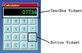
Figure 4.2. Calculator application from the Dashboard, showing how a number of widgets can be put together to create a complete application
Widgets, as well as panels, which we’ll look at in the next chapter, have a dual existence in GWT: You can think of them as both Java objects and DOM elements. The Java object view is the one you use in day-to-day programming to create applications. The DOM view is the view that the Java objects from your program have when you think of them in the context of what is displayed in the web browser. You’ll look at both of these views in the next two sections, starting with the Java object view of widgets.
The purpose of GWT is to develop rich Internet applications once, in Java, and then have the GWT compiler generate the HTML and JavaScript necessary for the application to work in a variety of different browsers. To achieve this, you must have a way of representing various browser objects, which GWT calls widgets, in the Java programs.
This approach takes advantage of the object-oriented programming world’s ability to model objects and concepts as programming objects. For example, in a GWT program, you can happily use a Java object called Button. This Button object models various properties that you expect a button to have, such as being able to set the visible text and click the button. You can model all the components you wish to see in a browser—the widgets—as Java objects with methods and properties.
During your everyday programming use of GWT, you’ll consider all widgets in their natural Java object form. The button we mentioned in this section’s introduction is created by calling the constructor of the GWT Java Button class as follows:
Button theButton = new Button("Click Me");This code creates a new GWT button Java object on which you can then execute various class methods. The tasks shown in table 4.2 are typical operations you can perform on a GWT Button widget.
Table 4.2. Functionality that results from applying some Java Button class methods to the Java Button object
Description | |
|---|---|
| Sets the Cascading Style Sheet (CSS) class name for the button. A corresponding entry should be found in the CSS style sheet attached to the web document, although its name must be prefixed with a period: for example, |
theButton.addClickListener(
new ClickListener(){
   public void onClick(Widget sender){
   }
}); | Adds a |
| Changes the text shown on the button from the original Click Me to “Go on, click me”. |
| Hides the button on the web browser so that it’s no longer visible. |
The Java view of widgets is straightforward to anyone familiar with writing Java programs or using similar high-level object based language; you create objects from classes and call methods that those classes have. What the Java view doesn’t give you is an understanding of how these widgets are displayed on a web page. That is provided by the widget’s alternative DOM representation.
The Java representation of the widget you’ve just seen works great in the Java code and allows you to build GWT applications as you want, using any number of widgets and using their associated methods to build the functionality. However, you can’t display these Java objects in a web browser, so you don’t yet have an Ajax application. This is where the alternative DOM representation of widgets comes in.
The Document Object Model (DOM) is the browser’s view of the web page you see. You can access and alter the DOM using a variety of languages, and the effects of most manipulations are immediately visible on the current browser page. Manipulations can include adding or removing elements, hiding or making elements visible, or changing their location. In the case of GWT, this manipulation is eventually performed through JavaScript in the compiled code; but in your program, you use Java. Next, we’ll look at how to bridge that gap.
All GWT widgets have an alternative DOM representation that is built in parallel with the Java object. The Java constructor is generally responsible for creating this DOM representation; if you look at the detail of the constructor for the Button class, you see the following definition:
public Button() {
   super(DOM.createButton());
   adjustType(getElement());
   setStyleName("gwt-Button");
}
The call to DOM.createButton() creates the DOM element <button> through the GWT DOM classes. Also, in the constructor of the parent, the setElement() method is called to set the widget’s Java class DOM representation to this new <button> element. Using this value set by the setElement() method, you get access to the DOM representation from the Java view (to do so, you use the getElement() method). If you were to look at the DOM representation of a GWT Java button, you would see that it looks like this:
<button class="gwt-Button"
        eventbits="7041"
        onchange="null"
        onload="null"
        onerror="null">
      Click me
</button>
This is the standard DOM representation of a <button> object with a couple of additional GWT-specific attributes. These additional attributes (eventbits, onload, and so on) are set by the object’s Java constructor when this DOM representation is created. Don’t be confused by the name of the first attribute, class; this refers to the CSS styling that can be applied to a widget, rather than the Java class name of the widget.
The next attribute, eventBits, is one that occurs in many widgets. It indicates to GWT what type of events are listened to (sunk) by that particular widget; we’ll go into this in more detail in chapter 6, but it will keep popping up in examples until we get there. A widget sinks browser events that it’s interested in handling.
One golden rule that applies to this DOM representation is that you shouldn’t rely on the fact that a particular widget is implemented as a particular DOM element, because nothing stops future implementations of widgets from being represented using different DOM elements than previous versions. By focusing your programming efforts on the Java code view using the methods provided by each GWT widget class to perform functionality, you protect yourself against possible future changes at the DOM level. As a rule, you should need to access the DOM in your applications only on rare occasions, if ever.
Now that you know what a widget is and how it’s represented both in Java and the DOM, we’ll take a quick tour of the widgets that are available as part of the GWT distribution.
The standard GWT distribution comes with a wide range of widgets for use in applications. These widgets cover the types of areas you would expect: buttons, text boxes, so on. However, some widgets you may expect are missing—for example, progress bars and sliders, although you’ll build one of them in chapter 7.
In the set of widgets, the designers of GWT have implemented a strong hierarchy of Java classes in order to provide an element of consistency across widgets where that consistency naturally exists. Take the TextBox, TextArea, and PasswordTextBox widgets; it isn’t unreasonable to expect them to share certain properties. GWT recognizes this fact and captures the common properties in a TextBoxBase class, which these three widgets inherit. To get a snapshot of this hierarchy, cast your eye over figure 4.3.

Figure 4.3. GWT widget class hierarchy, showing the widgets from GWT 1.3 (more widgets are added continuously in new releases, but looking at GWT 1.3 widgets shows the hierarchy in a nice, succinct manner), also indicating the types of event listeners that can be registered against each widget and whether they have text and/or HTML associated with them
You can see in this hierarchy that all widgets ultimately inherit from the UIObject class, which contains a number of essential housekeeping and property aspects. In the UIObject class, you’ll find the setElement() method, which we discussed previously regarding its use to set the physical link between a widget’s Java object and DOM views. Subclasses of UIObject must call this method as the first thing they do before any other methods are called, to ensure that the link to a Browser element is established.
Note
All GWT widgets inherit from the UIObject class. This class provides a common set of methods and attributes for all widgets, including setting size, visibility, and style names, as well as providing the link between the Java and DOM representations.
We won’t go through all the methods in the UIObject class, but we’ll highlight the typical functionality you can expect all widgets to inherit. The UIObject class provides access to a wide range of DOM functionality without your having to access the DOM directly. For example you can set the height of a GWT UIObject using the setHeight() method, which in turn uses the setStyleAttribute() method from the DOM class:
public void setHeight(String height) {
   DOM.setStyleAttribute(element, "height", height);
}
The other methods written in this style include the ability to set the width, title (what is displayed when a mouse hovers over an element), and both width and height at the same time through the setSize() method. All these methods take Strings as parameters, such as setSize("100px","200px"). Meanwhile, the setPixelSize() method allows integers, such as setPixelSize(100,200). Although these methods for setting style attributes are available, we recommend that styling generally be performed using CSS. This is because it allows a nice separation between functional code and how the application looks (and it also lets you hand off to the design department to style the application they way they do best).
After UIObject, all widgets (except TreeItem and MenuItem) must inherit from the Widget class; it provides widgets with their widget-ness, including the methods that are called when a widget is attached or detached from a panel. This class also contains the default implementation of the onBrowserEvent() method, which lets a widget manage any events it has sunk (you’ll see this in action in chapter 6).
In the next section, we’ll look briefly at some of the widgets you get for free with the GWT distribution as well as how you’ll use them in the Dashboard application. We won’t aim to talk about all the widgets, because the set is growing with each new GWT release; those we’ll cover are shown in figure 4.4.
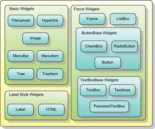
Figure 4.4. Summary of widgets included in GWT, indicating how they will be grouped and discussed in this chapter
As we discuss the widgets in this chapter, we’ll include simple code showing their use and point out where in the Dashboard application you use them. This code may look a little alien in some places; don’t worry, we haven’t introduced most of the concepts used in the code yet, because they come in the next few chapters, but in most cases you should be able to see what is happening.
There are a couple of principles to bear in mind as you read the next few sections. First, this isn’t intended to be a complete walkthrough of the GWT API for widgets; to do that would border on the excessively boring. Instead, we’ll try to show some of the key methods and pitfalls, as well as where you use the methods in the Dashboard application, so you can look in the code. In general, where a getter method is used, such as getText(), the GWT API provides the appropriate setter method too (setText()). Finally, we often don’t include names or number of parameters for a method, unless it’s really necessary; this allows us to write a book focused on what can be done without getting bogged down in details. The online GWT API reference (http://code.google.com/webtoolkit/documentation/gwt.html) is an invaluable source of help for the details, as is the use of a good IDE.
We’ll break the discussion of widgets into the following five main categories of widgets shown in figure 4.4: basic, label style, focus, ButtonBase, and TextBoxBase. Let’s start by looking at basic widgets.
We define the basic widgets as those that inherit directly from the Widget class. There are five of these widgets which we’ll briefly consider next in the context of the Dashboard application you’re building. Sometimes we’ll also show a code sample in isolation to emphasize a particular point or property.
The FileUpload widget acts as a GWT wrapper to the standard browser file-upload text box—the one you use to let the user upload a file from their machine to your server. (See figure 4.5.)
Remember that this is only the client-side component—clicking the Browse button allows the user to select a file on their computer through the standard File Search dialog box, but it doesn’t let you save a file to your server. That takes a little more work. This widget should be embedded in a form that has its encoding set to multipart. When ready, you submit the form to your server to process the uploading of the file selected (an example of this functionality is provided in the FileUploadServlet class in the server package of the Dashboard). This widget doesn’t provide any server-side code to handle file upload; you have to provide that, but you’re free to do so in your favorite server-side language. We’ll look at such a FileUpload widget in more detail when we discuss server-side components in chapter 12; we’ll also consider it briefly later in this chapter when we discuss how to build widgets.
Note
Because your GWT application becomes JavaScript code, access to files falls under the same restrictions as JavaScript. This means no direct saving of files to a user’s machines; and the only way to access files on a user’s machine is to use the FileUpload widget.
The FileUpload widget is one of the most inconsistently implemented widgets across browsers; different browsers allow differing security restrictions and abilities to style it. Most browsers, for example, won’t let you set the default value of the text box because that would allow a web application to go fishing for files. As with all widgets, remember that if you can’t do something with the widget in HTML and JavaScript, then you can’t do it in GWT. GWT only provides a getFilename() method that retrieves the filename selected by a user. Don’t confuse this method with the getName() and setName() methods, which are used to set the DOM name of the FileUpload widget.
But enough of file uploading until chapter 12. We’ll now continue looking at some of the other basic widgets that GWT provides.
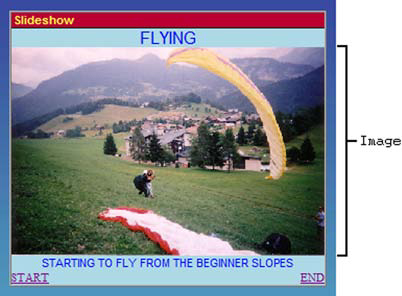
The Hyperlink widget acts as an internal hyperlink in your GWT application. To the user, it looks exactly like a normal hyperlink on the web page; when they click it, they expect navigation to occur in the application. This action is usually coded as manipulating the GWT History object to change the application state—you can see how this works in the Dashboard’s Slideshow application (org.gwtbook.client.ui.slideshow.Slideshow). The application has two hyperlinks at the bottom, as shown in figure 4.6, which enable the user to move the slideshow to the start or the end.
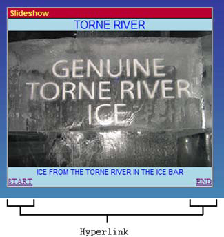
Figure 4.6. Two Hyperlink widgets (Start and End) in action at the bottom of the Slideshow Dashboard application
Any component that uses a Hyperlink widget should also extend the HistoryListener interface and implement the onHistoryChange() method to catch and manage clicks the hyperlinks. As you can see, the Dashboard’s Slideshow component implements two hyperlinks, which can be found in the code as follows:
Hyperlink startLink = new Hyperlink("Start","0");
Hyperlink endLink = new Hyperlink("End",""+(maxNumberImages-1));
Each Hyperlink widget constructor comprises two elements: the text to be displayed on the screen and a history token (which can be any arbitrary string). In the Slideshow’s case, all the history tokens represent numbers of a picture, starting at 0 for the first and ending at the maximum number of images in the slideshow minus one. It’s easy to have a hyperlink that points to the start and end of the slideshow by using the appropriate values in the Hyperlink constructor—“0” for the start (as shown in ) and the string representation of the largest image number (as shown in ).
When you’re using GWT History, remember to include the following line in the body of your HTML page:
<iframe id="__gwt_historyFrame"
        style="width:0;height:0;border:0">
</iframe>
Failure to include the history frame will result in errors, because it’s used in GWT’s approach to storing and retrieving history tokens. This error in hosted web mode is visible by errors in the hosted web mode console, as shown in figure 4.7 (however, you’ll get no similar warning in web mode).
Figure 4.7. Error raised when you try to use the GWT History subsystem in hosted mode without its being properly initialized
(The rebinding message in figure 4.7 is a result of GWT manipulation you’ll perform later in the book using GWT generators to take the basic component application and automatically generate new code to show an About menu item.)
Using methods in the Hyperlink class, it’s easy to get the history token associated with a particular link (getTargetHistoryToken()) or update the token if you wish (setTargetHistoryToken()). Similarly, you can set the hyperlink’s text or get it through the setText() and getText() methods respectively (or the HTML using setHTML() and getHTML() if you’ve created the hyperlink so the text is treated as HTML, using the Hyperlink(String, boolean, String) constructor instead of the more simple Hyperlink(String, String) version), which treats the hyperlink as simple text.
Treating hyperlink text as HTML means that any mark-up code—such as text in bold, underlines, and images—is displayed. If you want a normal hyperlink to, say, another HTML page, then use the HTML widget, which we’ll look at later, rather than a Hyperlink widget that has its text set to some HTML.
Hyperlinks are one way to navigate through an application; another is to use a menu system.
The menu system provided by GWT is based on the MenuBar and MenuItem widgets. MenuItems are added to MenuBars, and MenuBars are added to other MenuBars, to create your application’s menu system. Figure 4.8 shows the Dashboard menu system, where Clock, Calculator, and Slideshow MenuItems are added to a Create MenuBar; this Create MenuBar and a Help MenuBar are then added to another MenuBar, which is displayed on the browser page.
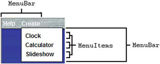
Figure 4.8. MenuBar and MenuItem widgets used in the Dashboard application. In this example, three MenuItems are placed in one MenuBar, which is then added to an overall MenuBar.
In the Dashboard class (org.gwtbook.client.Dashboard), you define one global MenuBar using the following code:
MenuBar menu = new MenuBar();
This simple line creates a horizontal menu bar. (It could just as easily be created using the alternative constructor, which takes a boolean parameter whose value is set to false: for example, new MenuBar(false). If the parameter is set to true, a vertical MenuBar is created.) At present, the Dashboard will have two standard menu bars; you’ll create two additional ones later in this book, and further down the Dashboard code you can find two methods used to build the create and help menu bars. The method buildHelpMenu(), shown in listing 4.1, builds the initial Create menu bar using vertical menu bars.
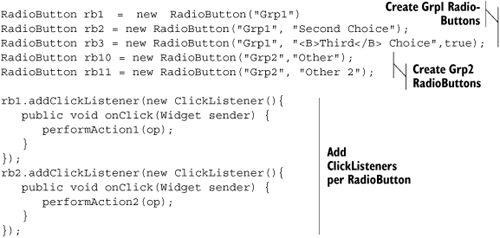
Example 4.1. Building the Dashboard’s Create menu bar and menu items, and the nested Locale menu bar
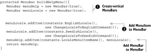
You create vertical menu bars by passing the Boolean value true as a parameter in the constructor (see ). In a MenuBar, one or more MenuItems or other MenuBars go together to give the visual structure shown in figure 4.8. It’s possible to create MenuItems inline in the code, which is what you do at where the first parameter to the addItem() method is a new MenuItem. Each MenuItem is bound to a segment of code, the second parameter to the addItem() method, which is executed when that menu item is clicked.
You use the command pattern to describe the command that will be executed when a menu item is clicked. In practice, this means you create a new instance of either the GWT Command class or a subclass, which contains an execute() method where the code is stored. For the Dashboard, we decided to define a number of Command subclasses as inner classes to the Dashboard, because this best met our needs. An example of one of these classes is shown in listing 4.2 (this command is attached to the MenuItems defined in of listing 4.1).
Example 4.2. A subclass of the Command class to change the application locale to English
class ChangeLocaleToEnglishCommand implements Command{
  public void execute(){
    Window.removeWindowCloseListener(dashboardWindowCloseListener);
    changeLocale("");
  }
}
Using the command pattern allows the GWT application to turn a request for future functionality into an object that can be passed around the code; the defined functionality can then be invoked later. In the case of the menu items, GWT provides the plumbing so that when a menu item is clicked, the associated command’s execute() method is invoked. In this example, when the user clicks a menu item whose command is set to an instance of the ChangeLocaleToEnglishCommand class, then this execute() method is invoked, and a WindowCloseListener is removed from the application before the changeLocale() method is called. (Otherwise, you invoke both of the window-closing events you’ll set up in chapter 6—in the case of the Dashboard, these event handlers display two alert boxes, which you don’t want to happen if you’re just changing the locale.)
You can interrogate a MenuItem to find out what its parent menu is through its getParentMenu() method, as well as find out whether it opens a submenu through its getSubMenu() method. Similarly, you can set the submenu of a MenuItem through the setSubMenu() method, but not its parent menu. In some applications, you may need to change the command associated with a particular MenuItem (setCommand()) or find out what that command is (getCommand()).
The final implementation aspect of a MenuItem we want to discuss relates to the text shown as the item itself. This text can be treated either as pure text or as HTML, depending on whether a Boolean parameter is provided in the constructor of the MenuItem. As with any widget that can allow HTML to be set, you should always take care that you don’t expose the application to script-based security issues. Creating a menu item using new MenuItem(String, true, Command) treats the String as HTML; using the MenuItem(String, false, Command) or MenuItem(String, Command) constructor treats it as pure text.
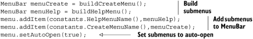
A MenuBar widget lets you define whether its child menus open automatically or wait for the user to click them to open. The setAutoOpen() method achieves this. In the Dashboard, you do this in the onModuleLoad() method, where you create the whole menu system using the code shown in listing 4.3.
At the top of the screen is the Dashboard’s menu system, shown in figure 4.9, which is involved in the code a number of times. The Help and Create menu bars are created as simple implementations for an Internet view (in the Dashboard class) and then overridden to provide a more functional intranet version (in the Dashboard_intranet class). The version used, intranet or Internet, is chosen by using GWT user-defined properties and setting the user-defined externalvisibility property in the Dashboard.html file (we describe all this in chapter 15).
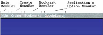
Figure 4.9. The Dashboard menu system, showing the four possible menu bars. The Help and Create menu bars are always present, the Bookmarks menu is loaded as XML from the server, and the option menu bar is shown when a component application gains focus.
The text for these two menu bars is created using GWT internationalization constants set up for a default (English) locale and an alternative Swedish locale. This internationalization approach, which we looked at briefly in chapter 3, is expanded on in chapter 15.
You also use the two new MenuItem widgets you’ll create later in this chapter in the Dashboard’s menu system. When running in intranet mode, the Help menu bar lets the user turn on/off the confirmation requested when they delete a component application; they do this through a TwoComponentMenuItem. In both modes, the user can change the locale through two TwoComponentMenuItems: one for each locale supported by the application. You can see the intranet view of the Help menu in figure 4.10, where both new widgets are in use.

Figure 4.10. Examining the Dashboard’s menu system and showing off the two new MenuItem widgets built in this chapter. The English and Swedish locale MenuItems are instances of the TwoComponentMenuItem, and the Confirm Delete MenuItem is an instance of the ToggleMenuItem (it’s shown in the ON state).
You also manipulate the menu bar in two further ways. First, you create a bookmark menu bar whose contents are loaded from an external XML file using the GWT implementation of the XMLHttpRequest object; this is covered in chapter 12. Second, each component application can register an option menu, which is shown in the main menu when the application gains focus (you use a GWT generator, discussed in chapter 14, to automatically generate an About item in the option menu for each application; it lists all the methods and fields included in the application). Figure 4.10 shows the option menu for the Google Search component application. These component applications also have some generic functional requirements placed on them.
The final point to note about the MenuBar is that it implements the PopupListener interface, which allows functionality to be fired when the MenuBar is closed. If you wish to use different functionality than the standard when the MenuBar closes, then you can override the existing class and implement your own onPopupClosed() method. (You don’t use this functionality in the Dashboard.)
We’ve nearly completed our look at most of the basic widgets in GWT. Two are left, the first of which is the Tree widget. This widget provides applications with a standard hierarchical tree comprising TreeItem widgets. (See figure 4.11.)

Figure 4.11. The Dashboard’s Book application, showing the Tree widget on the left. In chapter 6, you’ll see how events are used when TreeItems are selected or expanded.
A Tree is built similarly to the way you built a menu earlier. In that case, you added a number of MenuItems to a MenuBar; here, you’ll add TreeItems to a Tree. The constructors for a TreeItem are flexible and allow you to create an empty TreeItem or TreeItems from Strings or other widgets (which could mean a standard widget or a composite widget). In listing 4.4, which comes from the Dashboard’s Book application (org.gwtbook.client.ui.book.Book), you build a simple tree to represent the top-level structure of the book.

Unlike in the menu system, you don’t add commands to MenuItems to implement functionality when they’re clicked or expanded; instead, you implement a TreeListener. Doing so requires you to implement two methods: an onTreeItemSelected() method, which is fired when a MenuItem is selected; and the onTreeItemStateChanged() method, which is invoked if the state (opened or closed) of a TreeItem changes.
For the Dashboard Book application, you implement the TreeListener as shown in listing 4.5.
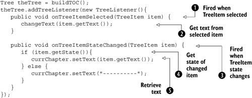
This listener calls the Dashboard application’s changeText() method to fill in the text box at right in the Book application with text when a TreeItem is selected . When the state of a TreeItem changes, then the onTreeItemStateChanged() method  is called. This method retrieves the state of the
 MenuItem that was changed  and, if this item is now open, places the text of the time at the bottom of the widget by retrieving it using the
 getText() method  . Otherwise, it places dashes as the text.
A TreeItem comes with a host of helper methods that you can invoke to learn more about or change existing properties of the item. You can find out the child at a particular index (getChild(int index)), count the number of children (getChildCount()), or get the index of a particular child (getChildIndex(TreeItem)). Additionally, you can get the Tree a particular TreeItem is in (getTree()), find out if an item’s children are currently displayed (getState()), determine its parent item (getParentItem()), and find out whether it’s currently selected (isSelected()).
A TreeItem may have a widget associated with it, though if it does, it can’t directly have text associated (unless it’s set up as a composite widget). Often, you may associate a CheckBox, for example, with TreeItems. You associate a widget with a TreeItem either through the setWidget() method or by using the TreeItem(Widget) constructor.
Finally, the various states of the TreeItem, whether an item is closed or open, are shown as images. By default, these images are in the public folder of your application and are called tree_closed.gif, tree_open.gif, and tree_white.gif. You can replace these images with your own versions if you wish—just keep the names the same. If you’d like to store the images in a different directory, indicate the location using the setImageBase() method.
If you wish to display an image in a GWT application, you can use the Image basic widget. This widget allows images to be loaded and displayed, as you can see in figure 4.12.
An interesting aspect of the Image widget is the ability to add a LoadListener to it so that a particular action can be performed when the image has completed loading (onLoad()), or another action can be performed if there is an error loading the image (onError()).
Tip
The LoadListener will work only if the Image is added to the browser page, usually via a panel, which is itself added to the browser. Just creating the Java object and adding a LoadListener isn’t enough to catch the events, due to the way in which the GWT event-handling system works (see chapter 6).
Listing 4.6 shows the code from the Dashboard’s Slideshow component (org.gwt.client.ui.slideshow.Slideshow), which can be used to preload images into an application.

The preloadImages object is a HorizontalPanel, which you add to the application specifically for the future use of preloading images. Due to the way the GWT event mechanism works, you need to have the images loading into a component that is added to the browser page (if they aren’t, then there is no hook into the event mechanism, and the LoadListener is ignored). However, there is no requirement for the component to be visible, so in you set it to be invisible to avoid an unsightly mess!
You add a new LoadListener at and define the onError() method to just put a JavaScript alert on the screen if there is an error ; or, if the image loads, you change the title bar of the browser window to show the image name using the Window.setTitle() method .
Once you have an Image object, it’s possible to use the prefetch() or setUrl() method to load a new image rather than creating new objects as you did in the example. Either way is valid, and you’ll choose which way to set it up in your own applications.
You should also be aware that when you use a transparent PNG image over another image in Internet Explorer 5.5 and 6, ugly backgrounds start to get applied. You’ll build a new widget later in this chapter that overcomes these problems.
An exciting addition that came with GWT 1.4 is the ability to bundle together and clip images. The original Image class gained a new method that allows you to display only a portion of the image. For example, to display only the top left 50x50 pixel square of an image, you can use the constructor new Image("image.png", 0, 0, 50, 50).
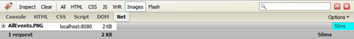
The ultimate purpose of clipping an image is optimizing the load time of your GWT application. Loading one image containing a number of images you’ll use is more efficient than loading each of the images individually. Let’s look at an HTML page that loads the five images displayed in the Events Widget Browser Dashboard application. When you have a simple page that loads all five images separately, the Firebug extension to Firefox reports the timelines shown in figure 4.13.
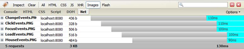
The five images take around 130ms to download. The images are coming from a web server local to the machine; but look at the results shown in figure 4.14, where we manually created an image that contains all the five images in one. You’re down to 50ms to load the images. Extend this to a larger application that is loading images across a real network, and you can begin to see that there are distinct advantages to bundling images together. There’s a disadvantage as well, though: Do you want to manually manipulate all the images you have into one? Luckily, GWT provides the ImageBundle class that gets around this problem. You provide your images as you want and create an interface that extends ImageBundle that references your images, and GWT does the work of putting them together for you. Let’s look at that in more detail.
In the Public folder of the Dashboard application, create a ToolbarImages folder into which you place all the individual images for the toolbar. Then, in the org.gwtbook.client.ui.EventsWidgetBrowser package, create a new interface class that extends ImageBundle; a sample of that interface is shown in listing 4.7.

The interface defines a method for each image that will be bundled together, and the GWT-generated implementations of these methods are used to extract the clipped images. By default, GWT takes the images from within the package in which the bundle interface is defined (this is different from other images/resources) and looks for an image named after the method name. To play nicer with the application structure, you can direct GWT to take the resource from a location of your choosing. This is achieved by using annotations in the comments; for example, tells the compiler to get the image returned by the ChangeEvents() method from the ToolbarImages directory.
Using the bundled image is simple. Listing 4.8 shows the case of creating an instance of your image bundle, via the deferred binding approach. With access to the image bundle, you call the appropriate methods for the image we wish to use, and that method returns an AbstractImagePrototype. To get the Image you’re after, you call the createImage() method on the AbstractImagePrototype. Now, you have a standard Image that can be added to your application.

But images aren’t the only thing you can display on the application. You also have a range of ways to display text.
The Image widget we looked at just now is useful for displaying pictures and images on the web browser. However, many applications need to show text either as passive information or more actively or funkily. As we dig down into the hierarchy of widgets, two widgets allow you to present text on the screen: Label and HTML.
A Label widget contains arbitrary text, which is displayed exactly as written. This means the Label created by the code new Label("Hi <B>there</B>") appears on the browser page exactly as “Hi <b>there</b>”—the word there isn’t interpreted as HTML and isn’t shown in bold text.
It’s possible to control the horizontal alignment of labels, although by default the size of a Label widget is the size of the text it encloses. Right-aligning, using the following command
theLabel.setHorizontalAlignment(HorizontalAlignmentConstant.ALIGN_RIGHT)
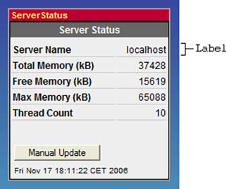
has little visible affect unless you use a style sheet (or, less preferably, the theLabel.setWidth() method) to set the width of the label to be longer than the text. The alignment you see in the Dashboard’s Server Status application (org.gwtbook.client.ui.serverstatus.ServerStatus), shown in figure 4.15, is achieved by aligning Labels in a Grid panel (see chapter 5). A Label may also word-wrap if the setWordWrap() method is called; this method takes a Boolean variable that is set to true if the Label should word-wrap and false otherwise.
GWT allows you to add ClickListener and MouseListener to a standard Label widget, offering the possibility of capturing the user trying to interact with the Label. By default, no action occurs; you have to add click or mouse listeners. In the EditableLabel widget you’ll build in chapter 7 (org.gwtbook.client.ui.EditableLabel), when a user clicks the label, you present a text box instead of the label; they can use it to change the text of the label. You add the click listener as shown in listing 4.9.
Example 4.9. Adding a ClickListener to the GWT EditableLabel widget
text = new Label(labelText);
text.setStyleName("editableLabel-label");
text.addClickListener(new ClickListener()
{
   public void onClick (Widget sender){
      changeTextLabel();
   }
});
The ClickListener acts similarly to the Command you used in the MenuItem widget. It registers an onClick() method that GWT executes when the user of the application clicks the label.
Once you have a label, you can change the text programmatically using the setText() method (as well as get the current text using the getText() method). See listing 4.10.
You can also use a slightly more active text-presenting widget if you wish: the HTML widget.
If you want to provide more funkiness with the presentation of text, then the HTML widget may be the component you’re looking for. It acts the same as a Label widget, but—this is important—it interprets any text as arbitrary HTML. Whereas in the label the text “Hi <B>there</B>” is written as is, if you write the code new HTML("Hi <B>there</B>"), the text is displayed as “Hi there”.
The HTML widget is also useful if you wish to provide a true hyperlink. When we looked at the Hyperlink widget, you learned that you can present what looks like a hyperlink to the user, but when clicked, it only changes the historical aspect of the application. If you use an HTML widget instead, then you can provide proper links, as you’ll do later in the About application to link to the book’s web pages:
new HTML("<a href='http://www.manning.com/hanson'>Manning</a>");You must be careful with this widget because allowing arbitrary HTML can expose security issues to your application if maliciously constructed HTML is used. Also consider whether the HTML Panel we’ll discuss in chapter 5 is more appropriate for your needs.
Labels and HTML are a useful way of presenting information to a user, but there is another half of interacting with the user: capturing their input.
You can grab user input using one of a number of widgets in GWT, all of which fall under the FocusWidget hierarchy shown earlier in figure 4.3. These widgets inherit from the FocusWidget class; but before we look at them in detail, you should understand that FocusWidget isn’t a widget in the normal sense—you can’t create an instance of it and display it on the browser. Yes, it extends the Widget class, but its only purpose is to provide a class that handles focus, click, and keyboard events that can be extended to provide the necessary common functionality across its children. So, it’s defined as an abstract class.
Although it’s abstract, FocusWidget provides the common functionality for all focus widgets; this includes setting the widgets position in the browser’s tab index through the setTabIndex() method. A widget’s tab index indicates the ordering in which it will highlight when the user uses the Tab key to move through web-page elements. Setting tab indexes is particularly useful to the user if widgets are used in a form; correspondingly, the standard form components are subclasses of FocusWidget.
You can also use the setAccessKey(char key) method to assign a special key combination that, when pressed, gives the widget focus—or you can do this pro-grammatically through the setFocus() method. In the EditableLabel widget you’ll build in chapter 7, you change a Label widget into TextArea for editing. Once the widget swapping has taken place, to make sure the TextArea immediately has focus, you call the setFocus() method on it (see listing 4.11).
In GWT, two widgets extend FocusWidget directly to produce new widgets: Frame and ListBox. We’ll look at them next, as well as two additional abstract subclasses of focus widgets (TextBoxBase and ButtonBase), which in turn have more widgets as their children.
In the Dashboard, we wanted to introduce flexibility into the About component application (org.gwtbook.client.ui.about.About). Rather than hard-code the about message, we decided that it should be loaded from a separate HTML file. To support that functionality, you use the Frame widget, into which you can easily load a new HTML page. You do this either through the constructor, such as new Frame("resource-to-load"), or through the widget’s frame.setURL("resource-to-load") method.
Figure 4.16 shows the basic About component application in the Dashboard, where the contents are loaded from another HTML file (About.html, if you’ve downloaded the example code). Because the widget represents an IFRAME DOM element, this content can easily be created from a static HTML file, JSP, servlet, PHP script, .NET application, and so on.

Figure 4.16. Using the Frame widget in the Dashboard About dialog. The contents of this display are loaded from another HTML file into a frame.
A subclass of the Frame widget is the NamedFrame widget, which lets you associate a name. These NamedFrames are typically used as targets for the FormPanel—and you’ll see this in action in chapter 12, when we deal with forms.
The ListBox widget is used extensively in the Dashboard’s Address Book application (org.gwtbook.client.ui.addressbook.AddressBook), as shown in figure 4.17. It presents a list of choices to the user, either as a drop-down or as a standard list box. In the Address Book application, you use the listbox form for selecting names and in drop-down form for selecting countries.
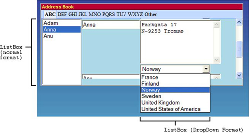
Figure 4.17. The Dashboard Address Book application uses both forms of the ListBox widget. Names are stored in a normal format list box, and countries are selected from a list box in its drop-down style.
To create a normal format list box, you use the standard constructor new ListBox(), as shown in listing 4.12.
Example 4.12. Creating a standard ListBox and adding a ChangeListener to the Address Book application

After creating the ListBox object , you set the maximum number of visible items that will be shown through the setVisibleItemCount(number) method; this is effectively the height of the list box. For the Address Book, you display 10 items as standard; if there are more, then the widget acquires a scroll bar.
Having a list box provides a way of presenting choices to the user. To understand which item the user selects, you add a ChangeListener to the ListBox . When the selected value in the list box is changed, the onChange() method is called. You use this change listener to show the address of the new person by first finding out the index of the option the user selected (using the getSelectedIndex() method, ) and then passing that index value as the parameter to the getItemText() method to get the text representation of the selected option . This returned text is then used as a parameter in the Address Book’s showAddress() method.
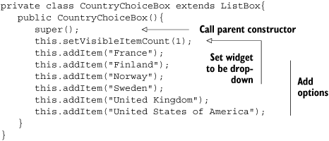
The alternative view of ListBox as a drop-down box of options is created by setting the visible item count to 1. For variety in the Address Book, you subclass the ListBox widget to provide a country choice drop-down widget, as shown in listing 4.13.
You select an option programmatically using the setSelectedIndex(value) method. This method works best, and makes more sense, when the list box is in its drop-down view; you use it in the Dashboard to ensure that the correct country option is shown for each address.
One thing you don’t do in any of the Dashboard component applications is allow the list box to have multiple selections. To do so is just a case of using the setMultipleSelect() method. If you do that, then you need to be a little more intelligent when getting the selected item, because the getSelectedItem() method returns only the first selected item. To get all the selected items, you need to iterate over all the items, calling the isItemSelected() method for each item to determine whether it’s selected.
Using a list box gives the user a wide range of choices. If you wish to be more careful about the range of choices offered to the user, then you should consider using one of the widgets that extends the ButtonBase widgets.
These widgets include Button along with RadioButton and CheckBox. ButtonBase provides the standard methods common to its three children—for example, setting and getting the text associated with them through the setText() and getText() methods or the similar methods for the HTML (setHTML() and getHTML()).
Let’s look at these three children and how you use them in the Dashboard.
The Button widget is one you’ve already seen in this chapter. It’s a push button in the style normally found on web pages. It’s created by calling the constructor as follows:
new Button("7");You can see the Dashboard’s calculator buttons all lined up in figure 4.18. You add them to a Grid panel and also apply some CSS styling to change the normal gray button/black text to a light blue button/green text—although that may not be visible in the book!

Figure 4.18. A range of Button widgets set out to form the keypad of the Calculator Dashboard application
Normally, you register a ClickListener with the Button in order to perform some functionality when the button is clicked. For the keys that represent the operation buttons (plus and so on) in the Dashboard’s Calculator application (org.gwtbook.client.ui.calculator.Calculator), you add click listeners to the button:
Button w = new Button("+");
w.addClickListener(new ClickListener(){
   public void onClick(Widget sender) {
      performCalculation(op);
   }
});
When you press keyboard buttons while focused in the Dashboard Calculator application, you wish to perform the same functionality as if you clicked the buttons. You achieve this by programmatically executing the clicking of a button by calling the button.click() method.
Buttons are one subclass of the ButtonBase widget, but there are two more. Next, we’ll look at the CheckBox.
The CheckBox widget implements the standard browser check box functionality (see figure 4.19). In normal pre-Ajax applications, this widget was usually found in a Form, and the values were submitted to the server when the form is submitted. In the Ajax world, this isn’t a constraint anymore; yes, it’s still found in forms, but it can also function as a standalone component. If you’re using it standalone, you can add a ClickListener to it, so that some segment of code can be executed when the element is checked or unchecked. You’ll do this in chapter 5 for the Dashboard application.
The final widget we’ll look at that’s included with the GWT distribution as a subclass of ButtonBase is the RadioButton widget, which provides the implementation of a set of mutually exclusive selections. As with the CheckBox, it’s common to see this either in a form or standing alone. Unlike CheckBox, you need a way to indicate which RadioButtons are included in a particular group. You do this in the constructor, which has three forms, all of which require the definition of a group name. Listing 4.14 shows the construction of two groups of radio buttons.
If management of choices isn’t the purpose of your application and you need a freer way to let users express themselves, then the next set of widgets in the TextBoxBase family are probably the ones you’re after.
Extending the FocusWidget is the TextBoxBase widget, which again isn’t a widget but an abstract class providing standard functionality for the PasswordTextBox, TextArea, and TextBox widgets. The TextBoxBase class provides the type of functionality you would expect for an editable text element on screen: for example, canceling keypresses, setting and getting the visible text, setting the cursor position, and trapping a keypress and replacing it in the text box with a different character.
TextBoxBase provides a number of methods that you’d reasonably expect a widget that extends it to implement. You can get all the text in the widget with the getText() method or just get the text the user selected using the getSelectedText() method. In addition, you can get the length of the selected text using getSelectionLength() and the cursor position with getCursorPos()). It’s also possible to set all these properties using the opposite methods, such as setText() and setCursorPos(), or to select all the text using the selectAll() method.
Let’s look the three child widgets of TextBoxBase and how you use them in the Dashboard.
The PasswordTextBox widget represents the standard browser text box that masks its input when the user types in values. It’s commonly used to allow application users to enter passwords. The Dashboard includes a simple security application called the Login component (org.gwtbook.client.ui.login.Login), which uses the PasswordTextBox as shown in figure 4.20.

Figure 4.20. PasswordTextBox in the Dashboard Login application hides the characters being typed for the password.
This widget is easily created using the PasswordTextBox() constructor, but it includes no other methods except those inherited from the TextBoxBase widget.
The TextArea widget allows application users to enter text that has multiple lines. In the Dashboard, you use this widget in the EditableLabel composite widget (see chapter 7) as shown in action in figure 4.21.
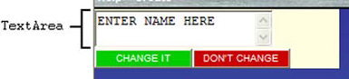
Figure 4.21. Using the TextArea in the EditableLabel composite widget built for the Dashboard (we’ll look at this in more detail in chapter 7)
Creating a TextArea is a simple case of using the TextArea() constructor. From there, you can set the width and height of the TextArea either through CSS or by using the provided setCharacterWidth() and setVisibleLines() methods.
Sometimes you don’t need multiple lines of text, and in that case the TextBox widget is more appropriate.
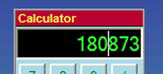
If you don’t need multiple lines of text that can be edited, then TextBox is probably a more appropriate widget. In the Dashboard, you use text boxes in a number of places, including in the Calculator Dashboard application; a user can enter numbers directly in the screen area as well as by clicking buttons (see figure 4.22).
One aspect of TextBoxBase widgets we haven’t discussed is the ability to trap keypresses and either change or cancel them through using a KeyboardListener. In the Calculator, you don’t want users to have the ability to enter anything except numerical characters in the text box. You achieve this using the code given in listing 4.15.
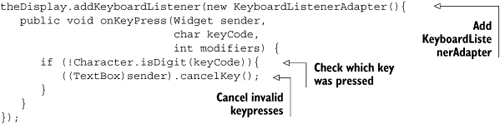
First, you associate a KeyboardListenerAdapter with the text box (theDisplay) and then override its onKeyPress() method. In that method, you check to see if the keyCode is a digit by using the Java Character.isDigit() method. If it isn’t a digit, then you cancel the keypress—which means it doesn’t reach the widget and therefore is never displayed on the browser. The syntax to do this may be a little strange; you have to cast the sender object into a TextBox object before you can call the cancelKey() method, because the listener method only deals with pure Widget class objects.
Just as you can alter some of the stylistic aspects of the TextArea via either the preferred approach of CSS or programmatically, you can do the same with TextBox. Programmatically, you use the setMaxLength() and setVisibleLength() methods. The first method defined the maximum number of characters that can be typed into the text box; the second the maximum number of characters that are visible at any one time.
We hope this discussion has shown that many widgets are available for you to use in your applications and indicated where you’ll use them in future development in this book. However, sometimes this set of simple widgets isn’t enough or doesn’t fulfill the needs of your application. In these cases, you can either create your own widget or extend an existing one.
Although GWT provides an extensive set of widgets, it can be the case that you don’t have the functionality you need for your application. This may be because the provided widgets aren’t quite right, or a basic widget is missing. There are three ways to create new widgets, as shown in figure 4.23.
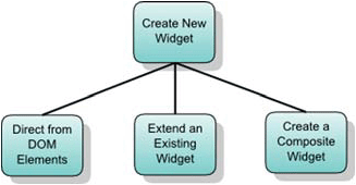
Figure 4.23. The three options available for creating a new widget in GWT. In this section, we’ll look at following two methods: directly from the DOM and extending an existing widget (chapter 7 covers composite widgets in detail).
In this section, we’ll look at the first two approaches: creating new widgets directly from the DOM and by extending an existing widget. Remember that when we say a basic widget, we’re referring to a widget that represents some basic functionality a browser can provide—anything more complicated involves the third approach: creating composite widgets. We’ll discuss composites in detail in chapter 7; they’re used if you need to create a widget that is made up of two or more existing widgets.
For the first approach, we struggled to find an example to include in this book, because the current GWT distribution has been comprehensive enough for our purposes. Earlier distributions were missing a FileUpload widget, so we built one; we’ll look at how we did that in this section. When it comes to extending existing widgets, you’ll build three new widgets for the Dashboard. The first is the PNGImage widget, which extends the standard Image widget to cope with some IE 5.5 and 6 problems with displaying PNG image transparency (you’ll use this for the trash-can icon to allow PNG images to be used there).
The second new widget extends the MenuItem widget to create the Dashboard’s ToggleMenuItem widget. GWT provides a MenuItem widget that is used in menus, but it consists just of text. The ToggleMenuItem will consist of text and one of two images indicating the toggled state of the menu item (imagine that these images consist of a check or a blank image indicating that the functionality represented by the menu item is on or off).
Let’s assume that you need to create a new widget. First, you’ll see how you do that through manipulation of the DOM.
The first approach we’ll discuss when you need to create a new widget is how to do so by manipulating the DOM directly (this is generally the way the standard GWT widgets are constructed). You won’t have to do this often, because most widgets are already built; and you should do this only on those occasions when a basic browser widget is missing.
When writing this book, we couldn’t think of a widget that needed to be built this way, but we recalled that when we started using GWT, a basic widget was missing: FileUpload. There is now a standard GWT version, so we’ll look at how you built that.
You want the version of the FileUpload widget to look like exactly like the standard browser file-upload box shown in figure 4.24.
The first step when creating a new widget is to decide which DOM element the widget will implement. In this case, it’s a simple choice: Because you want a FileUpload widget, you need to use a DOM <input> element whose type attribute is set to file (this is the only way in a browser to create the widget shown in figure 4.24).
Next, you decide where the new widget will sit in the hierarchy that already exists. The approach sometimes involves a little trial and error because the hierarchy is large. Taking a common-sense approach, you want the widget to be notified of focus events and clicks, so you choose for it to sit under the FocusWidget class.
The widget is rather like a text box, and a user may expect it to behave in such a way, so TextBoxBase is also a good candidate; but there are a number of issues with this. It isn’t possible to set the text of the underlying input DOM element due to valid security restrictions implemented by most browsers. Plus, the notion of text alignment isn’t valid for this type of widget. Choose for this widget to extend FocusWidget as well as implement the HasText interface (which indicates that there is text you can set and get in this widget).
The widget consists of the code shown in listing 4.16.
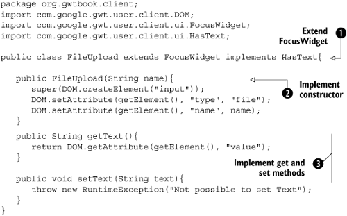
At , you state the name of the new widget and say that it will extend the FocusWidget class as just discussed. You’ll inherit a number of methods from there. You also say that this widget will implement the HasText interface, which means you have to provide setText() and getText() methods.
Next , you define the constructor of this widget. Here you introduce the direct DOM manipulation we’ve discussed in this section so far. Initially, you need to create the DOM input element, using the following code:
DOM.createElement("input")This creates the <input> element, which you then use in the FocusWidget’s constructor, which is accessed through the call to super() to establish the widget. This also sets the element field of the widget to be this new <input> element.
To complete the widget, you use more DOM manipulation approaches to set the type of the element (file) and its name:
DOM.setAttribute(getElement(), "type", "file");
DOM.setAttribute(getElement(), "name", name);
The getElement() method retrieves the widget’s underlying element that was set in the call to the FocusWidget’s constructor. You use this returned element in the two setAttribute() calls to set both the type and name attributes.
After the constructor has completed the element, you have the following DOM element held as the Java object:
<INPUT type="file" name="name" __eventBits="7040"/>
The eventBits has been set, although you haven’t asked for it. These values appeared because you’re extending the FocusWidget that has these values set.
Because you’ve implemented the HasText interface, you need to provide the two methods that this interface requires. First is the getText() method. For the FileUpload widget, it makes sense that the value returned is the value of the filename selected by the user. To get this value, you must perform some more DOM manipulation; this time, you use the getAttribute() method, as follows, to retrieve the value of the file input box :
return DOM.getAttribute(getElement(), "value");
Another consequence of implementing the HasText interface is that you must provide the setText() method . The majority of browsers place security restrictions on setting the text of a browser file-upload input, so you raise an exception if this method is called:
throw new RuntimeException("Not possible to set Text");You can now use the new widget like any other widget by creating a new instance of it in the Java code, such as this:
FileUpload myUpload = new FileUpload();
As it turns out, this version isn’t too far off the version that now ships with GWT, although that one is a little fancier and more flexible. The steps required to create a new widget by manipulating the DOM are summarized in table 4.3.
Table 4.3. Steps to create a new widget through DOM manipulation
Step | Action | Description |
|---|---|---|
1 | Identify the DOM | Identify which DOM element(s) the widget will wrap. |
2 | Locate the widget on the hierarchy | Locate where on the hierarchy this new widget should sit. Should it be directly under the |
3 | Identify interfaces to implement | Identify what interfaces (in addition to those it inherits) the widget should implement. We’ll cover event interfaces in chapter 6. |
4 | Implement the constructor | Create the constructor using the appropriate DOM methods to create the element and add necessary attributes to the DOM element. |
If the widget is to sink events that aren’t included in the hierarchy, then use the | ||
5 | Implement the required methods | You now need to implement three types of methods:
|
That is all there is to it to building a simple new widget from scratch. As we’ve said, though, it isn’t easy to see where this situation will arise, given the increasing completeness of the provided GWT widgets. Most of the time, new widgets come from extending existing ones or creating composite widgets (as you’ll see in chapter 7). The next section looks at how you extend existing widgets; you’ll build three concrete examples for use in the Dashboard later on.
Instead of creating a widget directly from scratch, there are occasions where you can create a new widget by extending an existing one that almost has the functionality you need. In this section, you’ll see three examples. The first extends the Image widget to allow it to cope with displaying transparency in the IE 5.5 and IE 6 browsers, which you need for the trash-can icon in the Dashboard example. Second, you’ll build a widget that extends the standard MenuItem widget by letting you display another widget after the menu text; you’ll then extend that widget to create a third one that allows you to toggle the widget shown after the text between two different widgets when the menu item is clicked.
The new widgets will follow the development steps shown in table 4.4. These are comfortingly similar to the steps involved in developing a widget from scratch—except you no longer need to identify DOM elements and where in the hierarchy the widget will sit, because these are given by the widget you choose to extend.
Table 4.4. Extending an existing widget to create a new one
Step | Action | Description |
|---|---|---|
1 | Identify the widget’s functionality | Define exactly what you wish the new widget to do. |
2 | Identify the widget to extend | Identify which widget provides the closest match to the functionality you require. Sometimes you’ll find a widget that provides not enough functionality in one area but too much in another. This is easy to fix, because you can override methods to provide both more and less functionality (sometimes this over-functionality is in the event-handling area, in which case you can use |
3 | Identify interfaces to implement | Do you need to implement any new interfaces for this new widget? We’ll cover event interfaces in chapter 6. |
4 | Implement the constructor | Create the constructor using the appropriate calls to |
5 | Implement the required methods | You now need to implement three types of methods:
|
Let’s create the first of three new widgets you’ll be using in the Dashboard: the PNGImage widget.
The Dashboard application displays a trash-can image that sits at upper right on screen. In chapter 3, you implemented this as a simple Image widget. However, the Image widget that comes with GWT isn’t that successful in displaying a transparent PNG image over another when you’re using IE 5.5 or 6. This is what you could end up doing in the Dashboard, where the trash icon sits on top of a background image. Also, when you build the slider widget in chapter 7, you’ll be sliding a thumbnail image over a background scale image; if you use the standard Image widget, and the programmer provides two PNG images, then it will look messy.
The problem is that the transparent PNG images acquires a halo effect in IE 5.5 (see figure 4.25) and a horrible background in IE 6 (see figure 4.26).

Figure 4.25. PNG image transparency problem in IE 5.5: a white halo around the star using the GWT Image widget

Figure 4.26. PNG image transparency problem in IE 6: a gray background around the star using the GWT Image widget
The third-party GWT Widget Library includes a PNGImage widget that overcomes this problem. In this section, we’ll walk through the steps we took to develop this widget (to avoid importing the GWT Widget Library into the project yet, you’ll create the PNGImage widget under the org.gwtbook.client.ui package).
Rather than try to create a completely new widget, we decided that PNGImage should behave as much as possible like the standard GWT Image widget, and therefore inheritance from the standard Image widget was the way forward. The widget is made from three classes: a main widget class and two implementation classes (one for IE and one for other browsers). The full code for the implementation class of the PNGImage is shown in listing 4.17.

Having identified the functionality required for the PNGImage to be exactly the same as the Image widget, except to be able to handle PNG transparency, you indicate that the definition of the PNGImage class extends the Image widget . There are no new interfaces that you wish PNGImage to implement, because you want PNGImage to behave the same as Image.
At you use code similar to that which we looked at when we discussed internationalization. Although in this case, instead of deferring picking the right Java class until you know the locale, you defer the binding until you know the browser in which the code is being executed (this is known technically as deferred binding, which we’ll cover in chapter 15—it’s used here because you need to implement different code depending on whether the browser is IE 5.5/6 or not). If the browser isn’t IE 5.5/6, then the deferred binding picks a class called PNGImageImpl; if not, then it picks a class called PNGImageImplIE6.
At , you create the DOM object that represents the PNG image. You do so by calling the create method on whichever version of the PNGImageImpl class has been selected by the compiler under the deferred binding rules. In the case where the browser isn’t IE 5.5/6, the create method contains the following code to create a standard <image> DOM element and set some attributes:
Element result = DOM.createImg();
DOM.setAttribute(result, "src", url);
DOM.setIntAttribute(result, "width", width);
DOM.setIntAttribute(result, "height", height);
return result;
If the browser is IE 5.5/6, then the create method in the PNGImageImplIE6 class is used. First, it determines whether the image is a PNG image (by crudely looking at the extension). If the file isn’t a PNG image, then the normal constructor is used to create an <img> element. Otherwise, you need to apply a specific IE AlphaImageLoader filter to the image. You do this by creating a <div> element and then setting the innerHTML of that DIV to include the PNGImage plus a specific IE AlphaImageLoader filter, as follows:
Element div = DOM.createDiv();
DOM.setInnerHTML(div, "<span style="display:inline-block;width:" +
                    width + "px;height:" + height + "px;"+
 filter:progid:DXImageTransform.Microsoft.AlphaImageLoader(src='" +
                    url + "', sizingMethod='scale')"></span>");
In all cases, a DOM element is returned to the constructor in the PNGImage class. This element is then set as the element of the PNGImage widget. You can find the full code for the implementation classes in the electronic downloads for the book (http://www.manning.com/hanson).
The events that this widget must sink are the same as for the Image widget, so normally you wouldn’t need to include a new sinkEvents() call. However, in this case you don’t call the Image constructor using (super()), so you must explicitly identify the events you’ll sink . You don’t need to override the onBrowserEvent() method because that is directly inherited from the parent Image widget.
To finalize the widget, you ensure that the methods from the Image class you inherit are handled appropriately. The getURL() method of the Image class is no longer valid in this implementation, so you override it and make it call the browser-specific implementation you’re using to return the correct value.
Finally, for PNG images, it isn’t possible to set the URL, because it’s for an Image widget. This is a case where the parent widget provides more functionality than you can support in the extended widget. You solved this problem by raising a RuntimeException if someone wishes to try to call this method  .
.
The corrected PNGImage now displays correctly in IE 5.5/6, as shown in figure 4.27. The halo effect from IE 5.5 and background from IE 6 are gone, and PNGImage displays a PNG image correctly in all browsers.

Figure 4.27. Corrected IE PNG handling with no halo or background using the new PNGImage widget, which extends the GWT Image widget
You create the new PNGImage object using the standard Java call to its constructor:
PNGImage myImage = new PNGImage("star.png",100,100);Now that you have the PNGImage class, you can represent the trash icon in the Dashboard application and use safely when building the sliders—both of which we cover later in this book. Next we’ll look at developing another widget that you need for the Dashboard—the ToggleMenuItem widget.
As we explained earlier, GWT provides a useful widget called the MenuItem. One or more of these menu items are placed in a menu bar to create the GWT menu system. Useful as it is, it isn’t immediately obvious how to use MenuItem to display menu items that has two components—for example, the menu item and a shortcut key, or a menu item followed by an image.
In this section, you’ll first build a TwoComponentMenuItem widget that allows you to place some text followed by another widget (which could be a Label representing a shortcut key combination, or an Image). The content of a MenuItem is generally text, although you have the option of that text being interpreted as HTML; this is the hook you’ll use to build this new widget. In the Dashboard, you’ll use this widget to indicate the locales, as shown in figure 4.28.
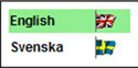
Figure 4.28. Example of the TwoComponentMenuItem in the Dashboard. It displays an animated GIF of a country flag related to the selectable locale.
Once you have a widget that allows you to place two components in a menu item, you can extend that to get to the widget you need for the Dashboard, which shows one of two images after the text depending on an internal state. When the widget is clicked, the state and image change, as shown in figure 4.29. This widget is called the ToggleMenuItem.
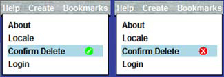
Figure 4.29. Various states of the ToggleMenuItem in the Dashboard example’s Help manu bar. (You show the Confirm Delete functionality as either enabled or disabled.)
For the Dashboard, you use this widget to indicate to the user whether they will be asked to confirm that a component should be deleted. On the left side of figure 4.29, you indicate that the user will be asked for confirmation; if the user clicks the menu item, then the right side of figure 4.29 is visible. Let’s build the TwoComponentMenuItem first and then look at the ToggleMenuItem.
The TwoComponentMenuItem provides a widget that displays the text in a normal MenuItem followed by a second widget, as shown in figure 4.30. This second widget could be text showing which shortcut key combination can be used—for example, Ctrl + O to fire the command behind the menu, or perhaps an image.

You implement TwoComponentMenuItem as shown in listing 4.18.
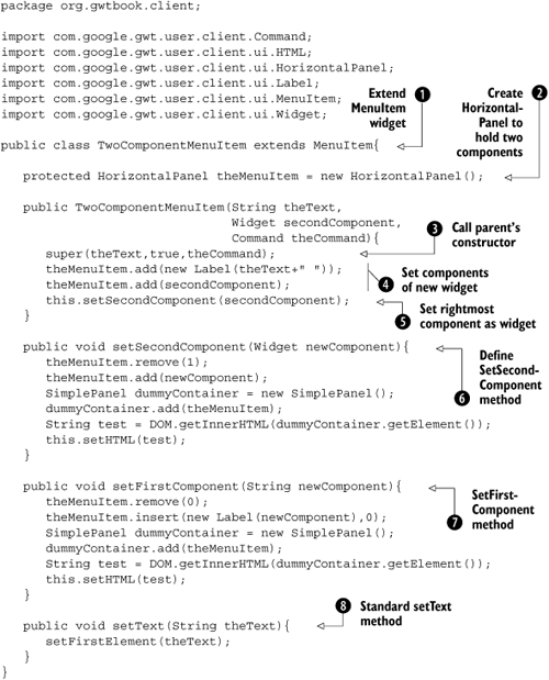
The TwoComponentMenuItem extends the MenuItem class , so everything there is available to you in the class and you can use this class everywhere you would use a MenuItem. To provide the ability to handle two components, you create a HorizontalPanel that will hold the two components: The first element is a Label that contains the text, and the second is whatever widget is passed in to the class.
In the widget’s constructor, you first call the MenuItem constructor to make sure you’re creating a valid MenuItem, but you let it know that you’ll be treating the text component as a piece of HTML text. Next, you create a Label using the text passed in for the menu and add it to the HorizontalPanel as well as adding the second component directly to the same HorizontalPanel. Then, you call the setSecondComponent() method —you have to add the second component prior to calling the method to set it; or the method would break because it first removes the second component (as you’ll see next).
To create the view of the two components on screen, you perform some GWT and DOM magic . First, you remove any existing second component from the HorizontalPanel, and then you add the new second component. So far, this is simple GWT. Next, you want to get access to the HTML of the HorizontalPanel; you do so by juggling with the DOM. You put the HorizontalPanel into a SimplePanel and then retrieve the inner HTML of the SimplePanel. A similar process is shown to set the first element in  , but note that the code now removes the first component (index 0), which makes the second component become the first. The implication is that when you add a new first component, you must insert it before the existing first component and so use the
 insert() method as opposed to the add() method.
Finalizing the component is a case of overriding the setText() method, because you need to put any text in the HorizontalPanel instead of straight into the widget. To change the text, you set a new first element as shown in the override method  .
.
As with the PNGImage and FileUpload, you create the new widget using its constructor:
TwoComponentMenuItem myMenuItem =
     new TwoComponentMenuItem("MenuItem",
                              new Image("myMenuImage.jpg"),
                              new Command(){
                                 public void execute(){
                                    Window.alert("Menu Clicked");
                                  }
                              });
With the TwoComponentMenuItem in place, you can look at specializing it by extending the class to create the Dashboard’s ToggleMenuItem widget.
With the TwoComponentMenuItem widget built, you can extend it to provide the ToggleMenuItem as shown in listing 4.19. This widget shows one of two different images depending upon an internal status. For the Dashboard, you wish to show a check image if a certain piece of functionality is enabled and a cross image if it isn’t (although you could easily show a check and no image as the disabled view in other scenarios).
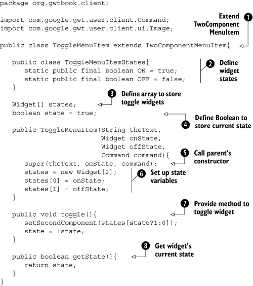
For the ToggleMenuItem, you’re extending the TwoComponentMenuItem; you say so in the definition of the class . Through the inheritance hierarchy, this widget inherits MenuItem and can be used anywhere a MenuItem could.
The second component of this widget is one of two different widgets (in the Dashboard you use Images), which you hold in the array of Widgets you create at . To determine which widget you’ll show by default, you set the state value of this ToggleMenuItem widget to be true .
Creating the widget is performed by the constructor, which first calls the parent constructor to ensure that this ToggleMenuItem will act in a similar manner to a TwoComponentMenuItem and sets the second component as the image representing the first state. It then creates an array and stores the two Widgets passed in as parameters as the alternative two states’ widgets .
We’ve talked a little about states in this widget, and at you define an inner class that contains the available states (ON and OFF). Toggling the state of the menu item is performed through the toggle() method , which it’s expected will be called by the user’s code. This method sets the second component of the ToggleMenuItem widget to be the widget representing the state you’re currently not in, and then it changes the internal representation of the state. You return the current state of the widget by calling the getState() method defined at .
You could continue the hierarchy of MenuItems, building many different types if you wished (to build the menu items you’re familiar with from desktop applications), but we’ll leave it with these two. With this class developed, you now have the set of basic widgets that you need to develop the Dashboard example; but we still need to look at panels and events.
That concludes the first part of the journey through the GWT basics, covering widgets. You’ve seen that GWT provides quite a few standard widgets; but where the functionality you need isn’t present, then it’s relatively simple to create your own widgets. You can do this either by starting from scratch or by extending an existing widget (if you need more complicated functionality, which is better implemented as two or more simple widgets put together, then you should consider composite widgets, which are discussed in chapter 7).
The fact that widgets have two alternative views, the Java object and the DOM representation, can be a little strange at first. However, 99 percent of the time you only have to consider the Java object view. One of the few times you need to think of the widget in its DOM view is if you’re creating new widgets. It can be dangerous to rely on the DOM view of the widget, because there is no guarantee that future versions of GWT will use the same DOM construct for a particular widget.
In the second half of the chapter, you constructed three widgets that will be used in the running Dashboard application—the PNGImage together with the TwoComponentMenuItem and ToggleMenuItem—and we discussed how they’re created. To keep going with the Dashboard, we next need to look at how you visually arrange widgets in the application. You’ll do that in chapter 5 by using panels.