
CHAPTER 6
Navigation and Interfaces
Designing navigation refers to guiding players through the game, including how to adjust sound, graphics and animation, special attributes for the avatar (including the name), saving games, tutorials, and so on.
Whether the game is designed for play on home computers or a playback system like the Wii or handheld devices, players need to have the ability to adjust gameplay and personalize aspects of the game, such as adding their name, choosing avatars, and selecting customizable color palettes or even textures for the backgrounds.
For players who have slower computers, navigation screens can also provide ways to adjust how fast or slow the game can run so they may optimize performance.
The player interacts with the game through a series of interfaces: clickable menus or other elements such as inventory, points, maps, and so on.
In addition, in this chapter, we'll review methods for testing games and see exactly when testing should start and its incredible importance to the overall success of the project.
- Guides for the player
- Interface design
- Testing!
Guides for the Player
For the most part, guiding players through games is fairly standard, and for good reason. If navigation screens are too unique or unusual, most players won't stick around to figure them out. These screens, such as the splash screen and main menu, are an integral part of any game design. Players purposely look for these screens to help them get started.
You need to take care to figure out how much information and how many interactive elements to add to each screen. Some screens carry a great deal of information (how much usually depends on the complexity of the game) or are broken into sequences of screens. Some are extremely simple and filled with eye candy. One thing is true for almost all games: these screens are the first thing any player interacts with when starting a new game. When coming up with the look for the splash (or title) screen, you should not only provide a good visual that communicates the look and feel of the project, but also entice the player and make it easy for them to get right into the game (finding what buttons to push, and so on).
Use words, colors, and graphics that appeal to your audience. If the game is designed for little children, then select bright colors, use text that's easy to see and read, and consider having animations that actually jump up and down and point at things the child needs to interact with in order to play the game. Be careful of cluttering screens for children's games. It's tempting to fill them with all kinds of cute things, but if your goal is to entice the child and let them run the game, then they need to see clearly what they have to interact with.
Languages
All the screens for the game need to be checked for typos, and the complexity of the words and grammar should align with your audience. If your game needs to be translated into other languages, use a professional service. Copying and pasting text from a free online translation site will yield iffy results.
MOST COMMONLY USED LANGUAGES
According to the Summer Institute of Linguistics (SIL)'s 2009 census, the most common languages in the world are
- Chinese (Mandarin)—1,213 million speakers
- Spanish—329 million speakers
- English—328 million speakers
- Arabic—221 million speakers
These numbers are based on the numbers of people in the world who speak the languages. Significantly more people speak Chinese than speak any other language. The languages listed for numbers 2, 3, and 4 change from time to time, as the populations adjust and census methods vary, to include Hindi, Bengali, Portuguese, Russian, and Japanese. Although there are more Chinese speakers, the English language is the most widespread.
Although deciding the languages into which a game will be translated generally falls to the publisher, the game maker needs to know if the game will be translated for the following reasons:
- Space for areas that hold text may need to be enlarged.
- Colors may need to be adjusted due to cultural influence.
- Characters or environments may need to be designed and then swapped out to make the game more appealing to other audiences.
Usually, games are translated into other languages after their completion; however, the game makers are often brought into the loop during this phase because areas on the screens sometimes need to be made larger to accommodate more text, or colors need to be adjusted. Although certain colors were selected during the initial design phase, swapping those out for colors that are more appropriate for players from other cultures is often part of the process.
Everything Needs to Be Tested!
As you work on the navigation screens, you should also be preparing for testing None of the planning will let you know if your game is going to be successful or not, until the game gets to the testing phase. (See “Testing!” later in this chapter for more information about this important phase of game design.)
Consider the design for a car. On paper, it looks fantastic—the concept art shows it be the coolest vehicle ever to roll over the face of the Earth. But if a driver gets behind the wheel and discovers that the car drives terribly or not at all, then it's a failure. Keep this analogy in mind as you design anything for a game. Designing a cool car that also drives like a dream (that's the gameplay!) is your goal.
Launch Icons
Whether you're launching the game on your home computer, handheld device, or playback system such as PlayStation or Wii, the game needs to have some type of icon or shortcut to click to start it. For home computers, those graphics tend to be 256 × 256 pixels; so whatever the graphic is, it needs to be clear and easy to read at such a small size. Various playback systems and gaming portals specify sizes they require, and they can be as tiny as 32 × 32 pixels.
Games come with desktop icons that can be used to launch the game. The player can easily see these unique icons on the desktop or user interface for console games.
Programs such as iConvert, IcoFx and LiquidIcon allow you to make your own customized icons on your home computer. You can also use Windows 7, which has features to let you make customizable icons.
To create a launch icon:
- Create the graphic at 32 × 32 pixels.
- Save to your desktop as a .png.
- Change the file extension to .ico.
Launch!
When you launch a game, most designers feature an intro screen, which can be the splash art, title screen, startup screen, loading screen, or any combination of those. This screen usually includes a button that players can click to proceed to the main menu (alternately, they can click anywhere, and the game will proceed). Some designers also add some of the elements that are associated with the main menu (see the section “Main Menu”).
To get to this first screen, players need to click a launch button. For players with home computers, the launch button appears as an icon, generally on the desktop. Figure 6.1 shows a close-up of what a launch icon typically looks like on a computer desktop. This icon launches the game Apparitions: The Haunting of the Red Reef Inn. The logo is used through the game and its marketing, making it easy to spot on the desktop.

FIGURE 6.1 Launch icons are unique to any game or software program.
Interface Design
Game makers continue to improve graphics, animation, sound, and gameplay in an effort to engage the player more and more. Getting players involved in a game is almost like drawing them into a movie or TV show, but games are set apart in a few distinct ways. Whereas a film or TV show is a linear experience, pulling the viewer along from scene to scene, games can be nonlinear, and they also allow the gamer to interact with events in the game.
There are a few different forms of interactivity:
User-to-technology interactivity This type of interactivity can occur when someone accesses a website like an online dictionary. You can type in a word, and the website returns information to you.
Player-to-technology interactivity This is the type of interaction generally found in a game, where the player can pick up an object or turn something on that affects the gameplay.
Player-to-player interactivity Social games and massively multiplayer online games (MMOGs) offer this type of interactivity, where players can interact with each other in game.
The ability of the player to interact with a game occurs through interactive screens. These screens, known as interfaces or the user interface (UI), tend to fall under two main categories:
Dispensing information These tend to tell the player things such as how much money they have, how much life they have left, and so on.
Allowing for action These aspects of a screen allow the player to do something in the game such as pick up an object, fire a weapon, jump, and so on.
EARLY IDEAS ON INTERFACES
In 1945, Vannevar Bush, a scientist at MIT, wrote an article titled “As We May Think.” In it, he proposed a method for making data more accessible on microfilm using hyperlinks. This was the first thinking that helped develop Uls.
GUI and HUD
One common type of interface is a graphical user interface (GUI). In other words, you can see and then click something. In contrast, with a command-line interface (CLI) like the one you encountered in Colossal Cave Adventure in Chapter 2, “Gameplay Styles,” you type in commands. The GUI and CLI are both examples of UIs.
The GUI is often referred to conversationally as the “gooey”.
The HUD is the heads-up display. The term comes from a type of display that was created for fighter pilots: they were able to see critical information displayed as transparent images on the visors of their helmets or windshields so they could access that information and also maintain visual contact with what was in the area. This let pilots keep their heads up instead of having to look down at controls in the cockpit.
Many HUDs in games are designed to appear as part of the game world. For example, in a racing game, the player sees dials that could be part of a car's dashboard.
For gamers, HUDs can appear as pop-ups in the center of the screen or off to one side. This allows them to quickly see the information without losing sight of what they're doing in the game. The HUD in a game can also be part of the toolbar or any other display that is kept up during play. HUDs typically show the health of the character, points accumulated, time elapsed or a clock, weapons and ammunition, and so on.
An interface can be active or passive. Active means the player interacts wit it, and passive is usually a HUD like a map.
Important Aspects of the UI
The look and feel of the UI need to match the look and feel of the game.
The most relevant information needs to be provided to the player with as few button presses as possible. If this interface is too complicated, it can clutter up the playing field and cause the player frustration. Nothing is more annoying than being involved in a big battle, or coming to the conclusion of a fast-paced race, and not being able to find the right button to push to complete the actions.
Games can combine elements that are part of the game world (diegetic) or not (non-diegetic), as they suit the needs of the game. The goal is to keep the UI simple, yet match the look and feel of the world while also being functional. Don't have buttons on the interface just because they look cool. If they don't have a function, don't clutter real estate with them.
In the game Apparitions: The Haunting of the Red Reef Inn, interfaces are on all screens during gameplay. This is typical so that players can interact with the game, access other features such as the Options menu, or exit.
Figure 6.2 shows an interior in the game where the player—in this case, a ghost hunter—is studying an abandoned spiral staircase. Along the bottom, the toolbar has several buttons that can be clicked.
Figure 6.3 is also from the game Apparitions. A critical component of game-play is being able to review data that the player (the ghost hunter) has captured while investigating the hotel. This interface is a bit more complex and has many buttons that can be pushed to capture photos, audio clips, and video; view the past history of the hotel; and submit findings to the Ghost Hunters (SyFy Channel), Jason Hawes and Grant Wilson.
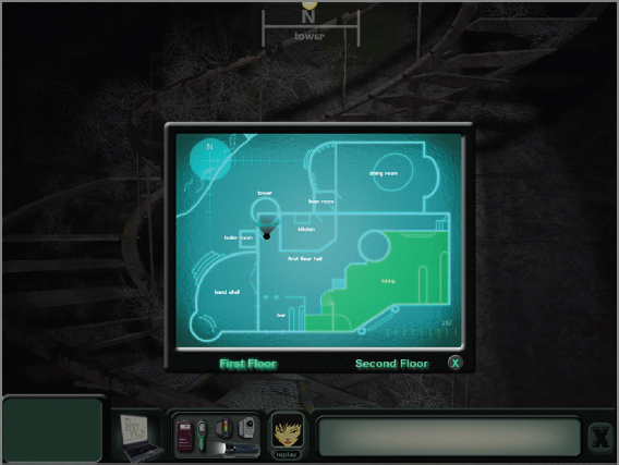
FIGURE 6.2 This toolbar from Apparitions is a non-diegetic example of a UI. One of the buttons on the toolbar brings a map forward full screen: the player can click this type of HUD to navigate to other areas of the hotel where the game takes place.
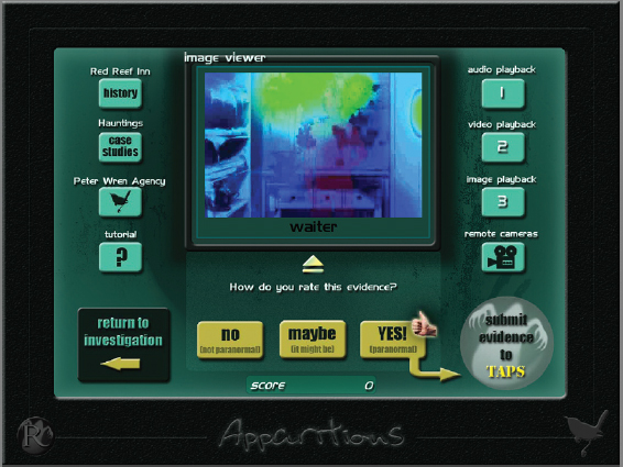
FIGURE 6.3 Clicking the open laptop on the toolbar displays a new screen that is all interface. This is where players can play back and review data they have collected. Looks like they captured something!
Spatial Relationships
There are a number of ways to classify interface types. For example, interfaces can be diegetic or not non-diegetic:
Diegetic interface This unique interface is incorporated in the world in which the gamer is playing. As the player moves around the world, they may encounter things to interact with, in the environment or on the character, and these are diegetic. This type of interface lets players immerse themselves more fully in the world of the game they're playing.
Non-diegetic interface This is the most common type of interface players encounter in games. The interface is seen and heard by the player, but it isn't part of the game world. For example, in a racing game, the player may see a steering wheel or speedometer on the screen that shows what is happening to them and their vehicle in the race, but the display isn't part of the actual race going on in the game world. A HUD is an example of a non-diegetic interface.
Figure 6.4 shows a terrific example of a diegetic interface from the survival game Dead Space 2, which is a third-person shooter. The game, developed by Visceral Games and published by Electronic Arts (EA), doesn't use any HUDs at all.
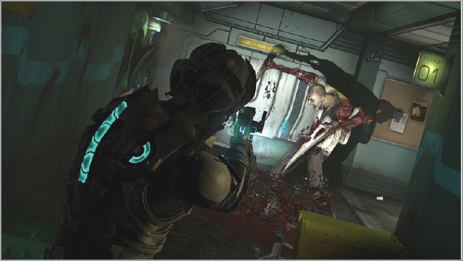
FIGURE 6.4 In Dead Space 2, you can see the player in the foreground wearing his unique suit. The dashed blue bar down the back indicates health, and the circular one on the right shoulder indicates the stasis meter.
Working with spatial elements can alter the gameplayer's experience:
Spatial elements Objects may appear in the game world that aren't part of the action designed to help the gamer understand what is happening. For example, an object the player needs to interact with might glow or jump, drawing the player's attention to it. These elements appear in perspective, matching that of the environment.
Meta elements These objects may appear during gameplay, but they don't match the perspective or the world. For example, in some games, when a character is shot, blood splatters appear on the screen as if someone flicked them onto the monitor from inside the computer to indicate that damage has been inflicted.
Interfaces can also be classified as manual or visual:
- Manual interfaces usually involve the hardware used to connect with the technology, such as a keyboard, game controller, or footpad.
- Visual interfaces that the designer works on involve the creation of graphics, animation, audio, and special effects that appear on screen.
Different Types of Screens
Once launched, games usually provide the following screens, and generally in this order:
- Licenses (EULA)
- Splash (or title) screens
- Loading
- Main menu
- Instructions (also called the tutorial)
- Options
- Toolbar
- High scores
- Credits
- Exit
Any type of interface created for the gamer to use needs to be functional and easy to use and should, whenever possible, match the look and feel of the game.
Licenses
The end-user license agreement (EULA) is a document provided with any game that tells you who owns the copyright and what rights or permissions the buyer has. The EULA may be the first thing presented to the player or can come after the startup screens.
The game designer is usually tasked with creating an interface in which the player can read the information provided in the EULA and then click to accept it or decline (in which case the game usually shuts off). Even though this can be fairly dry reading, it's still a legal document, so all of the information needs to be easy to read; however, most designers create an interface that matches the look and feel of the game.
Splash Art
One of the most fun types of screens to design for a game is the splash art. This screen can often become the signature look for the product. It may be used on the homepage of a website designed to support the game and is often used on the box art (or a variation of it, depending on the shape of the box).
Splash or title screens can be static or include clickable items or movies. Instructions may be static or movies, too.
Figure 6.5 shows a fun, simple launch screen that is also the splash art for the game Findola. This is an amusing, fast-paced game in which the goal is to match tiles on a game board and rack up points as quickly as possible before hazards begin to get in the way, such as ice that forms on some tiles and blocks the possibility of making a match.
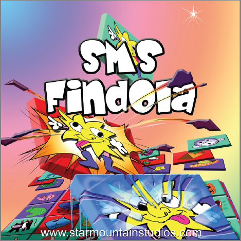
FIGURE 6.5 The art on this splash screen, with its dynamic imagery and bright colors, communicates to the player that the game is lighthearted and fast-paced.
Figure 6.6 shows an example of another launch screen, designed for the game Frozen, which clearly shows that the gameplay takes place in a snowy environment—in this case, Antarctica. The page also includes instructions for purchasing and registering the game, an Exit button, and the splash art for the game (at lower left).
The designer for Frozen chose to include more information on the launch screen because the game is more complex than Findola. Frozen also has more options for gameplay variations than Findola, as well as a backstory that can be accessed during play.
As you play more games and consider their design, you'll discover that these screens (interfaces) can have many different combinations of sign-in features, options, features, art, animation, and so on. The designer's job is to provide screens that help guide the player through the process of learning how to use the game, or customize the game and still keep its look intact through the selection of art and animation.
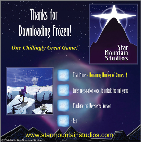
FIGURE 6.6 The launch screen for Frozen provides more detail, including the splash art and a link to the company website.
Keep in mind that no matter what information you as the designer feel a screen should have, the player must be able to use it.
Loading Screens
Loading screens are fairly typical for most games and usually feature some type of animated graphic indicating that the player needs to wait for a few moments while the game loads.
This graphic can be in the form of a bar moving across the screen or a simple animation indicating that the load has started.
Even if a game is already installed on your computer, your machine needs a few moments to access any stored information that is required. The animation lets the player know how much longer they need to wait for their game to load; in the case of long loads, the animation also lets them know that their computer hasn't crashed.
In Frozen, once the player chooses which option they want from the launch screen, the full-screen splash art comes up next with an animated graphic of ice cubes along the bottom, indicating the game is loading. For this design, the splash art is also the loading screen. You can view this loading screen for free, by accessing the game at www.starmountainstudios.com.
For standalone loading screens, the designer can create a simple animation that lets the player know the game is loading. You may want to consider adding an animation here because it acts as a type of timer, indicating how quickly things are loading, and also lets the player know (if they have to wait a few minutes) that their machine hasn't frozen. In Star Mountain's game Kotsmine Hills, shown in Figure 6.7, a standalone screen with animation reflects the look and feel of the game: it's a spooky but fun hidden object game (HOG) in which players hunt for objects and clues to unmask a mysterious killer lurking in the town.

FIGURE 6.7 In this loading screen for the game Kotsmine Hills, a spotlight plays from left to right across a series of tombstones that spells loading.
Loading screens are fun to make, but be careful not to use too much animation. The more animation you place in the game, the larger the file gets. For games that must be downloaded, files that are too large are prohibitive.
Main Menu
The majority of games, after they launch, take the player to a main menu. This screen usually has art associated with the look of the game and lets the player change modes and adjust settings that affect the look or performance. This menu typically contains all or some of the following:
Choose or create player name Players enter their name or an alias they will play under.
Continue or change player If more than one player is saved to the game, the player selects the appropriate player.
Log in You may need to provide your login name along with a password. Passwords are generally required for online gameplay in the larger MMOGs like World of Warcraft. Designers may choose to provide them with any game, so that players who share a computer with others can protect any aspects of their customized game from being deleted.
Exit Sometimes you launch a game and then decide not play, so the designer may provide an Exit button with the launch screen.
Splash art In splash art, designers use art, assets, and the color palette, textures, and logos to brand the game. This art is often also used in marketing or for the box or website related to the game.
ESRB R If a game has gone through the ESRB ratings process, you'll generally see the rating here. (For more information on ESRB ratings, see Chapter 2.)
Other The launch screen may also display other features such as the official website address (often clickable), fansites, and links to reviews or other clickable locations.
Figure 6.8 is an example of a main menu from the game Frozen.
This menu offers the player the option of which type of gameplay they wish to experience. After that selection is made, they have access to more menus they can use to adjust the game's performance, look, and other elements. Because each unique game option has specific attributes, one main menu for all would be too complicated and cluttered. The menu shown in Figure 6.8 also lets the player see the avatar for the game, Samantha Bloodworth, and her trusty sidekick, a little robot named PEDRO.

FIGURE 6.8 In this example of a main menu, the player is provided with information about how to play the game before they choose a gameplay mode.
Figure 6.9 shows another main menu example. This is a casual HOG. The main menu gives access to certain features such as selecting the player, a clickable link to the designers (Star Mountain Studios), the Options button, and of course Play! The name of the game, Kotsmine Hills, is etched into the tombstone, giving the player a pretty good indication that this game will be a bit spooky—albeit spooky fun.
The main menu is an important center point for the designer to work with. Like good web pages, main menus should make features easy to see and understand and contain graphics and/or animation that help brand the game. The moment any navigation screen—especially the main menu—becomes so complicated that the player can't understand how to use it, your game is likely to be discarded.
If reviewers include a graphic from a game, they often choose the main menu because it provides the look of the game and additional information.
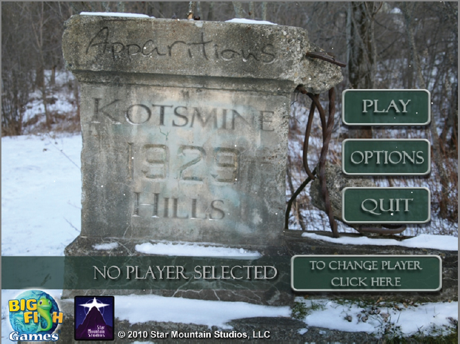
FIGURE 6.9 In this example of a main menu, the spooky look and feel of the game are clearly evident from the snowy tombstone behind the buttons that access different aspects of the game.
Instructions
Providing instructions for gameplay can be a slightly tricky undertaking. As discussed previously, part of the fun of a game is figuring it out. Designers need to make gameplay clear without boring the player with too much detail.
At this stage of game development, the genre and demographic should be fairly well established, so begin by putting yourself in the shoes of your target player. Try to anticipate players' needs and questions.
Instructions can come in the form of tutorials at the beginning of the game. They can be either static images with words describing what the player needs to do or movies explaining how to play. These tutorials can also be interactive. For example, at the beginning of a game, players may be allowed to play through part of a level, with help; their performance won't affect the final score they achieve for the game as long as they're in the tutorial mode.
Weird Helmet has a specific look, showing lots of weathered metal but bright colors. That look was carried through all the tutorial screens to not only provide the player with important information, but also keep them immersed in the look and feel of the game. The goal of the game is to get an avatar from the door on the left to the door on the right by turning tiles to make a path for the fast-running character. Players have the option to run a tutorial explaining how to play the game. The first screen of that tutorial is shown in Figure 6.10.
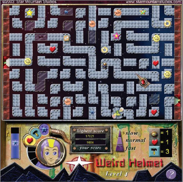
FIGURE 6.10 The first screen of the Weird Helmet tutorial shows the gameboard filled with all the possible powerups and hazards that can appear during play.
The tutorial continues with directions, as shown in Figure 6.11. These are text based and include images to help the player understand the toolbar and powerups.
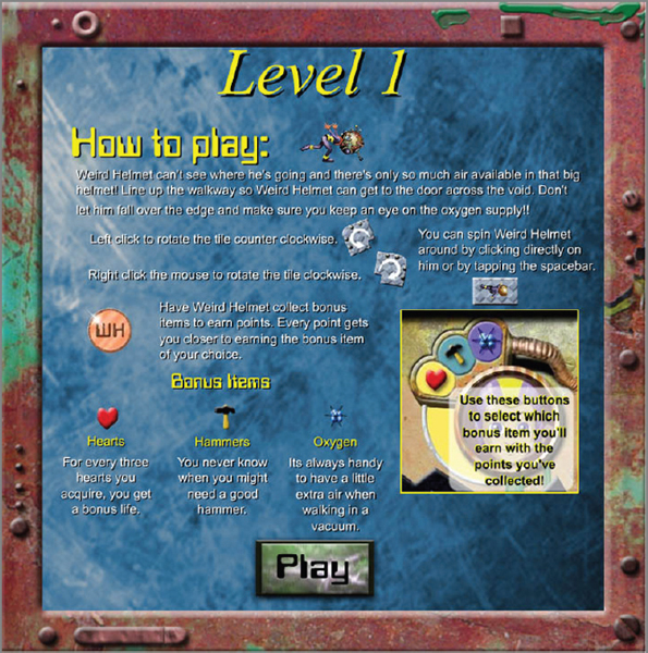
FIGURE 6.11 After seeing what the gameboard looks like, the tutorial continues with specific information about how the powerups and certain parts of the toolbar work.
At any time during gameplay, the player can click the Options button on the toolbar and access a Help screen to review the instructions (as shown in Figure 6.12). These tutorial screens also appear at the beginning of the game for first-time players, right after the EULA is agreed to, although the player can opt not to run them.
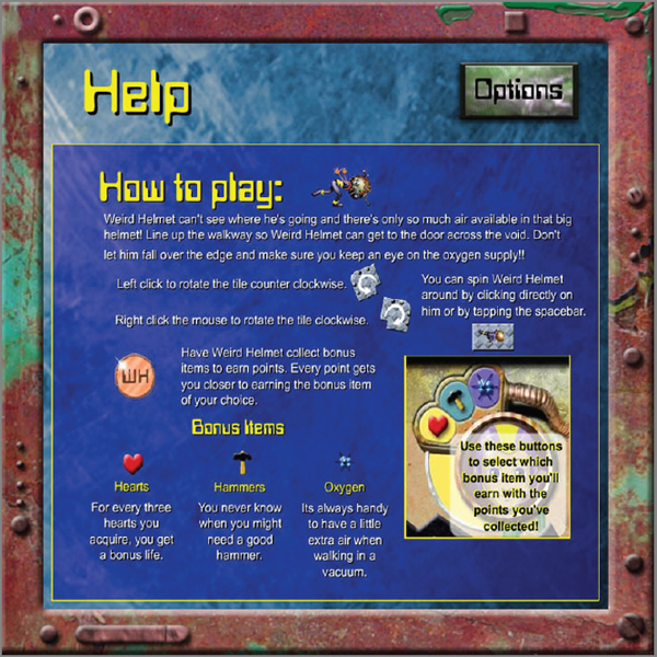
FIGURE 6.12 The Help screen from Weird Helmet
Options
Players can change the volume, turn off music and leave dialogue, or reduce ambient sounds and decrease but not turn off the music or dialogue.
Options screens for games can include the following:
- Adjust sound
- Adjust playing speeds to help performance for slower machines
- Adjust performance
- Restart or reset the game
- Change playing modes
- Change players
- Access other levels that may be saved and are in progress, or start a new level
- Access websites associated with the game
- Access the tutorial
- Exit
Typically, performance is adjusted by modifying levels of graphics detail such as overall screen dimensions, texture detail, particle effects (often used for weather), and anti-aliasing.
Figure 6.13 shows us the options screen from the game Frozen. Notice how it ties in with the look of the splash art and main menu. (The logo for Star Mountain, is actually just the star and the mountain; however, the designer added snow to the logo to stay with the look and feel of the game.)
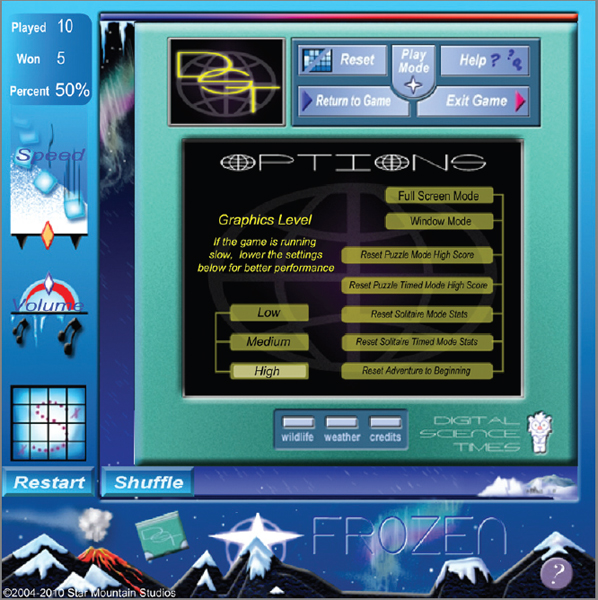
FIGURE 6.13 Options screens usually allow the player to adjust sound and graphics and reset game modes.
This options screen also has a few other fun features such as the ability to check the weather in Antarctica and view screens that contain information about wildlife. None of these features affect gameplay. The designers included them to allow players of this casual game to immerse themselves a bit more in the game's world.
Many buttons and tools that are built into games but aren't used on a regular basis, such as adjusting sound or gameplay or resetting things, tend to be relegated to the options screen. This way, they don't clutter the playing area and use up precious game real estate.
The term real estate describes the physical visual area designers have to work with.
Toolbar
The toolbar is a navigation aid that can appear as soon as gameplay starts and remains in place as long as the game is open. Designers may provide an option for players, usually a keyboard shortcut such as Alt+Z, to hide the toolbar until the same shortcut is pressed again.
Allowing players to hide the toolbar helps reduce clutter for those who like to take screenshots during gameplay.
Toolbars usually contain general inventory items that are needed quickly and often during gameplay, such as weapons, equipment (for example, different golf clubs for a golfing game or a variety of weapons for a shooter), powerups, maps, and saved items (such as objects collected in a hidden object game or adventure game).
Most toolbars contain the following features:
Inventory This can include items picked up and carried during gameplay or elements to help the player get started. For example, if you're playing a game where you need to enter a mine and gather specific ores, the inventory might contain a pick for you to use.
Options Clicking this takes the player to the options screen.
Help If a player gets stuck, clicking this button on the toolbar should take them to a screen with suggestions. The help screen is often set up in a Frequently Asked Questions format.
The Help button is often in the toolbar, but it may be anywhere on the gameboard.
Exit If the player wants to leave the game, they click this. In some games, when you click Exit, another pane or a pop-up window asks if you really want to leave, and gives you the options Yes and No; or you may be asked if you want to save the game.
Figure 6.14 shows a toolbar from the game Apparitions: The Haunting of the Red Reef Inn. The features are labeled for you. At far left, the player can access a map that lets them click any other site on the gameboard and be transported there.
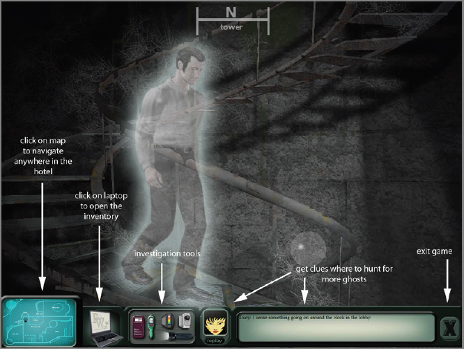
FIGURE 6.14 Most toolbars are oriented across the bottom. It's natural for the player to focus on the game and then glance down to access different tools.
Most toolbars are oriented along the bottom of the visual screen. However, they can be placed anywhere as long they remain functional and don't impede play.
Because the inventory of things collected in this game is extensive (it's a ghost-hunting game in which the goal is to gather as much evidence as possible and determine whether the observed phenomenon is paranormal), there is a separate set of menus for those items. As stated earlier, toolbars often contain inventory items that are needed frequently and quickly, so investigative tools such as cameras and flashlight are included here. In addition, there is an in-game help feature in the form of a character named Lucy. Click her icon, and she will type out a message suggesting good places to hunt. At far right is an Exit button.
Toolbars, like all the screens discussed so far, are unique elements that designers create to help the player move around the game. They provide methods for adjusting gameplay.
Study toolbars for various games that have different gameplay styles, to see the most prominent elements. Odds are, the more action-packed the game, the more prominent tools or weapons. In slower adventure or hidden object games (HOGs), the collected inventory can become more important and prominent.
Scores
Some gamers just like to open a game and wander about, poking at this or that and having fun with the graphics, animation, and so on. It's safe to say, though, that the majority of gamers are more competitive, and that means providing a system to show scores. Most scores appear on the toolbar or in their own area on or next to the gameboard.
Many games allow players to post their scores online. This lets players not only to try to beat the game, but also try to outdo other players.
Scores can use any type of denomination that fits your game. They don't have to be sequential numbers. For example, sports games such as tennis and football use sports scoring, which may award more points for a more challenging play. In football, a touchdown is worth more points than a field goal, and so on.
Other scoring methods can be how much gold or how many gems or other objects the player gathers during play. Scores can also include the number of extra lives acquired, quests completed, levels bested, and so on. Basically, any type of measurement can be used to tally a score. Don't be afraid to be creative or unique when it comes to how your gamer can tally scores (maybe they collect golden apples, beating hearts, or live squirrels), but do be clear and understandable.
Exit
Exit features, as part of navigation, might seem to be a no-brainer; however, you need to make good decisions about their design. If you place the exit feature in an awkward area or use a poor design, you may cause some players to click the button accidentally and exit before they want to. This leads to player frustration and, quite likely, the player tossing your game.
Pop-ups
You may want to include pop-ups from time to time. These can be little messages that pop onto the screen with help, advice, timers, clues, rewards—all types of additional messages that haven't been directly covered in the categories so far.
Pop-ups usually contain information that is important only at certain times. Using real estate on the toolbar or playing field for this information is a waste of space.
They can pop up over the playing field, temporarily pausing the gameplay without the player risking any losses. Again, these are assets that can add to the game's final file size. Although they don't increase the size a great deal, you should still use them sparingly.
Many players find too many pop-ups annoying.
Sharkbites is a fast-paced version of hangman. If the player fails to select the correct letters used in the game (they have 10 tries, as indicated by the number of steps on the gangplank), then they plop into the water and get eaten by the trio of hungry sharks. If that happens, a pop-up appears on screen, encouraging the player to try again and avoid those pesky sharks. Figure 6.15 shows a pop-up that appears when the player wins. This pop-up covers real estate that would normally be used in gameplay, but only while the game is paused as part of the reward for the player. After it disappears, the next round begins.
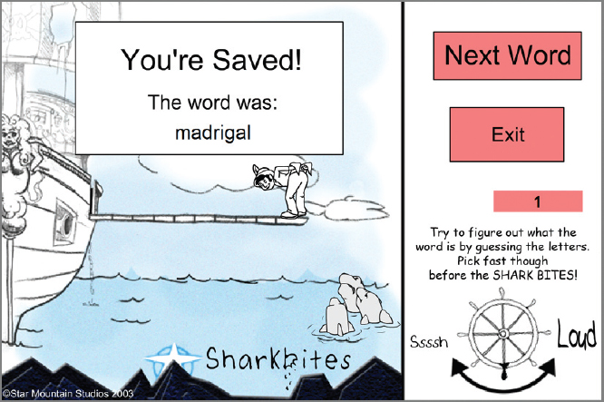
FIGURE 6.15 In this pop-up from the game Sharkbites, the player has won the round. The pop-up stays on screen for just a few seconds while the game is paused.
As you've seen so far, you can design several types of interfaces to aid the player during the game. For the most part, they epitomize the look of the game and offer clickable areas to access other menus or locations to travel to.
Testing!
Now that you've had a chance to look at how navigation and the user interface are created, and all the text, graphics, animation, and interactive elements used in the process, testing becomes paramount. Any game should go through a substantial amount of testing. Many pieces go into a game, and any designer or group of designers can only anticipate so much. Testing will indicate if something is broken, doesn't work the way it should, or is too complicated or confusing. For example, navigation systems in games are tested extensively.
Games generally require a great deal of time and, often, money, to create. It would be foolish for any designer to invest so much in the creation of a game and then release it with mistakes or bad gameplay, when those things can be caught during testing.
Departments in gaming companies that test games are generally referred to as Quality Assurance and Software Testing (QA). Testing tends to fall under two major approaches to gathering data:
Qualitative Testing gauges emotional responses and reactions to the game. This information is generally gathered by observing players or asking them questions related to likes and dislikes related to gameplay.
Quantitative Testing records hard data such as number of wins, number of deaths, amount of money won, and so on.
The more testing you can do, the more useful the information is to the designer. Many companies contract testing to third-party companies that can be more objective about gathering and analyzing data.
When selecting participants, try to find subjects who fit into the demographic the game was designed for. Lots of feedback is an essential part of game design. This process tends to discourage new designers, but seasoned creators know that this invaluable information can help refine their hard work. Embrace the information that testing provides, and then test some more.
In this chapter, we examined how navigation refers to physically finding your way around environments as well as finding your way around how the game is played. Good navigation design requires an appreciation for logic and creating art and animation that fit the game's look and feel.
Navigation screens designed to help guide the player are often the first things the player interacts with when playing a new game, so they need to be useful, be attractive, make sense, and be fun.
Methods for navigating through the space created in a game will continue to develop as technology changes. We have seen this spatial aspect change dramatically from low-end 2D games to the more modern, high-end 3D games. As spatial design becomes more complex, with overlapping elements in highly immersive environments, providing guidance systems and maps for the player is opening up areas for designers of those types of interfaces.
Along with controllers, a keyboard, and a mouse to help move around in these worlds, companies are exploring the possibility of upping the experience by having the player interact with the world as much as possible. Some companies are experimenting with head-tracking systems, where the game can track what you're looking at and move the avatar in that direction.
Game systems like the Wii provide such direction interaction that movement in the worlds designed for that system let the player physically move and create actions and reactions within games such as bowling, baseball, and fishing.
Technological changes will continue to affect the design and creation of games. Over the past few decades, technology has dramatically changed the look and feel of games. The logic behind interacting with them remains fairly consistent, so the challenge is to keep refining these interfaces to match the ever-improving technology.
ADDITIONAL EXERCISES
- Review at least five different games, and compare the splash art for each one. What similarities do you find? What are the differences? Does the look and feel imparted by these splash screens tell you what the game is going to be like? Do any of them appear to be badly designed and confusing? If yes, what poor design elements do you see?
- Have you ever found a bug in a game? This happens quite a lot. If you do find a bug, write up a report answering the following questions:
- What were you doing when you found the bug?
- Where in the game were you (physical location)?
- Did you try to do the same thing to see if the bug would repeat (if yes, note that)?
After you write up your report, contact the company that made the game and send it to see what sort of response you get (reputable companies are usually grateful to have such bugs reported and are often quick to fix the problem).
- True or false. QA stands for quick and accurate.
- HUD stands for __________________.
- Honor under duress
- Heads-up display
- Homing utility device
- Help user detail
- True or false. A diegetic UI displays clickable buttons outside the gameplay area.
- True or false. Linear games focus on encouraging players to follow narrow story lines.
- What is the EULA?
- End Users License Agreement
- Equal Use Loading Aid
- Easy Use Learning Application
- Extension Upper Layer Addendum