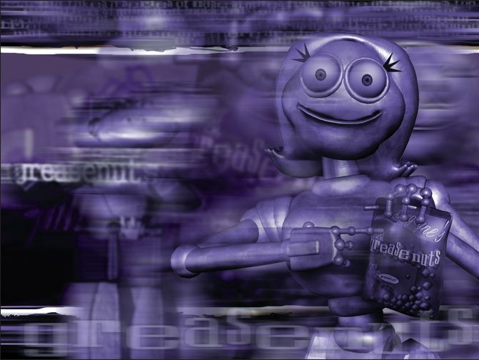
tv case studies: looking behind the scenes at the creation of network idents and commercials
by Marcia Kuperberg
by Marcia Kuperberg
TV case studies: looking behind the scenes at the creation of network idents and commercials
INTRODUCTION
Television is so much a part of our daily lives, it’s hard to imagine life without it. Consider this: the average person in Britain watches over 25 hours of television per week* and in the USA, over 26 hours**. By age 65, that adds up to nearly nine solid years glued in front of the tube! We’re entertained by TV; we’re informed by TV and we’re persuaded by what we see on it. In other words, TV represents mega bucks and has a major influence on our lives.
In recent years we’ve seen huge changes in television: the advent of digital T V, new styles of viewing such as hard disk recording with instant playback, Internet T V, pay per view of specialist programmes or films via satellite or cable, and last but certainly not least, an extraordinary proliferation of channels and networks – offering a huge range of programmes that cater to our every whim and interest.
How to find your way through the jungle of such choice? Enter the advertising agencies, design studios, and production houses whose job it is to help you find your way to their network, their programme or their product.
In this chapter you get a chance to look behind the enticing imagery that may catch your eye on TV and lead you consciously into an evening’s viewing entertainment or, perhaps unconsciously, towards buying a particular product.
Four top creatives from two major production companies (3 Ring Circus based in LA, USA and FrameStore CFC, in London, UK) explain the thinking behind their creative decisions and take you through the production processes involved in rebranding TV networks (3 Ring Circus) and making award-winning product commercials (FrameStore CFC).
To fully understand and appreciate the work you really do need to see the actual moving images. To do so, log onto www.guide2computeranimation.com
FrameStore CFC is the largest visual effects and animation company in Europe. Formed in 2001 through the union of FrameStore and The Computer Film Company, FrameStore CFC has over 30 years’ combined experience in digital film and video technology. The company has won numerous international awards, including two Technical Academy Awards from the Academy of Motion Picture Arts and Sciences, and eight Primetime Emmy Awards.

Through the long history of excellence in visual effects they have built up strong relationships with major studios and with individual film directors such as John Woo, Guillermo del Toro, Chris Columbus, Stanley Kubrick, Nick Park, Joel Coen, Neil Jordan and Tim Burton. The commercials department consistently produces award-winning work such as the breathtaking ‘Odyssey’, Jonathan Glazer’s latest contribution to the Levi’s campaign, and Daniel Kleinman’s spectacle, Chrysler ‘Golden Gate’. We look behind the scenes at the making of this and the Cingular Wireless commercials.
3 Ring Circus specializes in developing powerful brand identities for television networks and entertainment companies alike.

In the US, it has developed on-air identities for ABC, Fox Family, Showtime, A&E, Discovery Communications, The Travel Channel, Telemundo, and DIRECTV, to name a few. International clients include Sony Entertainment Television (India, Taiwan and Latin America), Telecine (Latin America), Mega Channel (Greece), RTL (Germany), Viasat (Scandinavia) and Astral Television Networks (Canada). Other companies that have looked to 3 Ring Circus to help shape the world of entertainment and emerging technologies today include Canal+, US Technologies, DES, Netscape, CreativePlanet.com, TechTV, Discovery Digital Networks, and MultiChoice-South Africa.
This multi-faceted company employs a range of strategic thinkers from design, animation and production disciplines, to research, marketing and promotion. 3 Ring Circus is also parent to 3 Ring Circus Films, an independent feature film company. In this chapter, we look at four of its recent major network rebranding projects.
TECHTV San Francisco, California, USA
by Creative Director/Director/Designer, Elaine Cantwell
ZDTV’s reincarnation as the technology network TechTV began with a re-evaluation of the entire network brand, the technology landscape and the competitive market.

Fig. 6.3 Elaine Cantwell a.k.a. ‘Fire Eater’.
The process of developing the visual interpretation of the brand position for the re-launch of TechTV was defined directly by the creative platform ‘Connectivity’: how and where the viewer used technology was the inspiration for the journey and context of the four network image spots.
Each spot explores the transformative effect of technology through visual and conceptual perspectives. The viewer is taken on a journey that clearly connects people, products and places through technology.

This tangible expression of the idea of ‘Connectivity’ is visually simple yet complex in tone and manner. Flat 2-dimensional people transform into full 3-dimensional live action through the touch of a button. Each moment of transformation becomes the catalyst for the next, connecting the dots until resolving finally, with the TechTV logo. The project comprised an entire network re-launch package, from logo development to an image campaign of four spots that all conveyed the message of ‘Connectivity’. ‘Connectivity’ was the common thread that carried through from the series of four 30-second image spots: ‘Communicate’, ‘Connect’, ‘Convenience’ and ‘Community’.
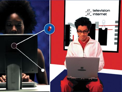
The post-production methodology was experimental in arriving at the most appropriate solution. Many options were explored before arriving at the conclusion of traditional rotoscoping as the most effective way to visualize the transformation from flat to real. Each 2-dimensional environment was created in 3D and expanded as the spot developed. The flat-to-live action transformation began with green screen footage of talent. Each shot was carefully planned and choreographed to anticipate the animated environment in which it would be placed. Each action was then minimized down to basic flat shapes in Henry while still maintaining the essence of fluid live-action motion. Combining both on Inferno completed the effect conveying all the magic of technology at work. The final composite on Henry brought each of the separate elements from Inferno, After Effects and 3D together culminating in a multimedia collage of people using technology in everyday situations.
The effects of interactivity both on the traditional platform of television and the Internet are visible within the TechTV relaunch. In communicating the landscape that technology exists within, the limitations and opportunities of both became the inspiration for the visual interpretation of the message. Connecting both heralds the future of technology as the vehicle that facilitates rather than limits enhanced communication across all boundaries.
Log on to www.guide2computeranimation.com to see the commercial.
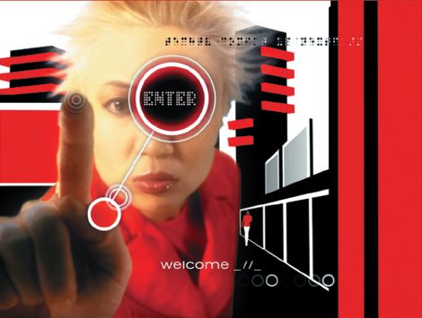
Figs 6.7 and 6.8 illustrate the theme of Community, whilst maintaining the common thread of Connectivity at the touch of a button.
Figs 6.4 and 6.5 directly express the idea of Connectivity, the common theme of these four network identity spots.
The minimal colour palette of red, black, white and blue was evocative of the ZDTV on-air identity and history, but expanded upon to include blue as an additional element in the TechTV visual language. Combined with the distinctive visual style, this defined the network in a distinctive and fresh manner evoking clear brand recognition in the very aggressive market of technology brands.
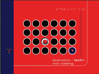
Fig. 6.9 and 6.10 Convenience is the theme portrayed here, one of the primary themes of the TechTV spots to rebrand this network.
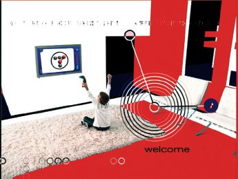
Fig. 6.11–6.13 below convey the theme of Communicate.
Spots of this nature must also carry through the promo elements of ‘lower thirds’, ‘promo opens’ and ‘closes’. This means that the TechTV identity remains visible but only occupies part of the screen, enabling other programme material to take precedence.
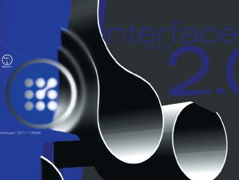
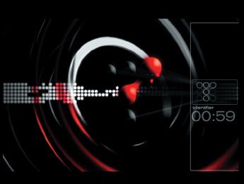
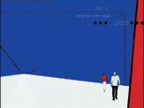
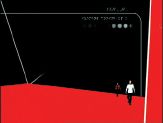
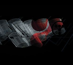
Fig. 6.16–6.18 show the character actions minimized to flat shapes using Quantel Henry. The end result transforms the action from these flat moving shapes to live action, placing the characters into a multimedia collage to convey the magic of technology at work.
The final composite was done on Henry, but intermediate stages used Discrete Inferno and Adobe After Effects in addition to 3D animation, the latter evident in figs 6.14, 6.15 and 6.18.
Credits:
3 Ring Circus for TechTV
Executive Producer: Anne White
Producer: Beth Elder
Creative Director/Director/ Designer: Elaine Cantwell
Off Line Editor: Jeremy Quayhackx
Director of Photography: Andrew Turman
Henry: Paul Geiger and John Ciampa, Ring of Fire
Post-House Producer: Casey Conroy, Ring of Fire
After Effects/Inferno/CG: Ring of Fire
Music Composer: Joel Beckerman, Man Made Music
MOVIEPIX Toronto, Ontario, Canada
by Creative Director/Director/Designer, Elaine Cantwell
The Moviepix personality was clearly defined through its brand attribute of ‘retro-hip’, communicating the nature of the programming content through the brand positioning of discovering ‘your favourite movies again or for the first time’.
The iconic element of the logo became the inspiration for the entire brand re-launch and creating a place that was recognizable as Moviepix. The simple three-dot element symbolically representing a film reel expanded to become ‘Reelworld’. This world established Moviepix as a tangible destination where you can be guaranteed the best in your favourite movies again and again. The three dots were the thread that carried consistency throughout the on-air package while allowing the individual characteristics of the brand personality to come through.
The project comprised of a series of hero ids, with genre ids developed to more strategically target the specific audience. Each id featured a series of film icons, shot in silhouetted style against green screen. By capturing signature icons – the international spy, the starlet, the action hero and the western hero – and actions associated with them, connected the breadth of the Moviepix programming base with the viewer in an emotional context. Each talent was then composited into the ‘Reelworld’ of Moviepix in After Effects. The environment of ‘Reelworld’ is entirely comprised of dots, drawing the viewer into the Moviepix experience. The dots were animated in After Effects beginning in the drama of a black world and filling with rich colour as the journey progressed.
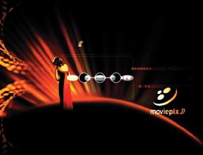
The logo resolve in each id was created in 3D to achieve the seamless transition from the Moviepix logo and its mother brand Astral Media, while still maintaining the simple graphic language of the network. The three-dot icon (fig. 6.19) was the common thread that appears as the cornerstone element of the network from Promo Opens, Endpages, Lower Thirds (see following pages) to forming the world for hero ids and feature leads for franchises such as Spotlight Presentation and Reel Premiere.
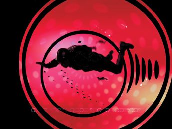
Fig. 6.22 The Action genre is portrayed primarily using reds and black.
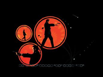
Fig. 6.23 Signature icons indicate breadth of programming content: shown here and fig. 6.24, international spy; figs 6.25 and 6.26, glamorous starlet.
The limited palette of black as the primary colour and the warm portion of the colour wheel – orange, red and yellow – provided a consistency of visual tone while allowing the separate genre characteristics to take on a personality of their own. The golden hues of the environment within the Glamour genre id were more in keeping with the character of the starlet and that era of movie-making. Red hues were chosen to support the more action-oriented id featuring the skydiver. This colour system can also be expanded over time as the Moviepix brand evolves. Maintaining the graphic world of the dots allows for flexibility in exploring other palettes while still belonging to the Moviepix brand.
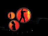
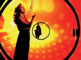
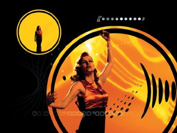
Figs 6.25 (left) and 6.26 (above) Glamour genre uses recognizable iconic figures and golden hues to target its audience.
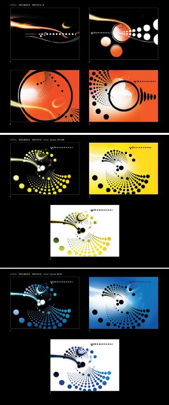
Figs 6.27–6.29 These three storyboard concepts were created by 3 Ring Circus for client, Astral TV network, the mother network for Moviepix.
Credits:
3 Ring Circus for Moviepix
Executive Producer: Lori Pate
Producer: Patty Kiley
Creative Director/Director/ Designer: Elaine Cantwell
Production Manager: Judy Tanke
Editor/Post-Production Supervisor: Jeremy Quayhackx
Director of Photography: Patrick Loungway
Colorist: Dave Hussey, Company 3
Animator: Josh Graham
3D Animator: Tory Mercer
Henry: John Eineigl, Complete Post
Henry: Bob Engelsiepen, View Studio
Music: Dave Baron, Baron & Baron
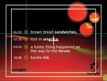
Fig. 6.30 A typical ‘endpage’ for the Moviepix network using a standard red toned background. The guidelines indicate correct positioning for the various elements that typically make up the screen.
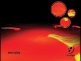
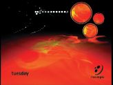
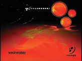

Fig. 6.35 is a ‘lower third’ matte. The black part of the screen allows programme content to show through, leaving the lower third white area (replaced on the TV screen by the graphics of fig. 6.36) which carries through the network id.

The network identity is carried through the various nights of the week by use of the themed colour backgrounds and the standard positioning of the elements as shown here in figs 6.31–6.36.
THE MOVIE NETWORK Toronto, Ontario, Canada
SUPER ÉCRAN Montreal, Quebec, Canada
by Creative Director/Director/Designer, Matthew Hall
The Movie Network is an English-based channel that delivers the best of Hollywood to their Canadian viewers and Super Écran offers a wide array of French and French-Canadian films. The network was in need of a complete overhaul that would make a big splash and help solidify it as the source for premier movies in Canada. To package the network, we developed an epic environment that captures the drama and spectacle of classic Hollywood.
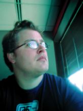
Fig. 6.37 Matthew Hall a.k.a. ‘High Diver’.
Credits:
3 Ring Circus for The Movie Network
Executive Producer: Lori Pate
Producer: Patty Kiley
Creative Director/Director/Designer: Matthew Hall
Production Manager: Judy Tanke
Editor/Post-Production
Supervisor: Jeremy Quayhackx
Director of Photography: Patrick Loungway
Colorist: Dave Hussey, Company 3
Animators: Matthew Hall, Tory Mercer, Josh Graham
CGI: Amalgamated Pixels
Flint: Dan Carrington, Milne fx
Henry: John Eineigl, Complete Post
Music: Mad Bus
The first step in repositioning The Movie Network as the source for premier movies in Canada began with a strategic analysis of the market and an internal audit of The Movie Network’s resources. This process helped to define the parameters that the creative must live within.
The second step was to develop conceptual platforms in written form that supported the overall brand strategy. These are broad-stroke concepts that form the backbone of network packages. In this step, the client is exposed to a wide range of ideas before beginning the process of visual development.
The conceptual platform for The Movie Network
Guidance. The Movie Network and Super Écran are virtual pipelines that link viewers to the world of cinema. The Movie Network and Super Écran deliver the latest releases from all the major studios around the world. ‘Guidance’ positions The Movie Network and Super Écran as the premier showcase for world class cinema. Their virtual networks tap all of the film hotspots around the world and bring the movies directly to the viewer’s door.
The ids, through the distinction of ‘Guidance’, direct viewers to a quality movie experience by drawing them into a rich and sensual environment that elicits an emotional connection. This epic environment projects an attitude that is full of pageantry and drama, turning the act of viewing movies at home into a big theatre experience. It creates a reverence for the quality of the films that are shown and for the networks themselves.
The ids are the hallmark of the networks, setting a standard for the entire package. The language and attitude of the ids are defined by the following elements: the epic scale of the id environment, the sense of movement and attitude of the live action talent, colour and textural palettes that exist with this environment and a sense of mood and rhythm created by the composed music. All of the supporting package elements must be derived from the ids to create a coherent identity.
The Movie Network and Super Écran use the promo package to guide viewers to movies that they will like. This may seem like a straightforward statement, but it is not. It is an intellectual process that requires the delivery of information in a clear, consistent voice to assist people in forming their opinions. This can be accomplished through enhancing promo information to include ‘directed by… starring…’ or adding genre headings. Presenting promo information with attention to detail will reinforce the reverence for a quality movie experience and help support the attitude generated by the ids. Visually, the promo package will be derived from the ids by using similar elements. Transition elements will be created using the live action talent, the fabric and light elements from the logo. Information graphics will be presented on background textures that are generated from the colour and texture palette in the ids. Used properly, these elements create a rich and informative identity for The Movie Network and Super Écran.
There is also an analytical/intellectual component of the ‘Guidance’ concept that can only be expressed through interstitial programming. Presenting behind the scene coverage – critical review, celebrity film intros and ‘film festival blocks’ – adds credibility and depth to the pageantry and drama of the network package. In short, it completes the movie-going experience.
The third stage is visual development. Redesigning The Movie Network as the source for premier movies in Canada began with new logo design. The Movie Network logo was based on a stylized film leader (fig. 6.44). The logo isn’t a literal interpretation of this movie icon but rather an abstraction that subtly makes reference to it. The entire logo design process took place over a couple months from beginning to end, which included many iterations and refinements.
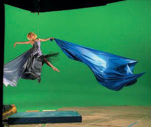
From here, we moved on to visual development consisting of storyboards and style frames designed and composited in Adobe Photoshop and Adobe Illustrator. The goal of the storyboard is to create a sequence of images that convey the concept as accurately as possible. In this case, it involved shooting fabric with a digital camera, compositing it with graphic elements and found imagery for our ‘goddess’.
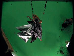
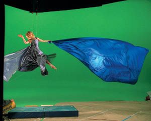
Figs 6.39–6.41 The goddess was hoisted eight feet in the air wearing a wire harness that gave the impression that she was flying. A techno-crane was used for multi-axis camera moves that helped with the illusion of flight. See the complete animation on www.guide2computeranimation.com.
The production was fairly complex. It involved an elaborate green screen shoot with female talent whose role in the overall design package was to unveil the logo by pulling off a shroud of fabric. It sounds simple but to create monumental scale in the Hero id we used 3D fabric simulations because the real piece of fabric would have been 60 feet wide by 45 feet tall. Once the elements were created, the whole job was composited in Adobe After Effects. Below is an example of that compositing process.
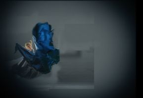
Green screen. The Goddess’s wire harness was rotoscoped out. Then a key was pulled using Puffin’s Primatte Keyer and the green was suppressed (fig. 6.42). This provided a matte with which to key the Goddess into the computer generated environments.
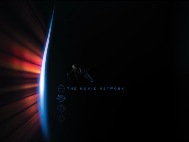
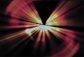
Light rays. A series of light rays was created using light effects shot on digital video and applying Ice Effects Light Blast (fig. 6.43). These were then composited in conjunction with the 3D logo to create the final logo resolve (fig. 6.44).
Background. The background was created using stock photography and animated elements from Electric Image and After Effects providing a monumental backdrop for the logo and Goddess to exist within.
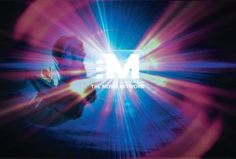
Final composite (fig. 6.45). Each element was finally brought together in After Effects to complete the visual interpretation of ‘Guidance’ to the wonderful world of movies.
BEHIND THE SCENES OF CINGULAR WIRELESS: TWO 30-SECOND TV SPOTS
by Markus Manninen, Co-Head of 3D Commercials, FrameStore CFC
After having spent some time talking to BBDO South during January 2001 about a cool attitude commercial for Cingular Wireless featuring ‘Jack’ (the character) on a Harley Davidson motorbike, speeding down a highway with style and attitude, things went quiet for a while. Nothing seemed to be happening, until one day our producer Helen Mackenzie came in looking a bit guilty.
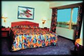
Fig. 6.47 Reference for motel bed.
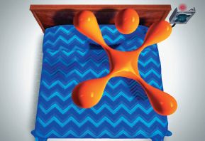
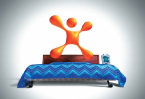
Fig. 6.48 Final composite frame of logo character, Jack, bouncing on motel bed.
It turns out that the six-week motorbike spot had ‘turned into’ four weeks and two entirely different spots. My first thought was ‘ok, we have four weeks. That’s not terrible’. Then it dawned on me, we had two weeks until the first one was to deliver, and then another two weeks until the second one.
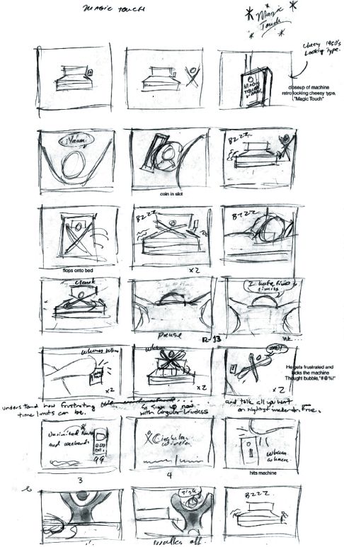
Having looked at the boards for the spot, things seemed quite straightforward (see fig. 6.50). The clients were looking for a Motel 6 type of bed with a retro-looking coin box in a simplistic graphical environment. The main issue was obviously making it all in two weeks, and then doing it again for the next spot with the same team.
Martin Carroll, Ulf Lundgren and I had a brief discussion on how to work out the kinks of the production. What could we streamline, what people could be part of it, what could they do most efficiently, and so on (see schedule, fig. 6.60). Since I was going to direct the commercial I thought we could keep the overhead of decision and presentations to a minimum, allowing us up to 40% more efficiency since I could direct the process as it was happening and without any preparation needed from the animators.
After the first conversation with the creatives at BBDO South (Bill Pauls, Steve Andrews, Christina Cairo) a different scenario appeared than the original board (see fig. 6.50). The storyboard was a throw away as far as animation was concerned (which we had almost assumed already). Bill and Steve at BBDO South had something else in mind, and we loved what we were hearing.
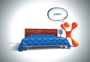
The concept behind the commercial is to promote Cingular’s ‘no time limit’ talk time during nights and weekends, where the customer can talk all they want for free. What basically happens in the commercial is that Jack is about to enjoy the vibrating bed. He puts his quarter in, and jumps on to the bed. Almost immediately the Magic Box reaches the time limit and the bed stops vibrating. Hence the time limit. Jack obviously gets upset. Since we didn’t want to make him violent we decided to make his reaction of anger a lot more ‘cartoony’, i.e. funny. The voice-over takes us into the pack shots explaining the benefit of Cingular. As an end gag when Jack finally has given up and walks away from the bed, the bed then starts shaking again.
So how could we think of ways to get things moving fast enough to make it happen? Basically we made a decision to go for a ‘shoot first ask questions later’ approach. Because of the time limit I wanted all the animators to be as efficient as possible, and not wait around for input or possible changes. We knew what the look was, we should just ‘do it’. Things we were happy with, the client would love.
I started doing a previz of the ‘Good Vibrations’ spot in Softimage|3D at home in the evenings coming to work with a new version ready to send to US for discussion. We tried out rough animation scenarios exploring how much Jack could move and how we could make the camera work interesting in such a graphical environment (read ‘WHITE’). We set up a daily 4 pm telephone conference with BBDO South in Atlanta (USA), and started to email quicktime movies and JPEG images to them between 2 and 4 pm every day. The quicktime movies were compressed using Discreet Combustion.
Bill and Steve at BBDO made a new storyboard (fig. 6.51) based on my initial previz from which I then redesigned the previz. During this time Martin created a model of Jack and set the character up in Alias|Wavefront Maya for animation (fig. 6.52).
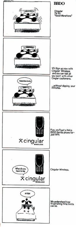
Fig. 6.49 Jack, Cingular logo character.

Fig. 6.50 (far right) BBDO South (US) storyboard.
Martin started testing out some of the most important animation of Jack in the spot, including the yawn (see this in the movie of the commercial by logging onto the book’s website: www.guide2computeranimation.com). The clients loved the animation, but sadly it was decided that Jack would mainly be in his logo pose most of the time, making our animation a lot subtler. Later (well, two days later) Martin really got to push the subtlety on the shots where Jack is jumping on the bed and when he’s kicking the Magic Box. We were trying to make Jack still feel like he was in his original pose, but still have the dynamic motion of a character shifting his weight and reacting to the environment. I think we were successful.
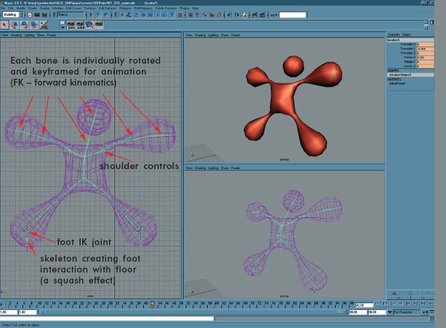
Fig. 6.52 Jack was mainly an FK (forward kinemation) setup, but he had IK (inverse kinemation) controls for both feet and arms if needed. I believe we used the IK on his feet when he was jumping on the bed, but for the rest it was all (FK) keyframe animation. Martin also built in some subtle animation controls allowing us to shrug his shoulders and breathe.
At this point Ulf was still on another job, but he still managed to find time to establish a look for Jack. First in Softimage XSI (fig. 6.50), using ‘final gathering’ – a way to get realistic lighting – and then matching this look in Maya which turned out to be a major work around because of Maya’s limited lighting tools.

Things were starting to pick up in speed. We had a previz 90% there, and we needed to move on to get the animation of the bed to start simulating the cloth. We brought in the previz scenes into Maya from Softimage.
About this time Antony Field came aboard to help us with the simulation of the bed cloth. We decided to go for a non-tucked blanket, giving the cloth a more airy feel of the motion (since the pillow wasn’t holding it down). Martin made a rough animation of the shot where Jack landed on the bed, with the bed now moving in Maya. Antony got some good first results of the cloth simulation using Maya Cloth in a scene which we sent to the client (see movie ‘cloth-demo’ on this book link on www.guide2computeranimation.com). They loved it.
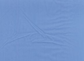
Fig. 6.54 Wrinkle material.
Ulf was working full steam on the building and getting the look of the bed. We had purchased a fabric to get wrinkles of the fabric photographed for texturing as a bump map (fig. 6.54). We couldn’t find the perfect looking pattern though. We did talk to BBDO about a sawtooth pattern, so Ulf created a blue pattern using four different shades. On top of this he added a bump map to give the cloth the thick feel of seams in the fabric (fig. 6.55). Steve at BBDO thought the colours were right, but that it would be interesting to see more detail as we get closer to the fabric, so Ulf re-addressed the pattern, adding additional shades in it to give a richness that was mostly visible as we moved closer to the bed. This was looking very good.
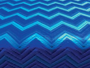
Fig. 6.55 Bed cover.
Ulf was also designing a wood look. Early on, we showed wood pattern to BBDO that had been downloaded from the web. Because of the limiting size of these web images, we had to find a new wood sample. The one we decided on was close: actually underneath our keyboards. The wood from our tabletops was photographed and adjusted in Adobe Photoshop to work as the wood on the bed. We had a light wood frame and a dark panel making the frame look quite ‘tacky’, but the client preferred a complete dark version.
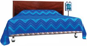
Ulf also did some really amazing work on the Magic Box. The client sent us a reference of the metal look (fig. 6.57) and we talked about getting a cheesy Las Vegas style look to the box. Ulf used this information and came up with a design for the box that made it work with the simplicity of Jack and the bed (fig. 6.58). The agency absolutely loved it. Steve at BBDO took it into Photoshop in Atlanta and added some thoughts into an image (fig. 6.59) that we then used to finish the box. The only change that happened was the cord of the box leading back to the bed. During the compositing we had to remake the cord, making it a little thicker.
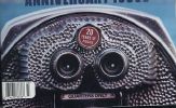
Fig. 6.57 Metal reference.
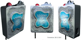
Fig. 6.58 (right) Three angles of The Magic Box designed by Ulf.
Antony was using every trick in the book to get the cloth to stay on the shaking bed (see this on the animations link on www.guide2computeranimation.com). The bed mattress and the pillow were both set up as dynamic objects – using soft bodies in Maya – to get the extra effect of the shaking bed. This way they were both struggling to keep up with the motion of the bed, making the effect less rigid. This made the cloth simulation more dynamic and less likely to stay on the bed. The cloth was finally pinned on both sides of the bed, and on the top (beyond the pillow).
We had tried during production to send properly rendered versions of each scene to the US as quicktimes, but since the schedule was so short and the creatives were knowledgeable about the animation process we did convert to sending even Maya playblasts that were quickly converted to quicktime format. This way we could show the creatives at BBDO at 4 pm what we’d done until 3 pm the same day, and keep working on the latest feedback.
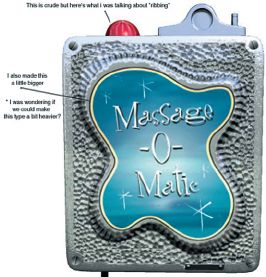
Fig. 6.59 Magic Box with further thoughts added by Steve at BBDO.
After a week of production we were crunching to get the film done in time for compositing. Martin was turning out some amazing and fast animation of Jack in most shots. I added a hand in a few shots to give Martin time to really get the ‘hero’ shots perfect.
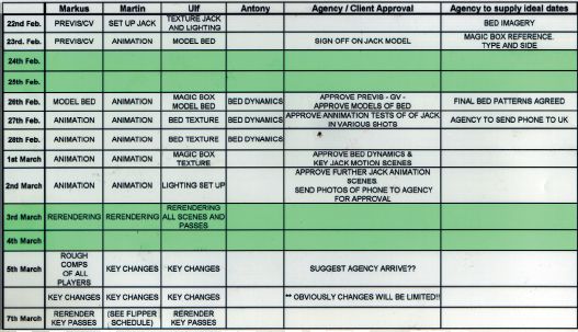
Kevin McGowan had been working on the fish bowl for the second Cingular spot (‘Goldfish’), and was brought in to help Ulf out with the lighting and rendering of ‘Good Vibrations’ in Maya. We had a meeting with Avtar Baines discussing our options to create the look. We decided to try to make the look come together in compositing, since the Maya lighting tools didn’t allow us to create the look that we’d had originally in Mental Ray: the look of Jack had to be soft with a hardback light creating a nice edge effect. This, however, forced us to use five to six light sources on Jack alone. So we ended up setting up a major light (a sun), casting shadows from Jack on to the bed, and the floor. Then we had associated lights that only affected Jack, or the bed, or the Magic Box, to get the look we wanted on each of the objects. Then we split up the rendering so that each object was rendered separately in passes, allowing Avtar to gain control of the look in Inferno render passes (figs 6.61–6.70).
About this time the creative team from BBDO South arrived in London for the compositing. We had an early ‘show and tell’ of a very rough version edit in Inferno together with Avtar Baines. Some timing changes were discussed to make Charlie Sheen’s voiceover work, but nothing major seemed to be changing. We kept on texturing, lighting and rendering the scenes to get a more complete edit to Inferno. The creatives spent a couple of days on a live-action pack shot of the phone.
This is when lightning struck. Suddenly someone realized that the bed cover wasn’t tucked under the pillow. Tuesday night, compositing starting Wednesday, and every shot was possibly incorrect. To re-simulate with a tucked in fabric seemed likely to fail on such a short time scale (less than a day).
After a restless night, we decided to try to fix the problem. Helen had thought of a possible solution. We could animate the fabric around the pillow by hand on top of the cloth simulation, which would then only have to simulate with the moving mattress. This sounded like a workable solution. So Wednesday morning Antony set up the scenes to simulate without the pillow, and I started keyframe animating a moving cloth piece around the pillow. Wednesday evening we were done (see this stage on the animations link on the website: www.guide2computeranimation.com).
RENDER PASSES FOR COMPOSITING IN INFERNO

Fig. 6.61 Sharp (raytraced) shadow matte on the floor (from bed).

Fig. 6.62 Soft (raycast) shadow matte on the floor.
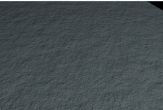
Fig. 6.63 The carpet texture of the floor (only visible in the shadow).
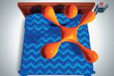
Fig. 6.64 The final composite after Avtar had his way with it.

Fig. 6.65 Jack’s beauty pass.

Fig. 6.66 Jack-bed-bounce-matte.
The bed was giving Jack a blue tint as he landed on it, this matte allowed for it.
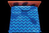
Fig. 6.67 Bed beauty.
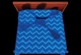
Fig. 6.68 Bed without highlights, allowing knocking the highlight back. This bird’s eye view was picking up a lot of unwanted highlights.
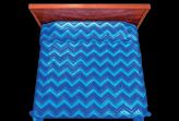
Fig. 6.69 Bed without shadows of Jack, allowing for colour correction of Jack’s shadow on the bed.

Fig. 6.70 Magic Box beauty.
At the same time our next problem became apparent. The Maya Render wasn’t rendering our passes correctly. Some passes just stopped mid-rendering, some passes rendered with artefacts making them unusable for compositing. So for the next 48 hours we were re-setting up scenes for rendering and baby-sitting our render farm. Friday evening at 10 pm I finally walked out of the building. Every pass was working, and Avtar was getting it all done in Inferno with the help of Nick Bennett, although he was looking as tired as I was feeling. But the spot was looking alright.
Saturday morning. I woke up immediately remembering that I had to start working on the previz for the next Cingular spot ‘Goldfish’ – to be completed in 13 days. But that’s another story.

In retrospect this first Cingular commercial was done with a little bit too short of time for comfort, but the team did make it work brilliantly. We started off with two animators and had another three plus two Inferno operators by the end. We could have possibly made things a little easier using our pipeline tools more, but these changes were implemented for the ‘Goldfish’ spot – and made all the difference when finishing the second spot. It was a testimony to how good people can do good work together.
TOOLS:
Previz: Softimage|3D v3.9 Extreme
Softimage XSI v1.0
CG software: Alias|Wavefront Maya v3.0 Unlimited
CG simulation: Maya Cloth
CG render: Maya Render
3D compositing (work in progress): Discreet Combustion v1.0
CG hardware: Max Black 2 × 800 MHz Intel P3 (Windows NT). Max Black 1.33 GHz Athlon (Windows NT)
Compositing software: Discreet Inferno
Compositing hardware: SGI Onyx
CREDITS:
Animation and Post-Production: FrameStore CFC
Director: Markus Manninen
Producer: Helen MacKenzie
3D
Markus Manninen
Martin Carroll
Ulf Lundgren
Kevin McGowan
Antony Field
Inferno Artists
Avtar Baines
Nick Bennett
Advertising Agency: BBDO South
Agency Producer: Christina Cairo Group Creative Director: Bill Pauls Art Director: Steve Andrews Copywriter: Mike Weidner
THE MAKING OF CHRYSLER’S ‘GOLDEN GATE’
by Andrew Daffy, Co-Head of 3D Commercials, FrameStore CFC, UK
A twisted idea
I came into work one spring morning to find a storyboard had been left on my desk. It had been faxed to FrameStore CFC overnight but something in the transfer had caused it to be highly degraded with large black noisy areas covering the frames. At a glance I could see cars, a Chrysler logo, and some tugboats. It was only after closer inspection that I realized I was looking at a suspension bridge, which had been bent into a series of S-shaped curves, similar to a racing course!
I remember thinking ‘they’re not thinking what I think they’re thinking!’
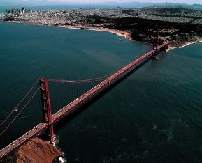
Fig. 6.75 The Golden Gate Bridge, San Francisco.
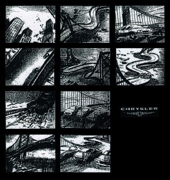
Fig. 6.76 Storyboard faxed to FrameStore CFC by advertising agency, FCB Detroit.
The board had been sent by the US agency FCB Detroit, so when the US woke up later that day, we got them to send it again. The idea had come from FCB’s copywriter and creative director, Mike Stocker – the idea being hundreds of tugboats hooking themselves onto the Golden Gate Bridge in groups, and pulling in opposite directions. The resulting twists gave the Golden Gate a theme-park-style, twisty road, perfect for testing the new range of Chryslers, named Sebrings (fig. 6.76).
Of course we took to the idea immediately, more so when we found out it was to be a 60-second spot. Finding out that Daniel Kleinman had been asked to direct it was the icing on the cake.
Daniel Kleinman is one of the UK’s leading commercials directors. On top of this he has directed the last three James Bond opening sequences. His commercials always have had a wonderful dry wit, and he owns more awards than you could shake a stick at. Bertie Miller was the UK producer for the project. Bertie works out of Spectre, where he is MD. Lance Anderson was the US producer for the project, working out of Ritts Hayden.
First contact
To co-supervise the effects on the job, William Bartlett came aboard. He would also be the principal compositor. He had worked on Daniel’s projects before, and possesses vast experience on sets, so it was more than useful having him around. The day before our first meeting with Spectre, William and I received a copy of Daniel’s treatment. The treatment is usually a one-page synopsis of the spot. It discusses things like mood, pace and motivation of a piece.
The initial meeting was scheduled, which was where Daniel could share his thoughts with William and me. By that point, Spectre hadn’t yet chosen the post house to award the project. These initial meetings can often be daunting. It’s our chance to sell our team, our technology and creative ability. In its simplest terms, we’re being interviewed for the job! We have to tread carefully though. We are aware that too much input at such an early stage can sometimes make us appear overpowering. We merely try to instil confidence at this point.
The meeting was mainly driven by Daniel explaining in detail how he saw the piece taking shape. His main concern was for the CGI bridge. He wanted to make sure that in every shot of the final spot, it looked utterly realistic. I remember slipping up a few times by entering ‘quites’ and ‘almosts’ in the conversation when we were discussing the CGI bridge’s reality. I was quickly corrected!
There were many complicated compositing issues with the project. Therefore William questioned Daniel in depth, and offered up lots of solutions to Spectre’s queries.
I was keen on introducing Daniel to previsualization. This is a process that goes beyond the animatic. Created in 3D software, it’s basically a technique of setting up virtual cameras in simple blocky versions of the actual environments in order to ‘previsualize’ a sequence before it gets made. This is hugely beneficial to effects laden work. We even have a previz showreel at FrameStore CFC highlighting this process created for these types of meetings. Introducing new tools to a director needs to be done with care, especially if it affects the way they shoot their film.
Daniel also wanted a really good storyboard drawn up. In general though, we find that there is inevitable artistic license in both 2D animation and in storyboards. This is fine to define a mood, but can be fatal when images that are visualized without referring to real dimensions get sold to clients, and then turn out to be impossible to realize within a film camera or in 3D software. Therefore Daniel suggested that the artist could take reference from angles visualized from our simple CGI bridge. The design of the bridge was the first of many challenges to come (fig. 6.77).
The core team
There were four key people overlooking the project at FrameStore CFC, who led eleven other FrameStore CFC operators and animators. We figured that these four main people would be able to cover the creative, technical and political angles of the production.
Helen MacKenzie – Producer. Helen is a senior producer at FrameStore CFC who deals almost solely with the CGI department. In her role on Chrysler, she would attend all the meetings, quote the job, discuss and plan the schedule, deal with Spectre, the production company, and FCB Detroit, the agency, organize FrameStore CFC’s involvement with the shoot, and generally make sure that the 2D and 3D operators had the suites and the tools required to perform their tasks. Then throughout the production, she would monitor our progress and ensure the deadlines were met.
William Bartlett – VFX Supervisor. The success of this commercial would be dictated on the whole by its realism. Therefore William would ensure he had all the correct elements to bring great shots together, i.e. he’d have a say in the plates Daniel shot in San Francisco. He’d make sure our CGI version of the bridge looked good enough to composite into his photorealistic scenes. He’d also be using Discreet Logic’s Inferno to composite the bulk of the shots himself. Ben Cronin would assist William, by painting mattes, bridge removal, tugboat replication, and would carry out full composites on a few shots also.
Andrew Daffy – CGI Supervisor. We wanted to make sure that Daniel was always heard throughout the production. I’ve found that directors tend to fear the CGI process. I think it’s partly down to where 3D has come from. Unreliability, slow render times and the old-school digital look have all aided in giving it a bad name. Though I find the main problem comes from the fact that the director never has much influence over the shots once in the CGI realm. We therefore decided that I would be the liaison between Daniel and our department.
As well as making sure that Daniel was looked after, I also wanted to make sure our team was running as efficiently as possible. It was becoming more apparent that we’d be having to deliver the commercial sooner than we’d have liked. Therefore I was keen to make sure that we were only doing work that was relevant. With a great deal of shots to contend with, plus an abundance of creative input from all angles, we felt that I should be present with Helen at all meetings, hear every comment, attend the shoot in San Francisco, previsualize (previz) the commercial, and supervise the whole 3D production, so that everyone else in the team could focus on their work, and not be bogged down with other issues.
Andy Lomas – R&D, Technical Supervisor. Andy at the time was Head of 3D at FrameStore CFC. A visionary in the field, Andy always keeps his ear to the ground and has a knack of pre-empting the next big thing about to shake the CGI world. He then thinks of a way of turning that concept into a tool that can be implemented into the FrameStore CFC system. For example, we decided early on to split the work between Avid’s Softimage and Alias|Wavefront’s Maya.
We have all of our animation, previz and tracking tools in Softimage, whilst Maya is capable of natural cable dynamics, and has wonderful deformation tools which would aid the bridge’s bend.
Our problem arose out of transporting scenes between Softimage and Maya, which had always been a challenge. Off-the-shelf software only took us so far in the transfer. Therefore with our senior developer Alex Parkinson’s help, Andy set about the challenge of writing the FrameStore CFC conversion software.
Design
Distorting simple geometry in 3D is quick and easy. Fig. 6.77 shows the progress of the bridge design, each time after comments by Daniel. After the design was approved, he was keen to see how it would look in the real bay.

Fig. 6.77 Design for the twisted bridge.
Spectre, the production company, searched archive after archive of GGB photos. After sending us five, animator David Hulin and I endeavoured to match the angles in the computer. We then used Adobe Photoshop to replace the original bridge with our 3D rendered version. These stills and others were sent to the storyboard artist, Temple Clark, who with Daniel’s brief, began to draw (fig. 6.78).
Our previz
As mentioned, we’re very keen on helping directors realize their film by offering previz as a tool that can help plot out their whole commercial. Before this though, a 60-second ‘animatic’ usually gets made. The pace of a commercial needs careful timing. The animatic helps by inserting storyboard frames over the length of the sequence. This will only go so far in aiding the production of a commercial. The previz uses virtual cameras that match those on set, including lens information that can be fed straight into cameras on a real film shoot, making it a far more useful process.
The expense of finding interesting camera angles in 3D is vastly lower than doing it with a crew of 50 people on location. 3D operators have never had much of a presence on location shoots until the last few years. Our live-action-based commercials rely on a 3D operator to assist the director and modify the previz online.
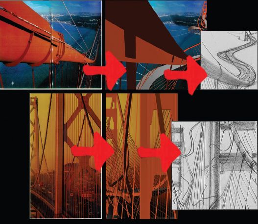
Fig. 6.78 Storyboard mockup of twisted bridge (illustrations on right of the above board) compared with the real bridge (shown on the left).
As we couldn’t film the Chryslers driving along a bent bridge, we needed to film them on an area of road that was broad enough to re-enact the girth of a bent bridge. Also, reflections in the metallic car would need to be minimal (we’d be adding our own bridge reflections later). It was decided that a disused airport runway in the Californian desert would be ideal (fig. 6.80).
How does this affect the previz? Well, we found previzing the action with a digital bridge very good at easing the minds of clients who for a few weeks would be used to seeing a lone car driving through a desert, when eventually it would be driving along the bendy bridge. Naturally, this interim stage can make clients rather nervous.
Our previz ended up being a combination of 3D shots and storyboarded images (fig. 6.79). Shots that would start and end as live action such as a hand on a tugboat throttle needn’t be prevized: in such cases, the storyboard frames would do fine.
Shooting plates
The shoot would be based both in San Francisco Bay and in the Californian desert, a total of ten days. We decided that both William and I should be in San Francisco, and then I’d go back to the UK to deliver and organize the near 500 photographic stills I’d taken, which could then be mapped onto the bridge. In the meantime, William would assist the desert shoot of the Chrysler cars.
I remember when we travelled from the airport towards the bay, seeing the bridge, far off in the distance, greyed out by the fog, early evening, it felt like a mission. A crew of people in a black Spacewagon, setting out to ‘shoot’ the bridge!
The morning calltimes were early, but that was balanced by the luxurious hotel and the excellent food that we were treated to out there.
We prepared for the shoot by scanning a map of the bay area we found on the web. Multiple copies of this were made, one per shot. Then from taking measurements from the 3D environment, plotted co-ordinates drawn on the map would guide the helicopter-assisted Wescam where to be, in order to match the angle from our previz.
William was up in the helicopter with the pilot and cameraman, whilst I attended the other crew and Daniel on the boat. It was amazing seeing the overnight rushes each morning, seeing the real bridge shot based on my computer co-ordinates. I kept in touch with the progression of the work back in the UK via the Internet.
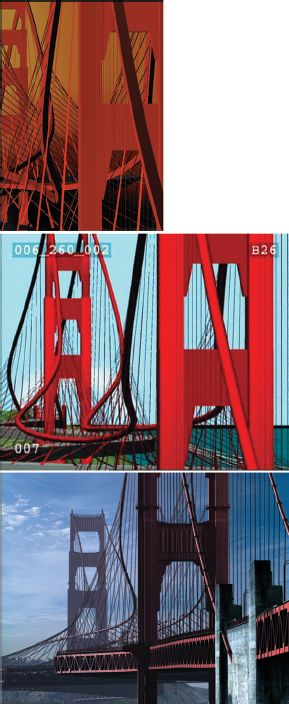
Fig. 6.79 Three stills from the previz.
Senior animators, Kevin McGowan and Jake Mengers, had gone a long way in figuring out the most efficient way of modeling and texturing the bridge.
They had the tremendous task of making a bridge that would look utterly realistic, from a distance, and close up, underneath and overhead. Never before have we used a 3D model so extensively from every angle. And as it was Daniel’s number one cause for concern, it was our main priority to get modeling as soon as we received go-ahead. Both Kevin and Jake specialize in using Maya. They split the bridge into 15 sections, and two versions were made of each, one low resolution and one high resolution. A low resolution version would comprise 75% of the composition of a shot. After a certain distance, granules in the road, rivets in the bridge aren’t seen, so to keep render times down, these ‘low-rez’ versions were essential. The ‘high-rez’ bridge would be used for those extreme close-ups and the foreground areas that the Chrysler cars would drive over.
Alongside, Andy had written systems that bent bits of fencing automatically, shook the suspension cables so they reverberated like harp-strings and created the hawsers connecting the bridge to the 101 tugboats. And again the hawser rope had Maya dynamic properties so that it sagged when loose and sprung when taut. It should be said though that these incredible Maya dynamics are only automatic when set up correctly. Careful crafting is required to give them the right attributes in the first place. These were set up by our Senior Technical Animator, Antony Field. Antony also was responsible for animating those few cables that snapped during bend phase due to them reaching their extremes. Of course, after Antony made the fall of these cables look so convincing, we knew that we should feature them more in the main commercial. Visit the website www.guide2computeranimation.com and notice the shot at the end of dynamics.avi, the shot dedicated to his dynamic cables. See the cable dynamic tests – hawser test.avi – on the website.
The cut
There are some things that can’t be previsualized. There is an energy to top car commercials that’s hard for a CGI team to capture. Therefore the dynamic timings were carefully edited and finessed by top UK Soho editor, Steve Gandolfi, of Cut And Run.
Where shots were to be completely digital, bits from the previz were laid into the edit. See previz.avi on the website.
Matching virtual to reality
In a 60-second edit with around 40 cuts, 30 of those would need a CGI bridge inserting to replace the original. Therefore, once all of the background plates had been shot and cut to length, they got graded and scanned into the computer using a Spirit. This pricey piece of kit takes the 35 mm film and transfers it to digital frames. In the process, the hues, contrast, and saturation of the film can be altered or ‘graded’ to suit the needs of the director. This was done by our Senior Colourist, Dave Ludlam.
Once the frames were on our network, Chris Syborn, David Hulin and I began the arduous task of tracking. This is the process of matching camera angles and objects shot for real with virtual cameras and virtual objects, such as our Golden Gate Bridge. Frame by frame the two bridges would need to line up together. Having prevized the shots to begin with helped somewhat, but due to real camera shake and all the other imperfections of a non-digital move, it was almost like starting from scratch. Tracking long shots of the bridge proved fiddly, but not difficult. Because the original bridge stayed in frame throughout, we always had a good solid reference to lock to.
Tracking shots that were hand-held of cars in the desert were more of a problem. Our only reference to what would really be going on in the scene was the swerved road markings on the ground.
Software exists that can do tracking semiautomatically, but we chose to do it all by hand so as to have absolute control of the environment. You can also see this on the website: look for the link to bg plate – tracking marks – with cars .avi

Fig. 6.80 The cars running on the desert track are later cut and matted into the CGI twisted bridge.
Animation
In animation terms, bending the bridge to its full amount over 40 seconds doesn’t immediately suggest a lot of special work. But Daniel was very keen to feature certain shots where the tugs gave the bridge an initial pull, and to see the whole bridge shake and reverberate. Almost like loosening it up, before they really start bending it. It was a very tricky thing to do when you’re trying to convince your audience that this situation is plausible. Varied amounts of shake were added until we got the right balance between barely noticing and it being too light and bendy. I wanted people to be thinking ‘did I just see that bridge move?’.
Final touches
The matte painting team under William and Ben’s instruction was set to the task of removing the real bridge from the long shots: sections of water are taken from areas located near the bridge and ‘pasted’ over the bridge, thus removing it from frame.
The Chryslers that were filmed in the desert would need removing from their sandy background in order for them to be inserted onto our CGI bridge, which in turn would lay onto the digital San Franciscan bay. The cars therefore needed mattes; these black and white images are painted frame by frame by our matte artists team. They are basically a silhouetted version of cars. In the compositing process in the edit, the computer uses these to calculate which part of an image to use and which to throw away, a bit like a pastry cutter (fig. 6.80).
Things like shadows, digital motion blur and the reflections of the bridge in the sea, all help make CGI look realistic. Daniel needed to approve the bridge structure before we generated all of these ‘passes’ involved in making it photoreal. Therefore we rendered a basic pass of each shot, which we composited roughly over the background. From this, Daniel could see his whole commercial at an accurate level of detail, but without the bells and whistles that would finish it off.
Then Jake, Kevin and 3D animator, Jamie Isles, started to tweak different settings in Maya that would affect the digital lights that would allow the bridge to casts shadows, and the motion blur tools to help match the 3D image to that created in a real camera. Reflections were also made of the bridge in the sea.
We also couldn’t shoot more than one tug at a time, making a distant shot featuring 101 tugboats impossible. CGI stepped in again and based on photos we took, the mass of boats were replicated and placed over the background, each churning their own digital wake.

Fig. 6.81 Stages of the transformation of the Golden Gate Bridge.
The compositor would blend all of these elements together along with the matted cars in order to create a completely realistic scene.
With all shots complete, Daniel’s final job at FrameStore CFC was to reuse the talents of Dave Ludlam in Spirit to give the whole commercial a final grade. Daniel was keen that the shots should not look like those seen in a picture postcard. The newly contrasty grade made the spot that bit edgier and contemporary (fig. 6.82).
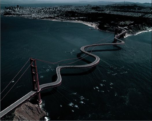
Fig. 6.82 Final film grading avoids the picture postcard look for added realism
The commercial was a huge success worldwide, quickly becoming a very recognizable piece of work in America. Our international friends in the animation industry were full of praise for the spot. It also received the 2000 London Effects and Animation Festival (LEAF) award in the ‘best live action commercial category’. We are delighted with the results, but more so, knowing that Daniel enjoyed the experience!
Chrysler Golden Gate Commercial Credit List
Special Effects |
VFX Supervisors: William Bartlett, Andrew Daffy Inferno Artists: William Bartlett, Ben Cronin Matte Artist: Darran Nicholson Spirit: Dave Ludlam Post-Producer: Helen MacKenzie (For CGI/3D team see ‘Animators’ below). |
FrameStore CFC, London, UK |
Director |
Daniel Kleinman |
Spectre, London, UK |
Copywriter |
Mike Stocker, Creative Director |
FCB Detroit, MI, USA |
Art Director |
Robin Chrumka, VP Art Director |
FCB Detroit, MI, USA |
Executive Creative Director |
Bill Morden |
FCB Detroit, MI USA |
Producer |
Bertie Miller |
Spectre, London, UK |
Set Designer |
Evan Jacobs |
Vision Crew, LA, CA, USA |
Production Companies |
Spectre, Ritts Hayden |
Spectre, London, UK |
Ritts Hayden, IA, CA, USA |
||
Advertising Agency |
FCB Detroit |
FCB Detroit, MI, USA |
Agency Producer |
Jack Nelson |
FCB Detroit, MI, USA |
Animators |
3D: Andy Lomas, Andrew Daffy, Kevin McGowan Jake Mengers, Antony Field, Jamie Isles, Dave Hulin Chris Syborn, James Studdart, Dan Mahmood 3D Development: Andy Lomas |
FrameStore CFC, London, UK. |
Editor |
Steve Gandolfi |
Cut and Run, London, UK |
Sound Design |
Stephen Dewey |
Machine Head, LA, CA, USA |
Music Arranger |
Rob Hughes |
Tape Gallery, London, UK |
Account Handler (Agency) |
Jon Curcio |
FCB Detroit, MI, USA |
Marketing Executive (Client) |
Jay Kuhnie, Director: Chrysler Brand Global Communications and CRM Olivier Lecocq, Senior Manager: Chrysler Brand Global Advertising |
|
Client (Company) |
Daimler/Chrysler, MI, USA |
|
Director of Photography |
Jean Yves Escoffier |
*Source: British Broadcasting Corporation; BARB; Taylor Nelson Sofres Ltd; RSMB Ltd; RAJAR/RSL Ltd (1999).
**A.C. Nielsen Co. (1998).
