There are a number of new styles for setting the background styles of elements. You can now easily draw gradients without using images. You can change the size and origin of background images, and even use multiple images in backgrounds.
Gradients draw a background for an element that fades from one color to one or more other colors. They give depth to your pages and add a more natural look. You can specify two different types of gradients in CSS3: linear and radial. Linear gradients are, well, linear. They flow from one color to another in a straight line. Radial gradients spread out from a central point in a radial fashion.
Linear gradients are defined using the linear-gradient specifier on a background property. For the simplest form, you specify a start and end color using any of the color specifiers we discussed earlier in the section on colors, and it will draw the gradient from the top to the bottom of the element. The following fades from red to blue:
background: linear-gradient(#FF0000, #0000FF);
Although gradients are supported by nearly all browsers at this time, you still have to use browser-specific prefixes to get them to work. That means specifying them at least four times to hit most browsers. Remember to always specify the non-proprietary version last, as shown in the following CSS snippet, so it will override the browser-specific version when available:
background: -webkit-linear-gradient(#FF0000, #0000FF);
background: -moz-linear-gradient(#FF0000, #0000FF);
background: -ms-linear-gradient(#FF0000, #0000FF);
background: linear-gradient(#FF0000, #0000FF);
If you want the gradient to start somewhere other than the top, you can specify a first parameter that is either the name of the side to start from or the amount to rotate it. The sides are top, bottom, left, and right. You can specify degrees from -360deg to 360deg, or radians from -6.28rad to 6.28rad. 0 is the same as left. A positive number rotates counter clockwise and a negative number clockwise. The following draws a gradient from left to right:
background: linear-gradient(left, #FF0000, #0000FF);And the following draws a gradient at 45 degrees, which is from the bottom-left corner:
background: linear-gradient(45deg, #FF0000, #0000FF);You may also add more than two color stops if you like. The following draws a gradient at a 45 degree angle from red to blue to green:
background: linear-gradient(45deg, #FF0000, #0000FF, #00FF00);Here is how these code snippets will display:

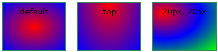
Radial gradients are nearly identical to linear gradients in the parameters they use. The default is to draw a gradient from the center to the edge of the element:
background: radial-gradient(#FF0000, #0000FF);
You can also specify a position such as linear-gradient using one of the predefined positions or an offset point from the top-left corner for the center of the gradient:
background: radial-gradient(top, #FF0000, #0000FF);The following draws the gradient with the center at 20 pixels over and 20 pixels down:
background: radial-gradient(20px 20px, #FF0000, #0000FF);You can also add more than two color stops for radial gradients. The following draws the gradient with the center at 20 pixels over and 20 pixels down from red to blue to green:
background: radial-gradient(20px 20px, #FF0000, #0000FF, #00FF00);Here is how these code snippets will display:
There are many more settings that you can specify for gradients to achieve some interesting effects, but they are beyond the scope of this book. If you find that creating your own gradients is too hard, you can find an excellent gradient generator at http://www.colorzilla.com/gradient-editor/.
You can set the size of a background image to either a fixed pixel amount or a percentage of the area of the element. The image will be scaled to fit in the area specified. The background-size property takes two values: a horizontal size and a vertical size. If you want a background image to fill the entire background of an element, you can use the following:
background-size: 100% 100%;
You can specify multiple background images by separating them with commas. The first image in the list will be drawn on top and the last will be drawn on the bottom. The following draws two background images:
background: url(bg-front.png),
            url(bg-back.png);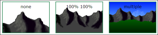
There is also a new background-origin property that determines where the background image is drawn. The possible values are as follows:
content-box: Draws the background image only in the content area of an elementpadding-box: Draws the background image out into the padding area of an elementborder-box: Draws the background image all the way out into the border of an element
Here is an example:
background-origin: content-box;
And here is the output:

The next concept we are going to discuss is CSS sprites. This technique isn't new to CSS3, but it is an important thing to know how to use when writing HTML5 applications. CSS sprites allow you to put all of the images for your application in a single image file and then slice the individual images out into elements using CSS. This technique saves the time and network resources required to download multiple images. It is especially useful if your application has a lot of small images.
To implement CSS sprites, put all of your images into a single image file, known as a sprite sheet . Then follow these steps to get an image in the sprite sheet into an element on the page:
- Make the element the same size as the image you want to show.
- Set the background image of the element to the sprite sheet image.
- Adjust the background position of the sprite sheet so that the image you want to see is at the top-left corner of the element.
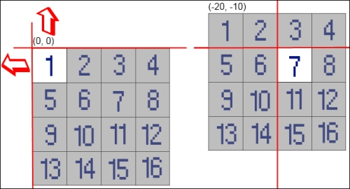
Let's look at an example. The following sprite sheet has 16 images and each image is 10 pixels wide and 10 pixels high. First, we set the element's width and height property to 10 pixels. Next, we set the background image to the sprite-sheet.png sprite sheet. If we were to stop now, we would only get the first image showing in our element.
But we want to show the seventh image in our element. So we need to offset the background position of the sprite sheet by 20 pixels left and 10 pixels up. You must use negative offsets to get the correct image into position because you are moving the background image, not the element:
#seven
{
    Width: 10px;
    height: 10px;
    background-image: url(sprite-sheet.png);
    background-position: -20px -10px;
}
Here is the result: