
"Men who wish to know about the world must learn about it in its particular details."
—Heraclitus
This chapter is all about the new HTML5 input types and how to interact with them using JavaScript. In Chapter 1, The Task at Hand, we created a task list application and in Chapter 2, Let's Get Stylish, we styled it using new CSS3 styles. In this chapter we continue to improve it by adding a task details section using the new HTML5 input types. Then we will use custom data attributes to automatically bind values in the view to the data model in our application. We will also add some jQuery animations to make UI transitions smoother.
We will learn the following topics in this chapter:
- The new HTML5 input types and what benefits they provide
- Custom data attributes and their uses
- How to bind a data model to input elements using custom data attributes
- Using jQuery animation methods to hide and show elements
- Using timers to queue up saves to localStorage
HTML5 comes with a whole host of new input types. These new types are designed to provide formatting, validation, and in some cases, selectors. For touch devices some of them provide a different set of keys for the keyboard. Not all of the new input types are supported by all browsers yet. Fortunately for us, if a browser doesn't support a type it will just display it as a normal text field. Unfortunately for us, you can't depend on the browser to provide the correct formatted data if the unsupported types are only shown as text fields. So make sure you have a backup plan if you are going to use them.
Here are a few of the more useful new input types with images of the ones that are supported by Chrome.
The
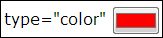
color input type is used to choose a color. When clicked it usually displays a color picker. The value is a hex color specifier (for example, #FF0000). This control isn't widely supported for now, so use with caution.
<input type="color" value="#FF0000"/>
The
date input type is used to select a date. When clicked it usually displays a date picker. The value is a date string in the format yyyy-mm-dd (for example, 2013-01-23). You may also specify the min and max attributes in the same date format to limit the date span:
<input type="date" value="2013-01-23" min="2013-01-01"/>

The
email
input type is used to enter an e-mail address. It looks and behaves like a standard text field. On touch devices the keyboard usually changes to provide e-mail symbols such as the @ sign and .com:
<input type="email" value="[email protected]"/>
The
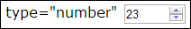
number
input type is used to enter a number. It is usually displayed with up and down buttons (a spinner control) that change the value by the step amount when clicked. On touch devices the keyboard may change to a number pad. There are a few attributes you can use to restrict the field:
min: This specifies the minimum value allowedmax: This specifies the maximum value allowedstep: This specifies the amount by which value changes when you click on the up or down spinner buttons<input type="number" value="23" min="0" max="100" step="1"/>
The
range
input type is used to choose a value from a range of values. This is nearly identical to the number input type, except that it is usually displayed as a slider control. It has the same attributes as the number input type.
<input type="range" value="20" min="0" max="100" step="10"/>
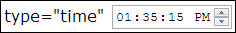
The time
input type is used to select a time. When clicked it may display a time picker or you can set the time using the spinners. The value is a 24-hour format time string in the format hh:mm:ss (for example, 13:35:15).
<input type="time" value="13:35:15"/>
The url
input type is used to enter a URL. Like the email type, touch devices usually display a keyboard optimized for entering a URL.
<input type="url" value="http://www.worldtreesoftware.com"/>
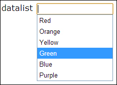
In addition to these new input types, a new <datalist> form element has been added in HTML5. It is used to add a drop-down list of hints to a text field. When the user starts typing in the text field, all of the list options that match the letters being typed will be shown in a dropdown under the field. The user can select one of the options to automatically fill in the field.
You associate a <datalist> element with a text field by setting an ID on the <datalist> element, and referencing it with the list attribute of an <input> element.
<input type="text" list="color-list"/>
<datalist id="color-list">
    <option value="Red"/>
    <option value="Orange"/>
    <option value="Yellow"/>
    <option value="Green"/>
    <option value="Blue"/>
    <option value="Purple"/>
</datalist>
Note
Because implementation of the new input types is spotty at this times, be cautious when using them. Using a number field isn't going to cause many problems if it's not supported; the user can still enter a number in the text field. But something like the color field, if not supported, shows as a text field. Will your user be willing to enter a color in hex code in that case?
There's one more useful addition to HTML5 input elements. A new autofocus attribute was added to set the focus on a particular <input> element when the page is first loaded. Previously we did this in our application by calling the jQuery focus() method for the <input id="new-task-name"> element. We can do the same thing in HTML5 by just adding the autofocus attribute.
<input type="text" autofocus id="new-task-name".../>