
Chapter 9
Exploratory and Predictive Data Analysis
We are overwhelmed by information, not because there is too much, but because we don’t know how to tame it. Information lies stagnant in rapidly expanding pools as our ability to collect and warehouse it increases, but our ability to make sense of and communicate it remains inert, largely without notice.
Stephen Few, Now You See It
Exploratory data analysis is an approach to analyzing data for the purpose of formulating hypotheses worth testing, complementing the tools of conventional statistics for testing hypotheses. It was so named by John Tukey to contrast with confirmatory data analysis, the term used for the set of ideas about hypothesis testing, p-values, and confidence intervals (CIs).
Tukey suggested that too much emphasis in statistics was placed on statistical hypothesis testing (confirmatory data analysis); essentially more emphasis had to be placed on enabling data to suggest hypotheses worth testing (exploratory data analysis). We must not muddle the two types of analyses; formulating workflows that convolve them on the same set of data can lead to systematic bias owing to the issues inherent in testing hypotheses suggested by the data.
The exploratory phase “isolates patterns and features of the data and reveals these forcefully to the analyst.”1 If a model is fit to the data, exploratory analysis finds patterns that represent deviations from the model. These patterns lead the analyst to revise the model via an iterative approach. In contrast, confirmatory data analysis “quantifies the extent to which deviations from a model could be expected to occur by chance.”2 Confirmatory analysis uses the traditional statistical tools of inference, significance, and confidence. Exploratory data analysis is sometimes compared to detective work: It is the process of gathering evidence. Confirmatory data analysis is comparable to a court trial: It is the process of evaluating evidence. Exploratory analysis and confirmatory analysis “can—and should—proceed side by side.”3
Modern computer technology with its attendant high-powered graphic screens displaying multiple, linkable windows enables dynamic, simultaneous views on the data. A map of the position of sample data in space or representations along the time axis can be linked with histograms, correlation diagrams, variogram clouds, and experimental variograms. It is thus feasible to garner important spatial, time, and multivariate structure ideas from a host of simple but powerful displays. The data typically analyzed in reservoir characterization projects can be visualized in one, two, and three dimensions, with the one-dimensional perspective leading inexorably and logically to the next dimension, and so forth, until a comprehensive appreciation of the underlying structure of the data explicates and corroborates appropriate modeling techniques whence viable and reliable conclusions can be ascertained for efficient field management strategies to exploit extant reservoirs.
Predictive analytics enable you to quickly derive evidence-based insights, take impactful decisions, and improve performance across the E&P value chain. Running your processing, refining, or petrochemical plant at peak performance is a critical factor for success, but there are times when events or special unforeseen factors prevent operators from achieving this goal. The trick is to learn how to predict when outages may occur, using data that are available for the wide range of variables that impact these processes, such as temperature, chemical composition degradation, mechanical wear and tear, or the simple life expectancy of a valve seal. By integrating data from a variety of process sources with knowledge and experience databases, operations can boost uptime, performance, and productivity while lowering maintenance costs and downtime. This is attainable by building a predictive model, calibrated by a root-cause analytical methodology that starts with a data quality control workflow, followed by development of an appropriate spatiotemporal data mart, and finally an exploratory data analysis step.
EXPLORATION AND PRODUCTION VALUE PROPOSITIONS
Statistical thinking will one day be as necessary for efficient citizenship as the ability to read and write.
H. G. Wells
Producers seek the most productive zones in their unconventional basins, as well as continued improvement in hydraulic fracturing processes, as they explore and drill new wells into a resource that requires careful strategic planning not only to increase performance but to reduce negative impacts on the environment. Decreasing costs and reducing risk while maximizing gas production necessitates innovative, advanced analytical capabilities that can give you a comprehensive understanding of the reservoir heterogeneity in order to extract hidden predictive information, identify drivers and leading indicators of efficient well production, determine the best intervals for stimulation, and recommend optimum stimulation processes and frequencies.
Following are some high-level steps in a study for an unconventional reservoir that concentrated on the influence of proppant and fracture fluid volumes, with extended analytical projects around other operational parameters to determine an ideal hydraulic fracture treatment strategy that could be used as an analog in new wells.
The operator in the unconventional reservoir wished to identify the impact of the proppant and fracture fluid volumes on performance across some 11,000 wells, of which some 8000 wells were in the public domain. Is there a correlation, and if so, how strong is the relationship between proppant/fracture fluid volumes and performance?
The adoption of data management workflows, exploratory data analysis (EDA), and predictive modeling enabled them to cluster the operational and nonoperational variables that most impacted each well’s performance and hence identify characteristics of good and bad wells. How were these good/bad wells distributed across the asset? Did the wells map to the current geologic model? Who operated the good and bad wells? Some of the questions were answered through a data-driven methodology that could throw light on business issues when exploiting unconventional reservoirs.
The operator faced many challenges, such as the inability to:
- Understand impact of proppant and fracture fluid volumes on production and enumerate key production indicators that increase performance.
- Isolate significant variables impacting the hydraulic fracture process.
- Understand interaction of multiple variables and quantify uncertainty in those variables.
- Understand why some oil/gas wells are deemed good and others poor, although they are drilled with similar tactics in ostensibly similar geologic strata.
The study demanded an exploration of the volumes of proppant and fracture fluid utilized by various operators traversing multiple counties, geographically distributed across the asset. A target variable or objective function of cumulative gas is defined and an EDA performed to understand the influence of operational parameters upon the target variable. Hidden patterns and trends in those parameters deemed important as influencers on the cumulative production, either as an agent of increase or decrease in gas production, are identified or further investigated. The main objective is to understand the relationship between proppant usage (volumes and type), well profiles, and geospatial location with production levels. The premise is that advanced analytics can provide insight into the complexity of how selected proppants relate to production in a variety of wells. Proppant is a large cost factor in the unconventional drilling process; the optimization of proppant usage will lead to substantial savings. Currently, the operator has a basic understanding of the effects of these types on production variables (bivariate analysis). It was proposed that an advanced statistical multivariate analysis be studied to find patterns that can lead to deeper understanding on how proppant factors can impact (or not) production levels.
The solution enabled descriptive analysis of the analytical data warehouse, plus workflows to analyze the impact of the different variables on production, using bivariate correlation analysis and multivariate predictive models using techniques such as decision trees, regression, and supervised neural networks. Additional techniques like SOM and unsupervised neural networks enabled insight to the relationships between performance and the operational parameters of a hydraulic fracture treatment plan.
The study resulted in a reduction in proppant volume across multiple wells, controlling costs and indirectly having a positive impact on the topside footprint. Thus, optimizing well performance has a positive impact from an environmental perspective. The objective function, cumulative production, may not have been improved across some wells, but a 30 percent decrease in proppant for those wells was shown to be ideal to exploit similar gas production, resulting in massive savings annually in operational expenditure.
EDA COMPONENTS
EDA itself can be partitioned into five discrete component steps:
- Univariate analysis
- Bivariate analysis
- Multivariate analysis
- Data transformation
- Discretization
Univariate Analysis
The univariate analysis sketches the data and enumerates the traditional descriptors such as mean, median, mode, and standard deviation. In analyzing sets of numbers you first want to get a feel for the dataset at hand and ask such questions as the following: What are the smallest and largest values? What might be a good single representative number for this set of data? What is the amount of variation or spread? Are the data clustered around one or more values, or are they spread uniformly over some interval? Can they be considered symmetric? You can explore the distributions of nominal variables by using bar charts. You can explore the univariate distributions of interval variables by using histograms and box plots.
A histogram is an estimate of the density or the distribution of values for a single measure of data (Figure 9.1). The range of the variable is divided into a certain number of subintervals, or bins. The height of the bar in each bin is proportional to the number of data points that have values in that bin. A series of bars represents the number of observations in the measure that match a specific value or value range. The bar height can represent either the exact number of observations or the percentage of all observations for each value range.

Figure 9.1 Histograms Depicting Dynamic Relationships between Gas Production, Wellbore, Oil Production Rate, and Oil Production Volume
Descriptive statistics embrace the quantitative appreciation inherent in a dataset. To be distinguished from both inferential and inductive statistics, descriptive statistics strive to summarize a data sample taken from a population and hence are not evolved on the basis of probability theory. The measures generally used to describe a dataset depict central tendency and variability. Measures of central tendency include the mean, median, and mode while measures of variability include the standard deviation (or variance), the minimum and maximum values of the variables, kurtosis, and skewness. Kurtosis reflects the “peakedness” of a probability distribution describing its shape. A high kurtosis distribution has a sharper peak and longer, fatter tails while a low kurtosis distribution has a more rounded peak and shorter, thinner tails. Skewness is a measure of the extent to which a probability distribution “favors” one side of the mean. Thus its value can be either positive or negative.
A box plot as depicted in Figures 9.2 and 9.3 summarizes the distribution of data sampled from a continuous numeric variable. The central line in a box plot indicates the median of the data while the edges of the box indicate the first and third quartiles (i.e., the 25th and 75th percentiles). Extending from the box are whiskers that represent data that are a certain distance from the median. Beyond the whiskers are outliers: observations that are relatively far from the median.

Figure 9.2 Outlier Detection Implementing a Box Plot
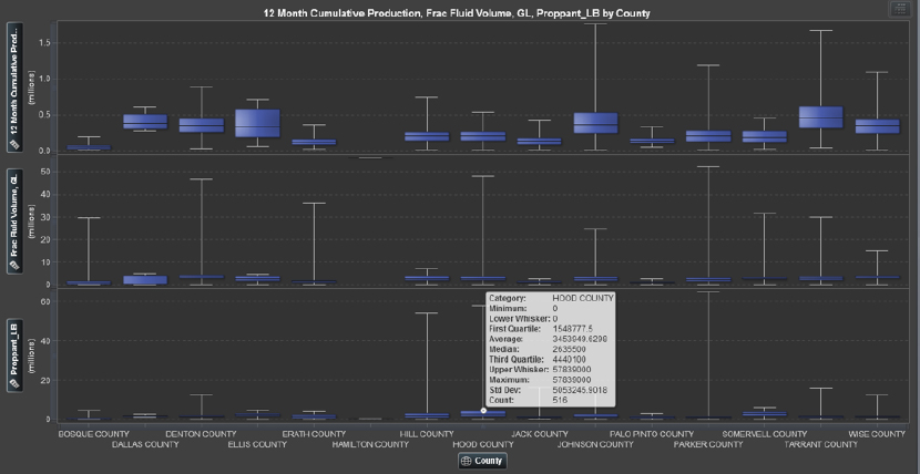
Figure 9.3 Box and Whiskers for Descriptive Statistics of Operational Parameters
Quantitative terms of operational and nonoperational parameters in E&P are essential to tabulate, in addition to pictorial representation. In Figure 9.3 we see the average, mean, minimum, and maximum as well as the first and third quartile of cumulative production, fracture fluid, and proppant volumes.
Bivariate Analysis
One can explore the relationship between two (or more) nominal variables by using a mosaic chart. One can also explore the relationship between two variables by using a scatterplot. Usually the variables in a scatterplot are interval variables. If one has a time variable, one can observe the behavior of one or more variables over time with a line plot. One can also use line plots to visualize a response variable (and, optionally, fitted curves and confidence bands) versus values of an explanatory variable. One can create and explore maps with a polygon plot.
The rank correlation coefficient depicted in Figure 9.4 is a useful statistical tool for comparing two variables. Unlike the correlation coefficient, which can be influenced by extreme values within the dataset (impacting the mean and variance), the rank correlation coefficient is not affected significantly. Therefore, it is a relatively robust measure and may enable detection of any measurement errors, especially if there is a noticeable difference between the values. The correlation coefficient is 0.9272 and the rank correlation coefficient is 0.8971, indicating very little local bias in this relationship.
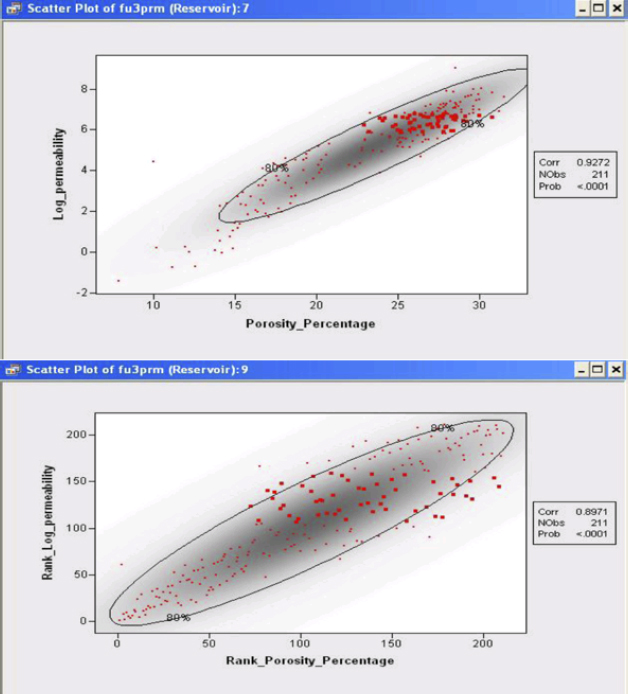
Figure 9.4 3D Scatterplot Surfacing Relationship between Porosity, Permeability, and Water Saturation
A mosaic plot is a set of adjacent bar plots formed first by dividing the horizontal axis according to the proportion of observations in each category of the first variable and then by dividing the vertical axis according to the proportion of observations in the second variable. For more than two nominal variables, this process can be continued by further horizontal or vertical subdivision. The area of each block is proportional to the number of observations it represents. The polygon plot can display arbitrary polylines and polygons. To create a polygon plot, you need to specify at least three variables. The coordinates of vertices of each polygon (or vertices of a piecewise-linear polyline) are specified with X and Y variables. The polygon is drawn in the order in which the coordinates are specified. A third nominal variable specifies an identifier to which each coordinate belongs.
Multivariate Analysis
Multivariate analysis examines relationships between two or more variables, implementing algorithms such as linear or multiple regression, correlation coefficient, cluster analysis, and discriminant analysis.
One can explore the relationships between three variables by using a rotating scatterplot. Often the three variables are interval variables. If one of the variables can be modeled as a function of the other two variables, then you can add a response surface to the rotating plot. Similarly, you can visualize contours of the response variable by using a contour plot.
A contour plot as shown in Figure 9.5 assumes that the Z variable is functionally related to the X and Y variables. That is, the Z variable can be modeled as a response variable of X and Y. A typical use of a contour plot is to visualize the response for a regression model of two continuous variables. Contour plots are most useful when the X and Y variables are nearly uncorrelated. The contour plot fits a piecewise-linear surface to the data, modeling Z as a response function of X and Y. The contours are level curves of the response function. By default, the minimum and maximum values of the Z variable are used to compute the contour levels.
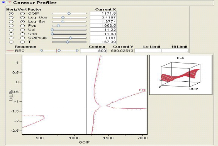
Figure 9.5 Contour Profiler Observing the Recovery Factor against OOIP and Log of Water Saturation
Figure 9.5 also depicts a rotating plot in which one assumes that the Z variable is functionally related to the X and Y variables. That is, the Z variable can be modeled as a response variable of X and Y. A typical use of the rotating surface plot is to visualize the response surface for a regression model of two continuous variables. One can add the predicted values of the model to the data table. Then one can plot the predicted values as a function of the two regressor variables.
Data Transformation
The data transformation methodology encompasses the convenience of placing the data temporarily into a format applicable to particular types of analysis; for example, permeability is often transferred into logarithmic space to abide its relationship with porosity.
Discretization
Discretization embraces the process of coarsening or blocking data into layers consistent within a sequence-stratigraphic framework. Thus, well-log data or core properties can be resampled into this space.
EDA STATISTICAL GRAPHS AND PLOTS
There is a vast array of graphs and plots that can be utilized during the discovery phase of raw data. It is essential to know the relevance of these visualization techniques so as to garner maximum insight during the exploratory data analysis phase of data-driven modeling. Let us walk through several of the most important and useful visuals to enable an intuitive feel for the upstream data.
Box and Whiskers
The box plot in Figure 9.6 displays the distribution of data values by using a rectangular box and lines called “whiskers.”
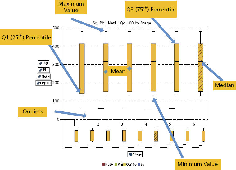
Figure 9.6 Box and Whiskers
The bottom and top edges of the box indicate the interquartile range (IQR), that is, the range of values that are between the first and third quartiles (the 25th and 75th percentiles). The marker inside the box indicates the mean value. The line inside the box indicates the median value.
You can enable outliers, which are data points whose distances from the interquartile range are greater than 1.5 times the size of the interquartile range. The whiskers (lines protruding from the box) indicate the range of values that are outside of the interquartile range. If you do not enable outliers, then the whiskers extend to the maximum and minimum values in the plot. If you enable outliers, then the whiskers indicate the range of values that are outside of the interquartile range, but are close enough not to be considered outliers.
If there are a large number of outliers, then the range of outlier values is represented by a bar. The data tip for the bar displays additional information about the outliers. To explore the outliers, double-click on the outlier bar to view the values as a new histogram visualization.
The basic data roles for a box plot are categories and measures. You can assign one category only, and the category values are plotted on the category axis. You can assign many measures, and the measure values are plotted on the response axis. At least one measure is required.
Histograms
The principal utility of the histogram (Figure 9.7) is that it shows the relative class frequencies in the data and therefore provides information on the data density function. A widely used graphical display of univariate data is the histogram, which is essentially a bar plot of a frequency distribution that is organized in intervals or classes. The important visual information that can be gleaned from histograms encompasses central tendency, the dispersion, and the general shape of the distribution. However, quantitative summary or descriptive statistics provide a more accurate methodology of describing the reservoir data. In purely quantitative terms, the mean and the median define the central tendency, while data dispersion is expressed in terms of the range and the standard deviation.
Figure 9.7 Histograms
Parameters of central tendency or location represent the most important measures for characterizing an empirical distribution. These values help locate the data on a linear scale. The most popular indicator of central tendency is the arithmetic mean, which is the sum of all data points divided by the number of observations. The median is often used as an alternative measure of the central tendency since the arithmetic mean is sensitive to outliers. Although outliers also affect the median, their absolute values do not influence it. Quantiles are a more general way of dividing the data sample into groups containing equal numbers of observations.
Probability Plots
The graphical techniques described so far provide a reasonably good idea about the shape of the distribution of the data under investigation but do not determine how well a dataset conforms to a given theoretical distribution. A goodness-of-fit test could be used to decide if the data are significantly different from a given theoretical distribution; however, such a test would not tell us where and why the data differ from that distribution. A probability plot, on the other hand, not only demonstrates how well an empirical distribution fits a given distribution overall but also shows at a glance where the fit is acceptable and where it is not. There are two basic types of probability plots: P-P plots and Q-Q plots. Both can be used to compare two distributions with each other. The basic principles remain the same if one wants to compare two theoretical distributions, an empirical (or sample) distribution with a theoretical distribution, or two empirical distributions.
Let us follow a case study to optimize a hydraulic fracture strategy in an unconventional reservoir where the EDA techniques are enumerated and graphically detailed as we strive to increase production performance based on operational parameters that must be customized to the reservoir characteristics across the shale play.
Scatterplots
A scatterplot is a two- or three-dimensional visualization that shows the relationship of two- or three-measure data items. Each marker (represented by a symbol such as a dot, a square, or a plus sign) serves as an observation. The marker’s position indicates the value for each observation. Use a scatterplot to examine the relationship between numeric data items.
The 3D scatter-graphs in Figure 9.8 are frequently used when the data are not arranged on a rectangular grid. Simple 3D scatter-graphs display an object or marker corresponding to each datum. More complicated scatter-graphs include datum-specific marker attributes, drop-lines, and combinations of the scatter data with additional objects such as a fitted surface.
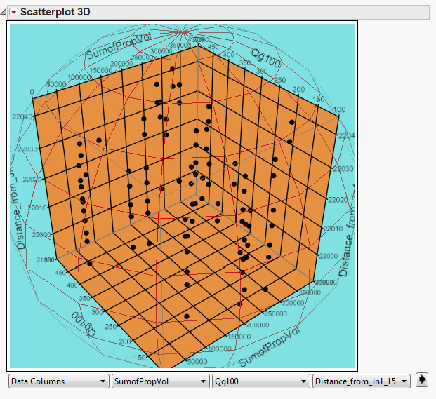
Figure 9.8 3D Scatterplot
3D scatterplots are used to plot data points on three axes in the attempt to show the relationship between three variables. Each row in the data table is represented by a marker whose position depends on its values in the columns set on the X, Y, and Z axes.
A fourth variable can be set to correspond to the color or size of the markers, thus adding yet another dimension to the plot.
The relationship between different variables is called correlation. If the markers are close to making a straight line in any direction in the three-dimensional space of the 3D scatterplot, the correlation between the corresponding variables is high. If the markers are equally distributed in the 3D scatterplot, the correlation is low, or zero. However, even though a correlation may seem to be present, this might not always be the case. The variables could be related to some fourth variable, thus explaining their variation, or pure coincidence might cause an apparent correlation.
You can change how the 3D scatterplot is viewed by zooming in and out as well as rotating it by using the navigation controls located in the top-right part of the visualization.
Heat Maps
Heat maps are a great way to compare data across two categories using color. The effect is to quickly see where the intersection of the categories is strongest and weakest. A heat map essentially displays the distribution of values for two data items by using a table with colored cells.
We use heat maps when we want to show the relationship between two factors. We could study segmentation analysis of a well portfolio, garner insight into well performance across reservoirs, or understand rig productivity based on engineering experience and rate of penetration.
Figure 9.9 illustrates the potential comprehension surfaced by studying visually the 12-month cumulative gas production across an unconventional reservoir, noting the optimum upper and lower perforated stages. We also note the “best-fit line” that results in a quadratic fit plotted across the heat map to describe the relationship between the two variables when that relationship exhibits the “bowl shape” curvature typically defined by a quadratic function. If the points on the scatterplot are tightly clustered around the line, then it likely provides a good approximation for the relationship. If not, another fit line should be considered to represent the relationship.
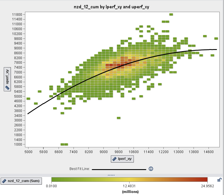
Figure 9.9 Heat Map
Bubble Plots
A bubble plot (Figure 9.10) is a variation of a scatterplot in which the markers are replaced with bubbles. A bubble plot displays the relationships among at least three measures. Two measures are represented by the plot axes, and the third measure is represented by the size of the plot markers. Each bubble represents an observation. A bubble plot is useful for datasets with dozens to hundreds of values. A bubble’s size is scaled relative to the minimum and maximum values of the size variable. The minimum and maximum sizes are illustrated in the plot legend.

Figure 9.10 Bubble Plot
Tree Maps
A tree map (Figure 9.11) displays a hierarchy or a category as a set of rectangular tiles. Each branch of the tree is given a rectangle, which is then tiled with smaller rectangles representing sub-branches. A leaf node’s rectangle has an area proportional to a specified dimension on the data. Often the leaf nodes are colored to show a separate dimension of the data.
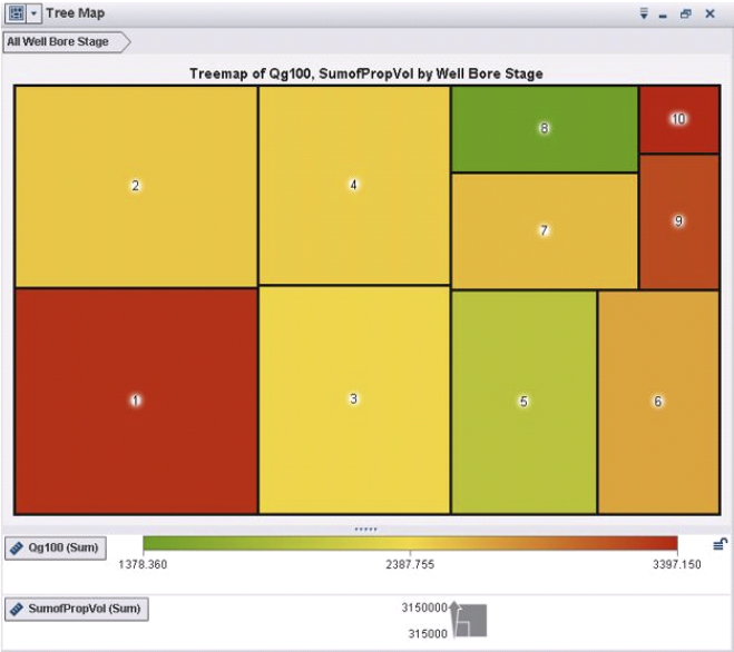
Figure 9.11 Tree Map Defining Cumulative Gas Production for Each Wellbore Stage
When the color and size dimensions are correlated in some way with the tree structure, one can often easily see patterns that would be difficult to spot in other ways, such as if a certain color is particularly relevant. A second advantage of tree maps is that, by construction, they make efficient use of space. As a result, they can legibly display thousands of items on the screen simultaneously.
ENSEMBLE SEGMENTATIONS
Segmenting wells across an asset portfolio based on their performance or their geomechanical attributes is the mainstream of reservoir segmentation basics; however, until recently the idea of combining these different reservoir segmentations has not been reported in literature. The ability to combine groups of segments together actually stems from a Bayesian methodology for combining information from different sources together to form a new insight not found in the uncombined information sources alone. The algorithm to perform these combinations, however, can take on a Bayesian approach or a more traditional approach, such as K-means clustering.
What exactly is ensemble segmentation? In order to answer that question, it is prudent to answer what a predictive ensemble model is first. Ensemble means to combine, collect, or collaborate; for instance, a music ensemble is a small group of musicians performing a single manuscript of music together. Thus segmentation is the process of placing observations that are classified into groups that share similar characteristics. In predictive modeling, an ensemble model is the combination of two or more predecessor models, and a combination function defines how the models are to be combined. An example of an ensemble model might be a response such as well production rate and a regression tree and a least squares regression combined as the average of both models as points along the data space. Another example might be a model to predict water cut where the training dataset contains high water cuts as 1’s and low water cuts as 0’s. A decision tree and a logistic regression and possibly a neural network could predict the probability of high water cuts (1’s) and the combination function could be a voting of the maximum probability for each of the input models along the data space.
Ensemble Methods
Typical methods for combining different models of the same target variable have been reported, such as bagging and boosting. Bagging stands for bootstrap aggregation. In a bagging model, the following steps are taken in the algorithm:
- Step 1. A random sample of the observations is done with a size of n with replacement (meaning that once a draw has been made, if an observation has been drawn before, a replacement is done).
- Step 2. A model is constructed to classify the target response variable, such as a decision tree, logistic regression, or neural network. If a decision tree is used, the pruning part is omitted.
- Step 3. Steps 1 and 2 are repeated a relatively large number of times.
- Step 4. For each observation in the dataset, the number of times a model type is used in step 2 acts as a classification for each level of the target or response variable.
- Step 5. Each observation is assigned to a category by voting with the majority vote from the combination of predecessor models.
- Step 6. The model is selected that has the highest majority vote of correct classifications of the response. This is an ensemble of repeated samples and model building and the combination function is a vote with the best classification of the response variable.
Boosting is another ensemble model algorithm that boosts a classifier model that is weak or poorly developed.
Ensemble Clusters
In ensemble clusters, the goal is to combine cluster labels that are symbolic, and therefore one must also solve a correspondence problem as well. This correspondence problem occurs when there are two or more segmentations/clusters that are being combined. The objective is to find the best method to combine them so that final segmentation has better quality and/or features not found in the original uncombined segments alone. Strehl and Ghosh4 used a couple of methods to combine the results of multiple cluster solutions. One method is called cluster-based similarity partitioning (CSPA) and another is called meta-clustering algorithm (MCLA).
Ensemble Segments
How do ensemble segments add value to upstream business issues? Let us enumerate some of the more tangible and important benefits:
- Customer data is complex: Segmentations simplify the complex nature of the data.
- Ensemble segments further simplify multiple segmentations.
- Ensemble segmentation is conceptually just as simple as originally grouping customers into segments.
- Combining segmentations allows the fusing of multiple business needs/objectives into a single segmentation objective.
- Method enables merging of business knowledge and analytics together.
- Ensemble segmentation is simple to implement.
DATA VISUALIZATION
Despite the fact that predecessors to data visualization date back to the second century A.D., most developments have occurred in the last two-and-a-half centuries, predominantly during the last 30 years. The earliest table that has been preserved was created in the second century in Egypt to organize astronomical information as a tool for navigation. A table is primarily a textual representation of data, but it uses the visual attributes of alignment, whitespace, and at times rules (vertical or horizontal lines) to arrange data into columns and rows. Tables, along with graphs and diagrams, all fall into the class of data representations called charts.
Although tables are predominantly textual, their visual arrangement of data into columns and rows was a powerful first step toward later developments, which shifted the balance from textual and visual representations of data (Figure 9.12).
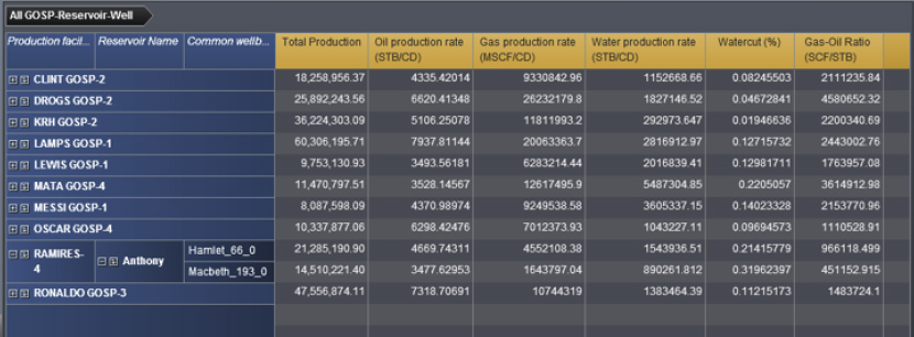
Figure 9.12 Tabular Format for Depicting Production Data
The visual representation of quantitative data in relation to two-dimensional coordinate scales, the most common form of what we call graphs, didn’t arise until much later, in the seventeenth century. Rene Descartes, the French philosopher and mathematician probably best known for the words Cogito ergo sum (“I think; therefore, I am”), invented this method of representing quantitative data originally, not for presenting data, but for performing a type of mathematics based on a system of coordinates. Later, however, this representation was recognized as an effective means to present information to others as well.
Following Descartes’ innovation, it wasn’t until the late eighteenth and early nineteenth centuries that many of the graphs that we use today, including bar charts and pie charts, were invented or dramatically improved by a Scottish social scientist named William Playfair.
Over a century passed, however, before the value of these techniques became recognized to the point that academic courses in graphing data were finally introduced, originally at Iowa State University in 1913.
The person who introduced us to the power of data visualization as a means of exploring and making sense of data was the statistics professor, John Tukey of Princeton, who in 1977 developed a predominantly visual approach to exploring and analyzing data called exploratory data analysis.
No example of data visualization occupies a more prominent place in the consciousness of businesspeople today than the dashboard. These displays, which combine the information that’s needed to rapidly monitor an aspect of the business on a single screen, are powerful additions to the business intelligence arsenal. When properly designed for effective visual communication, dashboards support a level of awareness that could never be stitched together from traditional reports.
Another expression of data visualization that has captured the imagination of many in the business world in recent years is geospatial visualization. The popularity of Google Earth and other similar web services has contributed a great deal to this interest. Much of the information that businesses must monitor and understand is tied to geographical locations.
Another trend that has made the journey in recent years from the academic research community to commercial software tackles the problem of displaying large sets of quantitative data in the limited space of a screen. The most popular example of this is the tree map (Figure 9.13), which was initially created by Ben Shneiderman of the University of Maryland. Tree maps are designed to display two different quantitative variables at different levels of a hierarchy.

Figure 9.13 Tree Maps Explain Production of Hydrocarbons and Water by GOSP
High-quality immersive visualization can enhance the understanding, interpretation, and modeling of Big Data in the oil and gas industry; the combination of advanced analytical methodologies and a flexible visualization toolkit for the O&G industry deliver efficient and effective insight, characterization, and control of a very complex heterogeneous system that is an oil and gas reservoir.
The fundamental goal is to present, transform, and convert data into an efficient and effective visual representation that users can rapidly, intuitively, and easily explore, understand, analyze, and comprehend. As a result, the raw data are transformed into information and ultimately into knowledge to quantify the uncertainty in a complex, heterogeneous subsurface system to mitigate risks in field (re)development strategies and tactics.
Existing reservoir visualizations can be complex, difficult to interpret, and not completely applicable to the available information and visualization requirements of the different states and characteristics of the field development cycle:
- Early exploration, with limited data availability, high level of uncertainty, and the requirement of visualizing and interpreting the big picture
- Exploration and drilling appraisal and field development, with medium levels of data availability, uncertainty, and details to be visualized
- Production, with large data availability, a reduced level of uncertainty, and requiring visualizations for insight and interpretation over a multitude of details
To meet this challenge, novel types of interactive visualization systems and techniques are required to reflect the state of field development and available (increasingly more complex) data and information. Figure 9.14 illustrates a bivariate correlation of operational parameters in an unconventional shale reservoir, illuminating the important parameters that statistically impact well performance.
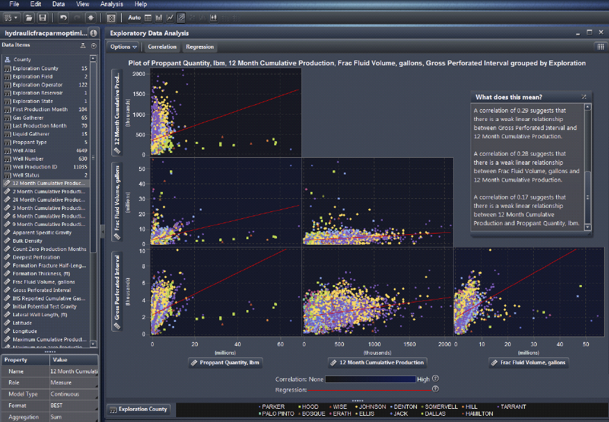
Figure 9.14 Suite of Scatterplots with Correlation and Regression Insights
CASE STUDIES
The following case studies illustrate the practical application of graphs and plots to uncover knowledge from upstream data across unconventional reservoirs.
Unconventional Reservoir Characterization
It is important to ascertain a more robust reservoir model and appreciate the subtle changes in geomechanics across an unconventional asset as drilling and completions strategies become more cost prohibitive to exploit these resources.
Again, marrying a data-driven methodology with traditional interpretive workflows enables more insight, and adopting EDA to surface hidden patterns culminates in hypotheses worth modeling under uncertainty.
To abide by Tukey’s dictates we must generate a comprehensive suite of visualization techniques, preferably via an auto-charting methodology that is optimum for the datasets construed as essential for the business problem under study. We can progress through the iterative process of farming knowledge from our raw data. With the advent of Big Data as intelligent wells and digital oilfields are becoming more popular on the asset surveillance and optimization landscape, we need to handle terabytes of raw data as aggregation across engineering silos enables geoscientists to interpret data without the inherent issues associated with sampling these data.
Exploratory data analysis is the key to unlock the pattern-searching workflow, identifying those bivariate and multivariate relationships that enhance the engineers’ understanding of the reservoir dynamics. Why use EDA?
- EDA is an iterative process that surfaces by trial-and-error insights and these intuitive observations garnered from each successive step are the platform for the subsequent steps.
- A model should be built at each EDA step, but not too much onus should be attributed to the model. Keep an open mind and flirt with skepticism regarding any potential relationships between the reservoir attributes.
- Look at the data from several perspectives. Do not preclude the EDA step in the reservoir characterization cycle if no immediate or apparent value appears to surface.
- EDA typically encompasses a suite of robust and resistant statistics and relies heavily on graphical techniques.
Maximize Insight
The main objective of any EDA study is to “maximize insight into a dataset.”5 Insight connotes ascertaining and disclosing underlying structure in the data. Such underlying structure may not be surfaced by the enumerated list of items above; such items assist to distinguish goals of an analysis, but the significant and concrete insight for a dataset surfaces as the analyst aptly scrutinizes and explores the various nuances of the data. Any appreciation for the data is derived almost singularly from the use of various graphical techniques that yield the essence of the data. Thus, well-chosen graphics are not only irreplaceable, but also are at the heart of all insightful determinations as there are no quantitative analogues as adopted in a more classical approach. It is essential to draw upon your own pattern-recognition and correlative abilities while studying the graphical depictions of the data under study, and steer away from quantitative techniques that are classical in nature. However, EDA and classical schools of thought are not mutually exclusive and thus can complement each other during a reservoir characterization project.
Surface Underlying Structure
We collected about 2500 individual well datasets in the Barnett from a major operator and integrated them with publicly available well data from the same region, resulting in an aggregated analytical data warehouse (ADW) containing both production and operational data from 11,000 wells that define the important hydraulic fracture parameters for each well’s strategy. The primary goal was to understand which independent operational variables most impacted well performance with an initial focus on both proppant and fracture fluid volumes.
The target variable or objective function we agreed upon was the 12-month non-zero cumulative gas production. Let us explore its correlation with some of the operational parameters.
A correlation matrix displays the degree of correlation between multiple intersections of measures as a matrix of rectangular cells. Each cell in the matrix represents the intersection of two measures, and the color of the cell indicates the degree of correlation between those two measures.
The stronger correlations appear to be with the shallowest and deepest perforation, so we shall have to investigate further to identify the sweet-spot as regards minimum/maximum depths for 12-month non-zero cumulative gas production.
Further reading of the correlation matrix illustrates the low correlations between our two study parameters, proppant and fracture fluid volumes and the target variable. Already we have identified potential savings in OPEX by a reduction in these operational parameters with comparable gas production. Another beneficial consequence is the positive impact on the environment as the hydraulic fracture strategy would necessitate less sand and water, resulting in fewer truck trips and smaller surface footprint. These deductions must be studied further with more visualization to fully understand an optimized hydraulic fracture strategy.
We can identify and quantify the influence of the operational parameters upon the target variable. This will enable us to build more precise models in the next stage of the study.
Extract Important Variables
From the correlation matrix in the previous visualization we can start an iterative analytical process for each cell and study further the bivariate relationships to identify possible operational parameters that may have an impact on gas production. Let us take the shallowest and deepest perforation cell in the matrix and note those cells that correlate with best performance according to the target variable in this visualization, the heat map shown in Figure 9.15.
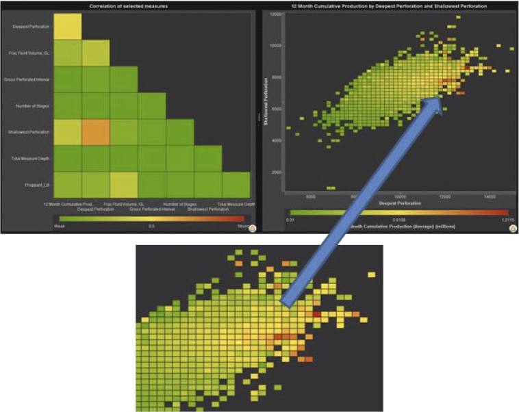
Figure 9.15 Heat Map Enables Identification of Sweet-Spot for Perforation
A heat map displays the distribution of values for two data items by using a table with colored cells. If you do not assign a measure to the color data role, then the cell colors represents the frequency of each intersection of values. If you assign a measure to the color data role, then the cell colors represent the aggregated measure value for each intersection of values.
Auto-charting enables users to create the best possible visualizations. Normally, with two numerical variables a scatterplot is rendered, but owing to the large number of data points, we witness the software modifying how the data are represented, producing in this case a heat map that shows the frequency or density of the data in each cell, here representing the objective function.
Initial reading of this visualization leads us to believe optimum average 12-month cumulative production occurs between the shallowest perforation depths of 6,625 and 8,125 feet, and between the deepest perforation depths of 11,900 and 12,900 feet (see inset, Figure 9.15). We shall also have to investigate the outliers for high production by drilling down to identify which wells contributed to those cells.
Detect Outliers and Anomalies
The box-whiskers visualization is ideal to highlight the descriptive statistics for the independent variables as we try to establish potential values for each parameter that is important as we build the predictive model. It is a convenient way of graphically depicting groups of numerical data through their quartiles. Box plots usually have lines extending vertically from the boxes (whiskers) indicating variability outside the upper and lower quartiles. Box plots display differences between populations without making any assumptions of the underlying statistical distribution: they are nonparametric. The spacing between the different parts of the box helps indicate the degree of dispersion (spread) and skewness in the data, and identify outliers. It is a convenient way to visually Quality Control your data prior to building a predictive model.
A box plot (Figure 9.16) displays the distribution of values for a measure by using a box and whiskers. The size and location of the box indicate the range of values that are between the twenty-fifth and seventy-fifth percentile. Additional statistical information is represented by other visual features.

Figure 9.16 Box-Whiskers Chart Detailing Twenty-Fifth and Seventy-Fifth Percentiles
You can create lattices, and select whether the average (mean) value and outliers are displayed for each box.
Test Underlying Assumptions
A bubble plot represents the values of three measures by using differently sized markers (bubbles) in a scatterplot. The values of two measures are represented by the position on the graph axes, and the value of the third measure is represented by the marker size.
An animated bubble plot (Figure 9.17) displays the changes in your data values over time. Each frame of the animation represents a value of the date-time data item that is assigned to the animation data role.
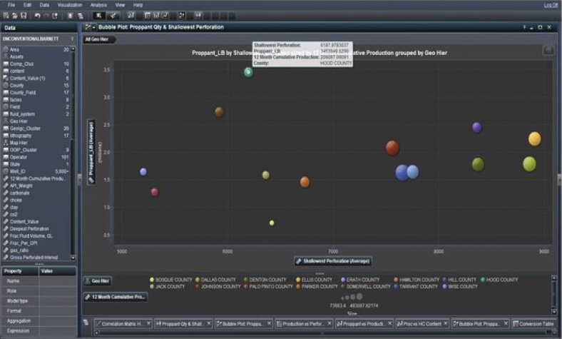
Figure 9.17 Animated Bubble Plot Offers Insight across a Temporal Slice of the Data
If we look at the average shallowest perforation, we see that both Johnson and Tarrant counties, red and dark blue respectively, have the highest average gas production in addition to Dallas, exhibiting the average optimum depths of 7621 to 7722 feet, respectively, which is consistent with our earlier findings on the heat map. Dallas reflects an average shallowest perforation of 8888 feet that falls outside the sweet-spot previously identified. Is this an outlier or reflective of the geologic dip of the producing zone of interest across the region? These depths across counties suggest a geologic characteristic that must be compared to a current static geologic model for the asset. These values seem important as indicators of high gas production, which is something we need to be aware of as we build a decision tree or neural network in our modeling phase.
This bubble plot representation also underlines that Hood County utilizes a large amount of proppant but the corresponding gas production is low by comparison with other counties. Also, note the shallowest perforation is about 6150 ft. Does this correlate with the dip of the shale zone across the Barnett? At this point we can drill down and surface which operators are inefficient in Hood County. Remember, not only do we wish to identify an optimized hydraulic fracture strategy that can be implemented in future wells by way of analogues, we are also trying to reduce the proppant and fracture fluid volumes so as to reduce OPEX without impacting performance.
Figure 9.18 underlines the poor performance in Hood County and enables the identification of those operators that perform poorly as the main contributors to overall low gas production vis-à-vis proppant volumes. For instance, we can observe that Enervest Operating LLC is using the highest amount of proppant for a fairly average production of oil. We should investigate their best practices and compare to other operators in a comparable geographic area.
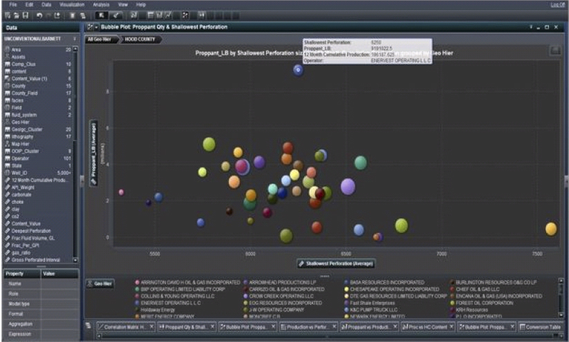
Figure 9.18 Bubble Plot Can Drill into a Hierarchy to Identify Well Performance
One of the major functionalities implemented in this visualization is the usage of the hierarchy that facilitates the drill-down of parameters based on a user-controlled characterization of the data. It is essentially OLAP cubes on-the-fly, a very simple methodology to cascade through a layered set of data that fall into a natural hierarchy such as Field: Reservoir: Well.
We are now establishing a more comprehensive understanding of each operator’s usage of one of our study operational parameters, proppant volume. Which companies are underperforming by implementing too much proppant in their hydraulic fracture strategy? And what is the best practice as regards proppant volume for each respective fracture strategy across the geologic strata? Similar visualizations can be built to study fracture fluid. We are now moving toward defining the important parameters in our predictive model.
Drilling down we arrive at the well level and see that well #242090238900 is the one that uses the highest amount of proppant, but with relatively high gas production. Is this an outlier, or is it representative of the geologic characterization in this area of the Barnett? We must determine if the performance is acceptable, falling between confidence limits for cumulative gas production. This visualization details some much better performing wells with much smaller amounts of proppant; what key production indicators differentiate these good wells from the bad well in Hood County operated by Enervest Operating LLC?
We are building some identifying characteristics for good and bad well performance. We can subsequently ratify these findings by running a cluster analysis.
High volumes of proppant are being used in Hood County with relatively little return in 12-month cumulative production when compared to other counties, such as Tarrant and Johnson, where less proppant is used on average with improved average performance. We have not been convinced that the associated gas production in Hood warrants such a large quantity of proppant. Perhaps the varying proppant quantities and gas production we see in the animation in Figure 9.19 across the GPI from 2200 to 2400 can be explained by thief zones in Hood County: faults/fractures not identified, consuming the fracture fluid and proppant with no impact on performance.
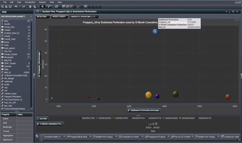
Figure 9.19 Animated Plot Investigating Proppant Quantities against Performance
Or is poor performance related to poor operator practices? The visualizations associated with exploratory data analysis enables the identification of hypotheses worth modeling. We are quantifying the uncertainty in the underlying parameters.
For a more effective analysis of the efficiency at well level we can compare two maps (Figure 9.20), where in the first we show the amount of proppant and production across the region and in the second the content value (where 6 represents oil and 1 gas/condensate). We can see, for instance, in the first map that well #242090242813 in Hood County has definitely some issues with proppant quantity and efficiency. In fact, adjacent wells that have the same level of gas production utilize far less volumes of proppant. This is definitely indicative of poor practices and hydraulic fracture treatment strategy as the geologic model is fairly homogeneous as borne out by the wells in close proximity that show comparable performance.
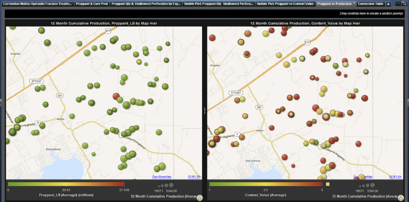
Figure 9.20 Bubble Plot Mapped across the Well Locations
The distribution of the wells’ content value in the second map reflects a fuzzy understanding of where the oil and condensates are located. Do these map to the overlying geologic expectation? What are the reservoir characteristics at these well locations? We could cluster the wells by content value and include reservoir characteristics and geomechanical data, and tying these well properties to the static geologic model we can ascertain localized geologic structure/stratigraphic characteristics. Do they reflect comparable well production?
Here we look again at Hood County in terms of proppant per fluid per GPI used and content value (we see that it is > 4.8 representing oil).
Which hydraulic fracture strategy is best for oil as opposed to gas production? What are the best practices in Johnson County that appear to produce more efficiently with comparable average proppant per fluid per GPI?
We must investigate whether proppant is being used efficiently, and if so, whether we could attain a similar level of production with a much lower amount of proppant, as implied by previous visualizations.
A crosstab shows the intersections of category values and measure values as text. If your crosstab contains measures, then each cell of the crosstab contains the aggregated measure values for a specific intersection of category values. If the crosstab does not contain measures, then each cell contains the frequency of an intersection of category values.
In the cross-tab visualization in Figure 9.21, we take into consideration two wells that in Hood County have approximately similar amounts of cumulative production but with a radically different amount of proppant volume. In fact, the well that seems highly inefficient is well #242090242813, which is operated by Chesapeake Operating Inc. This visualization can be built out to quickly identify best and worst practices across different wells in various counties. This process will throw light again on identifying the ideal values for important operational parameters deemed most influential in a hydraulic fracture strategy treatment plan. The results read from this visualization will help build future predictive models.

Figure 9.21 Crosstab Display Detailing Specific Measures
The data roles for a crosstab are columns, rows, and measures. You can assign either a single hierarchy or any number of categories to each of the columns and rows roles. If you assign measures to the crosstab, then the measure values are displayed in the cells of the crosstab. If you do not assign measures, then the cells of the crosstab show the frequency of each intersection of values.
Early Warning Detection System
Oil and gas companies traditionally implement rudimentary monitoring consoles and surveillance systems that are at best case-based reasoning by nature. They offer isolated perspectives and tend to be predominantly reactive. With the proliferation of predictive analytical methodologies across many business verticals, it is paramount that the O&G industry adopt an analytics-based framework to improve uptimes, performance, and availability of crucial assets while reducing the amount of unscheduled maintenance, thus minimizing maintenance-related costs and operation disruptions. With state-of-the-art analytics and reporting, you can predict maintenance problems before they happen and determine root causes in order to update processes for future prevention. The approach reduces downtimes, optimizes maintenance cycles, reduces unscheduled maintenance, and gains greater visibility into maintenance issues.
There are multiple sensors on O&G facilities generating a tsunami of data points in real time. These data are invariably collated on a data historian, compressed, and then batch-processed by an analytical workflow. Figure 9.22 depicts a possible flow of data streams from sensors aggregated with other disparate datasets into an event stream processing engine. Such an engine focuses on analyzing and processing events in motion or “event streams.” Instead of storing data and running queries against the stored data, it stores queries and streams data through them. It allows continuous analysis of data as they are received, and enables you to incrementally update intelligence as new events occur. An innate pattern-matching facility allows you to define sequential or temporal (time-based) events, which can then be used to monitor breaks in patterns so actions can be taken immediately. The engine processes large volumes of data extremely quickly, providing the ability to analyze events in motion even as they are generated.

Figure 9.22 Data Stream Flows Generated by Sensors
Incoming data are read through adapters that are part of a publish-and-subscribe architecture used to read data feeds (Figure 9.23). An early warning detection system takes advantage of predictive analytical methodologies that house a predictive model. How is that model built and operationalized? First, we need to identify signatures and patterns in a multivariate, multidimensional complex system that are precursors to an event; that event could be a failure in a pump or a liquid carryover occurrence. A root-cause analytical workflow that mines all the aggregated datasets deemed relevant to the study is performed to identify those signatures and patterns that occur prior to the event. The root-cause analysis determines leading and lagging indicators to characterize the performance of the system in real time. The objective is to identify the rules that are harbingers to the event under study based on the occurrences of other events in the transactions. Once established we can build a predictive model, be it a neural network, a decision tree, or a vanilla nonlinear regression model. A hybrid of said models could also be deployed. Having operationalized the predictive model, we can open the gates to the flood of real-time data from sensors via the historians into a complex event processing engine. The engine handles data streams in real time. First principles or engineering concepts can be built into the engine’s logic as the streaming data are analyzed and broken down into succinct events. Those data are then passed into the predictive model to monitor the signatures and patterns identified as precursors to an impending event.

Figure 9.23 Event Stream Processing Engine and Associated Data Flows
The basic principle of a model-based early warning fault detection scheme is to generate residuals that are defined as the differences between the measured and the model predicted outputs. The system model could be a first principles–based physics model or an empirical model of the actual system being monitored. The model defines the relationship between the system outputs, system faults, system disturbances, and system inputs. Ideally, the residuals that are generated are only affected by the system faults and are not affected by any changes in the operating conditions due to changes in the system inputs and/or disturbances. That is, the residuals are only sensitive to faults while being insensitive to system input or disturbance changes.6 If the system is “healthy,” then the residuals would be approximated by white noise. Any deviations of the residuals from the white noise behavior could be interpreted as a fault in the system.
Thus, predictive models are at the core of any predictive asset maintenance workflow. It is an analytics-driven solution designed to improve uptimes of crucial assets and reduce unscheduled maintenance, thus lowering maintenance and operating costs and minimizing maintenance-related production disruptions. To get answers to complex E&P questions it is necessary to adopt a multipurpose and easy-to-use descriptive and predictive analytics suite of workflows. Adopting EDA and predictive analytics you can:
- Discover relevant, new patterns with speed and flexibility.
- Analyze data to find useful insights.
- Make better decisions and act quickly.
- Monitor models to verify continued relevance and accuracy.
- Manage a growing portfolio of predictive assets effectively.
The case study in Chapter 10, “Deepwater Electric Submersible Pumps,” expands on an opportunity to apply a predictive model to preclude failures in electric submersible pumps.
A potential suite of workflows that illustrates implementing predictive models on real-time data is depicted in Figure 9.24.

Figure 9.24 Workflows to Implement Predictive Models