
11
INFORMATION CREATION THROUGH ANALYTICS
Contents
Introduction to the Concept of Analytics
Dynamic Reporting through OLAP
Analytics at a Glance through Dashboards
Robust Business Intelligence and Drill-Down behind Dashboard Views
Data Mining and the Value of Data
Analysis of Unstructured Data and Combining Structured and Unstructured Sources
Analytics of Episodes of Care and Episode Treatment Groups
Cognitive Systems in Healthcare
An Often Overlooked Sector of Analytics (Power of the Simple Graphic)
Closing Comments on Efficiency and Productivity
The primary initiative in leveraging the value of data resources lies in the realm of analytics. This term, however, encompasses a wide variety of methodologies that can provide descriptive, comparative, and predictive information for the end user. This chapter provides a brief background and description of some noteworthy analytic approaches as applied to more historical, structured data and includes references to big data issues along the way.
Analytic methods can range from simple reports, tables, and graphics to more statistically based endeavors to quantitative-based methods. We provided some analytic approaches according to some commonly referred to categories below. Regardless of the techniques deployed, the end result of an analytic endeavor is to extract/generate information to provide a resource to enhance the decision-making process.
1.Spreadsheet applications (also facilitated by vendor software packages)
a.Data/variable calculations, sorting, formatting, organizing, transforming
b.Distribution analysis and statistics (max, min, average, median, percentages, etc.)
c.Correlation calculation between variables
d.Linear and goal programming (optimization)
e.Pivot tables (an intro to online analytic processing [OLAP] and business intelligence)
2.Business intelligence
a.Query and report creating
b.Online analytic processing
c.Dashboards
3.Multivariate analysis (also part of business intelligence)
a.Regression (hypothesis approach)
b.Data mining applications (data-driven information creation)
Neural networks
Clustering Segmentation classification
Real-time mining
4.Analysis of unstructured data
a.Text mining
5.Six Sigma
6.Visualization
The type of analytic approach is generally dictated by the objective of what the user of the analysis requires, and where the objective and overall initiative needs to be clearly defined to achieve the most effective and informative results. This problem definition process generally involves the selection of a performance metric and identification of variables that impact that metric. Once the scope of the analytic endeavor (problem definition) has been established, then corresponding data resources must be managed (variables selected at a particular level of detail) and analysis can begin. The remainder of this chapter provides an overview of some of the aforementioned business intelligence–based analytic methods and includes some basic examples pertaining to healthcare.
Introduction to the Concept of Analytics
One of the initial stages of any analytic endeavor is the incorporation of an investigative study of a data resource. In other words, before a report is generated or quantitative modeling is conducted, an analyst needs to better understand what’s in a data file. This investigative process involves conducting a distribution analysis of various data variables, perhaps calculating maximum, minimum, and variance metrics such as standard deviations. This provides a descriptive character of what the data variables comprise and renders additional analysis more robust, as it identifies the presence of such issues as data bias or skew, outliers, and even errors in data resources.
Business Intelligence
Reports
The focus of this book revolves around informatics, which largely involves the utilization of business intelligence applications (e.g., OLAP, dashboards, mining) to extract actionable information from all types of data to enhance the decision-making process. One of the most basic levels of this approach is the creation of business reports that incorporate sequel-related queries of data resources to extract variables that describe a business scenario. The introduction of big data involves additional requirements for this process; namely, when devising the parameters of the report to be created, the decision maker now must consider new variables that impact that conceptual report. The volume of data that must be processed must also be considered, and finally, the currency of the report (e.g., how often a report must be updated to provide adequate information for the decision maker). However, as simple as the process of generating a report may be, creating one that provides essential information to those that receive it be a quite complex task.
Consider a request by a hospital’s administrative area to produce an analytic report that provides some information on patient volume and hospital capacity along with patient satisfaction. Although this initiative appears to be straightforward and simplistic in nature, one must consider all the variables that comprise the area to be analyzed, along with the needs of the user of the report.
Some dimensions and variables that could be included in this analysis would involve the following.
| TIME | PERFORMANCE METRIC | CARE AREA | DETAILED DESCRIBERS |
|---|---|---|---|
| Day | Bed utilization | Cardio | DRG |
| Week | Patient volume | Pediatrics | Physician |
| Month | Satisfaction rate | Med/surg oncology | Staffing |
When conducting customized analytics (tailored analytics to a specific company’s activities) data experts and analysts must apply due diligence to acquire that information that provides a strategic advantage in the marketplace. This involves the storage, processing, management, and ultimate analysis of data resources that describe a particular process.
Well-designed reports that incorporate the pertinent and available variables that describe a business activity can be an important source of information to decision makers (see Figure 11.1). However, the limitation of information creation at the report level is that the user often scans a report, assimilates the information, and quickly thinks of alternative business scenarios that are essential to providing more robust information regarding a process or activity. The report is limited to its current level of data aggregation and variables depicted. The next step to analysis or business intelligence involves the application of OLAP, which gives users the flexibility to view and analyze multiple scenarios of a business process. Before we describe the application of OLAP functionality that leverages large data resources and addresses currency of data, consider the more simplistic spreadsheet application of pivot tables.
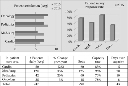
Figure 11.1 (See color insert.) Hospital patient volume and satisfaction.
Pivot Tables
A simplistic version of OLAP that many users can quickly relate to includes the use of pivot tables in a spreadsheet environment. Pivot tables leverage data in a flat, spreadsheet file to present alternative scenarios that describe a business activity. Through basic spreadsheet functionality, users can quickly generate a table view of relevant variables at a particular level of aggregation. For example, a spreadsheet of data that describes a software company’s sales activities can include numerous rows according to corresponding variables. Hypothetical data recording national sales activities of branches across the country are illustrated in Table 11.1.
Table 11.1 Hypothetical Data Recording National Sales Activities
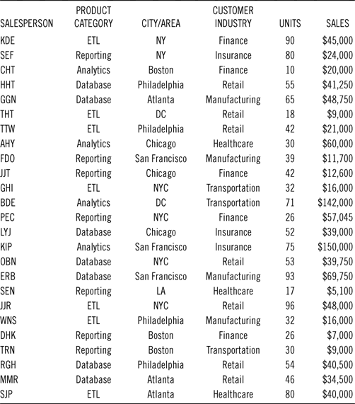
With a simple pivot function, Table 11.2 could be calculated with ease.
Dynamic Reporting through OLAP
Pivot tables are similar to OLAP in that they provide a multidimensional view of an activity. Enterprise OLAP provides greater scale to the analytic process, as it provides the platform to address multiple levels of aggregation of data resources, can depict updated views as source data are updated, and can process extremely large volumes of data. With this flexibility OLAP can help decision makers investigate information addressing multiple descriptive scenarios regarding an operation’s activity, therefore enhancing the knowledge generation process and overall ability to generate effective strategic conclusions. The diversity of information views involves various dimensions of time, performance metrics, and descriptive variables.
Table 11.2 Sales by Product Category by City
| ETL (Extract Transfer and Load) | |
| New York | $61,000 |
| DC | $9,000 |
| Philadelphia | $37,000 |
| Atlanta | $40,000 |
| Total | $195,000 |
| Reporting | |
| New York | $81,045 |
| San Francisco | $11,700 |
| Chicago | $12,600 |
| Boston | $16,800 |
| Los Angeles | $5,100 |
| Total | $127,245 |
| GENERAL CUBE INPUTS | ||
|---|---|---|
| TIME | DESCRIPTIVE VARIABLES | PERFORMANCE METRICS |
| Daily | Demographics | Sales |
| Weekly | Behavioral | Response rate |
| Monthly | Strategic | Operational performance |
| Quarterly | Process related | Units |
These inputs must be organized to provide information (variables at levels of detail) that describes a business scenario to facilitate decision support for the end user. Consider the graphical view of a cube in Figure 11.2.
Figure 11.2 depicts an illustration of an OLAP cube that facilitates analytics of patient satisfaction rates at a cardio area in a hospital. The cube presents a multidimensional view of a few variables that could potentially affect patient satisfaction. The platform gives the analyst the ability to query data variables from different levels of detail and in different combinations, through both numeric data and visualization. The tabs at the top of the graphic depict the variables that are available to be analyzed. The scenario depicted illustrates the number of daily visits to a patient by hospital staff (nurses, nurse assistants, technicians) and the corresponding patient satisfaction rates.

Figure 11.2 (See color insert.) Multidimensional cube.
Users also have the ability to change variable views regarding patient satisfaction from different perspectives, including:
•Time (weekly, monthly, quarterly)
•Illness severity (critical, observation: according to cardio Diagnosis-Related Group [DRG])
•Length of stay (LOS; duration of excess of LOS beyond expected)
•Physician (primary physician, specialty)
By navigating the different dimensions of the cube, the analyst can quickly identify strengths and weaknesses of different operational and patient descriptive variables on the performance metric. OLAP enhances the decision makers’ ability to understand more fully some of the attributes that drive patient satisfaction. Other variables can be introduced with the deliberation of stakeholders (e.g., staff training in patient communication tactics, etc.).
So what about big data you say? Remember, big data entails not only volume of data but also the new variables (sources of data). Both of these factors are considered when conducting analytics. In other words, a conceptual model must be generated that best describes the attributes of a desired process (entity to be better understood), and then data corresponding to those variables must be applied to that analytic framework. Big data adds complexity to the generation of the conceptual model as it introduces new descriptive variables that may not have been available or incorporated in the traditional structure of the particular process (e.g., categorizing physician comments on electronic health records [EHRs] during patient visits). The value of big data follows the basic concepts just mentioned; however, it can provide even greater value to the user by providing more robust models that provide greater descriptions and understanding of what affects process performance. In the patient satisfaction scenario depicted in the preceding text, perhaps a new variable that leverages social media (e.g., hospital Facebook likes) can be incorporated for another frame of reference. When considering big volumes and velocities of data in an OLAP environment, methods such as parallel processing and map reduction of data resources must be considered.
OLAP provides a robust source of business intelligence to decision makers, as it can leverage data resources including big data volumes and also provides a platform that offers a flexible, accurate, and user-friendly mechanism to understand quickly what has happened and what is happening to a business process. The multidimensional framework will give users the power to view multiple scenarios of a given process, such as the following:
•Are there associations between DRGs and excesses in patient LOS?
•What association do nurse-to-patient ratios have with readmit rates?
•How does patient demand for healthcare change during different months of the year?
The key to a valuable OLAP cube involves the combination of a few factors. One of these relates to the concept mentioned earlier, namely, that a cube must effectively describe a business scenario. The conceptual model that is used to build the cube must include noteworthy variables (relevant) with an appropriate detailed format that give users true business intelligence. The next major factor is filling the cube with accurate, current, and consistent data. Deficiencies in either of these areas can quickly render the analytic method useless for decision making. It should be noted that using OLAP for certain healthcare applications (e.g., outcomes associated with processes) introduces greater complexity than standard industry environments (e.g., sales by product by region) and requires more complex dimension modeling.1
Analytics at a Glance through Dashboards
In today’s ultrafast, ultracompetitive information-based economy, it seems that the more senior a manager you may be, the less time that is available for investigation and drilling around multidimensional cubes. Often the level of analytics is filtered down to a few insightful reports, ongoing insights absorbed in the marketplace, and the access to real-time dashboards that display key performance indicators relevant to a particular process. These dashboards are designed to provide decision makers with a feedback mechanism as to how an organization is performing closer to real time. In the healthcare industry, streaming data from a medical sensor depicting real-time vital information of a patient takes the importance of a dashboard to a new level (just consider the traditional EKG or heart monitor). The key elements of dashboards are the delineation of relevant key performance indicators (KPIs) to a particular process, timeliness of their readings (currency of information), and finally, a user-friendly visual that provides the decision maker with a clear way of determining whether a process is operating successfully or not. The more traditional visual platform resembles that of an odometer in an automobile, where color schemes of performance reflect that of traffic lights (e.g., green, all is well; yellow, caution; and red, something is wrong and needs to be investigated). However, dashboard technology is quickly evolving where styles can include combinations of a variety of visuals (bar, line, pie charts) according to designated scales and are being utilized by decision makers at all levels in an organization.
The key to the effectiveness of a dashboard design involves its connection to the process at hand and use for decision making. Displays must be simple to understand and interpret. Just as a simple graphic display must adhere to design conventions (e.g., coherent color scheme, axis labeling, scale), so too must dashboard design, which adds complexity to the process as it combines various visual elements. The true key to a successful dashboard is evident by its effectiveness in providing timely, easy-to-understand decision support of a corresponding process. Dashboards that are too busy (include too many visuals), that are difficult to interpret, can quickly become omitted from an analyst’s arsenal of decision support information.
Consider the dashboard example in Figure 11.3. The various graphic displays are clearly delineated from one another (separate sections) and are clearly labeled. Also, the design includes different visual displays, so the information presentation does not appear to overlap or include a blended view. Finally, complementary but distinctly different KPIs give the decision maker a well-rounded view of a human capital management application in this case.

Figure 11.3 (See color insert.) Clearly designed employee analytic dashboard. (From http://www.dashboards-for-business.com/dashboards-templates/business-intelligence/business-intelligence -executive-dashboard; Domo, Inc., http://www.domo.com.)
Robust Business and Drill-Down behind Dashboard Views
Dashboards provide an instantaneous mechanism to analyze the performance status of a process. Organizations with extensive analytic capabilities through business intelligence applications can have OLAP cubes that can be quickly drilled into from a dashboard KPI that provides descriptive analytics of underlying variables that underpin the KPI. A prime example of an e-commerce-based KPI is the bounce rate on a landing page for an organization, especially when a new marketing initiative has been launched. Perhaps an organization has initiated an Internet marketing campaign with banners listed on various complementary referral sites. A red signal indicating a higher than acceptable bounce rate would provide decision makers with a timely analytic alert mechanism to investigate the source of the problem. A real-time cube or report could quickly depict which referral site may be the greatest source of misdirected traffic.
Not all dashboard displays need to be real time, where a simple refresh of data on an interim basis provides decision makers with an accurate indication of whether a process’s performance is adequate. However, the big data era involving high velocity of streaming data resources often requires a real-time dashboard visual of a given process to provide users with a quick view of variable impacts on KPIs.
Data Mining and the Value of Data
As we’ve illustrated in the business intelligence section (e.g., reporting, OLAP, dashboards), a primary approach to generating value from data resources is to manage it into useful information assets (e.g., building conceptual models and viewing data according to level of details according to variables that describe a process). The next step in the valuation process is to generate a higher level of knowledge through the information created from data. Data mining involves the application of quantitative methods (equations and algorithms), along with forms of statistical testing that process data resources, which can identify reliable patterns, trends, and associations among variables that describe a particular process. Techniques such as segmentation classification, neural networks, logistic regression, and clustering, to name a few, incorporate the use of algorithms and code or mathematical equations to extract actionable information from data resources. Chapter 14 provides more information on applications of major mining methods.
Why Things Are Happening
Data mining can provide decision makers with two major sources of valuable information. The first refers to descriptive information, or the identification of why things may be occurring in a business process. This is done through the identification of recurring patterns between variables. Cross-sectional graphic displays can add significant information to decision makers to illustrate patterns between variables. Figure 11.4 provides a simple graphical view that illustrates an advertising spend versus dollar revenue elasticity curve as identified in the mining process. The figure depicts that a recurring pattern exists between the two variables, and that a direct relationship is prominent, where an increase in ad spend yields an increase in product revenue. Many non-mining-centric analysts would quickly raise the point that this information is not noteworthy, given the natural relationship between the two variables (e.g., the more spent on advertising, the more sales that are generated); however, this criticism is quickly dispelled when posing the question: If ad spend is increased by 5% from $200,000, what is the expected increase in revenue? That question is difficult to answer without the use of mining.
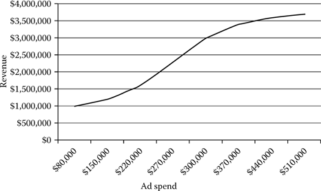
Figure 11.4 Advertising spend versus revenue curve.
Mining methods can yield insightful patterns as to demographic and behavioral attributes of consumer response to marketing initiatives, the impacts of process components on performance metrics, and many more. The following are a few prominent applications where mining is often utilized:
Healthcare-related areas (outcomes measurement, treatment effectiveness, operational performance)
Consumer propensities
Marketing and advertising effectiveness
E-commerce initiatives
Fraud detection
Worker and team performance
Pricing policies
Process-related applications (throughput, workflow, traffic analysis)
Risk assessment
What Is Likely to Happen
The other main source of information where mining provides value to decision makers is in the deployment of mining results. The patterns that have been identified are often embedded in an equation or algorithmic function, which are often referred to as the model, can be used to perform a “what if” analysis or estimate future expected results based on inputs. In other words, if I market my product to a particular market segment defined by demographics, what is my expected response rate? Or, is a particular activity (e.g., credit card use) likely to be fraudulent? If the analysis is based on a time series approach, mining models can provide forecasts for product sales. The analyst in this case needs to make assumptions as to future input values.
The healthcare industry involves a number of diverse areas for which analytics are required for knowledge generation. These scenarios often involve a number of diverse variables that encompass the descriptive drivers of performance metrics. Consider all the variables that follow and the corresponding level of detail that may provide descriptive information in better understanding performance metrics.
DRGs
Physician related
Nurse and staff related
Service entity (primary care physician, hospital, accountable care organization)
Patient descriptive and behavioral
Treatment related
Prescription related
Area of care
Time related
The incorporation of data mining methods that enable analysts to discover recurring patterns in an array of variables is often an essential technique to generate vital information.
Real-Time Mining and Big Data
The evolution of the big data era has increased the utilization of the concept of real-time or streaming mining approaches. More traditional streaming mining involves the creation of models through analyzing a data sample or historical data of a given process. The resulting model then becomes a function that can be used to process streaming or real-time incoming data, and corresponding actionable outputs are generated in real time as well. Streaming mining addresses the big data concept of velocity and volume of data and is incorporated in processes in which timely results are needed to improve strategies. Streaming mining applications are commonly applied in
Website traffic analysis for real-time online marketing
Fraud detection for online transactions
Financial market risk and trading
However, with the more prominent use of medical sensors that monitor patient metrics in the healthcare industry, the future may incorporate these real-time advanced analytic techniques to identify “trouble in the pipeline” for patients given the streaming data of vital signs.
Some big data sources (e.g., sensor- and satellite-producing entities) with extreme velocity and volume sometimes render the ability to extract a sample that represents the entire data source difficult, to say the least. In these instances, the ability to create optimized quantitative models to process this streaming data is limited. Techniques such as multisampling2 and the implementation of self-optimizing quantitative techniques that learn as data are encountered have evolved to address this issue.
Analysis of Unstructured Data and Combining Structured and Unstructured Sources
Up to this point, this chapter has dealt with analytics of structured data. The big data era, however, largely involves the incorporation of unstructured data resources that need to be analyzed to identify actionable information that enhances strategic initiatives. Text mining addresses the analytics of textual data (words, phrases, messages, emails, etc.). At a high level of description, text analytics seeks to create structure from unstructured sources. It does this by processing various unstructured forms and classifies them into particular categories. Processing is generally based in mathematics or linguistics.
In the realm of the vastly growing utilization of electronic communication, which includes texting, tweeting, leaving content on social media, emailing, and so forth, one can quickly see the possible value that exists in deploying analytic techniques to extract information that describes responses to marketing initiatives and product and service offerings, reactions to news and events, and general consumer behavior and sentiment.
An example involving the analysis of both structured and unstructured data for informative decision support is evident when examining patients’ EHRs to better understand treatment outcomes and patient diagnosis. More structured physiological data (e.g., blood sugar levels) can be combined with unstructured data (e.g., physician comments on treatment) to better understand a patient’s status. Analytic techniques such as semantic mining can be applied in this situation to extract actionable information.
Six Sigma Analytics
Still many other analytic approaches exist outside the realm of business intelligence applications. More intensive, user-generated analytics include Six Sigma–based initiatives. The core of Six Sigma is a philosophy and focus for reducing variability in process operations. It involves process definition and the incorporation of an array of statistical analytic methods to measure the performance of various attributes.3 Classic Six Sigma is underpinned by the DMAIC methodology, which is an acronym for
Define: Process attributes and project objectives.
Measure: Identify relevant data variables and measure performance of the process.
Analyze: Identification of sources of unacceptable variances.
Improve: Initiate strategic tactics to address causes of variance.
Control: Establish metrics to measure performance for ongoing feedback and take appropriate actions to address shortcomings of the process.
The initial three steps to the methodology clearly depict classic analytics as they involve the definition of the problem objective and corresponding use of statistics and techniques to analyze the performance of the process. Consider the recent evolution of the health-care industry that has involved an aggressive adoption of information technologies to underpin the vast processes that exist in a healthcare provider’s operations in treating patients. Workflow processes (e.g., the stages that a patient must go through when visiting the emergency room, or on a more detailed basis, the activities that are entailed from when a physician orders an exam to when the results are available) are often time stamped, which enables the estimation of time duration of activities. This provides a prime example for Six Sigma analysis. Chapter 12 illustrates the use of Six Sigma for better understanding the efficiency of treating patients at the emergency room.
Analytics of Episodes of Care and Episode Treatment Groups
Episodes of Care (EOCs) measure a more complete set of activities when considering the treatment of an individual’s ailment or illness instead of considering a single outcome to an isolated procedure (e.g., surgery). EOCs consider the entire set of activities that encompass a patient’s treatment. In the case of an acute situation, an EOC begins or takes its anchor with an initial diagnosis or identification of an ailment and includes all activities (prescriptions, procedures, etc.) and ends when the ailment subsides. Measuring the cost of the entire episode captures a more complete picture of the healthcare process.
To analyze EOCs in the aggregate to determine more or less effective treatment procedures, episodes need to be categorized into similar groupings to perform a comparative analysis. Categories can include DRG-related ailments that must be adjusted for any comorbidities, complications or treatments that dramatically change a patient’s clinical profile, care utilization, and costs. The ultimate result is an Episode Treatment Group® (ETG®) or a grouping of individuals with similar EOCs. ETGs become a homogenized group of episodes that can be compared and analyzed to identify those activities that depict or drive high cost variances or outliers in relation to the expected cost of a given EOC in an ETG.4
When analyzing a high-cost EOC, one should keep in mind what the episode really depicts. An EOC can be comparable to a work-flow process or even a supply chain of events. In a traditional business workflow, a project requirement is received and a series of activities must be carried out to complete the task. In a supply chain, orders for products are received and parts must be acquired, assembly takes place, and shipping to the final destination occurs. A breakdown in any of the chain of events in workflows or supply chains can have adverse effects on the final performance metric.
Analyzing episodes of care is no simple task, given the chain of activities that are involved. A good starting point is the identification of the outliers of episodes within the homogeneous categories or ETG. ETGs should be assigned an expected performance outcome, similar to LOS estimates according to DRGs. The outlier provides an identification mechanism that a particular episode of care has weak links. Perhaps prescription medications were not adhered to; a procedure was not appropriately administered; error in instructions or recording of information took place, and so forth.
However, even when a disruptive activity within an EOC has been identified, this may not be actionable information because it pertains to an individual instance of an individual case. High-value information comes in the form of identifying recurring patterns of events that result in high cost or suboptimal care. This gives the analyst and ultimately service provider the ability to identify noteworthy, repeated breakdowns in care and also provides focus for a solution (e.g., implement a prescription alerting system). The result should be a better functioning episode, where future recurring breakdowns are mitigated, which is high-value analytics. Data mining techniques provide effective analytic methodologies for the aforementioned case. The algorithmic processing of data with statistical techniques is well suited to identify patterns that enable a solution provider to pinpoint the areas of concern within an EOC.
Cognitive Systems in Healthcare*
One of the most ambitious approaches to decision support in health-care involves the use of cognitive systems—those technologies that seek to emulate or improve upon human decision-making capabilities, and have some degree of autonomous intelligence. These systems typically involve a combination of analytics, machine learning, natural language processing, and event processing or workflow functions. The most well known example is IBM’s Watson, but there are systems from a variety of companies that are being used in healthcare.
Healthcare is well suited for the use of cognitive systems because it is increasingly difficult for humans to master all the health and wellness information necessary for effective decision making. In oncology, for example, physicians now believe that there are more than 400 kinds of cancer, with hundreds of potential oncogenes and tumor suppressor genes that can govern the growth of cancers. There are more than 75 alternative drugs to treat breast cancer alone, and new cancer treatments emerge almost daily. In short, the amount of complex and rapidly changing information an oncologist would need to master is well beyond most human capacities.
Even in situations in which human clinicians can keep up with the information complexity, there are economic and wellness benefits to cognitive systems. They can provide “second opinions” to clinicians, and can advise patients on treatment and wellness issues when they are not in a doctor’s office or hospital. In some cases they may allow nurses to dispense medical advice that would otherwise require a physician. They can provide a level of detail and personalization in recommendations that goes far beyond any existing medical website. And in that remote care context they can be easily updated to accommodate advancing medical knowledge.
There are three primary applications of cognitive systems in health-care thus far. One is the diagnosis and treatment of complex diseases, with physicians as the primary users. Memorial Sloan Kettering and M.D. Anderson Cancer Centers both have cancer treatment projects underway with IBM Watson. Such projects tend to be large, expensive, and time consuming; they are the “moon shots” of cognitive systems in healthcare. When fully implemented they are unlikely to replace human physicians, but it is possible that they could affect physician employment on the margins. Rural hospitals, for example, might be able to get by without certain types of specialists if the knowledge for that specialty was contained in a cognitive system and could augment the work of an internist or hospitalist.
Somewhat less ambitious cognitive projects involve treatment and care recommendations for patients. M.D. Anderson and Intermountain Healthcare, for example, are in the process of implementing systems to provide care and wellness recommendations for patients with cancer and type 1 diabetes, respectively. These systems can incorporate data from patients’ electronic medical records as well as home monitoring and activity tracking devices. Both are employing technology from startup vendor Cognitive Scale. Welltok, a startup in the wellness space, employs IBM’s Watson for similar patient care recommendation purposes.
Finally, there are a variety of administrative activities in health-care that can also benefit from cognitive tools. They include billing, IT support, admitting, and other financial and operational processes. M.D. Anderson, for example, is using a Cognitive Scale system to score patient bills that are the least likely to be collected. That institution’s chief information officer, Chris Belmont, has identified more than 50 use cases for cognitive technology, and has already implemented several.
Given the complexity of healthcare and the need for performance improvement, it seems very likely that cognitive systems—which might be called “decision support on steroids”—are likely to become much more common in the field. they may not significantly reduce employment levels for clinicians, but they do present opportunities for more efficient and effective care, and they are likely to have significant impacts on care delivery, both within and outside of medical institutions.
An Often Overlooked Sector of Analytics (Power of the Simple Graphic)
Although many think of analytics as crunching numbers through an array of techniques and interpreting metrics to support decision making, analytics are greatly enhanced by the incorporation of an often taken for granted application of visual displays. Just think of having to analyze tables and columns of pure numbers when reviewing analytic reports. The process can quickly become mundane and even painful. In the host of analytic applications we described in the preceding text and for numerous additional analytic methods, there is a common denominator to a successful endeavor, and that is the use of graphics to disseminate information. A simple view of a well-designed graphic can provide the decision maker with a clear presentation of extensive analytic results in a comprehendible manner.
To leverage graphics successfully, a few key points need to be considered. Before you become intrigued with robust colors and images that quickly draw you to generate dramatic conclusions about a particular process, take a step back and increase your understanding of what the information is actually portraying. In other words
1.Analyze the titles and legends.
2.Take notice of the scale of the axis.
3.Understand the graphic/chart method used.
When the analyst fully understands the variables that are depicted in the graphic, what the type of graphic focuses on, and the scale of the axis, only then can he or she begin to generate effective interpretations. In the following section, a variety of graphical styles are listed with some simple descriptions of when they should be used. Keep in mind that when considering graphics in a big data era, the most significant elements are real-time graphics that provide analysts with a streaming view of processes. The real-time streaming visualization of data actually becomes a dashboard that analysts can monitor to observe variances in KPIs in relation to some event.
Graphic Types
Figure 11.5 illustrates the classic pie chart that depicts how a whole unit is divided among some subcomponents (pieces of an established pie). Market share is a prime example for pie charts, where share can be delineated by product lines, regions, industry competitors, etc. Pie charts have limitations when considering negative values.
Despite the seemingly simplistic bar chart depicted in Figure 11.6, the visual actually incorporates a number of important elements in the realm of analytics. The graphic depicts a comparative view of a multicomponent process (call centers in this case) in a time series setting (quarterly views). With a quick glance, the analyst can make inferences regarding relative performance (customer satisfaction) of three different call centers over time. Bar charts are more appropriate in depicting quantities or amounts of select variables.

Figure 11.5 Pie chart depicting market share.
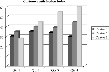
Figure 11.6 Bar chart (comparative view of multicomponent process).
Bar charts are also often used to illustrate variable distributions (percentages of ranges or categories of a given variable). Figure 11.7 depicts a categorical age variable and the amount of data that exists in selected ranges. This gives analysts a better understanding of the dimensions of a given data variable, and in this case enables them to determine if there is any age skew or bias (high percentage of one age range relative to the population). In conducting market research, a variable distribution view enables the researcher to determine if a target market is included in a data resource.
Variable distribution analysis can often include visuals via line graphs that are useful in illustrating scenarios involving continuous variables. Figure 11.8 illustrates the continuous data variable of mall foot traffic for a given day according to retailers.
Time series line charts provide users with a visual of potential seasonality in processes. Figure 11.9 depicts the classic holiday effect in retail as is seen in the repetitive bump in sales in Q4.
Another type of chart involves the scatterplot that is commonly used to illustrate correlations between variables, where simple plots of individual data points are depicted. Figure 11.10 depicts data points illustrating correlations between employee performance and training received.

Figure 11.7 Age distribution chart.

Figure 11.8 Line chart of continuous variable distribution of mall traffic.

Figure 11.9 Time series line charts for seasonality.
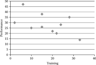
Figure 11.10 Scatterplot for correlations.
A rather insightful chart style is the bubble chart. The bubble graphic enables analysts to depict three-dimensional scenarios in a coherent fashion by incorporating bubble size to illustrate variable attributes. Figure 11.11 depicts the multidimensional scenario of organizational team performance according to workload and team size.
Yet another graphic style that has increased in importance over the evolution of the big data era is the use of maps. Map visuals are generally utilized when an analysis involving location is emphasized; however, location can also refer to a process location. Applications such as traffic analysis or population analytics are common examples. Traffic can refer to website activities, vehicular, consumer, or some type of designated activity.
In a simple web traffic visual, a map can illustrate cross sections of time and area of a webpage that are receiving high user traffic. This can provide strategists with actionable information to more effectively apply online marketing tactics (e.g., display banners in hot spots on a particular page at a particular time).
Civil engineering can leverage heat maps by incorporating GPS data to investigate hot areas of traffic incidents (congestion, accidents) and optimize new designs to alleviate existing trouble areas and in designing new roadways.
Figure 11.12 provides a standard heat map where “hot colors” depict more intense activity. In this case, the hotter areas depict areas where job vacancies are difficult to fill.

Figure 11.11 (See color insert.) Bubble chart depicting workforce team performance.

Figure 11.12 (See color insert.) Heat map that illustrates areas of hard-to-fill job vacancies. (From Wanted Analytics, http://www.wantedanalytics.com.)
Map visuals are particularly applicable in the big data era, when real-time, high-velocity analytics and voluminous sources are involved. Applications that leverage big data include geovisualization that involves the analysis of geographic specific flows of data and bioinformatics and sensor output in the healthcare spectrum. For example, the healthcare industry is increasingly utilizing streaming sensor data generated by various treatment and diagnostic technologies. For diagnosis (magnetic resonance imaging [MRI]), these data describe the characteristics of a patient. Visual displays of this source are essential to extract information on trouble areas for patients. Chapter 9 (Figure 9.5) provides more detailed information corresponding to this concept. As big data sources emerge, the application of heat maps should become a common visual technique for providing analysts with a mechanism to enhance strategic initiatives. Figure 11.13 depicts a heat map showing percentage likelihood that a primary melanoma site will show lymphatic drainage to axillary lymph-node fields. While Figure 11.14 depicts an example of computerized tomography, three dimensional image of the brain and blood vessels.
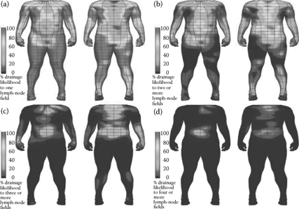
Figure 11.13 (See color insert.) Three-dimensional visualization of lymphatic drainage patterns in patients with cutaneous melanoma. (From Reynolds, H., Dunbar, P., Uren, R., Blackett, S., Thompson, J., and Smith, N. Three-dimensional visualisation of lymphatic drainage patterns in patients with cutaneous melanoma, Lancet Oncol 8:806–12, 2007 (Figure 1), http://www.thelancet.com/journals/lanonc/article/PIIS1470-2045%2807%2970176-6/fulltext?rss=yes.)
Value of Data and Analytics
We began this chapter by stressing the importance of analytics as an essential component to deriving value from data, where the era of big data adds intensity to the concept, as it adds new dimensions to the equation. Regardless of the source of data, its value is not realized unless it provides some resource to a strategic endeavor. Rarely does a decision maker reference a data source without first formulating a reason to do so. Once the conceptual need is defined, only then can data provide value.
The conceptual need involves the quest to better understand a process with the goal of enhancing its efficiency or productivity. Simply analyzing random data and coming up with associations between variables may actually generate negative returns because the analytic process requires time and resources, and the result may not add meaningful information.

Figure 11.14 (See color insert.) Computer tomography image. (From Shutterstock, http://www.shutterstock.com/pic-221642638/stock-photo-medical-illustration-of-the-brain-and-head -arteries.html.)
Consider the growing data resource in the area of sports. More variables (variety) and real-time downloads of various athletic activities at corresponding events (velocity and volume) may seemingly provide great value to understanding various attributes of different athletes and sports teams. However, to truly generate value for decision making, a conceptual model must be created. Consider the quest to better understand what leads a team to achieve a winning record. An analysis of corresponding data could yield the following result: basketball teams with winning records generally score more 3-point shots.
At first glance, this may seem to be very valuable information, but the revelation proves limited at best when looking to make a strategic decision. What does a coach do in leveraging this associative pattern—encourage players to take more shots from the 3-point zone? Does he change practice to intensify skills for increasing 3-point percentages for players? And if so, what happens to the team’s performance from the 2-point zone, and does a reduction in 2-point conversions decrease the likelihood of winning a game despite an increase in 3-point shots? In the case at hand, does the variable of number of 3-point shots really add descriptive value to what leads to a team’s success? Perhaps more appropriate variables that can provide strategic action could entail
Team practice data (frequency, drills, duration)
Player descriptions (height, speed, position, age)
Type of offensive and defensive tactics
Identifying patterns among these types of variables empowers a coach (decision maker/strategist) to implement strategic initiatives that impact a performance metric or defined objective—winning.
Closing Comments on Efficiency and Productivity
The concept of value also extends to three often cited benchmarks in the realm of commerce: efficiency and productivity. One should note that although the three terms appear synonymous, there are noteworthy differences among them, so when seeking to succeed in strategic endeavors, decision makers must clearly understand the entire initiative from the perspective of these three concepts.
Analytics of all types naturally address the quest for enhancing efficiencies of corresponding processes. Enhancing efficiency naturally leads to cost reduction for the defined process; however, simply increasing efficiency for a particular activity does not necessarily imply an increase in productivity and profitability at the organizational level. Consider a marketing department for a small retailer that depends on more traditional mail order initiatives to generate sales. The department could consistently achieve increased efficiency in the process of creating printed marketing materials, generating addresses, and mailing literature to the market. These efficiencies could be achieved by implementing new printing technologies, data-based endeavors, and so forth. However, productivity as measured by response rate or increased product sales may not necessarily increase. Perhaps traditional mail is no longer the most effective marketing medium for the type of product given the evolution of e-marketing tactics and the adoption of smartphones and electronic communication by consumers, or perhaps the target market has changed its behavior and a different segment is actually more appropriate for the product. What may actually transpire for this endeavor is an efficient process that yields decreased productivity for the organization (deploying resources and achieving decreased returns).
Just as analytics were utilized to better understand what drives wasteful activities for the mail order marketing initiative, so too should they be utilized for such endeavors as better understanding overall marketing effectiveness and target marketing. Simply put, strategic endeavors must incorporate a bigger picture than simple processes.
This idea reigns true in the realm of healthcare. With evolving data resources that provide the building blocks to actionable information, analysts and decision makers need to keep in mind the big picture when implementing new initiatives. Analytics provide insights into achieving efficiencies in treatments, workflows, and so forth where the ultimate goal of achieving a healthier population and higher quality of life while effectively managing costs should not be forgotten.
References
1. Parmanto B, Scotch M, Ah SA. 2005. Framework for designing a healthcare outcome warehouse. Perspect Health Inf Manage 2:3.
2. Rajaraman A, Ullman J. 2011. Mining data streams. In Mining of massive data sets (pp. 129–132). Cambridge, UK: Cambridge University Press.
3. Pande P, Neuman R. 2000. The Six Sigma way: How GE, Motorola, and other top companies are honing their performance. New York: McGraw Hill.
4. Symmetry® Episode Treatment Groups® (Measuring health care with meaningful episodes of care). White Paper. Eden Prairie, MN: OPTUMInsight™.
______________________
*Section contributed by Thomas H. Davenport.