Filling open paths
Discovering how to use strokes
Getting to know the Color and Swatches panels
Using and creating patterns
Applying textures to paths
Working with gradients
A Fills and strokes give life to your artwork. If Illustrator were a coloring book, the fills and strokes would be the biggest, best box of crayons ever (only better because these colors always stay inside the lines). Better still, they're magic colors. You're not limited to a single solid color within an area. You can have gradients and patterns as well. And not only can you color inside the lines, but you can color the lines themselves, make them thinner or thicker, or hide them altogether. Best of all, unlike crayons, these don't make a mess when your big sister grinds them into the carpet because you ran to show Mom your new artwork and forgot to clean up after yourself.
In this chapter, you discover the different boxes of crayons Illustrator has to offer, such as the Color and Swatches panels, and how to color your artwork with them by using the Fill and Stroke boxes. You find out how to create your own colors. Rounding things out, you get to know the special colors, gradients, and patterns in Illustrator, which stretch the meaning of what color really is.
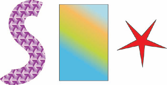
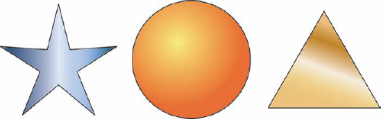
A fill is a color enclosed by a path. A stroke is a line of color that precisely follows a path. To run the coloring book metaphor into the ground (carpet?), the stroke is the line, and the fill is the inside-the-line that you aren't supposed to color outside of (but you did anyway because you weren't about to let your parents stifle your creativity!). Color is a loose term here: It can mean a solid color, a pattern, or (in the case of fills) a gradient. In Figure 5-1, you can see a variety of paths with different strokes and fills applied to them.
Although a stroke can be any thickness, it always uses a path as its center. And although you can stylize your strokes with solid colors or patterns, you can't use a gradient. (Patterns and gradients are special combinations of colors; read more about them in the upcoming section "All the colors in the rainbow and then some.") Remember that a path surrounds the area where you put the color. This area is the fill because, um, it's filled (with color).
Tip
Fills and strokes can obscure the boundaries of your paths, especially when you have very thick strokes on your paths, such as the S-shaped purple pattern in Figure 5-1. To temporarily hide all fills and strokes, choose View
You have many ways to create and modify fill and stroke color in Illustrator, but the quickest and easiest way to apply them is by using the Fill and Stroke boxes in the Tools panel, which looks remarkably like what you see in Figure 5-2.
You can change a fill or a stroke, but not both at the same time. You decide whether to change the fill or the stroke by selecting an object and then clicking the Fill (solid) box or the Stroke (bordered) box. The box you click comes to the front; after that, every color change you make is applied to whichever one you chose . . . until you choose the other one.
Some very useful features surround the Fill and Stroke boxes. Just to the upper right is a little curved line with arrows on both ends. Click this thingamajig (the Swap Fill and Stroke button) to swap fill and stroke colors. (Go figure.)
Tip
Press Shift+X on your keyboard to swap fill and stroke colors without having to click anywhere!
To the lower left of the Fill and Stroke boxes are miniature white (Fill) and black bordered (Stroke) boxes. Click this Default Fill and Stroke button to set the Fill and Stroke boxes to their default colors: white for Fill, and black for Stroke.
If you prefer fills and strokes in festive colors, here's the story: Beneath the Fill and Stroke boxes live three square buttons that handle colors. Click the first square (the Color button) to change the fill or stroke color to the last color that you used. Click the second square (the Gradient button) to change the color of the stroke or fill so that it matches the last-selected gradient you used. Click the third square (the None button) to use no fill or stroke color at all.

Tip
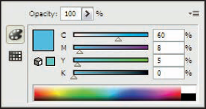
Double-clicking the Stroke or Fill boxes summons the Color Picker, shown in Figure 5-3, from which you can specify colors in a variety of ways. You can choose a color from a spectrum, using the true color field and the color slider, or define a color numerically. You can also select colors from the Color and Swatches panels, as I describe later in this chapter.

You can fill a path with one color and stroke it with another, as shown in Figure 5-4.
To fill a path with one color and stroke it with another, just follow these steps:
With any of the selection tools, select the path that you want to color.
In the Tools panel, click the Fill box (the solid one).
Doing so tells Illustrator to apply the next color you choose to the fill (but not the stroke) of the selected path.
Choose Window

The Swatches panel appears. The squares in this panel function in much the same way as the three squares beneath the Fill and Stroke boxes in the Tools panel. Click any square in the panel to apply that swatch to the selected stroke or fill. (For more information, see "The Swatches Panel" later in this chapter.)
Click any solid-color swatch.
Well, okay, any swatch in the panel works. The ones that aren't solid colors are special colors, such as patterns and gradients — but sticking to solid colors is less confusing early on.
Click the Stroke box (the thick-bordered one) in the Tools panel.
Illustrator is ready for you to pick a stroke color.
In the Swatches panel, choose a solid color, just like you did for the fill color in Step 4.
Tip
You can also drag and drop color onto your path. Simply drag a color swatch from the Swatches panel and drop it onto your path. Depending on whether the fill or stroke is selected in the Tools panel, either the fill or stroke is colored anew.

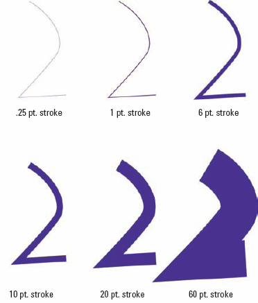
When you follow the steps to color a stroke and don't see any change, you probably have too narrow of a stroke. Stroke widths can range anywhere from 0 points (pt) to 1,000 pt (18 inches, or about 46 centimeters), as shown in the examples in Figure 5-5. If the stroke is too narrow to be visible onscreen, you can change the stroke width by using the Stroke panel, as shown in Figure 5-6.
To give the path a different stroke width
Select the path with any selection tool.
Choose Window
The Stroke panel appears.
Enter a new value in the Weight field. Or, if you like, just choose one from the field's drop-down menu.

You can make the stroke you've created dashed by putting numbers in the Dash and Gap fields at the bottom of the Stroke panel. Dash fields are solid chunks of stroke, while Gap fields are empty spaces. You can also change the end cap type to Butt (snicker), Rounded and Projected, as well as change the corner type to Miter, Round or Bevel.
This power-user tip will have your friends writhing in jealous agony: Choosing the Add New Stroke option from the Appearance panel pop-up menu places a second stroke on your path. You can make this stroke a different color or width, and even apply an effect directly to it. To avoid confusion, always check to see which stroke is highlighted in the Appearance panel (accessed by choosing Window
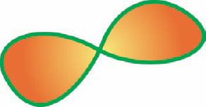
Sometimes a path crosses itself. For instance, a path in the shape of a figure eight crosses itself once. If you fill this path, the two round areas of the eight end up full, as shown in Figure 5-7.
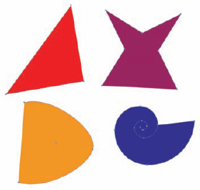
Open paths, which have separate starting and ending points, can also be filled, but the results are a little different from what you might expect. When you fill an open path, an imaginary path connects the first and last points of the original path. This imaginary path marks the limits of the fill area. If you apply a stroke to the figure, the stroke doesn't apply to the imaginary path. Figure 5-8 shows open paths with fills in them. The fill of the paths results from an imaginary line drawn between the two endpoints of the path. (If you look closely at Figure 5-8, you'll notice that the blue highlights marking a real path are missing from the imaginary path connecting the endpoints.)
Illustrator stores colors in the Swatches panel for quick and easy access — and no matter how fast you grab a color, you never have to worry about splattering paint. The Swatches panel comes with a whole set of colors that are ready to use just by clicking them in the panel.
Additionally, Illustrator comes with many swatch libraries — sets of colors created for special purposes — so if your first-grade crayon box never seemed to have enough colors, you're in luck. You can even create your own custom colors by using the Color panel (see the later section "The Color Panel") and adding them to the Swatches panel.
Using the Swatches panel (shown in Figure 5-9) is almost as easy as looking at it. Select an object with any selection tool, click the Stroke or Fill box in the Tools panel, choose Window
The Swatches panel contains several different types of color swatches, each with its own range of purposes and uses. Such swatches are used primarily for two purposes: first, to quickly access commonly used colors, gradients and patterns; second, for setting "global" colors that you can apply in your illustration and then change later, affecting all the objects that have that color applied to them. You can even group colors together.
Here's the lineup:
Process color: This is your run-of-the-mill, straight-up color with no added bells or whistles. You can make a color for use on-screen or for print by mixing varying amounts of red, green, and blue (RGB) or cyan, magenta, yellow, and black (CMYK). For more information on using RGB versus CMYK colors, see Chapter 1. These appear as solid color squares.
Spot color: (Nope, not for creating polka dots or Dalmatians.) Spot colors are used exclusively in printing. The four-color CMYK printing process can create only a limited range of colors from its four basic color ingredients. To compensate, the process can also use spot colors of specified inks that come in a particular color. Many companies make spot colors, but most countries have one dominant company that sets the standards for spot-color printing in that country. (In the United States, it's Pantone; in Japan, it's TOYO.) The range of all colors that a company produces is its library. Illustrator includes swatch libraries from all the swatch-producing companies. Spot colors show up in the Swatches panel with little triangles in their lower-right corners; these triangles have a tiny spot in their corners.
Registration color: Registration is a special Illustrator color that uses 100 percent of all inks. Although it looks like black on-screen, it's not for artwork. Registration (as a color, at least) exists for a very specific technical purpose: creating the Registration marks used by commercial printers to get things in proper alignment on press. If you aren't a commercial printer or haven't been specifically told to do so by a commercial printer, you should never use Registration. Registration looks like a crosshair in the Swatches panel.
Warning
If you use Registration to color your artwork, you get an unprintable sticky mess that will probably stink (chemically, at least), waste ink, and never dry.
None: This color choice differs from White, which tells a printer to put no ink in a particular space, on the assumption that the paper itself supplies the white color. None, on the other hand, is the complete absence of color. In a picture, a white object is opaque — it blocks your view of any objects behind it. (You can't see the electric outlet behind a white refrigerator.) An object with a color of None, however, is transparent — invisible. If you want to use a stroke but also want other objects to show through the fill (or let the fill show through the objects), choose None for the specific on-screen area you want to see through. None appears in the Swatches panel as a white square with a diagonal red line through it.
Gradients: Gradients combine two or more colors in a smooth transition that shades from one color into the other.
Patterns: If you really love wallpaper, you can use one or more objects in a tiled pattern to fill other objects.
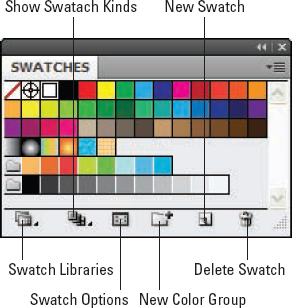
The icons at the bottom of your panel (refer to Figure 5-9) allow for different swatch-related functions. They are, from left to right:
Swatch Libraries: This displays a list of all of the Swatch Libraries available. There are an awful lot of them available when you install Illustrator, and you can use any existing document as a swatch library by choosing Other Library from the list and browsing to an Illustrator document of your choice.
Show Swatch Kinds: This allows you to filter the types of swatches shown; pick from All, Just Color, Just Gradients, Just Patterns or Just Color groups.
Swatch Options: This displays the options for the currently-selected swatch (allowing you to name it and change other attributes of it).
New Color Group: This creates a folder where you can organize related swatches.
New Swatch: This creates a new swatch based on the current active color.
Delete Swatch: This deletes selected swatches from the swatch panel.
Swatches are a quick way to retrieve colors, but they do more. Double-click any swatch in the panel to open the Swatch Options dialog box, shown in all its useful glory in Figure 5-10.
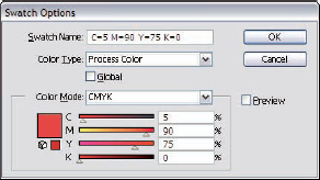
The Swatch Options dialog box keeps you busy with choices and gives you creative possibilities. Here's the list:
Swatch Name: Here, you can give the color a distinctive name (such as Maine Blueberry) or change its name.
Color Type: You can change a spot color to its closest CMYK or RGB equivalent. This is a handy option when your client provides you with a logo rendered in spot colors ("Metallic puce? You're not kidding?"), and you have to produce an image in CMYK or RGB.
Note
Unfortunately, you can't go the other way around. Trying to change a process color into a spot color doesn't give you the closest spot color equivalent from the Pantone, TOYO, or any other color library. (For more about color libraries, see the following section, "Swatch libraries.")
Global: After you select (check) this option, Illustrator remembers everything you color with a particular swatch. When you change the color of the swatch, everything with the old swatch's color updates to the new color. (Mercifully, Adobe didn't call this feature The Old Swatcheroo.) This feature's a great timesaver when you want to change a color scheme. You don't have to go back, reselect, and recolor everything — very handy, indeed.
Color Mode, gamut warnings, and color sliders: These features are especially powerful when used with Global color. They all work just like the Color panel except that they apply your changes only to the selected swatch. See more on this panel in the upcoming section, "The Color Panel."
Illustrator comes loaded with color choices in the form of swatch libraries — sets of color swatches created for specific purposes. (Pantone, for example, has several libraries devoted just to spot colors.) The libraries you get with Illustrator draw from all the major spot-color sources in the world. A Web library provides tried-and-true colors that work best on the Internet. To peruse these libraries, choose Window
Tip
Some libraries contain hundreds of swatches, which can make finding a particular color difficult. Fortunately, swatch libraries have a Find field at the very top of the window. For example, if a client wants a logo done on a report cover in Pantone 185, just open one of the Pantone libraries (by choosing Window
Tip
If you need to choose spot colors for a project that will be offset printed, make sure to select your color from a printed swatch book manufactured by your chosen ink company. Never select the colors based on your on-screen view of the swatches in the library. Because of many variables, your screen can give you only its best match of the printed color. It will never be exact and frequently will be quite different.
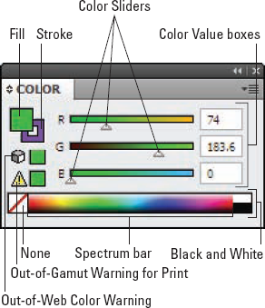
The Color panel is as close as Illustrator gets to a real-world artist's palette. You use it to create new colors by blending. Instead of mixing splotches of pigment and linseed oil with a brush (and getting half of it on your jeans), you move sliders to adjust how much of each component color goes into your new color.
The Color panel (see Figure 5-11) has several cool features, in addition to the color sliders, that make creating colors easier.
Fill and Stroke boxes: These function identically to the Fill and Stroke boxes in the Tools panel. They're available here in the Color panel for your convenience.
Color sliders and Color Value boxes: You can create a new color by dragging these sliders to the left or right. The color in the Fill or Stroke box (whichever is in front) updates to reflect the change, as does any selected artwork. To specify an exact amount of a particular color, type a number into the Color Value box to the right of each color slider.
None: Click the None button to choose a Stroke or Fill value of None.
Black and White: You guessed it! Click Black to make the color black, and White to make it white. (Wait a minute. Was that a trick question?)
Spectrum bar: In this little rectangle are all the colors that you can possibly create. Click anywhere on the Spectrum bar to choose a color. Well, okay, the spectrum is tiny; almost nobody picks exactly the right color on the first click. Use the spectrum to get a color that's in the right ballpark, and then use the sliders to make the color precisely what you want.
Out-of-gamut color warnings: When you create colors, tiny color boxes appear, warning you whether the color is outside the color gamut for print or the Web. (The gamut is the total range of colors that a method can create without having to alter any of the colors.) For the Web, the gamut is 216 colors; for print, it's several thousand. If you choose a color outside this range, that color can shift to another color. The Out-of-Web Color Warning is a square of color with a little cube beside it; the Out-of-Gamut Warning for Print is a square with an exclamation point inside a triangle beside it. Click the square to choose a color within the gamut that's closest to the color you chose. If you're creating for the Web, you can ignore the print gamut warning — and vice versa if you're creating for print.
To create a new color by using the Color panel, follow these steps:
Choose Window
The Color panel appears.
From the Color panel pop-up menu, choose a color model.
See the upcoming section "Modes and models" for more information.
Click the Fill or Stroke box in the panel.
Move the sliders of each component color to the left or to the right until the color you want appears in the Stroke or Fill box.
Of course, if you actually want to use the colors that you create in the Color panel (what a concept), you can do so in a couple of ways:
Use the color while you use the panel. Anything already selected when you create a new Fill or Stroke color is filled or stroked with that color. (For example, you can fill a selected pterodactyl with pteal or pturquoise.)
Save the new color for later. After you create the new color, you can save it to use again later. Here's how:
Open the Swatches panel by choosing Window
The Swatches panel appears.
Click the Fill or Stroke box (whichever you just created) in either the Tools panel or the Color panel.
Drag the Fill or Stroke box onto the Swatches panel.
Don't worry, you won't damage the Color panel when you drag away the Fill or Stroke box. Instead, you get a ghostly outline of the box while you drag it away. Release that outline on top of the Swatches panel to add the Fill or Stroke to the panel.
After you release the mouse, the color shows up in the Swatches panel for you to use again and again! (Pteal pterodactyls ptravel in flocks? Who knew?)
With the new color in the Swatches panel, you can double-click it to open the Swatch Options dialog box. Here you can give it a name, make it a global color, or use any of the options I describe in the earlier section, "Swatch options for super colors."
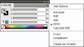
Mode and model are the Illustrator terms to define color. Color mode is the language of color your document speaks — either CMYK or RGB. Color model is a way of describing how to form the colors in the mode (color-language) your document uses.
All the colors used in the document (except spot colors) exist in one particular color mode, no matter what color model you use to create them. When you open a new document, you must decide whether to work in RGB or CMYK color. (See Chapter 1 for the tale of two color modes.) With that out of the way, you then get to choose a color model for your color mode from the Color panel pop-up menu (accessed by clicking the small horizontal bars in the upper-right of the panel); see Figure 5-12 for a mug shot.
Suppose, for example, that you want a shade of gray while you're working in RGB mode — the RGB color model of the RGB mode, to be more precise. Shades of gray are hard to create in the RGB color model, though, because you have to drag all three red, green, and blue sliders to get the color you want. To dodge that complexity, switch the color model to Grayscale in the Color panel pop-up menu. Then you have just one slider to deal with, and you can quickly create the exact shade of gray you want.
The Color panel is where you create the colors you need, using a variety of color models: Grayscale, RGB, HSB, CMYK, and Web Safe RGB. Each has a specific purpose, but really these different colors exist only to help you visualize the color that you're trying to create. The Color panel enables you to mix colors in any color model, but as soon as you apply them, they convert to the color mode you're using.
The following list describes these color models and the best ways to use each:
Grayscale: Here, colors express everything as a shade of gray. This model is handy when you're creating a black-and-white printing or just want a quick way to specify a shade of gray. Grayscale is measured in terms of ink values, with black as 100 percent — the most ink possible.
RGB: With this model, colors are based on the three colors (red, green, and blue) used by your monitor to generate all the colors that you see on-screen. These colors are designed for on-screen use, such as graphics for the Web or for video. The amounts that you see in the Color Value boxes range from 0–255. They correspond to the intensity of the light projected by your computer screen. Computer screens use tiny red, green, and blue phosphors that glow with different intensities to create the colors that you see. The higher the value, the brighter the glow. Specifying 255 for all colors gives you pure white; a 0 value for all colors gives you pitch black. These numbers, however, are less important than your practical results. Pay attention to the Fill or Stroke boxes when you drag the sliders and see the color that results.
HSB: Here, colors are seen in terms of hue, saturation, and brightness. Think of an HSB color in terms of a crayon. Hue is the color of the crayon, such as red. Saturation is how red that crayon is, such as brick red versus cherry red. Brightness is equivalent to how hard you press down when you use that crayon. This way of thinking might seem weird, but many painters and traditional artists find it very intuitive.
CMYK: In this model, colors are based on the four colors (cyan, magenta, yellow, and black) used in process printing. (Cyan is a light, bright blue; magenta is a bright purple color that's almost pink. You're on your own for yellow and black.) CMYK colors are designed to specify colors for print. Process printing enables people to achieve a wide variety of colors (including photographic-looking images) using only those four colors.
CMYK colors work the opposite of how RGB colors work: The more of each individual color, the darker the total color becomes. For instance, 0 percent of cyan, magenta, yellow, and black results in white; 100 percent of cyan, magenta, yellow, and black results in black. But nobody who knows better would ever create black for print by using 100 percent of all four colors — that would put way too much ink on the paper, resulting in a sticky mess.
Tip
Well, okay, in theory you could create black by using 100 percent of cyan, magenta, and yellow. However, printing inks (for the most part) are designed to be partially transparent, so they mix together better. The result would be a dark gray mess, not a crisp black. To create a black that really looks black, you have to add black to cyan, magenta, and yellow (fortunately, black ink is cheaper than those colors). Try using 100 percent black for black, adding just a little of the other three colors to make it look really black. (Such complications of even a basic concept may have driven some folks to make graphics only for the Web.)
Web Safe RGB: Most folks are probably used to working with the 16.7 million colors that most computer monitors can display these days. Of those colors, however, only 216 of them display consistently on Windows, UNIX, and Macintosh computers. This reduced range of color is because of differences in operating systems, Web browsers, and color cards. Colors outside this range of 216 can dither when displayed on a system that can't really show them properly. Dithering is the computer's attempt to create the missing colors by using dots of two colors it can display, creating an optical illusion that the missing color is there. Dithering usually looks awful. (See Bonus Chapter 1 on the Web site associated with this book for more on dithering.)
Tip
Use Web Safe RGB when you need colors that look their best on as many different computers and browsers as possible. (A corporate logo is a classic example.)
Hide Options, Invert, and Complement: The remaining choices in the Color panel pop-up menu aren't color models at all.
Hide Options collapses the Color panel so that just the Spectrum, Black and White, and None options show.
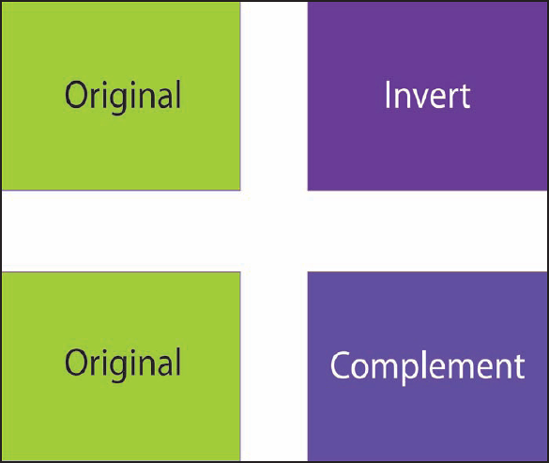
The Invert command changes the selected color into its opposite, as if you had taken a color photograph of it and were looking at a negative.
To understand Complement, think back to art class and the color wheel: Complementary colors are the colors on opposite sides of the color wheel. (Orange, for example, is the complementary color to blue. Roughly, blue never looks bluer than when it's next to orange, and vice versa.) Put another way, choosing Complement chooses the one color that will contrast the most with the currently selected artwork. Figure 5-13 shows both inverse and complement colors of a single color.
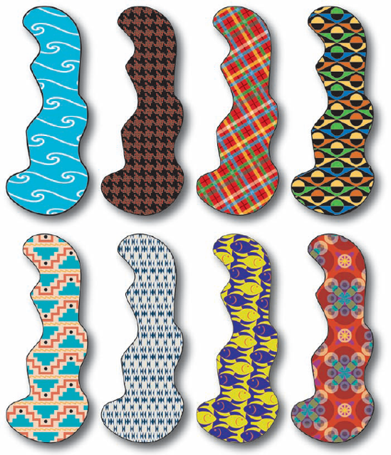
You can fill and stroke any path with a pattern. Patterns fill areas with repeating artwork.
To fill a path with a pattern, select the path, make sure the Fill box is active by clicking it in the Tools panel, and then click the pattern you want to use in the Swatches panel. The path fills with the pattern you selected. Figure 5-14 shows the same path filled with different patterns.
You can apply a pattern to a stroke as well as to a fill. Applying a pattern is exactly like applying a solid color. (See the section, "The Swatches Panel," earlier in this chapter.) Click the object, click the Fill or Stroke box to put the pattern in the proper place, and then click the pattern swatch in the Swatches panel. When you apply a pattern to a stroke, you might need to make the stroke extra thick for the pattern to be visible. (See the section, "Making a bold stroke," earlier in this chapter.)
You can easily turn most path-based artwork into a pattern (which hotly pursues the steps required to create a pattern out of paths).
To create a pattern out of paths, just follow these steps:
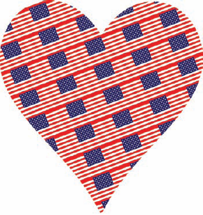
Create the artwork that you want to use for a pattern.
For this example, I use a US flag.
Select the artwork by using any of the selection tools.
Drag the artwork from the Document window onto the Swatches panel and release the mouse button.
A new swatch appears in the Swatches panel containing a very tiny version of your artwork.
To name the new swatch — a good idea if you want to identify it with relative ease later — double-click the swatch to open the Swatch Options dialog box.
Enter the name of the pattern into the Name field.
Click OK.
The custom pattern appears in the Swatches dialog box.
Apply your custom pattern to any path.
Check out how much I obviously love America in Figure 5-15.
Tip
Occasionally, you might want to space out your pattern artwork so that the repeated pieces of artwork are farther away from each other. You can easily trick Illustrator into doing this by drawing an invisible rectangle (a rectangle with a fill and stroke of None) over the artwork you're using as the basis for your pattern. The bigger the rectangle, the farther apart the repeated pieces are. Select the artwork and the rectangle before you make your pattern. Illustrator isn't quite smart enough to realize that the rectangle is invisible. The program sees only the paths that make the rectangle and repeats the artwork based on those edges.
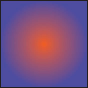
You can fill paths with gradients, which are colors that smoothly blend from one to another. Gradients can have any number of colors in them, with results that are nothing short of astonishing. Figure 5-16 shows three paths with gradient fills.
Filling a path with a gradient involves two steps: creating the gradient and then applying it to a path. However, you can do this in any order. Often, it's easier to create a gradient, apply it to a path, and then continue to tweak it by changing, adding, or removing colors or by modifying the position or angle of the gradient. You can see how the gradient looks on an object instead of just in a small box.
To fill a path with a gradient, select the path and then click a gradient in the Swatches panel. The object fills with a gradient that probably doesn't look a thing like what you want — but that's okay. By using the Gradient tool and the Gradient panel, you can tweak this gradient to your heart's content.
You can also load gradients from the Swatches panel. Illustrator comes with all sorts of Gradient swatch libraries with dozens of different swatches to get you started.
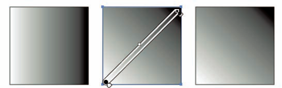
To use the Gradient tool, first use any selection tool to select an object that's filled with a gradient. Then click and drag across the gradient with the Gradient tool and release the mouse button when you get to the other side. The direction that you drag sets the direction of the blend. You see a bar showing the direction and angle of the gradient (and a circle if you're using a radial gradient). The place where you click gets 100 percent of the start color; the place where you release gets 100 percent of the end color. The gradient happens as a smooth blend between those two points (as you can see in Figure 5-17).
If you don't like the colors of your gradient, you don't have to settle for the gradients that come in the Swatches panel. You can either change, add, or remove colors; and/or change how the colors behave directly on the object with the Gradient tool or use the Gradient panel (by choosing Window
Tip
The Gradient panel looks simple compared with other panels, but don't be deceived. In spite of its humble appearance, this panel lets you create just about any gradient you could ever want. The Gradient panel works with the Color panel and the Swatches panel, so keep both those panels open whenever you edit a gradient.
The gradient sliders slide left and right. You use them to change how gradually (or not-so-gradually) your colors blend with each other. If you want the colors to blend without much nuance over a short distance, drag the sliders closer together. If you want the colors to blend more gradually across a longer distance, move the sliders farther apart.
Whenever you select a gradient slider, you can change its opacity in the Opacity field below the slider. In addition, you can specify the exact location of the slider in terms of left-to-right percentage in the Location field.
Tip
You can do most activities that the Gradient panel allows you to do directly on a selected object when the Gradient tool is selected. However, sometimes the angle or size of the object makes it difficult to use the tool for these purposes. As a rule, the smaller the object, the more you'll want to use the Gradient panel instead of editing the gradient directly on the object.
When you change a gradient in the Gradient panel, selected objects that are filled with that gradient update to reflect that change. You can see what's going on with the gradient more easily if you make an object and fill it with the gradient before you start making changes in the panel.
To change gradient colors, here's the highly artistic approach (no smock needed):
Double-click one of the gradient sliders beneath the gradient bar.
The color associated with the slider appears in a mini Color panel right next to the slider, as shown in Figure 5-19.
Choose a different color in the mini Color panel.
The color updates in the Gradient panel automatically. Is that slick or what?
Tip
As an alternative, you can click any solid color in the Swatches panel and drag it to the Gradient slider in the Gradient panel. You can also press Option (Mac)/Alt (Windows) and simply click a solid color swatch in the Swatches panel. The gradient updates with the new color.
Adding colors to the gradient is a lot easier than going to the paint store. Just follow these steps:
Click beneath the gradient bar where there isn't any gradient slider.
A new slider appears where you click.
Change the color of the new slider in the Color panel, double click on it to access the mini color panel or press Option (Mac)/Alt (Windows) and then click a solid color in the Swatches panel.
(Optional) Adjust the position of your gradient sliders.
Note
To remove a color, click the gradient slider and drag it off the Gradient panel. To save the gradient, drag the gradient swatch from the Gradient panel (or from the Fill box in the Tools panel) to the Swatches panel. You can also simply click the New Swatch button (a dog-eared page icon) in the Swatches panel.
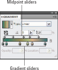
Between every pair of gradient sliders (on top of the gradient bar) is a midpoint slider. This sets the point at which the two colors blend at 50 percent of each color. You can also move this point by dragging it to the left or to the right. Figure 5-20 gives you a look at ways to change the gradient.
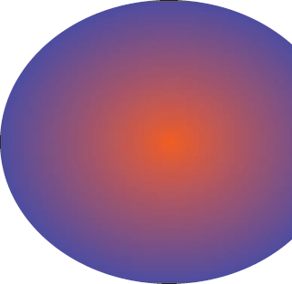
If you click the gradient swatches in the Swatches panel, you might notice that some gradients look like spheres or sunbursts — radial gradients. No amount of clicking and dragging with the Gradient tool — and no amount of moving gradient sliders — can make a radial gradient from the default Linear style.
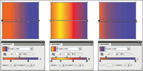
Figure 5-20. First, moving the sliders closer together. Second, adding new color sliders. Third, moving the gradient midpoint.
The trick is in a hidden option in the Gradient panel. Click the little triangle in the upper right of the Gradient panel. The Gradient panel pop-up menu, with only one item (Show Options), appears. Choose this option to make several more options appear in the panel. The one you want is the Type option, which reveals two choices: Linear and Radial. Choose Radial. The beginning color is the center color. When you click and drag, the spot where you click sets the center of the gradient. Figure 5-21 shows the same gradient from Figure 5-16 in radial gradient form.