
In This Chapter
Way-cool special effects with the Effect menu
Looking at the Appearance panel
Adding additional fills and strokes
Combining Effects settings to create different effects
Creating a style
Manipulating existing styles
Back in the twentieth century, Illustrator was a straightforward program that offered relatively few (and relatively obvious) choices. You knew when you looked at a pink rectangle that it was made with four corner points joined by four paths and was filled with a single, solid pink color. But those days of blissful innocence are past. Now that pink rectangle might really be a red rectangle that some fiend faded to 50% Opacity via the Transparency panel. And that rectangle might not be a rectangle at all, but a graphic of an old shoe that has been disguised as a rectangle using the Effect
The truth is, the ability of Illustrator to make objects look different without changing the original object is amazing. Illustrator lets you do incredibly powerful stuff that would be impossible otherwise, and more importantly, gives you incredible editability. Editability, you ask? That's one of the primary reasons to use Illustrator in the first place. The ability to go back at any time to change a small aspect of your artwork without having to redo all the work you initially put in is incredibly valuable.
Effects (and transparency) let you change the appearance of your artwork easily (again, without changing the underlying object). Illustrator has dozens of them, giving you power and flexibility beyond anything you can dream of.
In this chapter, you also discover a wonderful tool for cutting through (and taking control of) the illusions of Illustrator: the Appearance panel. The Appearance panel enables you to see exactly what secrets your artwork is hiding. If that were all it did, it'd be worth its weight in gold. But it does so much more! Beyond just seeing what's been done to an illustration, you also find out how to change the attributes of the illustration. For example, you can alter applied effects — or delete them altogether.
You also discover how to use the Appearance panel to target only the fill of an object (or just the stroke) when you apply Transparency or Effects settings. You also use the Appearance panel to perform casual miracles, such as assigning multiple fills and strokes to a single object.
To make matters even better, this chapter shows you how to save all the Appearance settings as a style. Styles are saved in the Graphic Styles panel. You can apply a style to any object. In addition to being a quick way to apply all these attributes to objects, styles can be updated in a way that also updates all objects with those styles applied.
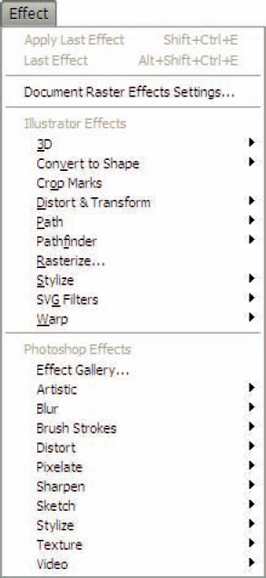
The Effect menu (shown in Figure 11-1) contains more amazing things than you see on a government-sponsored tour of Area 51 (okay, bad analogy . . . but there's a lot of stuff there, really). Everything that you apply remains live — that is, changeable until you tell it to stop changing. Effects change the way an object looks but not the object itself. Applying effects is like telling the object to put on a specific costume, or changing the appearance of the world when you look through rose-colored glasses. No permanent change to the underlying object takes place.
Note
Instead of rewriting the code for an object (which is what you tell Illustrator to do when you move a point), effects tack on extra code, leaving the original code untouched. You can change or remove the extra code, without affecting the original. It's sort of like when you put on a nice outfit — you're still the same person underneath, but you have snazzy duds on that make you look different.
Ah, yes, all things must change — and sometimes you get to change them. Contemplate the concept of infinite editability for a moment. An object in Illustrator is saying, "Turn me into anything." Illustrator provides the capability of changing appearance without manipulating points. You can simply get rid of them at any time, without putting a scratch on your original artwork, without having to redo it, without having to resort to Edit
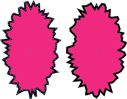
Figure 11-2 shows the difference between manually changing an object as opposed to a live effect. A path (left) is manually "roughened" by adding points and moving them, and the same path (right) roughened with the Roughen effect. The biggest difference is that the path on the manually changed object shows the additional points you had to put on the path, and where you moved them. The Roughen effect, found under the Effects menu, leaves the original path untouched, but still looks roughened.
To apply an effect to a path, follow these steps:
Select a path using a selection tool of your choice.
Choose an effect from the Effect menu.
For example, you can choose Effect

Note
You can always go back and change the settings if you don't like the result. (If only I could do that in real life.)
Click OK to apply the effect to the path.
Warning
Some effects (many of these are in the second section of effects that starts with the Artistic effect) only work when the document is in RGB Document Color mode. (See Chapter 1 for more on the various modes.) If an effect is grayed out (unavailable) after you select an object, your document is probably in CMYK (cyan, magenta, yellow, and black) mode. You can, however, work on artwork initially in RGB Document Color mode and change it to CMYK later.
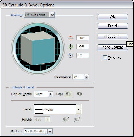
Illustrator is technically a 2D product. Everything it creates exists (at least in final form) in 2D space. But hidden away amongst all the cool effects in the Effects menu is the 3D effect, which allows you to quickly extrude, revolve, and rotate items in 3D space. Figure 11-3 shows the 3D Extrude and Bevel dialog box, where you can see all sorts of fun 3D options (and there's all sorts of other ones that are hidden)!
Going into all the options for 3D is beyond the depth <cough> of this book, but simply stated, select any path with a solid color fill, choose Effects

To change or remove effects, use the Appearance panel, as shown in Figure 11-5. The Appearance panel is such an amazing panel that the majority of this chapter is devoted to it. For now, though, I just want to show you how to use the Appearance panel to remove and change effects.
Appearances aside (so to speak), removing an effect is as simple as following these steps:
Select the object that has the effect that you want to remove. (Unless the object is grouped, you can use the regular (black) Selection tool for selecting the object.)
If the Appearance panel isn't visible (it is by default), choose Window
In the Appearance panel, the selected object is listed as Object or Path. Beneath the object is a list that includes the stroke and fill of the object and all the effects applied to it.
In the list, click the effect that you want to discard.
Click the trashcan at the lower right of the Appearance panel.
The effect disappears, and the object returns to its former appearance (before you applied the effect).
Tip
To change an effect, follow the preceding steps. However, instead of clicking the trashcan, double-click the effect in the Appearance panel. The particular effect's dialog box opens, where you can enter new settings. Click OK to apply the effect with the new settings.
Warning
Do not go back to the Effect menu to change the settings of an effect that has been applied to an object, even if adding the effect is the last thing you did. Instead of changing the settings on the existing effect, you actually apply another effect to the object on top of the existing one. While applying multiple effects to objects is often desired, it isn't if you're trying to edit the existing effect. So, as my Tip above states, just go back and start all over again.
Not all effects can be generated from path-based artwork. That's where the Rasterization effects come in. (Rasterization = the process of turning things into pixels or adding pixel-based imagery to your artwork.) These effects either change the original artwork into pixels or add new pixel-based images to achieve the desired effect. The effects in the second section of the Effect menu (from the Artistic effect down), as well as Drop Shadow, Feather, Inner Glow, Outer Glow, and Rasterize use pixels to achieve the change in appearance.
You control various attributes of these rasterization-based effects by choosing Effect
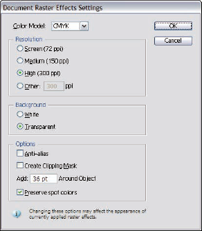
In the Document Raster Effects Settings dialog box, you can set the following options:
Color Model: This setting determines the color model used by the resulting graphic. Try to use the color model of your target output as much as possible. If you're creating a graphic print in grayscale, choose Grayscale. If you're bound for the Web, choose RGB. Choosing Bitmap turns your art into harsh black and white tones, if you're into that sort of thing. But most people aren't, and you should stay away from that setting. Refer to Chapter 1 for more about CMYK vs. RGB.
Resolution: This setting determines how much information the resulting image contains. Try to match this setting with the graphic's purpose. For the Web, select 72 ppi (pixels per inch). For most ink jet printers, 150 ppi is sufficient. For high-resolution printing, 300 ppi is a good, all-purpose size.
Background: Pixel-based images are always rectangular. If the graphic you're rasterizing is anything but rectangular, you have to add a background to make the graphic rectangular. The background can be white or transparent. White is fine for a stand-alone graphic, but if that graphic is in front of other objects, the white background obscures them. When that's the case, choose the Transparent setting.
Options: The Anti-Alias option adds a slight blurring wherever different colors meet. Believe it or not, this setting usually makes the resulting graphic look better. Results vary from graphic to graphic, of course, so try rasterizing with and without the Anti-Alias option selected. The Create Clipping Mask option matters only if you select white for the Background setting; see the preceding bullet. In Illustrator, a clipping mask is a special graphic that hides parts of other graphics. When you select the Create Clipping Mask option, a clipping mask is added to hide the white parts added to make the graphic rectangular.
Add: Typing a numeric value in this option box adds extra pixels around the graphic, just in case you need them. Hey, you never know! Nobody wants to run short of pixels, and this option actually helps prevent objects, such as drop shadows and other offset pixels, from getting clipped on the edges.
Preserve Spot Colors: Checking this box will allow you to use spot colors in your document if it contains transparency. If you're using a spot color, keep this checked.
After you choose your settings, click OK. Any existing (or future) effects that use pixels will use these settings.
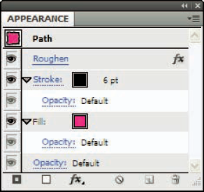
The Appearance panel, shown in Figure 11-7, is where you go to see why your artwork looks the way it does. (However, the panel can't explain why anybody would put neon-pink paisleys all over the place.) You can view the Appearance panel by choosing Window
Not to worry: This wealth of information isn't nearly as confusing as your income tax form. Here's why: All along, in the course of creating your artwork, you've been putting all these informational tidbits into the Appearance panel. You tell Illustrator to add info to this panel every time you set an option that changes the way your object looks (such as stroke, fill, and transparency).
Note
The Appearance panel faithfully records all this information all the time, even if you don't look at it. (Good thing it doesn't record everything appearance related, like that incredibly fashionable bathrobe you're wearing as you read this.)
The (much larger) Appearance panel shown in Figure 11-8 displays accumulated information about a particular object. What does it all mean? Is it important? Why oh why did Natalie ever leave the Maniacs? I'll answer the first questions, and leave the last one for a Behind the Music special.
To make sense of all the Appearance panel's information, peruse the following list of its features:
Target: This feature identifies the type of graphic that the information in the Appearance panel refers to. Typically this feature reads Object or Path, meaning the information in the panel refers to (or will be applied to) an appearance that is or will be applied to a single selected object. When you select a group or a layer, the target reads Group or Layer. If text is selected, the target reads Type. The target section is always at the top. A tiny thumbnail image emulates the appearance of the graphic.
Global effects: These effects apply equally to, and affect all aspects of, the entire object. Whenever you apply Effects or Transparency settings (as I described earlier in this chapter) without using the Appearance panel, you apply the effects as global effects. Although they're usually the first attribute you apply, they always appear near the bottom of the list in the Appearance panel.
Tip
Another way to differentiate global effects from other effects is how they line up with other items listed in the panel. Global effects appear in alignment with the Stroke and the Fill listings. Effects applied to a specific stroke are indented beneath the listing for that specific stroke. In Figure 11-8, Roughen is the global effect.
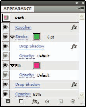
Strokes: Objects can have more than one stroke only when you add them through the Appearance panel. (See the section, "Adding fills and strokes," later in this chapter.) Therefore, the first one (listed at the top) is typically the one also shown in the Tools panel. The target may have additional strokes listed here as well. Strokes can have effects applied to them specifically. In Figure 11-8, you see a single stroke with a weight of 6 points. See Chapter 5 for more information on strokes.
Stroke and Fill effects: Effects can be applied directly to strokes and fills, instead of to the entire object, group, or layer. In this figure, a drop shadow has been applied directly to the fill.
Stroke and Fill Opacity: Each stroke and fill can have various Transparency settings applied to it. Here, the fill has an Opacity setting of 61%.
Fill: Each object (group or layer) can have multiple fills (like it can have multiple strokes). Each fill can also have any number of effects applied to it.
Eyeballs: Every single line in the Appearance panel has an eyeball next to it. Super creepy, I know. But each of those eyeballs can be used to hide any one line of info for the selected object, or the object itself. Say you're working with an object that has three strokes, and you want to see the color of the middle stroke, but it's hard to see @@'cause the top stroke is covering it. No problem! Just click the eyeball next to the top stroke, and it won't be visible while you're working on that middle stroke.
Opacity: This feature is the transparency appearance for the entire object, group, or layer. In Figure 11-8, the Opacity is set to 61%, meaning the entire object has been faded to 61%. If no special Transparency settings were applied, this would simply read Opacity: Default. See Chapter 10 for more information on the Transparency panel.
The top-to-bottom order of the fills and strokes in the Appearance panel reflect a front-to-back order in the graphic. Strokes and fills on top in the panel appear in front of the strokes and fills that are lower in the panel. Effects run from top to bottom in terms of which effect is applied to the graphic first.
Most of the items in the Appearance panel can be moved up and down through the list into different positions, and this change is reflected in the actual graphic. For instance, you can move the Feather effect applied to a stroke so that it's applied to a fill. You can also move the Feather effect so that it applies to the entire object. To move something in the Appearance panel, drag it up and down through the panel, just as you move things in the Layers panel.
Tip
If a fill or stroke has an effect applied to it, the little disclosure triangle automatically appears on the left and points down, listing the attributes of that fill or stroke. When you have a whole lot of different effects applied to a fill or stroke, the panel can get cumbersome. Clicking the disclosure triangle hides the list of effects. You can access the list at any time by clicking the disclosure triangle again.
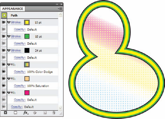
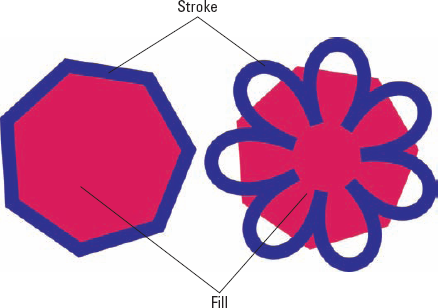
Chapter 5 explores fills and strokes in greater detail (and if you want to nip back there for more information, I can wait). When you apply a different stroke or fill to an object without using the Appearance panel, the fill or stroke replaces any existing fill or stroke. You don't have to settle for just one of each, though! From the Appearance panel, you can add as many fills and strokes as you want, as shown in Figure 11-9. This feature offers some interesting possibilities. For example, you can give a path three different colored strokes of different sizes, to create a striped path. Or you can apply a pattern fill over a solid-color fill. The Appearance panel is shown next to this figure so you can see exactly how it is constructed.
Just follow these steps to apply an additional fill and stroke to an object:
Create an object with a fill color and a thick stroke.
In this example, I drew a simplistic rubber ducky shape using the Pen tool. (See Chapter 7 for more information on the Pen tool.) I filled it with a solid color by clicking the Fill box in the Tools panel, and then by adjusting the sliders in the Colors panel. I next added a 24-point black stroke to the ducky by clicking the Stroke box in the Tools panel, and then by clicking a black swatch in the Swatches panel, and finally by choosing 24 points from the Stroke panel. (For more info on fills and strokes, see Chapter 5.)
Choose the Add New Fill command from the Appearance panel pop-up menu or by clicking the white box at the bottom left of the Appearance panel.
Tip
Illustrator adds a fill, but you don't see any difference because the new fill is identical to the fill already there. The new fill is highlighted in the Appearance panel, however, and as soon as you select a new fill from the Color panel or the Swatches panel, you see the new fill over the old one.
With the new fill still highlighted in the Appearance panel, change the fill to a pattern fill from the Swatches panel.
For this example, change the fill to the pattern called "Polka Dot Pattern" by clicking it in the Swatches panel. Then click on the Opacity link under that fill and change the blend mode to Saturation.
Tip
If you don't know which pattern is the Polka Dot pattern, pause your cursor for a moment above each swatch. Its name pops up.
Choose the Add New Fill command from the Appearance panel pop-up menu or by clicking the white box at the bottom left of the Appearance panel.
Illustrator adds another fill on top of the second one you created. With the new fill highlighted, change the fill to a gradient by clicking on it in the Appearance palette. Then click on the Opacity link under that fill and change the blend mode to Color Dodge.
Choose the Add New Stroke command from the Appearance panel pop-up menu or by clicking the black framed square at the bottom left of the Appearance Panel.
A stroke appears on top of the original stroke. Like with the added fill color, the new stroke uses the same settings as the previous stroke, so you don't see an immediate difference.
In the Color panel, change the color of the new stroke to green and change its stroke width to 18 points (pt).
Choose the Add New Stroke command from the Appearance panel pop-up menu or by clicking the black framed square at the bottom left of the Appearance Panel.
Another new stroke appears on top of the 2nd stroke. Change the color of the stroke to Yellow and change the stroke weight to 10 points.
After you add strokes and fills, you can move them around. Simply click them in the Appearance panel and drag up or down. While you drag, a black line appears in the panel, indicating where that fill or stroke will go after you release it.
Tip
Multiple fills and strokes work great with the Transparency panel. Each fill and stroke can have its own Transparency settings. This approach is a great way to blend fills and strokes together to achieve unique appearances. For example, if you apply a solid color fill over a pattern fill and then change the blend mode of the color fill to hue, you replace the color(s) in the pattern with the color of the solid color but still maintain all the detail of the pattern. See Chapter 10 for more information on the Transparency panel and blend modes.
You can change the appearance of groups or layers as well as objects. Groups are collections of separate objects that have been grouped together (using the Object
To change the appearance, you need to target those groups or layers first. Targeting is a method of selecting a group or layer so that any changes made to the appearance affect all the objects in the group or layer. Changing the appearance of groups or layers creates a global appearance for all objects in the group or on the layer. Objects still maintain their individual appearance settings, but any group or layer changes are added to all the objects.
To change the appearance of a group by adding an effect, just follow these steps:
I applied the Gaussian Blur effect to the previous figure. (The figures for this book tend to be done in Illustrator, which is an amazing coincidence.) The panel (a placed image) and the original path were grouped and the effect was applied to it, resulting in the mess you see in Figure 11-10.
On the other hand, targeting a layer to apply an effect is a little more unusual, since you have to use the Layer palette to "select" a layer first, as shown in Figure 11-11.
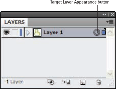
Layers are a way to organize and arrange objects in your document. (Chapter 13 talks about layers in depth.) Every time you add an object to a layer, the appearance of that object changes to match the settings of the layer. When that object goes to another layer with different Layer Appearance settings, the object's appearance changes again.
To target and apply an effect to a layer, just follow these steps:
Choose Window
The Layers panel opens (refer to Figure 11-11).
In the Layers panel, click the Target Layer Appearance button beside the layer that has the appearance you want to change.
The Target Layer Appearance button is the circle to the right of the name of the layer in the Layers panel. Clicking this circle targets the layer, so your changes affect that layer.
Add an effect to the layer.
For this example, choose Effect

Normally, whenever you apply an effect, it's applied to the entire object. However, to keep matters interesting (or confusing), you can also apply any effect to either a stroke or a fill. Whichever one you change, the other remains unaffected, as shown in Figure 11-13.
To apply an effect to a stroke only or to a fill only, just follow these steps:
Select an object by clicking it with the Selection tool.
Choose Window
In the Appearance panel, select the stroke or the fill to which you want to apply the effect.
For this example, select the stroke.
Choose an effect from the Effect menu.
For this example, choose Effect
When you look at your artwork, you see that only the stroke has been puckered (or bloated, depending on what you chose). If you want to apply an effect just to a fill, follow the preceding steps, but select a fill instead of a stroke.
Any effect previously applied to an object, group, or layer can be modified. You can edit the effect by double-clicking it in the Appearance panel. After you do, the effect's dialog box appears, enabling you to edit the current values for that effect. If the effect dialog box has a Preview check box, place a check in it and watch your changes in real time!
Note
Don't try to edit an effect you just applied by selecting that effect again in the Effect menu. Doing so applies the same effect a second time over the same path. Instead, double-click the effect in the Appearance panel.
If you're tired of keeping up appearances (for example, you feel your artwork is too complex and want it to be cleaner and simpler, or you added so many effects that printing or drawing on-screen takes too long), Illustrator gives you three ways to remove them (from on-screen artwork, that is). You can take an appearance apart (one attribute at a time), trash the whole appearance except the basics, or zap everything at once. Here's how you accomplish each of these tasks:
To get rid of a single effect, transparency setting, stroke, or fill: Select what you want to remove in the Appearance panel and then click the little trashcan icon at the bottom right of the panel.
To get rid of all effects, extra fills and strokes, and transparencies: Click the Reduce to Basic Appearance button (the button with the circle with a slash running through it at the bottom center of the panel). This action strips away everything except one stroke and one fill color and resets the Default Transparency setting to a blend mode of normal and an Opacity setting of 100%. (See Chapter 10 for more details on blend modes and Opacity settings.)
To clear everything: If you really want to clear the decks, leaving a path with no strokes or fills whatsoever, click the Clear Appearance button (the circle with a line through it at the bottom left of the panel).
Note
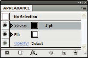
Note that the Appearance panel always shows a Fill color, Stroke color, and default Opacity setting for an object, even after you throw them away. Throwing away a fill or stroke automatically sets it to None; throwing away a transparency sets it to the default Opacity setting, which is a blend mode of Normal and an Opacity setting of 100%.
Tip
If you're wondering what the last three buttons in the Appearance panel do, here's the skinny. The FX button provides superfast access to the Effect menu (the entire menu magically appears right at the button!). The dog-eared page icon is the Duplicate button. Select the appearance effect or attribute (stroke or fill) you want and click this button to create a duplicate. The trash can icon will delete any line item(s) you choose in the appearance palette.
Sometimes, you want to preserve the way an object looks, but get rid of all the things in the Appearance panel. One reason to do this is that all these multiple fills, strokes, and effects can take tremendous processing power when they are live. This situation can result in long print times, or long times redrawing whenever you make a change to your graphic. The drawback to live effects is that they are previews and need to be recalculated every time you make a change. You can kill these live effects so that they permanently change your graphic. You can no longer make individual adjustments to them or remove them, but all the calculations have been made and the graphic has been permanently changed. This results in a much simpler, if limited, graphic.
To permanently set all the live effects, choose Object
Styles are collections of colors, transparency settings, effects, and additional fills and strokes that can be applied to any path, group, or layer. Just think of all that information in the Appearance panel. Saving it and applying it to different objects (without having to re-create all those settings) can significantly reduce the time and effort you spend. That's the advantage of using styles.
Another advantage is that any update in the style changes all the objects to which you apply that style. For instance, if you apply a style with a red fill and black stroke to a path, and later you update the style to an orange fill, the object you previously applied that style to changes to an orange fill and black stroke.
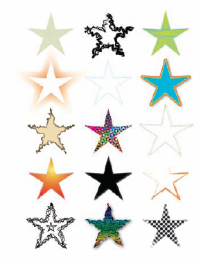
Illustrator comes with a whole slew of premade styles that are stored in the Graphic Styles panel and in premade libraries that ship with Illustrator (see Figure 11-10), ready for you to use with just a click.
To apply a style to an object, follow these steps:
Select an object.
Choose Window
The Graphic Styles panel appears. Figure 11-15 shows styles from the default Style library as well as styles from other libraries included with Illustrator.
Click a thumbnail style in the Graphic Styles panel.
Doing so automatically applies all the settings to the selected object.
You can create a style from any selected object in the document. You can also create a style based on the current Appearance panel settings. (The Appearance panel contains the settings for the last object selected, even if that object isn't currently selected.)
Select an object (or not, as the case may be).
If you don't select a path, the style you create adopts the current settings in the Appearance panel.
Open the Graphic Styles panel by choosing Window
The Graphic Styles panel (shown in Figure 11-16) appears.
Click the New Style button (the middle button at the bottom right of the Graphic Styles panel) or simply drag your object onto an empty space in the Graphic Styles panel.
A thumbnail representation of the new style appears in the Graphic Styles panel.
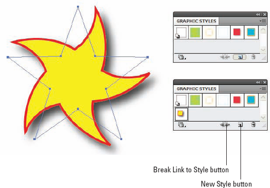
You have more than one method available to edit an existing style. Regardless of the method you use, Illustrator automatically updates all the objects that have that style applied to them to match the new style. The basic way to edit an existing style is to redefine it.
Tip
After you apply a style to an object, you can click the Break Link to Style button on the Graphic Styles panel to prevent Illustrator from updating the object to a new style if you redefine the existing one.
To redefine an existing style, just follow these steps:
Create a basic shape and apply a style to it.
In this instance, I created a triangle by using the Basic Shapes tool. Then I chose Window
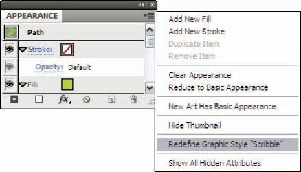
Edit the selected object as you normally would to create the new appearance that you want.
Change the fill and stroke, and/or add effects. In this case, I chose a darker fill color and added two strokes of different colors to the triangle by using the Add New Stroke command in the Appearance panel pop-up menu (which I describe in the "Adding fills and strokes" section of this chapter).
After you're satisfied with the changes, open the Appearance panel by choosing Window
You're replacing a style, but you have to do it through the Appearance panel. Go figure! Because the name of the style I edited in this example was Scribble, the menu reads Redefine Graphic Style "Scribble." The menu changes to whatever name the style has been given.
Illustrator updates the style in the Graphic Styles panel with the changes — and updates any object in the document that has that same style applied to it.
Another way to edit an existing style is to replace it with another set of Appearance settings. Set the fill, stroke, and effects for an object to make it look the way you want. Then hold down the Alt key (Option on a Mac) and drag the object over the thumbnail of the style that you want to replace in the Graphic Styles panel. It might look as if you're dragging that entire object into the Graphic Styles panel, but you're just dragging its fill, stroke, and effects settings (in other words, its appearance). To let you know that the object is in the proper position to replace the existing style, a black border appears around the style. Release the mouse to update the style to the Appearance settings of the selected object. Illustrator also updates all objects that share the style.
The Illustrator graphic styles are different from its text styles. (Text styles are discussed in Chapter 14.) Graphic styles specify graphic attributes, such as fill color, stroke color, transparency, additional strokes and fills, and any applied effects. Text styles (Illustrator has two types: Character and Paragraph) specify text attributes, such as font, size, leading, alignment, and other Character panel and Paragraph panel settings.
The Illustrator graphic styles don't allow you to save text attributes, such as font and alignment, with them. However, you can apply graphic styles to text and text objects; the graphic styles just don't apply any text-specific attributes.
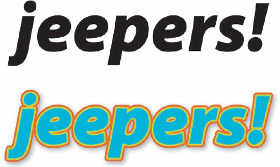
Illustrator looks at text as a picture of letters and numbers — not as letters and numbers — and then applies a graphic style to that picture, as shown in Figure 11-18.
To apply a graphic style to text, just follow these steps:
Select text by using the Selection tool.
Display the Styles panel by choosing Window
Click a thumbnail in the Graphic Styles panel to apply that style to the text.
Illustrator applies the graphic style you select to the text object.
You can quickly apply a style to text or other objects by selecting the style you want and then clicking with the Paint Bucket (which is located in the same Tools panel slot as the Eyedropper tool) on anything you want to change to that style. (It's so much easier than dragging a real paint bucket. And you don't have to worry about the carpet. Is Illustrator great, or what?)