
Creating tone and shading using the Mesh tool
Making artwork partially transparent
Blending artwork
Stroking your way to victory over drab art
Creating custom strokes
Using masks to hide objects with other objects
To say that in Illustrator, you can create just about anything you can imagine isn't an overstatement. The trick is to know which buttons to push to make your artistic vision become an Illustrator document. This chapter pushes fills and strokes to their limits, showing you how you too can create cool stuff. You know — the stuff that makes you scratch your head and say, "How did they do that?" And then you wonder whether you'll ever be able to create anything as artistic.
Well, it isn't so hard. You just need to use some of the more arcane Illustrator tools (the Mesh tool, for example) and a few cantankerous menu commands that don't want to do anything unless you apply them just right. This chapter shows you how to use them to get good results with the tools and commands that take center stage. Like temperamental sports cars, they're a little tricky to use — but worth the effort!
Illustrator is really great at filling areas with solid colors, continuous patterns, or gradients. Illustrator gets testy, though, when you try to create a continuous tone — such as the many skin tones that define a human face, or how colors fade into one another in a piece of folded fabric. However, you can use the Illustrator Mesh tool, even if it is a bit of a crotchety magician. Just talk nicely to it, and it can help you bend the rules a bit. With the Mesh tool, you can create amazing shading and tonal effects.
And gradient meshes overcome the limitations of gradients (the other Illustrator feature that enables you to blend colors; for more, see Chapter 5). Simple gradients fill areas with linear and radial color blends. Period. Comparatively, gradient Meshes have no such limitation. You can use them to assign colors to the specific points and paths that make up an object. Where the mesh lines cross, you can assign a different color to every line and every point. These colors blend with the colors of the other points. Take a look at Figure 10-1 for a sample of what you can do with a gradient mesh.

Figure 10-1. The artwork that made up the Illustrator Venus was colored entirely with the Mesh tool.
Figure 10-1 might seem complex, but the difficulty lies much more in the artistry than in the technical aspects. The Mesh tool might seem daunting at first, but you can tackle it if you begin by adding a highlight to a simple shape, as shown in Figure 10-2. Do that, and you're well on your way to gradient mesh mastery, as spelled out in the next section.
To add a gradient mesh to a simple shape, just follow these steps:
Create a shape by clicking and dragging with any of the basic object tools (see Chapter 4 for more on basic objects) and fill the shape with a dark color.
You can use any shape. For this example, I created a circle and colored it black.
Deselect the path (choose Select

Set the fill color to any light color.
Choose Window

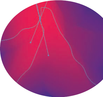
As if by magic, two intersecting paths appear on the object, crossing at the spot where you clicked. (You can see this intersection back in Figure 10-2 where all the blue lines are converging in the red middle of the star.) This intersection is the mesh point. These paths are the gradient mesh. The highlight appears where the paths intersect.
Click other areas within the path to add more highlights — as many as you want.
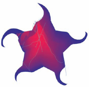
The paths that make up the gradient mesh can be edited the same as any other path. Click the mesh points in the path with the Direct Selection tool and move them to create different effects. Mesh points also have direction points, just like curved paths. (See Chapter 6 for more on paths.) These direction points can be moved to change the shape of the gradient mesh. You can also change the color of any point or path segment by clicking it and choosing a different color in the Color or Swatches panels. Figure 10-3 shows different effects made by mashing the gradient mesh around.
That's really all there is to this tool! I moved those points by using the Direct Selection tool and then tweaked the colors by selecting a point or a path and choosing a new color in the Color or Swatches panels (accessible by choosing Window
You can automate the process by clicking the object you want and choosing Object
After you select the Create Gradient Mesh command, the Create Gradient Mesh dialog box opens (shown in Figure 10-4). Set your options, click OK, and the command does the mesh-y work for you. Here's the all-star lineup of options:
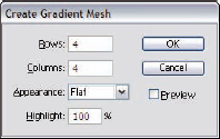
Rows and Columns: These options set the number of mesh paths that the command creates. The higher the number, the more control you have over the colors in your object (but the more complicated the graphic is to work with).
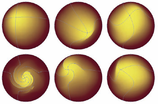
Appearance: Select one of three Appearance options. Figure 10-5 shows the differences between the three options.
To Center: Lightens colors to place a highlight in the center of the object, creating the appearance that the graphic is being pulled outward
To Edge: Places a highlight at the edges of the object, creating the appearance that the graphic is being pulled inward
Flat: Doesn't change any colors but still creates the mesh, so you can change colors on your own
Highlight: When you select an Appearance option of To Edge or To Center, the Highlight setting determines the maximum amount that the colors lighten to create the 3-D effect.
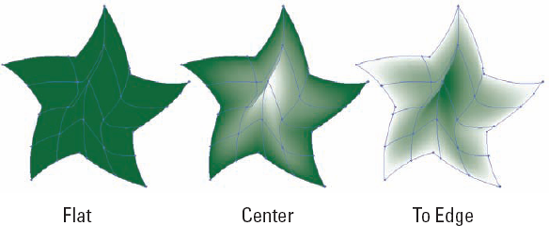
In Figure 10-5, the two examples on the right show objects with a highlight applied to them using the Illustrator automatic highlighting process.
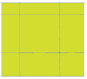
You can use the Mesh tool to create a soft-beveled object. The following steps illustrate a very basic, yet quite handy, method for creating bevels:

Other shapes work with this, but a square is the simplest.

This creates a total of nine mesh patches on the square, as shown in Figure 10-6.

You have seven points selected now, around the top-left corner, all on the outside edge of the square.
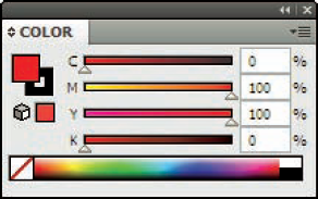
Choose Window
The Color panel appears, as shown in Figure 10-7.
Holding down the Shift key, drag one of the right-most triangles to the left about halfway. (In the example using the red color from Figure 10-7, you could choose either the Magenta or Yellow triangle.)
The Shift key "tints" whatever color you selected in Step 1 when you drag a slider in the Color panel.
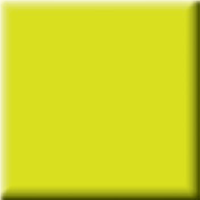
Again using the Direct Selection tool, drag a marquee around the three rightmost points along the bottom edge of the square. Then press Shift and drag a marquee around the middle two points on the right edge of the square.
With the lower-right points selected, you're now ready to darken this corner of the square.
Drag the K slider on the Color panel to the right until you darken the lower-right edge to your liking.
The result looks something like Figure 10-8.
By default, Illustrator creates objects that hide whatever is behind them. However, the Transparency panel enables you to change this situation. With the Opacity option, you can fade objects so that the underlying objects show through them. You can also blend the colors in the top graphics with the underlying graphics (in an astonishing variety of ways) by using blend modes.
One of the powerful features of the Transparency panel is that everything you do in it is live, meaning that your paths suffer no permanent changes after you make them transparent. You can change opacity again and again — or remove it altogether if you want — without changing your path data. This capability gives you tremendous room to play and experiment with different opacities.
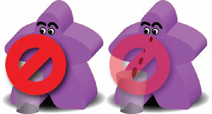
In Figure 10-9, a red "no" symbol is faded-out to 50% opacity to partly reveal details behind it.
To make something partially transparent, follow these steps:
Select the object (or objects) that you want to fade.
Note
When you select multiple objects, they all get the same opacity setting.
Choose Window
The Transparency panel appears, as shown in Figure 10-10.
In the Transparency panel, drag the Opacity slider until it shows the percentage of opacity you want to give to the selected object(s).
After you release the mouse button, the selected objects become partially transparent.
Tip
By default, transparency applies evenly to both the fill and stroke. To assign the fill and the stroke independent Opacity values, use the Appearance panel. See Chapter 11 for details.
Pssst! Listen very, very carefully while I tell you what's really going on with blend modes. Here's the scoop: Forget the math and pay attention to what the resulting artwork looks like.
Note
Illustrator defines every color mathematically. You see that math when you drag sliders in the Color panel. A bright red color may be defined as R:216, G:20, and B:7 (in RGB) or C:20%, M:95%, Y:95%, and K:5% (in CMYK). Each of these numbers reflects a different amount of a component color; every different color has its own color value.
Blend modes take the colors in an object and mix them with the colors in underlying objects, performing a mathematical calculation using numbers that identify the colors of the objects. Therefore, if the top object is red, the underlying object is blue, and you have the blend mode set to Multiply, red's number gets multiplied by blue's number. The resulting color is what you see. Other modes do more complex calculations. What does that mean? What's blue times red? What's the difference between yellow and mauve? What's the sound of one hand clapping?
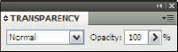
In short, it doesn't matter. What the result looks like is what matters! Try this approach for yourself: Select the top object and choose a different blend mode. Blend modes hang out in the Transparency panel Blend Mode menu, as shown in Figure 10-11.
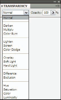
Figure 10-12 shows three (of the 16 possible) blend modes at work on the same image — and they're completely changeable. If you try one and don't like it, just choose another from the menu.
Any path in Illustrator can pick up a stroke (. . . stroke . . . stroke! Sorry. Just daydreaming about going for a nice row on a lake). In Illustrator, a stroke is a line placed on a path. A stroke can be of any thickness, which Illustrator calls its weight. Strokes can be any color or pattern.
In Chapter 9, I discuss the specialized strokes that you can make with the Paintbrush tool. The Pen and Pencil tools also provide distinctive strokes of their own (Chapters 7 and 8, respectively).
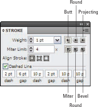
In addition to color and weight, you can give strokes special attributes. These attributes include the specific look of corners (joins) and endings (caps) as well as whether the stroke has a pattern of dashes applied to it. To investigate all the advanced ways you can modify strokes, look at the Stroke panel shown in Figure 10-13. (Choose Window
Strokes are applied to the center of a path by default, which means that the strokes, especially those of larger weight, can ooze beyond the path. The path runs along the exact middle of the stroke. For more information on the relationship between strokes and paths, see Chapter 5.
A stroke can be (and often is) a continuous line of color that follows a path, even if the path is as convoluted as a strand of cooked spaghetti. But paths can also appear chopped up into dashes. You can tweak the shape of the dashes all at once, without having to fuss over every single one. You can set the shape that an individual dash (the basic unit of an open path) begins or ends with (its cap) and the shape of its corner points (its join).
Strokes can have any of three different caps and any of three different joins applied to them. Combine these with the almost-limitless combinations possible for dash patterns and weights, and you can see the incredible versatility of strokes. To access these additional options, choose Window
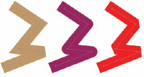
Shaping the ends of the dashes that make up an open path can change the entire look of the path. For example, imagine a dashed line that's 500 dashes long. Then imagine that all 500 dashes have identical ends, shaped like one of the three shapes in Figure 10-14.
Depending on which Cap setting you choose, you get three noticeably different capped lines. Here are the options:
Butt Cap: Chops off the stroke at the ends.
Round Cap: Extends the stroke past the ends (or around the dash location) with semicircular ends. (The radius of each semicircle equals half the stroke weight.)
Projecting Cap: Extends the stroke past the ends (or around the dash location) with squared ends. (The amount of each extension equals half the stroke weight.)
To change how a line is capped, select it with any selection tool, and then click the desired cap in the Stroke panel.
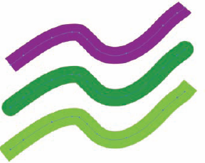
The Stroke panel offers three different joins. Figure 10-15 shows how they appear on paths. Joins affect only corner points, not smooth points. (See Chapter 6 for more info on corner points.) They make corners appear sharp and pointy, blunt and rounded, or squared off.
Depending on which Join setting you choose, you get three noticeably different corners. Here are the options:
Miter Join: Causes the outside corner of the stroke to come to a sharp point
Round Join: Causes the outside corner of a stroke to come to a rounded or smooth curve
Bevel Join: Cuts off the corner so that the width of the stroke is the same at the bevel as on the rest of the stroke
If these terms look familiar, you're probably familiar with woodworking — or you actually paid attention in industrial arts class.
Dashes break up the stroke into repeating segments of any length, with gaps between them, also of any length. You can set up to three different dash sizes — and three different gap sizes — in any stroke, as shown in Figure 10-16.
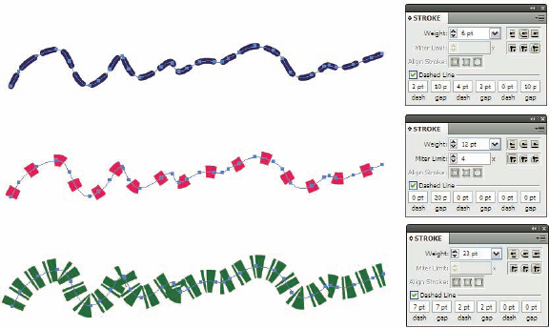
Dashes work with the Cap settings. (What the heck, call it a labor-saving device.) Whichever Cap setting you use applies to the ends of all the dashes, not just to the ends of the path.
To create a dashed line, follow these steps:
Select the Dashed Line option in the Stroke panel.
Set a dash size in the first dash box.
Remember that the Round and Projecting Cap settings extend the dash from its center by half the width of the stroke. Therefore, if you use the Projecting Cap setting and your dash setting is 10 points (pt), on a line with a 20 pt stroke, the dash will be 30 pt long.
Tip
Choose a Butt Cap setting when you want your dashes to be an exact length that doesn't vary with the width of the stroke. If you want an exact circle for a dash (or a dot), use a 0 pt dash. That creates a dot the width of the stroke.
Set the gap size in the first gap box (the distance between the ends of the dashes).
Warning
This setting can be a little confusing if you're using the Round or Projecting Cap settings because these extend the length of the dash past the end of the dash and into the gap, based on the width of the stroke, creating a gap that looks smaller than what you specified. The width of the stroke also affects the gap size. If you want a gap of 20 pt and you're using a 10 pt stroke, set the gap size to 30 pt.
No, clipping masks aren't special headgear that the barber wears to entertain young customers. Clipping masks are simple, yet incredibly handy, Illustrator features. Simply put, they hide things. Like Effects and Transparency settings, Clipping Masks are live functions that make no permanent change to path data. They make things look different, but you can take them away with a single command, and your paths remain exactly as they were before.
Clipping masks use objects to hide other objects, as shown in Figure 10-17. The top object (the masking object) becomes completely transparent. The underlying objects become invisible except for where the mask object is. The number of objects beneath the mask doesn't matter. Only the topmost object functions as the masking object. The top object's fill and stroke also don't matter, because the top object becomes invisible.
Note
Clipping masks let you "fill" an object with any other object(s), making them the most extreme fill you'll find in Illustrator.
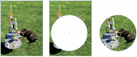
Figure 10-17. Original (left), the masking object in front of the artwork (middle), and the masked artwork (right).
To create a clipping mask, here's the drill:
Create an object to be used as a mask.
Masks can be any shape or color. You can even use text as a mask.
Position the object in front of whatever you want to mask out.
Select the object and all the objects behind it that you want to mask out.
Shift-click with the Selection tool to select multiple objects.
Choose Object
The masking object and anything outside the mask disappear, leaving just what's inside and behind the masking object.
Note
The things that seem to disappear after you apply the mask aren't really gone. They're just hidden. You can bring them back by choosing Object