
Chapter 2

SIMPSON’S PARADOX
Statistics are like bikinis. What they reveal is suggestive, but what they conceal is vital.
Aaron Levenstein
Apocryphal Stories
It is difficult for the non-cricket fanatic to appreciate the trauma associated with the biannual cricket competition between the arch-rivals England and Australia, universally known as the Ashes. On 29 August 1882 (at home) a full-strength England cricket side was for the first time beaten by Australia, which caused the British publication The Sporting Times to run an obituary for English cricket which included the words ‘The body will be cremated and the Ashes taken to Australia’. On the return fixture (in Australia) England regained the upper hand and a small urn was presented to the captain, Lord Darnley, in commemoration; and so the uncompromisingly fierce competition began for the notional possession of a tiny urn of questionable contents which hardly ever leaves London no matter who wins it.
A chance hit on a Queensland educational website1 revealed a little apocryphal story based on the two former Australian batsmen, the brothers Steve and Mark Waugh. In paraphrase it read
Steve and Mark decided to have a little wager on who would have the better overall batting average over the two upcoming Ashes series, the first in England and the second in Australia.
After the first Ashes series, Steve said to Mark, ‘You’ve got your work cut out for you, mate. I have scored 500 runs for 10 outs, for an average of 50. You have 270 runs for 6 outs, for an average of 45.’
After the second Ashes series, Steve continued by saying, ‘Ok, mate, pay up. In this series I scored 320 runs for 4 outs, an average of 80, while you had 700 runs for 10 outs, which is only an average of 70. I topped you in each of the Series.’
‘Hold on,’ said Mark, ‘The wager was for the better batting average overall, not series by series. As I reckon it, you have scored 820 runs for 14 outs, and I have scored 970 runs for 16 outs. Your average is 58.6, while my average is 60.6. I win.’
How is this possible, that Steve could have the better average in each of the two tests but a lower average overall?
The matter at hand has nothing to do with the intricacies of cricket. The Ask Marilyn column in Parade Magazine (a supplement to many American Sunday newspapers) provides a forum for readers to ask questions and give opinions on a wide variety of matters and often generates a great deal of reader response. Sometimes readers send in questions for the column’s editor, Marilyn Vos Savant, to contemplate—and since she is listed in the Guinness Book of World Records Hall of Fame as the individual with the highest IQ, they can reasonably expect thought-provoking answers. The following question was posed by a reader in the Ask Marilyn column in the 28 April 1996 issue of Parade Magazine:
A company decided to expand, so it opened a factory generating 455 jobs. For the 70 white collar positions, 200 males and 200 females applied. Of the females who applied, 20% were hired, while only 15% of the males were hired. Of the 400 males applying for the blue collar positions, 75% were hired, while 85% of the 100 females who applied were hired.
A federal Equal Employment enforcement official noted that many more males were hired than females, and decided to investigate. Responding to charges of irregularities in hiring, the company president denied any discrimination, pointing out that in both the white collar and blue collar fields, the percentage of female applicants hired was greater than it was for males.
But the government official produced his own statistics, which showed that a female applying for a job had a 58% chance of being denied employment while male applicants had only a 45% denial rate. As the current law is written, this constituted a violation. Can you explain how two opposing statistical outcomes are reached from the same raw data?
The reader may wish to check the arithmetic but Marilyn correctly noted that, even though all the figures presented are correct, the two outcomes are not, in fact, opposing. Nor is it the case that such conflicting data are necessarily contrived. Consider the following true story.
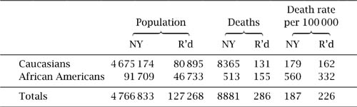
In 1934 Morris Cohen and Ernst Nagel cited actual 1910 death rates from tuberculosis in two cities (Richmond, Virginia, and New York, New York). Table 2.1 shows their data. From it we can see that the death rates for Caucasians and African Americans were each individually lower in Richmond than in New York, yet the death rate for the total combined population of African Americans and Caucasians was higher in Richmond than in New York.
Simpson’s Paradox
All of the above are examples of sets of data separately supporting a certain hypothesis but, when combined, support the opposite hypothesis. The phenomenon is known as Simpson’s Paradox, after E. H. Simpson, who discussed it in a 1951 article (The interpretation of interaction in contingency tables, Journal of the Royal Statistical Society B 13:238–41). As is so often the case, the person after whom a result is named is not the person who first considered it. G. Udny Yule preceded Simpson in 1903 (Notes on the theory of association of attributes in statistics, Biometrika 2:121–34) and he was preceded by Karl Pearson, A. Lee and L. Bramley-Moore in 1899 (Genetic (reproductive) selection: inheritance of fertility in man, Philosophical Transactions of the Royal Statistical Society A 173:534–39): Yule described the association as ‘spurious’ or ‘illusory’. Yet, it was Simpson’s witty and surprising illustrations of the phenomenon which earned the name and the clear view that something peculiar but explicable was happening.
As our contender for a witty illustration, consider the following factual case, which demonstrates the process in reverse.
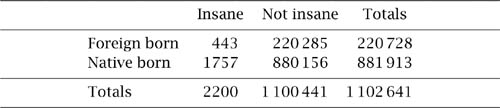
An argument to substantiate the claim that foreigners were more likely to be insane than native-born Americans was advanced in Massachusetts in 1854 and table 2.2 shows the figures that were given in justification. These show that the probability that a foreign-born individual was deemed insane was ![]() = 2.7 × 10⁻³, whereas for a native-born individual the probability reduces to
= 2.7 × 10⁻³, whereas for a native-born individual the probability reduces to ![]() = 2.2 × 10⁻³. There might be something in the claim.
= 2.2 × 10⁻³. There might be something in the claim.
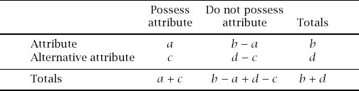
Now let us agree to divide the data according to an accepted social hierarchy of the time: rather strange to the modern eye the division is into the pauper class and the independent class. We then arrive at tables 2.3 and 2.4.


Within the pauper class we have that the probability of a foreign-born person being deemed insane is ![]() = 0.02, which is the same as a native-born person, with the calculation
= 0.02, which is the same as a native-born person, with the calculation ![]() = 0.02. The same is true for the independent class, where the probabilities are both 2.0 × 10⁻³; so, if an adjustment is made for the status of the individuals, we see that there is no relationship at all between sanity and origin.
= 0.02. The same is true for the independent class, where the probabilities are both 2.0 × 10⁻³; so, if an adjustment is made for the status of the individuals, we see that there is no relationship at all between sanity and origin.
An Analysis
For the purposes of illustration we will detail a final, theoretical example of the phenomenon.
1http://exploringdata.cqu.edu.au/sim_par.htm.
Table 2.5. Effects of the drugs on men.

Table 2.6. Effects of the drugs on women.

Suppose that two new drugs, X and Y, are tested on a sample of the population suffering from a particular ailment and that tables 2.5 and 2.6 show the comparison of the effectiveness of the two drugs on men and women separately, giving frequencies of curing the patient (C) and otherwise (∼ C). Since ![]() >
> ![]() and
and ![]() >
> ![]() the tables show that for both males and females drug X is more effective than drug Y.
the tables show that for both males and females drug X is more effective than drug Y.
Now combine the data to arrive at table 2.7, which shows the comparative effect of each drug for the population as a whole. Since ![]() >
> ![]() , drug Y is now more effective than drug X. Which is better, drug X or drug Y?
, drug Y is now more effective than drug X. Which is better, drug X or drug Y?
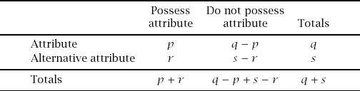
The structure of the process is encapsulated in tables 2.8−2.10.
We can see that the basis for the paradox is the simple arithmetical fact that, for positive numbers, if
![]()
it is not necessarily the case that
![]()
and vice versa. For example, ![]() >
> ![]() and
and ![]() >
> ![]() but
but
![]()
Table 2.7. Effects of the drugs on both sexes combined.


In the hypothetical case above, ![]() >
> ![]() and
and ![]() >
> ![]() but
but
![]()

Figure 2.1.
If we use matrix notation to summarize the data sets with
![]()
representing the two subcollections, then
![]()
in which case the above conditions on inequalities translate to the equally obvious statement that, if det X > 0 and det Y > 0, it is not necessarily the case that det (X + Y) > 0: matrix determinants are not additive.
Alternatively, we can use figure 2.1 to provide a geometric explanation of how the reversal can occur, taking lines the slopes of which are the fractions we are comparing: the slopes of the dashed lines are in the reverse order to the slopes of the comparable full lines.
As an aid to constructing paradoxical data we can argue as follows.
Since we assume that
![]()
![]()
and if the paradox is to exist we reverse the third inequality to get
![]()
and so
![]()
These combine to bounds on p of
![]()
For example, we can determine the boundaries for p which allow the paradox to exist using the data from the theoretical example to get 75 < p < 125, and the actual value of p = 85 sits nicely in that interval.
To find a lower bound on q we can eliminate p above to give
![]()
and therefore we have
![]()
or
q(r(d + s) − s(c + r)) < s(b(c + r) − a (d + s)),
which means that q (dr − cs) < s (b(c + r) − a (d + s)).
If, for the sake of definiteness, we take
![]()
and so dr − cs > 0, we can now divide to get our inequality
![]()
Again, from the theoretical example we get q < 285.7 and q = 100 again fits the inequality.
Finally, it might be of interest to consider the smallest population in which the paradox can exist. If we assume that no category can have a zero entry, then Thomas Bending has shown that
![]()
gives a paradoxical situation with a total population of b + d + q + s = 20; whether or not this is minimal, as he says, is quite another matter.
Examples of the occurrence of Simpson’s Paradox are legion in areas ranging from SAT scores divided into ethnic groups (D. Berliner, 1993, Educational Reform in an Era of Disinformation. Educational Policy Analysis Archives), through growth of children in South Africa (Christopher H. Morrell, 1999, Simpson’s Paradox: an example from a longitudinal study in South Africa, Journal of Statistics Education, volume 7(3)) to the much publicized Berkeley sex bias case of 1973 in which the University of California at Berkeley was sued for bias against women applying to graduate school (P. J. Bickel, E. A. Hammel and J. W. O’Connell, 1975, Sex bias in graduate admissions: data from Berkeley, Science 187:398–404).