Chapter 6. Understanding Problems: Define, Measure, and Analyze
Sections
Concluding Understanding Problems
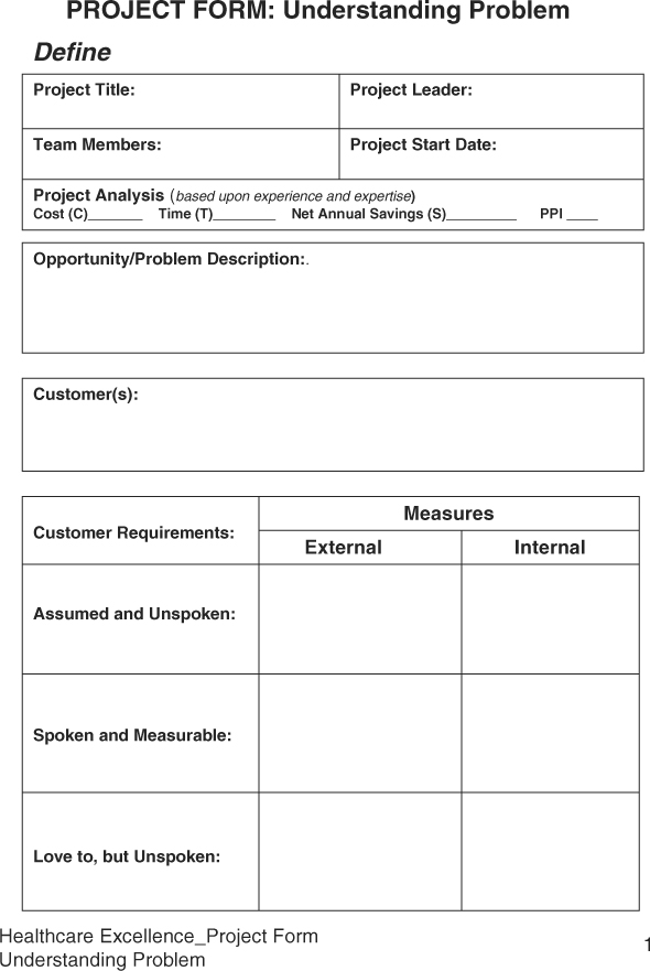
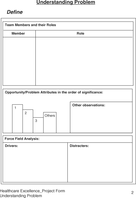
Sample Healthcare Excellence Project Forms: Understanding the Problem
Six Sigma was initially developed for manufacturing processes. In the manufacturing environment, machines and tools play a more dominant role than people do. However, in healthcare, people and methods play a more important role in delivering services than the equipment, which is still a critical aspect of providing healthcare services. Thus, the DMAIC must be adapted and simplified for the healthcare environment. First, DMAIC can be divided into two parts. The first part can be called Understanding the Problem and consists of the Define, Measure, and Analyze phases. The objective of the “Understanding Problems” part is to recognize the significance of a problem, learn about the process, establish a performance baseline, and establish the causative relationship between the problem symptoms and process variables. The second part can be looked at as the Solving Problem part consisting of Improve and Control phases. The objective of “Solving Problem” is to develop a breakthrough solution and sustain its benefits.
Healthcare excellence Project Forms have been designed to apply the Six Sigma DMAIC methodology for reducing cost and improving quality in a specific area. Samples of these forms appear at the end of the chapter.
Define Phase
It has been said that a well-defined problem is half solved. Many times, we jump into solving a problem without even knowing what we are trying to solve. Then, we find out that by solving some mystery problem, we have created new problems. Many solutions we implement we do not verify, and thus end up creating new problems. The list of problems grows rather than shrinks.
Thus, the Define phase requires us to spend enough time to gather sufficient information to clarify the opportunity for improvement, learn about the process, and learn about the organizational barriers to solving the problem, and then develop a plan to address it. An important aspect of Six Sigma is to produce breakthrough results fast by scoping out the problem such that the project is completed in no more than six months. A team of three to five qualified individuals is formed to solve a problem. Additional individuals of desired process knowledge may be invited as needed. At the end of the Define phase, the project team has learned significantly about the problem symptoms, process, and organization, and have prepared a project charter to accomplish tasks to successfully solve the problem.
Common Define Tools
Following is a list of some of the tools that are widely used to filter out the high-impact problem that has a direct bearing on the bottom line:
• Listening to customers
• Kano’s Model
• Affinity Diagram
• Pareto Analysis
• Gaining Process Knowledge
• Process Mapping
• SIPOC Analysis
• Sizing the problem
• Force Field Analysis
• Developing Project Charter
Listening to Customers
Our customers can be internal or external. Internal customers could be other departments, nurses, physicians, pharmacies, or the staff. We primarily provide services to external customers such as patients or institutions. Thus, by listening to customers, by understanding what customers consider critical, we can design healthcare services or products that meet customer requirements. Our objective must become to know the patient and understand the patient’s needs, desires, wants, whims, and if possible those things that the customers don’t even know they want just yet.
To implement the customer focus culture and remove the departmental barriers, organizations treat each employee as a customer. Every one is a customer for something and a supplier for something. This creates a culture of understanding of satisfying the customer needs within the organization and then extends to the external customers. While customers’ needs vary, our inability to respond to customers’ needs arises from our rush to get busy and our over-confidence in knowing our customers, without any effort to even listen to them. The external customers may be a group through HMOs or individuals. Ultimately, it is people who are customers of healthcare organizations.
As a physician or an HMO, listening to customers means asking patients questions personally or as a group. As a healthcare organization, the customers’ needs may include:
• At the medical facility
• Easy parking
• Clear directions
• Clean facility
• Prompt attention at reception
• Pleasant registration staff
• Assigning the right doctor
• Medical record availability
• Shorter waiting time
• Easy registration
• Treatment
• Availability of necessary tools and supplies
• Availability of doctors and support personnel
• Doctor’s success rate for the treatment
• Availability of backup experts
• Being treated with respect
• Communicating with the patient/attendee(s)
• Collecting correct sample(s)
• Receiving correct treatment
• Timely reports
• Availability of medicines/substitutes/generic
• Correct medicine
• Legible prescription
• Stay at the medical facility
• Caregivers
• Cheering
• Positive attitude
• Responsive
• Caring
• Room
• Ambiance
• Available
• Clean and well made
• Entertainment devices
• Good food
• Periodic doctor visits
• Space for visitors
• Post treatment
• Easy discharge process
• Easy to understand bills
• Correct billing
• Support for transportation
• Total cycle time
• Follow-up calls
• Scheduling follow-up visits
One can see that the list of needs can be quite extensive. Interestingly, people feel that they have no voice in their healthcare services for which they pay. Insurance companies do not listen to them; HMOs do not listen to their needs, and doctors are always rushed and have no time for patients. Physicians are treating the disease, not the patient. In order to provide collaborative caring healthcare services, organizations must establish a process to listen to their customers. The methods could include random brainstorming sessions, surveys, lunch with the staff at the healthcare facility, or focus groups. The easiest method appears to be just take time, demonstrate care, and ask for time with the patients or visitors to learn more about their needs, their satisfaction, and for their ideas how to improve their services.
Kano’s Model of Customer Requirements
Noriaki Kano developed a model of the relationship between customer satisfaction and customer requirements. Accordingly, most of the customer requirements are unspoken. What we are told is little, and the customers expect a lot more than what they ask for. Besides, a business organization would love to have its customers patronize its services or products. Kano’s model provides an excellent platform to understand customer requirements and expectations, and leads the organization into becoming a best-in-class service provider. According to the Kano’s model, customers have three types of requirements:
• Assumed Requirements (Unspoken). When a patient plans to visit a healthcare facility, or deals with a provider, there are certain basic expectations, such as being able to find a parking space, get taken care of, or receive necessary treatment. If the service provider does not have the capability, the patient really becomes frustrated and annoyed. Given a choice, the patient will not visit the same facility again. These unspoken assumed requirements are called dissatisfiers. The best the service provider can do is to not upset the customer, because one upset patient shares personal stories with many potential customers in the neighborhood.
• Marketplace Requirements (Spoken). The marketplace requirements are commonly known expectations built through branding or general awareness of the industry. Patients know that these days there are options for treatment for various diseases, whether angioplasty, bypass surgery, medicine treatment, dietary treatment, and so on. On the other hand, it may also appear that providers always chose the best approach to ensure treatment of the disease and prevent medical errors, thus eliminating malpractice claims. Currently, patients do not appear to have choices about treatment or services they receive at healthcare facilities. Instead, they feel helpless going to the facility and surrender to the service provider and pray.
As competition from global service providers grows, listening to the customer would become important. The quality and cost of healthcare service must become competitive through improvement and competitive strategic planning based on the customer requirements. Many hospitals have started talking on their websites and literature about patients’ safety as a major customer requirement. That is an assumed requirement of the customers and an understood requirement from the provider. Evidently, there is a gap between the patient and the provider of healthcare services.
• Love-to-Have Requirements (Unspoken). In the age of customer-and-supplier relationship management, organizations are learning to love their business partners. Any relationship requires knowing what your partner loves to have; similarly, in case of customer relationship management (CRM), the project team must learn what it is that customers would love to have. In case of healthcare customers, it is important to know what patients would love to have during their visit. One of the first “love-to” requirements could be the zero wait time, or provision of caring services, such as games for adults, gentle care for extremely sick patients, interesting books to read instead of the generic cheapest magazines, coffee or snacks, or pre-recorded favorite TV shows. While visiting, if the co-payments are easily handled upfront, patients’ prescriptions are sent to the pharmacy of their choice for easy pickup, and rides are available to go back home as needed, patients might feel as though their needs were being addressed.
It has been observed that customers love the providers who furnish what they love to have, and customers are willing to pay a premium of 10-20 percent for such additional services. The challenge for providers is to learn customers’ “love-to-have requirements” because customers do not easily share them. It requires an extra effort for providers to find out through caring attitude and creative practices. Fulfilling “love-to-have requirements” does not always mean costly freebies. Patients love to have an element of surprise from their service providers.
Figure 6.1 shows Kano’s model of customer requirements. The X-axis shows level of effort by the provider, and the Y-axis represents extent of customer satisfaction. The intersection of two axes represents “do not care” on the Y-axis. One can see that by providing the services to meet the assume requirements, the best one can do is to achieve customer’s ignorance of performance. As to the spoken requirements, in terms of getting treatment for the specific disease, when needed, and with minimal pain, or additional side effects, the customer satisfaction grows proportionately. In other words, the more we satisfy patients’ needs, the more they are satisfied with the services. The final element of the customer requirements, “love to have” is beyond the spoken requirements. The customer satisfaction exponential grows with the provision of “love-to-have” requirements. Customers love such an experience, brag about the service provider, and bring in new customers through word of mouth. The challenge for the providers is to keep up with the customer’s “love-to-have requirements” because customers continually ask for more, better, and cheaper. If an organization wants to grow the business, it must habitually meet “love-to-have requirements.” Otherwise, its competition will be growing.
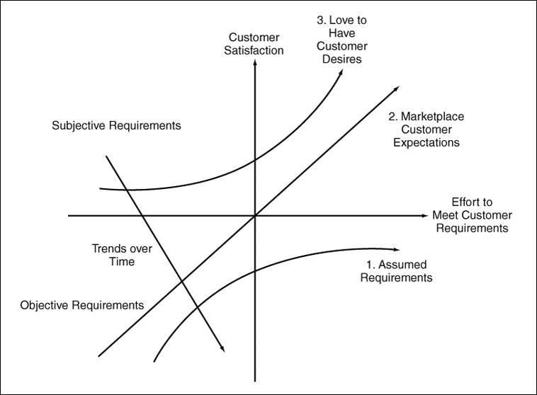
Figure 6.1. Kano’s model of customer requirements.
Affinity Diagram
The Affinity Diagram is an excellent method used to solicit input from various stakeholders, be they patients, staff, nurses, doctors, or directors. Many organizations have methods to collect ideas in a suggestion box and dump them in another box. Those ideas are not exploited to create value. Sometimes, the ideas in the suggestion box are too suggestive, thus ignored. In a brainstorming session, a few outspoken individuals take over the meeting, and the meeting ends up with a bunch of old, limited-in-number ideas.
An Affinity Diagram is a wonderful tool to gather ideas from anybody and everybody in a room. Experience has demonstrated that by using Affinity Diagram methods, a group can generate many ideas very fast. Once the ideas are generated, they are grouped and themes of ideas are developed for identifying action items for creating solutions from the ideas. An Affinity Diagram can also be used to generate new ideas from patterns and combinations of facts and team. Thus, the Affinity Diagram is a tool that organizes ideas based on their affinity and discovers new valuable ideas.
An Affinity Diagram is used when there is a
• Shortage of ideas by allowing everyone to participate in generating ideas.
• Large number of ideas by organizing them in groups of related ideas.
• Bottleneck by opening new direction of thinking.
• Disagreement by objectively evaluating ideas.
Constructing an Affinity Diagram involves the following steps:
1. Write a statement clearly defining the problem or goal.
2. Identify the cross-functional team that would work to create the Affinity Diagram.
3. Provide 3” × 5” cards or Post-It notes to each member of the team for writing ideas.
4. Ask team to be silent for five minutes, and write down as many ideas on their 3 × 5 cards as they can. Any incentive to write more ideas can be helpful.
5. Collect the cards and spread them out on a flat surface (such as a desk or wall) so everyone can see them.
6. Have team members arrange the cards into groups of related ideas.
7. Develop a main category or a theme for each group. That main category idea becomes the affinity card. Members move around cards to fit in best-suited group.
8. Once all cards or notes have finally been placed under a proper affinity card, the diagram can be drawn up.
9. The main theme or ideas are then used to build solutions and identify action items.
Gaining Process Knowledge
We require sufficient process knowledge to work on a project successfully. As a fact of matter, one can solve a problem only with process knowledge. However, we tend to substitute with the experience in an area with the process knowledge. To gain process knowledge, one must deliberately attempt to learn details of the process, be able to answer various questions about the process, fix its problems, or guide others to replicate the process. For example, if a physician is an expert in heart surgery, it implies that the physician knows the ins and outs of the heart. He knows how to open it, how to operate on it, and how to properly work with it, and if an anomaly occurs how to handle it. Many times, having the false perception about the process knowledge we tend to resist new ideas or alternate methods. Based on concepts of the process thinking, it is expected that process experts must be able to answer the following aspects of a process1:
• Purpose. Purpose is the most important aspects of a process. Team members must be able to articulate what the basic purpose of a process is. Is the process needed? Does it add any value? Can the project be done without the process?
• Process description. The process owner must be able to describe the process from beginning to end. The one responsible for the process should be able to explain key aspects of the process, measurements to monitor it, and its deliverables.
• Process details. The process knowledge includes knowing details such as process inputs, critical process steps, process outputs, process parameters, and workmanship standards. There must be a clear understanding of the target and tolerance conditions for the process.
• Process performance. An important aspect of the process knowledge consists of knowing process performance at key measurement points throughout the process operation. The process performance includes knowing typical performance levels, trends in the performance, and the amount of improvement. If there are visual standards of excellence, they must be clearly known.
• Handling of nonconforming material. In addition to knowing the good product or process output, employees working on the project must also know how the nonconforming material is handled. What kinds of exceptions are made, and what is sent on “as-is?” This represents the “knack” of a process.
• Statistical performance. In addition to the qualitative knowledge of the process, a process expert must understand the process variability and the process performance in statistical terms. Jeff Hawkins, the author of On Intelligence, defines intelligence as “an ability to predict.”2 Statistical understanding of a process provides the ability to project and predict.
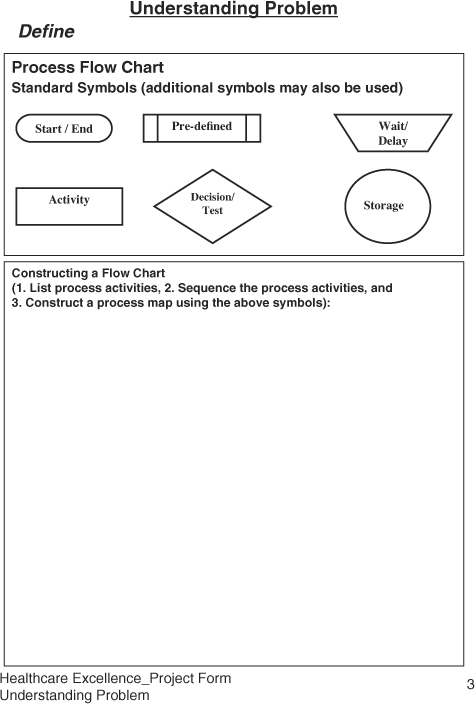
Process Mapping
To understand a process better, process mapping is an excellent exercise to identify various activities and their interrelationships. The SIPOC (supplier, input, process, output, and customer) is another tool to identify opportunities in the process. These opportunities, if performed incorrectly, may result in an unacceptable performance.
A process can be defined as a series of tasks that transform a set of inputs into desired outputs. Our objective should be to establish the shortest and simplest process of doing a task. The more the steps, the more complex the task becomes, and the more opportunities there are for errors. The basic building block of a process is the 4P model, where the 4Ps stand for Prepare, Perform, Perfect, and Progress.3 In the Preparation stage, a process requires material or information, method or approach, tools or equipment, and people with the required skills. A successful outcome of a process depends on a good preparation. The Perform stage focuses on excellent execution of certain tasks. The Perfect stage highlights the target performance rather than acceptable performance. The knowing target is the essential minimum requirement for achieving excellence in anything. The Progress stage focuses on actions to reduce inconsistencies in the process.
A well-defined process must address the following:
• Process has a purpose.
• Process has beginning and end states.
• Process has needs or inputs.
• Process must have a clear target performance.
• Process output does vary due to uncontrolled sources of variation.
• Process must be evaluated based on its mean or typical performance, as well as range between worse and better performance levels.
Constructing a Process Map
A process map is a graphical representation using standard symbols of a set of activities arranged in a sequence from start to the end. Process maps provide a picture of how the work is done and are used as training tools to reinforce the process training. Examples of process are Registration Process, Patient Release Process, Post-surgery Care Process, Clinical Trial Process, Patient Visit Process, Patient Feedback Process, Physician Ethics Process, Billing Process, and Handling of Rude Patients Process.
To construct a process map, follow these steps:
1. Select a process to be mapped.
2. State purpose of the process, and define its boundaries.
3. List all the activities that occur in the process
4. Sequence the activities.
5. Construct the flow chart using a standard set of symbols.
6. Connect various process steps to describe the flow of information.
7. Identify areas where review or verification is to be performed.
8. Include redo or repair activities.
9. Highlight critical activities and associated measures of performance.
The process map can be generated at the business level, department level, or the process level. The business level map is at a high level to depict information flow of the major business processes. The business level process map crosses the departmental boundaries and shows the information flow across the departments. The process level map identifies details of a process.
An example of a process of visiting doctor is shown in Figure 6.2. The map displays the flow of information and can act as a visual tool for training, identifying disconnects, and opportunities for improvement to reduce cost and responsiveness.
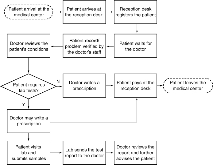
Figure 6.2. A sample process map for visiting a doctor.
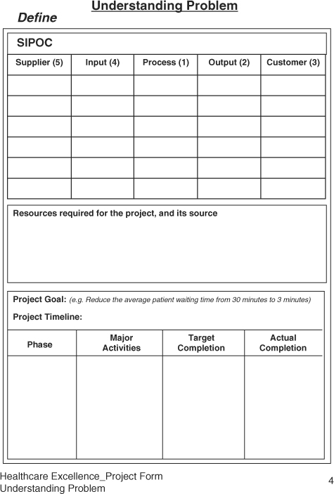
SIPOC
SIPOC, an abbreviation for Supplier, Input, Process, Output, and Customer, is used to expand the process map to identify players in the theater of operation. The main benefit of constructing a SIPOC is to identify practically all variables affecting performance of a process. From such understanding, we can prioritize critical customer outputs, process inputs, and the critical process steps in delighting patients, or the customer. A sample of SIPOC for a typical patient visit is shown in Figure 6.3.
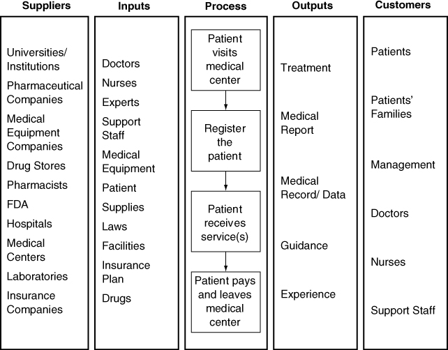
Figure 6.3. An example of a SIPOC for a general physician visit.
Constructing a SIPOC
To construct a SIPOC effectively, one can first complete the middle column by writing the process steps from the process map. Then, complete two columns on the right related to the customer. First identify the process outputs, and then identify who the process output is going to. The customer could be external or the internal. The internal customer could be another department, such as radiology providing services to surgical operations, or the next process within an operation. The final steps would include completing the inputs column which can be a little tedious. The best way to complete the inputs column thoroughly is to ensure material or information, method or approach, machine or tools, or the manpower or people and skills have been considered for each process. We suggest that a cross-functional team is used to construct the SIPOC as it represents the cumulative knowledge of a process within the organization.
In working on the Six Sigma project, the process map and SIPOC are used to establish a baseline of the process knowledge. This knowledge enables us to identify and prioritize areas for improvement in order to achieve the improvement goal.
Pareto Analysis
Pareto analysis is also known as the 80:20 rule. The Pareto analysis is a powerful tool to develop our ability to make decisions based on importance instead of convenience. In our daily lives at work, we tend to get busy with easy to-do activities, rather than important things to do. As a result at the end of the day or even over a period of time, one does not see any improvement. In case of working on a project, Pareto analysis is used to prioritize process steps, process inputs, and process outputs based on their significance to the organization, instead of some arbitrary criteria. According to the Pareto principle, a few vital opportunities exceed many trivial ones combined for their impact. For example, most of the deaths in a hospital occur due to few diseases, or most of the malpractice premium is affected by the few risky practices, or most of errors are caused by a few individuals.
The Pareto analysis demonstrates that all customers, suppliers, activities, problems, or opportunities are not equally important. Pareto analysis is used to prioritize limited resources to maximize their return on investment. While selecting a project from many opportunities, one can prioritize based on their social or economical impact on the organization. It helps to focus on a few vital opportunities rather than working on many trivial ones.
Pareto analysis includes a graphical representation of a set of data, be it deaths by disease, errors by departments, waste by functions, or complaints by a group of customers. A Pareto chart is a bar chart showing attributes of the problem on x-axis and frequency of occurrence on y-axis. The data is arranged in descending order such that the tallest bar is plotted on the left representing the most significant opportunity for improvement. It has been observed that the two or three bars on the left together account for most of the unacceptable performance. Thus, we deploy limited resources to the most significant opportunity.
Some Pareto charts also plot a cumulative line accumulating the contribution of each category, thus highlighting areas for improvement and accounting for about 80 percent of the opportunity. Some examples of opportunity for improvement include the following which can be prioritized using the Pareto analysis:
• Causes of variation in diagnosis
• Causes of variation in the cost of treatment of a particular disease
• Type of diseases requiring medical attention at a particular facility
• Causes of various diseases
• Types of infections
• Reasons for delay in attending a patient
• Reasons for wrong prescription
• Reasons for the patient loyalty
• Cost (lower than the others)
• Comfort (quality of treatment)
• Convenience (location)
• Care (by the doctor)
• Choice (lack of)
• Consistent (good experience)
• Competent (doctors)
The following steps describe the process of constructing a Pareto chart:
1. Draw X and Y axes, where the X axis represents data categories, and the Y axis represents frequency of occurrence. Label axes appropriately.
2. Establish the attributes or categories for analysis of data.
3. Select a time interval for analysis. This interval should be a representative of typical process performance.
4. Calculate the frequency of occurrence or determine the significance of category.
5. Arrange categories in descending order based on the frequency of occurrence.
6. Plot data on the bar chart. Work on the tallest bar for improvement.
One of the challenges in constructing a Pareto chart is too many categories. The typical rule of thumb is to plot seven bars, and the last bar is designated “miscellaneous,” which includes all categories beyond the top six categories. An example of the Pareto chart for the late delivery of food to patients is shown in Figure 6.4.
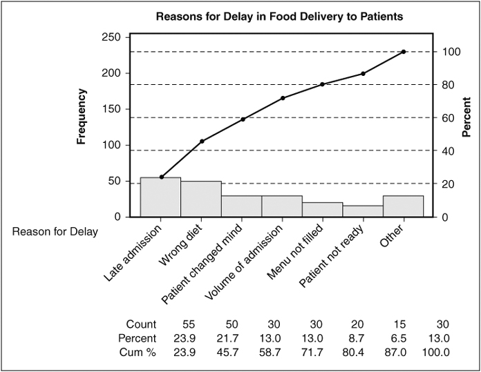
Figure 6.4. An example of a Pareto chart explaining the reasons for delay in food delivery to patients (Minitab® Statistical Software).
Force Field Analysis
While working on Six Sigma projects that require cooperation of other departments or individuals, we experience resistance to cooperating due to conflicting priorities. Force Field analysis is a simple method used to identify supportive and resistive resources that could be utilized effectively toward the project goals. The Force Field analysis includes identification of factors or individuals that support (drivers) the project objectives and those that may distract (restrainers) from the project objectives. Our objective is to identify supporting individuals or factors that we can exploit to accelerate change, and identify resistive resources in order to manage them effectively considering the project objectives. For example, in an attempt to reduce waste in the emergency department, one may start monitoring use of supplies. Initially this may cause a little concern because of the monitoring or discomfort in reducing the use of cleaning supplies. By identifying the people’s concern upfront, we can address the issue through raising awareness or training, and converting the resistive emergency staff into staff supporting the project objectives.
Force Field analysis is widely used in planning for change management. The Force Field analysis is mostly used at the planning stage to maximize the ration of Drivers to Restrainers. For example, Figure 6.5. shows how Driving and Restraining forces have an impact on reducing the waiting time.
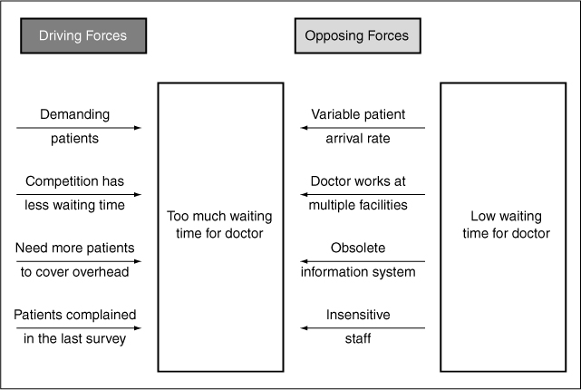
Figure 6.5. An example of force field analysis for waiting time.
Project Charter
Once we understand our process, customer, and customer’s critical requirements, a project charter is created to document planned steps. The project chart compiles the problem definition, goals, objectives, and action plans to achieve them. The project charter is a written roadmap that
• Justifies the project efforts with the financial impact.
• Describes the problem and its scope to be addressed by the project in the specified timeframe.
• Declares the goal, objectives, and measures of success.
• Defines the roles of the team members.
• Establishes the timeline, milestones, and key deliverables.
• Identifies required critical resources.
The Measure Phase
Once the process knowledge has been gained through process maps and SIPOCs, we need to baseline the performance. One of the main tenets of Six Sigma is measure what we value. The purpose of the Measure phase is to identify correct measures, establish a baseline, and eliminate trivial variables or issues from further analysis.
We see data everywhere, and sometimes there is too much to handle. However, we are too busy to plan for data analysis and do something with it. The purpose of data collection has been to ensure compliance regulation or industry requirements. Instead, the purpose of the data collection should be to identify areas for improvement and ensure compliance to various requirements. Healthcare facilities have been more focused, with exceptions, on ensuring compliance rather than on improving operations. While applying the Measure phase, the following concepts and tools are important to understand:
• Basic statistics
• Statistical thinking
• Cost of quality
• Measurement system analysis
• Critical parameters
• Critical to Quality (CTQs)
Statistics is of two types: descriptive and inferential. The descriptive statistics summarizes the historical data, while the inferential statistics is based on analysis of the sample to infer performance of the process. One can consider statistics as a science of natural behavior of a process. Several statistical tools have been developed to analyze two types of data, such as variable and attribute. The variable data is a measure of performance on a continuous scale such as temperature, time, quantities of medication, and duration of stay. Examples of variable data include the following:
• Patient waiting time
• Initial
• Treatment
• Discharge
• Hospital mortality
• Mortality after a defined period from the date of hospital discharge
• Duration of hospital stay
• Days lost from work or normal routine
• Hospital readmission rates
• Complication or “adverse event” rates
• Bed turnaround time
The other type of data is called attribute data which has pass or fail, low or high, up or down, good or bad, cured or not cured, and zero or one values. Here the data does not have value, but has attributes. Such data is used by counting the frequency of occurrence.
Obtaining good data requires careful planning about what is required, why is it required, how often data should be collected, and where is the data stored or filed. In a healthcare organization, data is collected in clinical as well as staff areas. Staff areas will have employee, financial, facility, purchasing, supply, or patient’s personal data, while the clinical data will include disease specific, clinical trials, or patient’s health data.
Basic Statistical Analysis
Basic statistical analysis utilizes descriptive statistical tools such as mean and range, median, or mode. Such data are plotted to examine trends or distribution. Data are summarized by studying their central tendency or their typical values and variation or spread of the data. The mean value tells us the expected performance, and variation tells us about the consistency of a treatment or an action.
Mean or average is the most commonly used measure of location for a variable. The mean provides a measure of the most likely value of the observed data. The mean for a sample is represented by x-bar (a bar over x), and for population by a Greek letter μ (mu). A sample is a part of the population, with a much larger set of data. Examining a sample of a population is an economic way to learn about a process. The mean is calculated by summing all the numbers divided by the number of observations.
Median identifies the middle point in our dataset. Median is used when we count occurrences, and we want to look into percentiles for analysis. The lower quartile marks the 25 percentile point, and upper quartile marks the 75 percentile point. For example, if one looks into internal medicine data for a month, the median would imply how 50 percent of the people responded within a specific amount of time. For an odd number of observations, the middle value obtained by arranging the observations in an ascending order is called the median. For an even number of observations, median is the average of the two middle values. For example, for 49 observations, the 25th data point of sorted data will be the median, and for 50 observations, the average of 25th and 26th points will be the median. Median is a more meaningful measure of central tendency when data has some extreme values.
Mode is the value that occurs with greatest frequency. For example, the value that occurs most frequently in the Call Handling dataset is 5. Patients’ calls for flu in the allergy season may represent the mode. Sometimes it happens that two diseases may become most frequently occurring diseases; the data is said to be bimodal data.
Range is the simplest measure of variability or spread in the data. It is the difference between the largest and the smallest values in the dataset. It has limited application because of its sensitivity to just two of the observations.
Variance is a more accurate measure of variability as it utilizes all data points. Variance is calculated by determining the difference between a data point from its mean value, squaring, and summing it. The formula for variance is described as follows:
Variance = Sum{(xi – x-bar)2}/N
where N is the number of data points, and subscript “i” represents the sequence of data point between 1 to N.
Standard deviation is the square root of variance. While calculating sample standard deviation, we divide by (n-1) instead of N. Several statistical software programs such as Minitab, Stat-graphics, or Microsoft Excel worksheets are available for statistical computations and analysis.
Statistical Thinking
Normal distribution is a bell-shaped distribution of data values where the majority of the items are in the center and some are on the tail ends, as shown in Figure 6.6. The normal distribution is used to determine probability of occurrence of an event based on the knowledge of past performance. The area under the curve helps us define what proportion of values will fall within a certain range. For example, the probability of data points that fall within a range of one standard deviation around the mean is 68.26, or about two-thirds; within two standard deviations around the mean is 95.44, or 95 percent, and within three standard deviations around the mean is 99.73, meaning practically everything.
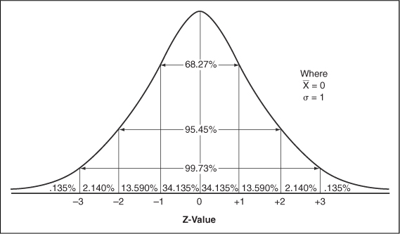
Figure 6.6. A normal distribution curve.
The reason we use normal distribution to estimate probability of occurrence is that most of the events in nature follow this distribution, which can be understood by its mean value and standard deviation. A normal distribution helps you make decisions about a treatment based on the sample data.
Random Versus Assignable Variation
Normal distribution has most of the points around its mean and a few on its tail ends. The data within the center of the distribution or within two standard deviations represent the common variation, while data outside the two standard deviations represent special variation. Walter Shewhart, a quality professional in the 1920s, called these variations random and assignable variations, respectively. More precisely, data that do not follow the normal distribution represents nonrandom variation, thus considered assignable variation. The statistical thinking means a clear understanding of the difference between the random and the assignable variation:
• Random variation occurs due to uncontrolled variables that exist in the environment around us. For example, variation among patients’ response to a treatment can be considered random variation. Random variation is hard to understand and control.
• The assignable variation occurs due to a specific cause. For example, a patient’s response that is significantly different from that of the group response to the same treatment can be considered assignable variation. Assignable variation is easier to understand and change.
At a personal level, when we commute to work, we expect a certain time with some give and take due to random variation. However, when an accident occurs, the commute time changes significantly due to an assignable cause; thus this is considered assignable variation.
Understanding the random and assignable variations allows us to make decisions to utilize our resources most effectively. Random variation represents the process capability, while the assignable variation is a deviation in performance from that capability. To improve capability of a treatment takes a lot of resources and fundamental research, while to change the performance of a treatment, some adjustments are needed.
Cost of Quality (COQ)
Dr. W. Edwards Deming, the famous quality guru, has said that variation is evil. Many business problems are caused by inconsistencies. Many organizational inefficiencies or malpractices are caused by inconsistency in our practices. The inconsistency could result from an illegible handwriting on prescriptions, excessive waiting time, poor training, insufficient documentation, and so on. Of course, some of the inconsistencies could be prevented with a good design of process or the product.
The main purpose of Six Sigma is to reduce the cost of quality (COQ). It is estimated that 3 Sigma level can be associated with COQ of about 15–25 percent of sales, and 6 Sigma level with less than 1 percent of sales. The COQ is beyond the cost of errors; instead it includes cost of handling problems, checking or verifying the performance, reworking the service, lost opportunity, or the lost customer. The COQ has three main components: Failure, Appraisal, and Prevention.
The Cost of Failure has two components, internal and external failures. Examples of the cost of quality may include the following:
• Failure costs
• External Failures
• Cost of malpractice insurance
• Legal costs of fighting malpractice cases
• Handling patient complaints
• Lost patients
• Lost doctors
• Revisits
• Internal Failures
• Lost patient information
• Long wait for patient
• Rework
• Nonstandard working methods
• Material or equipment waste/scrap
• Billing errors
• Other avoidable process losses, such as scheduled admission process
• Calling a doctor because an order is not clear
• Retaking an X-ray because the film quality was poor
• Inefficiencies
• Preventive
• Planning
• Capability studies
• Patient surveys and evaluation
• Training
• Doctors
• Patients
• Staff
• Resource planning
• Procedures
• Appraisal
• Excessive sign-offs or approvals
• 100 percent inspection of diagnostic code capturing when errors rarely occur
• Compliance to various regulatory and industry requirements
• Audits
One of the differences in reviewing cost of poor quality between healthcare and the conventional manufacturing industry is that direct cost of appraisal is not obvious, such as compliance to JCAHO requirements, or various reviews and approvals. However, some of these items are built-in service processes and are difficult to see as separate cost items. Besides, waste of time, reduced inefficiencies of staff and physicians, and overuse of supplies could also lead to increased COQ. Such inefficiencies can lead to fingerpointing among employees. The high frequency of mishaps may result is a negative work atmosphere.
Measurement System Analysis
An inaccurate blood pressure measuring system may show excessively high readings; the patient may be sent to an emergency care center, resulting in excessive anxiety and an enormous waste of expensive resources. I remember one of my friends went in for a quick examination at his workplace. His cholesterol level was detected to be at 300 plus level. He was shocked at such a high number. Even though the test was redone, he was recommended for further tests. Later he found out that the high cholesterol level was due to a bad test device. Another example is buying a blood pressure measuring device from a local pharmacy. It is difficult to get a consistent measure of one’s blood pressure, and even more difficult to correlate with another devices at the physician’s office or at the pharmacy. Even though the device may be acceptable to use, the measurement system is still questionable. Besides the measuring device, the measurement system includes variability because of the person taking the measurement and the patient who is being measured.
If more than one nurse measures a patient’s blood pressure, it is quite possible two measurements may not be the same or equally reliable. The objective is to be as close as possible to the actual blood pressure. One can see that the blood pressure can be inconsistent because of the patient’s condition, the measuring device, and the measuring method. The measurement system analysis (MSA) is a method of apportioning sources of inconsistencies in the measurement system. The MSA is important to conduct for devices that are used for measuring critical and sensitive measurements. MSA is also known as Gage Repeatability and Reproducibility (R&R), which involves taking a number of cases, patients, or test individuals, and measuring them by two or three individuals, gathering the data, and analyzing by using a statistical analysis software. The repeatability indicates how consistent is the measuring device and reproducibility indicates how consistent is the measuring person.
Figure 6.7 shows the difference between repeatability and reproducibility. Together, MSA determines the R&R factor. For good measurement systems, the R&R should be less than 10 percent, and acceptable measuring devices used for noncritical measures of R&R may be as high as 30 percent. In general, the rule of thumb is that the device must have a resolution fine enough to measure the variation in the measurement itself.
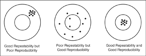
Figure 6.7. Repeatability and reproducibility.
Process Performance Measures
Besides defect per unit (DPU), or defect per million opportunities (DPMO), two other measurements must be learned to understand how the intent and actual performances must be aligned. Imagine you have a one-car garage with a door width exactly equal to the width of your car. How would you feel about parking in the garage, especially Friday night? Having a garage width exactly equal to the width of the car is considered as a borderline case of your car’s parking capability. We understand that it is difficult to drive exactly the same way and very precisely all the time. The inconsistency in our ability to drive like on railway tracks can be thought of as variability, which is measured in terms of standard deviation or the range.
Six times the standard deviation is considered as the process capability. One can understand that process capability is defined by the range of your performance, not the target or average of your performance. How frequently a process can achieve its target performance determines a process’ capability. Based on the process capability, two indices, Cp and Cpk, are defined.
The Cp, the process capability index, is as the ratio of expected to actual performance, tolerance to the process capability, or defined as
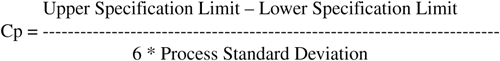
The difference between upper and lower specification limits is called the tolerance, and it represents the garage door width from the left to the right of the garage. The proces 109s standard deviation is a calculated measure of inconsistency of the process. According to the Six Sigma methodology, in order to achieve 3.4 errors per million opportunities, one should have Cp of 2 or better. In other words, having a garage door twice the width of the car can make the driving process to be at 6 Sigma level.
A complementary measure, Cpk, the process capability index adjusted for shift in the process mean, provides a snapshot of the process performance. While Cp deals with the variance, Cpk deals with the distance from target, or specification limits. Cp represents inherent process capability, and Cpk represents the actual process performance. It implies that for a given Cpk, one can expect a certain error rate.
The Cpk can have two values depending upon the shift in the process. The CPU is determined when the process center is closer to upper specification, and the CPL is determined when the process is closer to lower specification. The smaller of the two values is treated as the Cpk.
CPU = (Upper specification limit – Process mean) / 3 * Standard deviations, OR
CPL = (Process mean - Lower specification limit) / 3 * Standard deviations
Cpk = Min(CPU or CPL)
Thus, Cp can be remembered as a planned capability of the process; yes, having a one-car garage, I can park the car. However, how often I park the car in the garage well will determine its Cpk value.
The following guidelines can be used to evaluate Cp and Cpk values:
Cp > 1.33 (Capable)
Cp = 1.00 – 1.33 (Capable with tight control)
Cp < 1.00 (Incapable)
Cpk > 1.5 means that the process is achieving virtual perfection, and thus requires less control.
Cpk > 1.0 means 6s spread is inside of specification limits, thus lower failure rate.
Cpk < 1.0 means some part of the distribution is outside of the specification limits.
Figure 6.8 shows the concept of Cp, and Figure 6.9 shows the concept of Cpk.
Figure 6.8. Process capability index.
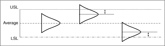
Figure 6.9. Process capability index adjusted for the shift in the mean.
The Analyze Phase
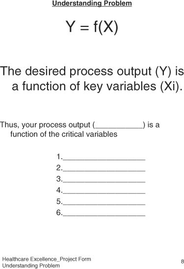
The Analyze phase begins the convergence of possibilities toward the root cause of the problem. At the end of the Analyze phase, we identify a list of critical variables. The Analyze phase focuses on the key variables so that problems can be fixed. In the Analyze phase, we investigate the family of variation to pinpoint the type of variation; then we conduct the root cause analysis, and reduce the number of variables to a manageable number. The root cause analysis is conducted to the level such that an action item can be identified that would alleviate inconsistency in the process output. In this phase, some hypothesis testing of “what-if” scenarios is also possible. Then, the regression analysis is conducted to ensure at least some statistical relationship between the parameter variables versus the output process performance. The likelihood of solving the problem increases as the problem is addressed through various phases of DMAIC. Finally, the failure modes and effect analysis (FMEA) is used to anticipate potential failure modes and address them.
Key Analyze Tools
Multi-vary analysis is a tool that apportions variation into its components and reduces the scope of the problem to a manageable level.
Cause-and-effect analysis is also known as fishbone or Ishikawa diagram. This tool is excellent to explore potential causes that could impact the problem. The team for further convergence or potential solution then prioritizes the causes.
Regression analysis is used to build process models, or to quantify or prioritize relationship between various causes and effects.
Failure modes and effects analysis, FMEA, is a great tool to anticipate potential problems so some of the problems could be prevented from occurrence in the proposed solution.
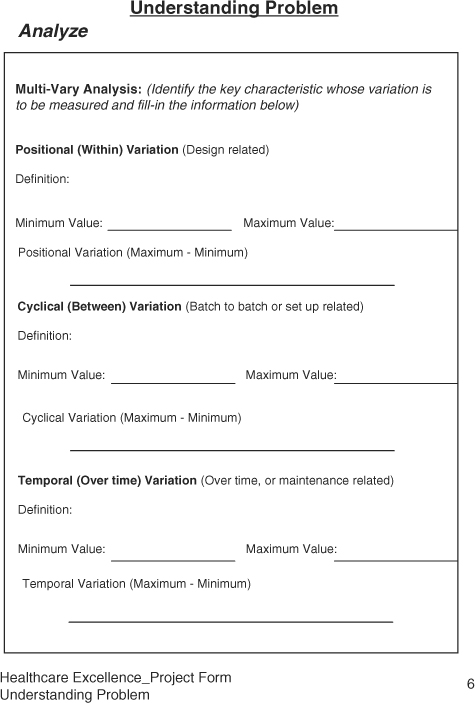
Multi-Vary Analysis
A typical process problem can be caused by many potential causes. In solving a problem, we try to reduce the number of potential causes by removing trivial ones. However, sometimes it is difficult to reduce the number of potential causes to a smaller number directly. In such circumstances the multi-vary analysis is used to reduce the scope of the problem. The multi-vary analysis reaffirms the approach that most of the problems are due to excessive variation. Thus, by categorizing the process variation, one can focus on the most significant sources of variation. Accordingly, a process output manifests three types of variation, namely, Positional, Cyclical, and Temporal. The multi-vary analysis is a graphical representation of three families of variation, identifying the most significant family of variation to work on, and reducing the scope of problem to one third of the problem.
The Positional variation, also known as within variation, represents the family of variation that occurs within a system at certain locations. The system could be a process or product. Thus, the position variation could be the occurrence of unacceptable variation within a process at certain specific steps, within a department at certain activity, or within a treatment at certain stage the results are unacceptable. The position variation occurs frequently, is considered repeatable, and thus relates to the design of the process. As a product, one can say that the certain medicine from a certain supplier is less effective than another manufacturer’s response to a treatment is more unique at some parts of the body than others. Thus, the treatment shows some location-specific effect.
For example, if one bakes cookies on a tray or the cookie sheet, and places the trays on a conveyor belt into the commercial oven, two cookies at one corner turn out to be uncooked on all trays. One can right away focus on that aspect of the baking process that includes oven, conveyor, trays, or heating element. Isolating the location-related pattern helps us in diagnosing the problem and identifying a solution to the problem.
The Cyclical variation, known as between variation, represents changes from one process cycle to the next process cycle. It means that at one time a treatment works; the other time it does not work. Or, one tray of cookies looks great; the next one has inedible cookies. Detecting such patterns of problems leads us to look into potential causes that relate to the process setup, rather than its design. If the cyclical variation is large, then one looks into the inconsistency in the setup of the process cycle, which could be due to wrong material, wrong quantity, wrong time, or an unqualified person
The Temporal variation, known as trends, is defined as the shift in the process output observed over time. Normally, such variation has been observed in decay of a process element over time. For example, in X-ray machines, the intensity of the X-ray source decreases over time, equipment using a laser source diminishes over time with usage, or in the case of cookies, normal decay in the heating element or change in the viscosity of the cookie dough by the seventh or eighth tray.
To conduct a multi-vary analysis, we define the three families of variation, design data collection forms, collect data, and analyze the largest family of variation by calculating range (difference between maximum and minimum) of consistency. The amount of data to be collected should be sufficient to represent most of the variation in the process. Once the largest family of variation is known, the root cause analysis is done to identify causes of the excessive variation, which could be due to design, setup, or maintenance-related activities.
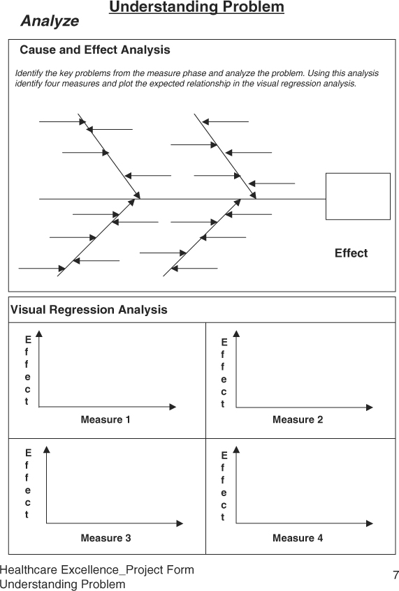
Cause and Effect Analysis
Cause and effect analysis was developed by Kaoru Ishikawa to identify the source of the problem seen at the process output or in the field. The chart representing the cause and effect analysis is called the Ishikawa diagram or the fishbone diagram. It a systematic approach to perform backward analysis by tracing an effect to its cause(s). The fishbone diagram contains a box (fish mouth) to represent the cause, and major branches represent bones. The four major branches include Material, Machine, Method, and Manpower. However, due to diversity in the workforce and advances in technology, we have relabeled these branches as Material/Information, Machine/Tools, Method/Approaches, and Mind Power/People Skills. The chart is formed in the team environment where expertise representing various branches and problems is available. One of the challenges in conducting root cause analysis using the Ishikawa diagram is that people tend to point to the person responsible for the undesired effect, and take necessary corrective action, which includes training and counseling. After some time, either the person is let go or feels bad; however, the problem recurs. In a performance-driven healthcare organization, when an error occurs, the question must be asked, “What happened?” rather than “Who did it?”
Accidents do occur in healthcare organizations causing dissatisfied, irritated, or helpless patients. Such errors can occur in any area whether at registration, examining the patient, or testing patients. Malpractice or dissatisfaction can be attributed to excessive inconsistency from expected practices at a typical process, or the condition of the patient.
Conditions of excessive deviation must be investigated. The extent of this investigation into root causes varies due to the frequency of the deviation and the severity of its effect. However, many times the extent of the investigation is not sufficient and proportionate to significance of the deviation, and the analysis remains shallow. As a result, problems recur, and soon we have many fires to fight.
The fishbone diagram provides a framework to understand the causative relationships between output and input variables more effectively. When constructing the Ishikawa diagram, one can either populate all four major branches in random fashion, or one at a time. In either case, it is imperative that no idea is left ignored. All ideas are documented first, and then evaluated for significance. A typical branch should have multiple potential causes. To identify the key potential causes, the team selects at least one key cause on each branch. This directly reduces the number of variables from a large number to a smaller number, between four to six variables. Once the key causes have been identified, each cause is drilled down by asking about five “why’s” or until clear actions are identified. Due to a lack of depth in the analysis, one cannot identify the appropriate action to remedy the problem. The following thread investigating the causes of long waiting time demonstrates the depth of analysis:
We have too many patients catching cold in the waiting room. >> Why do the patients catch cold in the waiting room? >> They wait too long. >> Why do they wait too long? >> Doctor spends too much time with patients and takes an interest in patients’ care? >> Why? Doctor does not have a standard process >> Why not? >>Because... >> Why not? >> Because doctors know what they are supposed to do?>> Really? >> Yes>> Why haven’t we documented the doctors’ process then?>> Well, nobody has asked for the procedures.>> Can we document the procedures now? Yes, let’s interview doctors, and document a standard procedure for patients’ examination to reduce a long waiting time in the reception area. (It should help in reducing the patient to patient variation, and help in scheduling appointments.)
Constructing the Ishikawa Diagram
The following steps may help streamline team meetings and expedite getting to the root cause:
1. Form a cross-functional team with members representing facility, doctors, staff, administration, pharmacy, compliance, and supplies.
2. Construct a cause-and-effect diagram and list potential causes on each branch.
3. Jot down as many causes as possible. Do not exclude any at this time.
4. Prioritize causes on each branch, select at least one important cause for further analysis, and ignore trivial causes.
5. For each important cause, conduct a detailed analysis by asking “Why” at least five times, as many times as needed to identify an action to reduce the undesired effect or eliminate it.
6. After the “Why” analysis, develop an action plan.
7. Follow up until the action item is implemented and the results are verified.
8. If the resultant outcome is unsatisfactory, further analysis or experimentation will be required using tools identified in the Improve phase.
Figure 6.10 shows an example of a cause and effect diagram for poor X-ray quality.
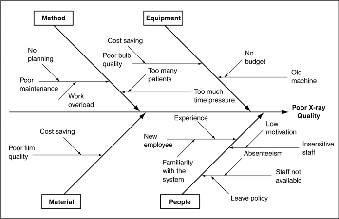
Figure 6.10. An example of a cause and effect diagram for poor X-ray quality.
Regression Analysis
The cause and effect analysis identifies potential causes that may relate to the expected or unexpected outcome. The regression analysis helps us in quantifying the strength of the relationship between the dependent (outcome) and independent (input) variables. For example, patients waiting too long in the reception area may be because of unscheduled arrivals, emergencies, or the doctor’s process of examining patients. In order to determine which one may be more significant than others, we correlate three potential causes of the delay to the waiting time.
Similarly, there may be other incidences where correlation can be estimated for evaluating the extent of causation:
• Billing error rate versus number of bills issued
• Mortality rates versus number of procedures
• Mortality rates versus number of patients treated
• Hospital re-admission rates versus number of patients treated
• Relapses versus type of disease
• Medication dose versus the patient’s weight or health
• Infant mortality rate versus demographics
In a Six Sigma project, regression analysis is used to prioritize independent variables or establish causative relationship between output and inputs. Once the relationship or a model has been established based on historical data, one could predict the dependent variable for a given independent variable. Regression analysis can be seen as analysis of scatter plots by adding best-fit lines and quantifying the relationship between the dependent and independent variables. The regression analysis includes the regression equation, residual variance, and R-square. Regression equation defines the best-fit line. The best-fit line is the line that quantifies the relationship between two variables. Figure 6.11 shows an example of the scatter plot for the relationship between the length of hospital stay and the patient satisfaction score using Minitab.
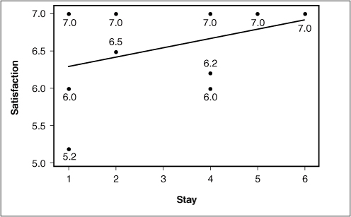
Figure 6.11. An example of a relationship between satisfaction score and the length of hospital stay (Minitab® Statistical Software).
When analyzing a scatter plot, there can be a negative, positive, or no correlation between two variables. If the output increases with the increase in the input, the correlation is called positive. If the output decreases with the increase in input, the correlation is negative, and when the output does not change with the change in input, then there is no correlation. The correlation is represented by a letter “R.” However, we examine square of R, represented as “r2,” that is a measure of certainty in the relationship between two variables. If r2 is more than 64 percent, we have established a correlation that accounts for almost a majority of variation in the relationship. This corresponds to the correlation coefficient of R = .8. The value of R ranges between –1 to 1, where 1 represents 100 percent correlation.
Performing Regression Analysis
Following are the steps for performing a regression analysis:
1. Select the key potential causes for regression analysis with the expected response.
2. Draw two axes, label Y-axis for the output (response) variable, and X-axis for input (predictor) variable. Plot the points on the chart.
3. Draw an approximate best-fit line, and interpret the relationship in physical terms. You may observe the relationship to be positive, negative, or no relationship.
4. Calculate the correlation of coefficient using Microsoft Excel or statistical software. If the r2 is greater than 60 percent, one can investigate for improving the relationship in order to predict response.
5. If r2 is less than 50 percent, one can use the regression analysis to prioritize potential causes for further analysis.
For performing regression analysis of multiple variables, statistical software is used, which one can learn through help files, tutorials, or some classroom training. At the end of the regression analysis, one may establish a strong relationship between two variables, or prioritize a group of variables for further analysis such as design of experiments (DOE) in the Improve phase.
Failure Modes and Effect Analysis (FMEA)
FMEA was first used in the aerospace industry in the mid 1960s to detect problems with an aircraft before it ever left the ground. FMEA is mandatory in aerospace, automotive, food, and pharmaceutical industries. The U.S. Food and Drug Administration requires FMEA to launch new medical devices or drugs.
FMEA is a tool used to identify the potential failures for maximizing patients’ safety and to reduce the chances of critical errors for reducing malpractice claims and achieving patient satisfaction. The failures could be the breakdown of a process, or its impact on the patient or the customer. As the name implies, while performing FMEA in a team environment, we identify various potential modes of failure, evaluate its effects, severity, frequency of occurrence, our ability to detect and control, and estimate associated risk. If the risk is high, preventive actions are initiated to reduce to risk to an acceptable levels. For example, from a manufacturer’s perspective while designing an X-ray machine, any potential failure mode that may expose a patient to the X-rays must be identified and addressed because that may lead to injury to the patient. Similarly, in a healthcare facility, one must do the FMEA in the emergency department; any potential for failure may lead to significant adverse effects to the condition of the customer. Even during the patient’s visit for a normal checkup, one must identify potential modes which may cause spread of infectious diseases as simple as a cold. While working on a Six Sigma project, FMEA can be used while identifying the potential causes, or evaluating a proposed solution for anticipating failures.
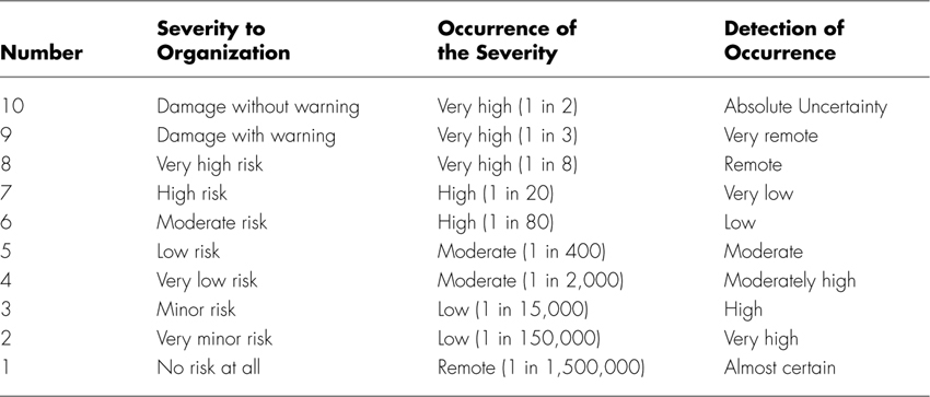
FMEA is more effective when it is proactively applied while designing a treatment, developing a new healthcare facility, or installing a new equipment with significant potential risks. After identifying the potential failure modes, the severity of the failure mode is evaluated for cosmetic, non-functional, or safety impact. If the impact is severe enough affecting patient safety adversely, it must be remedied before using the treatment or equipment. Then, the causes relating to the failure modes are identified, and the frequency of occurrence are identified from rare to all the time. If the causes of failure modes occur, our ability to detect and control is evaluated to minimize impact on the customer. Table 6.1 summarizes the grading criteria.
Table 6.1. Ranks of Severity, Occurrence, and Detection4
Steps to Perform FMEA
To perform FMEA, follow these steps:
1. Identify the project and understand its functional elements.
2. Form a cross-functional team.
3. Review ranking criteria for severity, occurrence, and detection as shown in Table 6.1.
4. Review SIPOC, and list potential failure modes relating all elements of SIPOC.
5. Identify potential causes relating to the failure modes and ability to detect or control occurrence of the potential causes.
6. Evaluate severity failure modes, occurrence of causes, and detection of controls on a scale of 1–10.
7. Calculate Risk Priority Number (RPN) by multiplying Severity, Occurrence, and Detection as follows:
RPN = Severity × Occurrence × Detection
8. Any severity rating more than 7 and occurrence 1 in 80 or more must be investigated for reduction. Then, address any RPN higher than a predetermined value of significance economic for the organization.
9. While addressing certain RPN, the team must look into implementing failure-free methodologies—for example, error-proofing the methods.
10. After implementing remedial actions, re-estimate RPN.
For example, a physical therapy clinic is interested in performing FMEA. A patient makes an appointment to meet a physical therapist. Table 6.2 shows a list of various failure modes or errors that could occur during the therapy process. Once failure modes are identified, severity and detection grading are assessed on a scale of 1 to 10.
Table 6.2. Example of FMEA for Physical Therapy Treatment at a Clinic
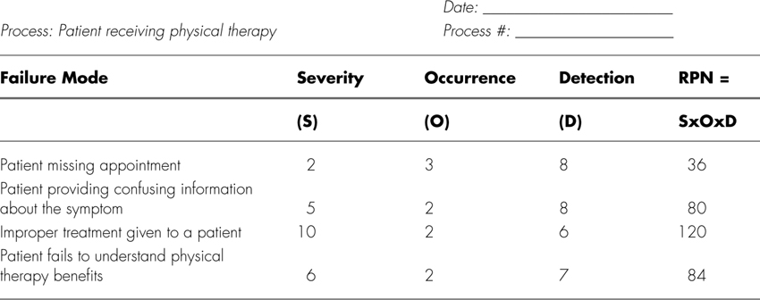
It appears that improper treatment given to a patient has the highest RPN and is therefore a likely candidate for process improvement.
Concluding Understanding Problems
By applying the first three phases of DMAIC methodology, one can get a better grasp of the process needing attention, establish a performance baseline, and conduct root cause analysis to identify likely causes of the problem. If the causes are too many, screening experiments can be conducted for shortening the list of potential causes; otherwise, you can conduct a concluding design of experiments to quantify the impact of causes on the response and optimize the solution before applying elements of the Control phase. The Healthcare-Excellence Project Forms present a simple way to apply commonly used Six Sigma tools.
Endnotes
1. Gupta, Praveen (2005), From PDCA to PPPP, Quality Digest, http://accelper.com/pdfs/From%20PDCA%20to%20PPPP.pdf.
2. Hawkins, Jeff and Blakeslee, Sandra (2004), On Intelligence, Times Books.
3. Gupta, Praveen (2006).
Sample Healthcare Excellence Project Forms: Understanding the Problem