6
Education
6.1 Introduction
Education is one of the most powerful instruments for reducing poverty and inequality in society and lays the foundation for sustained economic growth. The second millennium development goal of the World Bank has been to achieve universal primary education by 2015 (www.worldbank.org/mdgs/education.html). In this context, the World Bank compiles data on education inputs, participation, efficiency, and outcomes from official responses to surveys and from reports provided by education authorities in each country. The Key Education Indicators Dashboard presents a global portrait of education systems, from preprimary to tertiary education. The World Bank EdStats All Indicator Query contains around 2500 internationally comparable indicators that describe education access, progression, completion, literacy, teachers, population, and expenditures (http://datatopics.worldbank.org/education). The indicators cover the education cycle from preprimary to vocational and tertiary education. The database also includes learning outcome data from international and regional learning assessments (e.g., PISA, PIACC), equity data from household surveys, and projection/attainment data to 2050. Several quality indicators are tracked and reported including repetition rates, primary completion rates, pupil–teacher ratios, and adult literacy rates. The currently available reports rely on over 2000 quality indicators designed to answer specific questions such as the following:
- How many students complete primary school?
- How many students per teacher are there in primary classrooms?
- Are a few students repeating grades?
- Do females repeat primary grades more than males?
- Which regions have the highest repetition rates?
- Which countries have the highest primary student/teacher ratios?
- Which countries have the highest repetition rates in primary?
- Which countries have the highest repetition rates in secondary?
- Have adult literacy rates improved?
- Which countries have the lowest adult literacy rates?
- Are adult literacy rates equal for men and women?
- Are gender disparities in literacy rates decreasing over time?
The data described earlier, X, is analyzed by methods f to meet goals, g, implied by these questions. The utility function, U, can reflect the needs of a range of stakeholders including parents, teachers, and policy makers. The information provided by the various official reports to address the questions listed earlier is mostly descriptive and relies on a compilation of various data sources with varying levels of quality control and data quality. Assessing the level of information quality (InfoQ) of these reports, with respect to each of the previous questions, would score low on data integration, temporal relevance, and chronology of data and goal. This statement is based on the fact that indicators are considered separately, data is dated, and decision makers interested in forming policy with the support of such data experience a gap between the reported data and their objectives as managers or parliamentarians.
In this chapter, we consider in detail three education‐related application areas. The first application is focused on the extensive test reporting industry in the United States. After providing a general context based on work done at the National Assessment of Educational Progress (NAEP), the producer of the nation’s report card in the Unites States (http://nces.ed.gov/nationsreportcard), we evaluate the level of InfoQ of the Missouri Assessment Program (MAP) report. The second example interprets the ASA statement on education value‐added models (VAMs) using InfoQ dimensions. The third example concerns the assessment of conceptual understanding or “deep understanding” using Meaning Equivalence Reusable Learning Objects (MERLO). The example is based on the application of MERLO in an ongoing assessment program of teachers of mathematics in Italy. Reports based on MERLO assessment are then evaluated using InfoQ dimensions.
6.2 Test scores in schools
In the United States, over 60 000 000 individual reports are sent annually to parents of schoolchildren. Another 6 000 000 reports are generated in Canada. Over 1000 credentialing exams (e.g., securities, accountants, nurses) often exceed 100 000 candidates. The public, educators, policymakers, parents, and examinees want to understand scores and score reports. The types of questions asked by these various stakeholders on the basis of such reports are as follows:
- Parent questions:
- Did my child make a year’s worth of progress in a year?
- Is my child growing appropriately toward meeting state standards?
- Is my child growing as much in math as reading?
- Did my child grow as much this year as last year?
- Teacher questions:
- Did my students make a year’s worth of progress in a year?
- Did my students grow appropriately toward meeting state standards?
- How close are my students to becoming proficient?
- Are there students with unusually low growth who need special attention?
- Administrator questions:
- Did the students in our district/school make a year’s worth of progress in all content areas?
- Are our students growing appropriately toward meeting state standards?
- Does this school/program show as much growth as another (specific) one?
- Can I measure student growth even for students who do not change proficiency categories?
- Can I pool together results from different grades to draw summary conclusions?
Considerable investments of time and money have been made to address testing programs that produce student reports at various levels of aggregation. The testing field is full of experts working on item response theory (IRT) applications, scoring of performance data, test score comparisons, reliability estimation, and quality control issues such as cheating detection and advancing computer technology. Shortcomings of such student reports are reported in Goodman and Hambleton (2004) and include:
- No stated purpose, no clues about where to start reading.
- Performance categories that are not defined.
- Reports do not indicate that errors of measurement are present.
- Font is often too small to read easily.
- Instructional needs information is not user‐friendly—for example, to a parent. Try to interpret the statement: “You need help in extending meaning by drawing conclusions and using critical thinking to connect and synthesize information within and across text, ideas, and concepts.”
- Several undefined terms on the displays: percentile, z score, achievement level, and more.
In order to improve test reports, several standards have been developed. For example, the AERA–APA–NCME test standards state:
When test score information is released….those responsible should provide appropriate interpretations….information is needed about content coverage, meaning of scores, precision of scores, common misinterpretations, and proper use.…Score reports should be accompanied by a clear statement of the degree of measurement error associated with each score or classification level and information on how to interpret the scores (http://teststandards.org).
As a concrete example of applying InfoQ to answering a particular question using a school report (data), consider the MAP test report of 8th grader Sara Armstrong presented in Figure 6.1. The score report is not easy to follow. There are multiple scales and the report does not tell a logical story from point A to point D. The report is used as a reference in parent–teacher conferences and for instructional planning, and the quality of the information provided by this report has important consequences. For more information about MAP, see http://dese.mo.gov/college‐career‐readiness/assessment/grade‐level/map‐information‐parents. We will review the eight InfoQ dimensions of this report at the end of this section.

Figure 6.1 The Missouri Assessment Program test report for fictional student Sara Armstrong.
Source: http://dese.mo.gov. © Missouri Department of Elementary and Secondary Education.
Some points to consider in designing test reports include:
- Number of knowledge/skill areas being reported—too many is problematic, too few is not useful.
- Either normative or criterion‐referenced information (or both) can be provided.
- If normative, who is in the reference group: all, just passing, all passing, first‐time takers?
- If criterion referenced, what are the cut scores?
- Report precision of scores.
The related SAT Skills Insight report is available at www.collegeboard.com as a free online tool that helps students put their skills on the map by helping them understand what they know and what they need to know better. Figure 6.2 presents an example of such a report, zooming in on a 500–590 score in critical reading. We present it in contrast to the MAP report of Figure 6.1. As an example, consider the SAT reading and writing report diagnostic information: “To improve performance in READING, your child should work on 1) drawing conclusions about the central ideas in a text, 2) understanding the author’s techniques and decisions and 3) making, supporting, and extending inferences about contents, events, characters, setting, theme, and style. To improve performance in WRITING, your child should work on 1) organizing the writing around a single topic or central idea, 2) working to avoid errors in conventions of English usage, grammar, spelling, and punctuation that interfere with understanding and 3) supporting the ideas with more specific details.”
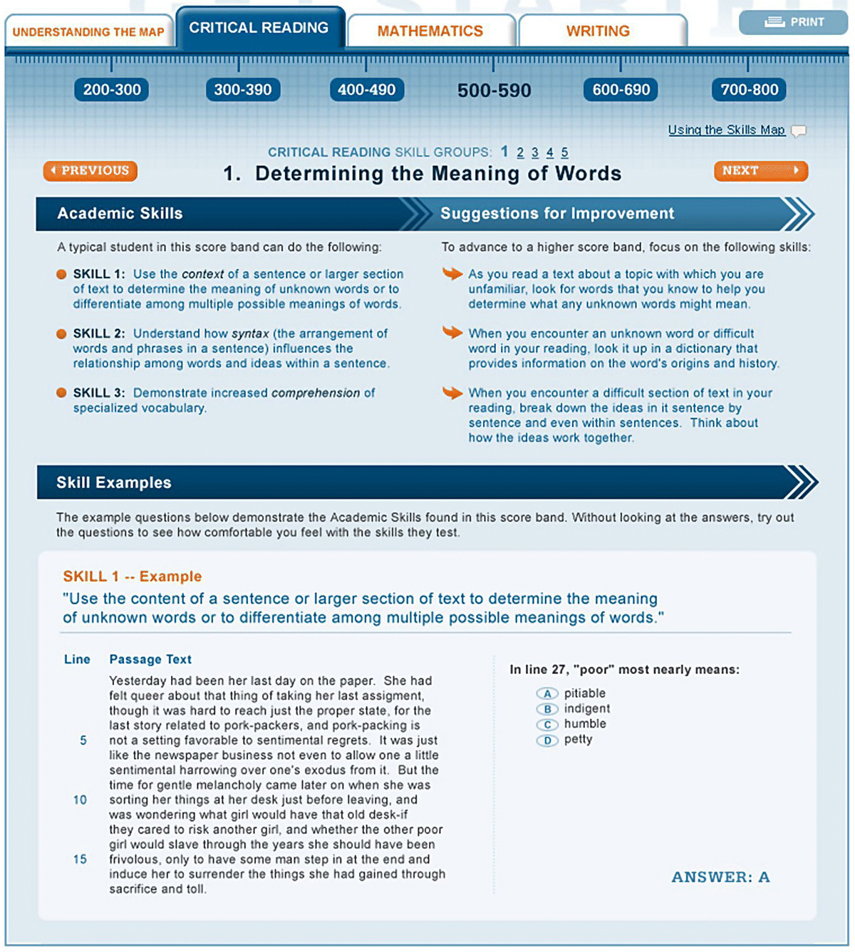
Figure 6.2 SAT Critical Reading skills.
Source: https://sat.collegeboard.org/home. © The College Board.
These instructions provide information of higher InfoQ than the MAP report.
Goodman and Hambleton (2004) point out major problems in score reporting such as providing complex explanations. Consider, for example, the following footnote from a NAEP report: “The between state comparisons take into account sampling and measurement error and that each state is being compared with every other state. Significance is determined by an application of the Bonferroni procedure based on 946 comparisons by comparing the difference between the two means with four times the square root of the sum of the squared standard errors.”
Other potential pitfalls listed by Goodman and Hambleton (2004) include small font size, unclear footnotes, acronyms not spelled out, cluttered page, not indicating score precision, not defining key terms, use of jargon, and poorly designed graphs.
With this background on test report design, let us consider the MAP report displayed in Figure 6.1 from an InfoQ lens. We start by identifying the four InfoQ components and then examine each of the eight InfoQ dimensions.
6.3 Value‐added models for educational assessment
Spurred in some cases by the federal government’s Race to the Top initiative, many states and school districts in the United States have included, in their performance evaluations, measures of teacher effectiveness based on student achievement data. States and districts started measuring teacher effectiveness by using test scores and value added models or VAMs. These models provide a measure of teachers’ contributions to student achievement that accounts for factors beyond the teacher’s control. The basic approach of a VAM is to predict the standardized test score performance that each student would have obtained with the average teacher and then compare the average performance of a given teacher’s students to the average of the predicted scores. The difference between the two scores—how the students actually performed with a teacher and how they would have performed with the average teacher—is attributed to the teacher as his or her value added to students’ test score performance. VAMs typically use a form of a regression model predicting student scores or growth on standardized tests from background variables (including prior test scores), with terms in the model for the teachers who have taught the student in the past. A percentile is calculated for each student from the model, relating his or her growth to the growth of other students with similar previous test scores. For each teacher, the median or average of the percentiles of his/her students are used to calculate the teacher’s VAM score. If a teacher’s students have high achievement growth relative to other students with similar prior achievement, then the teacher will have a high VAM score. Some VAMs also include other background variables for the students. The form of the model may lead to biased VAM scores for some teachers. For example, “gifted” students or those with disabilities might exhibit smaller gains in test scores if the model does not accurately account for their status.
Using VAM scores to improve education requires that they provide meaningful information about a teacher’s ability to promote student learning. For instance, VAM scores should predict how teachers’ students will progress in later grades and how their future students will fare under their tutelage. A VAM score may provide teachers and administrators with information on their students’ performance and identify areas where improvement is needed, but it does not provide information on how to improve the teaching. Such improvements need to be targeted at specific goals, and the VAM score should be evaluated in the context of such goals. Without explicitly listing the targeted goal, the InfoQ of the VAM score cannot be assessed.
The models can be used to evaluate the effects of policies or teacher training programs by comparing the average VAM scores of teachers from different programs. In these uses, the VAM scores partially adjust for the differing backgrounds of the students, and averaging the results over different teachers improves the stability of the estimates. For more on statistical properties of VAM, see Ballou et al. (2004), McCaffrey et al. (2003, 2004), Andrabi et al. (2009), Mariano et al. (2010), and Karl et al. (2013, 2014a, 2014b).
In the following, we look at two cases through the InfoQ lens. The first is an empirical study related to VAM, which has important policy implications. The second is a statement issued by the ASA on “Using VAM for Educational Assessment.” By examining these two different types of analysis (empirical and written statement), we showcase how the InfoQ framework can help characterize, clarify, and identify good practices as well as challenges in different types of reports.
6.3.1 “Big Study Links Good Teachers to Lasting Gain”
The January 6, 2012 New York Times article “Big Study Links Good Teachers to Lasting Gain”1 covers a research study on “The Long‐Term Impacts of Teachers: Teacher Value‐Added and Student Outcomes in Adulthood” (Chetty, Friedman, and Rockoff, NBER, www.nber.org/papers/w17699). The authors used econometric models applied to data from test scores of millions of students and their later financial and other demographic information for evaluating the effect of VA teachers on students’ future gain. The authors conclude:
We find that students assigned to higher VA [Value‐Added] teachers are more successful in many dimensions. They are more likely to attend college, earn higher salaries, live in better neighborhoods, and save more for retirement. They are also less likely to have children as teenagers.
Such conclusions can have critical policy implications. Let us therefore examine the study using the InfoQ framework.
6.3.2 ASA statement on VAM
On April 8, 2014, the ASA issued a statement titled Using Value‐Added Models for Educational Assessment (ASA, 2014). An excerpt from the executive summary of this document reads as follows: “Many states and school districts have adopted Value‐Added Models (VAMs) as part of educational accountability systems. The goal of these models… is to estimate effects of individual teachers or schools on student achievement while accounting for differences in student background. VAMs are increasingly promoted or mandated as a component in high‐stakes decisions such as determining compensation, evaluating and ranking teachers, hiring or dismissing teachers, awarding tenure, and closing schools… VAMs are complex statistical models, and high‐level statistical expertise is needed to develop the models and interpret their results. Estimates from VAMs should always be accompanied by measures of precision and a discussion of the assumptions and possible limitations of the model. These limitations are particularly relevant if VAMs are used for high‐stakes purposes. VAMs are generally based on standardized test scores, and do not directly measure potential teacher contributions toward other student outcomes. VAMs typically measure correlation, not causation: Effects—positive or negative attributed to a teacher may actually be caused by other factors that are not captured in the model…Ranking teachers by their VAM scores can have unintended consequences that reduce quality.”
6.4 Assessing understanding of concepts
This section is about the InfoQ of a formative assessment measurement approach used in education. Such assessments are used during training or education sessions to contribute to the learning of students and the improvement of material and delivery style. Before discussing the InfoQ evaluations, we introduce the topic of formative assessment in education with a review of several topics, including concept science and MERLO, with an example on teaching quantitative literacy. In the appendix of this chapter, we also include a MERLO implementation in an introduction to statistics course.
Listening to conversations among content experts reveals a common trend to flexibly reformulate the issue under discussion by introducing alternative points of view, often encoded in alternative representations in different sign systems. For example, a conversation that originated in a strictly spoken exchange may progress to include written statements, images, diagrams, equations, etc., each with its own running—spoken—commentary. The term meaning equivalence designates a commonality of meaning across several representations. It signifies the ability to transcode meaning in a polymorphous (one‐to‐many) transformation of the meaning of a particular conceptual situation through multiple representations within and across sign systems. Listening to conversations among content experts also reveals a common trend to identify patterns of associations among important ideas, relations, and underlying issues. These experts engage in creative discovery and exploration of hidden, but potentially viable, relations that test and extend such patterns of associations that may not be obviously or easily identified. The term “conceptual thinking” is used to describe such ways of considering an issue; it requires the ability, knowledge, and experience to communicate novel ideas through alternative representations of shared meaning and to create lexical labels and practical procedures for their nurturing and further development. This approach was originally developed by Uri Shafrir from the University of Toronto in Canada and Masha Etkind from Ryerson University, also in Toronto (Shafrir and Etkind, 2010). The application of MERLO in education programs of statistics and quantitative literacy was introduced in Etkind et al. (2010). For an application of MERLO and concept mapping to new technologies and e‐learning environments including MOOCs, see Shafrir and Kenett (2015).
The pivotal element in conceptual thinking is the application of MERLO assessment and MERLO pedagogy. MERLO items form a multidimensional database that allows the sorting and mapping of important concepts through target statements of particular conceptual situations and relevant statements of shared meaning. Each node of MERLO is an item family, anchored by a target statement that describes a conceptual situation and encodes different features of an important concept and other statements that may—or may not—share equivalence of meaning with the target. Collectively, these item families encode the complete conceptual mapping that covers the full content of a course (a particular content area within a discipline). Figure 6.5 shows a template for constructing an item family anchored in a single target statement.
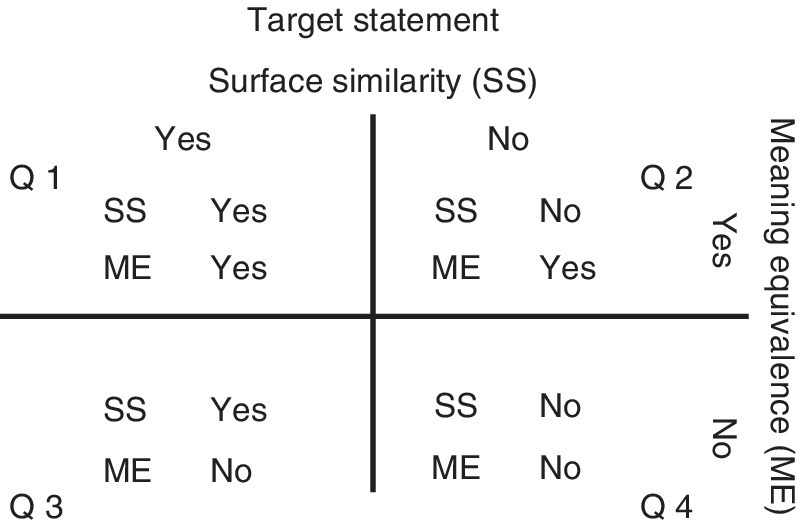
Figure 6.5 Template for constructing an item family in MERLO.
Statements in the four quadrants of the template—Q1, Q2, Q3, and Q4—are thematically sorted by their relation to the target statement that anchors the particular node (item family). They are classified by two sorting criteria: surface similarity to the target and equivalence of meaning with the target. For example, if the statements contain text in natural language, then by “surface similarity” we mean same/similar words appearing in the same/similar order as in the target statement, and by “meaning equivalence” we mean that a majority in a community that shares a sublanguage (Cabre, 1998; Kittredge, 1983) with a controlled vocabulary (e.g., statistics) would likely agree that the meaning of the statement being sorted is equivalent to the meaning of the target statement.
MERLO pedagogy guides sequential teaching/learning episodes in a course by focusing learners’ attention on meaning. The format of MERLO items allows the instructor to assess deep comprehension of conceptual content by eliciting responses that signal learners’ ability to recognize and produce multiple representations that share equivalence of meaning. A typical MERLO item contains five unmarked statements: a target statement plus four additional statements from quadrants Q2, Q3, and, sometimes, also Q4. Task instructions for MERLO test are as follows: “At least two out of these five statements—but possibly more than two—share equivalence‐of‐meaning: 1) Mark all statements—but only those—that share equivalence‐of‐meaning and 2) Write down briefly the concept that guided you in making these decisions.”
For example, the MERLO item in Figure 6.6 (mathematics/functions) contains five representations (A–E) that include text, equations, tables, and diagrams; at least two of these representations share equivalence of meaning. Thus, the learner is first asked to carry out a recognition task in situations where the particular target statement is not marked, namely, features of the concept to be compared are not made explicit. In order to perform this task, a learner needs to begin by decoding and recognizing the meaning of each statement in the set. This decoding process is carried out, typically, by analyzing concepts that define the “meaning” of each statement. Successful analysis of all the statements in a given five‐statement set (item) requires deep understanding of the conceptual content of the specific domain. MERLO item format requires both rule inference and rule application in a similar way to the solution of analogical reasoning items. Once the learner marks those statements that in his/her opinion share equivalence of meaning, he/she formulates and briefly describes the concept/idea/criteria he/she had in mind when making these decisions.

Figure 6.6 Example of MERLO item (mathematics/functions).
A learner’s response to a MERLO item combines a multiple choice/multiple response (also called recognition) and a short answer (called production). Subsequently, there are two main scores for each MERLO item: recognition score and production score. Specific comprehension deficits can be traced as low recognition scores on quadrants Q2 and Q3, due to the mismatch between the valence of surface similarity and meaning equivalence (Figure 6.5). Production score of MERLO test items is based on the clarity of the learner’s description of the conceptual situation anchoring the item and the explicit inclusion in that description of lexical labels of relevant and important concepts and relations. Classroom implementation of MERLO pedagogy includes interactive MERLO quizzes, as well as inclusion of MERLO items as part of midterm tests and final exams. A MERLO interactive quiz is an in‐class procedure that provides learners with opportunities to discuss a PowerPoint display of a MERLO item in small groups and send their individual responses to the instructor’s computer via mobile text messaging or by using a clicker (Classroom Response Systems (CRS)). Such a quiz takes 20–30 minutes and includes the following four steps: small group discussion, individual response, feedback on production response, and feedback on recognition response and class discussion. For a live example of such a discussion, see the 1‐minute video at https://goo.gl/XENVPn.
The implementation of MERLO has been documented to enhance learning outcomes. Such implementations were carried out at different instructional situations; see Shafrir and Etkind (2006).
To demonstrate the reports derived from MERLO assessments, we refer to results from classes of mathematics in a middle school in Turin, Italy (Arzarello et al., 2015a, 2015b). MERLO assessments were conducted after teaching ten concepts in a middle school. Percentages, powers, transitions, inverse proportions, line, and circumference were assessed in two parallel classes. Fractions, angles, functions, and equations were assessed only in one class. The basic statistics from the MERLO recognition scores are presented in Table 6.4. In Figure 6.7 we display box plots of the recognition scores for ten concepts taught in an Italian middle school in Turin. The conceptual understanding of powers is the lowest, and of angle, the highest. This initial feedback is mostly directed at the teachers and the designers of the material used in the class. The box plots in Figure 6.7 identify specific students with low scores who probably need extra attention. In powers we notice four students with perfect scores; investigating why they understand better than the others might create a learning experience beneficial to the whole group.
Table 6.4 MERLO recognition scores for ten concepts taught in an Italian middle school.
| Variable | N | N* | Mean | Minimum | Maximum |
| Percentages | 42 | 2 | 3.500 | 0.000 | 5.000 |
| Fractions | 29 | 0 | 4.172 | 2.000 | 5.000 |
| Powers | 49 | 1 | 2.531 | 1.000 | 5.000 |
| Transition | 43 | 1 | 3.930 | 2.000 | 5.000 |
| Line | 38 | 7 | 4.158 | 0.000 | 5.000 |
| Inverse proportions | 42 | 0 | 3.762 | 1.000 | 5.000 |
| Circumference | 44 | 2 | 3.500 | 1.000 | 5.000 |
| Angle | 18 | 1 | 4.444 | 2.000 | 5.000 |
| Function | 24 | 0 | 3.167 | 1.000 | 5.000 |
| Equations | 23 | 1 | 3.130 | 2.000 | 5.000 |
N* represents missing data.
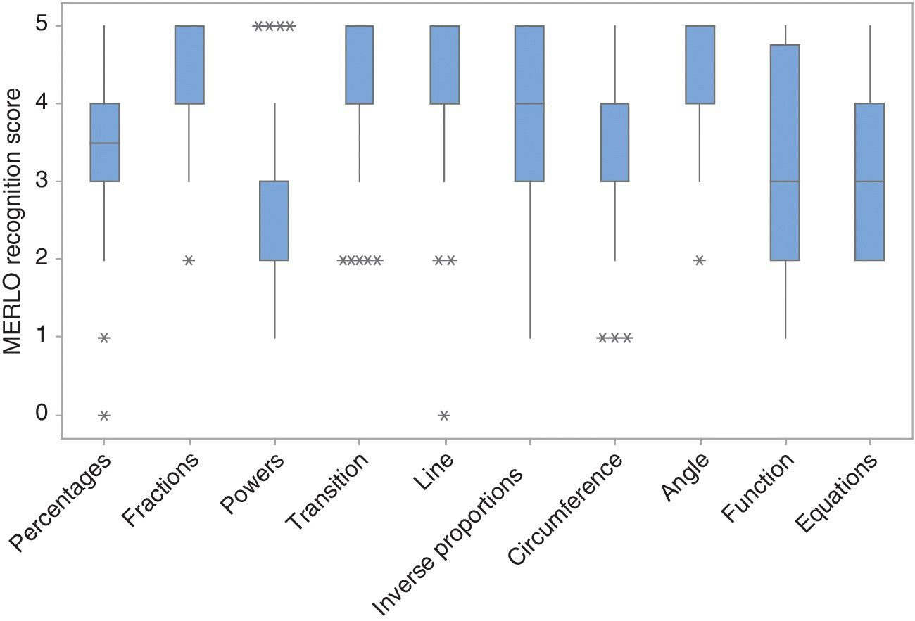
Figure 6.7 Box plots of MERLO recognition scores in ten mathematical topics taught in an Italian middle school. Asterisks represent outliers beyond three standard deviation of mean.
In Figure 6.8 we see that powers are less understood than most concepts including percentages and fractions and that angle is better understood than function and equations. Such comparisons provide instructors with useful insights in order to improve pedagogical and teaching strategies.
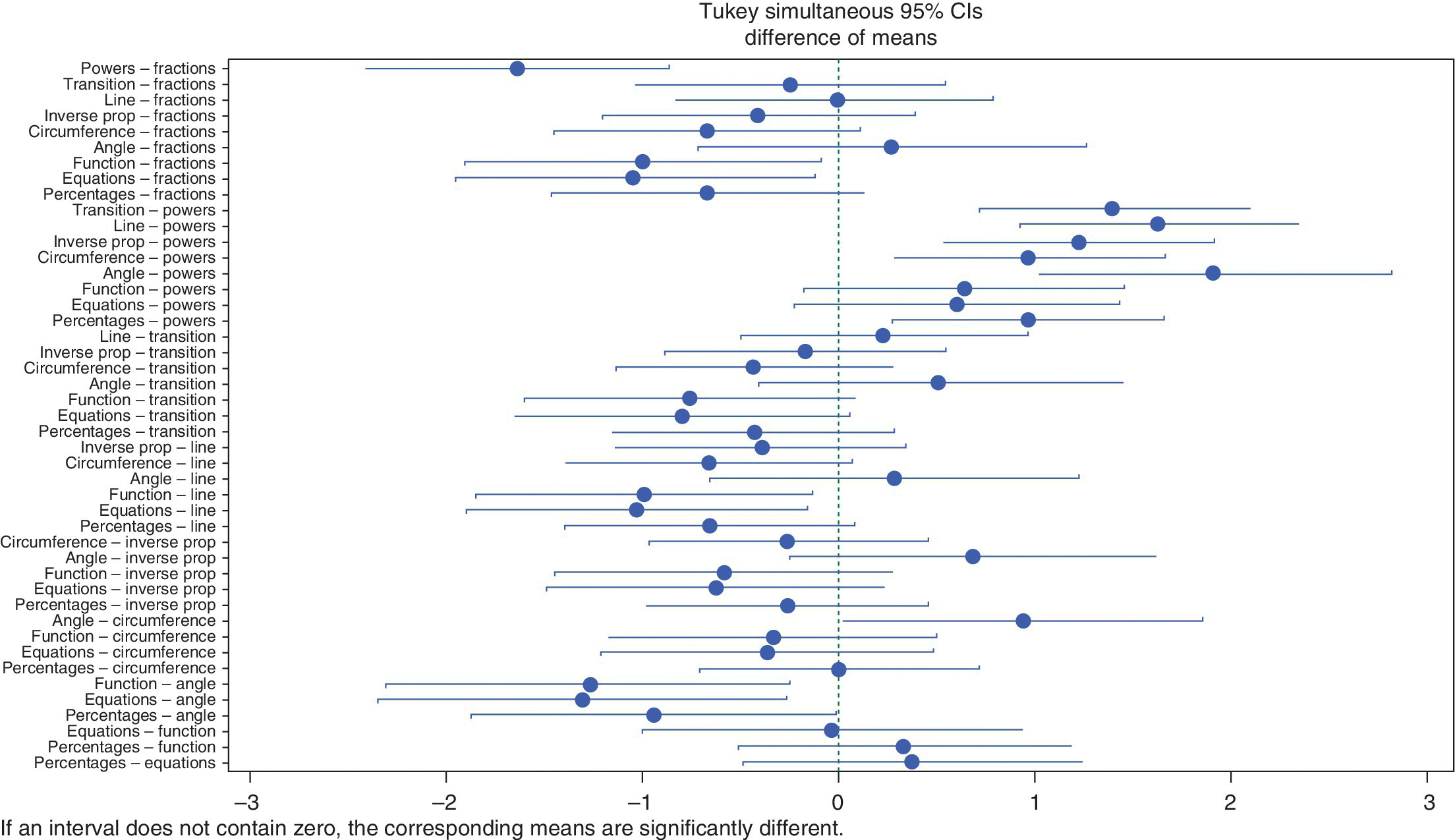
Figure 6.8 Confidence intervals for difference in MERLO recognition scores between topics.
We see that function, equations, and powers exhibit significantly lower scores than angle, fractions, line, transition, and inverse proportions. These structural differences provide more information to be leveraged by education specialists. The analysis presented in Figures 6.7 and 6.8 and Tables 6.4 and 6.5 was done with Minitab v17.2.
Table 6.5 Grouping of MERLO recognition scores using the Tukey method and 95% confidence.
| Factor | N | Mean | Grouping |
| Angle | 18 | 4.444 | A |
| Fractions | 29 | 4.172 | A B |
| Line | 38 | 4.158 | A B |
| Transition | 43 | 3.930 | A B C |
| Inverse proportions | 42 | 3.762 | A B C |
| Circumference | 44 | 3.500 | B C |
| Percentages | 42 | 3.500 | B C |
| Function | 24 | 3.167 | C D |
| Equations | 23 | 3.130 | C D |
| Powers | 49 | 2.531 | D |
Means that do not share a letter are significantly different.
6.5 Summary
The chapter presents four case studies related to education. Table 6.7 presents the InfoQ assessment from each of the four case studies by qualifying on a scale from 1 (“very poor”) to 5 (“very good”) the eight InfoQ dimensions of the case studies. This assessment is subjective and is based on discussions we held with colleagues. As a summary measure, we use the InfoQ scores on a 0–100 scale. From Table 6.7 we see that the use cases received an InfoQ score from 33 to 68%. These assessments can also point out to dimensions where focused improvements would increase the level of InfoQ of the related analyses and reports.
Table 6.7 Scoring of InfoQ dimensions of examples from education.
| InfoQ dimension | (1) MAP report | (2) Students’ earnings | (3) VAM statement | (4) MERLO |
| Data resolution | 2 | 4 | 5 | 4 |
| Data structure | 2 | 4 | 4 | 3 |
| Data integration | 2 | 5 | 5 | 3 |
| Temporal relevance | 4 | 3 | 5 | 4 |
| Chronology of data and goal | 4 | 4 | 2 | 4 |
| Generalizability | 2 | 2 | 3 | 4 |
| Operationalization | 2 | 2 | 2 | 4 |
| Communication | 2 | 2 | 3 | 4 |
| Use case score | 33 | 49 | 57 | 68 |
Appendix: MERLO implementation for an introduction to statistics course
The motivation for this work is the realization that much of the introduction to statistics classes (generically called “Statistics 101”) prove to have very low effectiveness. In some cases, this first exposure of students to statistics generates bias and negative preconceptions and a detrimental effect on lifelong careers with both a personal and professional opportunity loss. These introductory courses typically do not prepare students to apply statistical methods and statistical thinking in their workplace or private life. Here, we apply concept science methodological tools and focus on the quality of the information generated through statistical analysis of MERLO assessment as a remedial intervention reinforcing the constructive and important role of statistics and quantitative literacy in modern life and education.
Teaching statistical methods is a challenging task. Teaching statistical concepts is an even more challenging task that requires skill, experience, and adequate techniques. To demonstrate the use of MERLO in statistical education, we refer to Example 3.33, page 89, in chapter 3 on probability models and distribution functions from Kenett et al. (2014):
An insertion machine is designed to insert components into computer printed circuit boards. Every component inserted on a board is scanned optically. An insertion is either error‐free or its error is classified to the following two main categories: miss‐insertion (broken lead, off pad, etc.) or wrong component. Thus, we have altogether three general categories. Let J1 = Number of error free components, J2 = Number of miss‐insertions and J3 = Number of wrong components. The probabilities that an insertion belongs to one of these categories are p1 = 0.995, p2 = 0.001, p3 = 0.004. The insertion rate of the machine is fixed at 3500 components per hour.
Question: What is the probability that during one hour of operation there will be no more than 20 insertion errors?
A typical solution i: Pr(J2 + J3 ≤ 20) = Binomial (20;3500,0.005) = 0.7699.
A MERLO target statement for this underlying concept can be stated as independent Bernoulli event add up as a binomial random variable, with sample MERLO items being
- Q1: The probability of no more than 20 insertion errors in one hour is derived from a binomial distribution with n = 3500 and p = 0.005.
- Q2: Pr(J2 + J3 ≤ 20) = binomial (20;3500,0.005) = 0.7699.
- Q3: To compute the probability of no more than 20 insertion errors in one hour, we assume 3480 insertions and p = 0.005.
- Q4: To compute the probability of no more than 20 insertion errors in one hour, we assume 3480 insertions and a hypergeometric distribution.
As another example consider the target statement: The p value is the probability of getting the observed result or more extreme ones, if the null hypothesis is true, and one could have the following alternative representations:
- Q2: Consider the null hypothesis that the system operates as described earlier, if we reject this hypothesis when we get more than 20 insertion errors, p = 1 − Pr(J2 + J3 ≤ 20) = 0.23.
- Q3: The p value is the probability that the null hypothesis is true.
- Q4: A large p value indicates that the alternative hypothesis is true.
As mentioned, preparing MERLO items involves designing Q2–Q4 statements and creating sets consisting of a combination of four such statements in addition to the target statement for evaluation by the students. Test instructions for a MERLO item requires the learner to recognize and mark all but only those statements that share equivalence‐of‐meaning (at least 2 out of 5 statements in the MERLO item). In addition, students are requested to describe briefly the concept that he/she had in mind while making these decisions. Thus, a learner’s response to a MERLO item combines recognition, namely, multiple choice/multiple response, and production, namely, a short answer.
As mentioned, MERLO items are scored by counting the number of correct (marked or unmarked) statements. When a set of MERLO items is given to students, these scores reflect the individual level of understanding. In addition, scores by concept provide feedback to the instructor regarding specific topics that were covered in the course. Specific comprehension deficits can be traced as low recognition scores on quadrants Q2 and Q3, due to the mismatch between the valence of surface similarity and meaning equivalence. A low score on Q2 indicates that the learner fails to include in the “boundary of meaning” of the concept certain statements that share equivalence of meaning (but do not share surface similarity) with the target; such low Q2 score signals an overrestrictive (too exclusive) understanding of the meaning underlying the concept. A low score on Q3 indicates that the learner fails to exclude from the “boundary of meaning” of the concept certain statements that do not share equivalence of meaning (but that do share surface similarity) with the target; this lower Q3 score signals an underrestrictive (too inclusive) understanding of the meaning of the concept. This pedagogical approach is very different from the usual classroom scenario where students are given an exercise (like the one earlier) and are asked to solve it individually.
References
- Andrabi, T., Das, J., Khwaja, A. and Zajonc, T. (2009) Do Value‐Added Estimates Add Value? Accounting for Learning Dynamics, HKS Faculty Research Working Paper Series RWP09‐034, John F. Kennedy School of Government, Harvard University, http://dash.harvard.edu/handle/1/4435671 (accessed April 30, 2016).
- Arzarello, F., Kenett, R.S., Robutti, O., Shafrir, U., Prodromou, T. and Carante, P. (2015a) Teaching and Assessing with New Methodological Tools (MERLO): A New Pedagogy? In IMA International Conference on Barriers and Enablers to Learning Maths: Enhancing Learning and Teaching for All Learners, Hersh, M.A. and Kotecha, M. (editors), Glasgow, UK.
- Arzarello, F., Carante, P., Kenett, R.S., Robutti, O. and Trinchero, G. (2015b) MERLO Project: A New Tool for Education, IES 2015—Statistical Methods for Service Assessment, Bari, Italy.
- ASA, American Statistical Association (2014) ASA Statement on Value‐Added Models for Educational. https://www.amstat.org/policy/pdfs/ASA_VAM_Statement.pdf (accessed April 30, 2016).
- Ballou, D., Sanders, W. and Wright, P. (2004) Controlling for student background in value‐added assessment of teachers. Journal of Educational and Behavioral Statistics, 29, pp. 37–65.
- Betebenner, D.W. (2009) Norm‐ and criterion‐referenced student growth. Educational Measurement: Issues and Practice, 28 (4), pp. 42–51.
- Betebenner, D.W. (2011) A Technical Overview of the Student Growth Percentile Methodology: Student Growth Percentiles and Percentile Growth Projections/Trajectories. http://www.nj.gov/education/njsmart/performance/SGP_Technical_Overview.pdf (accessed April 30, 2016).
- Cabre, M.T. (1998) Terminology: Theory, Methods, and Applications. Benjamins, Amsterdam.
- Etkind, M., Kenett, R.S. and Shafrir, U. (2010) The Evidence Based Management of Learning: Diagnosis and Development of Conceptual Thinking with Meaning Equivalence Reusable Learning Objects (MERLO). In The 8th International Conference on Teaching Statistics (ICOTS), Ljubljana, Slovenia.
- Goodman, D. and Hambleton, R. (2004) Student test score reports and interpretive guides: review of current practices and suggestions for future research. Applied Measurement in Education, 17(2), pp. 145–220.
- Karl, A., Yang, Y. and Lohr, S. (2013) Efficient maximum likelihood estimation of multiple membership linear mixed models, with an application to educational value‐added assessments. Computational Statistics and Data Analysis, 59, pp. 13–27.
- Karl, A., Yang, Y. and Lohr, S. (2014a) Computation of maximum likelihood estimates for multiresponse generalized linear mixed models with non‐nested, correlated random effects. Computational Statistics and Data Analysis, 73, pp. 146–162.
- Karl, A., Yang, Y. and Lohr, S. (2014b) A correlated random effects model for nonignorable missing data in value‐added assessment of teacher effects. Journal of Educational and Behavioral Statistics, 38, pp. 577–603.
- Kenett, R.S., Zacks, S. and Amberti, D. (2014) Modern Industrial Statistics: With Applications Using R, MINITAB and JMP, 2nd edition. John Wiley & Sons, Sussex.
- Kittredge, R.I. (1983) Semantic Processing of Texts in Restricted Sublanguages, in Computational Linguistics, Cercone, N.J. (editors), Pergamon Press, Oxford, UK, pp. 45–58.
- Lohr, S. (2014) Red beads and profound knowledge: deming and quality of education, Deming lecture, Joint Statistical Meetings, Boston, MA.
- Mariano, L., McCaffrey, D. and Lockwood, J. (2010) A model for teacher effects from longitudinal data without assuming vertical scaling. Journal of Educational and Behavioral Statistics, 35, pp. 253–279.
- McCaffrey, D.F., Lockwood, J.R., Koretz, D.M. and Hamiltion, L.S. (2003) Evaluating Value‐Added Models for Teacher Accountability. The RAND Corporation, Santa Monica.
- McCaffrey, D., Lockwood, J.R., Louis, T. and Hamilton, L. (2004) Models for value‐added models of teacher effects. Journal of Educational and Behavioral Statistics, 29(1), pp. 67–101.
- Shafrir, U. and Etkind, M. (2006) eLearning for depth in the semantic web. British Journal of Educational Technology, 37(3), pp. 425–444.
- Shafrir, U. and Etkind, M. (2010) Concept Science: Content and Structure of Labeled Patterns in Human Experience. Version 31.0.
- Shafrir, U. and Kenett, R.S. (2015) Concept Science Evidence‐Based MERLO Learning Analytics, in Handbook of Applied Learning Theory and Design in Modern Education, IGI Global, Hershey, PA.
- Walsh, E. and Isenberg, E. (2015) How does value added compare to student growth percentiles? Statistics and Public Policy, 10.1080/2330443X.2015.1034390