14
InfoQ support with R
Federica Cugnata1, Silvia Salini2 and Elena Siletti2
1 University Centre of Statistics for Biomedical Sciences (CUSSB), Vita‐Salute San Raffaele University, Milano, Italy
2 Department of Economics, Management and Quantitative Methods, Università degli Studi di Milano, Milano, Italy
14.1 Introduction
R is a free software environment for statistical computing and graphics. It runs on a wide variety of platforms such as MS‐Windows, Mac OS X, and Linux. It is available as free software under the terms of the Free Software Foundation’s (FSF) GNU General Public License in source code form. It can be freely downloaded from the main CRAN repository at the URL: http://cran.r‐project.org or one of its mirrors.
Open‐source software is a term used to describe computer software which publishes for free the source code and makes it available to any user. The R code and its applications are protected under GNU General Public License, version 2 or 3, that provides rights to study, change, and distribute the software for any purpose. This enables a collaborative environment where many people around the globe can tweak, modify, and improve the software in question. As a result, an open software like R is upgraded at a faster pace than many other commercial alternatives.
R is similar to the S language and environment which was developed in the late 1970s by John Chambers and colleagues at Bell Laboratories (formerly AT&T, now Lucent Technologies). The S software was however not an open‐source project and failed to generate broad interest. Ultimately, the copyright was sold to TIBCO Software. Nowadays, R is surpassing what was originally imagined possible with S.
R was initially written by Ross Ihaka and Robert Gentleman (1996), also known as “R & R” of the Statistics Department at the University of Auckland. The current R is the result of a collaborative effort with contributions from all over the world. The open‐source nature of R was a key component of its success. As it is, any user can contribute “packages” that extend R’s capabilities. You can find community‐created tools for R that perform many modern statistical tools, some of them not available in other commercial software. The extensibility of R has grown even beyond that. There are now packages that allow you to create interactive visualizations, maps, or Web‐based applications, all within R. Ihaka himself attributes the accomplishments of R to its collaborative nature: “R is a real demonstration of the power of collaboration, and I don’t think you could construct something like this any other way. We could have chosen to be commercial, and we would have sold five copies of the software.”
While it is difficult to know exactly how many people are using R, in a New York Times article, it was estimated that close to 250 000 people work with it regularly (Vance, 2009). Revolution Analytics (http://www.revolutionanalytics.com/community), creators of an enhanced version of R, claims that the number of users surpasses two million.
Many users think of R as a statistics system; however, developers prefer to think of it as an environment within which statistical techniques are implemented. Its main environment properties are as follows:
- It allows for effective data management and storage.
- It is a suite of operators for calculations on objects (arrays, matrices, and vectors).
- It is a collection of tools for data analyses.
- It incorporates graphical facilities for data analysis and allows viewing on different media.
- It is made by a simple, effective, and well‐developed language which includes conditionals, loops, user‐defined recursive functions, and input and output facilities.
Being designed as a computer language, R allows users to add additional functionality by defining new functions. Furthermore, R can be extended using “packages.” Packages are collections of R functions, data, and compiled code in a well‐defined format. The directory where packages are stored is called a library. There are eight packages supplied with R, and many more are available through the CRAN covering a very wide range of modern statistics. On November 2015, the CRAN package repository featured 7531 available packages. Anyone can create an R package following the R development guidelines, support the R‐project sharing code, or simply save time by automating work. When a package is available through CRAN, it can be directly uploaded using the graphical user interface (GUI) functionality or by typing in the R console (install.packages("package.name")).
R has its own LaTeX‐like documentation format which is used to provide comprehensive documentation both online in a number of formats and in hard copy.
Another way to use the R environment is with RStudio (http://www.rstudio.com). Specifically, RStudio is an integrated development environment (IDE) for R that includes a console, a syntax‐highlighting editor that supports direct code execution, and tools for plotting, history, debugging, and workspace management (see Figure 14.1). RStudio offers a set of tools for the R computing environment. It is available both as open source, with limited features, and in a commercial version. It runs on a desktop (Windows, Mac, and Linux) and with a browser connected to RStudio Server or RStudio Server Pro (Debian/Ubuntu, Red Hat/CentOS and SUSE Linux). RStudio includes powerful coding tools designed to enhance productivity, enable rapid navigation to files and functions, and make it easy to start new or find existing projects; integrates support for Git and Subversion; supports authoring HTML, PDF, Word documents, and slide shows; and supports interactive graphics with Shiny and ggvis. Furthermore, it integrates R help and documentation and makes it easy to manage multiple working directories using projects. It also includes an interactive debugger to quickly diagnose and fix errors. Finally, it is an extensive package development tool, and the RStudio team contributes code to many R packages and projects. For a comprehensive treatment of modern industrial statistics and the mistat package available in CRAN see Kenett and Zacks, 2014.
Figure 14.1 An example of RStudio window.
Besides the traditional R command prompt, there are many GUIs which enable the analyst to use click‐and‐point methods to analyze data without getting into the details of learning the R syntax. R GUIs are very popular both as mode of instruction in academia and in industry applications as it cuts down considerably on time taken to adapt to the language. As with all command line and GUI software, for advanced tweaks and techniques, command prompts also come in handy.
One of the most widely used R GUI is the R Commander (Fox, 2005), commonly known as Rcmdr (see Figure 14.2). Basically, R provides the engine that carries out the analyses, and Rcmdr provides a convenient way for users to input commands. The Rcmdr program enables analysts to access a selection of commonly used R commands using a simple interface that is familiar to most computer users. It was created by John Fox to cover the content of a basic statistics course. However it is extensible and many other packages can be added in the form of R Commander Plugins.
Figure 14.2 An example of R Commander window.
The R Commander GUI consists of a window containing several menus, buttons, and information fields. In addition, the Commander window contains script and output text windows. The menus are easily configurable through a text file or, preferably, through plug‐in packages, of which many are now available on CRAN. The menus lead to simple dialog boxes, the general contents of which are more or less obvious from the names of the menu items. These boxes have a common structure, including a help button leading to the help page for a relevant function, and a reset button to reset the dialog to its original state. By default, commands generated in dialogs are posted to the output window, along with printed output, and to the script window. Lines in the script window can be edited and submitted for execution. In other words, using the script window, you can write R code in combination with the menus. As you point and click a particular menu item, the corresponding R code is automatically generated in the log window and executed. Traditionally error messages, warnings, and “notes” appear in a messages window.
All these features, in addition to making things simple, have the important role of helping users implement R commands and develop their knowledge and expertise in using the traditional command line that is needed by those wishing to exploit the full power of R. R Commander is also integrated with RStudio.
Nowadays, R provides a wide variety of statistical, linear and nonlinear modeling, classical statistical tests, time series analysis, classification, clustering, and graphical techniques, always being highly extensible. It is not only an application for standard statistical procedures, but it is also the de facto standard among statisticians for the development of new statistical procedures. R’s advantages include the ease with which we can import data and export data or output and well‐designed quality plots that can be produced, including mathematical symbols and formulas.
Importing data into R is fairly simple, and there are many ways to import data: getting data directly from different file types or directly from the Web. This means that data not only can be saved in a file on a personal computer (e.g., a local Excel, SPSS, or some other type of file) but can also be saved on the Internet or be obtained through other sources. Munzert and colleagues (2015) present a very exhaustive collection of techniques enabling the creation of powerful collections of unstructured or unsorted data, focused on Web scraping and text mining with R.
Using the JMP app (see Chapter 16), one can interact with R using JSL, that is, submitting statements to R from within a JSL script, exchanging data between JMP, and R and displaying graphics produced by R.
Usually we obtain a data frame by importing it from SAS, SPSS, Excel, Stata, Minitab, a database, or an ASCII file. Such a file can be also created interactively.
The read.table() function is the most important and commonly used function to import simple data files into R (.csv or .txt). It is easy and flexible. One of the best ways to read an Excel file is to export it to a comma delimited file (.csv) and import it using the aforementioned method. Alternatively you can use the xlsx package to access Excel files. For SPSS and SAS, we recommend the Hmisc package for ease and functionality. For Stata and Minitab, we recommend the foreign package. The RODBC package provides access to databases, including Microsoft Access and Microsoft SQL Server, through an ODBC interface. It is also possible to import data from other database interfaces, simply changing package; some examples include the RMySQL package that provides an interface to MySQL, the ROracle package that provides an interface for Oracle, and the RJDBC package that provides access to databases through a JDBC interface.
Getting data from HTML tables into R is pretty straightforward too, with a simple command or using httr package.
Using quantmod package we can easily import financial data from an Internet source. This package is closely related to the packages “xts” and “zoo” to analyze time series. The function that we use to get data into R is “getSymbols(),” like in the following example, where we download the time series of daily values of FTSEMIB from 01/01/2010 to 31/12/2015 from the website http://it.finance.yahoo.com:
library(quantmod)getSymbols("FTSEMIB.MI",from="2010‐01‐01", to="2015‐12‐31")to.monthly(FTSEMIB.MI, indexAt='lastof')
In the case presented here, the prices are converted from daily to monthly, presenting for each bar the opening, the max, the min, and the end of each month; you can switch to different time frames, such as weekly or yearly, but it is not possible to go down from longer to shorter ones (e.g., from months to days).
In recent years there is a growing interest in data from social media, like Twitter or Facebook. In R we can import and analyze this data very easily. The following sections present an application that uses data from Twitter.
There are numerous methods for exporting R objects into other formats. The simple way is with the function write.table() for .csv or .txt format. For SPSS, SAS, Stata, and Minitab, we need to load the foreign package. For Excel, we need the xlsReadWrite package.
Turning plain text output into well‐formatted tables can be a repetitive task, especially when many tests or models are being incorporated into a paper. For R users, there are a lot of ways to make it easier, regardless of what typesetting system is used.
R is able to quickly export results and the xtable package produces LaTeX‐formatted tables. Using specific kinds of R objects, such as linear model summaries, we can turn them into “xtables,” which can in turn be the output to either LaTeX or HTML. An alternative to xtable is the R2HTML package, which is similar, but does not require “xtable” objects to be created in order to generate HTML output.
With the Sweave environment, it is possible to work by combining R and LaTeX: this means that the source of a text could be a plain LaTeX file with special R tags. R reads and processes the file, producing the correct LaTeX code, graphics, tables, and all the R output. The new file is passed on to a standard LaTeX compiler, and the result is the final text ready to publish. The Sweave document is a live document, where changing the data frame updates all the statistical analysis.
14.2 Examples of information quality with R
Following Hand’s (2008) definition of statistics as “The technology of extracting meaning from data,” we consider the utility of applying a technology f to a resource X for a given purpose g, with R.
14.2.1 Text mining of Twitter data
Twitter is an online social network that enables users to send and read short 140'character messages called “tweets.” Registered users can read and post tweets, but unregistered users can only read them. Users access Twitter through the website interface, SMS, or mobile device app. This service was created in 2006 and rapidly gained worldwide popularity, with more than 100 million users who in 2012 posted 340 million tweets and handled 1.6 billion search queries per day. In 2015, Twitter had more than 500 million users, out of which more than 302 million were active users.1
Despite the potential, many researchers do not exploit big data from social network sites and do not know how to process it. In this section, we provide a basic introduction to text analysis of data from Twitter with R. Though data from Twitter is not different from data from other social media networks, Twitter has important characteristics that make it particularly interesting for text mining: on the one hand, weak‐tie connection among people on Twitter is stronger than other networks, which greatly increases information exposure, and on the other hand, it has word limits on each tweet, and for this reason users tend to be more precise than in conversational language.
As well as being a great tool of communication, Twitter can also be considered an open mine for text and social web analyses. Among the different applications that can be used to analyze Twitter’s data, R offers a wide variety of options. We don’t cover here all the topics associated with Twitter data analysis, but we offer some examples.
People gather data from Twitter for goals such as to discover useful, valid, unexpected, and understandable knowledge from data. We analyze information because we have some particular questions in mind, such as “What are people talking about when they refer to Expo 2015?,” “What is the average number of words per tweets on a specific topic?,” or “What’s the opinion of people about Expo 2015?.”
Get data from Twitter
There are several ways to get data from Twitter, but, in our opinion, the simplest and quickest way is by using the R package twitteR (Gentry, 2015).
Before using this package you need a developer account. To register go to https://dev.twitter.com/. Once you have it, you can obtain the API code creating a new application. In the bottom of the page, click “Manage Your Apps” under “Tools” and then on “Create New Application.” On the application creation page, you have to fill all the questions except the Callback. When you finish the creation step, you can check the details of our application. The generated consumer keys and secrets (API) would be under the tab “Keys and Access Token.”
This information is important to successfully connect to Twitter, and you need to run this procedure only once: with the same code you can connect forever:
install.packages(c("devtools", "rjson", "bit64", "httr"))#RESTART R session!library(devtools)install_github("twitteR", username="geoffjentry")#this is important to be sure to use the last version of the packagelibrary(twitteR)api_key <‐ "YOUR API KEY"api_secret <‐ "YOUR API SECRET"access_token <‐ "YOUR ACCESS TOKEN"access_token_secret <‐ "YOUR ACCESS TOKEN SECRET"setup_twitter_oauth(api_key,api_secret,access_token,access_token_secret)
Goal 1: Determine what people are talking about regarding “Expo 2015” and “Expo 2020”
In many cases, the main question that we want to answer from a twitter analysis is to know what people are talking about for a given topic. Usually the quickest way to know more about what people are talking about is by visualizing the most frequent words and terms contained in the tweets. We can do this by creating a plot—a bar plot with the most frequent terms—or we can use a more visually attractive way using a word cloud. A wordcloud is generally very helpful if we only want to take a quick and simple look at the data.
We download a maximum number of 1000 tweets in one week, containing Expo+2015+Milan and Expo+2020+Dubai:
expo2015 <‐ searchTwitter("Expo+2015+Milan",n=1000, lang="en")expo2020 <‐ searchTwitter("Expo+2020+Dubai",n=1000, lang="en")
Before beginning our analysis, we load all the required packages for text mining (Feinerer, 2015) and for creating (Fellows, 2013) wordcloud:
library(tm)library(wordcloud)
We extract the text from the tweets in two different vectors:
text_2015 <‐ sapply(expo2015, function(x) x$getText())text_2020 <‐ sapply(expo2020, function(x) x$getText())
We then need to clean the data, but tolower doesn’t always behave as expected and returns error messages. This is why we apply a modified version that skips such errors:
newTolower = function(x){y = NAtry_error = tryCatch(tolower(x), error=function(e) e)if (!inherits(try_error, "error"))y = tolower(x)return(y)}text_2015 <‐ sapply(text_2015, newTolower)names(text_2015) = NULLtext_2015 <‐ text_2015[text_2015 != ""]text_2020 <‐ sapply(text_2020, newTolower)names(text_2020) <‐ NULLtext_2020 <‐ text_2020[text_2020 != ""]clean.text = function(x){x = tolower(x)# remove rtx = gsub("rt", "", x)# remove atx = gsub("@\w+", "", x)# remove punctuationx = gsub("[[:punct:]]", "", x)# remove numbersx = gsub("[[:digit:]]", "", x)# remove links httpx = gsub("http\w+", "", x)# remove tabsx = gsub("[ | ]{2,}", "", x)# remove blank spaces at the beginningx = gsub("^ ", "", x)# remove blank spaces at the endx = gsub(" $", "", x)return(x)}text_2015 = clean.text(text_2015)text_2020 = clean.text(text_2020)
We then construct the lexical corpus. Furthermore, we consider some stop words and create the term document matrix:
corpus_2015 <‐ Corpus(VectorSource(text_2015))corpus_2020 <‐ Corpus(VectorSource(text_2020))skipwords <‐c("and","with","than","expo","the","for","2015","2020","from","will","you","not","this","these","those","has","are","our","in","into","your","which", "it","its")corpus_2015 <‐ tm_map(corpus_2015,removeWords,skipwords)corpus_2020 <‐ tm_map(corpus_2020,removeWords,skipwords)tdm_2015 <‐ TermDocumentMatrix(corpus_2015)tdm_2020 <‐ TermDocumentMatrix(corpus_2020)
Now we can obtain words and their frequencies:
milan = as.matrix(tdm_2015)word_freqs_milan = sort(rowSums(milan), decreasing=TRUE)dmilan = data.frame(word=names(word_freqs_milan), freq=word_freqs_milan)dubai = as.matrix(tdm_2020)word_freqs_dubai = sort(rowSums(dubai), decreasing=TRUE)ddubai = data.frame(word=names(word_freqs_dubai), freq=word_freqs_dubai)
Finally, we create the Wordcloud plots (Figure 14.3). Wordclouds are graphical representations of word frequency that give greater prominence to words that appear more frequently in a source text. The larger the word in the visual, the more common the word was in the document. This type of visualization can assist evaluators with exploratory textual analysis by identifying frequent words. It can also be used for communicating the most salient points or themes in the reporting stage:
pdf("expo_2015.pdf")wordcloud(dmilan$word,dmilan$freq,random.order=FALSE,colors=brewer.pal(8,"Dark2"), max.words=100)dev.off()pdf("expo2020.pdf")wordcloud(ddubai$word,ddubai$freq,random.order=FALSE,colors=brewer.pal(8,"Dark2"), max.words=100)dev.off()
Figure 14.3 Wordclouds for the two datasets.
Goal 2: Compare what people are talking about regarding “Expo 2015” and “Expo 2020”
When we work on a project comparing two text files, we can generate a unique wordcloud that can provide more insights. For this purpose, we have to make some changes in the script.
First, we join texts in a vector for each event:
m <‐ paste(text_2015,collapse="")d <‐ paste(text_2020,collapse="")all <‐ c(m, d)
We create the corpus, clean it, and create the term document matrix:
corpus <‐ Corpus(VectorSource(all))corpus <‐ tm_map(corpus,removeWords,skipwords)tdm <‐ TermDocumentMatrix(corpus)tdm <‐ as.matrix(tdm)colnames(tdm) <‐ c("Expo 2015", "Expo 2020")
For this goal, we can use the other type of graphic in the wordcloud package: the comparison and the commonality wordcloud before we plot a cloud, and we can compare the frequencies of words across documents:
pdf("comp_expo.pdf")comparison.cloud(tdm,random.order=FALSE,colors=c("green","red"), max.words=100)dev.off()
Let pij be the rate at which word i occurs in document j and pj be the average across documents: pj = ![]() . The size of each word is mapped to its maximum deviation (maxi(pij − pi)), and its angular position is determined by the document where that maximum occurs. The commonality cloud plot permits to plot a cloud of words shared across the two searches:
. The size of each word is mapped to its maximum deviation (maxi(pij − pi)), and its angular position is determined by the document where that maximum occurs. The commonality cloud plot permits to plot a cloud of words shared across the two searches:
pdf("comm_expo.pdf")commonality.cloud(tdm,random.order=FALSE,colors=c("green","red"), max.words=100)dev.off()
The wordclouds in Figure 14.4 are only examples used to analyze Twitter data with R.
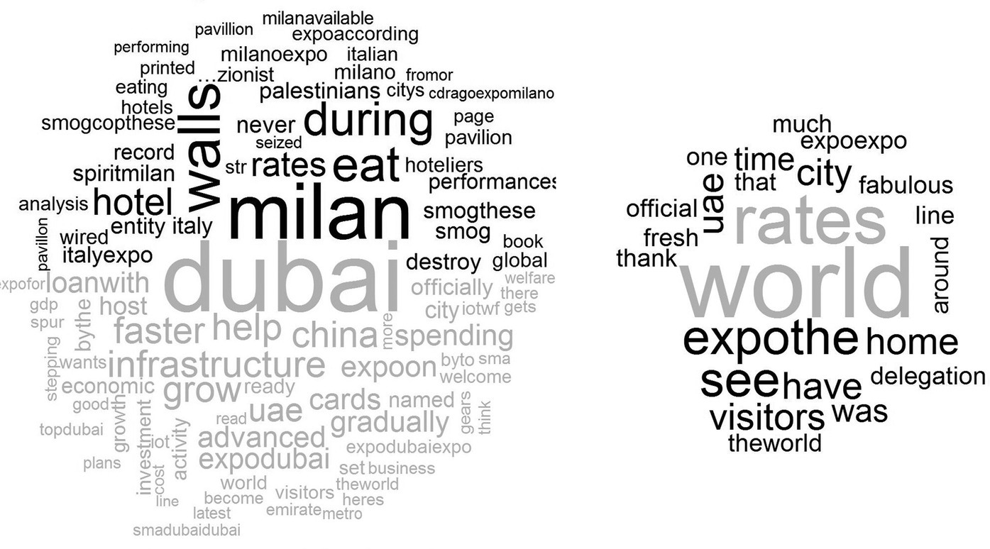
Figure 14.4 Comparison (Expo 2015 = dark, Expo 2020 = light) and commonality clouds.
Wordclouds are an easy to use and inexpensive option for visualizing text data, but we have to remember that the right way to interpret wordclouds is that the display emphasizes frequency of words, not necessarily their importance. Wordclouds will not accurately reflect the content of text if slightly different words are used for the same idea. They also do not provide the context, so the meaning of individual words may be lost. Because of these limitations, wordclouds are best suited for exploratory qualitative analysis.
An interesting analysis about Expo 2015 using R was conducted by the Voices from the Blogs.2 This application with ExpoBarometro3 presents an indicator that measures the daily social experience of Expo 2015, meaning the explicit reactions of the visitors of the event in Milan as they appear from posts published on Twitter, every day. ExpoBarometro presents an indicator of sentiment constructed as the ratio between the percentage of posts making a positive reference to the Expo experience and the sum of the positive and negative posts, excluding from the calculation those of neutral content.
All ExpoBarometro analyses are carried out through iSA® technology by Voices from the Blogs, a spin‐off of the University of Milan. In‐depth quality is achieved with supervised statistical techniques that initially predict a classification of a training set by means of human coders. This is the key to retrieve meaningful information from texts published on the Web, avoiding problems of linguistic expression that appear in analysis based on semantic engines or on other fully automated techniques.
The data feed analyzed daily by iSA relates to all tweets written in Italian containing one of the following expressions: “expo, Expo 2015, Expo 2015, expomilan, expomilano.” These tweets are obtained through Twitter’s API streaming, and the analysis does not contain duplications and excludes posts by official Expo accounts. Figure 14.5 shows a screenshot of the results obtained and published on the official website of Expo 2015 organization team.

Figure 14.5 ExpoBarometro results.
14.2.2 Sensory data analysis
Sensory analysis is a scientific discipline that applies principles of experimental design and statistical analysis to human senses (sight, smell, taste, touch, and hearing) for the purposes of evaluating consumer products. The discipline requires panels of human assessors, on whom the products are tested, and recordings of their responses. By applying statistical techniques to the results, it is possible to make inferences and generate insights about the products under test. Most large consumer goods companies have departments dedicated to sensory analysis. Sensory analysis uses human senses to characterize a product. The human being becomes a measurement instrument asked to quantify, compare, or score during tests what he/she felt when observing, tasting, smelling, touching, or listening to different stimuli. The tester is at the heart of the system that is used to identify and track the ideal product. Sensory analysis is a multidisciplinary discipline. Quality control combined with research and development, statistics, and marketing initiatives makes sensory data very powerful.
To derive precise results, this approach, based on the collection and computation of the sensations of a significant number of persons, needs a rigorous protocol and a suitable computer tool with proper session organization, data collection and storage, and result computation. Food tasting experiments have usually taken too long to get results, to reach good decisions, to make quick decisions, and to predict problems before they occur. Food tasting experiments have usually been conducted only in multinational food sector companies, with expensive and sophisticated software and technology.
Today, sensory analysis is a widely deployed technique. Various applications of sensory analysis exists not only in the food industry. The cosmetics industry and fashion and clothing companies can use sensory analysis to design better products. It is possible to measure the popularity of a theater play or a movie or the satisfaction from an event or an analysis of the characteristics of a sofa or a kitchen. Modern sensory data can be obtained in a cheaper way using tablets or smartphones, in real time, quickly and easily.
The problem is often how to analyze the collected data, that is, taking unstructured data, sometimes organized in many files produced by an app, and organizing and analyzing it with sophisticated statistical techniques.
In the foreword of the book Analyzing Sensory Data with R (Lê and Worch, 2014), Dr. Hal MacFie, a statistician with international reputation in the areas of product assessment and consumer research, wrote: “Back in the 1980s when I was still a consultant statistician supporting clients from sensory and other disciplines, I dreamed of the day when there would be free, easy‐to‐use statistical software for everyone to use. It seems that in sensory science that day is approaching fast with the arrival of SensoMineR [.] (Husson et al., 2015) Sensometrics is still a dynamic and fast‐moving discipline, the beauty of the R software is that new methods can be quickly programmed and added to the R portfolio.”
With this description, it is clear that R programs play a key role in approaching sensory data analysis following the InfoQ paradigm. In the next application, we show, with the four InfoQ components of Chapter 2, several examples of sensory data analysis. We then assess the application with the eight InfoQ dimensions of Chapter 3.
In this example, all the analyses are made using R and in particular the SensoMineR package http://sensominer.free.fr that was conceived and programmed in R language. The package is free and can be downloaded from CRAN.
SensoMineR includes several classic methods used when analyzing sensory data as well as advanced methods conceived and developed in a laboratory. It provides numerous graphical outputs that are easy to interpret, as well as syntheses of results derived from various analysis of variance models or from various factor analysis methods, accompanied with confidence ellipses. The package deals with classical profile data as well as with more specific data such as napping data as explained later.
SensoMineR is easy to use also for not advanced R users. Graphical interfaces are available using R commander, presented in Section 14.1 and SensoMineR Excel. Thanks to Heiberger and Neuwirth (2009) who developed RExcel, an Excel plug‐in, the R software can be used via Excel (see Figure 14.6). We can easily add the Rcmdr menu to an Excel menu, and since SensoMineR can also be integrated in Rcmdr, one is able to use it from Excel. When we open RExcel, R is opened automatically.
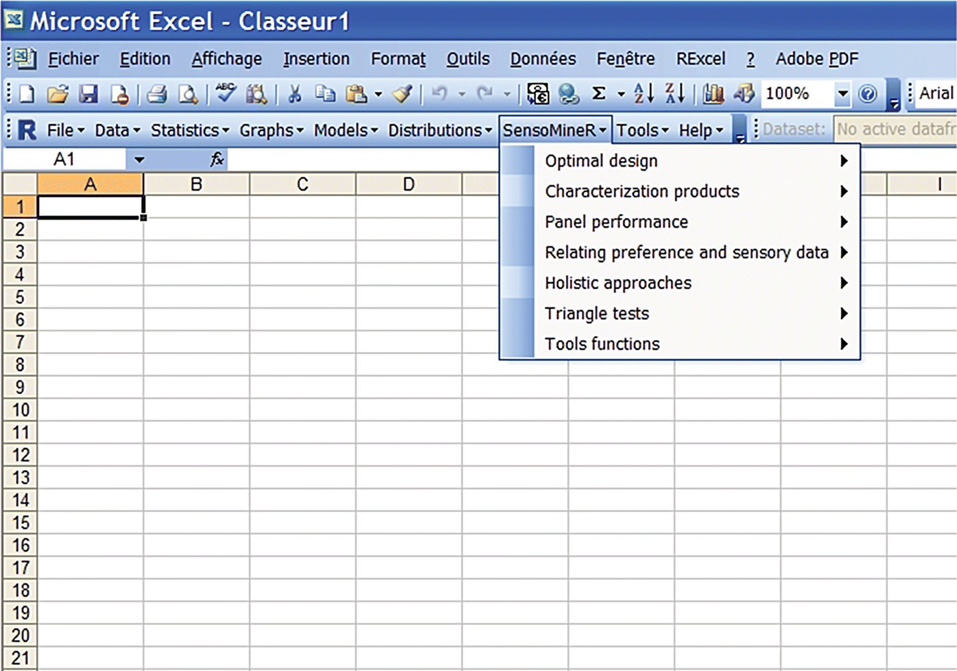
Figure 14.6 SensoMineR menu in Excel.
In sensory analysis, different goals can be identified, and consequently, different types of data and different statistical techniques are applied.
In the InfoQ framework, in order to increase the information and to generate insights with action items, it is important to match and combine all the goals gi, possibly using a flexible tool, like R, to integrate data with different structural form Xi, including a large portfolio of techniques fi, producing different utilities Ui.
In this section we consider the example of perfumes taken from Lê and Worch (2014). All the datasets mentioned here can be downloaded from www.sensorywithr.org/.
The first dataset perfumes_qda_experts.csv consists of a test involving 12 perfumes, rated by 12 trained panelists twice, on 12 attributes.
The second dataset perfumes_qda_customers.csv consists of a test involving 12 perfumes, rated by consumers on 21 attributes.
The third dataset perfumes_linking.csv consists of hedonic scores for the 12 perfumes, given by consumers.
Goal 1: Determine the performance of a sensory panel
For this goal, we consider the experts dataset. For each sensory attribute, it is possible to test the product effect, panelist effect, and session effect. Using R and in particular using the functions panelperf() and coltable() of SensoMineR, it is possible to get a useful plot that summarizes 12 different ANOVA models, one for each attribute, in which the cells are highlighted in yellow when p‐values are lower than 0.05:
## Goal 1 ###Experts <‐ read.table(file="perfumes_qda_experts.csv",header=TRUE, sep=",", quote="/", dec=".")experts$Session <‐ as.factor(experts$Session)experts$Panelist <‐ as.factor(experts$Panelist)res.panelperf1 <‐ panelperf(experts,formul="~Product+Panelist+Session+Product:Panelist+Product:Session+Panelist: Session",firstvar=5)coltable(res.panelperf$p.value[order(res.panelperf$p.value[,1]),],col.lower="yellow")
Figure 14.7 shows that the panel discriminates between the products for all the sensory attributes, except Citrus. It also shows that the panelists have particularly well differentiated the products.
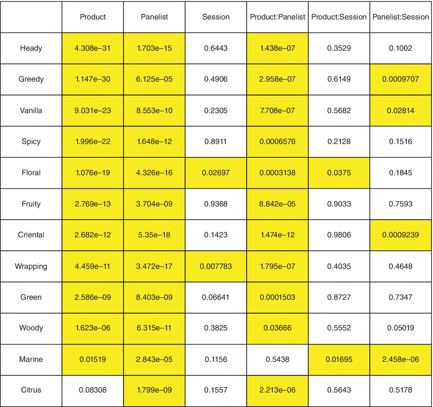
Figure 14.7 Assessment of the performance of the panel with the panelperf() and coltable() functions.
Goal 2: Represent the product space in a map
For this goal, we consider again the experts dataset. It is possible to define the sensory profile (adjusted mean) of the products using the decat() function in SensoMineR and then produce individual factor map and variable factor map using the PCA() function (see Figure 14.8):
## Goal 2 ###res.decat<‐decat(experts,formul="~Product+Panelist",firstvar=5,lastvar=ncol(experts))res.pca<‐PCA(res.decat$adjmean)

Figure 14.8 Representation of the perfumes and the sensory attributes on the first two dimensions resulting from PCA() on adjusted means of ANOVA models.
The main dimension of variability (i.e., the first component) contrasts products such as Pleasures with products such as Angel. In the second plot, for each dimension, only significant attributes are shown. Wrapping and Heady are most positively linked with the first dimension, whereas the sensory attributes that are the most negatively linked are Fruity and Floral.
A possible new question that arises looking at these plots can be: How would the positioning of the perfumes evolve if we would slightly change the composition of the panel? To answer this question, the developers of SensoMineR provide the panellipse() function:
res.panellipse <‐ panellipse(experts,col.p=4,col.j=1,firstvar=5,level.search.desc=1)
In Figure 14.9, the more one sees ellipse overlaps, the less distinctive (or the closer) the two products are. Hence it appears clearly that Aromatics Elixir and Shalimar are perceived as similar, whereas Shalimar and Pleasure are perceived as different.

Figure 14.9 Representation of the perfumes on the first two dimensions resulting from PCA() in which each product is associated with a confidence ellipse.
Goal 3: Compare the sensory profile of a panel of experts and a panel of customers
For this goal, we consider the experts dataset and the consumers dataset. A multiple factor analysis can be applied using MFA() function of SensoMineR in order to produce maps including both consumer and expert sensory responses, which are based on different sets of attributes (see Figure 14.10):
experts.avg <‐ decat(experts,formul="~Product+Panelist+Session+Product:Panelist+Product:Session+Panelist:Session",firstvar=5,graph=FALSE)$adjmeanconsumers <‐ read.table("perfumes_qda_consumers.csv",sep=",",header=TRUE,dec=".",quote=""")consumers$consumer <‐ as.factor(consumers$consumer)consumers.avg <‐ decat(consumers,formul="~product+consumer",firstvar=3,graph=FALSE)$adjmeandata.mfa2 <‐ cbind(experts.avg,consumers.avg[rownames(experts.avg),])res.mfa2 <‐ MFA(data.mfa2,group=c(12,21),type=c("s","s"),name.group=c("Experts","Consumers"))

Figure 14.10 Representation of the perfumes and the sensory attributes on the first two dimensions resulting from MFA() of both experts and consumers data.
From this representation, consumers and experts agree with the perfumes’ similarity even if they use different sets of attributes. The correlation circle highlights also the correlation between the attributes evaluated by experts and the attributes evaluated by consumers.
Goal 4: What is the best product?
For this goal, we consider the liking dataset, that is, the hedonic score for the 12 perfumes given by consumers. In order to make the plot more readable, we consider a set of only two panelists, A and B.
The null hypothesis to be tested is that there are no differences between A and B. This can be tested using a t‐test. Moreover, a useful plot implemented in SensoMineR is the graphinter() function:
Small <‐ read.table(file="perfumes_linking_small.csv", header=TRUE,sep=",", quote="/", dec=".")graphinter(small,col.p=2,col.j=1,firstvar=3,numr=1,numc=1)graphinter(small,col.p=1,col.j=2,firstvar=3,numr=1,numc=1)
As shown in Figure 14.11 (left panel), although the consumers provided different scores to the products (consumer A scoring higher than consumer B), both seem to evaluate the product in a similar way, at least in terms of ranking. Indeed, both consumers appreciate J’adore EP and J’adore ET the most and Shalimar the least. This finally reveals a strong product effect. Figure 14.11 (right panel) shows some inversion ranking for some perfumes, J’adore EP and J’adore ET and Chanel N°5 and Aromatics Elixir. In their book, Lê and Worch (2014) consider the complete liking dataset with all the consumers; ANOVA is applied and Fisher’s LSD is used. For a multivariate approach, the so‐called internal preference mapping is considered.
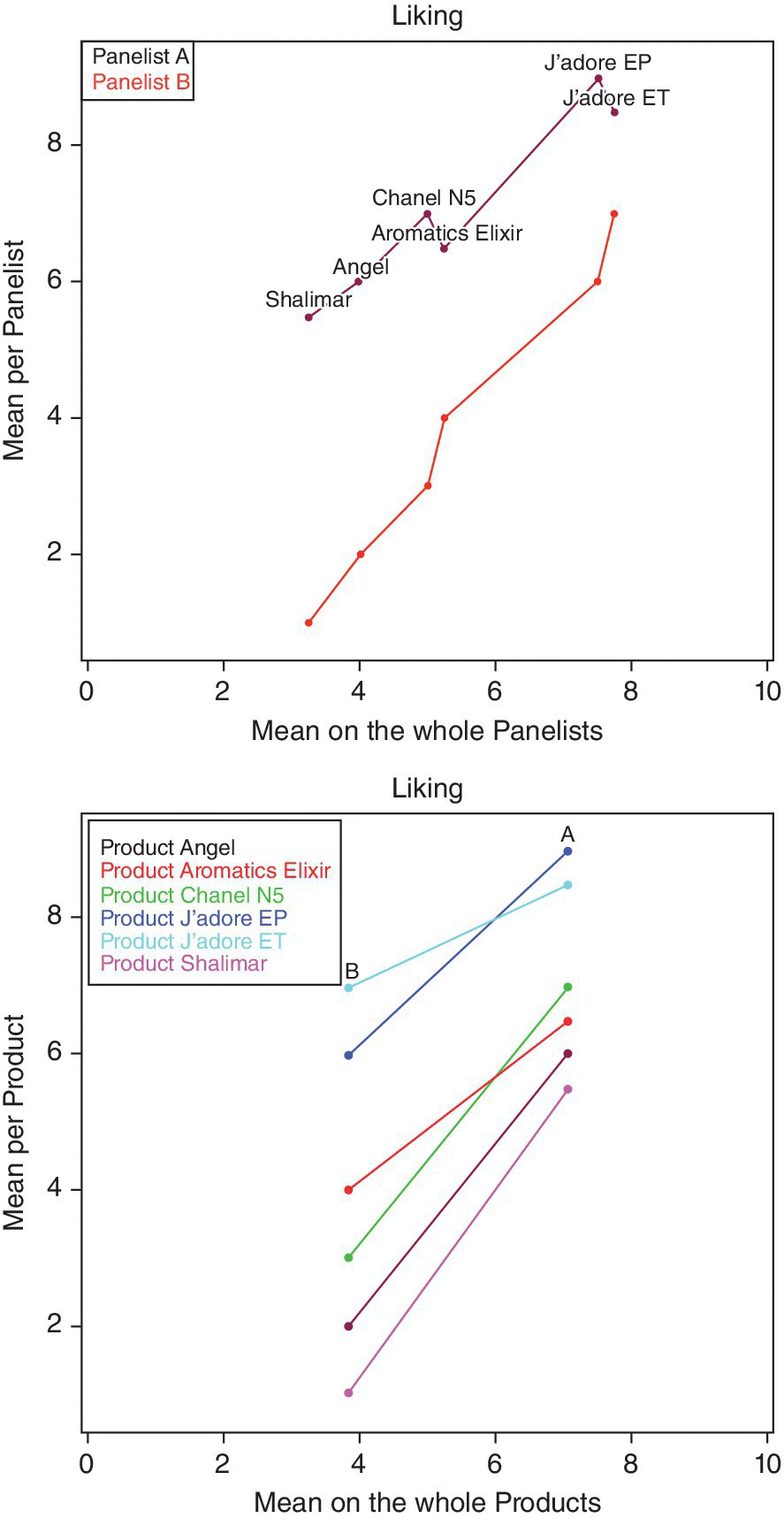
Figure 14.11 Visualization of the hedonic scores given by the panelists.
Lê and Worch (2014) also present other advanced analysis methods combining different datasets. Other possible data structure is textual data, napping data, or just‐about‐right (JAR) data.
Textual data are textual comments on product given by consumers. Text mining techniques have to be applied in order to handle such unstructured data. In this case typical words can be considered as attributes and used to describe the product profile.
Napping data are issued from sessions where panelists arrange all the products on a blank paper sheet. Napping allows collecting directly in only one session the sensory distances panelists perceived between products. Each panelist discriminates products according to his/her own criteria. The closer the two products are, the more alike the panelist perceives them. The dataset has as many rows as there are products and twice the number of panelist columns, each pair of columns corresponding to the X and Y coordinates of the products for one panelist.
JAR scales are commonly used in consumer research to identify whether product attributes are perceived at levels that are too high, too low, or just about right for that product.
Many other goals can be identified, for example, how the relationship between each sensory attribute and the hedonic score can be evaluated at different levels, how to get homogeneous clusters of products or of consumers, etc. All these goals can be easily reached using R and his packages.
14.2.3 Explore European tourism
In the past decades, lowered transportation costs led to a sharp increase in the physical accessibility of tourist localities. As a consequence, the proportion of foreigner tourists rapidly increased all over the word. According to the United Nations World Tourism Organization, Europe was the most frequently visited region in the world in 2013, accounting for over half (52%) of all international tourist arrivals.
Goal 1: Based on data from the Eurostat database, what are European tourism patterns?
Using R, it is possible to import and manipulate the Eurostat data very easily. The eurostat package (Leo et al., 2015) provides tools to access the data directly from the Eurostat database in R with search and manipulation utilities.
We can search the available variables using search_eurostat() function. In order to efficiently represent the European tourism, we consider the number of overnight stays in tourist accommodation by NUTS 2 regions (table tour_occ_nin2, source Eurostat). This indicator represents both the length of stay and the number of visitors.
To download the data, we use the get_eurostat() function:
dt <‐ get_eurostat("tour_occ_nin2", time_format = "raw")
An effective way to visualize how a measurement varies across a geographic area is a choropleth map, that is, a thematic map in which areas are shaded in proportion to the value assumed by the variable of interest in that particular region.
R offers a wide variety of ways to create maps. We’ll use principally two packages: maptools and ggplot2. The maptools package (Bivand and Lewin‐Koh, 2015) provides tools for reading and manipulating geographic data. In particular we use it to read shapefiles of Europe published by Eurostat. We will use the shapefile in a 1 : 60 million scale from year 2010 and subset it at the level of NUTS2. The ggplot2 package (Wickham and Chang, 2015) provides powerful graphics language for creating complex plots. In order to prepare the data for the visualization, we will use the fortify() function in ggplot2 to convert the shapefile into a data frame, and we will join the data about the tourism and the spatial data. Finally, we will create the choropleth map using the geom_polygon() function. R is not the easiest way to generate maps, but it allows for full control of what the map looks like.
The map in Figure 14.12 represents the total number of nights spent in tourist accommodation in 2013 at regional level. Using this representation, it is easy to identify where tourism in the European Union is concentrated. The most attractive areas are the coastal regions, Alpine regions, and some major cities. Spain and Italy are the most common tourism destinations in the European Union.
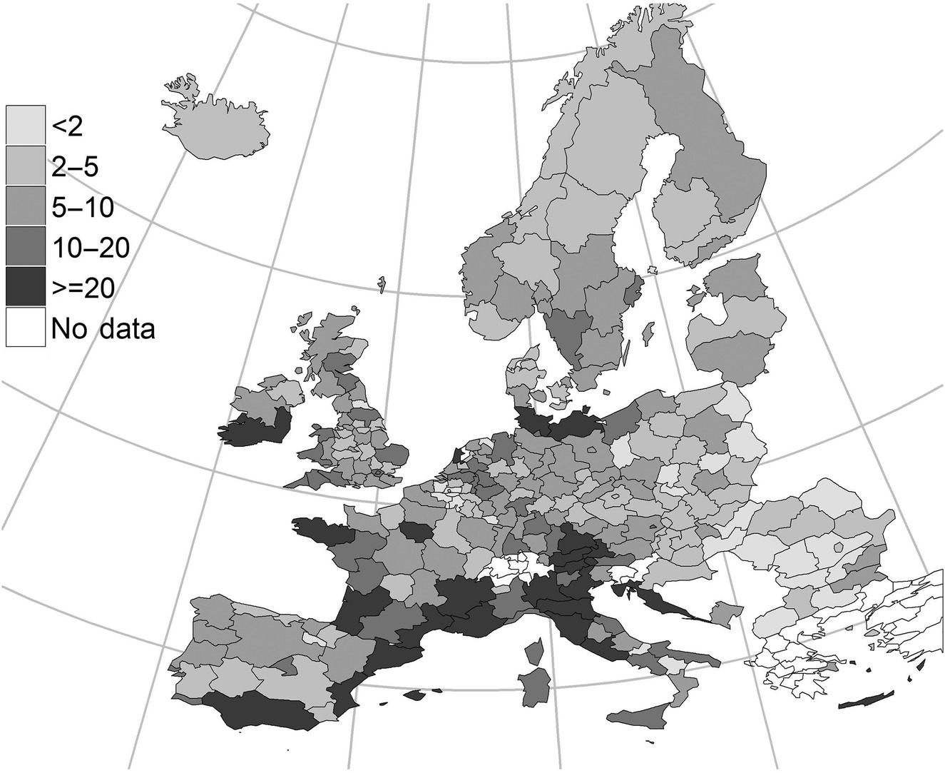
Figure 14.12 Nights spent in tourist accommodation establishments by NUTS level 2 region, 2013 (million nights spent by residents and nonresidents).
Source: Eurostat (tour_occ_nin2). © European Union.
Goal 2: Identify the determinants of overall tourists’ satisfaction
The tourism phenomenon raised several policy implications for the efficient supply of tourist services and amenities to the visitors from abroad. Among other issues, some works were devoted to the analysis of the foreigner tourists’ experience and their self‐reported satisfaction.
This example is taken from Cugnata and Perucca (2015). We use a large sample of data from a survey conducted every year since 1996 on behalf of the Bank of Italy. In every survey study, a sample of foreign tourists is asked to report (among other things) their satisfaction with various aspects of their journey in Italy. At the same time, we include some variables for the socio‐economic characteristics of the provinces visited by the respondent.
R offers efficient ways to integrate multiple data frames with different structures, for example, the merge function merges two data frames by common columns or row names or other versions of database join operations.
The goal of the application paper is to identify the determinants of overall tourists’ satisfaction, among individual characteristics and some features of the tourist services supplied.
We use a Bayesian network (BN) approach to the study of tourist satisfaction. As discussed by Salini and Kenett (2009), BN presents several advantages compared with other statistical techniques. First, they are able to outline the complex set of links and interdependencies among the different components of satisfaction. Second, they are extremely useful for policy‐design purposes, since they allow for the building of hypothetical scenarios, letting change the distribution of some parameters under the control of the policymakers and controlling the impact on the variables of interest.
Several R packages implement algorithms and models for constructing BN. We use the bnlearn package (Scutari, 2010, 2015). The hc() function is applied to learn the structure of the BN using the Hill‐climbing algorithm and the graphviz.plot() function to plot the graph associated with the estimated BN. Figure 14.13 shows the BN obtained with the Hill‐climbing algorithm with score functions such as AIC.
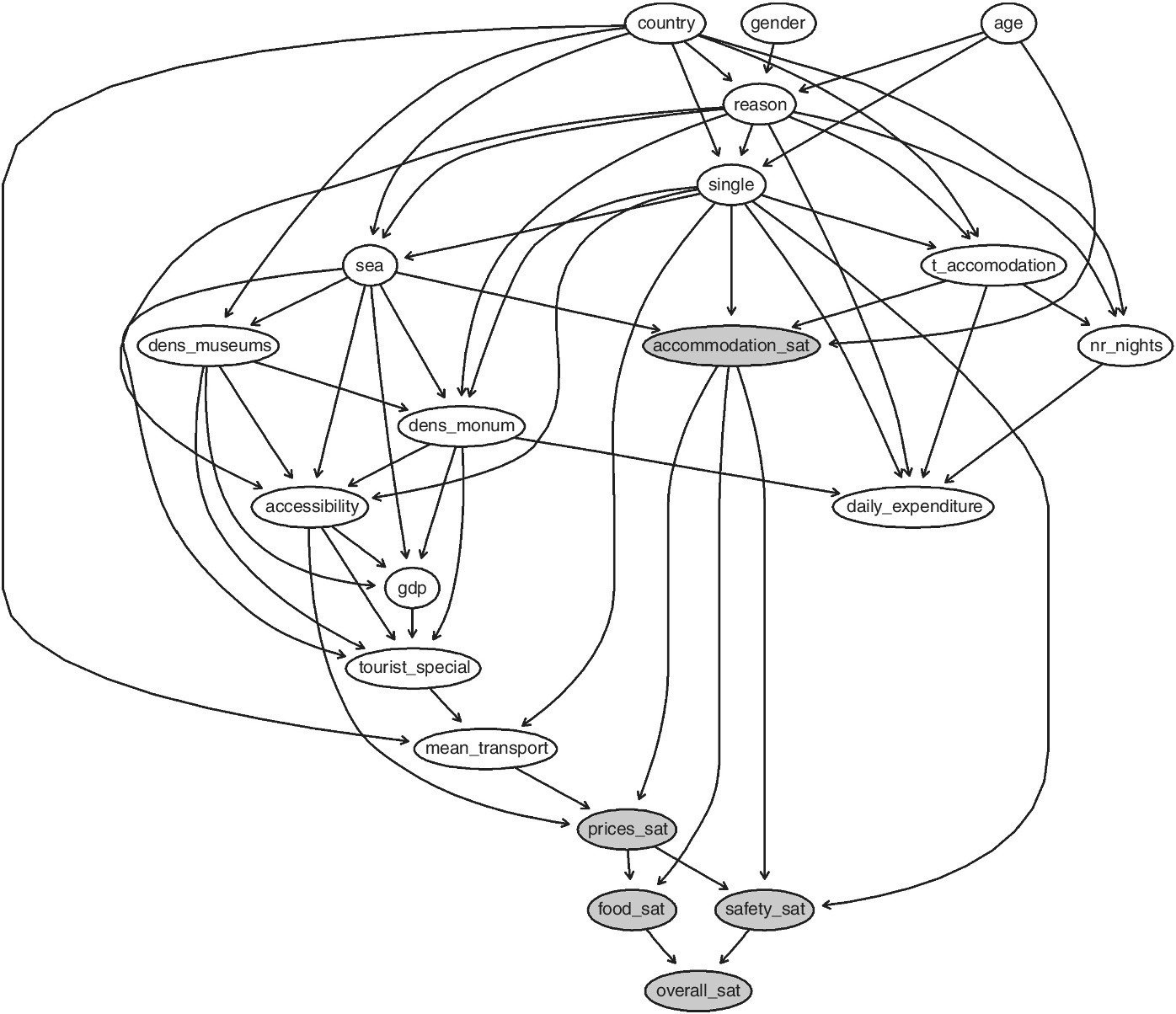
Figure 14.13 Bayesian network.
As expected, the three groups of variables are (within each category of data) joined together. However, both daily expenditure and the dimensions of satisfaction (in particular with the accommodation) are influenced by the individual characteristics and the socio‐economic indicators.
One of the main benefits of BNs is that they provide an opportunity to conduct “what‐if” sensitivity scenarios. Such scenarios allow us to set up goals and improvement targets. Comparing R to other BN software, an advantage of R is that it is a flexible tool.
Considering the dimensions of self‐reported satisfaction, overall satisfaction is directly influenced by safety and food satisfaction and (indirectly) from prices and accommodation. If we fix the dimension of satisfaction to a certain level, the proportion of (overall) very satisfied respondents (9–10) changes. Figure 14.14 shows the distribution of the overall satisfaction for each level of each variable.

Figure 14.14 Distribution of the overall satisfaction for each level of each variable.
14.3 Components and dimensions of InfoQ and R
In the following table, the three applications presented in Section 14.2 are summarized according to the InfoQ components.
| Example | g = goal | X = dataset | f = method | U = utility |
| 14.2.1 | 1: Exploring what are people talking about “Expo 2015” and “Expo 2020” in these days | Two datasets created by info downloaded from Twitter | Function search.Twitter of TwitterR and packages tm and wordcloud | Wordle |
| 2: Comparing what are people talking about “Expo 2015” and “Expo 2020” in these days | One dataset created merging info download from Twitter | Function search.Twitter of TwitterR and packages tm and wordcloud | Wordle | |
| 14.2.2 | 1: How to assess the panel performance | Experts dataset | Functions panelperf and coltable of SensoMineR | F, p‐values |
| 2: How to represent the product space in a map | Experts dataset | Functions decat and PCA of SensoMineR | Individuals and variables maps, confidence ellipse | |
| 3: Do panel of experts and panel of customers produce the same sensory profile? | Experts and consumers datasets | Functions decat and MFA of SensoMineR | Multiple individuals and variables maps | |
| 4: How can I identify the best product? | Liking data | Function graphinter of SensoMineR | Graphical representation of product ranking | |
| 14.2.3 | 1: Effectively represent the European tourism | Eurostat data |
eurostat, maptool and ggplot2 R packages | Choropleth map |
| 2: Identify the determinants of overall tourists’ satisfaction | Bank of Italy survey data + ISAT data |
bnlearn R package | Bayesian network |
We discuss now how R supports InfoQ dimensions, keeping in mind the aforementioned examples.
As presented in the introduction, R is able to deal with any type of data. Moreover, most modeling functions in R offer options for dealing with missing values. You can go beyond pairwise of listwise deletion of missing values through methods such as multiple imputation. Good implementations that can be accessed through R include Amelia II, Mice, ForImp, missForest, mitools, and many others. Also the outlier detection techniques are developed in a lot of R packages, for example, extremevalues, mvoutlier, outlier, outlierD, and many others. Unlike other software, R provides all the estimators and approaches for both robust regression and multivariate analysis. So when the data resolution is not high, R can help to increase that score.
Furthermore, the previous examples, expressly chosen, highlight the extreme flexibility of R to various data structure. This is very important, especially in big data where data arrives quickly, with high frequency and sometimes in unstructured formats. R has packages able to structure the data collected in different ways from various sources. So data integration is another strength of R software. Not only the matching techniques but also the possibility to merge objects (models, plot, table, index, ranking, etc.) coming from different dataset and different sources in order to produce unified analyses is allowed.
As mentioned, with big data, one needs to be able to work with high‐frequency data. The possibility to download updated data directly from the source (Eurostat, Twitter, finance.yahoo.com, sensory device, etc.) increases the score of the temporal relevance dimension and helps in the chronology of data and goal that obviously depends on the available data and on the specific goal.
The generalizability of the results depends on the context. R routines and R scripts, once written, are easily adaptable with other data sources and other application domains because of the versatility of the programming language. This definitely accelerates the process of generalization.
Operationalization is dependent on the emerged insights. Often the R functions are created with a precise operational value, with a clear objective. Every code inserted on CRAN needs to be motivated by an application example. This can help to follow a path that leads to maximum uptime.
Finally, communication is one of the greatest values of R community, intrinsically linked to the first absolute value, that is, to make statistics available to all. In R packages the graphics functions are often the most numerous. It is quite clear to all developers how important the end is to export any result, from the simplest to the most complex, in a format that anyone can easily understand. SensoMineR is a prime example of this philosophy.
14.4 Summary
Section 14.1 presents a brief introduction to R software environment, its origins, and its philosophy. The R graphical interfaces are mentioned, and the main data import and export functions are described. In Section 14.2 three non‐standard data analysis applications are presented with the aim to show the R potential with respect to other classical statistical packages.
The first example starts by downloading, within the R environment, Twitter data and analyzing it with text mining techniques. The second example deals with sensory data and sensory analysis; it is based on SensoMineR packages and, following Lê and Worch (2014), presents different datasets and different goals. The third example considers official statistics of Eurostat on tourism, directly downloaded in the R environment, and produces a geographical map; afterwards it considers survey data and tries to determine the key driver of tourism satisfaction using an advanced technique, a BN, provided by R.
Finally, in Section 14.3, the three applications are revised according to the InfoQ components, and a discussion on how R supports the InfoQ dimensions is given.
References
- Bivand, R. and Lewin‐Koh, N. (2015)
maptoolsPackage. https://cran.r‐project.org/web/packages/maptools/maptools.pdf (accessed May 2, 2016). - Cugnata, F. and Perucca, G. (2015) International Tourism in Italy: A Bayesian Network Approach, CLADAG 2015, Sardegna, Italy.
- Feinerer, I. (2015)
tmPackage. https://cran.r‐project.org/web/packages/tm/vignettes/tm.pdf (accessed May 2, 2016). - Fellows, I. (2013)
wordcloudPackage. https://cran.r‐project.org/web/packages/wordcloud/wordcloud.pdf (accessed May 2, 2016). - Fox, J. (2005) The R commander: a basic‐statistics graphical user interface to R. Journal of Statistical Software, 14(9), pp. 1–42.
- Gentry, J. (2015)
twitteRPackage. https://cran.r‐project.org/web/packages/twitteR/twitteR.pdf (accessed May 2, 2016). - Hand, D.J. (2008) Statistics: A Very Short Introduction. Oxford University Press, Oxford.
- Heiberger, R.M. and Neuwirth, E. (2009) R Through Excel. A Spreadsheet Interface for Statistics, Data Analysis, and Graphics. Springer, New York, NY.
- Husson, F., Le, S. and Cadoret, M. (2015)
SensoMineRPackage. https://cran.r‐project.org/web/packages/SensoMineR/SensoMineR.pdf (accessed May 2, 2016). - Ihaka, R. and Gentleman, R. (1996) R: A language for data analysis and graphics. Journal of Computational and Graphical Statistic, 5(3), pp. 299–314.
- Kenett, R.S. and Zacks, S. (2014) Modern Industrial Statistics: With Applications in R, MINITAB and JMP, 2nd edition. John Wiley & Sons, Ltd, Chichester, UK.
- Lê, S. and Worch, T. (2014) Analyzing Sensory Data with R. CRC Press. Chapman & Hall/CRC The R Series, Boca Raton, FL.
- Leo, L., Przemyslaw, B., Markus, K. and Janne, H. (2015)
eurostatPackage. https://cran.r‐project.org/web/packages/eurostat/eurostat.pdf (accessed May 2, 2016). - Munzert, S., Rubba, C., Meißner, P. and Nyhuis, D. (2015) Automated Data Collection with R: A Practical Guide to Web Scraping and Text Mining. John Wiley & Sons, Ltd, Chichester, UK.
- Salini, S. and Kenett, R.S. (2009) Bayesian networks of customer satisfaction survey data. Journal of Applied Statistics, 36(11), pp. 1177–1189.
- Scutari, M. (2010) Learning Bayesian networks with the bnlearn R package. Journal of Statistical Software, 35(3), pp. 1–22.
- Scutari, M. (2015)
bnlearnPackage. https://cran.r‐project.org/web/packages/bnlearn/bnlearn.pdf (accessed May 2, 2016). - Vance, A. (2009) Data Analysts Captivated by R’s Power. The New York Times. http://www.nytimes.com/2009/01/07/technology/business‐computing/07program.html?pagewanted=all&_r=0 (accessed May 2, 2016).
- Wickham, H. and Chang, W. (2015)
ggplot2Package. https://cran.r‐project.org/web/packages/ggplot2/ggplot2.pdf (accessed May 2, 2016).