
15
InfoQ support with Minitab
Pere Grima, Lluis Marco‐Almagro and Xavier Tort‐Martorell
Department of Statistics and Operations Research, Universitat Politècnica de Catalunya, BarcelonaTech, Barcelona, Spain
15.1 Introduction
Minitab is a statistical software package available from www.minitab.com that combines ease of use with the ability to handle large volumes of data and perform a wide range of statistical analyses. Simplicity and the feeling of always having everything “under control,” without the software making unclear assumptions, are strengths of Minitab that differentiate it from other statistical packages.
Data are placed in Minitab in Excel‐like datasheets, so that they are easy to view and manage. Furthermore, analysis of these data can be conducted using clear and well‐structured menus. In fact, you can start using Minitab without devoting a lot of time to learn how it works. This fact makes it very popular among those who occasionally need to perform statistical analyses with rigor and versatility but without mastering the intricacies of highly technical or specialized software. Perhaps for this reason, Minitab is widely used in industrial environments and in the field of quality improvement (often within the framework of a Six Sigma improvement project).
Minitab’s initial screen is shown in Figure 15.1. In addition to the main menu at the top, there is the session window (where the results of conducted analyses appear) and the worksheet, the Excel‐like datasheet where data are placed (each column being a variable).

Figure 15.1 Minitab user interface, with session and worksheet windows.
15.1.1 Data distribution: Differences between Minitab and Excel
When the worksheet is maximized, we can see a user interface very similar to an Excel spreadsheet, with which almost all of us are familiar. Data in a worksheet can be saved in Minitab format or Excel format, among others. Excel sheets can also be directly opened in Minitab, so if preferred, data manipulation and organization can be done in Excel and Minitab used only for the analysis.
The worksheet can contain up to 4000 columns and up to 10 000 000 rows, depending on the available memory in the computer. Unlike Excel, you cannot assign a specific formula to a cell but only to a column. After creating a column that is the result of a formula based on other columns, they may be linked (the values of the new column change when changing some of the columns involved in the formula, as in Excel) or fixed (default behavior in Minitab).
Similarly, when a chart is created from data, the graph can be updated as data changes (Excel behavior) or not (Minitab’s default behavior).
Some details make working with Minitab spreadsheets easier than working with Excel. For example, columns in Minitab are named Cx, where x is the column number. So, what in Excel is column BJ, in Minitab is column C62, a much clearer denomination. An appropriate habit when working with data is giving each column (each variable) a descriptive name. Minitab has a first row reserved for this name so that a column with 50 rows ends in row 50 and not 51 (the row for the name does not count).
15.1.2 Overview of some Minitab options
Minitab enables a great variety of statistical analyses, from classic basic statistics (Figure 15.2, top) to more sophisticated ones, such as modeling with regression equations, ANOVA, generalized linear models, factorial designs, surface response methodology, multivariate data analysis, or time series analysis. There is an emphasis on tools oriented to industrial statistics and quality management, some very general (Figure 15.2, bottom), others more specific, such as robust designs (Taguchi method) or statistical process control (SPC). For a comprehensive treatment of industrial statistics with Minitab see Kenett and Zacks (2014).
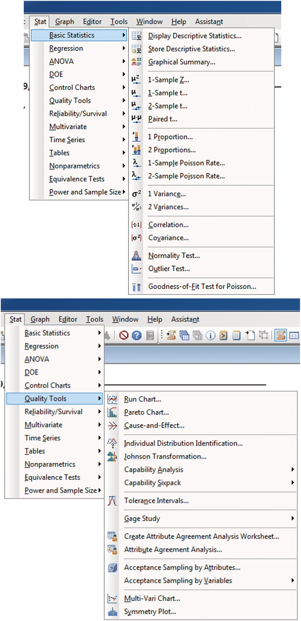
Figure 15.2 Some menu options for basic statistical analysis and quality tools.
15.1.2.1 Minitab help
Another strong point in Minitab is its help system, which is very thorough and carefully written. The help files not only explain how to conduct statistical analysis in Minitab, but also the conceptual ideas behind the tool are clearly explained. Reading Minitab help can be a quick way to learn statistics! It is possible to access Minitab help through the main menu but also using the help button in each dialog box. This leads to a detailed explanation of the tool being used at the moment, with examples and interpretation of the results (Figure 15.3).

Figure 15.3 A screenshot of Minitab help.
Minitab also has a wizard (called Assistant) that gives advice and guidance on the techniques to use depending on the characteristics of the data and the purpose of the analysis.
15.1.2.2 Minitab macros
In addition to using Minitab in a point‐and‐click manner through the menus, it is possible to write commands in the session window (when the enable commands option from the editor menu is activated). For example, if we write
MTB > random 10000 c1MTB > histogram c1
10 000 random numbers are generated (by default, they follow a normal distribution with mean 0 and standard deviation 1) and stored in column C1. After that, a histogram with the data is drawn. To generate random numbers from a normal distribution with mean 10 and standard deviation 2 and to change the appearance of the histogram (e.g., horizontal scale, tick marks, bins, font size), the commands needed are the following:
SUBC> normal 10 2.MTB > Histogram C1;SUBC> Scale 1;SUBC> PSize 12;SUBC> MODEL 1;SUBC> Tick 0 2 4 6 8 10 12 14 16 18 20;SUBC> Min 0;SUBC> Max 20;SUBC> EndMODEL;SUBC> Midpoint;SUBC> NInterval 50.
There is no need to memorize these commands because they appear printed on the session window while using the menus. They can later be copied and pasted (and modified as desired), and the macro is ready to be executed. These commands can be used together with usual flow programing commands: if, do, while, etc., so that programs similar to functions in R statistical scripting language can be created. However, it is not a good idea to use Minitab macros for intensive simulations, as its performance is slow.
15.2 Components and dimensions of InfoQ and Minitab
15.2.1 Components of InfoQ and Minitab
When studying how Minitab develops the four components of InfoQ (goal, data, analysis, and utility), it is obvious that the specific characteristics of a statistical software such as Minitab are especially relevant when dealing with data, analysis, and utility components of InfoQ. The following subsections deal with InfoQ components in Minitab.
15.2.1.1 Goal
Like other packages, Minitab statistical software offers a wide range of possibilities both for exploratory data analysis and for confirmatory analysis, following the classification of Tukey (1977). In particular, classical graphics (such as histograms, dotplots, scatterplots, and boxplots) are done in a breeze with Minitab and can be used as part of an exploratory analysis (Figure 15.2). If the objective of the study is more in the confirmatory analysis side, a wide variety of tests can be conducted.
Quality Companion, another product from Minitab Inc., can also be used to clarify the goal of a study. Quality Companion provides tools for organizing projects, emphasizing in a step‐by‐step roadmap achieved results. It also offers a set of “soft tools,” such as process mapping, templates for brainstorming, and reporting. Although it can be used under any improvement framework, it is especially suited for developing projects following the Six Sigma methodology (see Kenett and Zacks, 2014).
15.2.1.2 Data
As mentioned in the introduction, Minitab is able to manage large volumes of data in a structure similar to Excel sheets (although with the suitable restriction of having the same kind of data in a column).
It is easy to manage data in Excel and then use it in Minitab for statistical analysis. The most straightforward method is simply copying data from Excel and pasting it in Minitab. It is also possible to open Excel data files (and files in other formats) and establish more complex connections with Excel (such as establishing a dynamic data exchange (DDE) between Excel and Minitab).
15.2.1.3 Analysis
Minitab includes the most common methods of data analysis, both parametric and nonparametric. It does not include Bayesian methods, although it is possible to write macros to use Bayesian methods, as done, for example, in Albert (1993) or Marriott and Naylor (1993).
15.2.1.4 Utility
Minitab provides measures of utility of the performed analysis. For instance, when modeling with regression equations, goodness‐of‐fit measures are presented. In hypothesis testing, it is possible to compute the power of the test; when performing time series analysis, confidence intervals for the forecasts are offered (being more or less wide, that is, more or less “useful,” depending on the amount and variability of the data). It is also possible to perform fitting tests for a wide range of distributions.
15.2.2 Dimensions of InfoQ and Minitab
15.2.2.1 Data resolution
Working with data at an adequate level of precision and aggregation is a feature that lies more in the field of data collection planning and the application of appropriate measurement instruments than in the statistical software package used. Minitab uses 64 bits of memory to represent a numeric value; this allows working with up to 15 or 16 digits without rounding error. This accuracy is enough in the vast majority of cases.
One can get valuable information and identify the source of a problem when stratifying data by origin. For example, imagine that in the manufacturing of a product defective parts are produced very often. We have data about the machine, operator, shift, provider of the raw material, environmental conditions, etc. under which each unit is manufactured. Looking at all these data, we can probably identify the cause of the excessive number of defective parts. However, if only the number of defective units is known, identifying the cause will be much harder. Minitab can stratify the data according to their origin very easily (but if this information is not available, this is something impossible to perform, regardless of the software used).
Data can be aggregated in the most convenient form. Sometimes this aggregation is done automatically, as when a histogram is drawn and the number of data points in each interval is decided by the program. But it can also be done manually, encoding the data with a value depending on the interval to which they belong.
Minitab includes ways to represent data in aggregate form without losing the original values, such as stem‐and‐leaf plots. The histogram in Figure 15.4 (left) represents the heartbeats per minute for each of 92 students. We can see one student with heartbeats between 45 and 50 per minute, two students with heartbeats between 50 and 55, and so on. However, it is not possible to recover the exact number of heartbeats for each student. From the original data, you can build the histogram, but from the histogram you cannot reproduce the original data. The right panel of Figure 15.4 shows the stem‐and‐leaf plot with the same data. Each value is divided into two parts: the most significant is the stem, and the least significant (in this case the units) correspond to the leaves. It can be seen that the smallest value is 48, then 54 comes twice, etc. The profile of this diagram is identical to the histogram, so it contains the same information, but the original values of the dataset are not lost.
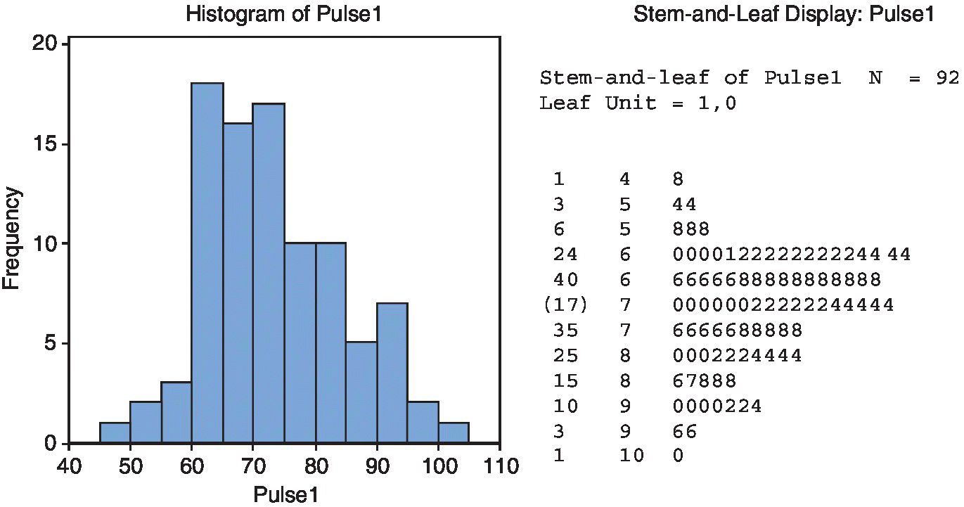
Figure 15.4 A histogram (left) and its corresponding stem‐and‐leaf graph (right), of heartbeats per minute of students in a class.
Being able to look at the specific values can sometimes be useful to correctly interpret the data. For example, in this case, the students were instructed to measure their heartbeats during one minute. However, we can see that, from the 92 values, only two are odd and the rest are even; this suggests that the measurements were done during only 30 seconds, and then multiplied by two, or during only 15 seconds, and then multiplied by 4! As an error at the beginning or end of the measurement period is common, it is not the same having an inaccuracy of ±2 (when measuring one minute) and an inaccuracy of ±8 (when measuring 15 seconds and multiplying by 4).
15.2.2.2 Data structure
Minitab can work with numerical data (called Numeric), text (called Text), or dates (called Date/Time). When the format is of type date, it is possible to perform common operations for this type of data, such as computing the number of days between two dates.
There are no tools for working with textual data. In general, text variables have the only purpose of identifying the source of the data or properties later used to stratify. The most common text variable in Minitab is a categorical variable with different levels. The values of a numerical variable can then be compared depending on the levels of this text variable (for instance, comparing sales (numerical variable) by region (textual variable)).
Contrary to what happens in Excel, each column in the datasheet must contain a single type of data. So if a column contains numeric values, no cell in that column can contain text or any content that is not numeric (except an asterisk, *, which represents a missing value in Minitab). This asterisk can be entered manually to represent a missing value (or when we want to ignore the existing value in an analysis); it can be placed automatically when a cell in a numeric column is left blank; or when the data obtained by some calculations do not result in a value which is a real number (such as when trying to compute the square root of a negative number). Minitab pays attention to the presence of missing values, and when computing statistical summaries of each variable (column), we get the information on the number of missing values.
It is possible to change the data type of a column by using the Data > Change Data Type menu option in Minitab. This is especially useful when the data type of the column is clearly not correct, something that sometimes happens when pasting data from other programs.
15.2.2.3 Data integration
There are different ways to input data into Minitab. An easy and straightforward system, already mentioned, is copying and pasting from another program. Copying and pasting data works very well and much better than in other statistical packages (such as SPSS). Minitab is able to open Excel files, by choosing Excel format in the Open Worksheet dialog box, and text files. However, it cannot directly open files from other statistical packages. If there are problems opening a text file, a safer option is using the File > Other Files > Import Special Text… menu option; this gives the possibility to custom define the format of the file. Minitab can also import data from a database using the Open Database Connectivity (ODBC) protocol. This allows opening data stored in database applications such as Access or SQL (having the ODBC driver for the desired database is a requirement for this functionality to work).
With an ODBC data connection, the link is not dynamic. However, it is possible to use DDE (dynamic data exchange) to dynamically exchange data between older versions of Minitab and other applications. A common use of this functionality was linking a Minitab datasheet with Excel: data then remains synchronized in both programs. So you can, for example, manage the data using Excel facilities and perform statistical analysis with Minitab without being continually moving from one program to another. This functionality has been discontinued in recent versions of Minitab. Figure 15.5 shows an example, where data from Excel is linked into Minitab, and results from Minitab are also linked in Excel.
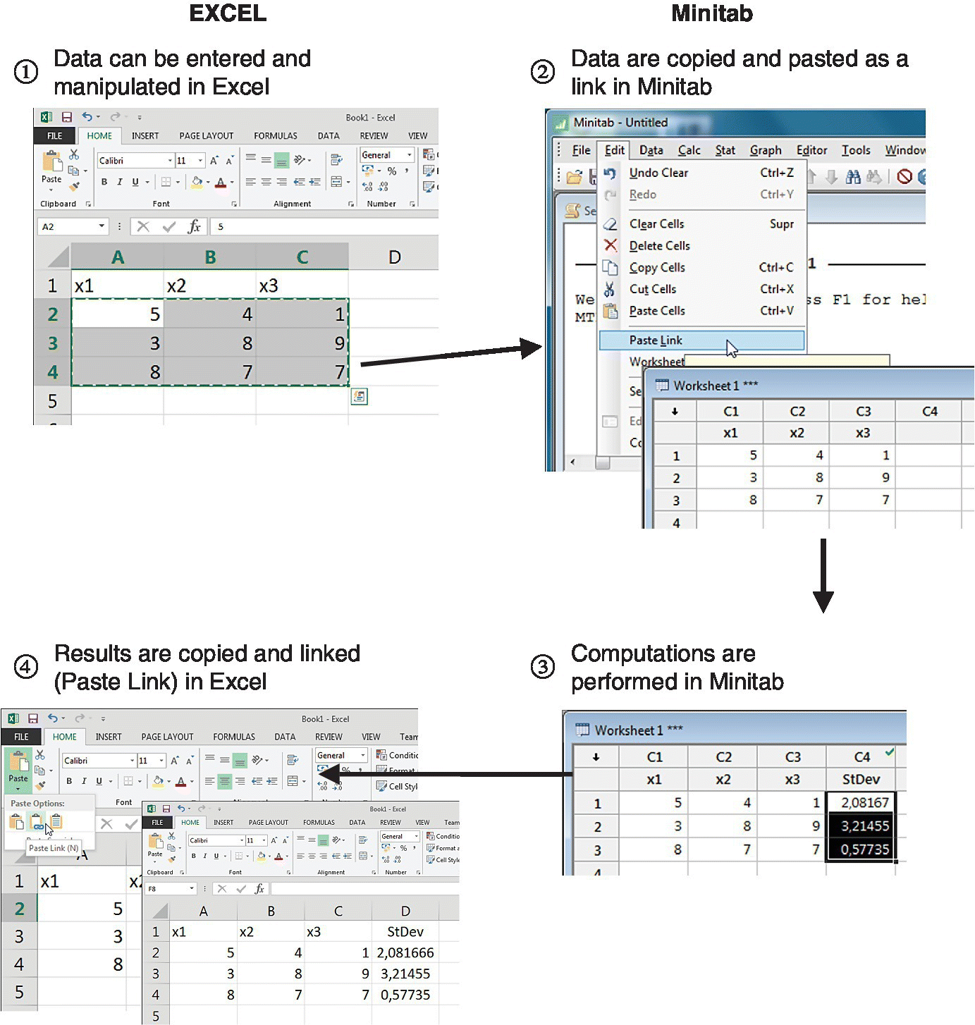
Figure 15.5 An example of a DDE connection between Excel and Minitab.
15.2.2.4 Temporal relevance
Analyzing data by taking into account the date and time when the data was collected is easy and offers many presentation possibilities using time series plots. For example, Figure 15.6 shows the evolution of the number of defects detected in the final inspection of a product during a month. The horizontal axis contains both the days of the week and the days of the month: the chart clearly shows the difference between weeks.

Figure 15.6 An example of the number of defects during a month, showed in a time series plot.
Sometimes the relevance of the temporal evolution is not so obvious. A company conducted a study on the complaints received in the last nine months. When drawing a Pareto chart of the causes of complaints, the most frequent was the one coded as B, representing almost half of the total (Figure 15.7, top). Without more analyses, it seems reasonable focusing on cause B. But when we look at the month in which the complaint was done, we realize that almost all type D complaints appeared in the last studied month (September), so probably the priority is solving the problem with type D complaints as quickly as possible (Figure 15.7, bottom). Minitab can stratify Pareto charts very easily, also with regard to time‐related variables or the order of the data collection.

Figure 15.7 An example of a Pareto chart with all the data together (top) and stratifying by month (bottom).
Another area in which the temporal evolution of the data is of great importance is statistical process control. Minitab can build a wide range of control charts, both univariate and multivariate (Figure 15.8), with many possibilities of format and presentation. However, keep in mind that these are really useful when graphics are built and analyzed in real time, and this requires solving the problem of capturing data and incorporating them into Minitab continuously, at specific moments in time. Minitab is useful for computing control limits in control charts based on already collected data, but it is probably not the best software for implementing real‐time statistical process control in a production line: there are many software packages focused on SPC that can perform this better, with more useful functionality.
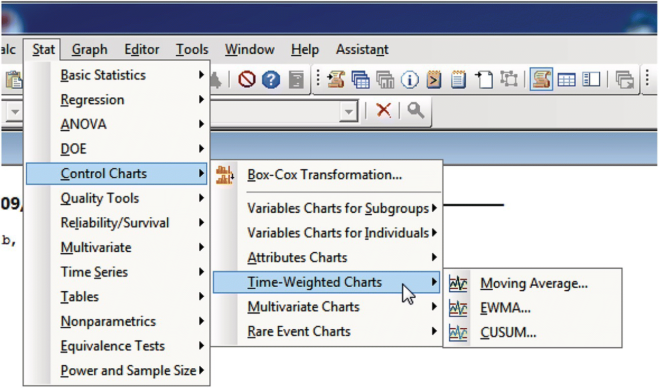
Figure 15.8 A screenshot showing different types of control charts in Minitab.
15.2.2.5 Chronology of data and goal
Besides forecasting models based on time series, Minitab offers extensive possibilities in modeling regression equations (Figure 15.9): from just adding the fitted line to a bivariate diagram to using sophisticated modeling techniques, including the calculation of all possible models with up to 31 independent variables. This involves calculating and comparing more than two billion equations, of which the best are presented according to the most common goodness‐of‐fit criteria: R2, adjusted R2, Mallows’ Cp, or standard deviation of the residuals.
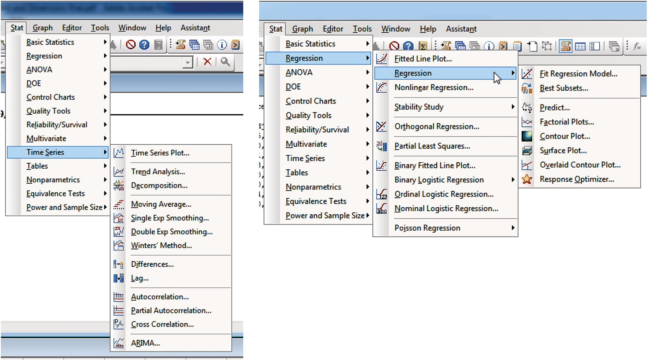
Figure 15.9 A screenshot with different modeling possibilities in Minitab.
If the aim is an explanatory model, that is, a model to explain the behavior of the response by identifying the most influential variables and how they behave, we will be interested in selecting a (usually small) subset of variables that are basically independent and that lead to a model with a reasonable physical interpretation.
However, if the aim is a predictive model, that is, what matters is making good predictions of the value of the response, without the priority of discovering which variables are influencing the response, the independence of the regressors is not that important, although surely the ease to measure them is.
Minitab offers a variety of graphical and quantitative support for the construction and analysis of models. But of course, it cannot replace the expertise of the analyst, who must be also guided by the intended use of the model.
15.2.2.6 Generalizability
Generalizing to the whole population of findings obtained from a sample (statistical generalization) gives good or bad results depending on the quality (representativeness) of the data. Generalizing from one population to another (scientific generalization) has more to do with experience and scientific knowledge than with the data or the statistical analysis. A well‐designed and conducted experiment with laboratory rats may reveal that a certain type of food produces a greater resistance to fatigue in rats, but inferring from this result that the effects in humans will be the same is a leap not justified without further analysis.
Regarding the statistical generalization, Minitab includes techniques for population parameter estimation, comparison of treatments—parametric and nonparametric—and goodness‐of‐fit tests. With Minitab, it is easy to answer the typical question of “what sample size do I need so my conclusions are valid?” For example, in a comparison of means with independent samples (2‐Sample‐t test), a dialog box appears when using the Stat > Power and Sample Size dialog box, where one must introduce values for three of the four variables that appear, and Minitab calculates the value of the fourth variable. So, if you want to detect a difference of three units with a power of 90% and the standard deviation of the population is five units, 60 observations in each sample are required. The significance level and the alternative hypothesis (0.05 and “other than” type, respectively) are included by default but can be changed via the options button (Figure 15.10).

Figure 15.10 Output from the power and sample size procedure for the comparison of means test.
15.2.2.7 Operationalization
The selection of variables for explanatory models can be performed using modeling techniques with regression equations. In the output from a regression analysis Minitab offers, in addition to measures concerning the statistical significance of each coefficient, the variance inflation factor (VIF) value associated with each variable. The VIF measures the degree of relationship of a variable with the other explanatory variables. Ideally, the variables are independent of each other so that the role of each one in the model can be assessed properly (this implies having VIFs close to 1).
When what really matters is not which are the variables involved in the model but the measurement accuracy of each one of them, as in predictive models, Minitab includes a wide range of techniques to assess the quality of the measurement system (Figure 15.11).
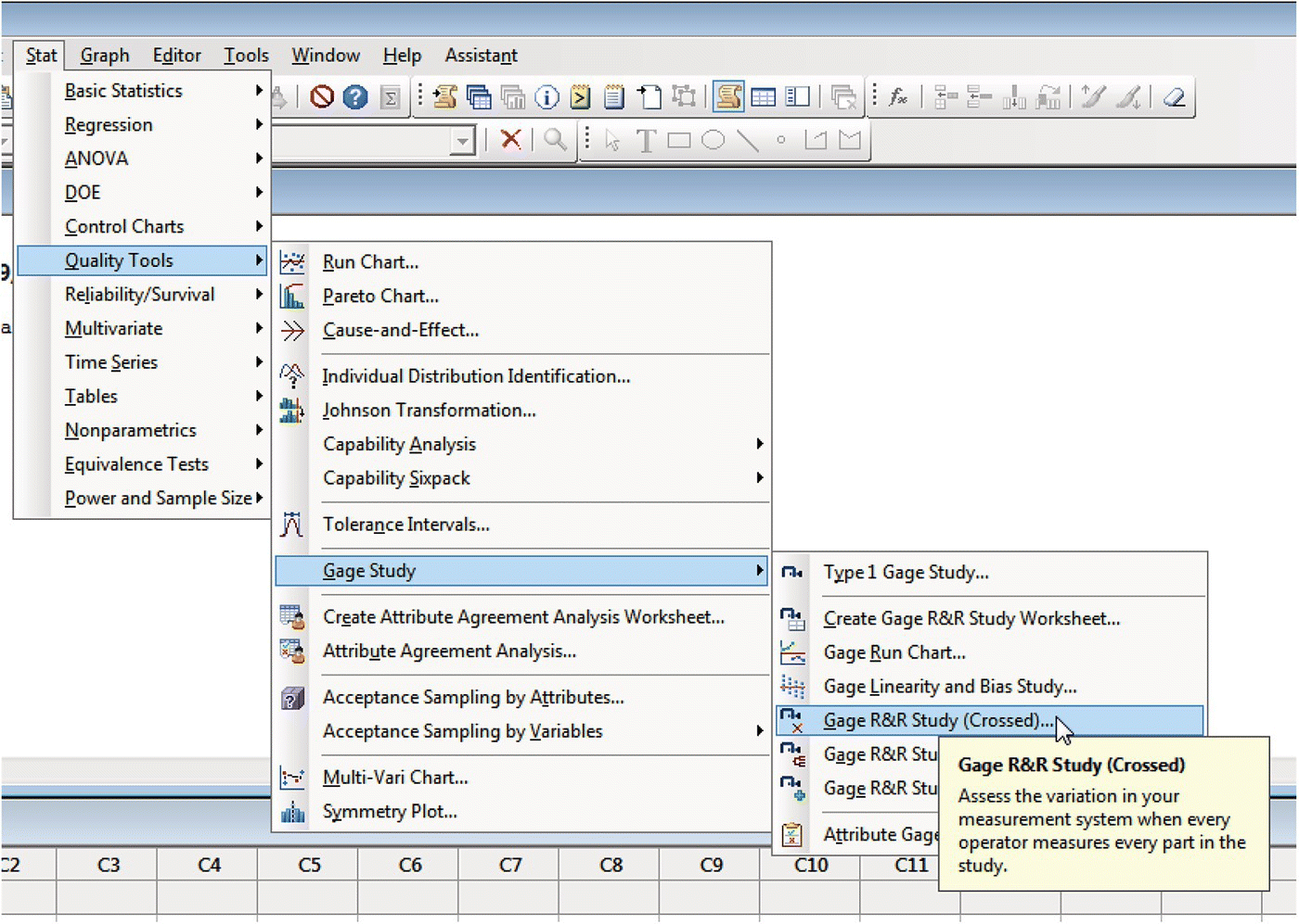
Figure 15.11 The menu option for a Gage R&R study to validate the measurement system in Minitab.
In industrial environments, the variability of critical to quality variables is an issue of concern. This variability in the data is due to the inherent variability of the parts and also to the variability introduced by the measuring system (sometimes even more important than the real variability among parts). The variability of the measuring system can be decomposed into variability caused by the measuring device (repeatability) and variability introduced by the way the operators use the machine, by environmental conditions or by other factors (reproducibility). For more on Gage R&R using the InfoQ lens, see Chapter 11.
Following an orderly process of data collection, Minitab includes analysis techniques that break down the total observed variability in each of its sources: part to part, repeatability, and reproducibility, the latter with each of its components. Of course, the variability introduced by the measurement system must be consistent with tolerances of the measured magnitude. If these tolerances are τ ± δ, it is not possible to have a measurement system with an accuracy of ± ε, ε being of the same order of magnitude as δ. Typically, the measuring system is considered suitable if ε < 0.1 δ, and Minitab provides this information directly.
15.2.2.8 Communication
Minitab has a structure that facilitates the management of the obtained results and makes the preparation of a final report fast and convenient. If Minitab is used in conjunction with Quality Companion, the preparation of a report or a presentation can be even faster (basically “dropping” results into a presentation template).
A notable feature in Minitab is the ease of presenting graphics in a clear and clean way in both written reports and presentations. Imagine the following situation: the manager of a bakery was concerned because he had detected loaves of bread below the minimum allowed weight. To study the origin of the problem, 80 units made with each machine were taken. Figure 15.12 shows the histograms of the weights depending on the machine in which they were produced. The nominal value is 220 grams and the tolerances are ±10 grams. A mere look at the histograms clearly reveals that the problem lies in machine 2, which is not centered.
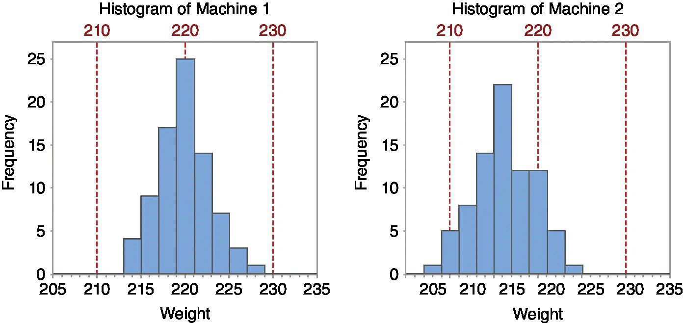
Figure 15.12 Representation of results (using histograms) in the case study of the bakery.
In the field of the analysis of variability, Minitab also includes not so classic graphs that are useful to identify the causes that affect the quality characteristics of a product. The following is an example based on data from a real case study. In a production process of glass bottles, the manager was concerned about the excessive variability in the weight of the bottles (what really matters is the resistance to internal pressure, but the weight is closely related to it and is much easier to measure). The molds are grouped in boxes; each box comprises ten sections with two cavities in which a molten glass drop (coming from two different nozzles) is introduced (Figure 15.13). It was not known if the variability was produced by the different weights of the drops, the characteristics of the boxes, or its sections (each section carries a separate cooling system).
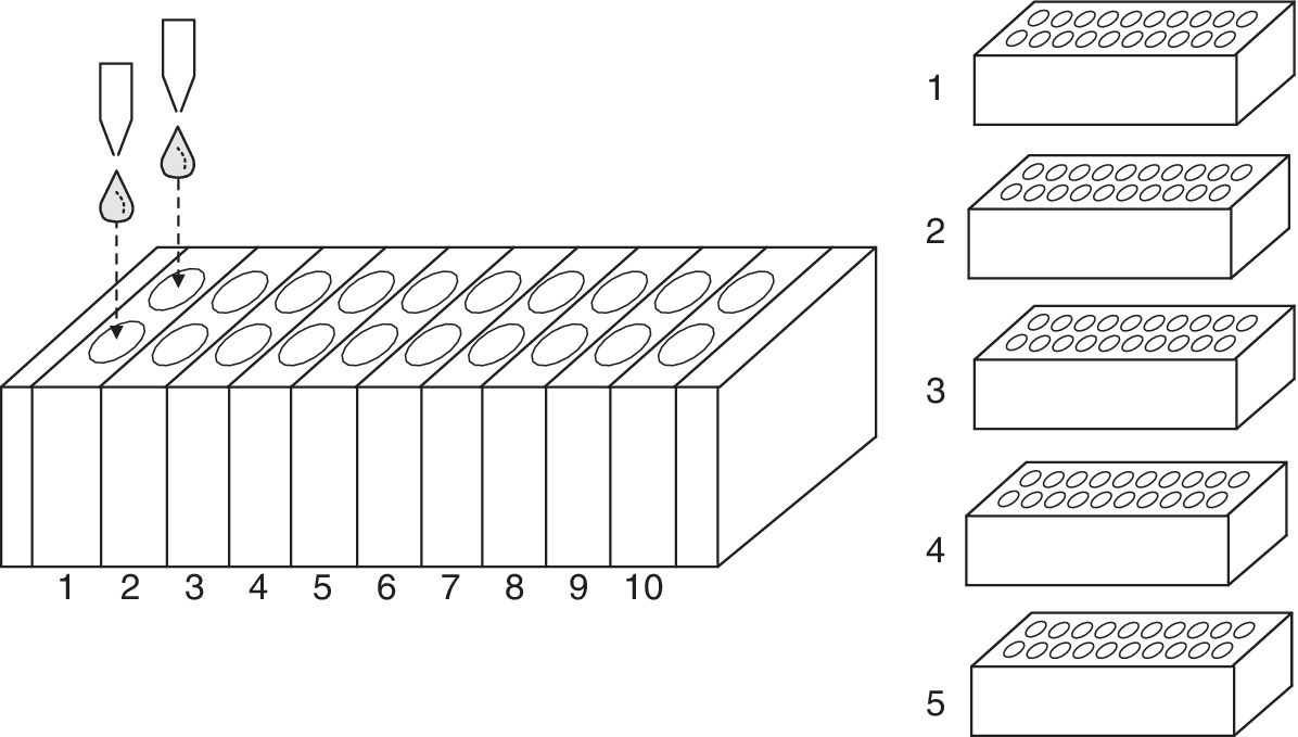
Figure 15.13 Schematic representation of the data collection procedure for the glass bottles case study.
To analyze the origin of the variability, the bottles of five consecutive boxes were weighed each hour during one day. The graph in Figure 15.14, called multivari chart, shows how the weights evolved throughout the day (seven samples were taken) depending on the box, the section, and the drop of each bottle. The graph clearly shows that the variability is essentially related to time.
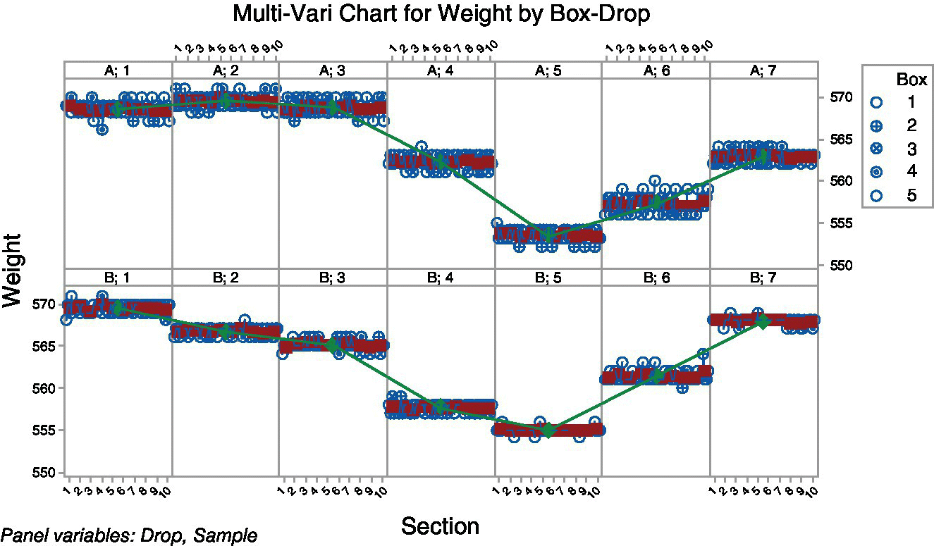
Figure 15.14 Representation of results (using a multivari chart) in the case study of the glass bottles.
15.3 Examples of InfoQ with Minitab
Following Hand’s (2008) definition of statistics as “the technology of extracting meaning from data”, we present two examples of applying f to a resource X for a given purpose g using Minitab. After each one of the case studies, the InfoQ assessment is offered. The examples are based on situations shown in Grima, Marco and Tort‐Martorell (2012).
15.3.1 Example 1: Explaining power plant yield
Technicians in a thermal power plant have collected data on several variables during 50 days of operation. The available data are the following:
| Name | Content |
| Yield | Yield of the thermal power plant |
| Power | Average power |
| Fuel | Combustible used (0: fuel, 1: gas) |
| FF | Form factor of the power curve. Measures the variation of the power throughout the day |
| Steam temp | Live steam temperature |
| Air temp | Air temperature (environment) |
| Seawater temp | Seawater temperature (cold source) |
| Day | Weekdays (1: Monday, 2: Tuesday, …) |
Our aim is building a model that explains the plant’s yield as a function of the variables available.
The chosen analysis technique f will be a regression analysis, with Yield as response. In preparation for the analysis, we realize that the variable Day, as such (qualitative variable with more than two categories), cannot be directly included in the model. However, we can encode it as 0 = working day (Monday to Friday) and 1 = weekend (Saturday and Sunday). This distinction seems reasonable to the technicians, because on weekends there is less demand and that could affect the performance of the power plant. Using Minitab coding capabilities (Data > Code > Numeric to Numeric), we create the new variable.
A first exploratory data analysis scatterplot of all pairs of variables (called matrix plot in Minitab) is shown in Figure 15.15. As there are many variables, the graph is not too clear. However, the scatterplot of yield versus power (Figure 15.16) shows a single point far from the others (a day with both high yield and high power).
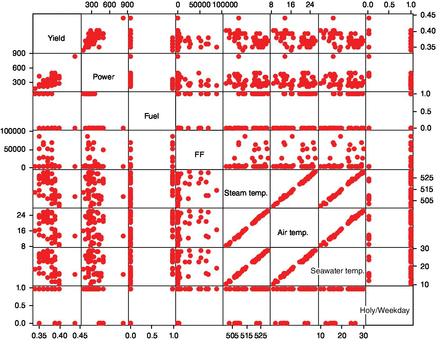
Figure 15.15 Matrix plot of all variables in the power plant case study.

Figure 15.16 Scatterplot of yield versus power (with outlier) in the power plant case study.
The technicians know that a yield of 0.44 is an impossible value. Hence, this value must be due to an error and therefore this day is excluded from the study. Redoing the scatterplot without that point (Figure 15.17), we see the point marked by a square (row 49) appears isolated and perhaps it would be better not to include it in the study. Looking at the reports from that day, we discover that the power plant was restarted. The technicians consider that this day should not be included in the study because there are very few days with a restart of the power plant and because the performance during these days is exceptionally low. The model should not be based on such days. Hence, this data point is also deleted.

Figure 15.17 Scatterplot of yield versus power (without outlier) in the power plant case study.
Before starting the search for the best model, we add some variables, transformations of the original ones, which may improve the final model. The transformations considered reasonable are as follows:
- Squared term for power: The scatterplot of yield versus power shows a relation that can be better described by means of a quadratic curve than by a straight line.
- The inverse of the power: This type of nonlinear relationship can also be modeled through the inverse of the power. In addition, our knowledge of the yield’s formula makes us think that the inverse of the power is a reasonable variable.
- The logarithm of the form factor: The form factor shows some values grouped near zero (see dotplot in Figure 15.18).
After a logarithmic transformation is applied, the new dotplot shows better behavior (Figure 15.19).
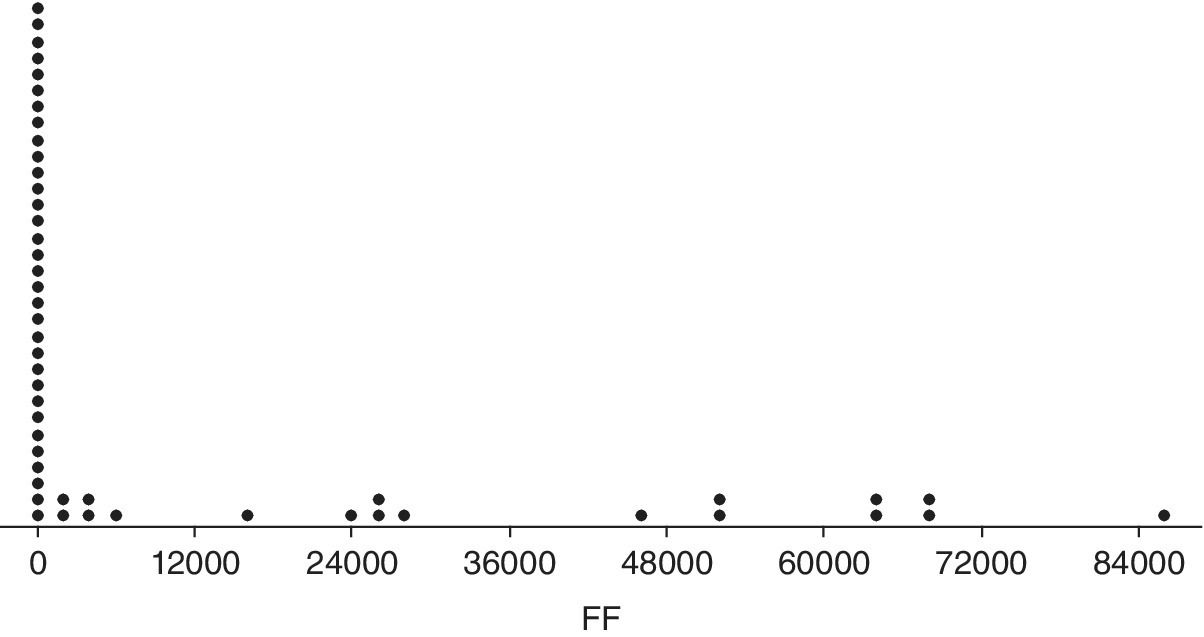
Figure 15.18 Dotplot of factor form in the power plant case study.
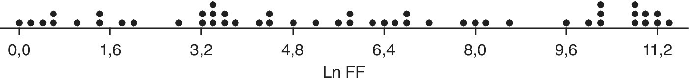
Figure 15.19 Dotplot of the logarithm of factor form in the power plant case study.
Using the best subsets command in Minitab (Stat > Regression > Regression > Best Subsets), we can generate all possible models. The models are ordered based on R2. Other goodness‐of‐fit indicators (U) are also presented as follows:

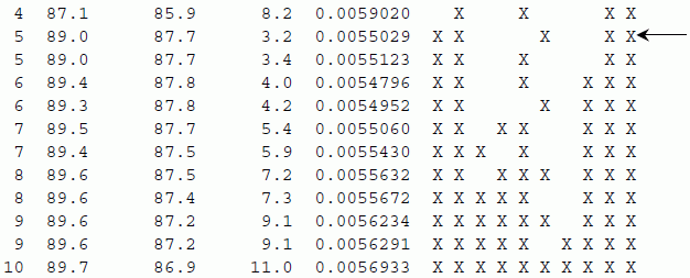
The most interesting model is indicated with an arrow (low values of Cp and S, high values of adjusted R2). This model can be fitted with the following result:
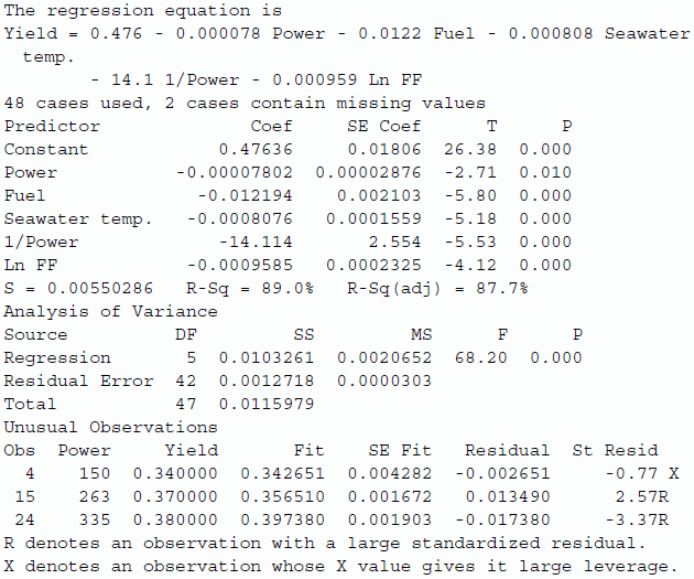
Nothing alarming appears when checking the residuals with a normal probability plot and a scatterplot of residuals versus fitted values, and the obtained model can be accepted without problems. The model can be used to predict yield based on power, fuel used, form factor, and seawater temperature.
We conclude this example with Table 15.1, the InfoQ assessment. The final InfoQ score obtained is 78%.
Table 15.1 InfoQ assessment for Example 1.
| InfoQ dimension | Score | Comments |
| Data resolution | 3 | Data at the day level is probably sufficient, although it could be beneficial having them at a lower aggregation level |
| Data structure | 5 | Outliers removed from the study are confirmed by technical expertise, number of decimal places in variables is sufficient |
| Data integration | 5 | Data are automatically registered from the power plant information systems, in a single database |
| Temporal relevance | 3 | Once the model is built, new predictions can be produced immediately. It is not clear if the model will be valid in case of profound changes in the process |
| Chronology of data and goal | 5 | Getting new data points for the model poses no difficulties |
| Generalizability | 4 | Although data from only 50 days were collected and in a single power plant, yield is based on physical principles, so it can probably be generalized |
| Operationalization | 5 | The model can be used for predicting yield in an easy way |
| Communication | 4 | Although the model can be interpreted, some kind of graphical representation (a dashboard, for instance) could facilitate understanding |
| Total score | 78% |
15.3.2 Example 2: Optimizing hardness of steering wheels
A manufacturer of steering wheels for cars had problems with the hardness of its product. The manufacturing process consists of injecting polyurethane into a mold.
To discover which variables affect the breakage index, a 23 factorial experiment is carried out with variables P (injection pressure), R (ratio of the two components of the polyurethane), and T (injection temperature). After properly choosing the levels and given the large variability detected in the hardness, a decision was made to replicate the experiment. The obtained results are shown in Table 15.2 (column Hardness1 is the first replicate, Hardness2 the second replicate).
Table 15.2 Results of the factorial experimental design of the steering wheels.
| P | R | T | Hardness1 | Hardness2 |
| −1 | −1 | −1 | 35 | 18 |
| 1 | −1 | −1 | 62 | 47 |
| −1 | 1 | −1 | 28 | 31 |
| 1 | 1 | −1 | 55 | 56 |
| −1 | −1 | 1 | 49 | 26 |
| 1 | −1 | 1 | 48 | 31 |
| −1 | 1 | 1 | 34 | 39 |
| 1 | 1 | 1 | 45 | 44 |
The aim is to analyze how each of the factors affects the hardness.
Minitab can be used both for creating the design matrix for a factorial design of experiments (thus getting the set of experimental conditions) and for analyzing the results.
As we have replicates, it is possible to estimate the variance of the response, and Minitab hence carries out significance tests for each of the coefficients in the model. The results are the following:
Estimated Effects and Coefficients for Hardness (coded units)Term Effect Coef SE Coef T PConstant 40,500 2,312 17,52 0,000P 16.000 8.000 2.312 3.46 0.009R 2.000 1.000 2.312 0.43 0.677T ‐2.000 ‐1.000 2.312 ‐0.43 0.677P*R 1.000 0.500 2.312 0.22 0.834P*T ‐11.000 ‐5.500 2.312 ‐2.38 0.045R*T ‐0.000 ‐0.000 2.312 ‐0.00 1.000P*R*T 2.000 1.000 2.312 0.43 0.677S = 9.24662 PRESS = 2736R‐Sq = 69.52% R‐Sq(pred) = 0.00% R‐Sq(adj) = 42.85%
The ratio of both components of the polyurethane (factor R) is inert within the range of values used in the experiment. Only pressure (P) and injection temperature (T) are active factors. We now have a look at the interaction between these two active factors (Figure 15.20).
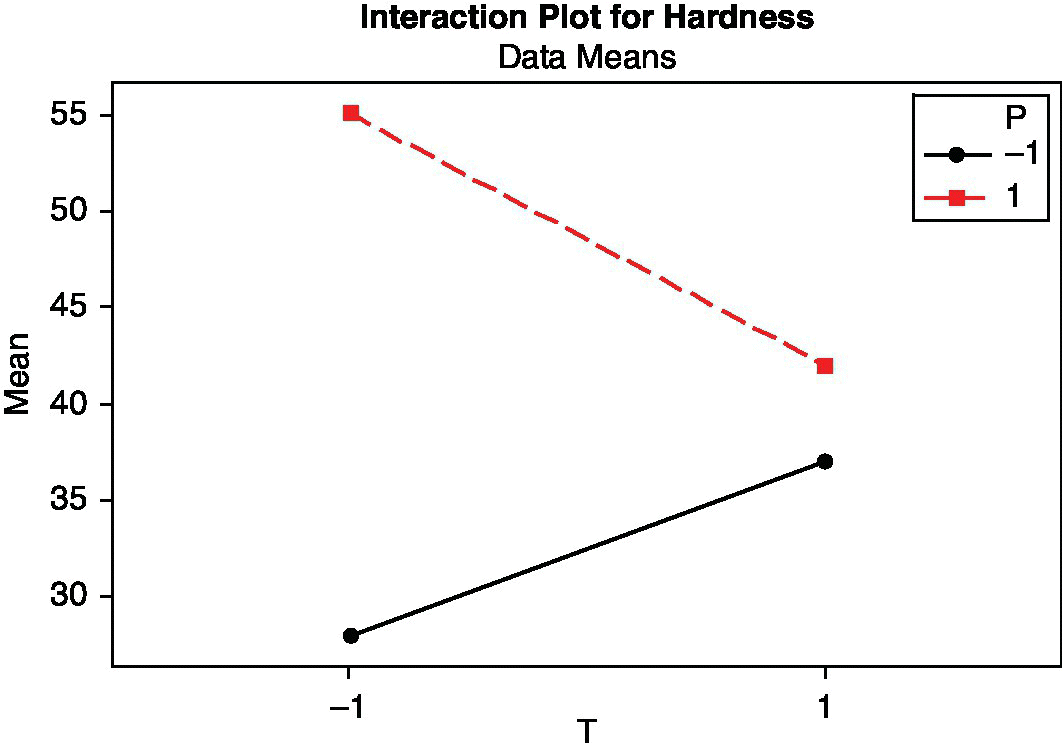
Figure 15.20 Interaction plot for pressure and temperature in the steering wheels case study.
The maximum resistance is obtained with pressure level + (denoted 1) and temperature level – (denoted –1). If at any time it is necessary to work with pressure level –, the temperature should be set at level +.
Although company technicians were satisfied with the information extracted from the experiment, a later study on the hardness of the steering wheels revealed that the previous experiment was not properly randomized. Initially, the first eight replicates were done, and then the other eight, with the aggravating circumstance that two weeks passed between both sets of experiments. Environmental conditions such as temperature and humidity may affect the characteristics of the components of polyurethane.
Therefore it was decided to reanalyze the experiment considering it as a 24 design, where a new factor W (level − for the eight runs of the first replication and level + for the eight runs of the second one) represents the differences (environmental or of other type) occurring during the two weeks that passed between the first and the second round. We’ll assume that these differences are due to weather changes (and thus we call the factor W “weather”).
As there is no replication now and no estimation of response variability is available, a common procedure to identify significant factors in a factorial design is representing the effects in a normal probability plot (Q–Q plot). Figure 15.21 shows the results given by Minitab.
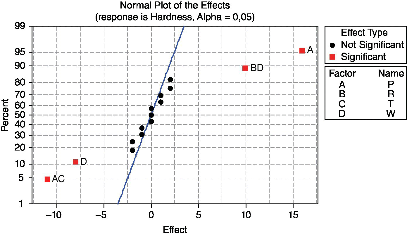
Figure 15.21 Normal probability plot of the effects in the steering wheels case study.
It is clear that the significant effects are A (P: pressure) and interaction AC (PT: pressure–temperature). Up to this point, the result is the same as in the previous analysis. However, also D (W: weather) and the interaction BD (RW: ratio–weather) are significant. Analyzing interaction PT, conclusions are the same as before. However, analyzing interaction RW, we obtain the interaction plot shown in Figure 15.22.

Figure 15.22 Interaction plot for ratio and weather in the steering wheels case study.
If R is at level –, weather clearly affects the hardness of the steering wheels; however, if it is at level +, this influence is much less. Previously, when the environmental conditions were ignored, R appeared as inert; so its value was insignificant. Now, in view of its interaction with weather, it can be used to neutralize the influence of environmental conditions and get a robust product independent of its production conditions.
We conclude this example with Table 15.3, the InfoQ assessment. The final InfoQ obtained is 87%.
Table 15.3 InfoQ assessment for Example 2.
| InfoQ dimension | Score | Comments |
| Data resolution | 5 | Data are collected in an experimental setting, thus assuring appropriateness |
| Data structure | 4 | The assumption of having real replicates appears incorrect but has been corrected with the reanalysis of the data |
| Data integration | 5 | Data are collected from the experimental setting, in a controlled environment |
| Temporal relevance | 4 | The model obtained taking into account machine parameters poses no difficulties, although changing environmental conditions could decrease model validity |
| Chronology of data and goal | 4 | Machine conditions coming from control factors can be set without difficulties, although this is not true for environmental conditions (could be considered a noise factor) |
| Generalizability | 4 | Discoveries made from the experiment will be useful for other similar machines producing wheels |
| Operationalization | 5 | The knowledge gained from the experiment can be used to define appropriate technical conditions |
| Communication | 5 | Graphical output showing main effects and interaction plots clearly communicate the effect of each factor |
| Total score | 87% |
15.4 Summary
Minitab is characterized by its ease of use. You can start using it almost without any prior training and autonomously progress in the understanding of its possibilities. From the point of view of the dimensions of InfoQ, Minitab lets you work with data on the desired resolution and easily organize it in a familiar structure of rows and columns that is very practical. Data can be easily integrated from a spreadsheet (although direct integration of data captured by external sensors is not provided). It has plenty of opportunities for graphical analysis and use of statistical methods. Its output is provided in a manner that is easy to use for fast and effective communication.
Besides developing aspects of Minitab that can support each of the eight dimensions of InfoQ, the two case studies offered in this chapter are examples of the simplicity and efficiency of Minitab as a statistical software for quality improvement and data‐driven decisions.
References
- Albert, J.H. (1993) Teaching Bayesian statistics using sampling methods and Minitab. The American Statistician, 47, 3, pp. 182–191.
- Grima, P., Marco, L. and Tort‐Martorell, X. (2012) Industrial Statistics with Minitab. John Wiley & Sons, Ltd, Chichester, UK.
- Hand, D.J. (2008) Statistics: A Very Short Introduction. Oxford University Press, Oxford.
- Kenett, R.S. and Zacks, S. (2014) Modern Industrial Statistics: With Applications Using R, Minitab and JMP, 2nd edition. John Wiley & Sons, Ltd, Chichester, UK.
- Marriott, J.M. and Naylor, J.C. (1993) Teaching Bayes on Minitab. Journal of the Royal Statistical Society, Series C (Applied Statistics), 42, 1, pp. 223–232.
- Tukey, J.W. (1977) Exploratory Data Analysis. Addison‐Wesley, Reading, MA.