Creating Style Rules
We've seen how to create selectors in rules; it's time to take a look at creating rules themselves. A rule is composed of a selector followed by a semicolon-separated list of property-value pairs enclosed in curly braces, like this:
TITLE {display: block; font-size: 24pt; font-weight: bold;
text-align: center; text-decoration: underline}
In this case, I'm setting values for the display, font-size, font-weight, text-align, and text-decoration properties. You assign a value to a property by following the name of the property with a colon, whitespace, and the value that you want to assign.
Quite a number of properties are defined in CSS, and the best way to get a grip on what's going on is to actually use them, so we're about to see a lot of examples.
Creating Block Elements
You might have noticed the property-value pair display: block in the rules in style.css:
TITLE {display: block; font-size: 24pt; font-weight: bold;
text-align: center; text-decoration: underline}
AUTHOR {display: block; font-size: 18pt; font-weight: bold;
text-align: center}
SECTION {display: block; font-size: 16pt; font-weight: bold;
text-align: center; font-style: italic}
P {display: block; margin-top: 10}
In particular, display: block specifies that the element in question get its own block, which means that these elements start on a new line, and the element following them starts on a new line as well—that is, you use display: block to create block-level elements.
The display property is more important in XML style sheets than it is in HTML style sheets because HTML styles such as <H1> already inherit the display: block style. To create elements that you want set off from other elements, such as paragraphs and headers, use display: block. (For example, using this style specification is the reason that elements such as <TITLE>, <AUTHOR>, <SECTION>, and so on appear on their own lines, as shown earlier in Figure 9.2.
Specifying Height and WidthYou can specify the width and height of a block using the width and height properties; see the section "Displaying Images," later in this chapter, for more details. |
Styling Text
Setting text styles is one of the more important aspects of cascading style sheets, but the process is not straightforward. Here are some properties that you can use with text:
Here's an example of putting some of these properties to use. In this case, I'll specify 18-point (a point is 1/72 of an inch) centered text in italic Arial (or Helvetica, if the browser can't find the Arial font face):
TITLE {display: block; font-size: 24pt; font-weight: bold;
text-align: center; text-decoration: underline}
AUTHOR {display: block; font-size: 18pt; font-weight: bold;
text-align: center}
SECTION {display: block; font-size: 16pt; font-weight: bold;
text-align: center; font-style: italic}
P {display: block; font-size: 18pt; font-style: italic; font-family:
Arial, Helvetica; text-align: center; margin-top: 10}
You can see the results of using this style sheet with the previous XML document in Figure 9.8.
Figure 9.8. Using font properties.

As with many groups of properties, you can use a shortcut property to set the font-style, font-variant, font-weight, font-size, line-height, and font-family properties all at once—the font property. To use this shortcut property, you just specify values for all these properties (in the order that I've given here), separating the font-size and line-height values with a forward slash (/) and listing all values without commas (except between font family names, if you list more than one). Here's an example using the font shorthand property:
TITLE {display: block; font-size: 24pt; font-weight: bold;
text-align: center; text-decoration: underline}
AUTHOR {display: block; font-size: 18pt; font-weight: bold;
text-align: center}
SECTION {display: block; font-size: 16pt; font-weight: bold;
text-align: center; font-style: italic}
P {display: block; font: italic normal bold 12pt/10pt arial,
             helvetica; text-align: center}
Most groups of properties—such as the font properties, or those you use to set borders—have a shortcut property that lets you set multiple property values at once. I'll list some of these shortcut properties and how to use them at the end of this chapter.
Setting Colors and Backgrounds
Here are the properties that you use to set color and backgrounds:
There's also a background shorthand property that you can set to the background color, image, repeat, attachment, and position all at once (list those values in order). I'll cover more on how to use this shorthand property at the end of the chapter.
In this next example, I'm styling both the background and the foreground (that is, the text color) of a document. In this case, I'm setting the background color of the <DOCUMENT> element to coral. Note that because all the other elements in the document are children of this element, they'll all inherit this background color—except for the <P> element, in which I'm specifically setting the background to white and coloring the text blue:
DOCUMENT {background-color: coral}
TITLE {display: block; font-size: 24pt; font-weight: bold;
text-align: center; text-decoration: underline}
AUTHOR {display: block; font-size: 18pt; font-weight: bold;
text-align: center}
SECTION {display: block; font-size: 16pt; font-weight: bold;
text-align: center; font-style: italic}
P {display: block; background-color: white; color: blue}
You can see the results in Figure 9.9 (of course, the coral background appears gray here).
Figure 9.9. Using font properties to style foreground and background.
Although dozens of colors are predefined in most browsers, the CSS standards define only 16 colors:
Aqua
Black
Blue
Fuchsia
Gray
Green
Lime
Maroon
Navy
Olive
Purple
Red
Silver
Teal
White
Yellow
In this example, I used the predefined colors coral, blue, and white, but you can also define your own colors as color triplets: #rrggbb. Here, rr, gg, and bb are two-digit hexadecimal values that you use to specify the red, green, and blue components of a color, just as you do in HTML. For example, white is #ffffff, black is #000000, pure blue is #0000ff, pure red is #ff0000, pink is #ffcccc, orange is #ffcc00, and coral is #ff7f50. Using color triplets, here's what the previous style sheet looks like:
DOCUMENT {background-color: #ff7f50}
TITLE {display: block; font-size: 24pt; font-weight: bold;
text-align: center; text-decoration: underline}
AUTHOR {display: block; font-size: 18pt; font-weight: bold;
text-align: center}
SECTION {display: block; font-size: 16pt; font-weight: bold;
text-align: center; font-style: italic}
P {display: block; background-color: #ffffff; color: #0000ff}
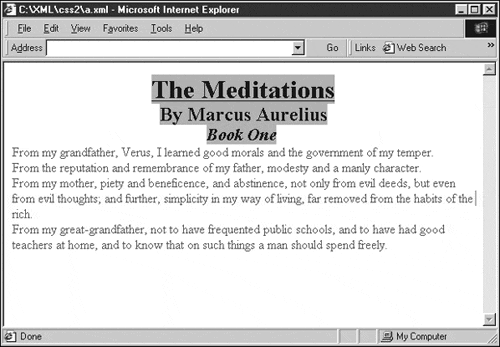
Here's another example that we saw in the beginning of this chapter, where I gave the <TITLE> element a pink background and red foreground:
<?xml version="1.0" standalone="yes"?>
<?xml-stylesheet type="text/css" href="style.css"?>
<DOCUMENT>
    <TITLE CLASS="RED">The Meditations</TITLE>
    <AUTHOR>By Marcus Aurelius</AUTHOR>
    <SECTION>Book One</SECTION>
    <P>
        From my grandfather, Verus, I learned good morals
        and the government of my temper.
    </P>
    <P>
        From the reputation and remembrance of my father,
        modesty and a manly character.
    </P>
    <P>
        From my mother, piety and beneficence, and abstinence,
        not only from evil deeds, but even from evil
        thoughts; and further, simplicity in my way of living,
        far removed from the habits of the rich.
    </P>
    <P>
        From my great-grandfather, not to have frequented
        public schools, and to have had good teachers at home,
        and to know that on such things a man should spend
        freely.
    </P>
</DOCUMENT>
The RED class was defined this way:
TITLE {display: block; font-size: 24pt; font-weight: bold;
text-align: center; text-decoration: underline}
AUTHOR {display: block; font-size: 18pt; font-weight: bold;
text-align: center}
SECTION {display: block; font-size: 16pt; font-weight: bold;
text-align: center; font-style: italic}
P {display: block; margin-top: 10}
.RED {color:red; background-color: pink}
Margins, Indentations, and Alignments
Here are the properties that you use to work with margins, indentations, and alignments:
| Property | Description |
|---|---|
| line-height | Indicates the height given to each line. Set this to an absolute measurement or a percentage value such as 200% to create double-spacing. |
| margin-left | Sets the left margin of a block element. |
| margin-right | Sets the right margin of a block element. |
| margin-top | Sets the top margin of a block element. |
| text-align | Sets the alignment of text; set this to left, right, center, or justify. |
| text-indent | Sets the indentation of the first line of block-level elements. Set this to an absolute value such as 10 pixels, 10px, or 4 points, 4pt. |
| vertical-align | Sets the vertical alignment of text; set this to baseline, sub, super, top, text-top, middle, bottom, or text-bottom. |
Here's an example showing how to put some of these properties to work. In this style sheet, I'm indenting the first line of each paragraph by 40 pixels. (For more on the kinds of units that you use to specify lengths, see Table 9.1, later in this chapter.) I'm also indenting all the text in paragraphs by 20 pixels:
TITLE {display: block; font-size: 24pt; font-weight: bold;
text-align: center; text-decoration: underline}
AUTHOR {display: block; font-size: 18pt; font-weight: bold;
text-align: center}
SECTION {display: block; font-size: 16pt; font-weight: bold;
text-align: center; font-style: italic}
P {display: block; text-indent: 40px; margin-left: 20px}
You can see the results in Figure 9.10. As you see there, the first line of each paragraph is indeed indented, and the paragraph text is also moved to the left.
Figure 9.10. Indenting text using a style sheet.

Applying Styles to Lists
This table describes the properties you typically use with lists:
| Property | Description |
|---|---|
| list-item | Set the display property to this value to create a list. |
| list-style-image | Sets the image that will be used as the list item marker. This is used in Internet Explorer 5 and later only. |
| list-style-type | Sets the appearance of the list item marker, such as disc,circle,square,decimal,lowercase Roman, uppercase Roman, and others. |
Here's an example; in this case, I'm setting the marker in front of each list item in an unordered list to a square using list-style-type—note that you have to set the display property to list-item:
TITLE {display: block; font-size: 24pt; font-weight: bold;
text-align: center; text-decoration: underline}
AUTHOR {display: block; font-size: 18pt; font-weight: bold;
text-align: center}
SECTION {display: block; font-size: 16pt; font-weight: bold;
text-align: center; font-style: italic}
P {display:list-item; list-style-type: square}
Creating Borders
You can also create borders for elements using CSS, setting the border style, border width, border color, and so on. These border properties are available:
| Property | Description |
|---|---|
| border-bottom-width | Width of the bottom of the border; set this to Creating Style Rules an absolute measurement such as 10px for 10 pixels, or 4pt for 4 points, or a keyword: thin, medium, or thick. |
| border-color | The color in which you want the border to be displayed (use a predefined color or a color triplet). Setting this property to one value sets the color of the whole border; two values set the top and bottom borders to the first value, and the right and left borders to the second; four values set the color of all border parts in order: top, right, bottom, and left. |
| border-left-width | Width of the left edge of the border; set this to an absolute measurement such as 10px for 10 pixels, or 4pt for four points, or a keyword: thin, medium, or thick. |
| border-right-width | Width of the right edge of the border; set this to an absolute measurement such as 10px for 10 pixels, or 4pt for 4 points, or a keyword: thin, medium, or thick. |
| border-style | Sets the border style. Possible values include dotted, dashed, solid, double, groove, ridge, inset, and outset. |
| border-top-width | Width of the top of the border; set this to an absolute measurement such as 10px for 10 pixels, or 4pt for 4 points, or a keyword: thin, medium, or thick. |
There are also five shorthand border properties:
| Property | Description |
|---|---|
| border-top | Sets the style of the top border |
| border-right | Sets the style of the right border |
| border-bottom | Sets the style of the bottom border |
| border-left | Sets the style of the left border |
| border | Sets the border style all at once |
You set the shorthand properties to a width, style, and color all at once like this:
P {border 10pt solid cyan}
Here's an example; in this case, I'm adding a border to the <SECTION> element in our XML document:
TITLE {display: block; font-size: 24pt; font-weight: bold;
text-align: center; text-decoration: underline}
AUTHOR {display: block; font-size: 18pt; font-weight: bold;
text-align: center}
SECTION {display: block; font-size: 16pt; font-weight: bold;
text-align: center; font-style: italic; border-style: solid}
P {display:block}
You can see the results in Figure 9.11, where you can see the solid border around the <SECTION> element. (I might note in passing that it's a good thing that we selected a solid border for this element: Internet Explorer currently cannot draw anything but solid borders around elements.)
Figure 9.11. Enclosing an element in a block.

Displaying Images
You can use several properties with images:
| Property | Description |
|---|---|
| background-image | Sets a background image; set this to an URL. |
| background-repeat | Specifies whether the background image should be tiled; set this to repeat, repeat-x (repeat in the x direction), repeat-y (repeat in the y direction), or no-repeat. |
| background-attachment | Specifies whether the background scrolls with the rest of the document. |
| background-position | Sets the initial position of the background. Specify an x and y coordinate here (where the origin is at upper-left), such as background-position: 0% 100% to add a background image to the lower-left. |
There's also a background shorthand property that you can set to the background color, image, repeat, attachment, and position all at once (list those values in order).
Here's an example showing how to use a background image. In this case, I'll add a background image to appear behind text in <P> elements, making that image repeat until it fills all the space behind the <P> element—note that you specify an URL with the url keyword:
TITLE {display: block; font-size: 24pt; font-weight: bold;
text-align: center; text-decoration: underline}
AUTHOR {display: block; font-size: 18pt; font-weight: bold;
text-align: center}
SECTION {display: block; font-size: 16pt; font-weight: bold;
text-align: center; font-style: italic}
P {background-image: url(image.jpg);
    background-repeat: repeat}
For this example, I'll condense all the <P> elements in our XML document into one <P> element so that the result, showing the background image, will be clearer:
<?xml version="1.0" standalone="yes"?>
<?xml-stylesheet type="text/css" href="style.css"?>
<DOCUMENT>
    <TITLE CLASS="RED">The Meditations</TITLE>
    <AUTHOR>By Marcus Aurelius</AUTHOR>
    <SECTION>Book One</SECTION>
    <P>
        From my grandfather, Verus, I learned good morals
        and the government of my temper.
        From the reputation and remembrance of my father,
        modesty and a manly character.
        From my mother, piety and beneficence, and abstinence,
        not only from evil deeds, but even from evil
        thoughts; and further, simplicity in my way of living,
        far removed from the habits of the rich.
        From my great-grandfather, not to have frequented
        public schools, and to have had good teachers at home,
        and to know that on such things a man should spend
        freely.
    </P>
</DOCUMENT>
You can see the results in Figure 9.12, where the background image does indeed appear behind the text.
Figure 9.12. Displaying a background image.

What if you just want to display an image by itself? In that case, you can create a dedicated element that uses the image as its background image. Here's an example—note that I'm setting the height and width properties to the size of the image. Note also that I'm using the float property to indicate that text should flow around the left of this element:
TITLE {display: block; font-size: 24pt; font-weight: bold;
text-align: center; text-decoration: underline}
AUTHOR {display: block; font-size: 18pt; font-weight: bold;
text-align: center}
SECTION {display: block; font-size: 16pt; font-weight: bold;
text-align: center; font-style: italic}
P {display:block}
IMG {background: url(image.jpg) no-repeat center center;
    height: 66px;
    width: 349px;
    float: right}
Here's how I add the <IMG> element to the document:
<?xml version="1.0" standalone="yes"?>
<?xml-stylesheet type="text/css" href="style.css"?>
<DOCUMENT>
    <TITLE CLASS="RED">The Meditations</TITLE>
    <AUTHOR>By Marcus Aurelius</AUTHOR>
    <SECTION>Book One</SECTION>
    <IMG></IMG>
    <P>
        From my grandfather, Verus, I learned good morals
        and the government of my temper.
        From the reputation and remembrance of my father,
        modesty and a manly character.
        From my mother, piety and beneficence, and abstinence,
        not only from evil deeds, but even from evil
        thoughts; and further, simplicity in my way of living,
        far removed from the habits of the rich.
        From my great-grandfather, not to have frequented
        public schools, and to have had good teachers at home,
        and to know that on such things a man should spend
        freely.
    </P>
</DOCUMENT>
You can see the results in Figure 9.13.
Figure 9.13. Displaying an image.

Absolute Positioning
You can use the position property to set the position of elements in a Web page. I'll take a look at positioning items in absolute terms in this section and in relative terms in the next section. Here are the properties that you commonly use when working with positioning:
In this example, I'll set the absolute position of the image that we used in the previous example so that it's directly on top of the text:
TITLE {display: block; font-size: 24pt; font-weight: bold;
text-align: center; text-decoration: underline}
AUTHOR {display: block; font-size: 18pt; font-weight: bold;
text-align: center}
SECTION {display: block; font-size: 16pt; font-weight: bold;
text-align: center; font-style: italic}
P {display: block; }
IMG {background: url(image.jpg) no-repeat center center;
    height: 66px;
    width: 349px;
    position:absolute; left:50; top:160;
    border-width: thick}
You can see the results in Figure 9.14; as you see there, the image has indeed moved so that it's now on top of the text. Using this technique, you can place elements as you like.
Figure 9.14. Using absolute positioning.

Relative Positioning
In addition to absolute positioning, you can use relative positioning. When you use relative positioning, elements are positioned relative to the location that they would have had in the normal flow of elements in the Web browser.
To position items in a relative way, you set the position property to relative. You can also set the other properties to indicate the new relative position. In this example, I'm moving some text—the name Verus—up 5 pixels from the normal position at which the browser would place this text with a new element, <SUP>, where I'm using a STYLE attribute to set the relative position:
<?xml version="1.0" standalone="yes"?>
<?xml-stylesheet type="text/css" href="style.css"?>
<DOCUMENT>
    <TITLE>The Meditations</TITLE>
    <AUTHOR>By Marcus Aurelius</AUTHOR>
    <SECTION>Book One</SECTION>
    <P>
        From my grandfather,
        <SUP STYLE="position: relative; top: -5">Verus</SUP>,
        I learned good morals and the government of my temper.
    </P>
    <P>
        From the reputation and remembrance of my father,
        modesty and a manly character.
    </P>
    <P>
        From my mother, piety and beneficence, and abstinence,
        not only from evil deeds, but even from evil
        thoughts; and further, simplicity in my way of living,
        far removed from the habits of the rich.
    </P>
    <P>
        From my great-grandfather, not to have frequented
        public schools, and to have had good teachers at home,
        and to know that on such things a man should spend
        freely.
    </P>
</DOCUMENT>
You can see the results in Figure 9.15, where, as you can see, the text inside the <SUP> element is positioned higher than the rest.
Figure 9.15. Using relative positioning.
