ENGAGING LECTURE TIP 19
Less Is More
Most of us have heard of and likely experienced a PowerPoint presentation when a presenter displays too much text on a single slide, which he or she then proceeds to read. The audience is caught between the choice of whether to pay attention to the slide or the speech because we cannot do both simultaneously, and typically chooses to read the slide because most people read faster than the typical rate of human speech. Then we must wait as the speaker dutifully attends to each word on the slide, the same words we've long before finished reading. We are bored. Hmmm, perhaps a quick check for messages on the phone while waiting for the speaker to catch up …
Poorly designed slide presentations interfere with our main messages. There are better methods, however, and speakers who use presentation software effectively have much to offer us as we seek to find our own styles. These speakers tend to go with minimalist slide design, showing only a few words or a single carefully selected image to support their oral presentation. We call this Tip Less Is More to signify the minimalist approach to slide design.
To do more with less, consider the following suggestions:
- Use simple but visually powerful slides.
- Use keywords to support your ideas; words should be easy to understand even and especially if the ideas behind them are complex.
- Create powerful slides by using high-quality images, which can be more memorable than text.
- Don't read from the slides; information is only interesting once, so let the students read a keyword or two to have it anchor the message you are trying to convey.
The challenge of minimalist slide design is that the lecturer really has to know his or her content. Thus this challenge is also one of the benefits of this approach because it challenges lecturers to be prepared and to think through the lecture ahead of time.
There are several pioneers of minimalist slide design who can serve as models while you learn to craft your own Less Is More style. Some of the notable ones are as follows.
Takahashi The Takahashi method uses one or two oversized keywords as a visual for the slide. Presenters who use this method do not use charts, pictures, abstract designs, or bulleted lists. It is a quickly paced presentation approach that relies on many more slides than a typical presentation. The oversized keyword(s) help the audience follow the presentation and understand the main emphasis of each idea. A Takahashi style slide might look like what is shown in Figure 7.2.

Figure 7.2 Takahashi Slide Design
Kawasaki The Kawasaki approach is also known as the 10–20–30 method. During the presentation, the speaker uses 10 slides, 20 minutes, and 30-point font or larger. This approach keeps the presentation clear and concise. It is direct and also tends to keep the audience's attention. A slide using the Kawasaki method might look like what is shown in Figure 7.3.
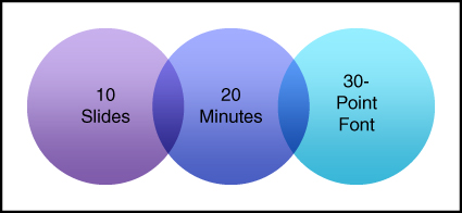
Figure 7.3 Kawasaki Slide Design
Lessig The Lessig method is another minimalist technique using slide decks. Using this method, one might spend fifteen to twenty seconds on a slide, using keywords on the slide or full-slide images to support the words of the speech. Slides look like what is shown in Figure 7.4.
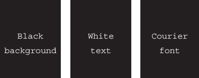
Figure 7.4 Lessig Slide Design
Godin Godin's method involves use of bold fonts, contrasting colors, and striking images to convey ideas in order to produce visually appealing presentations that create an emotional connection between the presenter and the listeners. Godin's rules are six words or fewer, no cheesy images, no transitions, limited sound used only for impact, and no printed handouts of the slides. Slides have elements similar to those shown in Figure 7.5.
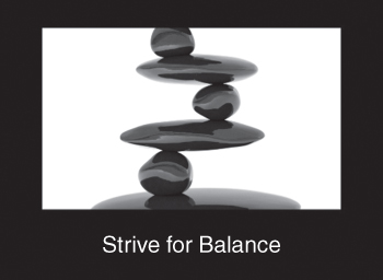
Figure 7.5 Godin Slide Design
Example
Key References and Resources
- Barkley, E. F., & Major, C. H. (2016). Learning assessment techniques: A handbook for college faculty. San Francisco, CA: Jossey-Bass.
- Godin, S. (2001). Really bad PowerPoints. Retrieved from www.sethgodin.com/freeprize/reallybad-1.pdf
- Slide Comet. (n.d.). Presentation design techniques. Retrieved from http://journaux.cegep-ste-foy.qc.ca/educenligne/public/Fichiers_attaches/presentationdesigntechniques-130510022136-phpapp02.pdf
- Slide Genius. (2016). Five effective PowerPoint delivery methods for presentations. Retrieved from www.slidegenius.com/blog/5-effective-powerpoint-delivery-methods-for-presentations/