Chapter 7. Improving Power BI reports
The previous chapters introduce many features of Power BI that are related to data modeling, publishing, and sharing. The focus in those chapters is on the data and the numbers, not on the presentation. Our friend David took advantage of these features to create a solution that uses Power BI to support a collaborative effort in the yearly budgeting process for his company, Contoso. Those chapters intentionally do not focus on the presentation layer or the visual options of Power BI, but now it is time to improve the reports and dashboards in your models.
This chapter is dedicated to the visual presentation capabilities of Power BI. We will use different dashboards with different datasets and requirements to show you the different scenarios and tools available. For this reason, we’re going to look beyond David’s requirements for his solution—we need a broader scope now. So, you will learn how to choose between the built-in visualizations available in Power BI, how to use custom visuals, how to use DAX to solve common reporting issues, and, finally, what the correct approach is for designing high-density reports.
This chapter is neither a step-by-step tutorial for using the visual editor in Power BI, nor a complete visual design patterns guide covering all the possible types of standard and custom visualizations. Its goal is to show you the available options in Power BI and act as an initial guide to choosing visualization solutions, depending on your requirements. We will do that by providing different practical examples that are available in the companion content, so that you can open the files and analyze the data in more detail, reviewing all the properties we used. In these pages, we provide commentary, explaining the reason for certain design choices; you should be able to apply the same principles when designing your own reports.
Choosing the right visualizations
You have several standard visualizations available in Power BI. In addition, you will see that you can extend this set by using custom visualizations. But, before doing that, you need to know what you can and cannot do using the standard components, which you can see in Figure 7-1.

The list of standard visuals includes 27 components in Power BI that are available as of this writing, but this might expand in future versions. Here are descriptions of the standard components:
• Stacked bar chart Use this when you want to compare different values of the same measure, side by side, or when you need to display different measures that are a part of the same whole. The bars are horizontally oriented rows.
• Stacked column chart The same as a stacked bar chart, but vertically oriented.
• Clustered bar chart Similar to the stacked bar chart, but instead of comparing different measures within the same bar, with a clustered bar chart you can compare different measures side by side.
• Clustered column chart The same as a clustered bar chart, but vertically oriented.
• 100% Stacked bar chart Similar to the stacked bar chart, but with each measure using a slice of each bar, which always corresponds to the entire width available (100%).
• 100% Stacked column chart The same as the 100% stacked column chart, but vertically oriented.
• Line chart Use this to display the trend of some measures over time. Usually the y-axis has a range that does not include zero.
• Area chart Similar to the line chart, use this when you want to display cumulative data rather than sequences of points. Usually, the y-axis range begins at zero, and there is only one measure. This looks like a line chart wherein the areas are filled with layers of colors.
• Stacked area chart Similar to the area chart, but with each measure cumulated to the others.
• Line and stacked column chart Use this when you need to display measures with different scales, such as currency and percentage, or different value ranges.
• Line and clustered column chart The same as the line and stacked column chart, but using clustered columns instead of stacked columns.
• Waterfall chart Use this to display cumulative data, highlighting for each value its positive or negative value. The initial and final value columns usually start on the horizontal access, with color-coded floating columns between them, making it look like a waterfall or bridge.
• Scatter chart Use this when you want to show possible correlations between two measures.
• Pie chart Use this to display the distribution of values of one or more measures. The values appear as pieces of the pie, with the larger values taking up larger slices. However, using pie charts is not a best practice.
• Treemap Similar to a pie chart, but using a rather different graphical representation, wherein the values are represented by colored rectangles on a page. It could be an alternative to a pie chart, but it is equally unreadable when you have many elements in it.
• Map Use this to display geographical data with variable-sized circular shapes on Bing maps.
• Table Use this to display data in a textual form as a simple table, where every attribute and every measure is a single column in the result.
• Matrix This extends the table, making it possible to group the measures by rows and columns.
• Filled map Similar to the map, but the data is represented by colored overlay areas.
• Funnel Similar to the stacked bar chart, but with a single measure and a different graphical representation, wherein the rows are stacked in order, which makes the chart look like a funnel.
• Gauge Use this to display a single measure against a goal. This chart resembles a gauge style that is common in cars.
• Multi-row card Use this to display different measures and attributes for each instance of an entity, each placed on a different colored and graphical card.
• Card Use this to display a single numerical value of a measure textually, placed on a colored and graphical card.
• KPI Use this to display a single value with a trend line chart in the background, highlighting its performance with colors.
• Slicer Use this to filter one or more charts by selecting values of an attribute.
• Donut chart Similar to the pie chart, but with a donut or tire-like graphical representation. However, using donut charts is not a best practice.
• R script visual Use this to display charts generated by R-language code.
The first design principle is simple: just because you have many components, there is no reason for you to use all of them. In a single report, the presence of many different types of components can be confusing. Thus, do not put too many different visualizations in the same report without a good reason. Moreover, the default properties of a component are not necessarily the right choice for your report, so you should consider modifying their value to better display your data. You will see several examples of these principles applied to our first report example.
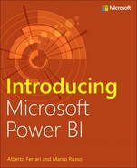
For instance, consider a dashboard displaying Sales for Contoso. By choosing the right visualization and setting the right colors, you can obtain a good presentation of your data, focusing your viewer’s attention on the data instead of the visualization itself. You can see a first version of this dashboard in Figure 7-2, in which sales amount, margin, and target values are sliced by date, brand, subcategory, and class. This dashboard is available on the page “Sales 2015” of the Sample-Sales.pbix file included in the companion content.
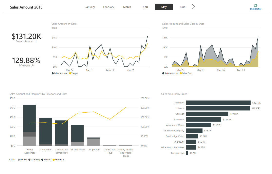
Figure 7-2: First version of a report displaying Contoso’s sales in 2015 using standard visualizations.
The first thing to notice in Figure 7-2 is that there are only two colors used in the report: black and yellow. Items in black identify the sales amount measure, whereas items in yellow are for other comparison measures (target, sales cost, and margin percent, depending on the visualization).
The four charts in the report use a limited number of common visualizations: line chart, bar chart, and columns chart. The rationale behind each visualization choice is described in the next section, but in general it is better to use simple, well-known visualizations when that is sufficient to produce the display of useful and understandable information.
Choosing between standard visuals
The first chart in Figure 7-2 compares Sales Amount and the Target values using a simple line chart. Figure 7-3 shows this in more detail.

The line chart is the primary choice when you display a measure over a date range or time, using the x-axis for the temporal dimension. You can select the colors of the different measures by using the Data Colors properties, as demonstrated in Figure 7-4. Here you can select the color of each measure included in the line chart.

You can use a slight variation of the line chart when a measure that you want to display is part of another measure. For example, consider the Sales Amount and Sales Cost measures. Hopefully, Sales Cost is always lower than Sales Amount, and the graphical distance between them represents this margin. With the line chart, the gap between the two measures might not be clear, so you might want to “paint” the area below the line by using the values of the measures along time. The area chart does exactly this, as illustrated in Figure 7-5.

The y-axis must begin at zero; otherwise, the area would not be fully representative of the two values. The visible gray area expresses the delta between the two measures in a graphical way and corresponds to the margin. You should not use an area chart when you have several intersections between different lines. You should consider it only when measures do not intersect often. The example in Figure 7-5 demonstrates one of the few cases for which you can consider using it.
Note
For the sample reports in this chapter, for the most part we do not use pie charts and donut charts. This is because they are not considered a best practice, with an exception that you will see in the last section. The human brain can more easily make comparisons between lengths (as in a bar chart) than between angles (as in pie and donut charts).
Comparing measures with different scales requires particular visualizations. You need to display two y-axes, and you need a way to easily associate the axis corresponding to each measure. For example, Figure 7-6 shows a line and stacked column chart that yields more details by displaying the sales amount measure divided by category and class, compared with the margin percent divided by category.

Figure 7-6: A line and stacked column chart of sales amount and margin percent by category and class.
The scale of the main measure (sales amount) is represented on the left y-axis, and the other measure (margin percent) is on the right y-axis. The x-axis shows the name of the category corresponding to each column, which is also divided by class using different shades of gray. Figure 7-7 shows the properties of this component used to bind data. The x-axis is called the shared axis, and it can include more than one attribute. In this case, we used two product attributes: Category and Subcategory. This makes it possible to perform an interactive drill-down of data in Power BI.

You can activate the drill-down feature for the selected column chart by clicking the drill down button (the down-arrow icon) located in the upper-right corner of the visualization. When drill-down mode is turned on, the drill-down button changes to display a black background, as depicted in Figure 7-8.

Figure 7-8: The drill-down button in a visualization. The black background signifies that drill-down mode is turned on.
With drill-down mode activated, when you click a column within the chart, you can drill down to that column’s respective subcategories. Figure 7-9 shows the resulting chart when you click the Computers column in Figure 7-6. Note all of the subcategories that are related to the Computers category.

Figure 7-9: A line and stacked column chart of sales amount and margin percent by subcategory and class for the Computers category.
To drill up, in the upper-left corner of the visualization, click the drill-up button (the up-arrow icon), as highlighted in Figure 7-10.

After you move up to the product category again, you can drill down to all of the subcategories for every category by selecting the double-arrow button in the upper-left corner of the visualization, as illustrated in Figure 7-11.

When you drill down to the subcategory level for all the categories, you obtain a chart similar to that shown in Figure 7-12. Both the Sales Amount and Margin percentage measures have the subcategories granularity in the chart, so you can still compare them.

Figure 7-12: A line and stacked column chart of sales amount and margin percent by subcategory and class, for all the categories.
More info
You can find an animated guide on how to use the drill-down feature in Power BI at https://powerbi.microsoft.com/documentation/powerbi-service-drill-down-in-a-visualization/.
Using custom visualizations
Power BI provides a number of embedded visualizations that are ready to use. By changing properties of the existing components, you can create solid presentations of your data. However, sometimes you might want to present data in a way that is not possible using the standard components. Power BI provides you with a gallery of custom visualizations that have been created by members of the Power BI community. You can download and install one or more of these custom visualizations in your report. To view a gallery of custom visualizations, go to https://app.powerbi.com/visuals/.
In this section, we will improve Power BI reports using features available in selected custom visualizations. The goal is to show you how to include custom visualizations in your report and what improvement you can achieve by using them. We suggest that you visit the gallery of available components because we cannot cover all the custom visualizations that are available, and new custom visualizations are published weekly.
First steps with custom visualizations
The first improvement we want to apply to the dashboard in the Sample-Sales.pbix file is coloring Sales Amount and Margin % according to their value. Using the standard card visualization, these values have a fixed color, as depicted in Figure 7-13.

You can change the color in the Data Label properties, but the choice would be static. We would like to dynamically change the color so that the Sales Amount is green when it increases more than 20 percent compared to the value of the previous year, and the margin percentage is green when it is higher than 130 percent; yellow when it is between 100 percent and 130 percent; and red when it is lower than 100 percent (you might want to use a red color only for negative margins in other scenarios; we use ranges that adapt to this specific example).
To achieve this goal, you need a custom visualization that dynamically changes the color of the displayed value, based on a particular state. In the custom visual gallery, you can choose the Card With States By SQLBI visualization, as illustrated in Figure 7-14.

After you download the visualization, you save the file using the .pbiviz extension (Power BI Visual). Then, in the Visualizations pane, you can import that visualization in your report by clicking the Import From File button (the ellipsis), which is highlighted in Figure 7-15.

More info
You can find a more detailed guide describing how to import a custom visualization at https://powerbi.microsoft.com/documentation/powerbi-custom-visuals-use/.
Note
The file Sample-Sales.pbix already includes the custom visualizations used in this example. You should already see the corresponding icons without having to install them.
If you select the card visualization displaying Sales Amount, you can change it to Card With States By SQLBI by clicking its button in the Visualizations pane, which became available after you imported the custom visual. Figure 7-16 shows the new button.

In the Fields pane of the component (left side, Figure 7-17), you set State Value to YOY %, which is a measure defined in the data model that provides the year-over-year growth as a percentage. We want a red color if the growth is negative, yellow if the growth is positive and less than or equal to 20 percent, and green if the growth is greater than 20 percent. Set the To Value property (shown in the right pane in Figure 7-17) of the State 2 section to 0.2 (which corresponds to a 20 percent increase), and the From Value property of the State 3 section to 0.2, as well.

You repeat the same operation for the card visualization displaying Margin %: changing it to Card With States By SQLBI, setting the State Value field to the Margin % measure, and setting To Value in the State 2 properties to 1.3, and also changing From Value in State 3 to 1.3. In this way, you will display the Margin % using the same value displayed, whereas the Sales Amount will be colored, based on a year-over-year growth percentage. Figure 7-18 shows the final result. By changing the selection of months, categories, and brands, you might see different colors.

We used this simple example to explain the process of importing and using custom visualizations in your report. In the following sections, we will focus more on considerations about when a custom visualization is useful or even required.
Improving reports by using custom visualizations
One of the charts available in the initial dashboard (the clustered bar chart in the lower-right corner of Figure 7-2) shows the sales amount divided by brand. This chart, as with all of the others in the dashboard, is dynamically updated whenever you select a different month or an element in other charts in the same dashboard. For this reason, the values displayed correspond to the sales filtered by the current selections in the charts and slicers in the dashboard. However, you might want to compare the sales amount of each brand with the corresponding sales made one year before as well as with the goal defined for the same selection. This initial chart displays only the sales amount, as shown in Figure 7-19.

If you want to display other measures in the same chart, you need to add them. Each measure will have a different bar, and you should set different colors to recognize each measure. For example, Figure 7-20 shows the goal measure and the sales amount measures for the years 2014 and 2015 (previously, we were displaying the sales amount only for the year 2015).

Note
You might wonder how we displayed two values of the same measure (sales amount) in the same chart with two different names. In Power BI Desktop, you can create new measures in the data model, so you can simply assign an existing measure to a new measure with a different name and then assign the new measure to the visualization. You will find other considerations about using DAX to improve reports in the section “Using DAX in data models,” later in this chapter.
You might consider using a different visualization to improve the readability of this chart. For example, by using the custom Bullet Chart By SQLBI, you can obtain the results shown in Figure 7-21. The value of the sales amount for 2015 is a bar in the middle, surrounded by a shorter bar (overlapping on top of it) that has the sales amount for 2014, along with a short, black vertical line that acts as a marker for the goal value. The different graphics simplify the way the reader recognizes the more important value and the terms of comparison.

Figure 7-21: The Bullet Chart By SQLBI visualization, which displays actual sales amounts and goals by brand.
The only issue in this visualization is that we used black for the Target marker and yellow for the 2015 sales amount, which inverts the choice made in other charts of the same report. The reason for this is if we applied this color choice to other charts, it would have produced a barely readable marker for the goal value. In this case, the custom visualization can slightly improve the visualization, but it is not strictly necessary. Figure 7-22 demonstrates the final result of the Sample-Sales.pbix report, using the two custom visualizations that we’ve used thus far.
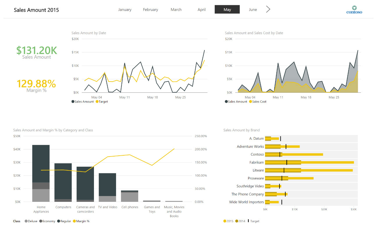
Figure 7-22: The final version of the report, displaying Contoso’s sales in May, 2015. This version uses standard and custom visualizations.
Let’s look at another example to see how using a custom visualization can improve a report. Figure 7-23 shows a report that represents the density of the population in each state within the United States, using the standard filled-map visualization. Darker shades correspond to higher-density values; lighter shades correspond to lower-density values.

This particular visualization (on the right of Figure 7-23) does not include the name of each state, because more than 95 percent of the states are condensed in less than 20 percent of the available real estate in the chart, so there simply is not enough room.
You can represent the same information by using a custom map and moving Alaska and Hawaii in a different position, changing also their size and making the map more readable. You can do this by using the Synoptic Panel By SQLBI visualization component that you can find in the visualization gallery. With this component, you can draw custom areas over any map image. (There is a gallery of maps ready to use at http://synoptic.design.) Figure 7-24 shows where you can find and download a map of the United States that includes the state names.

Figure 7-24: The gallery of country/region maps that are available on the Synoptic Designer website.
By using the Synoptic Design panel with the customized map of the United States, you can create the map shown in Figure 7-25, in which each state displays its name as well as its respective shade of gray. Moreover, the Synoptic Design panel also can work offline, whereas displaying the standard map component requires an active Internet connection to query the Bing service.

Figure 7-25: The same report displaying population density, but this time using a panel from Synoptic Design with a custom map of the United States.
Here again, you have seen how to improve a report by using a custom visualization, but until now we never had the need for a custom visualization to show the desired data. The standard components always offered an alternative way for you to display the same data that, even if not ideal, you could use if custom visualizations are not available. In the next section, you will see some examples for which a custom visualization is required to achieve a minimum goal.
Identifying conditions when custom visualizations are required
In this section, we use a different report to show conditions for which different visualization choices can produce more- or less-meaningful results. The report we want to consider shows the status of a stocks portfolio, using historical prices of stocks to display charts describing the behaviors of different shares and of the entire portfolio. Figure 7-26 depicts the initial version of this report.

Figure 7-26: A report displaying stock portfolio performance over time using standard visualizations.
Note
You can find this report on the page Stocks in the Sample-Stocks.pbix file.
The report includes a line chart for each share, representing the closing price of the corresponding ticker. The details of the portfolio are included in a simple table in the upper-left corner, which displays for each share the quantity owned in the portfolio and its corresponding value at current prices. There is also a line chart for the entire portfolio, in which each share is represented by a single line of a different color. The line represents the total value of such a share in the portfolio over time. This chart can be useful to identify which stock has the largest value in the portfolio over time, but it does not provide in any way an indication of the total value of the portfolio over time. However, you can change this visualization to the stacked area chart depicted in Figure 7-27 to obtain a better representation of the portfolio’s value.

Figure 7-27: The same portfolio value shown in Figure 7-26, but now shown over time, divided by share name.
Every color represents a different share, so you also have a rough estimation of the weight of each stock in the portfolio. The main difference between a stacked area chart and a line chart is that the former cumulates the value of each share name, whereas the latter displays each share name individually. In this case, an accurate choice of the visualization between the existing ones can satisfy the presentation requirements. However, in the other charts, a standard Power BI visualization is not very useful.
The four charts displaying the stock price for each day do not provide complete information. The data model actually contains different price values for each day: open price, minimum price, maximum price, and close price. It is very common to display these four values for each period considered (a day, in this example) by using a candlestick chart. This chart type is not available in the standard Power BI visualizations, so you need to install a custom visualization for that. For example, the Candlestick by SQLBI visualization provides a basic visualization that includes four measures for each period: Open, Close, High, and Low. Figure 7-28 presents the final result of the report after applying the two changes described in this section.

Figure 7-28: The same stock portfolio report displaying performance over time using custom visualizations.
You have seen how custom visualizations can improve the report, and sometimes they are necessary to achieve the desired graphical result. From time to time, though, you might still need to massage the data model to present measures and attributes to visualizations in the expected way, using the right granularity, and the expected formatting. The DAX language is your best friend here, as you will see in the next section.
Using DAX in data models
So far in this chapter, we have presented several examples of visualizations. We’ve demonstrated how you can improve your reports by choosing the right visualization, setting the properties in an appropriate way, and even installing custom visualizations when required. However, there are a number of improvements that you can achieve that do not require a direct action on the visualizations. You can instead create measures or calculated columns in DAX. Usually, you use DAX to obtain a certain numeric result, but sometimes you can take advantage of a DAX expression to control the report layout.
Our first example concerns the measures used in the candlestick charts of the report shown in Figure 7-28. Every time period displayed involves four measures: Open, Close, High, and Low. The data recorded in the data model has four corresponding columns for each day and stock. However, you might use the candlestick chart to display data by week or by month instead of by day. The aggregation required for each measure depends on the measure itself. The Open measure’s price must be the DayOpen value of the first day in the period, the Close price must be the DayClose value of the last day in the period, the High price must be the maximum value of DayHigh in the period, and the Low price must be the minimum value of DayLow in the period. You can write these four measures by using the following DAX expressions:
Open =
IF (
HASONEVALUE( StocksPrices[Date] ),
VALUES ( StocksPrices[DayOpen] ),
CALCULATE ( VALUES ( StocksPrices[DayOpen] ), FIRSTDATE ( StocksPrices[Date] ) )
)
Close =
IF (
HASONEVALUE( StocksPrices[Date] ),
VALUES ( StocksPrices[DayClose] ),
CALCULATE ( VALUES ( StocksPrices[DayClose] ), LASTDATE ( StocksPrices[Date] ) )
)
High = MAX ( StocksPrices[DayHigh] )
Low = MIN ( StocksPrices[DayLow] )
As mentioned earlier in this chapter, another useful tip is to create a measure just to display a measure with a different name. The reason is that many visualization components use the measure name in a legend or other description, and you do not have a way to rename that by using visualization properties. For instance, if you have two measures, Current and Previous, but you want to display the exact year in a particular visualization, you might create two measures with the exact year that you want to display in the legend, as in the following example:
[2014] = [Previous]
[2015] = [Current]
In a report that you will see in the next section, we will use data extracted from Google Analytics. The Website table contains the columns Users and Country ISO Code. In the dashboard, it will be interesting to show on a map the ratio between the number of users visiting a website and the population of the country/region where users come from, but such information is not available directly from Google Analytics. You can import the information about countries’/regions’ populations in a separate Countries/Regions table and link it to the Website table using the Country ISO Code column, as illustrated in Figure 7-29.

Figure 7-29: A schema of tables and relationships of a data model that extends Google Analytics website data.
Because the ratio would be a decimal number, you can create a metric called Users Per Million by using the following measure definition in DAX:
Users per Million =
DIVIDE (
SUM ( 'Website'[Users] ),
SUM ( 'Countries'[Population] )
) * 1000000
You should not expect that a visualization component would directly do a calculation, such as a ratio or a difference. It is always better to define the corresponding calculation in a DAX measure, and then you bind that measure to the visualization.
Finally, you should consider using a calculated column when you need a classification that groups existing data with a high granularity to a lower number of unique values that are easier to display in a chart. For example, Figure 7-30 shows the existing values in the Browser Size column that is provided by Google Analytics. There are more than 5,000 unique combinations of width and height, and this fragmentation of values makes the analysis harder. Moreover, each resolution is a single string, and the reports should group different resolutions by width, ignoring the height.

You can split the problem into two steps. First, you extract the width size from the string, converting the digits before the “x” character in an integer number. Then, you compare this number with a list of predefined values representing the interesting range of resolutions you want to analyze, such as 1024, 1280, 1440, 1920, and 2560. You can see the two calculations implemented in the following two measures, Width Size and Width Category, respectively:
Width Size =
VAR xPos = FIND ( "x", Website[Browser Size], , 0 )
VAR widthString = IF ( xPos > 1, LEFT ( Website[Browser Size] , xPos - 1 ), "" )
RETURN IF ( widthString <> "", INT ( widthString ) )
Width Category =
SWITCH (
TRUE(),
Website[Width Size] <= 1024, 1024,
Website[Width Size] <= 1280, 1280,
Website[Width Size] <= 1440, 1440,
Website[Width Size] <= 1920, 1920,
Website[Width Size] <= 2560, 2560,
CALCULATE ( MAX ( Website[Width Size] ), ALL ( Website ) )
)
Figure 7-31 presents the results of the two calculated columns. We will use the Width Category in one of the visualizations described in the next section.

Figure 7-31: A partial list of values included in the Browser Size, Width Size, and Width Category columns.
Creating high-density reports
In the last section of this chapter, we want to discuss the challenges that you face when creating high-density reports. When you include many visualizations in a single report, you need to carefully balance the amount of information provided in each of those visualizations, removing all the unnecessary elements that would reduce the attention of the user. You want your user to focus only on the data. As you will see, having an idea of the overall structure and tuning properties of each visualization is much more important than using particular custom visualizations, which are usually the icing on the cake.
Figure 7-32 depicts a first version of a report showing website data from Google Analytics for the DAX Formatter website, which is available in the companion content, in the file Sample-DAXFormatter-Analytics.pbix file. The report contains 28 visualizations with data, plus one slicer and eight components without data that are there only for aesthetic reasons (title, logo, pictures, and separators). The 28 visualizations only use 7 different visualization types, and some of them are simple variations of the same concept, such as stacked/clustered bar/column charts. You can obtain a complete and complex report using only a few component types.
The entire report is organized in three zones: left, center, and right. The left zone contains metrics regarding the number of users, the center zone shows data about the sessions, and the right zone includes technical information about average page load time, device type, operating system, browser, and resolution used by website visitors.
If you were to try to create a similar report starting from scratch, you would need to apply the following guidelines:
• Reduce text Include only the minimum necessary of textual elements, avoiding repetitive or verbose descriptions.
• Remove legends Whenever possible, avoid including a legend, especially whenever there is only one measure displayed in the chart.
• Remove axes In a compact visualization for which you already included the data labels (setting the Data Labels property to On), you can remove corresponding axes. All the clustered bar charts in the report are formatted in this way.
• Use images to explain concepts Use an icon or a meaningful image related to the data you show. Remember, a picture is worth a thousand words. In the example in Figure 7-32, at the top of the report is one different image for each of the three zones (Users, Sessions, and Average Page Load Time).
In the report, we used a donut chart. Previously in this chapter, we mentioned that using a pie chart or a donut chart is not a good idea, so you should avoid doing that. The exception we wanted to include in this report is when you compare only two values. In this example, we used a donut chart for the search engines distribution, showing the percentage of sessions coming from Bing searches versus Google searches. It is clear that Google has a clear leadership for directing visitors to this website, with Bing producing only a marginal contribution. For this difference, looking at the exact number or percentage is not relevant.
There are three visualizations that we wanted to improve, starting from this initial example. The sparklines used at the top of the report are simple line charts without any axes, legend, data labels, or border. Figure 7-33 illustrates that we set to Off most of the format properties of those line charts.

However, you cannot change the line width of the line chart. When you use the line chart in a small area, this produces a result that is difficult to read. You can replace the line chart with the Sparkline custom visualization that you can download from the Power BI visualization gallery. Figure 7-34 shows a side-by-side comparison of the same chart displayed by using a line chart (on the left) and a sparkline custom visualization (on the right). The custom visualization draws a line with a smaller width, generating a final result that is more readable.

Figure 7-34: A couple of examples of the same chart, using a standard line chart and a sparkline custom visualization.
Another visualization to improve is the countries/regions penetration displayed in the lower-left corner of the report. Instead of using a standard map, which shows a pie for each country/region with a size depending on the population density, you can use the Synoptic Designs panel, loading the world map from the gallery shown back in Figure 7-24. The result of displaying the measure Users Per Million in a Synoptic Designs pane is visible in Figure 7-35.

Figure 7-35: Synoptic Designs panel with a world map that displays the ratio between users and population.
The last visualization to improve is the one in the lower-right corner, showing the number of sessions by browser resolution. In the original data, we have a very fragmented number of different resolutions, so the bar chart only displays the first values, but the number of sessions of the most common resolution is just five percent of the total number of sessions, so there are a wide number of different resolutions considered, most of them not visible in the report. We solved this problem in two steps. First, we created a column containing the width category, which classifies the width extracted from the resolution string, as you have seen in the previous section about DAX. Then, we changed the clustered bar chart to a waterfall chart, using the Sessions % measure instead of the Sessions measure, as shown in Figure 7-36.

We do not use any decreasing step in the waterfall chart, but the final result clearly shows the distribution of the resolution in a meaningful way. The Sessions % measure is a DAX expression created just for this report, using the following definition:
Sessions % =
DIVIDE (
SUM ( Website[Sessions] ),
CALCULATE (
SUM ( Website[Sessions] ),
ALL ( Website[Width Category] )
)
)
Figure 7-37 presents the final result, after these improvements have been incorporated. As you can see, the overall difference is an incremental improvement and not a substantial change from the result we got initially by using standard visualization components.
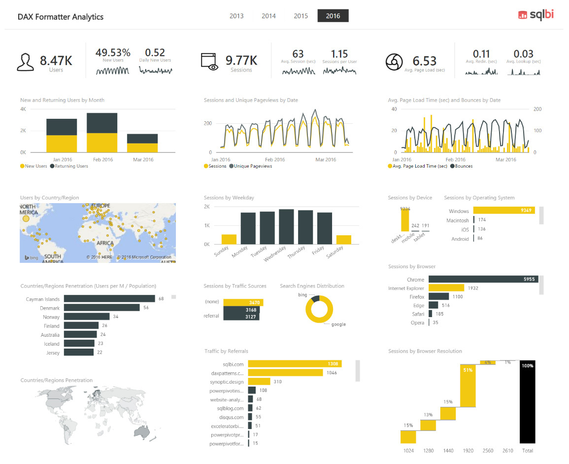
Especially in a high-density report, you should focus on the overall quality and readability, reducing the number of distractions for the reader. There is already an overwhelming amount of information, so the focus of the reader should be entirely on data, not decorations or visualizations that are too complex and do not provide any added value.
Conclusions
In this chapter, you have seen a number of techniques to improve Power BI reports by choosing the best built-in visualizations and adding custom visualizations. Here are the main steps in this process:
• Choose the right visualization type You can choose between many visualization types, but usually you do not need too many of them in the same report. Do not be afraid of using the same visualization type many times if it is the one that best displays your data.
• Customize visualization properties You can customize every visualization by using format properties. Using a consistent color scheme is one of the most important aspects of a good report.
• Consider custom visualizations when necessary The Power BI custom visualizations gallery provides you with many visualizations that extend the set of standard ones available in Power BI. You should consider using them when there is a concrete advantage over the standard visualizations.
• Use DAX to create measures and calculated columns You also can use DAX expressions to achieve the desired visualization. Even a simple transformation, such as renaming a measure in a legend, is not always possible within the properties of a visualization, but you can overcome this by creating new measures and calculated columns.
• Remove unnecessary elements in high density reports In a high-density report, you need to remove any graphical element that is not necessary to communicate information to the users; you do not want to distract them by including details that do not provide any useful information.
These guidelines are just a starting point in your journey to create clear and useful reports. Your experience, the feedback from users of your reports, and the analysis of reports created by other people are the other important steps along this road.