
CHAPTER 13
The Home as an Investment
For many years, Jonathan Clements wrote an influential personal finance column for the Wall Street Journal. One theme he revisited every year or so was the folly in believing that your personal home was a good investment. He argued that an investor would be much better off buying a modest home and investing more in a conventional portfolio of stocks and bonds. Don’t buy a $1 million home, he said. Instead, buy a home for half that amount and invest the extra $500 thousand in stocks and bonds. This chapter will show the merits of Clements’ argument. Clements will be shown to be right even if we examine housing prior to its recent collapse.
For many families in the United States, their home is their largest financial asset. In most cases, home ownership is leveraged with mortgage debt with the latter typically representing the largest financial liability of the family. But even taking into account mortgage debt, home ownership represents a substantial portion of net worth for many families. So it’s important to study returns on homes as part of a larger study of investing.
Until recently when house prices fell, many families believed that home ownership provided some of the highest returns that they earn in their lifetimes. One of the reasons for this belief is that families often suffer from “money illusion.” If your house doubles in value over time, that may or may not be a good return on investment. It all depends on how much the cost of living has risen over the same period. Too often families view the nominal appreciation of their homes as the return on their “investment.”
This chapter will examine the real (inflation-adjusted) returns on housing since the 1970s. The primary source of data will be home price indexes maintained by the oversight agency for Fannie Mae and Freddie Mac (the mortgage giants), the Federal Housing Finance Agency (FHFA). The predecessor to FHFA, the Office of Federal Housing Enterprise Oversight (OFHEO), developed these indexes in the early 1990s using series that Fannie Mae and Freddie Mac had developed earlier.1 Many of the housing series extend back to the mid-1970s. The indexes use a repeat-sales methodology developed by Case and Shiller (1989) that relies on observing sales prices of the same homes over time. The use of repeat transactions for the same house helps to control for differences in the quality or location of houses comprising the sample for any particular area.
The FHFA indexes use data for single-family detached properties that have been financed by mortgages processed by either Fannie Mae or Freddie Mac. These agencies limit their activities to moderate size “conforming” mortgages (up to $417,000 in 2013).2 So the indexes underweight more expensive homes that require “jumbo” mortgages. This is a particularly important limitation for areas of the country, like California, where average house prices are considerably above national levels with the result that many houses require jumbo mortgages. In addition, FHFA indexes underweight subprime and other lower-rated mortgages. For this reason, we will later consider another set of indexes developed by Case and Shiller now owned by Standard & Poor’s. FHFA provides indexes for the country as a whole, all states, as well as most metropolitan areas.
CAPITAL GAINS ON HOUSING BY STATE AND METROPOLITAN AREA
It is interesting to see the differences between housing markets across the country. Some people are lucky enough to live in California. Not only do those people enjoy fresh fruit and sunshine all year long, but they also can watch their houses appreciate (at least, most of the time). Those who live in Pennsylvania (as I do), on the other hand, must contend with cold weather half of the year while watching their home values stagnate. It isn’t fair, but at least they don’t live in Texas where home values don’t even keep up with inflation in the long run. (Of course, these three states all have other attractive features. That’s why so many of us are happy to live in Pennsylvania and Texas!)
This chapter begins by looking at the capital gains on housing in the six largest states and ten largest cities. This will give us a broad picture of how much housing varies across the country. The capital gains will be adjusted by inflation (using the consumer price index) so that we can see how much the real value of homes has changed.
Table 13.1 presents real house appreciation for the United States as a whole as well as for the six largest states by population. Two periods are studied, from the second quarter of 1975 (when the series begin) through the end of 2006, roughly 32 years, and 1975 through 2012. The end of 2006 was the peak of the housing market, so the shorter period will show housing gains at their best. If housing gains fail to impress us over the shorter period, we will prove Clements right.
TABLE 13.1 Real House Appreciation in United States and Six Largest States
| 1975 Q2–2006 Q4 | 1975 Q2–2012 Q4 | |||
| Average Real
Appreciation |
Cumulative Real
Appreciation |
Average Real
Appreciation |
Cumulative Real
Appreciation |
|
| United States | 1.5% | 59.4% | 0.4% | 18.0% |
| California | 4.3% | 284.7% | 2.1% | 116.4% |
| Texas | –0.1% | –1.7% | –0.2% | –8.2% |
| New York State | 2.3% | 107.0% | 1.3% | 60.0% |
| Florida | 1.9% | 82.0% | –0.2% | –6.7% |
| Illinois | 1.0% | 39.0% | 0.0% | –0.6% |
| Pennsylvania | 1.0% | 39.3% | 0.4% | 15.2% |
Notes: The real rates of appreciation are calculated using the consumer price index.
Data sources: FHFA and Bureau of Labor Statistics.
The U.S. housing market as a whole provided a real appreciation of 1.5 percent per year through 2006 and 0.4 percent per year through 2012. Those national averages hide tremendous variation across the country. California benefited from a 4.3 percent per year appreciation through 2006. The cumulative rise in California prices over 32 years is 284.7 percent! In contrast, Texas saw a slight drop in house prices (in real terms) through 2006 and Pennsylvania saw only a 1.0 percent/annum appreciation. Clearly “location” matters.
It’s interesting to examine real house appreciation by metropolitan areas as well. Table 13.2 shows the real house appreciation in the 10 largest metropolitan areas of the country.3 Most of the metropolitan area data begins later than the state data, so the table reports returns beginning in the first quarter of 1978. New York City, Boston, and Los Angeles provide the largest appreciations over both periods. Dallas and Houston, in contrast, experienced negative real appreciation over both periods. Consider how much location matters. Over the full period from 1978 to 2012, residents of New York City have seen their homes appreciate in real terms by over 130 percent, while residents of Philadelphia have had to be content with a real appreciation of 39 percent, and residents of Houston and Dallas lost ground to inflation.
TABLE 13.2 Real House Appreciation in 10 Largest Cities
| 1978 Q1–2006 Q4 | 1978 Q1–2012 Q4 | |||
| Average Real
Appreciation |
Cumulative Real
Appreciation |
Average Real
Appreciation |
Cumulative Real
Appreciation |
|
| New York | 4.1% | 216.7% | 2.4% | 131.4% |
| Los Angeles | 3.7% | 189.4% | 1.6% | 71.5% |
| Chicago | 1.3% | 45.6% | –0.2% | –5.3% |
| Dallas | –0.1% | –3.9% | –0.4% | –13.0% |
| Houston | –0.9% | –23.2% | –0.8% | –25.6% |
| Philadelphia | 1.9% | 74.9% | 0.9% | 39.0% |
| Washington | 2.9% | 126.2% | 1.3% | 56.3% |
| Miami | 3.1% | 139.8% | 0.6% | 22.7% |
| Atlanta | 0.8% | 24.4% | –0.5% | –16.0% |
| Boston | 4.1% | 221.4% | 2.6% | 141.6% |
Notes: Cities are ranked by size of metropolitan statistical areas.
Data sources: FHFA and Bureau of Labor Statistics.
Why are the rates of house appreciation so varied? For house prices to rise rapidly, there must be substantial growth of population in the area, and that requires substantial job growth. But that alone is not enough, since a city like Atlanta has surely seen a lot of growth. In addition, a city (or, more accurately, metropolitan area) must impose limits on land use. Los Angeles certainly qualifies in this regard, while Houston and Atlanta impose few limits on expansion. Scarce land combined with rapid growth lead to the bidding up of home prices.
Figure 13.1 shows the rise in house prices in California and its two largest cities since 1978. At the peak of the housing boom, the cumulative real appreciation of prices was almost 200 percent even for the state as a whole. It’s interesting to note that the ascent of prices was interrupted by a substantial decline in the early 1990s. The housing boom of the late 1980s was followed by a prolonged slump with nominal and real housing prices reaching bottom in 1996 or later, nearly seven years after the peak. So Californians experienced a slump in housing more than a decade before the most recent collapse in prices. The country as a whole, however, did not experience a significant decline in either nominal or real house prices until the housing crisis that began in 2007.4 So for the country as a whole, the recent housing slump was a genuine surprise.
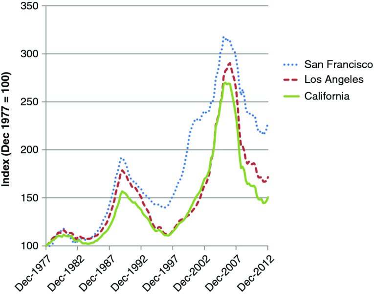
FIGURE 13.1 Real House Appreciation in California, 1978–2012
Data source: Federal Housing Finance Agency.
THE HOUSING BUST
Before considering long-run returns from housing, it’s important to discuss the effects of the housing bust that has occurred since 2006. It has been a grueling experience for many families, particularly in the hardest-hit areas of the country.
To study home prices in the recent period, we will use the indexes developed by Karl Case and Robert Shiller, two academic economists, rather than the FHFA indexes used for longer-run comparisons.5 Unlike the FHFA indexes, the Case-Shiller indexes have the advantage of including houses at all price levels. Since houses with subprime mortgages were particularly hard-hit in the crisis, the Case-Shiller indexes may measure the housing bust better than the more broad-based FHFA indexes.
Consider first the Case-Shiller 20-city index. This index fell by 28 percent between the end of 2006 and end of 2012. That’s quite a drop for an asset that hitherto had been considered “safe.” Recall that home investments are usually financed with large mortgages. In fact, the average mortgage outstanding at any given time is about 75 percent of the value of a typical house. A 28 percent drop in value is enough to wipe out most if not all of the equity in a home.
How much typical homeowners have lost depends on where they live. Table 13.3 reports the drop in the nominal value of homes between December 2006 (the peak of the market) and December 2012. Ten of the 12 largest cities are included in the table together with two cities, Phoenix and Las Vegas, that have been particularly hard hit by the bust. Some cities, notably Dallas and Boston, have fared relatively well during the bust, with drops in housing prices of “only” 2.1 percent and 9.6 percent, respectively. At the other extreme, Miami, Phoenix, and Las Vegas have suffered grievously. When home prices fall 40 percent or more, whole neighborhoods are severely affected. Evictions occur and sheriff sales become common. Tax rolls plummet. Even the 30 percent declines in prices that Chicago and Los Angeles have experienced cause great distress.
TABLE 13.3 Changes in Nominal House Prices, December 2006 through December 2012
| Housing Market | Change in Nominal Prices |
| 20-City National Index | –28.0% |
| New York | –23.9% |
| Los Angeles | –33.8% |
| Chicago | –32.5% |
| Dallas | –2.1% |
| Washington, D.C. | –21.4% |
| Miami | –45.7% |
| Atlanta | –27.6% |
| Boston | –9.6% |
| San Francisco | –30.7% |
| Detroit | –32.1% |
| Phoenix | –43.3% |
| Las Vegas | –55.9% |
Data source: S&P Case-Shiller Indexes.
It’s important to remember that individual families fare quite differently depending on their age and other circumstances. Even in cities with sharp declines in prices, the impact of the bust depends partly on where a family is in their life cycle. If the family bought its home in the late 1990s or earlier, perhaps because children were born at that time, it is likely to still be sitting on capital gains. On the other hand, if the family bought near the peak of housing in the mid-2000s, the house is now probably underwater. The level of distress also depends upon whether the family took advantage of rising house prices to refinance. If at the time of refinancing, the family took some of the equity out of the house, then the pain is all the greater. As stated at the outset of this chapter, the home is often the largest asset of a family as they near retirement. For that reason, the housing bust has severely impacted many families’ financial statuses.
Because the bust is such an unusual event, it’s important to examine housing in the period before the bust. So the next section of the chapter will examine the returns to housing through 2006, the peak of the housing boom. If housing is not a desirable investment prior to the bust, then Jonathan Clements will be proven right. We also will show returns that include the bust period, but that is only to emphasize the dangers of viewing “house ownership as an investment.”
RATES OF RETURN ON HOUSING
Rates of appreciation do not represent rates of return on housing, so they cannot be compared directly with stock returns or the returns on other assets. First of all, rates of appreciation do not take into account the leverage provided by mortgage financing. Second, the rates of appreciation do not take into account either the benefits of living in a house or the expenses of maintaining it. Returns on stocks and REITs, in contrast, take into account leverage as well as the dividends paid to investors.
The rate of return should depend on the capital gain on the house less the cost of mortgage financing. There is also the benefit of living in the house as well as the tax shelter provided by the favorable treatment of property taxes and mortgage interest in the tax code. But most experts believe that those benefits are offset by the property taxes, maintenance expenses, and other expenses of living in the house.6 In that case, the return on the house depends only on the capital gain less the cost of the mortgage. Of course, the greater the proportion of the purchase price that is financed, the higher the potential rate of return on the house. Leverage helps to raise returns, at least on the upside.
The purchase price of the house is usually financed by a combination of debt and equity. At the time of purchase, the equity in a house is the difference between its price and the debt used to finance it. The rate of return on the house depends on the capital gain on the house minus the cost of the mortgage.7 Consider a house that has a 12 percent capital gain but pays a 6 percent mortgage rate. Suppose that the house costs $600 thousand, but it has a $450 thousand mortgage. That means that the house has $150 thousand in equity. Then its rate of return is going to be:
Because the house appreciated so much faster than the mortgage rate, the investor made a huge return. After all, this investment is heavily leveraged.
Suppose instead that the house appreciated by only 6 percent. With a 6 percent mortgage rate, the house will still have a positive rate of return because there is equity in the house. The $150k equity invested in the house will earn a return of 6 percent. But what happens if the rate of appreciation is less than 6 percent? Table 13.4 shows what happens. This table is drawn up under the assumption that the house investor has a 75 percent mortgage and that the mortgage rate is 6 percent. If appreciation is only 3 percent per year, then the rate of return falls to –6 percent per year. And if the appreciation stops altogether, then the rate of return falls to –18 percent!8 Leverage has vicious effects when houses stop appreciating.
TABLE 13.4 How Capital Gains on a House Affect the Rate of Return
| Capital Gain on
House/Annum |
Rate of Return
on House |
| 12% | + 30.0% |
| 9% | + 18.0% |
| 6% | + 6.0% |
| 3% | –6.0% |
| 0% | –18.0% |
Assumptions: 75% mortgage and 6% mortgage interest rate/annum.
Readers may object to these examples on two grounds. First, perhaps the mortgage rate is too high. Second, perhaps the mortgage ratio is too low. (Keeping the mortgage ratio at 75 percent at least limits the damage on the downside). Well, it turns out that the average mortgage on a house is just about 75 percent. Homeowners often start out with a larger mortgage, but they gradually pay off the mortgage over time. The FHFA publishes tables showing average mortgage ratios since the mid-1970s. The average ratio is close to 75 percent over the full sample period as well as more recent periods. FHFA also publishes tables of average mortgage rates. These have fallen over time. From 1975 to 2006, the average mortgage rate was 9.1 percent. Over the six years ending in 2012, the average mortgage rate nationwide was only 5.2 percent. And the average rate in 2012 was only 3.8 percent. If mortgage rates are low as in 2012, the returns from owning a house improve, but leverage continues to lead to huge gains on the upside and grim losses on the downside.9
Now let’s look at the actual rates of return on housing. Here is the strategy. We will look at nationwide returns as well as returns from owning homes in California. After all, if returns are not great in California, they certainly won’t be great in Pennsylvania or Texas. We will calculate the returns assuming an average mortgage ratio of 75 percent. But we will use average mortgage rates for the particular period examined. All returns will be adjusted for inflation using the consumer price index.
We will consider four different periods for study:
- The 32-year period from 1975 to 2006 (the latter being the peak of the housing boom)
- The full sample period from 1975 to 2012
- Ten years of boom ending in 2006
- Six years of bust ending in 2012
The reason why we want to examine a decade of boom is that we want to understand how the myth of home ownership gets perpetuated. It’s great to be able to brag about an investment, whether it is gold in 2010, NASDAQ stocks in 1999, or California real estate in 2006. All you have to do is to bail out “just in time.” Then you will be able to regale your friends with tales of your investment prowess.
Table 13.5 presents the rates of return for the U.S. housing market as a whole as well as for the California market. The table reports the nominal rate of appreciation, the average mortgage cost, and the real rate of return based on a 75 percent leverage ratio. Consider first the two long-run periods starting in 1975. During the 32-year period ending in 2006, U.S. housing had a negative 7.5 percent per annum real return while California real estate earned a positive 4.0 percent/annum. When six more years are added to this sample period, so that the period from 1975 to 2012 is examined, even California housing has a negative real return.
TABLE 13.5 Real Returns on Housing in United States and California
| 1975*–2006 | 1975*–2012 | Boom Years
1997–2006 |
Bust Years
2007–2012 |
|
| Nominal House Appreciation | ||||
| United States | 6.0% | 4.5% | 6.8% | –2.8% |
| California | 9.0% | 6.2% | 12.2% | –7.2% |
| Mortgage costs | 9.1% | 8.5% | 6.7% | 5.2% |
| Real Rate of Return | ||||
| United States | –7.5% | –10.9% | 4.2% | –28.3% |
| California | 4.0% | –4.4% | 25.1% | –45.6% |
Note: Rates of return based on 75% mortgage. *1975 data begins in second quarter.
Data Sources: FHFA, Federal Housing Board, and Bureau of Labor Statistics.
Should we be impressed with California’s positive return in the earlier period? Recall Jonathan Clements’ discussion. The alternative to buying a big house in California is to buy a smaller house and invest the rest in a normal portfolio. Table 13.6 compares the real returns on housing with those on the S&P 500 stock index and the NAREIT index over these same two periods. In the period ending in 2006 before the bust begins, the positive real rate of return on housing in California of 4.0 percent is totally swamped by the 11.2 percent real return on REITs and 8.2 percent real return on stocks. If the period ends in 2012 instead, all assets perform worse. But real return on housing in California is now negative at –4.4 percent and the real return for the United States as a whole is an astoundingly large –10.9 percent/year. This is over a period when REITs are earning 9.3 percent in real terms and stocks are earning 6.9 percent. So it’s clear that Jonathan Clements was right when he described housing as a poor investment.
TABLE 13.6 Real Returns on Housing and Other Assets
| 1975*–2006 | 1975*–2012 | Boom Years
1997–2006 |
Bust Years
2007–2012 |
|
| Housing: | ||||
| United States | –7.5% | –10.9% | 4.2% | –28.3% |
| California | 4.0% | –4.4% | 25.1% | –45.6% |
| REITs | 11.2% | 9.3% | 11.8% | –0.6% |
| S&P 500 | 8.2% | 6.9% | 5.8% | 0.1% |
*1975 data begins in the second quarter.
Data Sources: Table 13.5 for housing rates of return. NAREIT, and S&P Dow Jones Indices for other returns.
What if we look only at the boom period for housing, the 10 years ending in 2006? Guess what? If you lever any asset during a period when it is going to boom, you will become rich! The real return on California housing is 25.1 percent per year during this period. Of course, not all of us can be lucky enough to live in California. If we invested during the boom period in the United States as a whole, we would earn a 4.2 percent real return per year. That is easily swamped by the returns on REITs and stocks. So even during the boom period, you had to live in California (or some other high-flying state) to beat conventional assets.
What if you lever up in a bust period? That’s a very relevant question, especially at the present moment in 2013 as housing remains severely depressed. Borrowing 75 percent of the purchase price leads to a 28.3 percent loss/year in the United States as a whole. (How can it be that large? It’s because leverage is brutal on the downside. You are losing 2.8 percent per year on the nominal price of the house. And you are paying an average mortgage rate of 5.2 percent. Look at Table 13.6 again to convince yourself of the brutal effects of leverage). And if you are lucky enough to live in California, you can build up losses of 45.6 percent per year. So much for the belief that the home is a safe long-run asset!
There is a surprising gap between perception and reality when it comes to investment in home ownership. No doubt part of the reason for this gap is that homeowners look at their house appreciation without taking into account inflation. But it’s also because home owners do not primarily regard their home as being an investment. It’s a place to live. It’s only after periods of appreciation of home prices that many individuals begin to regard their homes as investments. And they come to believe that the home provides higher, and more stable, returns than “risky” investments. So it’s important to consider the strong evidence to the contrary.
CONCLUDING COMMENTS
There is a huge contrast between the returns on investable real estate and homes. Since their introduction in the early 1970s, REITs have delivered returns even higher than those on the S&P 500. Home ownership is another story. The returns on home ownership are disappointing in most periods compared with investment in REITs or stocks. It’s true that with high leverage, home ownership can deliver spectacular returns when house prices are rising (as they did in the ten years through 2006). But that same leverage can lead to spectacular losses when home prices fall. Fortunately, when house prices fall, investors do not mark their homes to market (unless they are in the unfortunate position of having to sell). So they can ignore price trends knowing that there is no investment statement coming in the mail to jolt them back to reality. They simply sit in their houses waiting for the next boom to occur. If only stock investors had the good sense to be as patient.
NOTES
REFERENCES
- Case, Karl E., and Robert J. Shiller. 1989. “The Efficiency of the Market for Single-Family Houses.” American Economic Review (March): 125–137.
- Himmelgerg, Charles, Christopher Mayer, and Todd Sinai. 2005. “Assessing High House Prices: Bubbles, Fundamentals, and Misperceptions.” Journal of Economic Perspectives (Fall): 67–92.
- OFHEO. 2008. “Revisiting the Differences between the OFHEO and S&P/Case-Shiller House Price Indexes,” (January). www.fhfa.gov/webfiles.