
6-10. Invoking a Managed Bean Action on Render
Problem
You want to invoke an application-specific action when a JSF view is rendered.
Solution
Add an f:metadata tag to the head of your view, and then embed a viewAction component within it, specifying the action method you want to invoke. This technique can be handy for executing back-end code prior to loading a page. As such, this technique can also be used to replace the f:event tag in order to create a bookmarkable URL. In this example, the Acme Bookstore author bio page has been updated so that it can be directly linked to, passing in an author’s last name as a view parameter via the URL. The viewAction component is executed before the view is rendered, invoking the business logic to search for the requested author by last name and to populate the view components with the found author’s information.
The following listing is for recipe06_10.xhtml, and it can be invoked by visiting a URL such as http://your-server:8080/JavaEERecipes/faces/chapter06/recipe06_10.xhtml?authorLast=juneau
<?xml version="1.0" encoding="UTF-8"?>
<!--
Book:  Java EE 7 Recipes
Author: J. Juneau
-->
<ui:composition xmlns="http://www.w3.org/1999/xhtml"
                xmlns:f="http://xmlns.jcp.org/jsf/core"
                xmlns:ui="http://xmlns.jcp.org/jsf/facelets"
                xmlns:h="http://xmlns.jcp.org/jsf/html"
                template="./layout/custom_template_search.xhtml">
    <f:metadata>
        <f:viewParam name="authorLast" value="#{ch6AuthorController.authorLast}"/>
        <f:viewAction action="#{ch6AuthorController.findAuthor}" />
    </f:metadata>
            <ui:define name="content">
                <h:form id="componentForm">
                    <h1>#{ch6AuthorController.current.first}#{ch6AuthorController.current.last}</h1>
                    <p>
                        #{ch6AuthorController.current.bio}
                    </p>

                    <br/>
                    <h1>Author's Books</h1>
                    <ui:repeat id="bookList" var="book"
    value="#{ch6AuthorController.current.books}">
                        <tr>
                            <td>
                                <h:graphicImage id="bookImage"
                                                library="image"
                                                style="width: 100px; height: 120px"
name="#{book.image}"/>
                            </td>
                        </tr>
                        <tr>
                            <td>
                                <strong>#{book.title}</strong>
                            </td>
                        </tr>
                    </ui:repeat>
                </h:form>
            </ui:define>

 </ui:composition>
The next piece of code is an excerpt from the AuthorController managed bean class. This method is the implementation for the action method that is specified within the viewAction component. This method is responsible for finding the author by last name and loading the current Author object with the found object.
public void findAuthor(){
    if (this.authorLast != null){
        for(Author author:authorList){
            if(author.getLast().equalsIgnoreCase(authorLast)){
                this.current = author;
            }
        }
    } else {
        FacesContext facesContext = FacesContext.getCurrentInstance();
        facesContext.addMessage(null,
            new FacesMessage("No last name specified."));

    }
}
How It Works
The viewAction component was added to JSF in release 2.2, and with it comes the ability to perform evaluations before a page is rendered. The viewAction component is very similar to f:event, except for some notable differences.
- The view action timing is controllable.
- The same context as the GET request can be used for the action.
- Both the initial and postback requests are supported since the view action is incorporated into the JSF life cycle.
- viewAction supports both implicit and explicit navigation.
The viewAction component contains a number of attributes, as described in Table 6-3.
Table 6-3. viewAction Component Attributes
| Attribute | Description |
|---|---|
| action | Method expression representing the application action to invoke when this component is activated by the user |
| onPostback | Boolean value to indicate whether the action should operate on postback (default: false) |
| if | Boolean value to indicate whether the component should be enabled (default: true) |
| immediate | Boolean value to indicate whether notifications should be delivered to interested listeners and actions immediately, during the Apply Requests Values phase |
| phase | String that specifies the phase in which the action invocation should occur using the name of the phase constraint in the PhaseId class (default: INVOKE_APPLICATION) |
In the example for this recipe, the viewAction component is used to invoke a managed bean method, which searches for the author whose last name equals that which is contained within the authorLast property. An action method must accept no parameters, and it must return a String, which is then passed to the NavigationHandler for the application.
6-11. Asynchronously Updating Components
Problem
You want to provide periodic, asynchronous updates to portions of your view so that the user does not have to refresh the page in order to see the most up-to-date information.
Utilize an Ajax polling component (available from a third-party JSF component library) to poll the data asynchronously and re-render display components with the updated data without any user interaction. In this example, the site template for the Acme Bookstore application has been updated to include the current time and date. The clock will be updated each second so that, from a user’s point of view, it resembles a digital clock.
The following code is that of the view template entitled chapter06/layout/custom_template_search.xhtml, and it demonstrates how to use the PrimeFaces poll component:
<?xml version='1.0' encoding='UTF-8' ?>
<!--
Book:  Java EE 7 Recipes
Author: J. Juneau
-->
<!DOCTYPE html PUBLIC "-//W3C//DTD XHTML 1.0 Transitional//EN" "http://www.w3.org/TR/xhtml1/DTD/xhtml1-transitional.dtd">
<html xmlns="http://www.w3.org/1999/xhtml"
      xmlns:ui="http://xmlns.jcp.org/jsf/facelets"
      xmlns:h="http://xmlns.jcp.org/jsf/html"
      xmlns:p="http://primefaces.org/ui"
      xmlns:s="http://xmlns.jcp.org/jsf/composite/components/util">

    <h:head>
        <meta http-equiv="Content-Type" content="text/html; charset=UTF-8" />
        <h:outputStylesheet library="css" name="default.css"/>
        <h:outputStylesheet library="css" name="cssLayout.css"/>
        <h:outputStylesheet library="css" name="styles.css"/>

        <title>#{ch6AuthorController.storeName}</title>
    </h:head>

    <h:body>

        <div id="top">
            <h2>#{ch6AuthorController.storeName}</h2>
            <br/>
            <h:panelGrid width="100%" columns="2">
                <s:search id="searchAuthor"/>

                <h:form>
                <p:poll id="poll" interval="1" update="dayAndTime"/>

                <h:outputText id="dayAndTime" value="#{bookstoreController.dayAndTime}"/>
                </h:form>
            </h:panelGrid>
        </div>
        <div>
            <div id="left">
                <h:form id="navForm">
                    <h:commandLink action="#{ch6AuthorController.populateJavaRecipesAuthorList}" >
    Java 7 Recipes</h:commandLink>
                    <br/>
                    <br/>
                    <h:commandLink action="#{ch6AuthorController.populateJavaEERecipesAuthorList}">
     Java EE 7 Recipes </h:commandLink>
                    <br/>
                    <br/>
                    <br/>
                    <h:commandLink action="#{ch6ContactController.add}">Subscribe to
        Newsletter</h:commandLink>
                </h:form>
            </div>
            <div id="content" class="left_content">
                <ui:insert name="content">Content</ui:insert>
            </div>
        </div>
        <div id="bottom">
            Written by Josh Juneau, Apress Author
        </div>

    </h:body>

</html>
Here’s the class:
package org.javaeerecipes.chapter06;

import javax.inject.Named;
import javax.enterprise.context.SessionScoped;
import java.io.Serializable;
import java.util.Date;
import javax.faces.bean.ManagedBean;

/**
 *
 * @author juneau
 */
@ManagedBean(name = "bookstoreController")
@SessionScoped
public class BookstoreController implements Serializable {

    private Date dayAndTime = null;

    /**
     * Creates a new instance of BookstoreController
     */
    public BookstoreController() {
    }

    /**
     * @return the dayAndTime
     */
    public Date getDayAndTime() {
        dayAndTime = new Date();
        return dayAndTime;
    }

    /**
     * @param dayAndTime the dayAndTime to set
     */
    public void setDayAndTime(Date dayAndTime) {
        this.dayAndTime = dayAndTime;
    }
}
The date and time will appear on the right side of the header for the bookstore. The resulting solution should resemble that in Figure 6-4.
Figure 6-4. Ajax poll component used to update date/time
How It Works
The poll component of the PrimeFaces JSF component library can be used to update a specified portion of a view asynchronously on a timed interval. This can make web site content more dynamic because features can refresh in real time without any user interaction. For instance, the poll component would work well for a stock market graph to asynchronously update the graph every minute or so. In the example for this recipe, the PrimeFaces poll component is used to display the current time and date within the Acme Bookstore application, updating the time every second.
For starters, you must ensure you have installed the PrimeFaces component library to utilize the poll component. To learn more about installing a third-party component library, please see Recipe 5-11. Both PrimeFaces and RichFaces have a poll component, so you can take your pick of which to use. Neither is better than the other, but you may choose one over the other based upon the library that you like to use best. After the library has been installed, you must add the namespace for the taglib reference to each page in which the components will be utilized. In the example, the xmlns:p="html://primefaces.org/ui" namespace is added within the <html> tag. After the namespace has been referenced in the view, the PrimeFaces components can be added to the view.
The poll component can be added to a view by including a tag that uses the p prefix, therefore, p:poll. To utilize the p:poll tag, you must set an update interval. This can be done by setting the interval attribute to a numerical value, which defines an interval in seconds between the previous response and the next request. In the example, the interval is set to 1 and, therefore, every second. The update attribute of the poll component is used to specify which component(s) to update each time the specified interval of time goes by. It is really as easy as that. In the example, the update attribute is set to the component identifier of dayAndTime. If you look down a few lines in the code, you can see that dayAndTime is actually an outputText component that is used to display the current contents of the dayAndTime property within the BookstoreController managed bean via the EL #{bookstoreController.dayAndTime}. Diving into the code for the managed bean, it is easy to see that each time the dayAndTime property is obtained, it is set equal to a new Date() object. A new Date() object contains the current time and date at the time of instantiation. Therefore, the date and time will always remain current.
The poll component is just one simplistic example of how third-party component libraries can assist in the development of more dynamic applications. Although the poll component is not very complex or difficult to use, it provides a large amount of functionality for an application view in just one line of code. I recommend you download the latest user guides for both the RichFaces and PrimeFaces component libraries and read about all the components that are available. If you have a basic understanding of what is available, it will help you formulate a plan for the development of your application when starting your next project.
6-12. Developing JSF Components Containing HTML5
Solution
Create a composite component for JSF using the HTML5 component of your choice. For this example, an HTML5 video component will be constructed into a JSF composite component. The composite component will declare attributes, which will be passed through to the HTML5 video component in a seamless manner.
The first listing is that of the composite component, which resides in the resources/components/html5/video.xhtml file of the sources for this book.
<?xml version='1.0' encoding='UTF-8' ?>
<!DOCTYPE html PUBLIC "-//W3C//DTD XHTML 1.0 Transitional//EN" "http://www.w3.org/TR/xhtml1/DTD/xhtml1-transitional.dtd">
<html xmlns="http://www.w3.org/1999/xhtml"
      xmlns:h="http://xmlns.jcp.org/jsf/html"
      xmlns:cc="http://xmlns.jcp.org/jsf/composite">

    <!-- INTERFACE -->
    <cc:interface>
        <cc:attribute name="id"/>
        <cc:attribute name="width" default="450"/>
        <cc:attribute name="height" default="300"/>
        <cc:attribute name="controls" default="controls"/>
        <cc:attribute name="library" default="movie"/>
        <cc:attribute name="source"/>
        <cc:attribute name="type" default="video/mp4"/>
    </cc:interface>

    <!-- IMPLEMENTATION -->
    <cc:implementation>
        <video width="#{cc.attrs.width}" height="#{cc.attrs.height}"
   controls="#{cc.attrs.controls}">
            <source src="#{cc.attrs.source}" type="#{cc.attrs.type}" />

              Your browser does not support the video tag.
        </video>
    </cc:implementation>
</html>
To keep an aesthetically pleasing look to your pages, you will place a video component within the Acme Bookstore view named recipe06_12.xhtml. And the view that uses the component will look as follows:
<?xml version='1.0' encoding='UTF-8' ?>
<!--
Book:  Java EE 7 Recipes
Recipe: 6-12
Author: J. Juneau
-->
<!DOCTYPE html PUBLIC "-//W3C//DTD XHTML 1.0 Transitional//EN" "http://www.w3.org/TR/xhtml1/DTD/xhtml1-transitional.dtd">
<html xmlns="http://www.w3.org/1999/xhtml"
      xmlns:ui="http://xmlns.jcp.org/jsf/facelets"
      xmlns:h5="http://xmlns.jcp.org/jsf/composite/components/html5">
    <head>
    </head>

    <body>

        <ui:composition template="layout/custom_template_search.xhtml">
            <ui:define name="content">

                <h1>Bear Movie</h1>
                <p>
                    <h5:video id="myvideo" width="300"
                              source="http://www.w3schools.com/html5/movie.mp4"/>
                </p>

            </ui:define>
        </ui:composition>

    </body>
</html>
When the view is rendered, the user will see a page that resembles Figure 6-5.
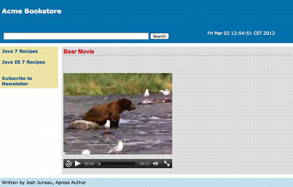
Figure 6-5. Using HTML5 components within JSF 2 composite components
How It Works
The use of HTML5 has become prevalent across the Web over the past few years. It is becoming the standard markup for producing web components that contain rich user interfaces. The JSF 2.2 release is being aligned with HTML5 so that the two technologies can coexist within the same views seamlessly. Prior to JSF 2.2, this was still a possible option, but some issues still may have been encountered when attempting to utilize some of the HTML5 components.
In the example for this recipe, an HTML5 component is embedded within a JSF composite component, and the result is a JSF-based video component that has the ability to accept the same attributes as the HTML5 video component and configure default attributes where possible. If you have not yet reviewed how to create composite components, please go to Recipe 4-4 and review the content there. The following are the major differences between the example in Recipe 4-4 and this recipe:
- HTML5 is specifically used in this recipe, and it is not in Recipe 4-4.
- No server-side code is written for this composite component.
The composite component is placed within the resources/components/html5 folder, so it will be made available for use within the application views automatically. All that is required for use within a client view is the definition of the taglib namespace within the html element. The name of the XHTML file that contains the composite component markup is video.xhtml, and it defines the namespace for the JSF composite component library inside the <html> element.
xmlns:cc="http://xmlns.jcp.org/jsf/composite".
The HTML5 video component accepts a number of attributes, and each of these is made available to the resulting JSF composite component by adding an interface to the component. This is done by supplying the opening and closing cc:interface tags, and each of the attributes that are to be made available for use with the composite component should be declared between the opening and closing tags. Each attribute is declared by adding a cc:attribute tag, along with the name of the attribute and a default value if needed. Here, you can see that the width attribute for the component will default to 450px if the user does not specify a width:
<cc:attribute name="width" default="450"/>
The actual component implementation takes place between the opening and closing cc:implementation tags, and the HTML5 video component is placed there. As you can see, each of the attributes is obtained from the composite component’s interface, so any of the attributes specified for the composite component will accept values and pass them through to their corresponding attributes within the video component using the #{cc.attrs.X} syntax, where X is the name of the attribute that is being passed. That’s it…the component is now ready to be used within a view.
To use the component, specify the namespace to the taglib within the client view’s <html> element, and then the tag will be made available. As you can see in the example, the namespace given to the taglib for this JSF HTML5 video component is h5:
xmlns:h5="http://xmlns.jcp.org/jsf/composite/components/html5"
Once that has been completed, the composite component can be used in the same manner as any standard JSF component or one from a third-party library. HTML5 can add exciting features to your web applications, and I expect the number of JSF custom components utilizing HTML5 (a mix of JavaScript and markup) to increase.
6-13. Listening to JSF Phases
Problem
You want to invoke a method within your application each time a particular JSF phase event occurs.
Create a class that implements the javax.faces.event.PhaseListener interface, and then implement the class’s beforePhase, afterPhase, and getPhaseId methods to suit the needs of your application. The following class demonstrates the creation of a PhaseListener:
package org.javaeerecipes.chapter06;

import javax.faces.context.FacesContext;
import javax.faces.event.PhaseEvent;
import javax.faces.event.PhaseId;

public class BookstorePhaseListener implements javax.faces.event.PhaseListener {

    @Override
    public void beforePhase(PhaseEvent event) {
        FacesContext.getCurrentInstance().getExternalContext().log("Before the Phase - "
                + event.getPhaseId());
    }

    @Override
    public void afterPhase(PhaseEvent event) {
        FacesContext.getCurrentInstance().getExternalContext().log("After the Phase - "
                + event.getPhaseId());
    }

    @Override
    public PhaseId getPhaseId() {
        return PhaseId.ANY_PHASE;
    }
}
Any view that wants to use the PhaseListener should then be registered with the listener by adding an f:phaseListener tag to the view as follows:
<f:phaseListener type="org.javaeerecipes.chapter06.BookstorePhaseListener" />
In the end, when the application is launched and any view containing the f:phaseListener tag shown previously is rendered, a series of events will be published to the server log such as the following whenever a component is accessed:
INFO: PWC1412: WebModule[null] ServletContext.log():Before the Phase - APPLY_REQUEST_VALUES 2
INFO: PWC1412: WebModule[null] ServletContext.log():Before the Phase - APPLY_REQUEST_VALUES 2
INFO: PWC1412: WebModule[null] ServletContext.log():After the Phase - APPLY_REQUEST_VALUES 2
INFO: PWC1412: WebModule[null] ServletContext.log():After the Phase - APPLY_REQUEST_VALUES 2
INFO: PWC1412: WebModule[null] ServletContext.log():Before the Phase - PROCESS_VALIDATIONS 3
INFO: PWC1412: WebModule[null] ServletContext.log():Before the Phase - PROCESS_VALIDATIONS 3
INFO: PWC1412: WebModule[null] ServletContext.log():After the Phase - PROCESS_VALIDATIONS 3
INFO: PWC1412: WebModule[null] ServletContext.log():After the Phase - PROCESS_VALIDATIONS 3
INFO: PWC1412: WebModule[null] ServletContext.log():Before the Phase - RENDER_RESPONSE 6
INFO: PWC1412: WebModule[null] ServletContext.log():Before the Phase - RENDER_RESPONSE 6
INFO: PWC1412: WebModule[null] ServletContext.log():After the Phase - RENDER_RESPONSE 6
INFO: PWC1412: WebModule[null] ServletContext.log():After the Phase - RENDER_RESPONSE 6
 Note For more detail regarding the life-cycle phases of a JSF application, please visit the online documentation at http://docs.oracle.com/javaee/7/tutorial/doc/bnaqq.html, or refer to Recipe 3-1 for a brief explanation.
How It Works
It is possible to listen to individual phases for each of the components within a view. Sometimes developers want to do this so that they can customize the component activity during these phases. A custom class can implement the PhaseListener interface in order to perform this level of scrutiny against components in your views. The class can then override the beforePhase and afterPhase methods to implement custom tasks that will be performed prior to or after the phase of your choice.
To create a PhaseListener class, implement the javax.faces.event.PhaseListener interface. Doing so will force you to implement the abstract methods: beforePhase, afterPhase, and getPhaseId. The getPhaseId method returns the phase that the listener will fire its actions against. In the example, the getPhaseId returns PhaseId.ANY_PHASE, which will cause the listener to be invoked before and after each phase. There are static identifiers for each of the other phases too, so you can cause the PhaseListener to invoke its actions only when a specific phase is occurring. Specifically, the other options are APPLY_REQUEST_VALUES, INVOKE_APPLICATION, PROCESS_VALIDATIONS, RENDER_RESPONSE, RESTORE_VIEW, and UPDATE_MODEL_VALUES.
The beforePhase method takes a PhaseEvent object, and it is invoked before the phase that is returned by the getPhaseId method. Therefore, in the case of the example, the beforePhase method will be fired before any phase occurs. The example simply prints out to the server log which phase is currently beginning.
The afterPhase method also takes a PhaseEvent object, and it is invoked after the phase that is returned by the getPhaseId method occurs. Therefore, in the case of the example, the afterPhase method will be fire after any phase occurs. The example prints out to the server log which phase has just ended.
To register a view with the PhaseListener, you need to add an f:phaseListener tag to it and set the tag’s type attribute to the PhaseListener class that you have created. Doing so will register the listener with the view such that when the view is rendered, the PhaseListener will kick in and begin listening for the phases that are specified by the getPhaseId method.
6-14. Adding Autocompletion to Text Fields
Problem
You want to add autocompletion to a text field so that when the user of your application begins to type, possible entries are displayed and made selectable via a drop-down list.
Solution
Utilize a third-party component library, and add an autocomplete text field to your application. For this example, the search box that is used for querying books and authors within the example Acme Bookstore application will be adjusted so that it autopopulates with text when a user starts typing. The following code is that of the custom search component view named search.xhtml, contained within the web/resources/components/util directory of the JavaEERecipes NetBeans project bundle. It has been updated to utilize a PrimeFaces autoComplete component as opposed to standard inputText.
Note This source comprises a JSF composite component. To learn more about JSF composite components, please refer to Recipe 4-4.
<?xml version='1.0' encoding='UTF-8' ?>
<!DOCTYPE html PUBLIC "-//W3C//DTD XHTML 1.0 Transitional//EN" "http://www.w3.org/TR/xhtml1/DTD/xhtml1-transitional.dtd">
<html xmlns="http://www.w3.org/1999/xhtml"
      xmlns:h="http://xmlns.jcp.org/jsf/html"
      xmlns:composite="http://xmlns.jcp.org/jsf/composite"
      xmlns:p="http://primefaces.org/ui">

    <!-- INTERFACE -->
    <composite:interface>
        <composite:attribute name="searchAction" default="#{bookstoreSearchController.searchAuthors
     (ch6AuthorController.completeAuthorList)}"
                      method-signature="java.lang.String action(java.util.List)"/>
    </composite:interface>

    <!-- IMPLEMENTATION -->
    <composite:implementation>
        <h:form id="searchForm">
            <h:outputText id="error" value="#{bookstoreSearchController.errorText}"/>
            <br/>

            <!-- implementation without autocomplete is commented -->            <!--h:inputText id="searchText" styleClass="searchBox" size="75" value="#{bookstoreSearchController.searchText}"/-->            <p:autoComplete id="searchText" value="#{bookstoreSearchController.searchText}"
                    completeMethod="#{ch6AuthorController.complete(bookstoreSearchController.searchText)}"/>
            <h:commandButton id="searchButton" value="Search" action="#{cc.attrs.searchAction}"/>

        </h:form>
    </composite:implementation>
</html>
Note that the autoComplete component contains a value attribute, which is set to the searchText property of the BookstoreSearchController managed bean, and a completeMethod attribute, which is used to specify the name of the method to use for autocompletion of the text. In this case, the method is named complete, and it resides within the AuthorController class. The following excerpt of code shows the complete method, which is excerpted from the AuthorController class (contained in the sources for Chapter 6):
/**
 * Auto-completes author names from the authorBookList
 *
 * @param text
 * @return
 */
public List<String> complete(String text){
    List<String> results = new ArrayList();
    // This should print each time you type a letter in the autocomplete box
    System.out.println("completing: " + text);
    for (Author author:authorBookList){
        if(author.getLast().toUpperCase().contains(text.toUpperCase())){
            results.add(author.getLast().toUpperCase() + " " + author.getFirst().toUpperCase());
        }
    }
    return results;
}
Note The searching logic in this application is suitable for smaller data sets. For larger data sets, a different approach would likely be used, such as a fully featured search engine solution.
When the component is rendered on the page and the user begins to type, then a drop-down list of matching author names will appear, allowing the user to choose one from the list. The drop-down will resemble that in Figure 6-6.
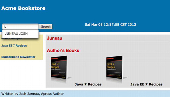
Figure 6-6. The PrimeFaces autoComplete component
How It Works
The autocomplete text box is one of the most sought after components for anyone looking to build a web input form. They are an ingenious invention because they help the user to choose from a list of available options, while narrowing down that list as the user types characters. In the end, the user will be less likely to enter invalid data since a selection list is made available while typing, and this will decrease the likelihood for invalid data. Unfortunately, the standard JSF component library does not ship with an autocomplete component, but luckily there are several available for use from other third-party libraries. This recipe covers usage of the PrimeFaces autoComplete component. The PrimeFaces autoComplete component provides a myriad of choices to the developer, and a handful of them will be covered here. For complete documentation regarding the autoComplete component, please visit the PrimeFaces online documentation.
To use the PrimeFaces component, the namespace must be declared for the PrimeFaces tag library within the view where the autoComplete component will be used. In the example, the namespace is declared as p, so the autoComplete tag is written as p:autoComplete. The example makes use of only three attributes, and two of them are essential for the use of the component. The first attribute is id, which is the unique identifier for the component within the view. Next is the value attribute, which is set to a managed bean property where the ending value will be stored. The value attribute for the autoComplete component is analogous to the value attribute of an inputText component. The final attribute used in the example is completeMethod, which is set to the managed bean method used to perform the autocompletion of the text.
The completeMethod is where the real work occurs, because this is where the text that has been entered into the component is compared against a list of values to determine which of the list elements are possible choices for the autoComplete component value. A List of Strings is returned from the completeMethod, and the values of the List will be displayed within a drop-down menu below the component when the results are returned. The completeMethod is executed each time the user presses another key, and the text that has been entered into the component thus far is sent to the method each time for evaluation. In the example, the text is compared to the author’s last name, and any author whose last name contains the text that has been entered will be added to the return List. Oftentimes the text from the component is compared against database table record values, as opposed to List elements, but the List demonstrates the technique fine too.
Those pieces of the puzzle that have been addressed already are the only essential pieces for making the autoComplete component function as expected. However, the PrimeFaces autoComplete component has a variety of attributes that can be used to customize the functionality of the autoComplete component. For instance, the component contains a minQueryLength attribute that can specify the minimum number of characters that need to be typed before the completeMethod will be invoked. The effect attribute can specify a range of different effects to apply to the autocomplete animation. The forceSelection attribute can be set to true to force a user to make a selection, and so forth. As mentioned previously, for a complete set of documentation covering the PrimeFaces autoComplete component, along with each of its attributes, please refer to the online documentation at www.primefaces.org.
The ability to autocomplete a user’s text entry while they are typing the characters provides a wide variety of benefits to an application. First, the data integrity of the application can benefit from the use of standard entries that are displayed via the autocomplete feature, as opposed to freehand text entries from many different users. Second, autocomplete solutions provide a more unified user experience, allowing the user to choose from an available list of options rather than guessing what the entry should contain.
6-15. Developing Custom Constraint Annotations
You want to create an annotation that can be applied to a managed bean property to perform bean validation.
Solution
Create a custom annotation class, specifying the properties you want the annotation to accept, and create a validator class that will perform the actual validation on the property. In this example, you’ll create a constraint annotation that can be used to validate the length of an inputSecret component value, that is, the length of a password. The following code is for a class named PasswordLength, which is used for creating the annotation that will be used for validating the password length:
package org.javaeerecipes.chapter06.annotation;

import static java.lang.annotation.ElementType.*;
import static java.lang.annotation.RetentionPolicy.*;

import java.lang.annotation.Documented;
import java.lang.annotation.Retention;
import java.lang.annotation.Target;

import javax.validation.Constraint;
import javax.validation.Payload;
import org.javaeerecipes.chapter06.validator.CheckPasswordValidator;

@Target( { METHOD, FIELD, ANNOTATION_TYPE })
@Retention(RUNTIME)
@Constraint(validatedBy = CheckPasswordValidator.class)
@Documented
public @interface PasswordLength {

    String message() default "{org.javaeerecipes.constraints.password}";

     * @return password length
     */
    int passwordLength();

}
Note that in the annotation class there is a reference to the CheckPasswordValidator class, which is where the actual validation takes place. The validator class for the annotation contains the logic for performing the actual validation, and the sources for the CheckPasswordValidator class are as follows:
package org.javaeerecipes.chapter06.validator;

import javax.validation.ConstraintValidator;
import javax.validation.ConstraintValidatorContext;
import org.javaeerecipes.chapter06.annotation.PasswordLength;

/**
 * Custom validation class to ensure password is long enough
 * @author juneau
 */
public class CheckPasswordValidator implements
        ConstraintValidator<PasswordLength, Object> {
    private int passwordLength;

    private String password;
    @Override
    public void initialize(PasswordLength constraintAnnotation) {
        // Initilize implementation here
        passwordLength = constraintAnnotation.passwordLength();
    }

    @Override
    public boolean isValid(Object value, ConstraintValidatorContext context) {
        boolean returnValue = false;
        if (value.toString().length() >= passwordLength){
            returnValue = true;
        } else {
            returnValue = false;
        }
        return returnValue;
    }
}
To make use of the annotation, place it before a field declaration just as with standard bean validation.
@PasswordLength(passwordLength=8)
    private String password;
How It Works
Annotations can be placed before a class, method, variable, package, or parameter declaration to indicate that it be treated in a different manner than a standard class or method. Annotations have been referred to as syntactic metadata, and they change the way that a piece of code functions at runtime. To create an annotation, you must create a piece of code that is very similar to a standard Java interface. At a glance, the main feature that separates a standard interface from an annotation is the @ character that is prefixed on the interface keyword. However, they have many differences, and special guidelines must be followed when creating them.
The name of the annotation when it is in use will be the same as the name of the @interface that is used to create the annotation. In the example, the annotation being created has a signature of @interface PasswordLength, and later the annotation will be used by specifying @PasswordLength, along with any parameters that go along with it. Annotations can contain method declarations, but the declaration must not contain any parameters. Method declarations should not contain any throws clauses, and the return types of method declarations should be one of the following:
- String
- Class
- Enum
- Primitive
- Array
Annotations can contain special annotations themselves that can be used only within the context of annotations. Those annotations are @Target, @Retention, @Constraint, @Documented, and @Inherited. I will briefly cover each of these annotation types, but it is important to note that custom constraint annotations require the @Constraint annotation to be placed before the @interface declaration, whereas other types of annotations do not.
The @Target annotation is used to signify which program elements can make use of the annotation. Table 6-4 describes the options that can be used within the @Target annotation.
Table 6-4. @Target Annotation Values
| Value | Description |
|---|---|
| TYPE | The annotation can be placed on a class, interface, or enum. |
| FIELD | The annotation can be placed on a class member field. |
| METHOD | The annotation can be placed on a method. |
| PARAMETER | The annotation can be placed on a method parameter. |
| CONSTRUCTOR | The annotation can be placed on a constructor. |
| LOCAL_VARIABLE | The annotation can be placed on a local variable or a catch clause. |
| ANNOTATION_TYPE | The annotation can be placed on an annotation type. |
| PACKAGE | The annotation can be placed on a Java package. |
For the purposes of creating a constraint annotation, the @Target annotation usually contains the following, as in the example to this recipe:
@Target( { METHOD, FIELD, ANNOTATION_TYPE })
The @Retention annotation is used to indicate how long the annotation will be retained. The options are class, source, and runtime. Table 6-5 describes these three types of retention.
Table 6-5. Annotation Retention Values
| Value | Description |
|---|---|
| class | The annotation is discarded during the class load. |
| source | The annotation is discarded after compilation. |
| runtime | The annotation is never discarded, available for reflection at runtime. |
The @Documentation annotation can be added to ensure that the @interface is added to the JavaDoc for the specific project that it is contained within. The @Constraint annotation is used to declare which constraint class will be used for testing the validity of the value contained within the field being annotated. In the example, the @Constraint annotation contains a validatedBy parameter value of CheckPasswordValidator.class, and this signifies that the CheckPasswordValidator class will be used to validate the value. You will take a more in-depth look at the CheckPasswordValidator class in a moment.
The last annotation that can be specified within an @interface declaration is @Inherited. This is used to allow the annotation to inherit properties of another class. In other words, if the @Inherited annotation is placed on an @interface declaration, then the properties of an annotation that has been placed on a class can be inherited by another class, which extends it. Therefore, if ClassA contains your custom annotation and the @Inherited annotation has been specified in the declaration of the custom annotation, then if ClassB extends ClassA, it also inherits the properties of the custom annotation.
To briefly explain the annotation member elements and methods, both the message() and passwordLength() elements are exposed for use with the annotation, so a developer can specify @PasswordLength(message="some message" passwordLength=6), for instance. You can add any number of elements to the annotation, utilizing any data type that makes sense for your annotation requirements, although most of the time an int or String data type is specified. In the case of the validation annotation, you may want to expose one or more of the elements within the validator class. I’ll show you how to do that after a brief explanation of how the validator class works.
Note Any member element in an annotation @interface can contain a default value by specifying the keyword default and specifying the default value afterward. Doing so would enable a developer to use the annotation without specifying the element when using the annotation.
The last piece of the puzzle for developing a custom validator annotation is the validator class itself. The validator class must implement ConstraintValidator. In the validator class, override the initialize and isValid methods for the implementation. The initialize method accepts an object of the annotation type that you created. In the example, you can see that the intialize method accepts a PasswordLength object. The initialize method is where you set up all the local fields that will be needed to validate the contents of the field that the annotation has been placed on. In the example, a couple of member fields have been declared: passwordLength and password. The passwordLength field is set to the value specified by the annotation element that is exposed to the developer. To capture this value, in the initialize method, the annotation object is used to obtain the value. In the example, passswordLength is set equal to constraintAnnotation.passwordLength(). The isValid method is then invoked, and the actual value that is contained within the annotated managed bean property is passed into this method. This is where the actual validation occurs. The isValid method should return a Boolean value indicating whether the value is valid. In the example, if the value is greater than or equal to the passwordLength field value, then it is valid, and isValue returns a true value.
Although there are a few pieces, it isn’t difficult to create a custom validation annotation once you’ve done it a time or two. There are some good use cases for developing custom annotations, so they make for a good tool to have in your arsenal.
6-16. Customizing Data Tables
Problem
You want to create a more customized table than the standard JSF dataTable component allows. For instance, you want to add the capability to edit the table cells inline.
Solution
Use a third-party component library dataTable component to provide custom options for your application needs. In this example, you’ll use the PrimeFaces dataTable component to create a editable dataTable for the Acme Bookstore shopping cart. Rather than clicking a link within a table row in order to edit the data for that row, this updated implementation will allow you to edit the table data inline, without the need to navigate to different page for editing the data. Everything will be done asynchronously via the use of Ajax, and the best part is that all of the dirty work is done for you. There is no need to code a single line of JavaScript. Let’s take a look at this solution!
Let’s look at an listing for the cart view that has been updated to use the p:dataTable (PrimeFaces dataTable component) and its inline row-editing capabilities. The following listing is the updated cart view, which resides in the file named recipe06_16.xhtml:
<?xml version="1.0" encoding="UTF-8"?>

<ui:composition xmlns="http://www.w3.org/1999/xhtml"
                xmlns:ui="http://xmlns.jcp.org/jsf/facelets"
                xmlns:f="http://xmlns.jcp.org/jsf/core"
                xmlns:h="http://xmlns.jcp.org/jsf/html"
                xmlns:p="http://primefaces.org/ui"
                template="./layout/custom_template_search.xhtml">
            <ui:define name="content">
                <h:form id="shoppingCartForm">
                    <h1>Shopping Cart Contents</h1>
                    <p>
                        Below are the contents of your cart.
                    </p>
                    <h:messages id="cartMessage" globalOnly="true"
                                errorStyle="color: red" infoStyle="color: green"/>
                    <br/>
                    <p:dialog id="updateDialog" widgetVar="updateDlg"
                              modal="true"
                              height="40" resizable="false"
                              closable="false" showHeader="false" >

                        <h:graphicImage id="loading" library="image" name="ajaxloading.gif"/>
                    </p:dialog>
                    <p:dataTable id="cartTable" value="#{ch6CartController.cart.books}" var="book"
                                 rendered="#{ch6CartController.cart.books ne null}">
                        <p:ajax id="rowEditAjax" event="rowEdit" execute="@this" update="@this"
                                listener="#{ch6CartController.updateRowData}"
                                onstart="updateDlg.show();"
                                oncomplete="updateDlg.hide();"
                                onerror="updateDlg.hide();"/>

                        <p:column id="title" headerText="Title">
                            #{book.book.title}
                        </p:column>
                        <p:column id="quantity" headerText="Quantity">
                            <p:cellEditor>
                                <f:facet name="output">
                                    <h:inputText readonly="true" size="10" value="#{book.quantity}"/>
                                </f:facet>
                                <f:facet name="input">
                                    <h:inputText id="bookQty" size="10" value="#{book.quantity}"/>
                                    </f:facet>
                            </p:cellEditor>
                        </p:column>
                        <p:column id="edit" headerText="Edit">
                            <p:rowEditor />
                        </p:column>

                    </p:dataTable>

                    <h:outputText id="emptyCart" value="No items currently in cart."
                                  rendered="#{ch6CartController.cart.books eq null}"/>
                    <br/>
                    <h:commandLink id="continueLink" action="#{ch6CartController.continueShopping}"
    value="Continue Shopping"/>
                </h:form>
            </ui:define>
</ui:composition>
Note that the view also contains another PrimeFaces component, the dialog. It is used to present a pop-up dialog, and in this case it shows an animation when the updating is occurring. Next, let’s look at the code behind the logic of the inline editing and the shopping cart in general. The following listing is an excerpt from the CartController class (in the Chapter 6 sources), showing a method named updateRowData, which is responsible for updating the data in the table.org.primefaces.event.RowEditEvent class into the source in order to make use of the RowEditEvent:
...

    public void updateRowData(RowEditEvent e) {
        System.out.println("Perform editing logic here...");
        currentBook = (Item)e.getObject();
        // Call the updateCart method, passing the title of the current book.
        updateCart(((Item)e.getObject()).getBook().getTitle());
    }
...
When the final cart view is rendered, it will look like that in Figure 6-7 when the table is being edited inline.
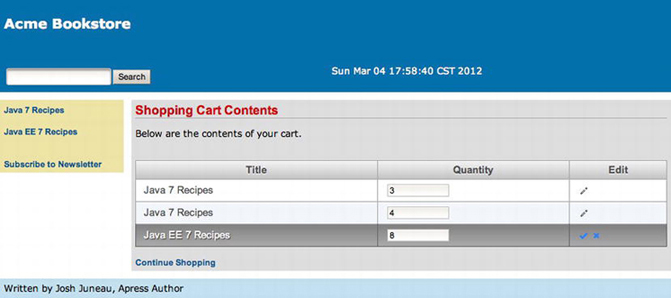
Figure 6-7. PrimeFaces dataTable Component: inline table editing
How It Works
The world of custom dataTable components is ever-changing, and there are a number of available implementations from which to choose. The RichFaces library offers its own flavor of the custom dataTable, providing sorting and editing options just like the PrimeFaces dataTable. To see a demo of each, please visit the RichFaces demo at http://livedemo.exadel.com/richfaces-demo/index.jsp and the PrimeFaces demo at www.primefaces.org/showcase/ui/home.jsf. This recipe demonstrates the editable dataTable available from the PrimeFaces component library. As always, the first step to using a component from a third-party library is to install the library for your application to use. If you have not yet done this, please see Recipe 5-11; otherwise, let’s continue learning more about the PrimeFaces dataTable.
It should be noted that the PrimeFaces dataTable offers many options, and this recipe covers only one of them, that is, inline editing. There are options for sorting, adding headers and footers, filtering, selecting one or more rows, grouping, and so on. An entire chapter could be written about using the many options of the PrimeFaces dataTable. I will not cover these features in this recipe; please see the PrimeFaces documentation for more information on using those features. I think you will find that PrimeFaces takes a “recipe” approach for demonstrating the use of its components. You can visit its showcase, see the components in action, and then look at the code on the same page. In this recipe, I will cover one of the more difficult features to customize: inline data editing.
Out of the box, the inline editing feature for PrimeFaces dataTables is very simple. A p:dataTable component works in the same manner as a standard JSF dataTable component, in that it accepts a List, DataModel, or Collection of data.
Note In a later chapter that makes use of database tables and entity classes, you will see a version of this recipe utilizing collections for the dataTable data type. The use of collections for dataTable components is new in JSF release 2.2.
In the example, you can see the p:dataTable component accepts a value of #{ch6CartController.cart.books}, which is a List of Item objects. The Item objects are those that are contained within the current session’s cart. If you look directly below the p:dataTable component, you will notice a p:ajax tag, which will provide extra functionality to the p:dataTable. You can ignore the p:ajax tag for now; it is not necessary to implement the inline editable table. However, in this example, you use it to gain control over the underlying update of the row.
Moving down the code, the column declarations are also very similar to that of a standard h:dataTable component. Instead of denoting columns with h:column, use p:column tags, and reference the data for each column using the p:dataTable’s var attribute keyword. In the example, var is set to book, so #{book.book.title} will return the title of the book, which is the first column’s output. Note that the second column contains an embedded p:cellEditor component. A p:cellEditor component indicates that this column will be made editable, and each p:cellEditor component must contain two facets, one for the output and another for the input. The <f:facet name="ouput"> tag should be used to enclose what the column’s output should display. In the example, an inputText component with a readonly attribute set to true is used to display the book quantity. The other facet within the p:cellEditor component is for the input, the facet tag should read <f:facet name="input">, and it should enclose the input component for this column’s value. In the example, an inputText component is embedded within the input facet, and the value is set to #{book.quantity}. This time, the readonly attribute is not specified, and therefore the inputText component renders an editable text field. Following the input facet is a closing p:cellEditor tag, followed by the closing p:column tag for that column.
The last column of the table is also a p:column component, and embedded inside is a p:rowEditor component, which will display a pencil icon that the user can click to toggle the row of data and make it editable. Following along with the p:cellEditor logic that was covered in the previous paragraph, when the table is initially rendered, the content that is embedded within the cellEditor’s output facet is displayed. When the edit icon is clicked, the cellEditor’s output facet contents are hidden, and the input facet contents are displayed. At this point, the rowEditor component turns into a check mark and an X. If the user makes a change to the editable row contents, they can click the check mark to save the changes; otherwise, they can click the X to close the editable row and cancel the change.
The editable dataTable component works fine with just the constructs I’ve discussed, and all of the row editing takes place behind the scenes. That is, PrimeFaces does a good job of abstracting the implementation details from the developer, allowing the developer more time to work on other more important tasks. However, what if you want to perform some custom business logic when the row is edited? Perhaps you want to validate the data or track what data has been changed. Intercepting the edit is easy to do, and it has been done in this example. By adding the p:ajax tag to the p:dataTable component, you can intercept the rowEdit event. When the rowEdit event is executed, it is intercepted by the p:ajax listener, which in the example is set to the updateRowData method of the CartController class. To create a listener method for a rowEdit event, you must write a method that has no return value and accepts a RowEditEvent object. The RowEditEvent contains the actual row contents that are being edited. In the case of this example, the RowEditEvent is an Item object, and the listener method sets the currentBook object in the CartController class equal to the Item object and updates the cart accordingly.
Note If you do not want to intercept the rowEdit event, simply leave out the embedded p:ajax tag. Doing so will cause the p:dataTable to take care of the update logic behind the scenes.
In this recipe, I touched upon one of the most widely used components in any data-related JSF application, the dataTable. There are many ways in which a dataTable can be customized, and plenty of third-party component libraries ship with customized dataTable components. This example demonstrates the use of the PrimeFaces dataTable component, which I highly recommend to anyone looking for a custom and easy-to-use dataTable component. Utilizing a PrimeFaces dataTable component and making it editable allows for the inline editing of table row data. This will provide users with the ability to edit data in a spreadsheet-like fashion, which is sometimes much easier than drilling into each record separately. To learn more about all of the custom options available with the PrimeFaces dataTable, please check out http://primefaces.org.
Note As mentioned in the introduction to this chapter, in order to use PrimeFaces with Java EE 7, you must download and utilize the PrimeFaces 4.x release, as PrimeFaces 3.x or prior will not work correctly with JSF 2.2. Therefore, this recipe will only work with PrimeFaces 4.x.
Problem
You want to develop a flow of pages within your application that share information with one another.
Solution
Define a page flow using the new faces flow technology that was introduced in JSF 2.2. The faces flow solution allows a defined set of views to be interrelated with one another to share a common set of data, and views outside of the flow do not have access to the flow’s data. Flows also have their own set of navigational logic, so they are almost like a subprogram within an application. To enable an application to utilize faces flow, a <flow-definition> section should be added to the faces-config.xml file. The section can be empty, because the navigational logic can instead reside in a separate configuration file for the flow. The following faces-config.xml file demonstrates how to enable faces flow for an application:
<faces-config version="2.2"
       xmlns="http://xmlns.jcp.org/xml/ns/javaee"
       xmlns:xsi="http://www.w3.org/2001/XMLSchema-instance"
       xsi:schemaLocation="http://xmlns.jcp.org/xml/ns/javaee
       http://xmlns.jcp.org/xml/ns/javaee/web-facesconfig_2_2.xsd">
 ...
<flow-definition>
    </flow-definition>
     ...
</faces-config>
The views belonging to a flow should be separated from the rest of the application views and placed into a folder at the root of the application’s web directory. The folder containing the flow views should be named the same as the flow identifier. Navigation and configuration code is contained within a separate XML configuration file that resides within the flow view directory, and the file is named flowname-flow.xml, where flowname is the flow identifier. The following configuration file demonstrates the configuration for a very basic flow identified by exampleFlow. You can find more information regarding the different elements that can be used within the flow configuration in the “How It Works” section.
<?xml version="1.0" encoding="UTF-8"?>
<!DOCTYPE html>

<html xmlns="http://www.w3.org/1999/xhtml"
      xmlns:f="http://xmlns.jcp.org/jsf/core"
      xmlns:j="http://xmlns.jcp.org/jsf/flow">

    <f:metadata>
        <j:faces-flow-definition id="exampleFlow">

            <!-- A faces-flow-definition in a facelet page without any other
            children declares a faces flow equivalent to this:

              <start-node>the name of this page without any extension</start-node>
              <view id="the name of this page without any extension">
                <vdl-document>the name of this page with the extension</vdl-document>
              </view>

            -->
        </j:faces-flow-definition>
    </f:metadata>
</html>
The views belonging to the flow should reside within the flow folder alongside the flow configuration file. Each of the views can access a managed bean that is dedicated to facilitating the flow. The flows share a context that begins when the flow is accessed and ends when the flow exits. The following view demonstrates the entry point to a flow named exampleFlow. This example view can be found in the book sources in the file recipes06_17.xhtml.
<ui:composition xmlns="http://www.w3.org/1999/xhtml"
               xmlns:ui="http://xmlns.jcp.org/jsf/facelets"
                xmlns:f="http://xmlns.jcp.org/jsf/core"
                xmlns:h="http://xmlns.jcp.org/jsf/html"
                template="layout/custom_template.xhtml">
    <ui:define name="content">
        <h:messages globalOnly="true"  errorStyle="color: red" infoStyle="color: green"/>
        <h:form id="flowForm">
            <p>
                Faces Flow Example
            </p>
            <h:commandButton value="Begin Flow" action="exampleFlow"/>
            <h:commandButton value="Stay Here" action="stay"/>

        </h:form>
    </ui:define>
</ui:composition>
Next, let’s take a look at a view that is accessing the managed bean that is dedicated to the flow. In the following view, the managed bean named FlowBean is accessed to invoke a method, which will return an implicit navigational String directing the application to the next view in the flow. Notice that this view also accesses the facesContext.application.flowHandler, which I will discuss more in the “How It Works” section.
<ui:composition xmlns="http://www.w3.org/1999/xhtml"
xmlns:ui="http://xmlns.jcp.org/jsf/facelets"
xmlns:f="http://xmlns.jcp.org/jsf/core"
xmlns:h="http://xmlns.jcp.org/jsf/html"
template="../layout/custom_template.xhtml">
<ui:define name="content">
<h:form>
<p>
This is the first view of the flow.
<br/><br/>
Flow ID: #{facesContext.application.flowHandler.currentFlow.id}
<br/>
<h:commandLink value="Go to another view in the flow" action="#{flowBean.navMethod()}"/>
</p>
</h:form>
</ui:define>
</ui:composition>
Each subsequent view within the flow can also access the resources of the flow’s managed bean. Lastly, you’ll look at the code that is contained within org.javaeerecipes.chapter06.FlowBean, which is the managed bean that is dedicated to the flow.
import javax.faces.flow.FlowScoped;
import javax.inject.Named;

@Named
@FlowScoped("exampleFlow")
public class FlowBean implements java.io.Serializable {

    private String flowValue;
    private String parameter1;
    /**
     * Creates a new instance of FlowBean
     */
    public FlowBean() {
    }

    /**
     * Initializes the flow
     */

    public void initializeIt(){
        System.out.println("Initialize the flow...");
    }
    /**
     * Finalizes the flow
     */

    public void finalizeIt(){
        System.out.println("Finalize the flow...");
    }

    public String navMethod(){
        return "intermediateFlow";
    }

    public String testMethod(){
        return "intermediate";
    }

    public String endFlow(){
        return "endingFlow";
    }

    /**
     * @return the flowValue
     */
    public String getFlowValue() {
        return flowValue;
    }

    /**
     * @param flowValue the flowValue to set
     */
    public void setFlowValue(String flowValue) {
        this.flowValue = flowValue;
    }

    /**
     * @return the parameter1
     */
    public String getParameter1() {
        return parameter1;
    }

    /**
     * @param parameter1 the parameter1 to set
     */
    public void setParameter1(String parameter1) {
        this.parameter1 = parameter1;
    }
}
This solution provided a quick overview of the files that are required for creating a flow within a JSF application. In the next section, I’ll cover the features in more detail.
How It Works
The concept of session management has been a difficult feat to tackle since the beginning of web applications. A web flow refers to a grouping of web views that are related and must have the ability to share information with each view within the flow. Many web frameworks have attempted to tackle this issue by creating different solutions that would facilitate the sharing of data across multiple views. Oftentimes, a mixture of session variables, request parameters, and cookies are used as a patchwork solution.
In JSF 2.2, a solution has been adopted for binding multiple JSF views to each other, allowing them to share information among each other. This solution is referenced as faces flow; and it allows a group of interrelated views to belong to a flow instance, and information can be shared across all the views belonging to a flow instance. Flows contain separate navigation that pertains to the flow itself and not the entire application. As such, flow navigation can be defined in an XML format or via code. A flow contains a single point of entry, and it can be called from any point within an application.
As mentioned in the solution to this recipe, the faces-config.xml file for a JSF application that will utilize the flow feature must contain a <flow-definition> section. This section of the faces-config.xml file can contain information specific to one or more flows residing within an application. However, for the purposes of this recipe, the solution utilizes a separate XML configuration file for use with the flow. Either way will work; the syntax does vary just a bit because the XML configuration file that is flow-specific uses a new JSF taglib for accessing the flow-specific configuration tags. To learn more about using the faces-config.xml file for flow configuration, please refer to the online documentation. Even if a flow is not using the faces-config.xml file for defining the flow configuration, the <flow-definition> section must exist to tell the JSF runtime that flows are utilized within the application.
The flow-specific configuration file and all flow-related views should reside within the same folder, at the root of the application’s web directory. The name of the folder should be the same as the flow identifier. As mentioned in the solution, the flow configuration file should be named flowname-flow.xml, where flowname is the same as the flow identifier. The URI, http://xmlns.jcp.org/jsf/flow, should be added to the flow configuration file in order to make flow-specific tags available for configuration use. The taglib declarations for a simple JSF view that includes flows may look like the following:
<html xmlns="http://www.w3.org/1999/xhtml"
      xmlns:j="http://xmlns.jcp.org/jsf/flow">
      xmlns:f="http://xmlns.jcp.org/jsf/core"
      xmlns:h="http://xmlns.jcp.org/jsf/html"
The Flow Managed Bean
A flow contains its own managed bean annotated as @FlowScoped, which differs from @SessionScoped because the data can be accessed only by other views (ViewNodes) belonging to the flow. The @FlowScoped annotation relies upon Contexts and Dependency Injection (CDI), because FlowScoped is a CDI scope that causes the runtime to consider classes with the @FlowScoped annotation to be in the scope of the specified flow. A @FlowScoped bean maintains a life cycle that begins and ends with a flow instance. Multiple flow instances can exist for a single application, and if a user begins a flow within one browser tab and then opens another, a new flow instance will begin in the new tab. This solution resolves many lingering issues around sessions and new-age browsers that allow users to open multiple tabs. To maintain separate flow instances, the ClientId is used by JSF to differentiate among multiple instances.
Each flow can contain an initializer and a finalizer (that is, a method that will be invoked when a flow is entered and a method that will be invoked when a flow is exited, respectively). To declare an initializer, specify a child element named <initializer> within the flow configuration <flow-definition>. The initializer element can be an EL expression that declares the managed bean initializer method, as such:
...
<initializer>#{flowBean.initializeIt}></initializer>
...
Similarly, a <finalizer> element can be specified within the flow configuration to define the method that will be called when the flow is exited. The following demonstrates how to set the finalizer to an EL expression declaring the managed bean finalizer method:
...
<finalizer>#{flowBean.finalizeIt}></finalizer>
...
Flows can contain method calls and variable values that are accessible only via the flow nodes. These methods and variables should be placed within the FlowScoped bean and used the same as standard managed bean methods and variables. The main difference is that any method or variable that is defined within a FlowScoped bean is available only for a single flow instance.
Navigating Flow View Nodes
Flows contain their own navigational rules, which can be defined within the faces-config.xml file or the individual flow configuration files. These rules can be straightforward and produce a page-by-page navigation, or they can include conditional logic. There are a series of elements that can be specified within the navigation rules, which will facilitate conditional navigation. Table 6-6 lists the different elements, along with an explanation of what they do.
Table 6-6. Flow Navigational Elements
| Element | Description |
|---|---|
| view | Navigates to a standard JSF view. |
| switch | Represents one or more EL expressions that conditionally evaluate to true or false. If true, then navigation occurs to the specified view node. |
| flow-return | Outcome determined by the caller of the flow. |
| flow-call | Represents a call to another flow; creates a nested flow. |
| method-call | Arbitrary method call that can invoke a method that returns a navigational outcome. |
The following navigational sequence is an example of a flow navigation that contains conditional logic using the elements listed in Table 6-6:
<j:flow-definition>

    <start-node>exampleFlow</j:start-node>

    <switch id="startNode">
        <navigation-case>
            <if>#{flowBean.someCondition}</if>
                <from-outcome>newView</from-outcome>
        </navigation-case>
     </switch>

     <view id="oneFlow">
         <vdl-document>oneFlow.xhtml</vdl-document>
     </view>

     <flow-return id="exit">
         <navigation-case>
             <from-outcome>exitFlow</from-outcome>
         </navigation-case>
     </flow-return>

     <finalizer>#{flowBean.finalizeIt}</finalizer>

 </j:flow-definition>
Flow EL
Flows contain a new EL variable named facesFlowScope. This variable is associated with the current flow, and it is a map that can be used for storing arbitrary values for use within a flow. The key-value pairs can be stored and read via a JSF view or through Java code within a managed bean. For example, to display the content for a particular map key, you could use the following:
The content for the key is: #{facesFlowScope.myKey}
6-18. Constructing a JSF View in Pure HTML5
Problem
You want to utilize HTML5 tags instead of JSF components, but you still want to utilize JSF and all of its capabilities within your application.
Solution
Utilize the HTML-friendly markup for use within JSF views. By using HTML5 within JSF views directly, you can take advantage of the entire JSF stack while coding views in pure HTML5. To use this solution, HTML5 tags have the ability to access the JSF infrastructure via the use of a new taglib URI specification xmlns:jsf="http://xmlns.jcp.org/jsf", which can be utilized within JSF views beginning with JSF 2.2 and beyond. In views that specify the new taglib URI, HTML tags can utilize attributes that expose the underlying JSF architecture.
In the following example view, HTML5 tags are used to compose an input form that is backed by a JSF managed bean. To visit the sources for this example, please visit the view recipe06_18.xhtml within the sources for the book.
<?xml version="1.0" encoding="UTF-8"?>
<!DOCTYPE html PUBLIC "-//W3C//DTD XHTML 1.0 Strict//EN" "http://www.w3.org/TR/xhtml1/DTD/xhtml1-strict.dtd">
<html xmlns="http://www.w3.org/1999/xhtml"
      xmlns:ui="http://xmlns.jcp.org/jsf/facelets"
    xmlns:f="http://xmlns.jcp.org/jsf/core"
      xmlns:jsf="http://xmlns.jcp.org/jsf">
    <head jsf:id="head">
        <meta http-equiv="Content-Type" content="text/html; charset=UTF-8"/>

    </head>
    <body jsf:id="body" prependId="false">
        <form jsf:id="form">
            <details jsf:id="outputMessage">
   <summary>Message</summary>
   <p>#{ajaxBean.status}</p>
   </details>
   <input type="text" jsf:id="value1" value="#{ajaxBean.value1}">
   <f:ajax execute="@this"/>
   </input>

   <br/><br/>
   <input type="text" jsf:id="value2" value="#{ajaxBean.value2}">
   <f:ajax execute="@this"/>
   </input>
   <br/>
   <br/>
   <input type="submit" jsf:id="status" jsf:value="#{ajaxBean.status}"
    jsf:action="#{ajaxBean.process()}" value="Process">
   <f:ajax execute="@this" render="outputMessage"/>
   </input>
   </form>
   </body>
   </html>
Note This feature is only available to views written in Facelets. It is not available to views written in JSP.
How It Works
The JSF 2.2 release includes the ability to utilize HTML5 markup within JSF views. As a matter of fact, the markup is not limited to HTML5; it can also include HTML4, and so on. The addition of a new taglib URI makes this possible, because it allows existing HTML tags to be bound to the JSF life cycle via the use of new namespace attributes. It is now possible to develop entire JSF views without using any JSF tags at all.
To utilize the new namespace attributes, your JSF view must import the new taglib URI xmlns: jsf="http://xmlns.jcp.org/jsf". The new taglib can then be referenced as attributes within existing HTML tags, setting the underlying JSF attributes that are referenced. For instance, to utilize an HTML input tag with JSF, you would add the jsf:id attribute and set it equal to the JSF ID that you want to assign to that component. You would then set an attribute of jsf:value equal to the managed bean value.
Note There is no need to import the http://xmlns.jcp.org/jsf/htmltaglib because you are no longer utilizing JSF component tags in the view.
The new syntax provides several benefits for web developers. Although not all web developers are familiar with JSF component tags, HTML tags are well known. Utilizing the new syntax, both JSF and HTML developers alike can create web views that utilize the power of JSF along with the flexibility of HTML. The new syntax also makes it easier to bind HTML tags with JavaScript, if needed. You no longer need to worry about JSF view IDs getting in the way when working with HTML and JavaScript. With the addition of new JSF taglib namespace for use with HTML tags, both JSF and HTML alike have been improved.