The apps for the iPhone will have you being creative beyond your wildest dreams with your photography. It’s amazing that you can create works of art with your fingers, and that you can do it anywhere. This chapter covers four more dynamite apps—PhotoForge, ColorSpash, Photo Studio, and Photo fx. You’ll find everything you need to use these apps, including a detailed list of the options to assist you in navigating through them.
In the section “Cropping with PhotoForge” in Chapter 8, a detailed discussion presented the ins and outs of cropping. There are many more options in PhotoForge that you can use, including a choice of 15 adjustments and 18 effects. You could spend all day playing around with your images with this app.
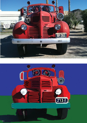
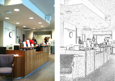
Indeed, I did spend all day making the fire truck picture from a photograph that you see in Figure 10.1.
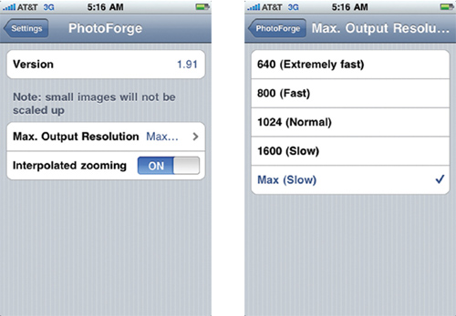
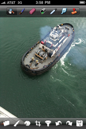
You can set PhotoForge’s output files to full resolution, but it’s a bit tricky, because you can’t do it from the app itself. There is no access to the settings when you are working in the app. To get to the settings that include access to change the resolution, you can tap Settings on your iPhone’s home screen and swipe downward until you get to the PhotoForge listing. Tap it, and you’re taken to the app’s settings, shown in Figure 10.2. Tap on Max. Output Resolution to be taken to a list of resolutions. You can choose from 640, 800, 1024, 1600, and Max. Figure 10.2 shows how the choices are displayed on the screen with Max. Output Resolution selected. To select a resolution, you just tap it.
In PhotoForge, you can start out by opening an existing photo, creating a new blank slate upon which to draw, or taking a picture with the camera. (See the description for the Folder icon later in this chapter.)
PhotoForge has many options, as you can see in Figure 10.3.
On the top, going from left to right, you have the following icons.
Magnifying Glass. The Magnifying Glass makes your image moveable. You can spread two fingers apart on the screen to magnify the image. You can use one finger to move it around. When you’re working, you move back and forth from this option to others so you can work with the image at different magnifications.
Paintbrush. When you tap on the Paintbrush icon, you’re put in Paintbrush mode. Every time you touch, tap, or slide your finger on the screen, you’ll apply paint marks on the screen. The White Paintbrush and Palette at the bottom of the screen control can be applied to this function. They are described in a moment.
Eraser. When you tap on the Eraser, it is activated, but it will only erase marks that you’ve made with another tool (the Paintbrush or Paint Can). It will not erase any part of your original image.
Paint Can (Fill tool). The Paint Can will color in the entire frame. For it to work, you must swipe your finger across the screen. It acts like a filter you’d put on your camera lens or like the filter you can apply in Photoshop. You can change color and transparency using the Palette option in the bottom row, which is discussed in a moment.
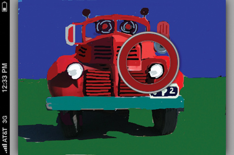
Eyedropper. You can use this tool to pick up a color you already have on your screen. After you tap it, move your finger around the screen. You’ll see a ring come up that changes color as you move your finger across the screen. When you see the color you want, lift your finger off the screen to have the paint palette set to that color. Figure 10.4 shows the Eyedropper’s ring, which has picked up dark red from the fire engine.
Finger (Smudge tool). The Smudge tool smudges any area of your image that your finger slides over.
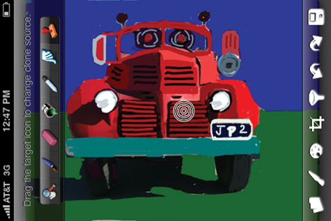
Clone Stamp. To copy one part of your image to another part, you first drag the target icon (shown in Figure 10.5) to the target area that you want to copy. Then you slide your finger back and forth over a new area where you want the target area copied. You can move the target icon by swiping your finger from it to anywhere on the screen.
On the bottom, from left to right, you have the following icons:
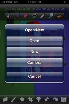
Folder. This option lets you do one of three things, as shown in Figure 10.6.
Open. You can open a photo after tapping this option. You’re taken to the Camera Roll, where you can choose a picture you have already taken.
New. You can create a new image on a blank slate that comes up after tapping New.
Camera. After you tap Camera, you can take a picture when the shutter comes up. You’ll then get a preview with two options: one to Retake and one to Use. If you like the picture you took, tap Use. The image you took will then appear with the PhotoForge options.
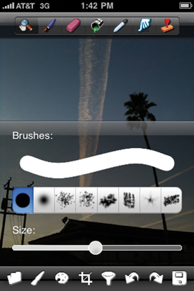
Paintbrush. You can change the Paintbrush size and type (see Figure 10.7) if you tap the Paintbrush icon in the bottom row of icons. You do this to paint when you are in Paint mode (which you get to by tapping the Paintbrush in the top row).
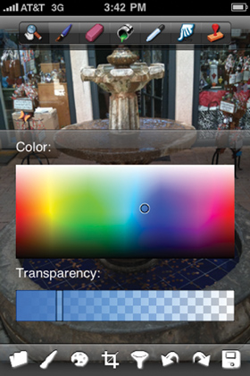
Paint Palette. The Paint Palette icon lets you choose a color and paint transparency (see Figure 10.8) not only for your brush, but also for the Paint Can (Fill tool). Remember that the Fill tool will affect your entire frame, not any one part of your image.
Crop tool. See the “Cropping and Rotating on the iPhone” section in Chapter 8.
Filters (T icon). This is the part of PhotoForge that packs in a plethora of options. They include Adjustments and Effects (see Figure 10.9; you need to swipe your finger up on the screen to view them all). The Adjustments are Curves, Levels, Noise Reduction, Unsharpen Mask, Sharpen, Blur, Simulated HDR, Hue/Saturation, Brightness/Contrast, Exposure, Vibrance, Tilt Shift, Auto White Balance, Auto Exposure, and Auto Enhance. The Effects are Dreamy, Vignette, Lomo, Sin City, Posterize, Watercolor, Oil Painting, Sepia, Black and White, Night Vision, Heat Map, Pencil, Neon, Emboss, Negative, Sunset, BlueSky, and Television. All of the adjustments involve another screen in which you have additional options for tweaking. The effects are automatically activated when you tap them, except for the ones that have an ellipsis next to them. The ellipses indicate that there are additional options for tweaking shown on a pop-up screen.
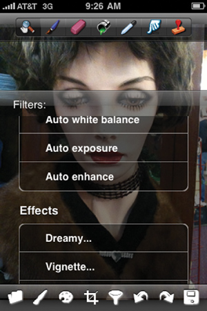
Figure 10.9. To see all the Filters and Effects, swipe your finger upward after tapping on the T icon.
Some of the adjustments offer one slider to tweak your image and are pretty self-explanatory. They are Noise Reduction, Sharpen, Blur, Exposure, and Vibrance. Noise Reduction reduces the tiny dots that are seen mostly in night images. The Sharpen option sharpens your photo. Blur lets you create differing amounts of softness in your photo by moving the slider to the right. Exposure basically darkens your photos if you move the slider to the left and lightens your photo if you move it to the right. Vibrance makes your colors more vibrant.
There are three auto adjustments: Auto White Balance, Auto Exposure, and Auto Enhance.
There are a few moments of processing time after you’ve tapped on one of them.
A few of the adjustments are more complex. They are explained in the following list.
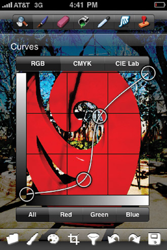
Curves. If you know Photoshop, the curves work in a very similar way to how they do in that program. If you don’t have Photoshop, this is still a fairly simple option. All you have to do when you tap this option on the menu is tap to create a curve point and then slide your finger to change the orientation of the line. You can add as many points as you want—but don’t add too many, because the whole thing will get too complicated. You can also tweak by color, opting for All (the default), Red, Green, or Blue. You can also change the color spaces to CMYK or CIE Lab. For the purposes of this book, though, stick with RGB—that is what is used for most purposes. Figure 10.10 shows a tweak of the curves that makes a tonal red solid.
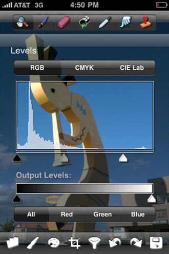
Levels. The Levels option (see Figure 10.11) also works the same way as it does in Photoshop. You can use the sliders (slide your finger using the small triangles at the bottom horizontal axis of the levels graph) to tweak your image. Slide the middle or right-end triangle to the left, and the image darkens. Slide the middle or left-end triangle to the right, and the image darkens. I recommend that you only work with the middle slider, because moving the end ones will lessen the number of color tones you will be working with.
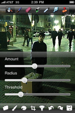
Unsharpen Mask. Unsharpen Mask (see Figure 10.12) is a sharpening tool with three parameters that can be tweaked using sliders: Amount, Radius, and Threshold. The Amount controls how much darker or lighter the edges of the image become. The Radius controls how much of the edge of the image will be affected. The Threshold controls which edges are tweaked. Low values will sharpen both low-and high-contrast areas. Higher values will sharpen only high-contrast areas.
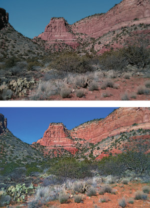
Simulated HDR. HDR stands for High Dynamic Range. It’s the latest trend in photography. Basically, it gives you a much better tonal range of colors in your photo. In PhotoForge, there are two sliders: Shadow and Highlight. Moving either to the right mutes the tones, causing them to change to a more basic form of the color. For example, dark red becomes a vibrant red after the tweak. Be careful not to overdo this one, because if you tweak too much, you’ll get blown colors in some of your image. Figure 10.13 shows a landscape before and after tweaking both the shadow and the highlight using the Simulated HDR.
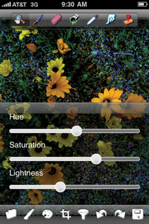
Hue/Saturation. No image-processing program would be complete without a tweak for hue and saturation. PhotoForge offers both of those and a lightness tweak when you tap on the Hue/Saturation option. Figure 10.14 shows the pop-up menu with the three sliders that appear after you tap the Hue/Saturation option.
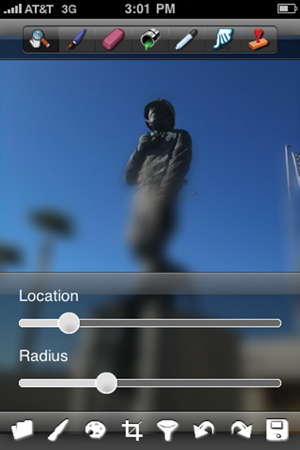
Tilt Shift. This is one compelling effect. It’s a bit tricky, though. All you have to remember is that when you swipe the slider to the right, the area that’s in focus moves down. When you increase the radius, more of the image comes into focus. Figure 10.15 shows a sample tweak where the Location (of the sharp area of the image) is toward the top and where the Radius is set so that the sharp area is wide enough to keep the statue of the soldier’s head and chest sharp.
PhotoForge has 18 effects. Here is the list, including the tweaking features of each. (If the option on the screen is listed with an ellipsis after it, it means that there is a tweaking option.) Some of the effects are great, and others are not so great. I included a before-and-after image with the effect if I thought it was particularly compelling.
Dreamy. Has a Strength slider.
Vignette. Has a Strength slider.
Lomo. No sliders; automatic tweak. See Figure 10.16.
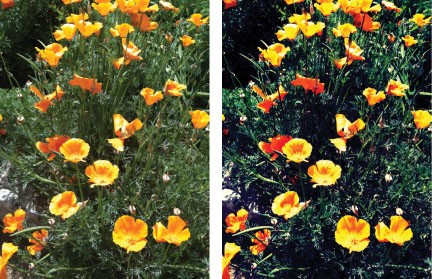
Figure 10.16. Photo of California poppies (the state flower of California) before and after the Lomo effect tweak.
Posterize. Has a Strength slider.
Watercolor. Has a Strength slider.
Oil Painting. Has a Strength slider. See Figure 10.17.
Sepia. No sliders; automatic tweak.
Black and White. No sliders; automatic tweak.
Night Vision. No sliders; automatic tweak.
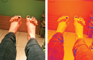
Heat Map. Heatmap Type slider. (As you swipe the slider to the right, color combinations of the image change. See Figure 10.18.)
Pencil. No sliders; automatic tweak. See Figure 10.19.
Neon. No sliders; automatic tweak.
The first thing ColorSplash does is ask you to choose a photo. There are two options: Take Photo or Load Image.
If you opt to take a photo, your camera’s shutter will appear. After you tap it to take a picture, a preview of it will appear on the screen. At that point there will be two buttons: Retake and Use. You can either retake the image or use it.
If you opt to use the image by tapping on Use, a prompt will ask you whether you want to save the photo at full resolution before you begin working on it. The options here are Save Photo or Don’t Save.
If you opt to load an image, you’ll be taken to your Camera Roll, where you can pick one of your images to use in the app.
Next, ColorSplash automatically converts your photo to black and white on a home screen that looks like the one shown in Figure 10.20.
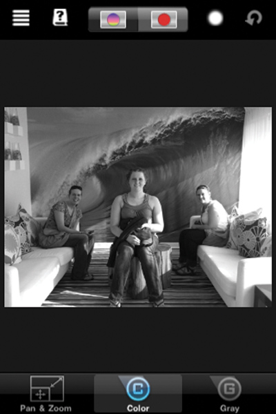
Figure 10.20. The moment your photo enters the ColorSplash home screen, it is converted to black and white.
The icons are laid out at the top and bottom of the screen. To get the color back in your image, you just paint the screen with one finger. Use two fingers to zoom in or to move the image around. Tap two fingers on the screen to return the image to its original size (the size of the iPhone screen).
The following subsections discuss what the top icons do.
Tapping the Menu icon (which looks like four horizontal lines) gives you options for loading, saving, and inverting your images, as well as access to the settings (see Figure 10.21).
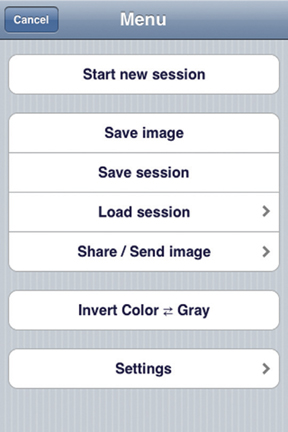
Figure 10.21. Options for the Menu icon. If you don’t like what you’ve done with an existing image, you can tap the Start New Session button.
The first set of options on the screen includes Save Image, Save Session, Load Session, and Share/Send Image.
When you tap Save Session, your session will be listed in the Load Session screen. Figure 10.22 shows several saved sessions. When you tap one of the sessions, you’ll be taken to a preview screen of it. You have to tap the Load Session button at the bottom of the screen to load it again.
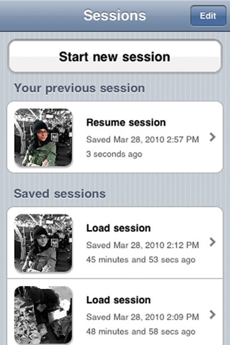
Figure 10.22. You can save a session that you’ve worked on and access it in the Load Session option.
Note
If you save your sessions right away, you won’t have to hunt again for the image you’ve chosen, because you will have loaded it and saved it already.
The Share/Send Image option lets you email your image, giving you a choice of sending your tweaked image at full resolution or choosing from six scaled-down resolutions.
After you tap on a resolution, you’ll get a screen with the email already written up and the picture attached. All you have to do is fill in the To and Subject lines.
You also have options to Copy to Clipboard as well as Upload to Facebook, Upload to Flickr, and Post to Twitter.
The next option in the menu is Invert Color to Gray. This option enables you to change anything that’s gray (black and white) on your screen to color and anything that’s in color to gray. You can change it back to what you had by tapping the Menu icon and then tapping the Invert Color to Gray option again.
When you tap the Help icon (which looks like a question mark), you’re taken to a screen with a series of help videos. They’re filled with info, and I recommend that you watch them—they are very well done.
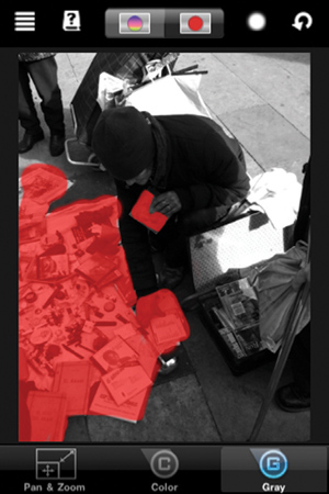
There are two modes in which you can color: the Red View mode (discussed in a moment) and the Color View mode. Color View mode lets you see the image as it is with both color and gray tones that you have created by painting with your finger.
Use the Red View mode to see what areas of the image you’ve added color back to. Figure 10.23 shows an example of the Red view. All of the area brought back to color by painting with a finger is in red, as shown. You can use Red view to add color to your image in the same way as you’d use it in Color view. The only difference is that you won’t be able to see the color reappear. To see it, you have to tap on the Color View icon.
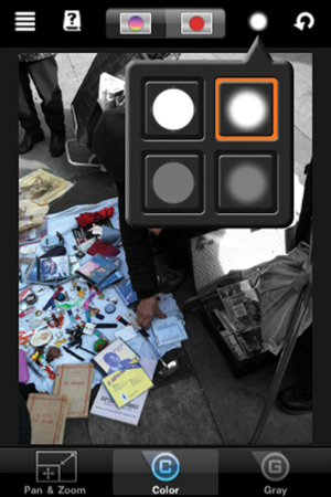
A drop-down menu of four brushes appears after you tap the Brush icon. At the top are soft- and hard-edged opaque brushes, and at the bottom are soft- and hard-edged transparent brushes. Figure 10.24 shows the brushes as they appear on the screen after you tap on the Brush icon.
There are also three icons at the bottom of ColorSplash. The following subsections describe what they do.
Tap the Pan & Zoom icon if you don’t want to risk painting your photos accidentally when you are panning and/or zooming with two fingers in Color mode. (Color Mode is discussed in the following subsection.)
This option is automatically selected when you first load an image into the app. Color mode allows you to paint back the color on the black-and-white photo that appears on your screen when you first load your image.
After tapping this icon, you can take away the color you’ve brought back into your image. Essentially, when you paint in this mode, it makes anything in color on the screen gray.
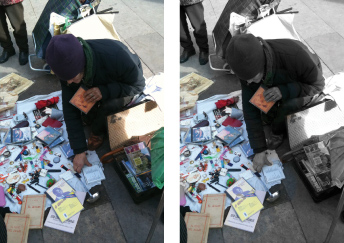
A finished image in ColorSplash can be quite compelling, especially if you want to bring out elements of the photo amidst a black-and-white background. You can see how the items for sale in Figure 10.25 are emphasized by having them in color against a black-and-white background.
One of the highest-rated effects programs is FX Photo Studio, an app that offers 125 effects. It lets you save your tweaked photo at the same resolution you started at—that is, full iPhone 3G or 3GS resolution. You can also crop, rotate, and flip your images.
When you tap to launch Photo Studio, you’re prompted with the following options: Take Photo, Load Photo, Options, and Want More?
If you tap Take Photo, you’re taken to your camera. After you shoot, you’re given a preview. You have two button options here: Retake or Use. If you tap Use, you’re taken to the home screen with your picture in it (see Figure 10.26). If you tap Load Photo, you’re asked to pick one from your Camera Roll.
If you tap Options, you’re taken to the screen shown in Figure 10.27.
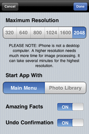
The first thing that is listed is a choice of resolutions at which your tweaked photo will be saved. You have a choice of tapping on 320, 640, 800, 1024, 1600, or 2048. The last resolution listed (2048) is the max for the iPhone 3GS.
If you change from Main Menu to Photo Library under where it says “Start App With,” you’re immediately taken to your Photo Albums when you start Photo Studio. There, you tap on the Camera Roll or album to pick your picture.
If you turn on the Amazing Facts, you get some fascinating trivia while your image is being processed.
After you tap on the photo you want, it appears on the home screen, which has seven icons—four at the top and three at the bottom.
Here is what the top icons do:
Four Horizontal Lines icon. This icon has only one prompt after you tap it. The app asks you whether you are sure you want to finish editing this image and select another image. If you tap Yes, you’re prompted with the same options as if you’d tapped the app icon on your iPhone’s home screen.
Circle with Arrow icon (Undo). Tap the Undo icon if you’ve made an adjustment that you don’t like. When you tap it, it will ask you if you are sure you want to undo the current changes. Tap Yes if you are sure, and the image will return to its original state.
Filmstrip icon. This is where all of the effects are. After you tap this icon, a new screen comes up with a listing of categories. Tap a category, and you will get a list of the effects in that category. At the bottom of that screen, there is a button to list all the effects without listing the categories.
The categories and their effects are:
Image Correction. More Contrast, Brighter Image, Vivid Colors, Night Vision, Less Colors.
Color Fantasy. Invert Image, Reduce Colors, Grayscale, Rainbow Palette 1, Rainbow Palette 2, Color Explosion, Color Sunlight Spots, Solarize, Tritone, Tritone 2.
Texturize. Crumpled Paper, Leather Canvas, Texturize, Rusted Metal 1, Rusted Metal 2, Dirty Picture 1, Dirty Picture 2, Rough Fabric.
Color Temperature. Cold Blue, Cool Blue, Cool, Warm, Warm Yellow, Hot Yellow.
Overlay. Water Circles 1, Water Circles 2, Water, Sparkles Big, Sparkles Small, Frost 1, Frost 2, Water Drops 1, Water Drops 2, Fire 1, Fire 2, Teddy Bear, Scary Face 1, Scary Face2, Scary Scull, Ghost, Lightning 1, Lightning 2, Bubbles, Kisses 1, Kisses 2, Steamy Window 1, Steamy Window 2, Color Stars, Hearts.
Symmetry. Symmetry Vertical, Symmetry Horizontal, Symmetry Quad.
Glow. Glow Vivid Color, Glow Grayscale, Glowing Edges.
Hue. Hue Blue, Hue Green, Hue Pink, Hue Turquoise, Hue Purple, Hue Yellow, Hue Red.
Vintage. Old Photo, Burnt Paper, Old Film Frame, Vintage, Vintage Red, Vintage Green, Vintage Blue, Vintage Grayscale, Ancient Canvas, Old TV, Sepia, Vignette 1, Vignette 2, Vignette 3, Vignette 4, Vignette White 1, Vignette White 2, Vignette White 3, Vignette White 4.
Art. Pencil Paint, Neon Light, Mosaic, Noise, Burnt Colors, Black and White, Dark Contours on White, Color Contours on Black, Dark Engraving, Bumpmapping1, Bumpmapping 2, Brush Strokes Dark, Brush Strokes Light, Color Reprint, Overburn Reprint, Abstract Contours, Linocut 1, Linocut 2.
Frames. Butterflies Frame 1, Butterflies Frame 2, Flowers Frame 1, Flowers Frame 2, Cupids 1, Cupids 2, Stardust Frame.
Distortion. False Mirror 1, False Mirror 2, False Mirror 3, False Mirror 4, Rippled Glass 1, Rippled Glass 2, Rippled Glass Dotted.
Photo Styles. B&W Magazine, Amsterdam, Hippie.
After you’ve applied the effect, it comes up on the screen. Note that you’re not finished yet. You have to save it.
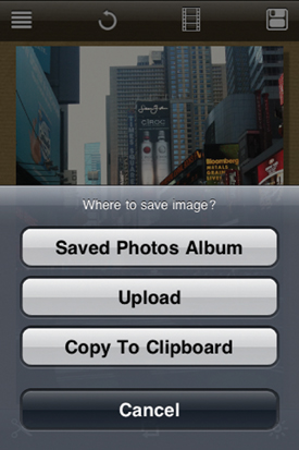
Disk icon (Save). The disk icon is for saving the file when it’s finished being processed. If you don’t save it, it will be lost forever. Figure 10.28 shows what comes on the screen after you tap the Save icon. Tap on the first button, Saved Photos Album, and your photo will be saved in your Camera Roll. Tap Upload, and you have three choices—uploading to Facebook, uploading to Twitter, or emailing the message. Tap Copy to Clipboard, and your image will be copied to the Clipboard.
At the bottom of the screen are three more icons: the Scissors option, which lets you crop your image, the Rotate option (two arrows icon), which lets you rotate your image, and the Sun icon, which lets you tweak the gamma (lightness) of your image with a slider.
Although some of the tweaks offered in this app are nothing to write home about (the Pencil tweak almost always comes out too light), there are quite a few that really give amazing results—so good, in fact, that they could be art-gallery worthy. What’s so impressive about this program is how sharp the photos come out when they are finished processing, which is due to the fact that the resulting photo is the same high (relatively) resolution that you began with. Figures 10.29 through 10.37 show some samples of a few of the effects.
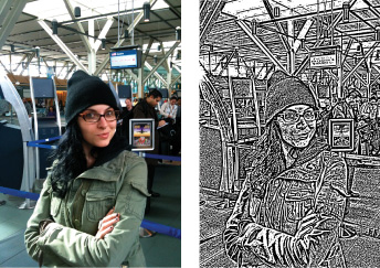
Figure 10.29 shows the tweak Art > Linocut 2, one that is similar to the Pencil effect but with much thicker and more detailed lines.
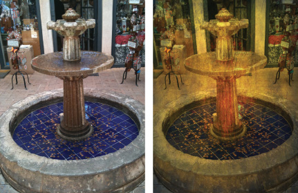
The Art > Overburn Reprint tweak really blows highlights and blackens shadows—so much that the photograph turns into something that resembles watercolor. Figure 10.30 shows the dramatic changes that occur with a photo when using this effect. The effect works really well on architecture photos.
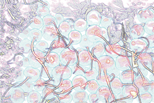
The Art > Dark Contours on White effect can take an ordinary photograph and turn it into an abstract painting. The image of the radishes in Figure 10.31 has blown highlights in the red of the radishes. It needn’t be tweaked to get rid of them (lowering the saturation would do this); it can just be brought straight into Photo Studio to be tweaked using Dark Contours on White to get a really compelling effect, as Figure 10.31 shows.
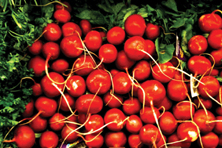
Figure 10.31. Using the Dark Contours on White effect gives an image the feel of an abstract painting.
The Symmetry options are limitless. You have a choice of vertical, horizontal, or quad.
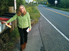
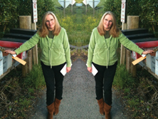
The Symmetry Vertical option takes the left half of the frame and makes it symmetrical with the right, as shown in Figure 10.32.
Try Symmetry > Symmetry Quad, and you’ll get astonishing results if the left quarter of the frame is exposed well and contains compelling elements. This option takes the left quarter of the frame and makes it horizontally and vertically symmetrical. Figure 10.33 shows an image where the left quarter of the frame contains well-exposed, interesting elements. After the quad tweak, you get a design of impeccable quality.
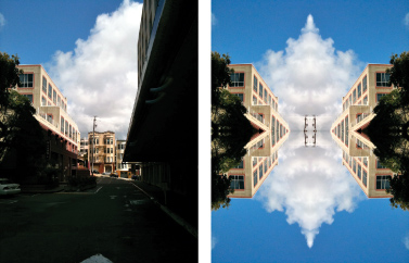
Figure 10.33. The left quarter of the frame is made symmetrical in both horizontal and vertical directions, creating a compelling image after the tweak.
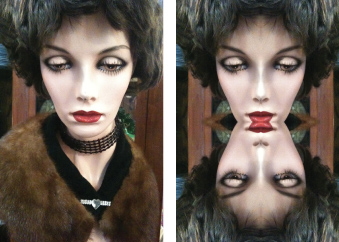
Figure 10.34 illustrates what happens when you make a tweak of an image that is already symmetrical (such as the face of the mannequin). You only get the horizontal component of symmetry because the vertical component of the first quarter is already symmetrical.
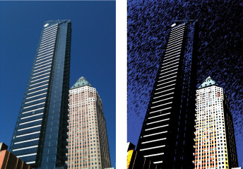
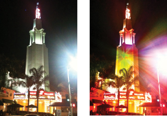
Color Fantasy > Color Explosion sprays multiple colors that extend outward from the center of the image. It’s a great effect for night architecture photos because the color can appear to be coming from a light fixture on the building you take a picture of, as shown in Figure 10.35.
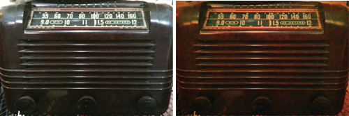
When you use the Vintage > Vintage Red effect, you can take a photo with flat colors and redden it so that it looks like an antique. This type of effect works really well if you’re photographing vintage appliances. Figure 10.36 shows the before and after results with this effect.
One of the better effects is Image Correction > Night Vision. Figure 10.37 illustrates how this effect can lighten dark shadows, revealing what they are covering up.
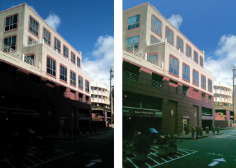
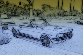
Photo fx is a powerful lens filter app. There are dozens of lens filters that simulate the effect of having a lens filter on your camera. The app does incredible pencil renderings (Fun fx > Pencil). Figure 10.38 shows one of those renderings with applications of two color filters.
The layout of the program is a bit of a challenge because there are so many filters you can use, and they’re located on many different screens under many different categories.
As with most such apps, the initial screen of the program offers four task options, each with an icon on the screen. The first is the Folder icon, which takes you to your Camera Roll to choose an image. The second is the Camera icon, which takes you to the camera to take a picture. You can take a picture after you tap it. You’ll then get a preview where there are two options: one to Retake and one to Use. If you like the picture you took, you tap Use. After you either tap Use or select an image from your Camera Roll, the image will appear with all of the different lens options.
The Wrench icon is for adjusting the settings. There are only two options. The first is Save Original Photo, which you can opt to turn on or off with a button to the right of the text. If it’s on, the original photo you shot and manipulated is saved along with the final photo you tweaked. In other words, the before and after photos are saved. The next option is Maximum Output Size. If you choose Full, Photo fx lets you save your photo at the same resolution at which you started your tweaking. The other resolutions are 640, 800, 1024, 1280, and 1600.
Finally, there is the Help (question mark) icon, which is what you tap when you need help. The Help section gives some brief information about using the app.
To use the app, all you do is choose a filter category from those listed at the bottom of the screen. For each category there are several variations. For each variation there are several different gradations/strengths/colors of the filter. Once you get down to the different gradations, you tap one in order to see your entire image come into the frame.
If you start out with a picture like the one in Figure 10.39, you can see how the app works.
If you choose Fun fx from the bottom of the screen, your image will come up with seven variations.
If you choose B/W Looks, you have the gradations/strengths/colors shown in Figure 10.40. A thumbnail is displayed for each. When you see dots at the bottom of the variations or gradations/strengths/colors screen (see Figure 10.40), swipe your finger to the right over the screen to go to the next one or to the left to go back. (The number of dots at the bottom of the screen denotes the number of pages.)
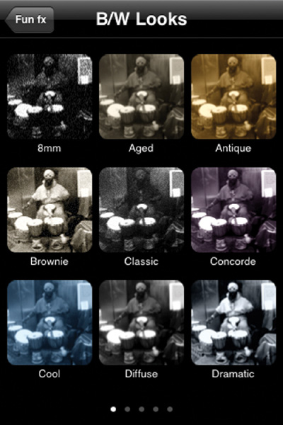
Figure 10.40. After choosing a variation, you are taken to a screen with all the different gradations/strengths/colors.
Finally, when your image is shown, you have a row of options at the bottom of the screen (see Figure 10.41). The circle with the line through it is the button to go back. Tapping it will take you back to the thumbnail screen. The icon with two arrows will undo the action after you’ve applied it. The icon with two sliders will make the sliders appear, which you can use to further tweak the image. The icon with a circle with a dashed line around it lets you set the area in the frame where the effect will be applied. (More about that in a moment, in the listing of filters.) The Crop icon lets you crop your photo, and the Disk icon lets you save your photo.
The Disk icon also has an Add Layer option. If you choose it, your current tweak will take effect, and then you’ll be taken back to the variations, where you can tap on a new category and/or variation to add another filter on top of the existing one. You can add one filter (layer) on top of another. When you’re finished, just tap the Disk icon and then Save.
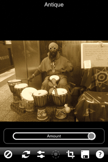
If you choose the Antique gradation/strength/color, the image shown in Figure 10.41 appears. You have the option to change the amount (using the Amount slider) of the effect if you wish.
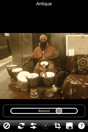
If you drop the amount, as shown in Figure 10.42, you get a really cool effect because some of the color reappears in the image, giving it a kind of faded-from-age look.
You then tap the Disk icon (Save command) on the bottom of the screen to save your image.
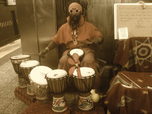
Figure 10.43 shows the resulting image from the tweak. It’s essentially a sepia image with some of the color still showing up—an image that looks as if it has faded over time.
You can use the following guide to make decisions about what filters you want to use by locating them here and then navigating to them via your iPhone screen.
Face fx
Black Pro-Mist: Black Pro-Mist 1–9
Center Spot: Center Spot 1–9
Pro-Mist: Pro-Mist 1–9
Soft/FX: Soft/FX 1–9
Outer fx
Color-Grad (color tints brushed at top of frame): Cranberry, Tangerine, Straw, Tobacco, Chocolate, Plum, Grape, Tropic Blue, Coral, Magenta, Pink, Red, Yellow, Green, Cyan, Cool Blue, Blue
Day for Night: Day for Night 1–6
Enhancer: Enhancer 1–9
Fog: Fog 1–9
Polarizer: Polarizer 1–9
Ultra Contrast: Ultra Contrast 1–9
Fun fx
B/W Looks: 8mm, Aged, Antique, Brownie, Classic, Concord, Cool, Diffuse, Dramatic, Fashion, Flashback, Glamour, Grainy, Grape, Green, Hicon1–3, Hicon Blue, Hicon Copper, Hicon Cyan, Hicon Purple, Hicon Red, High Key, Hollywood, Ice, Moonlight, Newspaper Old, Newspaper, Normal, Pink, Reminiscing, Satin Blue, Scary, Sepia, Steel, Still Life 1–2, Warm
Color Looks: 8mm, Basic, Black Diffusion, Bleach Bypass, Bright Shade, Burnt Copper, Color Reversal, Cool Desaturated, Cross Process, Dreamy, Faded, Faux Film, Glamour, Photocopy, Punchy, Push Process, Radiant, Romantic, Sixties Slide, Soft Diffusion, Sunset, Transparency, Warm Desaturation, Warm Diffusion, White Diffusion
Color Spot: Cranberry, Tangerine, Straw, Tobacco, Chocolate, Plum, Grape, Tropic Blue, Coral, Magenta, Pink, Red, Yellow, Green, Cyan, Cool Blue, Blue
Infrared: Normal Filter, Red Filter, Green Filter, Blue Filter, Yellow Filter, Orange Filter
Pencil: Pencil 1–5 (lightest to darkest)
Reflector: Gold, Silver
Star: Star 1–9
Wild fx
Glow: Glow 1–9
Grain: Basic, Basic Monochrome, Big, Big Monochrome, Heavy, Heavy Monochrome, 25ASA, 5245 50ASA, 100ASA, 5247 100ASA, 5248 100ASA, 5274 200ASA, 5287 200ASA, 5293 200ASA, SFX 200, 5246 250 ASA, 5277 320ASA, 5294 400ASA, 400ASA, 5279 500ASA, 5284 500ASA, 5289 800ASA, 5296 500ASA, 5298 500ASA, 800ASA, 1600ASA
High Contrast: High Contrast 1–5
Night Vision: Blue 1–5, Green 1–6, Orange 1–6, Red 1–6
Three Strip: Three Strip 1–6
Two Strip: Two Strip 1–6
Classic fx
Black and White: Normal, Red, Green, Blue, Yellow, Orange
Old Photo: Cyanotype, Kalitype, Light Cyan, Palladium, Sepia, Silver, Silver Gelatin, Van Dyck
Temperature: Warm 10%–90%, Cool 10%–90%
Tint: Blue, Cyan, Green, Magenta, Orange, Red, Violet, Yellow
Vignette: Black Circle, Black Square, White Circle, White Square
Lens fx
Close-Up Lens
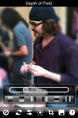
Depth of Field (see Figure 10.44)
Wide Angle Lens
Black Diffusion/FX: Black Diff/FX 1–9
Bronze Glimmer: Bronze Glimmer 1–9
Cool Pro-Mist: Cool Pro-Mist 1–9
Diffusion: Bark 1–3, Broom, Bubbly 1–2, Ceramic Pot, Ceramic Tiles, Clouds, Concrete 1–2, Cracked Wood, Dirty Metal, Donkey Fur, Fatigued Metal, Fragmented, Gauze, Glass, Glass Brick, Glass Square, Glass Window, Granite, Leather, Lichen, Marble, Material Pattern, Mosaic, Moss, Paint Splodge, Painted Metal 1–2, Pattern 1–3, Pebbles 1–3, Plastic, Reflective, Rust 1–2, Saucepan, Shells, Slate, Speckled, Strata, Streaked Metal, Termite Colony, Wet Slate, Worm Metal
Faux Film: Faux Film 1–9
Glimmerglass: Glimmerglass 1–9
Gold Diffusion/FX: Gold Diff/FX 1–9
HDTV/FX: HDTV/FX 1–9
Smoque: Smoque 1–9
Soft Light: Soft Light 1–9
Streaks: Horizontal 1–3, Vertical 1–3
Warm Black Pro-Mist: Warm Black 1–9
Warm Center Spot: Warm Spot 1–9
Warm Pro-Mist: Warm Pro-Mist 1–9
Warm Soft/FX: Warm Soft/FX 1–9
Color fx
812 Warming: 812 Warming 1–9
Bleach Bypass: Bleach Bypass 1–3, Warm 1–3, Cool 1–3
Color Infrared: Color Infrared 1–5
Cross Processing: Print to Slide 1–3, Slide to Print 1–3
Dual Grad: Blue-Magenta, Blue-Orange, Blue-Red, Magenta-Blue, Magenta-Orange, Magenta-Red, Orange-Blue, Orange-Red, Red-Blue, Red-Magenta, Red-Orange
Fluorescent: Fluorescent 1–9
Haze: Haze 1–9
Mono Tint: Blue, Cyan, Green, Magenta, Orange, Red, Violet, Yellow
ND-Grad: ND.3, ND.6, ND.9, ND1.2
Nude/FX: Nude/FX 1–6.
Sky: Sky 1–9.
Strip Grad: Cranberry, Tangerine, Straw, Tobacco, Chocolate, Plum, Grape, Tropic Blue, Coral, Magenta, Pink, Red, Yellow, Green, Cyan, Cool Blue, Blue.
Sunset/Twilight: Sunset 1–3, Twilight 1–3.
X-Ray: X-Ray 1–6.
Ambient Light: Ambient Light 1–7, Ambient Light 9–10
Edge Glow: Edge Glow 1–9
Ice Halos: 0 Degrees, 5 Degrees, 10 Degrees, 15 Degrees, 20 Degrees, 25 Degrees, 30 Degrees, 35 Degrees, 40 Degrees…90 Degrees
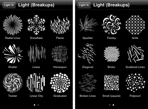
Light (Breakups) (see Figure 10.45 for patterns): Radial Lines, Snowflakes, Flame, Shatter, Linear, Homespun, Twister, Linear City, Graduated, Sparkler, Paisley, Grille, Diagonal, Bricks, Scattered Lines, Broken Lines, Small, Potpourri
Light (Foliage) (the same idea as Light Breakups): Jungle Leaf, Palm Leaves, Leaf Breakup, Tropical (palm fronds), Breakup 1–3, Sharp, Bamboo Leaves, Dense Foliage, Reversed Trees, Evergreens (a row of them), Saplings, Winter Trees, Evergreens 2, Twisted Tree, Japanese Bamboo, Thin Bamboo, Giant Grass, Christmas Tree, Open Leaves, Sharp (Square), Mountain Shrub, Summer Branches, Giant Trees, Grove, Open
Light (Lights): Spotlight 1–7, Heart, Searchlights, Beams, Row of Lights, Circle of Lights, Wavy Searching, Krelve, Pools of Light, Light Ray 1–3
Light (Windows): Spanish Shutters, Old Blinds, Office 2, Office 1, Elizabethan, Bars, Window Shades, Venetian Blinds, Shutters, Double Hung, Tracery, Bay, Chancery, Georgian, Tenement, Chinese Doors, Tudor 2, Byzantine, Austrian Curtain, Grid, Curtains, Café Curtains, Lace Medallion, Plaid 1–2, Office 3, Crooked Blinds, French Doors, Church Window, Entry
Relight
Water Droplets: Corona, Fogbow, Glory.
There’s one more option to illustrate. Sometimes the dashed circle icon is activated (it shows up lit on the screen). If this is the case, it means that you can move and stretch the tweak around. Let’s see how this works.
After choosing an image of a wine glass with a city background (see Figure 10.46), I navigated to Light fx > Relight and got to the screen that looks like the one shown in Figure 10.47. I found that the image lit up some in the center. I left the Brightness, Blur, and Displacement sliders alone, noting that when I fooled with the circle of light, it became not so subtle. (It changes into a bright circle of light with markedly different brightness where the circle ends.) Blurring with the slider, it makes a haze, and the Displacement slider doesn’t change anything. I then tapped the dashed circle at the bottom of the screen. The position of the circle of light is shown on the screen as you see in Figure 10.48.
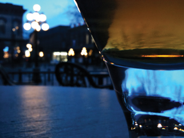
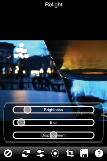
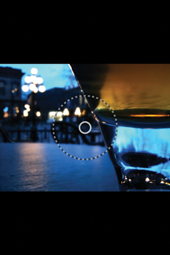
Figure 10.48. When you tap the dashed circle at the bottom of the screen, a circle of light guide appears for you to move around.
Note
You can change the diameter of the circle of light by swiping the dashed circle inward or outward. You can move the circle of light by swiping the center of the circle of light to a place where you want it on the screen.
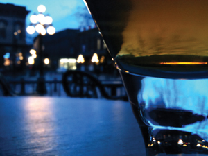
Now, I can move the circle of light. What really makes the image change to an effect I like is moving the circle of light into the water. Figure 10.49 shows where I moved the circle to.
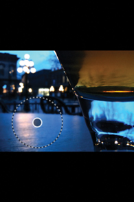
Figure 10.50 shows the image after applying the Relight filter and moving around the circle of light.
In another example of using two filters using the Add Layer option, you can come up with a rather ephemeral image. Here’s what you can do:
Begin with a portrait—any portrait that’s fairly close-up, such as the one shown in Figure 10.51.

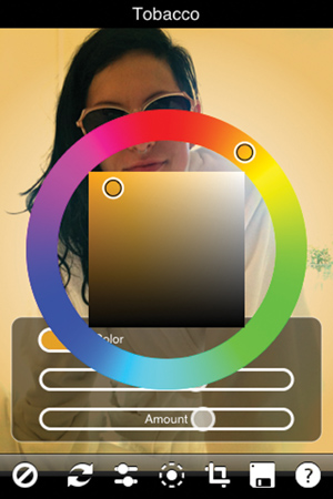
Now navigate to Fun fx > Color Spot > Tobacco. (You could also opt for other colors.) On the screen (see Figure 10.52) you have three options when processing the Tobacco color: Color, Softness, and Amount. I opted to increase the Softness (the second slider in Figure 10.52—you can’t see the word, but it’s there) so that the color spreads to more of the background instead of being concentrated at the edges. I left the Color the same, but if you look at the figure, you can see that when you tap Color, a color wheel comes up where you can change the color by tapping the wheel or the rectangle inside.
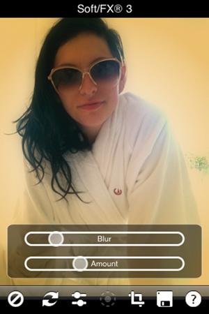
Next, I see that the image needs some softening, so I opt to add a layer by tapping the Disk icon and then tapping Add Layer. I navigate to Face fx > Soft/FX > Soft/FX 3. The screen in Figure 10.53 comes up. At this point I don’t touch the sliders; I like the effect as is.
Finally, I tap the Disk icon and tap Save, which gives me the image shown in Figure 10.54.

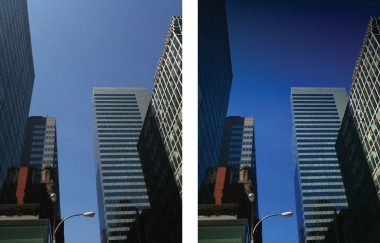
There’s another good way to use two filters. Sometimes the iPhone won’t give you a sky that is deep blue with blue tonal variations—instead, you get something like the photo you see in Figure 10.55. You can employ two filters to get a better sky:
Color fx > ND-Grad > ND 1.2. (ND is the Neutral Density filter, which adds gradations to the sky.)
Outer fx > Polarizer > Polarizer 8. (The Polarizer filter deepens the blue tones.)
Figure 10.55 shows the before-and-after images of these tweaks.