
2
APP INVENTOR AND EVENT-DRIVEN PROGRAMMING

App Inventor apps use a model called event-driven programming, where we program behaviors to respond to certain events. An event can be something the user does or something that happens within or to the device.
As App Inventor programmers, we use event handlers called when…do blocks to tell the app how to respond to an event. For each when…do block, we can include one or more commands for the app to follow in sequence once the event occurs. Those commands include blocks to get and set values as well as call blocks to start built-in methods or our own written procedures, which are a series of defined tasks for the app to execute.
In fact, you already used event handlers to create the “Hi, World!” app in Chapter 1. Let’s review all the blocks you used for “Hi, World!”.
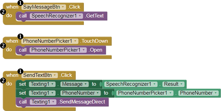
We can see the app’s three events ➊, which are the two button clicks on SayMessageBtn and SendTextBtn and the touch down event on PhoneNumberPicker1. You used three when…do event handlers ➋ to program the actions the app should take in response to those events, such as calling the SpeechRecognizer method to get text from speech, calling the PhoneNumberPicker.Open method to open the phone’s contact list, and setting the Texting component’s required properties before calling the method that sends a text.
Although the user triggered all the events in “Hi, World!”, that’s not always the case. Some events are caused when something happens to the device. For instance, when a phone receives a call, you can use an event handler to deal with that event. You also can use event handlers to respond to automatic events or events that happen to screens or components in your apps. For instance, you can add blocks to program actions that should occur when the screen of an app first opens.
We’ll play with several event handlers as we build the next app.
BUILDING THE “PRACTICE MAKES PERFECT” APP
In this chapter, you’ll create the “Practice Makes Perfect” app, which uses the Clock, Camcorder, and VideoPlayer components to let users repeatedly record videos of themselves practicing speeches or songs and then watch the videos to review their performance. For convenience, we’ll program “Practice Makes Perfect” to automatically open the device’s video camera, getting it ready to record right away. That’s different from many camera apps, which require the user to open the app, switch to video mode, and then record.
We’ll program six event handlers for “Practice Makes Perfect,” one to direct the action after a timer goes off five seconds after the app opens, another that tells the app what to do after the video camera records, and four that respond to the user’s button clicks.
Let’s get started! Log into App Inventor following the instructions outlined in “Getting Started with App Inventor” on page xviii. App Inventor should open to the last app you worked on. To start a new app, click Projects ▸ Start new project to open the dialog where you enter the project name, enter PracticeMakesPerfect without any spaces, and click OK.
DECOMPOSING “PRACTICE MAKES PERFECT”
“Practice Makes Perfect” will automatically open the device’s video camera to record a video and then play the video back on the app’s own video player. After that, the app will let users record and view as many additional videos as they want. The app will also display a decorative temporary, or splash, title screen when the user first opens it.
We can break this action down into four steps:
When a user opens the app, display the splash screen for 5 seconds before displaying the Record button, Watch button, and the VideoPlayer. Open the device’s video recorder so the user can record.
When the user clicks the Record button, open the device’s video camera so the user can record.
Once the user records a video, set the recorded clip to play the next time the app’s VideoPlayer starts.
When the user clicks the Watch button, play the user’s video clip in the app’s VideoPlayer.
You’ll need the following components:
Button (2) for the user to click to manually start action
Camcorder to open the app’s video camera
Clock to automatically start the action after a set interval
Image displaying the temporary splash graphic
VerticalScrollArrangement to hold the app’s Button and VideoPlayer components
VideoPlayer to play video clips within the app
LAYING OUT “PRACTICE MAKES PERFECT” IN THE DESIGNER
Let’s begin by laying out all the components, keeping in mind that we want the app to start with a separate splash screen and then automatically open the video camera to record the first video clip. We also want to arrange the components so that the app’s easy to use and understand.
Adding the Components
Go to the Designer window and drag the listed components from their drawers in the Palette pane onto the Viewer pane. From the User Interface drawer, drag an Image and two Button components; from the Layout drawer, drag a VerticalScrollArrangement; from the Media drawer, drag a VideoPlayer and a Camcorder component; and from the Sensors drawer, drag a Clock component. Your screen should now look like Figure 2-1.
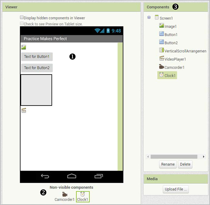
Figure 2-1: The screen after you drag the “Practice Makes Perfect” app components into the Viewer pane
In the Viewer pane, all visible components should show on Screen1 ➊, and the non-visible components (Camcorder and Clock) should show below the Screen ➋. In the Components pane ➌, you should see a list of all the components you’ve dragged onto the Viewer pane.
Creating a Splash Screen
As mentioned, we’ll display a full-screen introductory graphic that creatively illustrates the app’s name and purpose, but we’ll show it only temporarily to keep it from taking up too much screen space. We’ll use Image1 as the splash screen, and we need to adjust several properties to get it to display as desired.
First, click Image1 in the Components pane, and set its height and width to fill the screen by clicking the text boxes under both Height and Width in the Properties pane. When you click each text box, you should see the dialog shown in Figure 2-2.
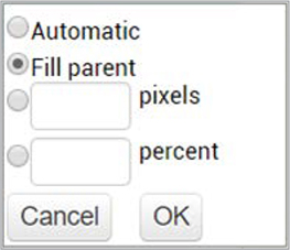
Figure 2-2: The Properties dialog that allows you to change a component’s height or width
Click the Fill parent radio button and then click OK. This will make the height and width of Image1 take up the entire height and width of the screen once the picture is uploaded.
Uploading a Picture
We now need to upload the picture we want to display as Image1 on the app screen. To upload a picture, click the text box under Picture and click the Upload File … button shown on the left in Figure 2-3, which should open the dialog shown on the right.

Figure 2-3: The Picture and Upload File … dialogs
Click the Choose File button. The file manager should open to show the files on your computer and allow you to find the picture you want to upload, as shown in Figure 2-4.

Figure 2-4: The file manager window allows you to select a file from your computer.
Click the image you want to use, click the Open button, and then click OK on the Upload File … dialog shown on the right in Figure 2-3.
NOTE
For some of the apps in this book, I created the decorative images we’re using by searching the web for pictures, saving them, and then adding text to them using a graphics editor. Before saving any images from the web, however, I made sure I had the license, or right, to use and modify them, and I checked whether the license requires attribution, which means I’d need to give credit to the original artist when using the pictures. If you use images or other files you find on the web, always make sure that they are labeled as free to use in the way you intend and that you give credit to the creator if directed.
You should now see the picture on Screen1 in the Viewer pane. Its width fills the screen, just as we want, but its height doesn’t because the other visible components are taking up most of the screen’s vertical space. We’ll adjust this later when we make those components invisible.
You’ll also notice in the Properties pane that, by default, the checkbox under the Image1 Visible property is checked, meaning users should see Image1 when the app opens. But because we want Image1 to show only temporarily, soon we’ll program the app to change the value of the Image1 Visible property to hide the splash screen when we no longer want it to show.
Finally, while in the Image1 Properties pane, click the checkbox under ScalePicturetoFit. This will distort Image1 for now, making it take up even more of the screen width, but later, when Image1 is the only visible component on the screen as planned, you’ll see that this is the effect we want.
Creating the Record and Watch Buttons
Next, let’s set the properties for both Button components. To avoid confusion, let’s give each Button a name that describes its function in the app, as we did in Chapter 1.
Click Button1 in the Components pane and then click the Rename button near the bottom of the pane. Replace Button1 with RecordBtn in the New name: text box and click OK. You should now see RecordBtn in the Components and Properties panes in the Designer window. Follow the same steps to change the name of Button2 to WatchBtn.
Using Images as Buttons
Let’s also change the look of the buttons. For that, we’ll use images with text and icons instead of the default App Inventor buttons. Click the text box under Image in the Properties pane for each button. Then upload the picture you want to use by following the steps just described in “Uploading a Picture” on page 27.
Once you upload the button images, be sure to delete the default text that’s displayed on the buttons. To do so, click the text box under Text in the Properties pane for each button, delete the existing text, and then remove your cursor from the text box.
Finally, let’s make each Button component and the VideoPlayer the width of the screen by clicking the text box under Width in the Properties pane for each component, clicking the Fill parent radio button and then clicking OK.
Grouping Components Vertically
As outlined earlier, step 1 of this app requires the Button components and VideoPlayer to be invisible for 5 seconds after the app opens. We can accomplish this by using the VerticalScrollArrangement component from the Layout drawer. Layout components allow you not only to uniformly align other components but also to combine components so you can program them as a group.
In this app, we’re grouping all the components we want to hide temporarily when the app opens—RecordBtn, WatchBtn, and VideoPlayer1—inside a VerticalScrollArrangement. We’re using the VerticalScrollArrangement in particular because we want to stack the components on top of each other, and we want to allow users to scroll vertically if necessary to see the videos in VideoPlayer1.
To group RecordBtn, WatchBtn, and VideoPlayer1 inside VerticalScrollArrangement1 in that order, click each component in the Viewer pane, and drag it into VerticalScrollArrangement1. You should then see the components nested within, or contained inside, VerticalScrollArrangement1 in the Viewer and in the Components pane, as shown in Figure 2-5.
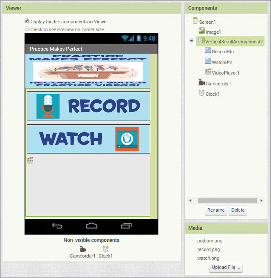
Figure 2-5: The Designer window after you drag RecordBtn, WatchBtn, and VideoPlayer1 inside VerticalScrollArrangement1
Let’s now change the Visible property of VerticalScrollArrangement1. Click that component in the Components pane, and then click the checkbox in the Properties pane under Visible to remove the check mark. This should make VerticalScrollArrangement1 and all its contents invisible in the Viewer now and when the app starts. When we program the app, we’ll have it adjust this setting while it’s running to display these components 5 seconds after the app starts. Also, you’ll see that because VerticalScrollArrangement1 is invisible, Image1 now fills the screen as planned.
The last component we need to adjust before we can start programming is the Clock. Click the Clock component in the Components pane to change its TimerInterval property, as shown in Figure 2-6.
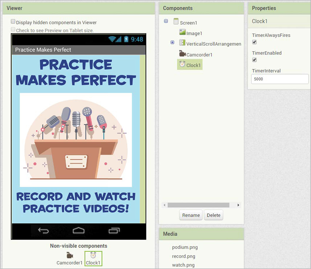
Figure 2-6: The Designer window after you lay out “Practice Makes Perfect,” showing the adjusted property pane for Clock1
To make the change, click the text box under TimerInterval, replace the default value of 1000 with 5000, and then click your cursor outside of the text box. This sets the Clock component’s timer interval to 5,000 milliseconds, or 5 seconds. This means that, as long as the Clock component’s timer is enabled and set to fire, or go off, as in Figure 2-6, it will automatically do what we program it to do every 5 seconds. But for your app, you’ll need to adjust the Clock1 properties while the app’s running so the timer fires just once to make Image1 disappear after 5 seconds when the Button, VideoPlayer, and Camcorder components appear, instead of firing every 5 seconds without stopping.
PROGRAMMING “PRACTICE MAKES PERFECT” IN THE BLOCKS EDITOR
Now that you’ve laid out all the components, you can move to the Blocks Editor to program the app. Click the Blocks button to switch to the Blocks Editor, and let’s begin programming the four steps in order.
STEP 1: STARTING THE APP
We start by telling the app what to do when it opens with the splash screen, Image1, displayed. We want it to wait 5 seconds before hiding Image1, showing the Button and VideoPlayer components for the remaining time that the app is open, and opening the Camcorder.
This code shows how to set up this first step using the Clock component’s timer event handler.
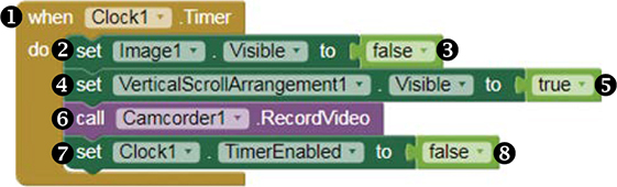
In the Blocks pane, click Clock1, and when the blocks for the component appear, drag the whenClock1.Timer event handler block ➊ to the Viewer. Next, in the Blocks pane, click Image1 and drag the setImage1.Visibleto block ➋ to the Viewer and snap it inside the whenClock1.Timer block next to the word do. Then, return to the Blocks pane, click the Logic blocks drawer, and drag the false block ➌ to the Viewer and snap it to the right side of the setImage1.Visibleto block. These are the blocks that set the value of the Image1 Visible property to false after the Clock component’s timer fires, which hides the Image1 splash screen after the 5-second time interval we set for the Clock in the Designer.
NOTE
In the Logic blocks drawer, App Inventor provides two Boolean value blocks, one with a value of true and the other with a value of false. Boolean variables and properties—such as the Visible property of most visible components and the Clock component’s TimerEnabled property—have only two possible values, true and false. You can set the initial values of these properties in the Properties pane by checking or unchecking the property’s checkbox, and you can change the values with the blocks while the app’s running.
Now that we’ve programmed the splash screen to disappear after 5 seconds, we need to make the buttons and video player visible. To do this, click VerticalScrollArrangement1, drag the setVerticalScrollArrangement1.Visibleto block ➍ to the Viewer, and snap it inside the whenClock1.Timer block under the setImage1.Visibleto block. Then, in the Blocks pane, click the Logic blocks drawer, and drag the true block ➎ to the Viewer and snap it to the right side of the setVerticalScrollArrangement1.Visibleto block. These blocks set the value of the VerticalScrollArrangement1 Visible property to true after the Clock component’s timer fires, which makes VerticalScrollArrangement1 and everything inside of it visible after the 5-second time interval we set for the Clock in the Designer.
Next, in the Blocks pane, click Camcorder1, drag the callCamcorder1.RecordVideo block ➏ to the Viewer, and snap it inside the whenClock1.Timer block under the setVerticalScrollArrangement1.Visibleto block. These blocks call the Camcorder component’s built-in RecordVideo method to automatically open the user’s video camera after the Clock’s 5-second time interval.
Finally, click Clock1, scroll down to find the setClock1.TimerEnabledto block ➐, drag it to the Viewer, and snap it inside the whenClock1.Timer block under the callCamcorder1.RecordVideo block. Then, in the Blocks pane, click the Logic blocks drawer, and drag the false block ➑ to the Viewer and snap it to the right side of the setClock1.TimerEnabledto block. These blocks set the value of the TimerEnabled property for Clock1 to false, which stops the Clock1 timer. This means that the timer will fire only once to execute the commands in this event handler after the first 5 seconds the app is open, and will not fire again until the app reopens.
In plain English, for step 1, you set the Designer properties to display the splash screen (Image1) when the app opens. Then, after 5 seconds, the code blocks tell the app to hide the image, display the buttons and video player, and open the video recorder to record a video.
Now live-test to see how these blocks work, preferably with your phone using the MIT AI2 Companion app, as outlined in “Live-Testing Your Apps” on page xxii.
Once you click Connect ▸ AI Companion in the top menu bar and scan the QR code with your phone’s Companion app, your “Practice Makes Perfect” app should open on your phone. As long as your blocks are placed as shown in the code example, you should see Image1 for 5 seconds before the buttons and video player appear and the video camera opens. You should not see the buttons and video player until you close the video camera. If you close the video camera without recording, you’ll likely see an error saying you didn’t record a video, which is true and fine for now. Leave the app open on your phone so you can keep live-testing.
STEP 2: OPENING THE VIDEO RECORDER
So far we’ve programmed what the app should do when the user first opens it. Now let’s program step 2 of the app, which lets the user manually open the video camera to record a video when needed.
Here’s where we tell the app what to do when users click RecordBtn, which is the way users reopen the video camera after it closes. When RecordBtn is clicked, we want the app to open the device’s video camera so the user can record.
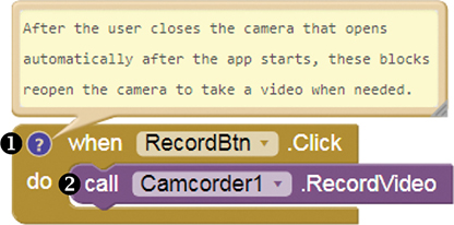
In the Blocks pane, click RecordBtn, and when the blocks for the component appear, drag the whenRecordBtn.Click block ➊ to the Viewer. Then, in the Blocks pane, click Camcorder1, drag another callCamcorder1.RecordVideo block ➋ to the Viewer, and snap it inside the whenRecordBtn.Click block next to the word do. These blocks call the Camcorder component’s built-in RecordVideo method to open the phone’s video camera when the RecordBtn is clicked, just as we planned.
NOTE
Seeing the RecordVideo method call in two different event handlers might initially confuse other programmers who see these blocks. To explain why you’re calling the method in two places, you can comment your code by right-clicking the second when...do block, selecting Add Comment, clicking the blue question mark icon that appears, and entering your explanation in the text area that opens. Readers can open and close your comment by clicking the question mark icon. Programmers often comment their code to add reminders for themselves and explanations for other coders.
Now live-test to see how these blocks work. When you click Record, your phone’s video camera opens and you can then click the camera’s record button to record a video. But don’t record just yet! First we need to tell the app what to do after the camera records. If you close the video camera again without recording, you’ll likely see the error saying you didn’t record a video, which is okay for now.
STEP 3: CHOOSING THE VIDEO CLIP TO PLAY
Let’s program step 3 of the app so that, after the user records a video, the app knows what to do with the recording. We want the app to set the path or storage location of the video as the source for the VideoPlayer component, which will ensure the recording will play next in the video player. Here are the blocks that handle this after recording event.
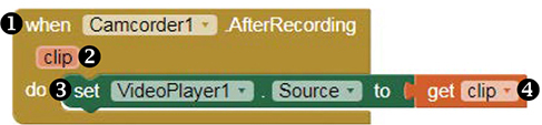
In the Blocks pane, click Camcorder1, and when the blocks for the component appear, drag the whenCamcorder1.AfterRecording block ➊ to the Viewer. Then, in the Blocks pane, click the VideoPlayer1 component, drag the setVideoPlayer1.Sourceto block ➌ to the Viewer, and snap it inside the whenCamcorder1.AfterRecording block next to the word do.
The clip ➋ on the whenCamcorder1.AfterRecording block is an event parameter, which is a container that holds an argument or information provided about an event. This information can only be used in the event handler that provides it. The clip parameter holds the path to the video clip recorded by Camcorder1 in part 1 or 2 of the app, and the video player can’t play the video until you set its source—the path to the file for it to play—to the path of the recorded clip.
To set the source, mouse over the clip parameter until you see a get clip block ➍. Drag the get clip block to the Viewer, and snap it to the right side of the setVideoPlayer1.Sourceto block. The blocks in this step set the path to the last recorded video clip as the source for VideoPlayer1.
STEP 4: PLAYING THE VIDEO CLIP
Finally, let’s program step 4 of the app, telling it what to do when the user clicks WatchBtn. When the user clicks this button, we want the app’s video player to start playing the user’s recorded video. Here is the code for programming this event handler.

In the Blocks pane, click WatchBtn, and when the blocks for the component appear, drag the whenWatchBtn.Click block ➊ to the Viewer. Then, in the Blocks pane, click VideoPlayer1, drag the callVideoPlayer1.Start block ➋ to the screen, and snap it inside the whenWatchBtn.Click block next to the word do. These blocks tell the app to call the built-in Start method for VideoPlayer1 to start the video player when the watch button is clicked, as planned.
Now live-test your completed app! Open the app on your phone, and you should see the splash screen for 5 seconds before the record and watch buttons and VideoPlayer1 appear and your phone’s video camera opens. Take a video and then click Watch to view the video in the app’s integrated video player. If you placed your blocks as shown in the code examples, you should be able to record and watch videos over and over again, and you’ve successfully created the “Practice Makes Perfect” app!
SUMMARY
In this chapter, you built the “Practice Makes Perfect” app, where users can record, watch, and re-record temporary video clips of themselves practicing speeches or songs. In the process, you examined how App Inventor uses event-driven programming to set app behavior, and you became familiar with different types of events and event handlers. You also learned about App Inventor’s Boolean value blocks and event parameters and used both to set values in this app.
In the next chapter, you’ll learn how to animate images; use random numbers; and create, set, and change the values of variables using App Inventor’s Animation, Math, and Variables blocks. We’ll use these tools to create a noisy, animated “Fruit Loot” game app, where players get points for catching fruit as it drops down the screen.
ON YOUR OWN
Save new versions of “Practice Makes Perfect” as you modify and extend it working on these exercises. You can find solutions online at https://nostarch.com/programwithappinventor/.
Extend the app so that the user can record, watch, and compare two practice video clips side by side. Which Layout and other component(s) would you need to drag to the Viewer to enable this? How will your blocks change?
Change the app so that it records and plays sound clips instead of videos. What components and blocks would you use to record and play sound?