
Inflation, interest rates, economic growth, and unemployment are key macroeconomic indicators used in assessing the overall health of the economy.1 Understanding them is important because they are interrelated. For example, accelerating economic growth increases real gross domestic product (GDP) relative to potential output. This pushes unemployment below its natural rate. As unemployment falls, labor markets tighten. This puts upward pressure on wages, as firms compete for fewer and fewer workers to keep pace with strong product demand. If firms pass on higher and higher production costs to consumers, inflation rises. This may lead to higher interest rates.
Inflation
Most textbooks define inflation as a general increase in the prices of products. This suggests that anything that causes prices to rise is inflationary. Demand-pull inflation results when aggregate demand grows faster than aggregate supply. A spike in crude oil prices raises production costs, reduces aggregate supply, and results in cost-push inflation. However, according to Milton Friedman (1970), inflation arises from the money supply growing more rapidly than real GDP. Monetarists like Friedman argued that, because price spikes reduce the money that is available for products when the quantity of money is constant, expanding it at an excessive rate allows all prices to adjust up. Figure 2.1 supports this view.2 The figure indicates that, in the long run, inflation rises nearly one-for-one in the growth of a country’s money supply.
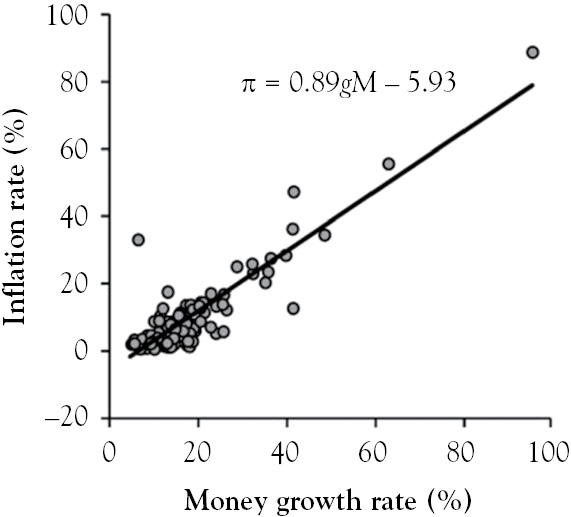
Figure 2.1 Inflation versus the growth in money
However inflation is defined, it is measured by computing the growth rate in the price level (PL) from year to year. In the United States, the Consumer Price Index (CPI) is used to measure inflation. The CPI is an average price of products. The set of products used to compute this average is referred to as the market basket. It includes 80,000 products, divided into eight categories, with the largest being housing. Because urban consumers purchase several loaves of bread a month and a new television once in a while, items included in the market basket are weighted. Product weights, which can be thought of as the quantities of products purchased each month by the typical consumer, are determined by the Consumer Expenditure Survey. The weights are held constant for a few years to compare prices over time. Every month, each item in the market basket is priced in multiple locations, and then averaged over 30 metropolitan areas. The total cost of this market basket is the dollar-valued PL.
Table 2.1 shows how the PL is computed using a hypothetical market basket of products. Some of the quantities in the table are less than one but others are not. For example, the typical consumer in this hypothetical is expected to go to the movies 5 times per month, and is expected to buy 0.04 televisions per month, or 4 every 100 months. After multiplying the quantities by their respective 2011 prices, the costs in the final column are totaled. The total, which equals 1260.07 dollars, represents the dollar-valued PL for 2011.
Table 2.1 Hypothetical market basket

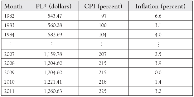
Table 2.2 displays hypothetical PLs, including the one computed in Table 2.1. The Bureau of Labor Statistics does not publish dollar-valued PLs. Instead, it releases the CPI. For a given year, the CPI equals the PL divided by the PL in base year 1983, which is listed as $560.28 in Table 2.2. The CPI values in the table are computed using
Table 2.2 Price level, consumer price index, and inflation
*The CPI from the BLS and the dollar-valued PL from Table 2.1 were used to simulate these values.
Plugging the 1983 PL, $560.28, into the above equation gives a CPI of 1. Multiplying this by 100 gives the 1983 CPI in Table 2.2. It equals 100 percent, which is the case for any index in its base year. In Table 2.2, the 2011 PL is $1,260.07. Plugging this into the CPI equation above gives 2011 CPI, which equals 225 percent. Subtracting a CPI value from its base year value gives the percent increase in prices between the years. The difference between the 2011 and 1983 CPI values indicates that prices rose by 125 percent over the 28-year period. This implies that a taco costing $1 in 1983 is expected to cost $2.25 in 2011.
The CPI is one of many price indices. The Personal Consumption Expenditure Price Index (PCEPI) is broader than the CPI because it includes the prices of all consumer products. The Federal Reserve, or the Fed, monitors inflation using the core PCEPI, which is the PCEPI with food and energy prices excluded. The GDP Deflator Price Index (DPI) is broader than PCEPI because it includes the prices of all final goods and services produced domestically.
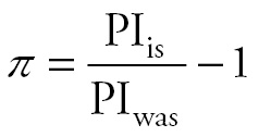
The annual percent change in the price index (PI ) is the inflation rate (π), which can be computed using the following equation:
Annual CPI inflation between 2011 and 2010 is found by substituting what the price index is in 2011 (2.25) and what it was a year earlier (2.18) into the equation above. Multiplying the result by 100 gives 3.2 percent, the 2011 inflation rate reported in Table 2.2. Negative inflation is called deflation, which indicates that prices generally fell during a given year. Disinflation is present if inflation declines over time. Table 2.2 indicates disinflation between 1982 and 1983, and between 2008 and 2009.
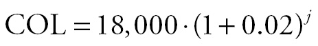
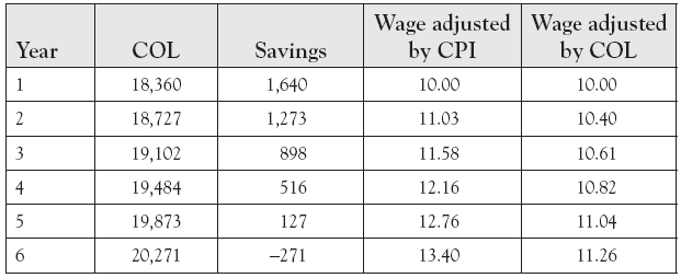
If wages are not adjusted for inflation over a long period of time, inflation acts like a tax.3 For example, suppose a manufacturer is able to convince a labor union to agree to a 6-year freeze in the after-tax wage of $10 per hour, or $20,000 per year with inflation at 2 percent each year. This rate of inflation seems harmless but is not due to compounding. If the cost of living (COL) is $1,500 per month, or $18,000 per year, the household saves $2,000 per year in the absence of inflation. The equation below adjusts the COL for 2 percent inflation.
Setting j equal to 1 in the above equation yields the COL for the first year, which is reported as $18,360 in Table 2.3. It is $360 higher than it was at the start of the first year, which causes the annual household savings to dip to $1,640. In the second year, j in the equation above is set equal to 2. The result is $367 higher than the COL at the end of the first year. Thus, the rise in the COL and the decline in savings are accelerating. The remaining costs of living and savings are listed in Table 2.3. It shows that the household is unable to live within its means by year six of the contract.
Table 2.3 Inflation and the cost of living (COL)
The CPI is an imperfect cost of living adjustment (COLA) because it does not include all components of the COL, and some of its components are mismeasured. According to Boskin et al. (1996), the CPI overstated inflation by 1.1 percentage points because it suffers from several sources of bias, which arise from the market basket being fixed for a few years. Product improvements and new goods do a better job than the older ones they replaced, but their higher prices are mistakenly measured as inflation. An increase in the price of beef relative to chicken causes some to switch to chicken, while a decline in incomes triggered by a recession may cause shoppers to switch from Macy’s to Walmart. Because neither substitution is captured by the CPI market basket, the higher price of beef and relatively higher prices at Macy’s overstate inflation.
Government’s use of the CPI as a COLA pushes up budget deficits. Because the CPI is used to adjust the income levels at which higher tax rates apply, more and more individuals over time escape higher tax brackets. This means fewer and fewer individuals are paying taxes at higher tax rates. This lowers tax revenue, provided entrepreneurialism and work effort are unaffected by lower marginal tax rates. Using the CPI to adjust government transfer payments makes the following more costly than they would have otherwise been: social security, military and civil service pensions, unemployment insurance (UI) compensation, Supplemental Nutritional Assistance Program (SNAP, formerly known as the Food Stamp Program), Medicare, and Medicaid. Finally, if increasingly generous transfers draw more and more workers out of labor markets over time, tax revenue will be even lower than what would have otherwise been collected.
Using the CPI as a COLA also distorts private contracts. In the labor contract example above, wages were frozen for six years. Suppose that the contract adjusts wages by CPI inflation, which is assumed to be 5 percent per year. If the contract affects 5,000 employees working 2,000 hours per year, and the actual COL grows at 2 percent each year, using CPI will distort the contract. The equation below adjusts the after-tax wage of $10 using the CPI inflation rate of 5percent or 0.05.
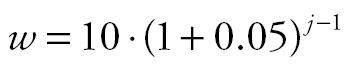
During the first year of the contract, j is equal to 1. This results in a first-year contract wage of $10 per hour. With j = 2, the equation yields a second-year wage of $11.03 per hour. The remaining CPI-adjusted wages are listed in Table 2.3.
The wages in the final column of Table 2.3 have been adjusted using the actual rise in the COL, which was assumed to be 2 percent. To compute these values, 0.05 is replaced with 0.02 in the equation above. This column indicates that wages need to rise from $10 to $11.26 just to keep up with the actual increase in the COL. The table demonstrates how CPI inflation substantially overstates the cost of the contract. By the final year, employees are earning $2.14 per hour more than they would have earned, had the actual COLA been used. Individually, this seems great. However, since 5,000 employees work 2,000 hours per year, they collectively work 10 million hours per year. The firm’s six-year wage bill, 709 million dollars, is 68 million dollars more than it would have been, had the actual COLA been used. With zero economic profits in the long run, firms may decide to move facilities to other states or countries to avoid such labor contracts.
Even if wages keep up with the COL, inflation is not costless. Consider the worst two cases on record: Hungary in 1946 and Zimbabwe in 2008 (Hanke 2009). At some point, prices in these economies were doubling daily. Firms in such an environment have to constantly update prices. This is costly because it involves printing new menus and catalogs, relabeling cans, and changing signs and websites. These monetary and time costs are called menu costs. When prices are doubling daily, holding money in one’s wallet, purse, cash register, or couch is devastating because its value is cut in half by the day’s end. Thus, money has to be deposited in interest-bearing accounts immediately to preserve its value. Before electronic transactions, people literally wore out the leather soles of their shoes running to the bank. In the age of electronic-commerce, shoe leather costs now represent the time and effort it takes to convert earnings, rents, and other payments denominated in a ravaged currency into stable foreign currencies or gold.
Persistently high inflation is costly in other ways. It distorts markets by making some goods relatively cheaper. This misallocates resources because these are being utilized in ways that would not have prevailed otherwise. If income tax rates are not indexed to inflation, earnings that rise with inflation end up in higher tax brackets, and workers will pay a higher share of income in taxes. An unexpected change in inflation redistributes wealth from savers to debtors because it makes the value of debt and returns on assets lower. Pensioners, living on fixed payments agreed to years earlier, are especially hurt by an unexpected change in inflation.
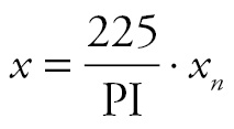
The value of earnings that is printed on an Internal Revenue Service Form W-2 is an example of a nominal variable. Over time, its value tends to rise for two primary reasons. First, the Mincer (1958) earnings function indicates the real value of earnings rise (at a diminishing rate) throughout one’s life because investments in human capital decline as returns on earlier investments rise. Second, modest steady inflation is a goal of the Fed. In order to compare values of a nominal variable over time, inflation must be stripped from it. A nominal variable that is stripped of inflation is called a real variable. The real variable equation below converts nominal variable xn into real variable x using price index PI.
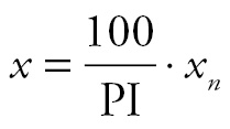
We use the CPI as the price index when accounting for inflation in consumer goods and worker pay. Because the numerator in the fraction of the above equation equals the value of the CPI in 1983, the equation values variable x in 1983-dollars.
The federal minimum wage rates in 1984 and 2010 cannot be compared because the first is in 1984-dollars and the other is in 2010-dollars. Plugging the 1984 values of the nominal minimum wage ($3.35) and CPI (104) into the equation above gives a real wage of $3.22 per hour. Doing the same with the nominal minimum wage ($7.25) and CPI (218) for the year 2010 gives the real 2010 minimum wage, $3.33 per hour. The real values are comparable because both are in 1983-dollars. The comparison implies that minimum wage workers are slightly better off in 2010 than they were in 1984.
The comparisons do not have to be made with 1983-dollars. Any year’s dollars can be used. For example, if one wishes to compare the price of a Hershey bar in 1936 ($0.05, according to FoodTimeline.org) to its price in 2011, the 1936 nominal price can be inflated to 2011-dollars. The following equation values prices in 2011-dollars because its numerator is the 2011 CPI:
Substituting the 1936 values of the CPI (14) and nominal price of a Hershey candy bar ($0.05) into the modified equation yields a real price of $0.80. Since this is in 2011-dollars, it is comparable to the nominal price of a Hershey bar purchased in 2011, which was about $1. In real terms, the Hershey bar is cheaper in 1936.
Interest Rates
The interest rate stated on a mortgage is an example of a nominal interest rate. It is the percentage of the principal, the amount borrowed, that the borrower agrees to pay each period until the loan matures. In the final period of the loan, the borrower pays the lender the final interest payment and any remaining principal. Interest compensates lenders for their time value of money. Instead of making the loan, the lender could have spent the amount buying consumer goods. Interest also compensates lenders for taking on risks.4 Because short-term securities are less risky than longer term securities, interest rates generally increase with maturity. For securities issued by a given organization, the relationship is called the yield curve, which tends to steepen as economic growth accelerates.
Although there are numerous nominal interest rates, due in part to risks varying across types of loans and individuals, there is only one rate in macroeconomics. It is determined in the loanable funds market. In this market, borrowers demand funds supplied by lenders, and borrowers pay lenders nominal interest rate i, which is the sum of real interest rate r and inflation rate π.
i = r + π
This equation suggests a one-for-one relationship between inflation and the nominal interest rate, which is called the Fisher effect. Figure 2.2a, however, indicates that the interest rate on three-month U.S. Treasury bills only increases by 0.71 percentage points when CPI inflation rises by one percentage point. Using international data, Figure 2.2b provides stronger support for the effect.5
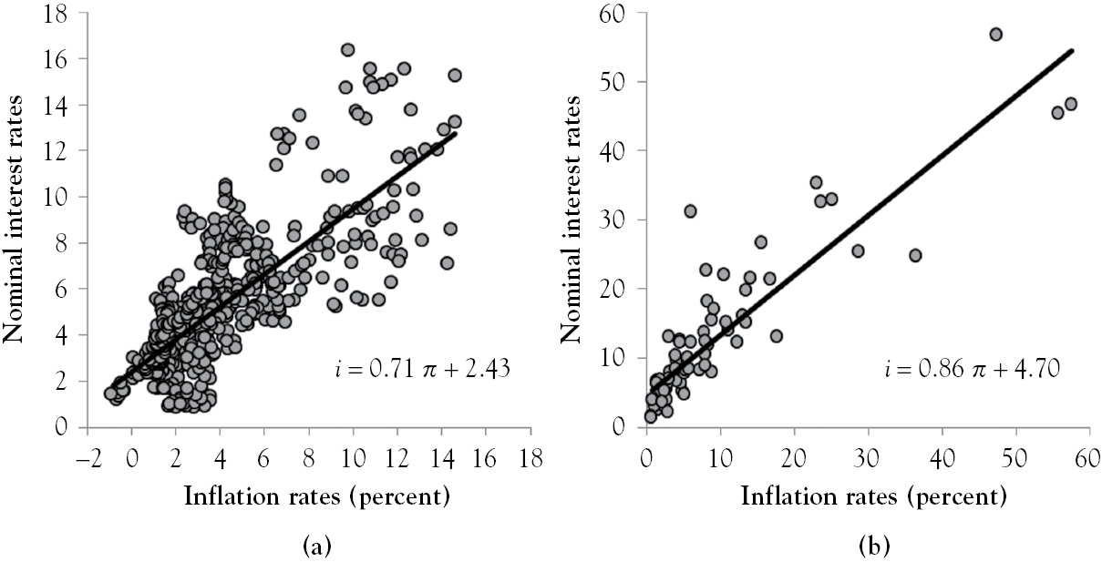
Figure 2.2 Nominal interest rate versus inflation
Using current inflation to determine the nominal rate of interest assumes that inflation will not change. The real rate of interest in the future will likely be much different from what it was when loan papers were signed. Borrowers do better and lenders do worse when loans are repaid with devalued money. In a world of uncertainty, the Fisher equation is
i = r + πe
where πe is expected inflation. Central banks are interested in real rates because they affect investment decisions of firms and savings decisions of individuals.
The yield on government-issued, inflation-indexed bonds is used to compute expected inflation. In the United States, these bonds are called Treasury Inflation Protected Securities (TIPS). The difference between the yields from conventional Treasuries and TIPS of the same maturity is called the TIPS spread. It is the market’s valuation of expected inflation, which differs from that of the Survey of Professional Forecasters (SPF). The Fed refers to this difference as bias. It estimated bias using regression analysis, which resulted in the equation below.6
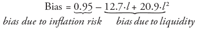
where l is liquidity premium, the difference between yields on 10-year Treasuries auctioned in the primary market and those traded in the secondary market. If the liquidity premium is 0.5, the Fed’s estimate of bias is found by plugging this value into the equation above. With this equal to −0.175, and the TIPS spread assumed to be 3.5 percent, the Fed’s estimate of πe is 3.325 percent. If the current interest rate on three-month U.S. Treasury bills is 1 percent, subtracting the estimate of πe from this value gives a real interest rate equal to −2.325 percent. In such a situation, lenders pay interest on the loans they make to borrowers.
Economic Growth
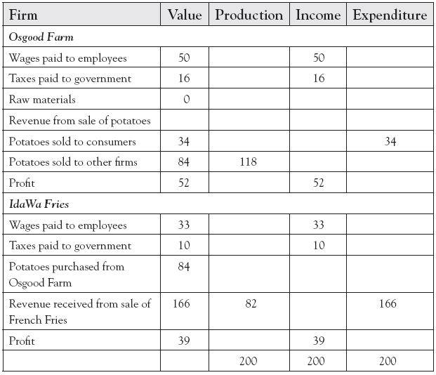
GDP is the market value of all final goods and services produced domestically during the year. It can be computed using the production, aggregate expenditure, or income methods, which are illustrated in the example summarized in Table 2.4. The production method sums the value added by firms. Osgood Farm’s value added is equal to its revenue, $118, because its raw material purchases were zero. For IdaWa Fries, the value added is $82 because its $166 in revenue has to be adjusted for the $84 potatoes purchased from Osgood Farm. The income method sums up incomes from labor ($50 and $33) and capital ($52 and $39), and the taxes government collects, which extracted $16 from Osgood Farm and $10 from IdaWa Fries. The aggregate expenditure method sums up consumer, business, government, and net foreigner expenditures, and all but consumer expenditures are zero in the table. All three methods give the same value of GDP because production equals income, which equals expenditures.
Table 2.4 The production, income, and expenditure methods of computing GDP
Calculating GDP is messy. This is illustrated in Figure 2.3. The black circle includes all legal and illegal final products produced domestically; the gray circle includes all recorded and unrecorded domestic transactions; and the gray area measures GDP. Area C includes all recorded transactions of final products produced within the year. It does not include purchases of stocks and bonds, but proceeds from these sales show up in C if they are used to purchase new products. Commissions from bond and stock sales are in C since the services are rendered this year. War and natural disasters overstate C because money spent rebuilding structures destroyed by bombs and Mother Nature could have been used to expand factories. Product quality improvements understate C because newer and older models are treated the same.
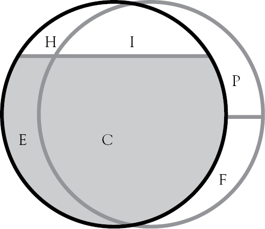
Figure 2.3 Inclusions and exclusions of GDP
Current transactions inside the gray circle include future (F) and past (P) production. Because used cars, previously owned homes, and items sold in yard sales were produced in prior years, these transactions are included in area P. If transactions in P are included in this year’s GDP, the production of these goods would be doublecounted because they were already counted in a previous year’s GDP. Intermediate goods like computer chips and tires produced during the year are in area F because these are installed on final products sold at a future date. Including intermediate products in GDP in the year that they were sold double-counts them because these costs are included in the price of the final product they were installed in or on. Proceeds from sales of stocks and bonds show up in F if firms use the proceeds to purchase capital goods.
Area I includes the production of illegal goods and services like crack and prostitution. If drug dealers and pimps reported annual sales to government (to ensure GDP is accurately measured), the value of their production would be included in GDP. The estimated value of these transactions is 8percent to 19percent of GDP.7 In a 15-trillion-dollar economy, economic activity in I represents 1.2 trillion to 2.85 trillion dollars in unreported income that is not being taxed.
Unpaid household production and leisure are in area H because no transactions record these activities. Examples of household production8 includes members of households cooking their own meals, cleaning and maintaining their homes, hemming their pants and shirts, and remodeling their bathrooms and kitchens. Leisure is an economic good that has a price equal to one’s hourly wage because leaving work an hour early costs an hour of pay.
Area E includes all unrecorded transactions that are included in GDP as estimates, which are called imputations. Between 2005 and 2012, imputations accounted for 16.5 percent of GDP.9 Job perks like employer-provided parking spaces are estimated using rents of nearby parking spaces. Other imputations include the proportion of vegetables, fruits, and meat produced on farms that farmers use to feed themselves and their families. Owner-occupied housing is the largest imputation. It is based on the idea that homeowners are essentially renting their homes to themselves.
Nominal GDP (denoted as GDPn) is equal to the economy’s output for a given year valued in the said year’s prices, whereas real GDP is that output valued in the base year’s prices. If firms sell only to consumers, intuitively, both of these definitions can be expressed as


The first equation computes nominal GDP in 2012 because firms’ outputs in 2012 are being valued in 2012 prices. The second is real GDP in 2012 because firms’ outputs in 2012 are being valued in base prices. Although nominal GDP rises if prices or quantities rise from year to year, real GDP rises only if quantities are generally higher because prices are “chained” to base year 2005. In practice, the nominal GDP equation works but the real GDP equation does not because products are improved and replaced over time.
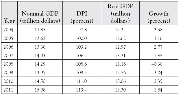
The first version of the real variable equation in the inflation section of this chapter is used to strip inflation from the nominal GDP values listed in Table 2.5. Because the DPI is used instead of the CPI and the DPI is equal to 100 in year 2005, the equation values GDP in 2005-dollars. Substituting the 2011 values of nominal GDP (15.08 trillion dollars) and DPI (113.4) into this equation yields the value of real GDP in 2011 that is reported as 13.30 trillion dollars in Table 2.5. Repeating this calculation for the other years in the table gives the remaining values of real GDP. Real GDP is less than its nominal value prior to 2005, equal to its nominal value in 2005, but greater than its nominal value after 2005. Thus, stripping inflation from GDP inflates it to 2005-dollars in years prior to 2005, but deflates it thereafter.
Table 2.5 Nominal GDP, real GDP, economic growth
With inflation stripped from real GDP, it can be used to compare economic output from year to year. Economic growth, the annual percent change in real GDP, is used to compare real GDP from year to year. It can be computed using the equation below.
Table 2.5 reports real GDP for select years. Plugging in what real GDP is in 2007 (13.21 trillion dollars) and what it was a year earlier (12.97 trillion dollars) gives an annual economic growth for 2007 equal to 1.85 percent. Applying the same equation to nominal GDP values over this same period gives the growth rate of nominal GDP, 4.9 percent. The difference in these growth rates is roughly equal to the inflation rate for the same year. This will generally be the case for all years.
The economy is expanding when economic growth is positive, but is contracting when growth is negative. Most textbooks define a recession as two consecutive quarters of negative growth, and a persistent one as a depression. In the United States, the National Bureau of Economic Research (NBER) dates recessions, and defines a recession as “a significant decline in economic activity spread across the economy, lasting more than a few months, normally visible in real GDP, real income, employment, industrial production, and wholesale-retail sales.” The black line in Figure 2.4 plots economic growth ( g) over a three-decade period, and the vertical gray bars mark the last five U.S. recessions. The figure shows economic growth accelerating, peaking, declining, and bottoming out five times. This cycling is called the business cycle. In the United States, expansions tend to be longer than contractions.
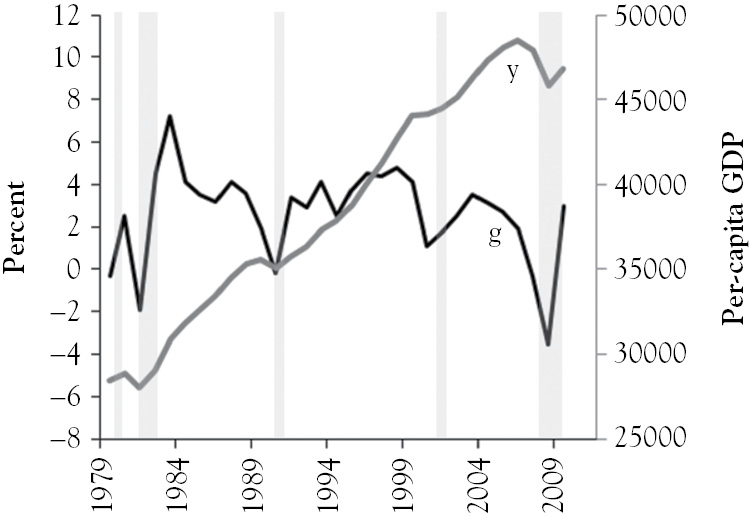
Figure 2.4 Graphs of economic growth and per capita GDP
The well-being of a nation’s citizenry is difficult to measure. Ideally, it would be measured by the quality of one’s life and that of his or her loved ones. In reality it is measured by per capita GDP, the ratio of real GDP and the size of the population. For a given nation, per capita GDP, one of the many measures of its standard of living,10 grows when its economic growth rate exceeds its population growth rate. The gray line in Figure 2.4 graphs U.S. per capita GDP (y) over time. In 2010, the real GDP was $46,844 per American, which is below its high of $48,532 in 2007 but much higher than what it was 10 years earlier, $44,081.
Unemployment
The Current Population Survey (CPS) is used to compile labor force statistics for the United States. Each month, members of 60,000 households are interviewed. Every person in the survey who is 16 years or older is in the working age population (WAP), provided they are not jailed, hospitalized, institutionalized, or in the armed forces. Figure 2.5 demonstrates how the WAP is broken up into its various parts: the number of people who are employed (E ), the number of unemployed workers (U ), and the number of people who have dropped out of the civilian labor force (O ).

Figure 2.5 Components of the working age population (WAP)
People in the WAP are employed during the reference week11 if they worked at least one hour for pay, worked in their own businesses, or performed at least 15 hours of unpaid work in family-owned businesses. People who did not work during the reference week are classified as employed if they were absent from work due to a work-related reason.12 Foreigners not living on embassy grounds who satisfy one of these conditions are considered employed. People having more than one job are counted once. As seen in Figure 2.5, 140 million workers are employed.
Individuals in the WAP who quit their jobs or get laid off or fired are counted among the unemployed provided they looked for work during the reference period.13 Laid-off workers expecting to be called back to work within six months are considered unemployed even if they have not looked for work in the reference period. The long-term unemployed and first-time job seekers are counted among the unemployed only if they looked for work during the reference period. As seen in Figure 2.5, 15 million workers are unemployed.
The civilian labor force (L) is the sum of employment and unemployment levels. As seen in Figure 2.5, adding the 140 million employed workers and 15 million unemployed workers gives a labor force of 155 million people.
The unemployment rate is the share of the labor force that is unemployed. It is the most cited labor force statistic. It can be computed using the following equation.14
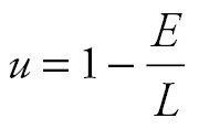
Between the years 2010 and 2011, Table 2.6 indicates that the number of workers in labor force fell from 153.89 million to 153.62 million as employment rose from 139.07 million to 139.87 million. Plugging these values into the equation above gives the unemployment rates for 2010 and 2011, which are 9.63 percent and 8.95 percent, respectively. The decline in unemployment occurred for two reasons. Overall employment rose, which is considered a healthy labor market signal. However, this coincided with the labor force shrinking. If the decline in the labor force results from discouraged workers exiting the labor force because they quit looking for work, declining unemployment is not necessarily good news.
Table 2.6 Labor force, employment, unemployment, unemployment rate
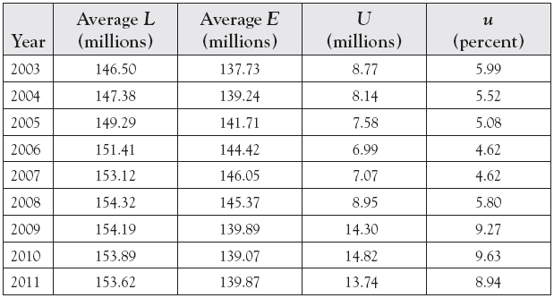
Figure 2.6 plots the labor force participation rate (lfpr = L/WAP), employment-to-population ratio (epr = E/WAP), and unemployment over time. According to it, labor force participation and employment are near 30-year lows, while unemployment is just under a 30-year high. The figure also shows the labor force continuing to fall as employment leveled off after 2008. An increasing number of baby boomers, Americans born between 1946 and 1964, reaching retirement age is a primary driver of the labor force participation rate beginning its marked decline in 2000.
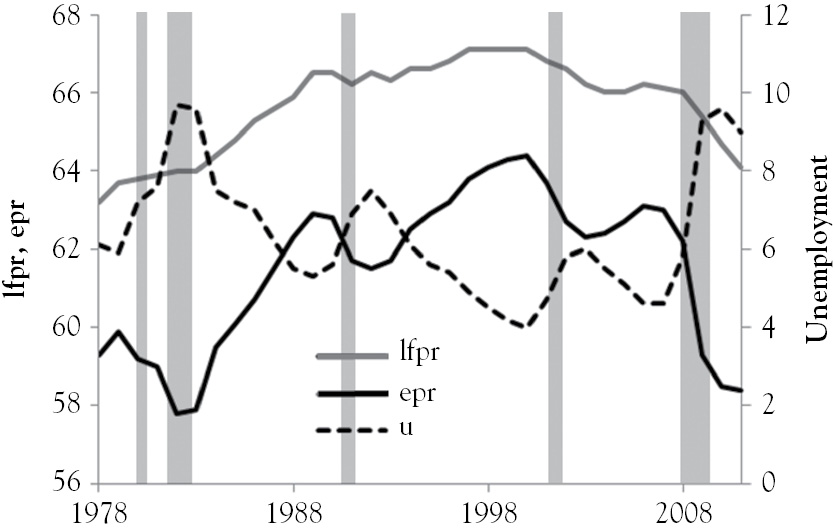
Figure 2.6 Graphs of lfpr, epr, and u
Figure 2.6 shows how unemployment changes over the business cycle. It suggests that unemployment fluctuates around a long-run trend that is called the natural rate of unemployment. From the early 1980s to 2008, the natural rate appears to generally decline from about 7 percent to about 5 percent, but appears to have risen above 7 percent in 2009. The difference between it and the unemployment rate is called the cyclical unemployment rate. The natural rate includes structural unemployment and frictional unemployment. Frictional unemployment includes idle workers who decline job offers paying wages below their reservation wages.15 It also includes workers who are temporarily between jobs due to a move or career change. Structural unemployment includes those who lose their jobs due to automation. It tends to rise after a slump in manufacturing or organizational restructuring.
Natural unemployment is a function of many factors. The 2009 spike in unemployment coincides with the 2007 Fair Minimum Wage Act, which raised the minimum wage to $7.25 in 2009, as well as the 2009 American Recovery and Reinvestment Act, which expanded the UI and SNAP programs, substantially. An increase in the minimum wage raises the cost of low-skilled labor, which can reduce employment and increase the number of people looking for work. SNAP, UI, and Medicaid can increase low-skilled workers’ reservation wages (Borjas 2012), which would lengthen unemployment spells. Laws restricting layoffs can make a firm less willing to hire new employees because it is more difficult to fire unproductive workers and shirkers.16
Persistently high unemployment is costly. It indicates that the economy is inside its production possibilities frontier for an extended period of time, which results in lost GDP. Unemployed workers receive UI compensation, pay fewer taxes, and may enroll in public assistance programs. These actions raise government expenditures and reduce tax collections, which widens the annual budget deficit. This requires more government borrowing, which is a tax on future generations. High persistent unemployment lengthens unemployment spells, which accelerates the depreciation of human capital, as skills become increasingly dated. It reduces the probability that idle workers will be offered jobs because firms may perceive them to be unproductive. It is linked to crime (Box 1987), divorce (Charles and Stephens 2004), and obesity (Morris 2007). It can push young mobile workers out of a region (Snarr and Romero 2014), which would leave behind an aging or unproductive work force.
A Synthesis
If John Donne (1572 to 1631) had been an economist rather than the poet and lawyer that he was, he would have likely concluded that no macroeconomic indicator “is an island, entire of itself, each is a piece of the continent, a part of the main,” meaning, indicators are intertwined. For example, accelerating economic growth pushes real GDP beyond its potential and unemployment below its natural rate. As unemployment falls, labor markets tighten, putting upward pressure on wages as firms compete for fewer and fewer workers to keep up with strong labor demand. If firms can pass higher costs to consumers, prices will rise, pushing up inflation and interest rates.
Figure 2.7a shows how the gap between real GDP (the black line) and its potential (the gray line) evolve over time. From 2009 onward, real GDP is well below its potential, with the unemployment rate above 8 percent as shown in Figure 2.7b. In 1996 and 2002, real GDP and potential output intersect at points E and F, suggesting that the economy was at full employment in these years. At points E and F in Figure 2.7b, unemployment is about 5 percent for these years, which implies that the natural rate of unemployment for 1996 to 2002 is in the neighborhood of 5 percent.
Figure 2.7 Graphs of potential GDP, real GDP, and unemployment
The discussion above implies that real GDP and unemployment are linked. This relationship is called Okun’s law and is shown in Figure 2.8a, which plots annual growth of quarterly real GDP against the annual change in quarterly unemployment for 1948 to 2012. Point A implies that a growth rate of 7.3 percent will prevail if unemployment declines by 2 percentage points. This is perhaps due to idle workers bidding down wages when unemployment is high.
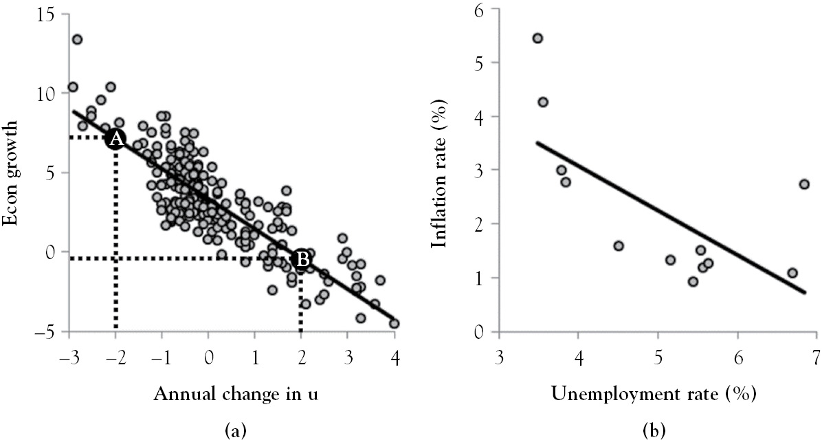
Figure 2.8 Okun’s law and the phillips curve
The line in Figure 2.8b is called the Phillips curve. It makes the case for a trade-off between unemployment and inflation between 1958 and 1969. The relationship disappears when additional years, 1970 to 2004, are included, which is the case in Figure 2.9a. Large fluctuations in inflation expectations began shifting the Phillips curve in 1969. The augmented Phillips curve, the line in Figure 2.9b, accounts for these fluctuations. It shows the relationship between unemployment and the expected change in inflation. Point F implies that inflation is not expected to change when unemployment is 5.9 percent. This suggests that the natural rate of unemployment is 5.9. Point B indicates that inflation is expected to rise by 1.6 points when unemployment is 3.5 percent, whereas Point A suggests inflation is expected to decline by 2.1 points when unemployment is 9.2 percent.
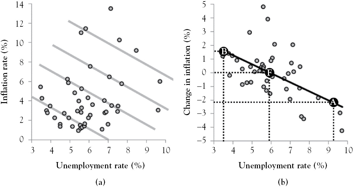
Figure 2.9 The slayed phillips and augmented phillips curves
1 All data used in this book were downloaded from the Federal Reserve Economic Database unless otherwise noted.
2 International Financial Statistics data for 120 countries, averaged over the years 1996 to 2004, are used in Figure 2.1.
3 In Chapter 2 of Keynes (1924), inflation is described as a hidden tax. Governments can levy an inflation tax more subtly than a legislative change in the tax code.
4 Borrowers may default and collateral may have been overvalued (systematic risk), government may change regulation and tax rules before loans are paid off (regulatory risk), or future payments may be eroded by an unexpected jump in inflation or exchange rates (inflation risk).
5 International Financial Statistics data for 75 countries, averaged over the period 1996 to 2004 are used in Figure 2.2b.
7 This is according to estimates published in Morris (1993); Johnson, Kaufmann, and Zoido-Lobaton (1998); Schneider and Enste (2000); and Dell’Annoa and Solomon (2008).
8 Chadeau (1992) estimates household production to be about 45 percent of GDP.
9 U.S. Bureau of Economic Analysis, “Table 2.6.12. National Income and Product Accounts” (accessed 3/25/14).
10 Investopedia.com defines standard of living as “[t]he level of wealth, comfort, material goods and necessities available to a certain socioeconomic class in a certain geographic area.”
11 The CPS reference week is the one that contains the 12th day of the month. If the week containing the 5th of December is entirely in the month, it is the reference week for December (see www.census.gov/cps/methodology).
12 Work-related reasons include illness, vacation, inclement weather, strike, lockout, job training, and family issues.
13 The reference period is the reference week and the preceding three-week period.
14 Unemployment does not include discouraged workers, self-employed contractors, involuntarily retired workers aged 64 years or younger, disabled workers looking for work, and part-timers wanting to work full time (Krueger and Katz 1999).
15 The reservation wage is the lowest wage at which a worker is willing to accept a job offer.
16 French firms skirt labor laws by starting a new company when its workforce reaches 50 (Viscusi and Deen 2012).