
Chapter 10: Exploring Time Series Analysis
In the previous chapter, we discussed using deep learning and its robust applicability when it comes to unstructured data in the form of natural language – a type of sequential data. Another type of sequential data that we will now turn our attention to is time series data. We can think of time series data as being standard datasets yet containing a time-based feature, thus unlocking a new set of possibilities when it comes to developing predictive models.
One of the most common applications in time series data is a process known as time series analysis. We can define time series analysis as an area of data exploration and forecasting in which datasets are ordered or indexed using a particular time interval or timestamp. There are many examples of time series data that we encounter in the biotechnology and life sciences industries daily. Some of the more laboratory-based areas of focus include gene expression and chromatography, as well as non-lab areas such as demand forecasting and stock price analysis.
Throughout this chapter, we will explore several different areas when it comes to gaining a better understanding of the analysis of time series data, as well as developing a model capable of consuming this data and developing a robust, predictive model.
As we explore these areas, we will cover the following topics:
- Understanding time series data
- Exploring the components of a time series dataset
- Tutorial – forecasting product demand using Prophet and LSTM
With that in mind, let’s go ahead and get started!
Understanding time series data
When it comes to using time series data, there are endless ways to visualize and display data to effectively communicate a thought or idea. In most of the data we have used so far, we have handled features and labels in which a certain set of features generally corresponded to a label of interest. When it comes to time series data, we tend to forego the idea of a class or label and focus more on trends within the data instead. One of the most common applications of time series data is the idea of demand forecasting. Demand forecasting, as its name suggests, comprises the many methods and tools available to help predict demand for a given good or service ahead of time. Throughout this section, we will learn about the many aspects of time series analysis using a dataset concerning the demand forecasting of a given biotechnology product.
Treating time series data as a structured dataset
There are many different biotechnology products on the market today, ranging from agricultural genetically modified crops, all the way to monoclonal antibody therapeutics. In this section, we will investigate the sales data of a human therapeutic by using the dataset_demand-forecasting_ts.csv dataset, which belongs to a small biotech start-up:
- With this in mind, let’s go ahead and dive into the data. We will begin by importing the libraries of interest, importing the CSV file, and taking a glance at the first few rows of data:
import pandas as pd
df = pd.read_csv(“dataset_demand-forecasting_ts.csv”)
df.head()
This will result in the following output:
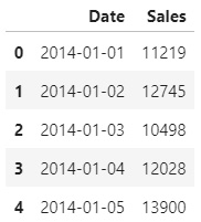
Figure 10.1 – The first few rows of the forecasting dataset
Relative to the many other datasets we have worked with in the past, this one seems much simpler in the sense that we are working with only two columns: Date and the number of Sales for any given day. We can also see that the sales have been aggregated by day, starting on 2014-01-01. If we check the end of the dataset using the tail() function, we will see that the dataset ends on 2020-12-23 – essentially providing us with 6 years’ worth of sales data to work with.
- We can visualize the time series data using the Plotly library:
import plotly.express as px
import plotly.graph_objects as go
fig = px.line(df, x=”Date”, y=”Sales”, title=’Single Product Demand’, width=800, height=400)
fig.update_traces(line_color=’#4169E1’)
fig.show()
Upon executing the fig.show() function, we will receive the following output:

Figure 10.2 – Time series plot of the sales dataset
We can immediately make a few initial observations regarding the dataset:
- There is a significant amount of noise and variability within the data.
- The sales gradually increase over time (I should have invested in them!).
- There seems to be an element of seasonality in which sales peak around December.
To explore these ideas a bit more and dive deeper into the data, we will need to deconstruct the time series aspect. Using the Date column, we can break the dataset down into years, months, and days to get a better sense of the repetitive or seasonal nature of this data.
Important note
Seasonality within datasets refers to the seasonal characteristics relating to that time of the year. For example, datasets relating to the flu shot often show increased rates in the fall relative to the spring or summer in preparation for the winter (flu season).
- First, we will need to use the to_datetime() function to convert string into the date type:
def get_features(dataframe):
dataframe[“sales”] = dataframe[“sales”]
dataframe[“Date”] = pd.to_datetime(dataframe[‘Date’])
dataframe[‘year’] = dataframe.Date.dt.year
dataframe[‘month’] = dataframe.Date.dt.month
dataframe[‘day’] = dataframe.Date.dt.day
dataframe[‘dayofyear’] = dataframe.Date.dt.dayofyear
dataframe[‘dayofweek’] = dataframe.Date.dt.dayofweek
dataframe[‘weekofyear’] = dataframe.Date.dt.weekofyear
return dataframe
df = get_features(df)
df.head()
Upon executing this command, we will receive the following DataFrame as output:
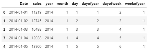
Figure 10.3 – The first five rows of the sales dataset showing new features
- Here, we can see that we were able to break down the time series aspect and yield a little more data than we originally started with. Let’s go ahead and plot the data by year:
plt.figure(figsize=(10,5))
ax = sns.boxplot(x=’year’, y=’sales’, data=df)
ax.set_xlabel(‘Year’, fontsize = 16)
ax.set_ylabel(‘Sales’, fontsize = 16)
After plotting our data, we will receive the following boxplot, which shows the sales for each given year. From a statistical perspective, we can confirm our initial observation that the sales are gradually increasing every year:

Figure 10.4 – Boxplot showing the increasing sales every year
- Let’s go ahead and plot the same graph for each given month instead:
plt.figure(figsize=(10,5))
ax = sns.boxplot(x=’month’, y=’sales’, data=df)
ax.set_xlabel(‘Month’, fontsize = 16)
ax.set_ylabel(‘Sales’, fontsize = 16)
Upon changing the x-axis from years to months, we will receive the following graph, confirming our observation that the sales data tends to peak around the January (1)/December (12) timeframes:

Figure 10.5 – Boxplot showing the seasonal sales for every month
Earlier, we noted that the dataset contained a great deal of noise in the sense that there was a great deal of fluctuation within the data. We can address this noise and normalize the data by taking a rolling average (moving average) – a calculation that’s used to help us analyze data points by creating a series of average values.
- We can implement this directly in our DataFrame using the rolling() function:
df[“Rolling_20”] = df[“sales”].rolling(window=20).mean()
df[“Rolling_100”] = df[“sales”].rolling(window=100).mean()
- Notice that in the preceding code, we used two examples to demonstrate the idea of a rolling average by using window values of 20 and 100. Using Plotly Go, we can plot the original raw data and the two rolling averages onto a single plot:
fig = go.Figure()
fig.add_trace(go.Scatter(x=df[“Date”], y=df[“sales”], mode=’lines’, name=’Raw Data’, line=dict(color=”#bec2ed”)))
fig.add_trace(go.Scatter(x=df[“Date”], y=df[“Rolling_20”], mode=’lines’, name=’Rolling 20’, line=dict(color=”#858eed”,dash=”dash”)))
fig.add_trace(go.Scatter(x=df[“Date”], y=df[“Rolling_100”], mode=’lines’, name=’Rolling 100’, line=dict(color=”#d99543”)))
fig.update_layout(width=800, height=500)
Upon executing this code, we will receive the following output:

Figure 10.6 – Boxplot showing the rolling average of the sales data
Notice that the raw dataset is plotted faintly in the background, overlayed by the dashed curve representing the rolling average with a window value of 20, as well as the solid curve in the foreground representing the rolling average with a window value of 100. Using rolling averages can be useful when you’re trying to visualize and understand your data, as well as building forecasting models, as we will see later in this chapter.
Important note
A rolling average (moving average) is a calculation that’s used to smoothen out a noisy dataset by taking the moving mean throughout a particular range. The range, which is often referred to as the window, is generally the last x number of data points.
Time series data is very different from much of the datasets we have explored so far within this book. Unlike other datasets, time series data is generally thought to be consistent with several components, all of which we will explore in the next section.
Exploring the components of a time series dataset
In this section, we will explore the four main items that are generally regarded as the components of a time series dataset and visualize them. With that in mind, let’s go ahead and get started!
Time series datasets generally consist of four main components: level, long-term trends, seasonality, and irregular noise, which we can break down into a method known as time series decomposition. The main purpose behind decomposition is to gain a better perspective of the dataset by thinking about the data more abstractly. We can think of time series components as being either additive or multiplicative:


We can define each of the components as follows:
- Level: Average values of a dataset over time
- Long-term Trends: General direction of the data showing an increase or decrease
- Seasonal Trends: Short-term repetitive nature (days, weeks, months)
- Irregular Trends: The noise within the data showing random fluctuations
We can explore and visualize these compounds a little more closely using the statsmodels library in conjunction with our dataset by performing the following simple steps:
- First, we will need to reshape our dataset by only keeping the sales column, dropping any missing values, and setting the date column as the DataFrame’s index:
dftmp = pd.DataFrame({‘data’: df.Rolling_100.values},
index=df.Date)
dftmp = dftmp.dropna()
dftmp.head()
- We can check the first few rows to see that the date is now our index:
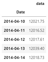
Figure 10.7 – First few rows of the reshaped dataset
- Next, we will import the seasonal_decompose function from the statsmodels library and apply it to our dataframe:
from statsmodels.tsa.seasonal import seasonal_decompose
result = seasonal_decompose(dftmp, model=’multiplicative’, period=365)
- Finally, we can plot the result using the built-in plot() function and view the results:
result.plot()
pyplot.show()
Using the show() function will give us the following output:
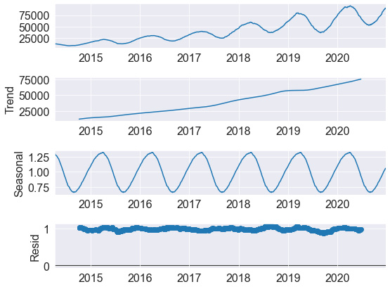
Figure 10.8 – Results of the seasonal decomposition function
Here, we can see the four components we spoke of earlier in this section. In the first plot, we can see the rolling average we calculated in the previous section. This is then followed by the long-term trend, which shows a steady increase throughout the dataset. We can then see the seasonality behind the dataset, confirming that sales tend to increase around the December and January timeframes. Finally, we can see the residual data or noise within the dataset. We can define this noise as items that did not contribute to the other main categories.
Decomposing a dataset is generally done to gain a better sense of the data and some of its main characteristics, which can often reshape how you think of the dataset and any given forecasting model that can be developed. We will learn how to develop two common forecasting models in the next section.
Tutorial – forecasting demand using Prophet and LSTM
In this tutorial, we will use the sales dataset from the previous section to develop two robust demand forecasting models. Our main objective will be to use the sales data to predict demand at a future date. Demand forecasting is generally done to predict the number of units to be sold on either a given date or location. Companies around the world, especially those that handle temperature-sensitive or time-sensitive medications, rely on models such as these to optimize their supply chains and ensure patient needs are met.
First, we will explore Facebook’s famous Prophet library, followed by developing a custom Long Short-term Memory (LSTM) deep learning model. With this in mind, let’s go ahead and investigate how to use the Prophet model.
Using Prophet for time series modeling
Prophet is a model that gained a great deal of traction within the data science community when it was first released in 2017. As an open source library available in both R and Python, the model was quickly adopted and widely used as one of the main forecasting models for time series data. One of the greatest benefits behind this model is also one of its consequences – its high-level nature of abstraction, allowing users to make a forecast with only a few lines of code. This limited variability can be a great way to make a quick forecast but can hinder the model development process, depending on the dataset at hand.
Over the next few pages, we will develop a Prophet model that’s been fitted with our data to forecast future sales and validate the results by comparing them to the actual sales data. Let’s get started:
- To begin, let’s go ahead and use the rolling() function to get a rolling average of our dataset. Then, we can overlay this value on the raw values:
df[“AverageSales”] = df[“Sales”].rolling(window=20).mean()
fig = go.Figure()
fig.add_trace(go.Scatter(x=df[“Date”], y=df[“Sales”], mode=’lines’, name=’Raw Data’, line=dict(color=”#bec2ed”)))
fig.add_trace(go.Scatter(x=df[“Date”], y=df[“AverageSales”], mode=’lines’, name=’Rolling 20’, line=dict(color=”#3d43f5”)))
fig.update_layout(width=800, height=500)
- This will result in the following output:

Figure 10.9 – The rolling average relative to the raw dataset
Here, we can see that the dataset is now far less noisy and easier to work with. We can use the Prophet library with our dataset to create a forecast in four basic steps:
- First, we will need to reshape the DataFrame to integrate it with the Prophet library. The library expects the DataFrame to contain two columns – ds and y – in which ds is the date stamp and y is the value that we are working with. We can reshape this DataFrame into a new DataFrame using the following code:
df2 = df[[“Date”, “AverageSales”]]
df2 = df2.dropna()
df2.columns = [“ds”, “y”]
- Similar to the implementation of the sklearn library, we can create an instance of the Prophet model and fit that to our dataset:
m = Prophet()
m.fit(df2)
- Next, we can call the make_future_dataframe() function and the number of periods of interest. This will yield a DataFrame containing a column of dates:
future = m.make_future_dataframe(periods=365*2)
- Finally, we can use the predict() function to make a forecast using the future variable as an input parameter. This will return a number of different statistical values related to the dataset:
forecast = m.predict(future)
forecast[[‘ds’, ‘yhat’, ‘yhat_lower’, ‘yhat_upper’]].tail()
We can limit the scope of the dataset to a few of the columns and retrieve the following DataFrame:

Figure 10.10 – The output of the forecasting function from Prophet
- Now, we can visualize our predictions using the built-in plot() function from our Prophet instance:
fig1 = m.plot(forecast)
This will result in the following output, which shows the original raw dataset, the future forecasting, as well as some upper and lower boundaries:
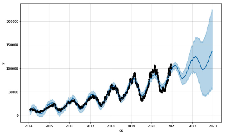
Figure 10.11 – Graphical representation of the forecasted data
- Alternatively, we can test the model’s capabilities by training the model using a portion of the data – for example, everything up to 2018. We can then use the forecasting model to predict the remaining time to compare the output with the actual data. Upon completing this, we will receive the following output:

Figure 10.12 – Graphical representation of the training and testing data
Here, we can see that the dashed line, which represents the forecasted sales, was quite close to the actual values. We can also see that the model did not forecast the extremes of the curve, so it likely needs additional tuning to reach a more realistic forecast. However, the high-level nature of Prophet can be limiting in this area.
From this, we can see that preparing the data and implementing the model was quite fast and that we were able to complete this in only a few lines of code. In the next section, we will learn how to develop an LSTM using Keras.
Using LSTM for time series modeling
LSTM models first gained their popularity in 1997, and then again in recent years with the increase in computational capabilities. As you may recall, LSTMs are a type of Recurrent Neural Network (RNN) that can remember and forget patterns within a dataset. One of the main benefits of this model is its mid to low-level nature in the sense that more code is required for a full implementation, relative to that of Prophet. Users gain a great deal of control over the model development process, enabling them to cater the model to almost any type of dataset, and any type of use case. With that in mind, let’s get started:
- Using the same dataset, we can go ahead and create a rolling average using a window of 20 to reduce the noise in our dataset. Then, we can remove the missing values that result from this:
df[‘Sales’] = df[“Sales”].rolling(window=20).mean()
df = df.dropna()
- Using MinMaxScaler from the sklearn library, we can go ahead and scale our dataset:
ds = df[[“Sales”]].values
scaler = MinMaxScaler(feature_range=(0, 1))
ds = scaler.fit_transform(ds)
- Next, we will need to split the data into our training and testing sets. Remember that our objective here is to provide the model with some sample historical data and see if we can accurately forecast future demand. Let’s go ahead and use 75% of the dataset to train the model and see if we can forecast the remaining 25%:
train_size = int(len(ds) * 0.75)
test_size = len(ds) - train_size
train = ds[0: train_size,:]
test = ds[train_size : len(ds), :]
- Given that we are working with time series data, we will need to use a lookback to train the model in iterations. Let’s go ahead and select a lookback value of 100 and use our dataset_generator function to create our training and testing sets. We can think of a lookback value as the range of how far back in the data the model should look to train:
lookback = 100
X_train, y_train = dataset_generator(train, lookback)
X_test, y_test = dataset_generator(test, lookback)
- As you may recall from our previous implementation of an LSTM model, we needed to reshape our data prior to using the data as input:
X_train = np.reshape(X_train, (X_train.shape[0], 1, X_train.shape[1]))
X_test = np.reshape(X_test, (X_test.shape[0], 1, X_test.shape[1]))
- Finally, with the data prepared, we can go ahead and prepare the model itself. Given that we are only working with a single feature, we can keep our model relatively simple. First, we will use the Sequential class from Keras, and then add an LSTM layer with two nodes, followed by a Dense layer with a single output value:
model = Sequential()
model.add(LSTM(2, input_shape=(1, lookback)))
model.add(Dense(1))
- Next, we can use an Adam optimizer with a learning rate of 0.001 and compile the model:
opt = tf.keras.optimizers.Adam(learning_rate=0.001)
model.compile(loss=’mean_squared_error’, optimizer=opt)
- Recall that we can use the summary() function to take a look at the compiled model:
model.summary()
This will result in the following output, which provides a glimpse into the inner workings of the model:

Figure 10.13 – Summary of the Keras model
- With the model compiled, we can go ahead and begin the training process. We can call the fit() function to fit the model on the training dataset for 10 epochs:
history = model.fit(X_train, y_train, epochs=10, batch_size=1, verbose=2)
- The model training process should be relatively quick. Once it’s been completed, we can take a look at the loss value by visualizing the results in a graph:
plt.figure(figsize=(10,6))
plt.plot(history.history[“loss”], linewidth=2)
plt.title(“Model Loss”, fontsize=15)
plt.xlabel(“# Epochs”, fontsize=15)
plt.ylabel(“Mean Squared Error”, fontsize=15)
This will result in the following output, showing the progressive decrease in loss over time:

Figure 10.14 – Model loss over time
Here, we can see that the loss value decreases quite consistently, finally plateauing at around the 9-10 epoch marker. Notice that we specified a learning rate of 0.001 in the optimizer. Had we increased this value to 0.01, or decreased the value to 0.0001, the output of this graph would be very different. We can use the learning rate as a powerful parameter to optimize the performance of our model. Go ahead and give this a try to see what the graphical output of the loss would be.
- With the model training complete, we can go ahead and use the model to forecast the values of interest:
X_train_forecast = scaler.inverse_transform(model.predict(X_train))
y_train = scaler.inverse_transform([y_train.ravel()])
X_test_forecast = scaler.inverse_transform(model.predict(X_test))
y_test = scaler.inverse_transform([y_test.ravel()])
- With the data all set, we can visualize the data by plotting the results using matplotlib. First, let’s plot the original dataset using lightgrey:
plt.plot(list(range(0, len(ds))), scaler.inverse_transform(ds), label=”Original”, color=”lightgrey”)
- Next, we can plot the training values using blue:
train_y_plot = X_train_forecast
train_x_plot = [i+lookback for i in list(range(0, len(X_train_forecast)))]
plt.plot(train_x_plot, train_y_plot , label=”Train”, color=”blue”)
- Finally, we can plot the forecasted values using darkorange and a dashed line to distinguish it from its two counterparts:
test_y_plot = X_test_forecast
test_x_plot = [i+lookback*2 for i in
list(range(len(X_train_forecast),
len(X_train_forecast)+len(X_test_forecast)))]
plt.plot(test_x_plot, test_y_plot , label=”Forecast”,
color=”darkorange”, linewidth=2, linestyle=”--”)
plt.legend()
Upon executing this code, we will get the following output:

Figure 10.15 – Training and testing datasets using the LSTM model
Here, we can see that this relatively simple LSTM model was quite effective in making a forecast using the training dataset we provided. The model was not only able to capture the general direction of the values, but also managed to capture the seasonality of the values as well.
Summary
In this chapter, we attempted to analyze and understand time series data, as well as developing two predictive forecasting models in less than 15 pages. We began our journey by exploring and decomposing time series data into smaller features that can generally be used with shallow machine learning models. We then investigated the components of a time series dataset to understand the underlying makeup. Finally, we developed two of the most common forecasting models that are used in the industry – the Prophet model, by Facebook, and an LSTM model using Keras.
Throughout the last few chapters, we have developed various technical solutions to solve common business problems. In the next chapter, we will explore the first step in making models such as these available to end users using the Flask framework.