
Chapter 6: Unsupervised Machine Learning
Oftentimes, many data science tutorials that you will encounter in courses and training revolve around the field of Supervised Machine Learning (SML) in which data and its corresponding labels are used to develop predictive models to automate tasks. However, in real-world data, the availability of pre-labeled or categorized data is seldom the case, and most datasets you will encounter will be in their raw and unlabeled form. For cases such as these, or whose primary objectives are more exploratory or not necessarily of automatable fashion, the field of unsupervised ML will be of great value.
Over the course of this chapter, we will explore many methods relating to the areas of clustering and Dimensionality Reduction (DR). The main topics we will explore are listed here:
- Introduction to Unsupervised Learning (UL)
- Understanding clustering algorithms
- Tutorial – breast cancer prediction via clustering
- Understanding DR
- Tutorial – exploring DR models
With these topics in mind, let's now go ahead and get started!
Introduction to UL
We will define UL as a subset of ML in which models are trained without the existence of categories or labels. Unlike its supervised counterpart, UL relies on the development of models to capture patterns in the form of features to extract insights from the data. Let's now take a closer look at the two main categories of UL.
There exist many different methods and techniques that fall within the scope of UL. We can group these methods into two main categories: those with discrete data (clustering) and those with continuous data (DR). We can see a graphical representation of this here:

Figure 6.1 – The two types of UL
In each of these techniques, data is either grouped or transformed in order to determine labels or extract insights and representations without knowing the labels or categories of the data ahead of time. Take, for example, the breast cancer dataset we worked with in Chapter 5, Understanding Machine Learning, in which we developed a classification model. We trained the model by explicitly telling it which observations within the data were malignant and which were benign, thus allowing it to learn the differences through the features. Similar to our supervised model, we can train an unsupervised clustering model to make similar predictions by clustering our data into groups (malignant and benign) without knowing the labels or classes ahead of time. There are many different types of clustering models we can use, and we will explore a few of these in the following section, and others further along in this chapter.
In addition to clustering our data, we can also explore and transform our data through a method known as DR, which we will define as the transformation of high-dimensional data into a lower-dimensional space in which the meaningful properties of the features are retained. Data transformations can either be used to reduce the number of features down to a few or to engineer new and useful features for a given dataset. One of the most popular methods that fall within this category is a process known as Principal Component Analysis (PCA)—we will explore this specific model in detail further along in this chapter.
Within the scope of both of these categories falls a niche field that is not quite yet a third category given its broad application—this is known as anomaly detection. Anomaly detection within the scope of UL, as the name suggests, is a method for the detection of anomalies within an unlabeled dataset. Note that, unlike clustering methods in which there is generally a balance within the different labels of a dataset (for example, 50:50), anomalies tend to be rare in the sense that the number of observations is usually anything but balanced. The most popular methods today when it comes to anomaly detection from an unsupervised perspective tend to not only include clustering and DR, but also neural networks and isolation forests.
Now that we've gained a sense of some of the high-level concepts relating to UL and know our objectives, let's now go ahead and get started with some details and examples for each.
Understanding clustering algorithms
One of the most common methods that fall within the category of UL is clustering analysis. The main idea behind clustering analysis is the grouping of data into two or more categories of a similar nature to form groups or clusters. Within this section, we will explore these different clustering models, and subsequently apply our knowledge in a real-world scenario concerning the development of predictive models for the detection of breast cancer. Let's go ahead and explore some of the most common clustering algorithms.
Exploring the different clustering algorithms
There exists not one, but a broad spectrum of clustering algorithms, each with its own approach to how to best cluster data depending on the dataset at hand. We can divide these clustering algorithms into two general categories: hierarchical and partitional clustering. We can see a graphical representation of this here:

Figure 6.2 – The two types of clustering algorithms
With these different areas of clustering in mind, let's now go ahead and explore these in more detail, beginning with hierarchical clustering.
Hierarchical clustering
Hierarchical clustering, as the name suggests, is a method that attempts to cluster data based on a given hierarchy using two types of approaches: agglomerative or divisive. Agglomerative clustering is known as a bottom-up approach in which each observation in a dataset is assigned its own cluster and is subsequently merged with other clusters to form a hierarchy. Alternatively, divisive clustering is a top-down approach in which all observations for a given dataset begin in a single cluster and are then split up. We can see a graphical representation of this here:

Figure 6.3 – The difference between agglomerative and divisive clustering
With the concept of hierarchical clustering in mind, we can imagine a number of useful applications this can help us with when it comes to phylogenetic trees and other areas of biology. On the other hand, there also exist other methods of clustering in which hierarchy is not accounted for, such as when using Euclidean distance.
Euclidean distance
In addition to hierarchical clustering, we also have a set of models that fall under the idea of partition-based clustering. The main idea here is separating or partitioning your dataset to form clusters using a given method. Two of the most common types of partition-based clustering are distance-based clustering and probability-based clustering. When it comes to distance-based clustering, the main idea here is determining whether a given data point belongs to a cluster based solely on distance such as Euclidean distance. An example of this is the K-Means clustering algorithm—one of the most common clustering algorithms, given its simplicity.
Note that Euclidean distance, sometimes referred to as Pythagorean distance, from a mathematical perspective, is defined as the distance between two points on a Cartesian coordinate system. For example, for two points, p (p1, p2) and q (q1, q2), the Euclidean distance can be calculated as follows:

Within the context of two dimensions, this model is fairly simple and easy to calculate. However, the complexity of this model can increase when given more dimensions, simply represented as follows:

Now that we have gained a better sense of the concept of Euclidean distance, let's now take a look at an actual application known as K-Means.
K-Means clustering
With the concept of Euclidean distance in mind, let's now take a close look at how this can be applied within the context of K-Means. The K-Means algorithm attempts to cluster data by separating samples into k groups consisting of equal variance and minimizing a criterion (inertia). The algorithm's objective is to select k centroids that minimize the inertia.
The K-Means model is quite simple in the sense that it operates in three simple steps, represented as stars in the following diagram:

Figure 6.4 – K-Means clustering steps
First, a specified number of k centroids are randomly initialized. Second, each of the observations, represented by the circles, is then clustered based on distance. The mean of all observations in a given cluster is then calculated, and the centroid is moved to that mean. The process repeats over and over until convergence is reached based on a predetermined threshold.
K-Means is one of the most commonly used clustering algorithms out there, given its simplicity and relatively acceptable computation. It works well with high-dimensional data and is relatively easy to implement. However, it does have its limitations in the sense that it does make the assumption that the clusters are of a spherical nature, which often leads to the misgrouping of data with clusters of non-spherical shapes. Take, for example, another dataset in which the clusters are not of a spherical nature but are more ovular. The application of the K-Means model, which operates on the notion of distance, would not yield the most accurate results, as shown in the following screenshot:
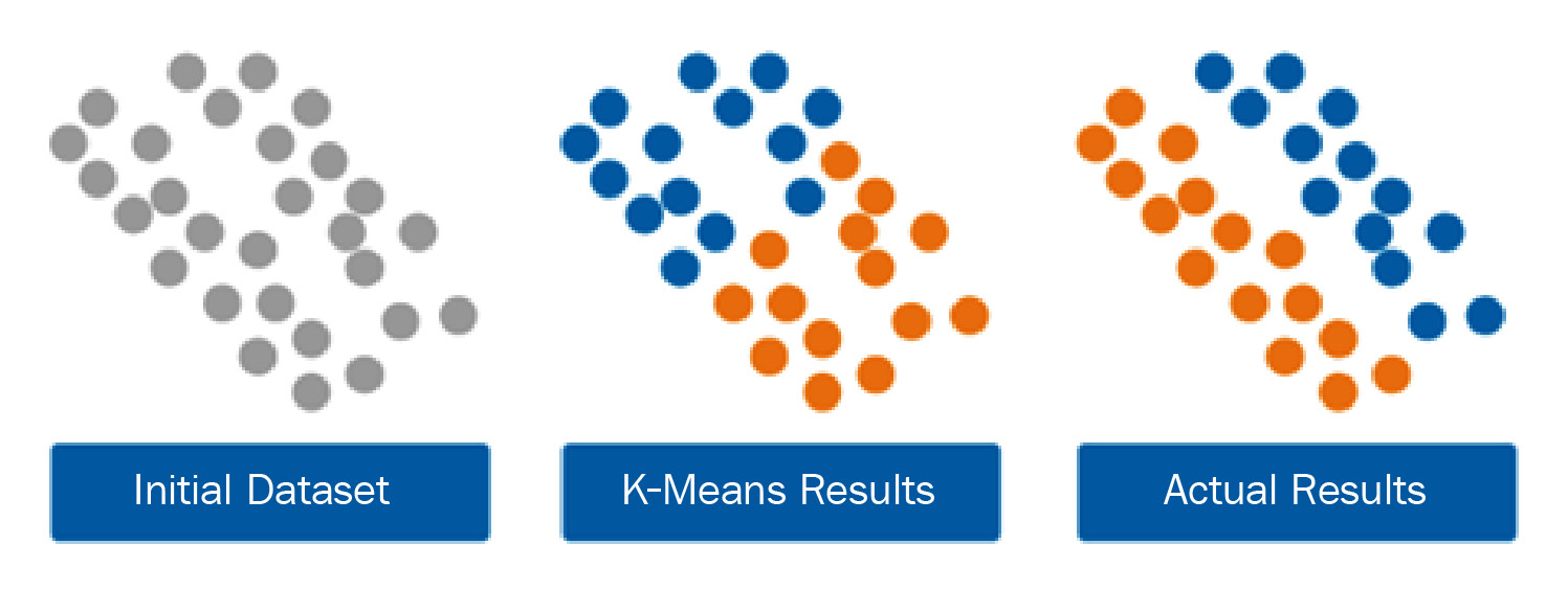
Figure 6.5 – K-Means clustering with non-spherical clusters
When operating with non-spherical clusters, a good alternative to a distance-based model would be a statistical-based approach such as a Gaussian Mixture Model (GMM).
GMMs
GMMs, within the context of clustering, are algorithms that consist of a particular number of Gaussian distributions. Each of these distributions represents a particular cluster. So far within the confines of this book, we have not yet discussed Gaussian distributions—a concept you will often hear about and come across throughout your career as a data scientist. Let's go ahead and define this.
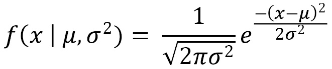
A Gaussian distribution can be thought of as a statistical equation representing data points that are symmetrically distributed around their mean value. You will often hear this distribution referred to as a bell curve. We can represent the probability density function of a Gaussian distribution as follows:
Here, ![]() represents the mean and
represents the mean and ![]() represents the variance. Note that this function represents a single variable. Upon the addition of other variables, we would begin to venture into the space of multivariate Gaussian models, in which x and
represents the variance. Note that this function represents a single variable. Upon the addition of other variables, we would begin to venture into the space of multivariate Gaussian models, in which x and ![]() represent vectors of length
represent vectors of length ![]() . In a dataset consisting of k clusters, we would need a mixture of k Gaussian distributions, in which each distribution has a mean and variance. These two values are determined through a technique known as Expectation-Maximization (EM).
. In a dataset consisting of k clusters, we would need a mixture of k Gaussian distributions, in which each distribution has a mean and variance. These two values are determined through a technique known as Expectation-Maximization (EM).
We will define EM as an algorithm that determines the proper parameters for a given model when some data is considered missing or incomplete. These missing or incomplete items are known as latent variables, and within the confines of UL, we can consider the actual clusters to be unknown. Note that if the clusters were known, we would be able to determine the mean and variance; however, we need to know the mean and variance to determine the cluster (think of the classic chicken-or-egg situation). We can use EM within the scope of the data to determine the proper values of these two variables to best fit the model parameters. With all this in mind, we are now in a position to discuss GMMs more intelligently.
We previously defined a GMM as a model consisting of multiple Gaussian distributions. We will now elaborate on this definition by including the fact that it is a probabilistic model consisting of multiple Gaussian distributions and utilizes a soft clustering approach by determining the membership of a data point to a given cluster based on probability rather than a distance. Notice that this is in contrast to K-Means, which utilizes a hard clustering approach. Using the previous example dataset shown in Figure 6.5 in the previous section, the application of a GMM would likely lead to improved results, as depicted here:

Figure 6.6 – K-Means clustering versus GMMs
Within this section, we discussed a few of the most common clustering algorithms commonly used in many applications within the field of biotechnology. We see clustering being applied in areas such as bio-molecular data, scientific literature, manufacturing, and even oncology, as we will experience in the following tutorial.
Tutorial – breast cancer prediction via clustering
Over the course of this tutorial, we will explore the application of commonly used clustering algorithms for the analysis and prediction of cancer using the Wisconsin Breast Cancer dataset we applied in Chapter 5, Understanding Machine Learning. When we last visited this dataset, we approached the development of a model from the perspective of a supervised classifier in which we knew the labels of our observations ahead of time. However, in most real-world scenarios, knowledge of the labels ahead of time is rare. Clustering analysis, as we will soon see, can be highly valuable in these situations, and can even be used to label data to use within the context of a classifier later on. Over the course of this tutorial, we will develop our models using the data but pretend that we do not know the labels ahead of time. We will only use known labels to compare the results of our models. With this in mind, let's go ahead and get started!
We will begin by importing our dataset as we have previously done and check the shape, as follows:
df = pd.read_csv("../../datasets/dataset_wisc_sd.csv")
print(df.shape)
We notice that there are 569 rows of data in this dataset. In our previous application, we had cleaned up the data to address missing and corrupt values. Let's go ahead and clean those up, as follows:
df = df.replace(r'\n','', regex=True)
df = df.dropna()
print(df.shape)
With the current shape of the data consisting of 569 rows with 32 columns, this now matches our previous dataset, and we are now ready to proceed.
Although we will not be using these labels to develop any models, let's take a quick look at them, as follows:
import seaborn as sns
sns.countplot(df['diagnosis']);
We can see in the following screenshot that there are two classes—M for malignant and B for benign. The two classes are not perfectly balanced but will do for the purposes of our clustering model:
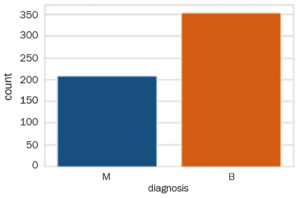
Figure 6.7 – The distribution of the two classes
To make our comparison to these labels easier during the following steps of our clustering analysis, let's go ahead and encode these labels as numerical values in which we will convert M to 1 and B to 0, as follows:
df['diagnosis'] = df['diagnosis'].map({'M':1,'B':0})
We can use the df.head() function to see the first few rows of our dataset and confirm that the diagnosis column did in fact get encoded properly. Next, we will prepare a quick pairplot of a few select features, as follows:
select_feats = ["diagnosis", "radius_mean", "texture_mean", "smoothness_mean"]
sns.pairplot(df[select_feats], hue = 'diagnosis', markers=["s", "o"])
We can use the markers argument to specify two distinct shapes to plot the two classes, yielding the following pairplot showing scatter plots of our features:
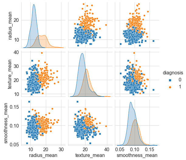
Figure 6.8 – Pairplot of select features
Our first objective is to look over the many features and get a sense of which two features show the least amount of overlap or the best degree of separation. We can see that the smoothness_mean and texture_mean columns have a high degree of overlap; however, radius_mean and texture_mean seem less so. We can take a closer look at these by plotting a scatter plot using the seaborn library, as follows:
sns.scatterplot(x="radius_mean", y="texture_mean", hue="diagnosis", style='diagnosis', data=df, markers=["s", "o"])
Notice that once again, we can use the style and markers arguments to shape the data points, thus yielding the following diagram as output:
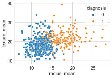
Figure 6.9 – Scatter plot of the two features that showed good separation
Next, we will normalize our data. In statistics, normalization or standardization can have a wide variety of meanings and are sometimes used interchangeably. We will define normalization to mean the rescaling of values into a range of [0,1]. On the other hand, we will define standardization to mean the rescaling of data to have a mean value of 0, and a standard deviation value of 1. For the purposes of our current objectives, we will want to standardize our data as we have previously done using the StandardScaler class. Recall that this class standardizes features within the dataset by removing the mean and scaling to variance, which can be represented as follows:

Here, ![]() is the standard score of a sample,
is the standard score of a sample, ![]() is the mean, and
is the mean, and ![]() is the standard deviation. We can apply this in Python with the following code:
is the standard deviation. We can apply this in Python with the following code:
from sklearn.preprocessing import StandardScaler
scaler = StandardScaler()
X = df.drop(columns = ["id", "diagnosis"])
y = df.diagnosis.values
X_scaled = pd.DataFrame(scaler.fit_transform(X), columns = X.columns)
With our dataset scaled, we are now ready to start applying a few models. We will begin with the agglomerative clustering model from the sklearn library.
Agglomerative clustering
Recall that agglomerative clustering is a method in which clusters are formed by recursively merging clusters together. Let's go ahead and implement the agglomerative clustering algorithm with our dataset, as follows:
- First, we will import the specific class of interest from the sklearn library, and then create an instance of our model by specifying the number of classes we want and setting the linkage as ward—one of the most common agglomerative clustering methods used. The code is illustrated in the following snippet:
from sklearn.cluster import AgglomerativeClustering
agc = AgglomerativeClustering(n_clusters=2, linkage="ward")
- Next, we will fit our model to our dataset, and predict the clusters to which they belong. Notice in the following code snippet that we used the fit_predict() function, using the first two features, radius_mean and texture_mean, and not the whole dataset:
agc_featAll_pred = agc.fit_predict(X_scaled.iloc[:, :2])
- We can then use matplotlib and seaborn to generate a diagram showing the actual (true) results on the left and predicted agglomerative clustering results on the right, as follows:
import matplotlib.pyplot as plt
import seaborn as sns
plt.figure(figsize=(20, 5))
plt.subplot(121)
plt.title("Actual Results")
ax = sns.scatterplot(x="radius_mean", y="texture_mean", hue=y, style=y, data=X_scaled, markers=["s", "o"])
ax.legend(loc="upper right")
plt.subplot(122)
plt.title("Agglomerative Clustering")
ax = sns.scatterplot(x="radius_mean", y="texture_mean", hue=agc_featAll_pred, style=agc_featAll_pred, data=X_scaled, markers=["s", "o"])
ax.legend(loc="upper right")
Notice in the preceding code snippet the use of the subplot() functionality in which the value 122 was used to represent 1 as the total number of rows, 2 as the total number of columns, and 2 as the specific index location of the plot. You can view the output here:

Figure 6.10 – Results of the agglomerative clustering model relative to the actual results
- From an initial estimation, we see that the model did a fairly reasonable job in distinguishing between the two clusters, having known very little about the actual true outcome. We can get a quick measure of its performance using the accuracy_score method from sklearn. Although getting a sense of the recall and f-1 scores is also important, we will stick to accuracy for simplicity for now. The code is illustrated in the following snippet:
from sklearn.metrics import accuracy_score
print(accuracy_score(y, agc_featAll_pred))
0.832740
In summary, the agglomerative clustering model using only the first two features of the dataset yielded an accuracy of roughly 83%—not a bad first attempt! If you are following along using the provided code, I would encourage you to try adding yet another feature and fitting the model with three or four or five features instead of just two and see whether you are able to improve the performance. Better yet, explore the other features provided in this dataset, and see whether you can find others that offer better separation and beat our 83% metric. Let's now investigate the performance of K-Means instead.
K-Means clustering
Let's now investigate the application of K-Means clustering using the dataset. Recall that the K-Means algorithm attempts to cluster data by partitioning the data into k clusters based on the location of their centroids. We can apply the K-Means algorithm using the following steps:
- We will begin by importing the KMeans class from the sklearn library, as follows:
from sklearn.cluster import KMeans
- Next, we can initialize an instance of the K-Means model and specify the number of clusters being 2, the number of iterations being 10, and the initialization method being k-means++. This initialization setting simply selects the initial cluster centers using an algorithm, with the aim of speeding up convergence. We can adjust the parameters in a process known as tuning in order to maximize the performance of the model. The code is illustrated in the following snippet:
kmc = KuMeans(n_clusters=2, n_init=10, init="k-means++")
- We can then use the fit_predict() method to fit our data and predict the clusters for each of the observations. Notice in the following code snippet that the model is only fitting and predicting the outcomes based on the first two features alone:
kmc_feat2_pred = kmc.fit_predict(X_scaled.iloc[:, :2])
- Finally, we can go ahead and plot the results of our predictions in comparison to the true values of the known classes using the seaborn library, as follows:
plt.figure(figsize=(20, 5))
plt.subplot(131)
plt.title("Actual Results")
ax = sns.scatterplot(x="radius_mean", y="texture_mean", hue=y, style=y, data=X_scaled, markers=["s", "o"])
ax.legend(loc="upper right")
plt.subplot(132)
plt.title("KMeans Results (Features=2)")
ax = sns.scatterplot(x="radius_mean", y="texture_mean", hue= kmc_feat2_pred , style= kmc_feat2_pred, data=X_scaled, markers=["s", "o"])
ax.legend(loc="upper right")
Upon executing this code, we get a scatter plot showing our results, as follows:
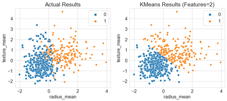
Figure 6.11 – Results of the K-Means clustering model relative to the actual results
While examining the two plots, we notice that the model did a remarkable job at separating the bulk of the data between the two clusters. Notice that K-Means, as opposed to agglomerative clustering, separated the boundary between the two clusters quite sharply defined. K-Means is known as a hard clustering model in the sense that the centroids and their distance from data points dictate the membership of a data point to a given cluster. Notice that this strongly defined boundary was the case for only the first two features and yielded an accuracy of 86%. Let's go ahead and try this with a few more features.
Although written in a non-Python fashion for illustrative purposes, we can fit out model using 2, 3, 4, and all the features, as follows:
kmc_feat2_pred = kmc.fit_predict(X_scaled.iloc[:, :2])
kmc_feat3_pred = kmc.fit_predict(X_scaled.iloc[:, :3])
kmc_feat4_pred = kmc.fit_predict(X_scaled.iloc[:, :4])
kmc_featall_pred = kmc.fit_predict(X_scaled.iloc[:, :])
- Next, using the subplot() methodology, we can generate four plots to illustrate the changes in which each individual subplot represents one of the plots depicted. Here's the code we'll need:
plt.figure(figsize=(20, 5))
plt.subplot(141)
plt.title("KMeans Results (Features=2)")
ax = sns.scatterplot(x="radius_mean", y="texture_mean", hue=kmc_feat2_pred, style=kmc_feat2_pred, data=X_scaled, markers=["s", "o"])
ax.legend(loc="upper right")
# Apply the same for the other plots
With the code executed, we yield the following diagram showing the results:
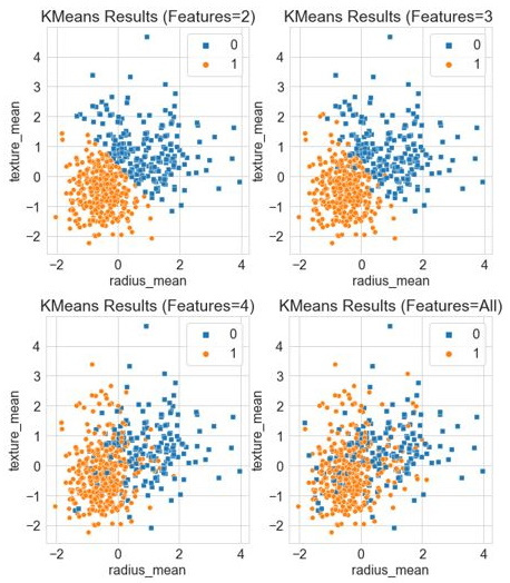
Figure 6.12 – Results of the K-Means clustering model with increasing features
We can calculate the accuracy using only two features to be ~86%, whereas three features yielded 89%. We will notice, however, that the numbers not only begin to plateau with more features included but also decrease when all features were included, yielding a lower accuracy of 82%. Note that as we begin to add more features to the model, we are adding more dimensions. For example, with three features, we are now using a three-dimensional (3D) model, as shown by the blended border between the two datasets. In some cases, the more features we have, the bigger the strain it will have on a given model. This borders a concept known as the Curse of Dimensionality (COD) in the sense that the volume of the space begins to increase at an incredible rate given more dimensions, which can impact the performance of the model. We will touch on some of the ways we can remedy this in the future, particularly in the following tutorial, as we begin to discuss DR.
In summary, we were able to apply the K-Means model on our dataset and were able to yield a considerable accuracy of 89% using the first three features. Let's now go ahead and explore the application of a statistical method such as GMM.
GMMs
Let's now explore the application of GMMs on our dataset. Recall that these models represent a mixture of probability distributions, and the membership of an observation to a cluster is calculated based on that probability and not on Euclidean distance. With that in mind, let's go ahead and get started, as follows:
- We can begin by importing the GaussianMixture class from the sklearn library, like this:
from sklearn.mixture import GaussianMixture
- Next, we will create an instance of the model and specify the number of components as 2, and set the covariance type as full such that each component has its own covariance matrix, as follows:
gmm = GaussianMixture(n_components=2, covariance_type="full")
- We will then fit the data model with our data, once again using only the first two features, and predict the clusters for each of the observations, as follows:
gmm_featAll_pred = 1-gmm.fit_predict(X_scaled.iloc[:, :2])
- Finally, we can go ahead and plot the results using the seaborn library, as follows:
plt.figure(figsize=(20, 5))
plt.subplot(131)
plt.title("Actual Results")
ax = sns.scatterplot(x="radius_mean", y="texture_mean", hue=y, style=y, data=X_scaled, markers=["s", "o"])
ax.legend(loc="upper right")
plt.subplot(132)
plt.title("Gaussian Mixture Results (Features=All)")
ax = sns.scatterplot(x="radius_mean", y="texture_mean", hue=gmm_featAll_pred, style=gmm_featAll_pred, data=X_scaled, markers=["s", "o"])
ax.legend(loc="upper right")
Upon executing our code, we yield the following output, showing the actual results of the dataset relative to our predicted ones:
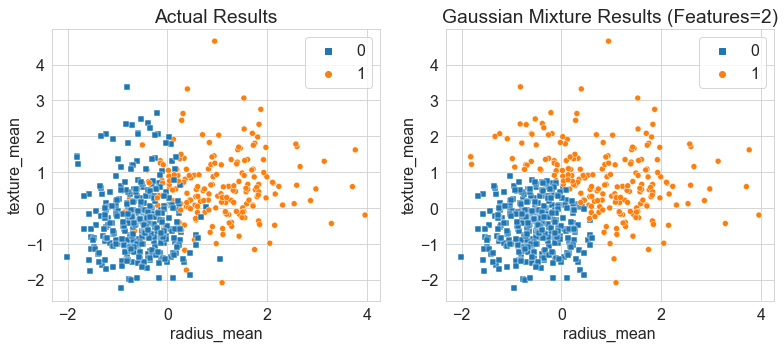
Figure 6.13 – Results of the GMM relative to the actual results
Once again, we can see that the boundary between the two classes is very defined within the Gaussian model, in which there is little to no blending, as the actual results show, thus yielding an accuracy of ~85%. Notice, however, that relative to the K-Means model, the GMM predicted a dense circular distribution in blue, with some members of the orange class wrapping around it in a very non-circular fashion.
Similar to the previous model, we can once again add some more features to this model in an attempt to further improve the performance. However, we see in the following screenshot that despite the addition of more features from left to right, the model does not improve, and the predictive capabilities begin to suffer:
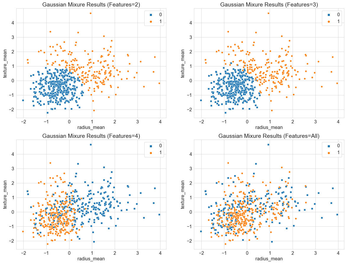
Figure 6.14 – Results of the GMM with increasing features
In summary, over the course of this tutorial, we investigated the use of clustering analysis to develop various predictive models for a dataset while assuming the absence of labels. Throughout the tutorial, we investigated the use of three of the most common clustering models: agglomerative clustering, K-Means clustering, and GMMs. We investigated the specific properties of all three models and their applicability to the Wisconsin Breast Cancer dataset. We determined that the K-Means model using three features showed optimal performance relative to other models, some of which utilized the dataset as a whole. We can speculate that all of the features contribute some level of significance when it comes to predictive power; however, the inclusion of all features within the models showed degraded performance. We will investigate some ways to mitigate this in the following section, pertaining to DR.
Understanding DR
The second category of UL that we will discuss is known as DR. As the full name states, these are simply methods used to reduce the number of dimensions in a given dataset. Take, for example, a highly featured dataset with 100 or so columns—DR algorithms can be used to help reduce the number of columns down to perhaps 5 while preserving the value that each of those original 100 columns contains. You can think of DR as the process of condensing a dataset in a horizontal fashion. The resulting columns can generally be divided into two types: new features, in the sense that a new column with new numerical values was generated in a process known as Feature Engineering (FE), or old features, in the sense that only the most useful columns were preserved in a process known as feature selection. Over the course of the following section and within the confines of UL, we will be focusing more on the aspect of FE as we create new features representing reduced versions of many others. We can see a graphical illustration of this concept here:
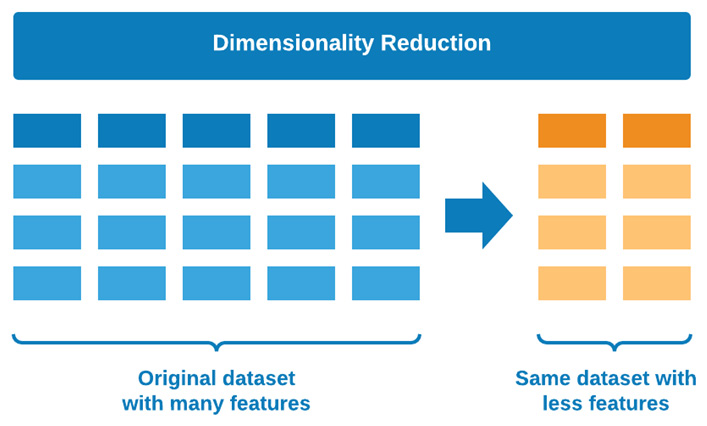
Figure 6.15 – Graphical representation of DR
There are many different methods that we can use to implement DR, each with its own process and underlying theory; however, before we begin implementing these, there is a very important concept we need to address. You are now probably wondering why DR matters. Why would any data scientist eliminate features after another data scientist or data engineer went through all of the trouble to put together a comprehensive and rich dataset to begin with? There are three answers to this question, as outlined here:
- We are not necessarily eliminating any data from our given dataset but are exploring our data from a different window, which may provide some new insights that we would not have seen using the original dataset.
- Developing models with many features is a computationally expensive process, therefore the ability to train our model using fewer features will always be faster, less computationally intensive, and more favorable.
- The use of DR can help reduce noise within the dataset to further improve clustering models and data visualizations.
With these answers in mind, let's now go ahead and talk about a concept that you will hear in many meetings, discussions, and interviews—the COD.
Avoiding the COD
The COD is regarded as a general phenomenon that arises when handling highly dimensional datasets—a term that was originally coined by Richard E. Bellman. In essence, the COD refers to issues that arise with highly dimensional datasets that do not occur in lower-dimensional datasets of similar size. As the number of features in a given dataset increases, the total number of samples will also increase proportionally. Take, for example, some dataset consisting of one dimension. Within this dataset, let's assume that we would need to examine a total of 10 regions. If we added a second dimension, we would now need to examine a total of 100 regions. Finally, if we added a third dimension, we would now need to examine a total of 1,000 regions. Think back for a moment to some of the datasets we have been working with so far that extend well beyond 1,000 rows and have at least 10 columns—the complexity of datasets such as these can grow quite rapidly. The main takeaway point here is that feature growth has a large impact on the development of a model. We can see a graphical illustration of this here:

Figure 6.16 – Graphical representation of the COD
As the number of features begins to increase, so does the overall complexity of an ML model, which can have a number of negative impacts such as overfitting, thus resulting in poor performance. One of the main motivations to reduce the dimensionality of a dataset is to ensure that overfitting is avoided, thus resulting in a more robust model. We can see a graphical illustration of this here:
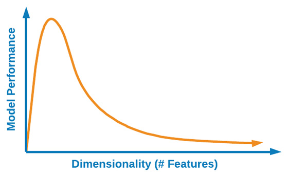
Figure 6.17 – The effect of higher dimensions on model performance
The necessity to reduce datasets from being highly dimensional to a low-dimensional form is especially true in the life science and biotechnology sectors. Throughout the many processes that scientists and engineers face within this field, there are generally hundreds of features relating to any given process. Whether we are looking for datasets relating to protein structures, monoclonal antibody titer, small molecule docking site selection, Bispecific T-cell Engager (BiTE) drug design, or even datasets relating to Natural Language Processing (NLP), the reduction of features will always be useful and in many cases necessary for the development of a good ML model.
Now that we have gained a better understanding of DR as it relates to the concept of the COD and the many benefits that can arise from these methods, let's now go ahead and look at a few of the most common models we should know about in this field.
Tutorial – exploring DR models
There are many different ways we can classify the numerous dimensionality algorithms out there, based on type, function, or outcome, and so on. However, for the purposes of getting a strong overview of DR in just a few pages within this chapter, we will classify our models as being either of a linear or non-linear fashion. Linear and non-linear models are two different types of data transformations. We can think of data transformations as methods in which data is altered or reshaped in one way or another. We can loosely define linear methods as transformations in which the output of a model is proportional to its input. Take, for example, p and q being two mathematical vectors.
We can consider a transformation to be linear when the following apply:
- The transformation of p is multiplied by a scalar and its result is the same as multiplying p by the scalar and then applying the transformation.
- The transformation of p + q is the same as the transformation of p + the transformation of q.
If a model does not satisfy these two properties, it is considered a non-linear model. Many different models fall within the scope of these two classes; however, for the purposes of this chapter, we will take a look at four main models that have gained quite a bit of popularity within the data science community over recent years. We can see a graphical illustration of this here:
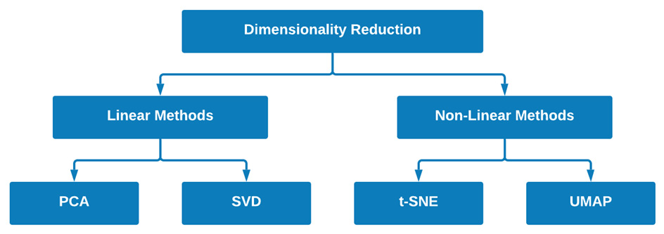
Figure 6.18 – Two examples of models for each of the fields of DR
Within the scope of linear methods, we will take a close look at PCA and Singular Value Decomposition (SVD). In addition, within the scope of non-linear methods, we will take a close look at t-distributed Stochastic Neighbor Embedding (t-SNE) and Uniform Manifold Approximation and Projection (UMAP). With these four models in mind and how they fit into the grand scheme of DR, let's go ahead and get started.
PCA
One of the most common and widely discussed forms of UL is PCA. PCA is a linear form of DR, allowing users to transform a large dataset of correlated features into a smaller number of uncorrelated features known as principal components. These principal components, although numerically fewer than their original features, can still retain as much of the variation or richness as the original dataset. We can see a graphical illustration of this here:
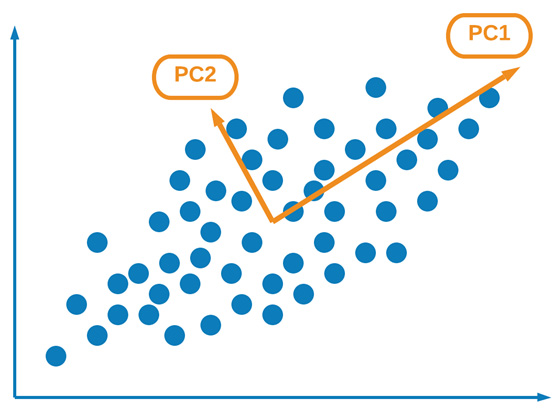
Figure 6.19 – Graphical representation of PCA and its principal components
There are a few things that need to happen in order to effectively implement PCA on any given dataset. Let's take a high-level overview of what these steps are and how they can impact the final outcome. We must first normalize or standardize our data to ensure that the mean is 0 and the standard deviation is 1. Next, we calculate what is known as the covariance matrix, which is a square matrix containing the covariance between each of the pairs of elements. In a two-dimensional (2D) dataset, we can represent a covariance matrix as such:

Next, we can calculate the eigenvalues and eigenvectors for the covariance matrix, as follows:
Here, ![]() is an eigenvalue for a given matrix A, and I is the identity matrix. Using the eigenvector, we can determine the eigenvalue v using the following equation:
is an eigenvalue for a given matrix A, and I is the identity matrix. Using the eigenvector, we can determine the eigenvalue v using the following equation:

Next, the eigenvalues are ordered from the largest to the smallest, which represent the components in order of significance. A dataset with n variables or features will have n eigenvalues and eigenvectors. We can then limit the number of eigenvalues or vectors to a predetermined number, thus reducing the dimensions of our dataset. We can then form what we call a feature vector, using the eigenvectors of interest.
Finally, we can form the principal components using the transpose of the feature vector, as well as the transpose of the scaled data of the original dataset, and multiplying the two together, as follows:

Here, PrincipalComponents is returned as a matrix. Easy, right?
Let's now go ahead and implement PCA using Python, as follows:
- First, we import PCA from the sklearn library and instantiate a new PCA model. We can set the number of components as 2, representing the fact that we only want two components returned to us, and use full for svd_solver. We can then fit the data on our scaled dataset, as follows:
from sklearn.decomposition import PCA
pca_2d = PCA(n_components=2, svd_solver='full')
pca_2d.fit(X_scaled)
- Next, we can transform our data and assign our output matrix to the data_pca_2d variable, as follows:
data_pca_2d = pca_2d.fit_transform(X_scaled)
- Finally, we can go ahead and plot the results using seaborn, as follows:
plt.xlabel("Principal Component 1")
plt.ylabel("Principal Component 2")
sns.scatterplot(x=data_pca_2d[:,0], y=data_pca_2d[:,1], hue=y, style=y, markers=["s", "o"])
Upon executing this code, this will yield a scatter plot showing our principal components with our points colored using y, as shown here:
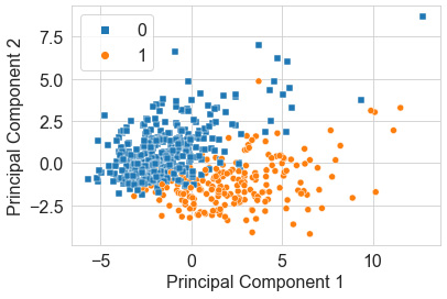
Figure 6.20 – Scatter plot of the PCA results
PCA is a fast and efficient method best used as a precursor to the development of ML models when the number of dimensions has become too complex. Think back for a moment to the dataset we used in our clustering analysis relating to breast cancer predictions. Instead of running our models on the raw or scaled data, we could implement a DR algorithm such as PCA to reduce our dimensions down only two principal components before applying the subsequent clustering model. Remember that PCA is only one of many linear models. Let's now go ahead and explore another popular linear model known as SVD.
SVD
SVD is a popular matrix decomposition method commonly used to reduce a dataset to a simpler form. In this section, we will focus specifically on the application of truncated SVD. This model is quite similar to that of PCA; however, the main difference is that the estimator does not center prior to its computation. Essentially, this difference allows the model to be used with sparse matrices quite efficiently.
Let's now introduce and take a look at a new dataset that we can use to apply SVD: single-cell RNA (where RNA stands for ribonucleic acid). The dataset can be found at http://blood.stemcells.cam.ac.uk/data/nestorowa_corrected_log2_transformed_counts.txt. This dataset pertains to the topic of single-cell sequencing—a process that examines sequences of individual cells to better understand their properties and functions. Datasets such as these tend to have many columns of data, making them prime candidates for DR models. Let's go ahead and import this dataset, as follows:
dfx = pd.read_csv("../../datasets/single_cell_rna/nestorowa_corrected_log2_transformed_counts.txt", sep=' ', )
dfx.shape
Taking a look at the shape, we can see that there are 3,991 rows of data and 1,645 columns. Relative to the many other datasets we have used, this number is quite large. Within the field of biotechnology, DR is very commonly used to help reduce such datasets into more manageable entities. Notice that the index contains some information about the type of cell we are looking at. To make our visuals more interesting, let's capture this annotation data by executing the following code:
dfy = pd.DataFrame()
dfy['annotation'] = dfx.index.str[:4]
dfy['annotation'].value_counts()
With the data all set, let's go ahead and implement truncated SVD on this dataset. We can once again begin by instantiating a truncated SVD model and setting the components to 2 with 7 iterations, as follows:
from sklearn.decomposition import TruncatedSVD
svd_2d = TruncatedSVD(n_components=2, n_iter=7)
Next, we can go ahead and use the fit_transform() method to both fit our data and transform the DataFrame to a two-column dataset, as follows:
data_svd_2d = svd_2d.fit_transform(dfx)
Finally, we can finish things up by plotting our dataset using a scatter plot, and color by annotation. The code is illustrated in the following snippet:
sns.scatterplot(x=data_svd_2d[:,0], y=data_svd_2d[:,1], hue=dfy.annotation, style=dfy.annotation, markers = ["o", "s", "v"])
We can see the results of executing this code in the following screenshot:

Figure 6.21 – Scatter plot of the results of the SVD model
In the preceding screenshot, we can see the almost 1,400 columns worth of data being reduced to a simple 2D representation—quite fascinating, isn't it? One of the biggest advantages of being able to reduce data in this fashion is that it assists with model development. Let's assume, for the sake of example, that we wish to implement any of our previous clustering algorithms on this extensive dataset. It would take considerably longer to train any given model on a dataset of nearly 1,400 columns compared to a dataset with 2 columns. In fact, if we implemented a GMM on this dataset, the total training time would be 12.4 s ± 158 ms using the original dataset, relative to 4.06 ms ± 26.6 ms using the reduced dataset. Although linear models can be very useful when it comes to DR, non-linear models can also be similarly impressive. Next, let's take a look at a popular model known as t-SNE.
t-SNE
On the side of non-linear DR, one of the most popular models commonly seen in action is t-SNE. One of the unique features of the t-SNE model relative to the other dimensionality models we have talked about is the fact that it uses probability distribution to represent similarities between neighbors. Simply stated, t-SNE is a statistical method allowing for the DR and visualization of high-dimensional data in which similar points are close together and dissimilar ones are further apart.
t-SNE is a type of manifold model, which from a mathematical perspective is a topological space resembling Euclidean space. The concept of a manifold is complex, extensive, and well beyond the scope of this book. For the purposes of simplicity, we will state that manifolds describe a large number of geometric surfaces such as a sphere, torus, or cross surface. Within the confines of the t-SNE model, the main objective is to use geometric shapes to give users a feel or intuition of how the high-dimensional data is arranged or organized.
Let's now take a close look at the application of t-SNE using Python. Once again, we can apply this model on our single-cell RNA dataset and get a sense of what the high-dimensional organization of this data looks like from a geometric perspective. Many parameters within t-SNE can be changed and tuned to fit given purposes; however, there is one in particular worth mentioning briefly—perplexity. Perplexity is a parameter related to the number of nearest neighbors used as input when it comes to manifold learning. The scikit-learn library recommends considering values between 5 and 50. Let's go ahead and take a look at a few examples.
Implementing this model is quite simple, thanks to the high-level Application Programming Interface (API) provided by scikit-learn. We can begin by importing the TSNE class from scikit-learn and setting the number of components to 2 and the perplexity to 10. We can then chain the fit_transform() method using our dataset, as illustrated in the following code snippet:
from sklearn.manifold import TSNE
data_tsne_2d_p10 = TSNE(n_components=2, perplexity=10.0).fit_transform(dfx)
We can then go ahead and plot our data to visualize the results using seaborn, as follows:
sns.scatterplot(x=data_tsne_2d_p10[:,0], y=data_tsne_2d_p10[:,1], hue=dfy.annotation, style=dfy.annotation, markers = ["o", "s", "v"])
We can see the output of this in the following screenshot:
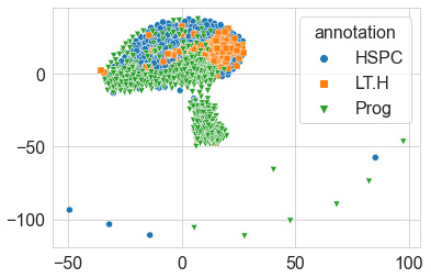
Figure 6.22 – Scatter plot of the results of the t-SNE model
Quite the result! We can see in the preceding screenshot that the model, without any knowledge of the labels, made a 2D projection of the relationship between the data points using the huge dataset it was given. The geometric shape produced gives us a sense of the look and feel of the data. We can see based on this depiction that a few points seem to be considered outliers as they are depicted much further away, like islands relative to the main continent. Recall that we used a perplexity value of 10 for this particular diagram. Let's go ahead and explore this parameter using a few different values, as follows:
data_tsne_2d_p1 = TSNE(n_components=2, perplexity=1.0).fit_transform(dfx)
data_tsne_2d_p10 = TSNE(n_components=2, perplexity=10.0).fit_transform(dfx)
data_tsne_2d_p30 = TSNE(n_components=2, perplexity=30.0).fit_transform(dfx)
Using these calculated values, we can visualize them next to each other using the seaborn library, as follows:
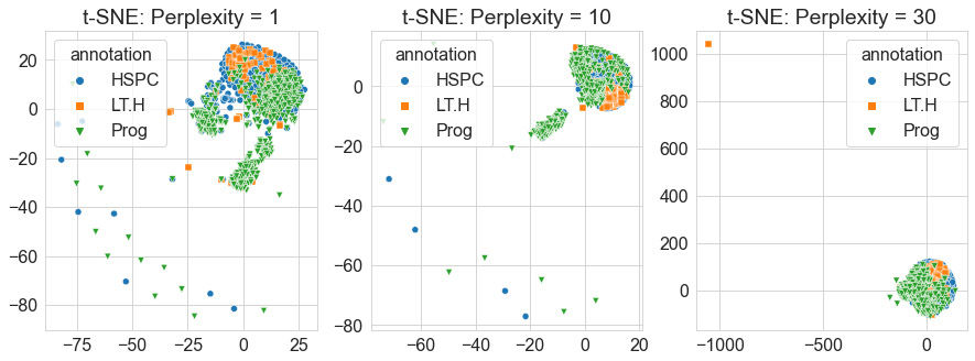
Figure 6.23 – Scatter plots of the t-SNE model with increasing perplexities
When it comes to high-dimensional data, t-SNE is one of the most commonly used models to not only reduce your dimensions but also explore your data by getting a unique feel for its features and their relationships. Although t-SNE can be useful and effective, it does have a few negative aspects. First, it does not scale well for large sample sizes such as those you would see in some cases of RNA sequencing data. Second, it also does not preserve global data structures in the sense that similarities across different clusters are not well maintained. Another popular model that attempts to address some of these concerns and utilizes a similar approach to t-SNE is known as UMAP. Let's explore this model in the following section.
UMAP
The UMAP model is a popular algorithm used for the reduction of dimensions and visualizing of data based on manifold learning techniques, similar to that of t-SNE. There are three main assumptions that the algorithm is founded on, as described on their main website (https://umap-learn.readthedocs.io/en/latest) and outlined here:
- The dataset is uniformly distributed on a Riemannian manifold.
- The Riemannian metric is locally constant.
- The manifold is locally connected.
Although UMAP and t-SNE are quite similar, there are a few key differences between them. One of the most important differences relates to the idea of similarity preservation. The UMAP model claims to preserve both local and global data in the sense that both local and global—or inter-cluster and intra-cluster—information is maintained. We can see a graphical representation of this concept here:
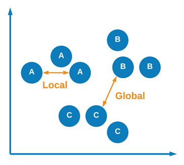
Figure 6.24 – Graphical representation of local and global similarities
Let's now go ahead and apply UMAP on our single-cell RNA dataset. We can begin by importing the umap library and instantiating a new instance of the UMAP model in which we specify the number of components as 2 and the number of neighbors as 5. This second parameter represents the size of a local neighborhood used for manifold approximation. The code is illustrated in the following snippet:
import umap
data_umap_2d_n5 = umap.UMAP(n_components=2, n_neighbors=5).fit_transform(dfx)
We can then go ahead and plot the data using seaborn, as follows:
sns.scatterplot(x=data_umap_2d_n5[:,0], y=data_umap_2d_n5[:,1], hue=dfy.annotation, style=dfy.annotation, markers = ["o", "s", "v"])
Upon executing the code, we yield the following output:
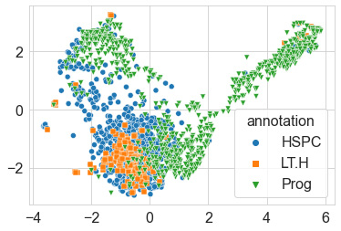
Figure 6.25 – Scatter plot of the UMAP results
Once again, quite the visual! We can see in this depiction relative to t-SNE that some clusters have moved around. If you recall in t-SNE, the majority of the data was pulled together with no regard as to how similar clusters were to one another. Using UMAP, this information is preserved, and we are able to get a better sense of how these clusters relate to one another. Notice the spread of the data relative to its depiction in t-SNE. Similar to t-SNE, we can see that some groups of points are clustered together in different neighborhoods.
In summary, UMAP is a powerful model similar to t-SNE in which both local and global information is preserved when it comes to neighborhoods or clusters. Most commonly used for visualizations, this model is an excellent way to gain a sense of the look and feel of any high-dimensional dataset in just a few lines of code.
Summary
Over the course of this chapter, we gained a strong and high-level understanding of the field of UL, its uses, and its applications. We then explored a few of the most popular ML methods as they relate to clustering and DR. Within the field of clustering, we looked over some of the most commonly used models such as hierarchical clustering, K-Means clustering, and GMMs. We learned about the differences between Euclidean distances and probabilities and how they relate to model predictions. In addition, we also applied these models to the Wisconsin Breast Cancer dataset and managed to achieve relatively high accuracy in a few of them. Within the field of DR, we gained a strong understanding of the significance of the field as it relates to the COD. We then implemented a number of models such as PCA, SVD, t-SNE, and UMAP using the single-cell RNA dataset in which we managed to reduce more than 1,400 columns down to 2. We then visualized our results using seaborn and examined the differences between the models. Over the course of this chapter, we managed to develop our models without the use of labels, which we used only for comparison after the development process.
Over the course of the next chapter, we will explore the field of SML, in which we use data in addition to its labels to develop powerful predictive models.