CHARACTER DESIGN

ANDY WACHOWSKI, ME, AND GEOFFREY DARROW AT COMIC-CON 2004
The great graphic novel artist Geoffrey Darrow (the visual creative force behind the Matrix trilogy) once told me that when he was in Australia working on one of the Matrix films, one of his designers was asked to create some new storyboards for an added scene. The designer in question was a very highly paid production designer on the film, but he begged out of doing the storyboards by saying he couldn’t draw. He couldn’t draw? How the hell did he get that job? He said he was great at computer animation, knew all the programs, was a whiz at programming, but knew zilch about drawing the human body.
What the hell’s going on? I’ve heard that a lot of art schools are dropping life-drawing classes to make way for more computer classes. What? Life-drawing is the basis of all art, and now they’re graduating students that can’t draw?!
Even at my age, I still attend life-drawing classes, and I sketch at home from images on TV or on the subway to keep my skills sharp. Please, dear readers, never stop drawing. If I were the Wachowski brothers, I would have fired that dumb production designer’s ass.
This chapter is my introduction to character design, the job of the best artists in the world. Here are the elements that I feel are the most important for great visual characters.

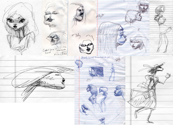
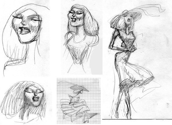
SKETCHES FROM LIFE DRAWING CLASSES AND FROM LIFE.
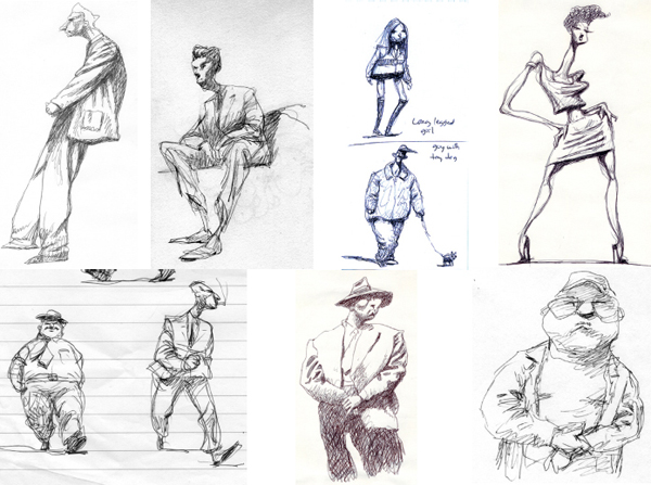
SKETCHES FROM LIFE DRAWING CLASSES AND FROM LIFE.
The great thing about being involved in animation is that you get to play God. What the audience sees on the screen is a manifestation of what is inside your imagination.
Unlike a live-action director, you are not forced to work with only the actors who are available—you get to create new characters that are yours alone. They are unique, different; maybe there have never been characters like them before—what a thrill!
But there are certain rules to follow with your characters. They should reflect the personality of the creation in the story, and they must visually embody the elements of their souls, so there is no confusion in the viewer’s eye about what each character represents. Also, as you leave the cinema, that personality should be alive in your brain like it was someone in your real life, such as a neighbor or a relative.
In fact, when I create a design for a character, I often look to real life for reference. I watch people for their movements, body positions, their manners, and their subtleties—how they look with different emotions.
All of these elements build strong personalities.
For me, dynamic shapes are the most important part of character design. The shape or silhouette of a character truly defines his or her effectiveness.
I see a lot of student films in which the characters are basically rectangular stubs, and I feel no empathy or emotion towards them. It’s the shape of the character that brings out the emotion.

In college, I had a design teacher named Arvid Orbeck, a wonderfully tall Norwegian who had fought Hitler’s Nazis as part of the WWII underground resistance. He suggested that we always be aware of shapes and design in everyday life.
For example, during lunch, when you’re sitting at your table, and in front of you is your fork, napkin, salt shaker, a sugar packet, whatever—take these objects, move them around on the table, and see how many interesting designs and shapes you can make. These shapes don’t have to mean or symbolize anything; they just have to be pleasing to the eye in some way. This is an excellent way to hone your composition skills. It’s quick, easy, and cheap.
You’d be surprised, though, how moving shapes around on a table can lead to making characters that have personalities and drama and can even tell a story (if you want to add a voice-over).
Another “secret” technique I like to employ is to keep the shapes triangular. I don’t know why, but I find characters made out of squares (or rectangles) and circles very boring compared to triangles. Maybe it’s just me, but triangles just seem to be more dynamic—they subconsciously put motion into the design. Look at the human face and how much cooler it is when it follows a triangular format; the square or circle looks so bland and emotionless.

TRIANGLE FACES
Another great idea is to keep the body, object, or figure off balance. Balance denotes rest, stability, and boredom; something out of balance suggests conflict, movement, and unpredictability and is thus more fascinating.
A good character design should work in a close-up shot as well as on a distant horizon. That shape should be so distinctive that the audience will be able to identify it from 100 yards away—now that’s a great character design!

NOTICE THE CHARACTER PROFILE READ WHETHER THEY ARE LARGE OR TINY: ROD FROM HAIR HIGH (2004)
Another important ingredient in character design is simplicity—it follows naturally that if your character reads well in silhouette, why bother putting a lot of distracting detail on the character? I see a lot of cartoon characters with tons of detail—intricate hair designs, clothes with excessive patterns, lots of jewelry, too much facial hair, and every feature of the face done in extravagant detail. And often these features either contradict each other or battle each other for attention. I know I’ve said that conflict is the basis for great story, but please don’t have the conflict take place on a character’s design.
For my needs, I like to keep the identifying features down to about two or three distinctive elements—perhaps a particular hair design, one strong facial element, or a unique body shape. That’s all you really need for a great character design.
Look through the terrific book titled Animation by the brilliant Preston Blair. He talks a lot about “line of action” in a character. This term means that one should be able to draw a simple line through the character, and it should be a smooth, simple line that defines the position and shape of the character with no superfluous angles or wasted tangents. This guideline is important to give the audience a mental picture and clean memory of the characters.
Once you get to the animation of your characters, continue to use the line of action. It works in all parts of the film—romance, action, humor, violence, and tragedy. It makes it easier for the eye to follow the story and appreciate the characters.

LINE OF ACTION
EVOLUTION OF CHARACTER DESIGN OF ELLA FROM CHEATIN’

CHARACTER DESIGNS OF JAKE FROM CHEATIN’

EVOLUTION OF CHARACTER DESIGN OF EL MERTO FROM CHEATIN’
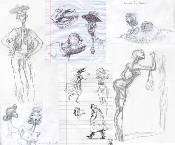
MISCELLANEOUS DESIGNS FROM CHEATIN’

VARIOUS CHARACTER DESIGNS OF HITMAN FROM CHEATIN’


Pushing the Eye Around
You’re going to hear a lot in this book about my theory of “pushing the eye around.” It’s nothing new, really—a lot of artists have talked about it before.
A while back, I was at a Q&A after a certain film screening, and the director was talking about how he wanted the film to manipulate the audience. A young female student felt offended that the director would dictate how the audience should feel. I guess she felt controlled—she wanted to be able to interpret the film in her own way. She must have preferred vague, abstract storytelling. Ambiguity and mystery are great for storytelling, but confusion is not—confusion is my nemesis!
It’s my belief that the audience goes into a cinema wanting to be manipulated and controlled. In fact, one of the greatest manipulative films is Jaws—boy, do we get manhandled in that one.
There are many ways to push and control the viewers’ eyes. Just like a magician uses distraction to make sure you don’t see his sleight of hand, the animator wants to control the eye to help tell the story that’s there in the storyboard or script. So the character design should reflect this control of the audience’s vision.
If the character is a strong guy, do you want to concentrate on his abs, or his hair? If the woman has a strong personality, do you want to emphasize her shoulders or her feet? If a child is a bit manic, make sure people see his eyes; this might seem elementary, but the magic trick is to deemphasize the other parts of the body. Again, as I said, just concentrate on two or three factors of the character, letting the others be much more subdued and in the background. You can do this with color, outlines, lighting, texture, detailed shading, or just plain arrangement.
It’s great playing God and controlling people’s vision.
Be sure that all of the characters have a consistent look. No matter what technique you use—computer, pencil, Sharpie, Flash, stop-motion, and so on—all characters should look like they’re from the same film. You should keep the style consistent: nothing’s worse than characters that look like they snuck in from a different movie. Well, actually there are things worse than that, like having an air conditioner fall on your head, but that shouldn’t affect your film.
However, I believe that once you’ve established the character and you have your two or three strong identifiers, you’ll be able to distort the drawings for emotional effect, and the audience will still know it’s them. You can change a character’s size, his body proportions, even his colors, and it’s my bet that the audience will still accept them—try it!
Over the last five years, from “Guard Dog” to “Horn Dog”, the look of my dog character has changed, yet people still love the dog and accept him as the consistently lovable loser he always is.

TOP: WHAT NOT TO DO—A CHARACTER WITH TOO MANY EXTREME FACIAL CHARACTERISTICS AND LOUD CLOTHING. BOTTOM: CHARACTERS WITH ACCEPTABLE EXTREME FACIAL CHARACTERISTICS
I get a lot of students coming by my studio, and I look at their work, and see so many drawings that just drive me crazy! Here are my top no-nos in character design:
1. Please don’t draw big hands. I drew big hands once for a week and then I realized how stupid it was. Back in the 1930s, when Mickey Mouse was popular, it was okay to draw big, gloved hands, but it’s now almost a century later—so enough with the big hands. It looks like the artist is either extremely immature or stuck in the 1930s.
2. Big, booted feet. See #1. Grown-ups all wear well-designed shoes, and small feet look so much cooler on a character than clod-hoppers do. Big feet draw attention to themselves, and I’m sure the basics of the story are not dependent on a man’s giant shoes.
3. Big noses. Some people believe that if a character has a big nose, then he’s automatically funny. I tend to think he’s got a humongous cold in his nose, and this is again a mark of an amateur. Way back in the early days of cartooning, a big nose was a way to make people laugh. But just like people tripping on a banana peel, the joke’s been worn out. That funny ship has sailed; we must find more original ways to make people laugh, hopefully with something connected to the story.
4. Please stop showing me animé and manga! I gave up teaching because everyone was copying Japanese artwork. If I see another Japanese character from young students, I’ll strangle that person.
5. Loud clothing. Please do not put wild, vivid, colorful patterns in your character’s clothing, even if he is a clown. My eye gets totally confused when the clothing dominates the screen. No plaid, please.
I look to some character designers for inspiration. These guys, in every film, create vivid, original, amazing designs that just blow me away. Check out Peter DeSeve, Carter Goodrich, Carlos Nine, Peter Chung, Heinz Edelmann, Will Eisner, and Winsor McCay.
The character above has all of the traits of a bad drawing, but characters with just one unusual trait are okay.