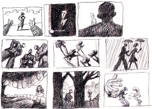
ANIMATION
Now for the most fun chapter—and this is the part I was born for: animation! You’ll be seeing a lot of sketches and examples in this chapter, because I’m so much more comfortable showing what I mean rather than talking about it. So fasten your seat belts: it’s going to be an exciting ride.
There are many great animators; in this chapter, I will give you a list of my favorites. I think it’s important to study the best; even now, I try to learn from the greats of the past and those working today. I want to continue to learn and grow, and one of the best ways is to study from the masters and to discover why animation is such a powerful art form. (Remember, there are a lot of fabulous animators that I’m leaving off this list, but listed here are the ones I look at the most.)
• First (and maybe the greatest) is Winsor McCay, animator of “Gertie the Dinosaur,” “Little Nemo,” and “The Sinking of the Lusitania” (brilliant!). This is the guy who really influenced Walt Disney to become an animator.
In fact, as I write this, I’m trying to contemporize one of McCay’s forgotten classics, “The Flying House.” I discovered this film when I got a collection of his works, and I wondered why I’d never seen this amazing film before. Well, probably because it’s hard to watch—it was produced in 1921 and runs about 13 minutes; what makes it hard to watch is the presence of loads of word balloons and intertitles. Plus, it’s black and white, silent, and there are lots of imperfections in the print (scratches, dust, reflections).

POSTER FOR “THE FLYING HOUSE” PROJECT
So I took it upon myself to fix all of these problems. I’ve cleaned up the surface so that it’s not all dirty and scratched. I’ve added color, gotten rid of all the captions, and hired Matthew Modine and Patricia Clarkson to voice the dialogue. Plus, I hired musicians and sound designers to create a soundtrack.
Without all of the written copy, the film is now down to a clean, speedy seven minutes, and it’s a joy to watch. I know purists will criticize me for tampering with a masterpiece—well, that masterpiece had been sadly, but understandably, ignored and it’s my goal to show young animators and the general public how great and brilliant Winsor McCay’s films are.
(Sorry for that diversion—I’ll continue now with my pantheon of great animators.)
• Milt Kahl: One of Disney’s “Nine Old Men,” and to me, one of the great draftsmen of all time.
• Preston Blair: I’ve talked about him before, but just check out his wonderful “Red Hot Riding Hood” animation, directed by the great Tex Avery. To me, dancing women are the hardest sequences to draw—I find them almost impossible without a model—and he did it out of his head! Wow!
• Rod Scribner, whose famous “Coal Black and de Sebben Dwarfs” (directed by Bob Clampett) is a masterpiece of animation and distortion.
• Hayao Miyazaki: Created some of the most beautiful animation ever. My favorites are Porco Rosso and Princess Mononoke.
• Joanna Quinn: One of the purest draftswomen alive today—her artwork is phenomenal.
• Michael Dudok de Wit: Animator of “Father and Daughter.”
• Frédéric Back: Animator of “The Man Who Planted Trees.”
• Glen Keane: The great Disney animator.

The great animators, in my opinion, are the artists who can magically fill their characters with a rich, believable soul and make them forever compelling. It’s much more than great draftsmanship, although that helps—it’s the power to tell a great story with rich, fascinating characters and to tell it in a new and unique way.
That’s what I’m attempting to do with each film, and perhaps when I’m 90, I will have succeeded … I hope!
The good news is that there are a multitude of style options available for young animators today—and there seem to be more developing every year. The only limits to the techniques are the artists’ imaginations. Of course, the computer has aided greatly to the wide variety of styles in animation. Here are some of my favorites:
• CG (computer graphics animation): This includes Maya, used in the great Pixar and Blue Sky Films
• Flash: As seen on Adult Swim
• Cel animation: Used by most of the Japanese animators, including Miyazaki
• Stop-motion puppets: Tim Burton, Henry Selick, Laika Studios
• Claymation: Nick Park of the Wallace & Gromit series
• Stop-motion: Jan Svankmajer
• Oil on glass: The great Alexander Petrov
• Paper/cut-out: Michael Ocelot, Lotte Reiniger
• Drawn animation: This obviously is my favorite, as I grew up drawing and spent 20 years as an illustrator; I love the look, and I’ll probably stick with this style of 2D art
• Pixillation: Norman McLaren, Juan Pablo Zaramello
ART STYLES ARE FUN TO PLAY WITH; SEE HOW MANY DIFFERENT ONES YOU CAN COME UP WITH.
There are, of course, a myriad of other styles—like sand painting, pin screen, collage, and mixed media. But for this book, as it’s about animating like Bill Plympton, I’m going to concentrate on my 2D drawing style, which includes various art utensils like colored pencils, graphite pencils, and Sharpies.
If you were to visit my studio in New York City, you’d see a large traditional animation board with the clear plastic animation disk in the middle, shelves for the stacks of drawings, my trusty mirror by my side, and electronic pencil sharpener, and of course my ubiquitous iPod for music (more about that later). It’s definitely old school, and it looks like it might be straight out of the Fleischer days, except for the iPod.
I have a box of Ticonderoga #2s and a couple of old coffee cans filled with Prismacolor pencils—nothing radical or cutting edge about that. What’s really important is the 40 years of constant practice in drawing. That makes the difference.
I’m going to go on a small rant now, so get ready …
I believe that one of the most important keys to my success, such as it is, is the visual storytelling—and how did I get to be such a great visual storyteller? By studying drawing. I still take life-drawing classes, and as I draw the model, I try to see her (or him) as a cartoon. Learning anatomy is essential, and I want to take those body shapes and contours and reimagine the human form in a different way. I try to show the human figure like it is in motion and constantly moving.
I just finished reading a book on N. C. Wyeth; check out how dynamic his illustrations are. It feels like the characters are performing a movie in front of your eyes—and you can’t create that fantasy without understanding the human body and how it moves.
I strongly encourage all artists to carry around a sketchbook or a piece of paper and a pen and to always be on the lookout for interesting people to draw.
After drawing all day at my animation board, sometimes it’s great to relax and watch a movie; while watching the film, I’ll be inspired to sketch one of the actors. There might be a certain gesture or way of seeing the actor’s face that I never noticed before, and I think it could look really cool in my next film. So, under my coffee table at home, I have stacks of little sketches, tossed there in a blind fury after jotting down visual ideas.

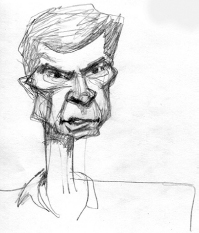
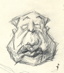
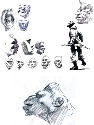
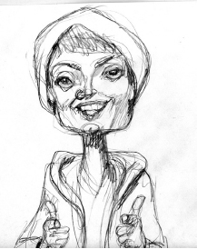
CARICATURE OF A YOUNG JACK PALANCE FROM TV
Another talent that I believe is really undertaught in our schools is that of visual memory. This is the skill of seeing an image or a character, keeping it in your brain, then later putting it down on paper—I swear by this practice.
When I started my animation school in 2009, I would bring in a guest lecturer for about half an hour, and then, after the visiting artist had left, I’d ask the class to draw that person. The students hated me for it, but it really stressed the point that whenever we see something or someone, we should always be super observant. I call it a “brain camera.” Study how something looks, search for the personality in everything—cars, clothes, buildings, toasters, and of course people. Because they all have a living soul, they all want to talk to you, and they all want to star in your next film. They won’t ask for payment; they just want to be Hollywood stars, like everyone else. So get their images stuck in your brain. How would you portray them in pencil, colors, computer? What are their basic shapes and silhouettes, their essences? What kind of personalities would they have?
This is the fun part of animation—making life a game, having fun with life. Remember, there are no limits in animation. If making the film is not amusing for you, then something is wrong with the process. If it’s not fun, find a way to make it fun, because if you’re going to work on a film project for two years, you better damn well have a good time!

I spent 20 years as a professional caricature artist, but when I started out, I wasn’t very good. I began when I was in the National Guard, and the captain knew I was an artist and that I hated doing military drills. So he put me in charge of creating drawings of all the officers—and I had to learn to draw portraits very fast, or I’d be kicked out onto the rifle range. Some of those drawings were very crude, but I had a strong incentive to improve.
I studied the caricatures of David Levine, Robert Grossman, and a college friend of mine, Bruce McGillivray. He’s a brilliant caricaturist, and he was a huge influence on me, and I slowly learned the craft and got better.
Caricature is the essence of animation because you can take the human face and exaggerate it to the point of humor. Animation is basically the same process—exaggerating the essential parts of the character or movement and minimizing the rest.
I’m now going to give you a few pointers on how I create caricatures; at the same time, you’ll be learning how I create animation—the rules are very similar.

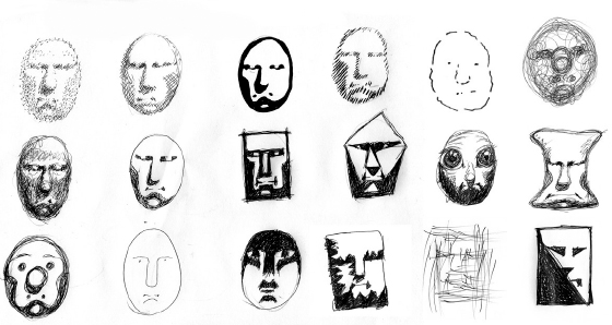
NEVER MAKE A CARICATURE USING AN OVAL. TRY TO FIND A SHAPE THAT IS UNIQUE AND COMPELLING, AND YOU’LL DEVELOP VERY INTERESTING CHARACTERS.
To start, look at the human face as a shape, a three-dimensional sphere, a ball of clay to be molded. Don’t be concerned with hair or facial details. Concentrate only on the shape. All human heads are oval, but making an oval is very bland. You want to create an outline that’s unique, dynamic, memorable. So play around with different shapes, looks, and styles.
Once you have a pleasing, exciting shape that generally represents your model, you’re ready to move on to more detail. The next step is defining the facial features—the eyes, nose, mouth, and ears. Very roughly, put some simple lines to indicate where those features are placed—remember, you may want to move them around later, but it’s important to get a rough idea of their relationships to each other.
Just as the human body should have a line of action (as Preston Blair calls it), so should the face. When I start to create a caricature, I either imagine or sketch a line of action in the face. This step is crucial for the success of the drawing because it’s like a gesture for the face and it reveals the personality in a very simple form.
This line of action should be used in designing the layout of the shot. I use it constantly to control the viewer’s eye and to show it where to look, and it makes the viewer so much more involved in the film.
I find that often the very first time I see someone’s face is when the design is clearest. I don’t know why that is; perhaps because it seems unique and different and then all of his or her characteristics are much more apparent. Likewise, the more I study a face, the harder it is to see the caricature’s potential in it—the face becomes too familiar and commonplace. Every face can be reduced to its essence; all people and objects have an essence, and the purpose of caricature is to exaggerate that essence. That is what animation does: it shows you the essence of character and movement. Simplify!

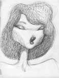
(LEFT TO RIGHT) DEBORAH HARRY, DIANA ROSS, CARLY SIMON, DOLLY PARTON, LINDA RONSTADT FOR VANITY FAIR, UNPUBLISHED (1983)


WOODY ALLEN

SOPHIA LOREN
TONY PERKINS

RONALD REAGAN

ELVIS PRESLEY
ALFRED HITCHCOCK

ROBERT DUVALL
YOUNG JOHN TRAVOLTA
HARRISON FORD

HUMPHREY BOGART

ROD STEWART
If I’m doing a caricature and I’ve come to the point where I have no idea how a certain face is unique, I’ll place it beside a group of other faces, and all of a sudden, it becomes clear how to exaggerate the features. Or, if the drawing is not going well, I’ll often leave it alone for a day, put it up on the wall at a distance, and when I see it fresh, I’ll know immediately what’s wrong with the drawing.
Another trick is to look at the drawing’s reflection in a mirror—sometimes the imperfections immediately make themselves known, and I’m able to fix them. It’s a new and different view of the drawing, so it’s like you’re seeing it for the first time.
Another trick I use is to try and give a verbal description of the face—for example, his head was like a head of lettuce, or had the look of a claw hammer. Then I just draw those objects and add the features.

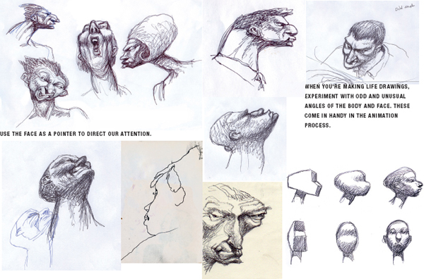
DESIGN—IN THIS ROUGH PENCIL SKETCH FROM CHEATIN’ YOU CAN SEE HOW I PUSH THE EYE AROUND. JAKE’S BODY ARC CURVES AROUND THE LADY AND POINTS TO THE HEROINE (ELLA) IN THE FRONT CAR. ALSO, HIS HEAD IS KIND OF A POINTER THAT DRAWS YOUR ATTENTION TO ELLA AND THE BONNET.
Another interesting aspect about caricature is that there are so many different ways to draw one subject’s face, and they can all be correct—there is never only one unique way to draw someone. When I used to hang out with a lot of caricature artists, I was amazed by how many variations of Ronald Reagan or George Bush’s face there could be, and they all seemed perfect.
When I had my school of animation, I had one session that was strictly for caricature—I had the class draw me, first very handsome and flattering, and then in a second drawing with more of an ugly and evil interpretation. This is a talent that is incredibly important in animation, because when you’re trying to create emotions and personality, you must get very theatrical. You have to know all the extremes of a personality, and how to express them. We all have the potential for good and evil in us, and as artists, we have to be able to show the entire spectrum.
When I look at the portfolios of young artists, the same bad habits keep popping up. These ugly drawings could have easily been improved by taking some life-drawing classes or by the study of great art.
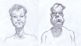
THIS IS A CARICATURE OF YOURS TRULY—FIRST AS A COMPLIMENTARY STUDY AND THEN AS AN INSULTING PORTRAIT.
Unfortunately, the only art these students have looked at is animé—and thus all of their drawings have the same look and feel. People with big eyes, and giant robot monsters—please, students, don’t use this stuff in your portfolio! It’s great that animé inspired you to become an animator, but widen your horizons. One of the reasons I quit teaching is that I had a bellyful of Japanese manga art.
I highly encourage young artists to widen their perspectives and to go to museums, galleries, and bookstores to look at other styles of art. See a lot of animation, not just Disney and animé, but also Warner Bros., the Fleischer brothers, indie animation, Russian, British, French—there are so many beautiful styles and visual ideas out there to influence you. Why stick to one boring genre?
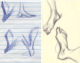
I will list all the difficult parts of the human body that students and professionals have trouble drawing—and how to fix those drawings. First, the feet—as I’ve said earlier, why do young artists insist on drawing huge, cartoonish shoes? Haven’t we progressed enough to be able to draw decent shoes?
I realize that shoes and feet are hard to draw, but it’s important to not use old, outdated designs. Look at your own feet and shoes—draw them, over and over and over, and then you’ll feel comfortable drawing great feet. Look at the great shoes drawn by Winsor McCay or A. B. Frost.
Clothing is another weak spot, not only for young artists but also for professionals. Look at the multimillion-dollar Pixar and DreamWorks films—the great computers have still not been able to recreate the look of real fabric. It looks like all the characters are wearing rubber suits—it’s so artificial! With all the money going into these films, can’t they design a program to simulate fabric folds?
Loose clothing is one of my favorite subjects to draw. Sometimes I get all caught up in the folds and bends of a loose pair of pants. One of the things I hate about life-drawing classes is that they rarely have models wearing loose clothes. That would be a thing of beauty for me, an otherwise nude model wearing a pair of loose trousers!

There’s a gorgeous pattern of design in fabric, and once you figure out how it works, you become a much freer artist, in that you can draw anything. And that makes it feel like you’re flying: there are no limits!
When drawing a person with loose clothing, be sure to be aware of the stress points. These are parts of the body with sharp angles, and you’ll notice how all of the wrinkles point to these extreme angles, but in concert with the pointing of the angles, also be aware of the pull of gravity. These two forces working together create a beautiful apparel design. Check out the work of the great Will Eisner for his fabric design.

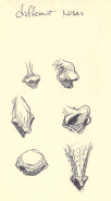
The hands, for me, are still the most difficult subjects to draw. There are hundreds of bones in the hand; thus there are hundreds of different positions that the hand can form. Consequently, the hands’ different shapes are limitless, and that makes it a tough model.
One of the issues that really bugs me is when young artists make the hands gigantic—that’s the first tip-off that they’re amateurs. I can’t tell you how many times I’ve seen huge hands in a beginner’s artwork. Why do they do that? You’d think that since they can’t draw hands well, they’d prefer to make them small and hide them. Well, I wish they would. When I was a young artist, I went through this phase myself, but fortunately I didn’t spend much time there.
Try to find a style for the hands that gives them the proper look and feel, yet is your own style. Study the great hands drawn by other artists—the works of A. B. Frost and Winsor McCay are a good place to start.

ONE OF MY ONLY DRAWINGS TO USE LARGE HANDS
Of course, you can always use your own hand as a model. It’s always available for model work, cheap. The more you draw hands, the more you’ll develop a great animated hand.
NOTICE HOW ALL THE BONES—LEGS, FEET, ARMS, FINGERS—FACE INWARD EXCEPT FOR THE THUMBS. ALSO NOTICE HOW THE WRINKLES ALL POINT TO THE STRESS POINTS.
Here’s another animating tip: every bone in the human body turns inward, so when you’re drawing the human body walking, or jumping, or in action, it looks really cool to exaggerate the bones as they all turn inward. My theory is that when we’re in the womb, we’re scrunched up in a little ball in order to not poke our extremities into our mothers’ stomachs and that smooth ball makes delivery that much easier.
However, there is one bone that doesn’t follow this rule, for some reason, and that’s the thumb. The thumb is the only bone that bends outward, rather than inward. It’s odd—what does that mean?
We’ve now come to the face—the most fascinating of subjects. I could do a whole film on the face. In fact, I did; it’s called “Your Face.”
To me, it’s the ultimate cliché: when we’re born, our mother’s face is the first thing we see. Our face is our identity; it’s the image on our passport. There is so much emotion and personality that can be communicated by just a small movement of the eyebrow, an adjustment of the eye, or a quiver of the chin.
That’s why it’s obligatory to learn how to draw the face. But the human face is the hardest subject to draw. I can look at a student’s portraits and I can immediately see whether they have artistic talent.
Here are some tricks of drawing the face that I’ve learned over the years.
Please don’t make big saucer eyes! In fact, eyes are much more engaging if they are simple, small shapes. Look at the eyes drawn by Winsor McCay, A. B. Frost, or Peter Chung—just a few simple scribbles and you can draw very cool, interesting eyes.
A lot of young artists also like to draw huge noses, perhaps thinking that the larger the nose, the funnier the character is. Unfortunately, the larger the nose is, the harder it is to give that character a three-dimensional personality. The nose gets in the way of any subtlety or depth in the being.
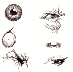
RANDOM EYES

(FIRST PICTURE) A BABY’S EYES POSITION (SECOND PICTURE) AN OLDER PERSON’S EYES POSITION

NOTICE HOW NOSE AND MOUTH SHADOWS GIVE THE FACE A SENSE OF REALITY.
Only rarely do I use exaggerated noses, and I do that with the utmost of care. For me, the best way to draw a nose is by use of the shadow. It’s a better indication of where the nose is. There is a big difference between the genders with regard to noses, and I do take advantage of that.
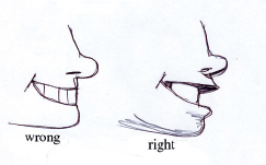
And here’s a trick for drawing the mouth. The lips, like the eyes, are on a curved surface, so use that to give dimension to the mouth. Beginners always forget to show the famous “lip ledge”—I don’t know why they do that, but they are missing a great opportunity. The size of the lip ledge indicates the sexiness of the mouth—I use it all the time.

female upper lip
And utilize the dark areas at the end of the teeth; they help define the curvature of the teeth.
Another cool trick is to exaggerate the cheeks and the jaw as someone is screaming or laughing. The jaw never just goes lower, it actually butts up against the neck and creates a cool triangle shape with the cheeks. Again, look for dynamic triangular shapes when drawing the face—they’re much more compelling and interesting.
A lot of Disney’s classic animated films have around eight or ten mouth positions for lip-synching to dialogue, but I’ve found that you can make all the words in the English language with just four mouth positions.

THIS IS A CLASSIC EXPRESSION THAT IS USED FOR MANY FACIAL EMOTIONS. THE YELL, THE YAWN—IT’S ALSO VERY CLOSE TO A FEARFUL SCREAM, AND A LAUGH. NOTICE HOW THE LOWER JAW ROTATES DOWN AGAINST THE NECK, AND ALSO HOW THE TOP OF THE HEAD FROM TEETH UP COMPRESSES TO A QUARTER THE LENGTH OF THE HEAD.
DIFFERENT NOSES

FACIAL PERSPECTIVES: IT’S A LOT OF FUN TO USE FORCED PERSPECTIVE WITH FACES, WHICH GIVES THE HEAD A MUCH MORE POWERFUL AND INTENSE LOOK.

NOTICE IN THESE HEAD PROFILES HOW YOU CAN USE THE PARALLEL LINES TO CONSTRUCT A SILHOUETTE.
If you get a chance, check out my short film “The Wiseman,” which also appeared in my feature film The Tune. When the Wiseman talks, and he says a lot, I used only four drawings, for about two minutes of animation—now that’s a shortcut! But no one was bothered that I used only four drawings for that long, because it worked.
“THE WISEMAN” (1992)
Also, never draw the face as a balanced sketch—that’s death to a drawing. It’s always more compelling if it’s uneven, unbalanced, or distorted. Look at the great caricatures of Philip Burke; his faces are so off-center that they become puzzles that suck your eye deeper into the art. You can’t take your eye away from that face, and that’s the way it should be.
Drawing the female face is a minefield full of traps. But if you follow a few simple rules, she’ll look beautiful: large hair; eyes wide apart (not necessarily large); big, vertical lips (not horizontal); high cheekbones; long, thin neck; big eyelashes; and a nose that’s small and close to the upper lip.
It’s my own theory that the basic shape of the human head is horizontal. I occasionally do vertical heads but more as a cartoon shape. I feel that the character is so much stronger with a flatter head shape. Also, it facilitates the pointing aspect of the design.

FACES AND BODIES ALWAYS LOOK MORE INTERESTING WHEN THEY ARE OFF BALANCE AND ASKEW. SYMMETRY IS VERY BORING; IT’S A MARK OF AN AMATEUR.
My final tip is to use the face as a design ingredient. I can’t stress enough how important it is to push the viewer’s eye around the screen. Use the drawings as directional signals to control what the audience sees and how they see it. To me, the face is the perfect tool to help control the viewer’s eye, and I use it incessantly.
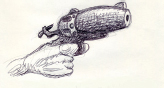
When drawing props and inanimate objects, you must think of them as animate objects, as if they’re alive, they have personality, they have souls. Otherwise, these items will be very boring to look at. For example, I’ve seen a lot of guns drawn like this:

But for me, this is a sissy gun. A gun is masculine, it’s macho—it’s got muscles. It’s not a delicate piece of ornamentation. No, it’s a brutal, powerful statement—so try drawing your pistols like they are characters in your story.
And that brings us to our next category in animation: design.

To me, it’s the arrangement of shapes so that they form a powerful image that is used to meet the creator’s needs. For example, if I want to create a feeling of peace and beauty, I’ll arrange shapes in such a way as to meet those ends. I’ll use soft, complimentary colors and shapes that have an easy flow. Or perhaps I want to communicate a feeling of violence, so the design might be much more aggressive or shocking, with bright colors and hard edges.
I can’t tell you how important design is to a great film. Again, look at some of N. C. Wyeth’s wonderful illustrations to see examples of how he used great design to push the eye around and to make you look where he wants you to look in order to capture your imagination and boost the powerful human emotions in the visuals. He used very little detail, and the detail he used was only to draw the eye to certain areas. The rest of the painting was dark shapes that have almost an abstract feel.
And that’s where design comes in. Here is a drawings in which I manipulate the eyeballs of the audience.
USE PERSPECTIVE TO PUSH THE EYE. JUST TRY TO LOOK AWAY FROM THE GUY’S HEAD—IT’S VERY DIFFICULT. MANY PICTORIAL ELEMENTS CAN BE USED TO DIVERT THE EYE.
One way to control the eyes is to use silhouettes. I use silhouettes a lot, especially in my later films. They allow me to heighten the drama of any scene; they also make it quicker to draw. If you watch a lot of film noir, you’ll see how effective and powerful silhouettes can be.
Another variation of the silhouette is the use of soft focus or depth-of-field visuals. In this technique, you draw the eye to a certain part of the frame by putting everything else out of focus (or making everything else silhouetted). I have been using this technique increasingly often because it’s such a great, visual way to tell a story.

PENCIL TEST SILHOUETTES FROM CHEATIN’
Many of the early motion pictures had a lush feel because they had that shallow depth of field and everything on the edges of the frame was blurry. I want to bring that look back because it lends itself so well to animated fantasy films.
Every morning before I attack the drawing board for a ten-hour animation session, I like to lie in bed and visualize all the scenes I’ll be drawing that day. Usually, I can draw about four or five shots a day, so I lay there and roll the images around in my mind (today, they call it “previz” for previsualization). It seems like the more I lie there, imagining each shot, the better the shots get. I mentally play with the backgrounds and try different looks; I play with the perspectives, the timing, the camera angles, and the shadows, always trying to make them better, clearer, funnier, and/or more appealing.
After about an hour or so of this, I know each shot very intimately—every detail is solid and clear in my head. Then I rush to my drawing board and copy the drawings from my memory to the paper. This stage is the reason that the retention of imagery is such a valuable talent. So I sit at my drawing board, not wanting to lose those precious images, and I whip up the animation as fast as I can—sometimes very roughly so that I capture the essence before I forget. I become so obsessed with the art that I often forget to go to the office.

Or, if the shot is particularly extravagant or complex, I’ll draw little thumbnail storyboards so that I can refer to them throughout the day, but this routine of visualizing the day’s artwork is very connected to my childhood love of daydreaming, so I guess I’m still a child, daydreaming my feature film.
Every animator has to know how to create walk cycles. They’re one of the most basic skills of any animator. They’re also fun to do.
I’ll give you my basic walk cycles, plus some extras, using different perspectives.
If you want to see great books on walking cycles, check out either the Preston Blair classic, Animation, or the great Richard Williams book The Animator’s Survival Kit.

A WOMAN WALKING, REAR VIEW

WALKING CYCLE, ¾ VIEW FROM THE BACK


THIS IS ANOTHER TRICK I USE TO SAVE TIME. INSTEAD OF THE 11 NORMAL STEPS TO WALK TO THE HOUSE, I DO IT IN 5 STEPS. IT’S SO MUCH EASIER, AND IT ACTUALLY LOOKS A LOT COOLER.
IDIOTS AND ANGELS (2008)
It’s amazing how many people don’t know my name when I introduce myself, but immediately recognize my work if they see it. I like that! My style has become quite identifiable.
I’ve carved out a niche—albeit a weird niche—in the pantheon of animation; it’s called branding. In other words, I’m like the Jim Jarmusch or the John Waters of animation, which I don’t particularly mind.
One of the reasons for this identity, aside from my pencil technique, is my use of a weird point of view (POV). I love to play with visuals; I’m always looking for different ways to visually tell a story. To me, that’s what makes animation so much fun: finding inventive and creative ways to imagine the everyday world. It’s too boring and too bland otherwise.
I like to take normal storytelling devices and kick them in the ass. I want to put the camera in places it’s never been before. And that’s what’s great about animation: there are no limits, no strict visual rules. I want to show you things that no one else has seen before. Also, I believe that the audience wants to see the world differently, too, so I’m always looking for fresh, bizarre camera angles.
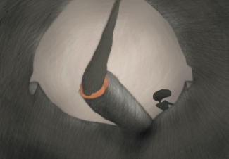
In Idiots and Angels, I have a real fun shot of a dance scene, but the shot is from the inside of an ashtray (everyone in the film smokes), so the first thing you see is a large lit end of a cigarette with smoke billowing from it. Then, far off in the distance, you can see the couple dancing by. A lot of people have mentioned that shot as being very weird—I love it!
I love using an interesting POV. I’ve done a number of films using this kind of POV, including “One of Those Days,” “The Exciting Life of a Tree,” and one of my favorites, “Draw!”, in which we see the world in slow motion from the point of view of a bullet being fired out of a gun to kill a cowboy. It’s so interesting to play around with POV.
I believe that life is enriched by seeing the world from different angles. Everyone has many sides to their personalities. Hitler was a vegetarian—he loved animals and didn’t want to harm them—that’s a side of him I find fascinating. So that’s why I love seeing stories from different angles and unique viewpoints. Try it in your film; see how many bizarre places you can put the camera.
I often like to play a visual game when I’m flying across the country. From 20,000 feet up, I’ll see a car speeding down a freeway and imagine what the driver is seeing when he looks up at me in my airplane: how do I look? And perhaps he then looks at a hitchhiker on the side of the road, and I magically fly into the hiker’s head to see his vision of the car and the plane. Then perhaps I zap into a cactus in the desert nearby, how it would view the hitchhiker, and so on. I find these games fun and visually stimulating, and often I get good ideas from playing bizarre games like this. That’s how boring my life is.

Perspective and Foreshortening
Another trick I use to capture the eyeballs of the viewer is playing around with perspective and foreshortening, which means exaggerating the size of certain objects to give the illusion of depth. In other words, if a guy is pointing a gun at the camera, the gun would be extremely large (super close up) and the man’s face would be very small by comparison.
This look can also be achieved by using a wide-angle or “fish-eye” lens. These lenses are often used for dramatic effect or to show that a character is on some kind of drug trip. However, I like to use the exaggerated perspective all the time—it makes the viewers feel like they’re in a dream, a fantastic place. For me, it heightens the intensity and makes the visuals much more memorable.
In association with exaggerated foreshortening, I like to play with the vanishing point perspective. In high school art classes, learning proper perspective is one of the foundations, but I like to screw around with it.
In college, I saw the famous Mystery and Melancholy of a Street by Giorgio de Chirico. I thought, “Wow, this guy really needs to take lessons in perspective.” Yet the painting was such a jumble of different vanishing points that it stuck in my head. It really was a haunted mystery. And then I understood it, and thought, “Wow, I should play around with skewed perspectives in my films and see what happens.” And it just happened that it fit in quite well with my weird camera angles and distorted foreshortening.

DESIGN IDEAS TO MAKE YOUR LAYOUTS MORE INTERESTING. (THANKS TO “WALLY WOOD’S 22 PANELS THAT ALWAYS WORK.”)
The third trick I use for my Plympton style is distortion—playing with the imagery. Of course, the first and best example of this I used was in the short film “Your Face,” and that film was such a big success that I’ve used the technique in almost all of my films.
Distortion is actually a very close cousin to exaggeration; however, I like to use distortion more as a visual tool to tell a story, not so much as a comedic tool. Often the distortion can be quite subtle, and sometimes not. In my film “Push Comes to Shove,” I have an excellent example of extreme distortion: one of the gentlemen places a mouse, cat, and dog inside the other man’s mouth, and naturally the animals begin to fight with each other, causing the man’s head to take on extremely weird shapes. This distortion goes on for quite a while, so it was a real pleasure for me to draw. It was as if I had taken a plateful of psychedelic drugs.
Around that time, I learned another important lesson; this one may seem obvious to you, but to me it was a real breakthrough. I was trying to draw a giant, and I thought, “Well, he’s a giant, so I have to make everything big!” So I made all of his features larger than normal—big feet, big hands, big head, big shoulders, big legs, everything. But when I finished the drawing, he looked exactly like he did before, only he filled the frame, so there was no more room for the other characters!
“PUSH COMES TO SHOVE” (1990)
That’s when it struck me: sometimes it’s easier to create largeness by just shrinking the other parts of the art. Ah, but what parts to shrink? Once I shrunk his hands, feet, and head, he suddenly looked like a real giant. So remember: sometimes shrinking some features makes other objects look bigger.
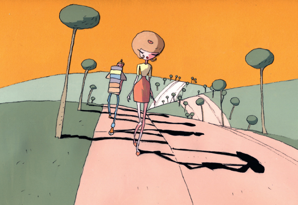
Another distinctive quality of my films is the use of shadows. It really bugs me how the Disney films of the 1980s and 1990s were so expensive—budgets of hundreds of millions of dollars—yet they refused to use shadows, whereas the Miyazaki films have this gorgeous use of shadows with a budget that’s a fraction of that of the Disney films.
Why do the Disney films not make good use of shadows? Shadows add color and dimension to the characters—they make them look so real and lifelike. I believe that the wonderful shadows you find in the Miyazaki films are one of the main reasons they are so well-loved.
SHADOWS ARE ONE OF THE MOST IMPORTANT PARTS OF VISUAL STORYTELLING. THEY HELP DEFINE THE VOLUME AND THREE DIMENSIONS OF ANY PIECE OF ART. THEY ADD A SENSE OF REALITY TO ANY CARTOON, NO MATTER HOW BASIC OR CRUDE. SOMETIMES I LIKE TO CREATE CHARACTERS USING ONLY SHADOWS AND NO LINES. TRY IT! IT’S FUN.
At a fairly early age—I think I was in basic training at Fort Ord, where the sun shined every day and created wonderfully colorful shadows—I became obsessed with shadows. Not just those projected on the ground, but also on people’s clothing and faces.
I became so obsessed that I started creating drawings using just shadows. No lines, no textures, nothing but shadows. It’s a great exercise; it teaches you how to look at a visual image in a completely fresh way. Shadows add bulk and solidity to a drawing. You can feel that a character’s persona is much more real—it has weight. I’d love to do a film in which everything is defined by shadows.

And the ever-present shadow on the ground gives them an integration into the background—you feel that they are much more connected to the picture. I also love using shadows on the wall to add drama, mystery, and variety to the story. Look at the wonderful Orson Welles film Citizen Kane and see how he uses shadows not just on the body, but projected on the walls and ground. Another great shadow film to check out is The Third Man, a very fantasy-oriented noir film.
Experiment with shadows; they are so much fun to play with, and they create such great visuals.
If you saw my Oscar-nominated film “Your Face,” then you’re aware of another popular trick I use very often: metamorphosis. I don’t claim to have invented it; if you look at the very first animated shorts, “Fantasmagorie” (1908) by the Frenchman Émile Cohl or “Humorous Phases of Funny Faces” (1906) by James Stuart Blackton, you’ll discover that metamorphosis was the very foundation of the charm of the earliest animated films. But along the way, Walt Disney emphasized a more realistic type of storytelling. Well, I decided to bring magical transformations back.
One of the more popular parts of Idiots and Angels is when the Angel character gets up in the morning and the shower becomes the faucet, then the milk in the cereal. Then the spoon in his mouth transforms into a key in his car’s ignition. It seemed like a fun and original way to get the character off to work.
Animation is the perfect art form for metamorphosis. Try it; you’ll like it.
In the big, wide world of corporate animation, everyone has his or her specific job: lighting, effects, key animation, or whatever. There seem to be a thousand different specialty occupations.
But when you’re an independent filmmaker like me, you have to do all that stuff by yourself. There are no in-betweeners, no clean-up people, no breakdown artists. I do it all. Why? Because I’m too cheap, and also because it’s fun. I feel more in control when I can fully design the characters to my desires and then make them come to life.
Therefore, I rarely shoot my drawings on ones, meaning 24 drawings per second (one for each frame of film). Quite frankly, I don’t believe the average viewer can tell the difference, or even cares, whether animation is shot on ones or twos (one drawing for every two frames of film).
I even consider one drawing for every three frames of film appropriate for me—it feels smooth enough. And if I’m really feeling bold, I’ll shoot on fours or fives. Sure, the movement is a little jerky, but often that’s appropriate for the action. In fact, my films can never compete with Disney films—I can’t match their budgets and professionalism. If their films are like hundred-piece orchestras, my films are more like garage bands—raw, crude, and sometimes offensive. And I like it that way. My audience is definitely a lot younger and more rebellious, though I haven’t seen a mosh pit at any of my screenings.

OPENING SEQUENCE OF IDIOTS AND ANGELS (2008), SHOWING METAMORPHOSIS

OPENING SEQUENCE OF IDIOTS AND ANGELS (2008), SHOWING METAMORPHOSIS
Having said that, you’ll see that my exposure sheets (charts indicating which drawing goes in which frame of film) are very loose. I try to maintain a close relationship with the person scanning my drawings, and often I’ll make many adjustments to the timing once the pencil test is finished, at which point I can retime the drawings to my imagination.

A SAMPLE EXPOSURE SHEET. VERY SIMPLE, I KNOW, BUT IT MEETS MY NEEDS.
Viewing the pencil test many times really helps me get the timing correct. In fact, I believe that showing the pencil test to a number of people—and getting feedback from them—is essential.
I often do shows at festivals and schools, where I show my works in progress, so I’m forced to watch the rough pencil tests with an audience, sometimes with a temporary soundtrack, which really helps me see what needs to be fixed.
The students often make comments or suggestions that help me improve the film. But more often, by just watching the film in an audience situation I can intuitively tell what’s wrong with the picture. And the more I watch it, the better the corrections are.

I get this question a lot—and I know most animation these days is done using breakdown artists, in-betweeners and such, but I like to create all of my own drawings.
There are a number of reasons why I create all of my own animation art. When I was making Hair High, I thought I might use some other animators to help me speed up the process. They did wonderful work, but I constantly had to redraw their shots because they didn’t follow the image I had in my head—and how could they? The other animators couldn’t see inside my brain. There’s no window in my skull.
Because I had to constantly adjust their drawings, it actually slowed down the production and didn’t really help that much. And on top of all that, it was very expensive. So that’s why I stopped hiring other artists to help with the animation.
Once I’ve revised the pencil test to the point where it meets my expectations, and those of my friends, I’m ready to finish the film. I go through all of the artwork again, fixing any rough spots, accenting the outlines, adding texture and tone to the artwork, and going in with my eraser to bring out the highlights. I make some last-minute touches such as bringing out the details, especially in faces, and blurring areas that aren’t important—again, in order to direct the eyes to the areas I want them to see.
Because I started out as an illustrator, as you can imagine, I’m a big fan of backgrounds. They are a very important ingredient in the success of a film. But because I usually create my own backgrounds, I like to stay away from artwork that has too much detail. I don’t want the backdrop to compete with the action in the foreground.
Again, this is my “pushing the eye” theory; if the viewer’s eyeball gets caught up in the minutiae of the artwork behind the action, I’m in big trouble. I want the eye to get involved in the story, not the art.
The background should enhance the storytelling and perhaps bring an ambience or flavor to the location, and nothing else. If it does get too rich in detail, I may have to soften the focus a bit to make sure the characters are clearly observed. I want the characters to “read.”
If the characters are not in view and the background is a location shot or has some information that’s essential to the story, then by all means, I go crazy with detail. But remember, I want to push the eye to that feature in the background that’s essential to the plot.
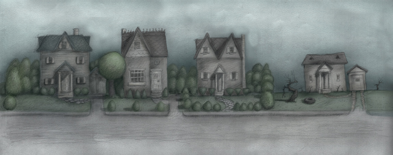
OPENING BACKGROUND FROM IDIOTS AND ANGELS (2008)
I get a lot of criticism about my films. People say that they’re too raw and unfinished and that they have too many imperfections. And you know what? They’re right: my films are jam-packed full of mistakes. Booboos abound, problems aplenty.
But that’s okay! I don’t want to make perfect films—perfect films are anathema to me. It’s like having a perfect lover: their hair is always in place, there are no wrinkles on their clothes, they never make mistakes, and they have no faults. Would you want to live with someone like that?
I want someone who’s human—whose frailties and foibles are endearing. That’s what makes love happen.
“Perfect is boring.”
—TINA FEY
An old girlfriend once told me that she liked someone for their charms but she loved him for his weaknesses. Well, that’s how I feel about my films. They each have a personality, a style, and an identity, and my crudeness and edginess are parts of my style.
I know this one animator who made a film that many people called the greatest film ever made! It constantly ranks as the most “perfect” animated short ever. God, what a millstone that is! Now he’s working on his follow-up film. But how can he finish it, when it has to be better than the greatest film ever made? He’s been working on this follow-up film for 20 years, and he’s frozen by perfection. Twenty years to make a short film; how does he live during all that time? I have no idea.
For me, mistakes are cool. They can often lead to great ideas and new directions. I’ll be walking down the crowded streets of New York and overhear a conversation, and because the surrounding noise level is so loud, I don’t always hear the words clearly. I misunderstand the words, and my brain makes up something completely different. That’s what I mean when I say mistakes can lead to great creativity.
And that’s where a lot of my ideas come from: mistakes and misperceptions. Sometimes the absurdity of these errors is a perfect source for many of my ideas. And it’s not just misheard conversations. If I take my glasses off, I’ll see things that are not in fact part of reality—mistakes again. Sometimes I purposely hinder my senses so I can make a lot of misunderstandings, and I get a lot of ideas that way. Often these crazy ideas are a great source of visual jokes.
But I also value mistakes in my art. I like to animate quickly; that way, a lot of options open up in terms of design. The looser the drawing, the more creative I become. These very rough drawings—more like sketches—are actually very impressionistic and much more compelling to look at.
It’s kind of like going to a museum and marveling at the hand-drawn art. You can feel the hand of the artist. But with a computer-made film, it feels more like watching a machine. The artwork is cold and impersonal, and perfect. I prefer the warmer, mistake-filled, handmade, funky feel of my artwork over a cold piece of perfection made by a computer. I’ve got my own proprietary software; it’s called a “pencil.”
A side effect to being a perfectionist is thinking you’re the greatest artist in the world. I’ve seen many filmmakers crash and burn because of their ego, vanity, and hubris. Please have a little humility. We’re competing against each other, and that’s what makes us better, but appreciate other people’s films. No one’s perfect; we’re all trying to make a living in animation, and there’s no room for self-indulgent narcissists.
In fact, it’s very dangerous once you have a big hit. You win lots of prizes and believe you have the magic formula for success. You don’t! Audiences change; they’re fickle. What’s funny one year could be pathetic the next. The audience is like a mutating virus—they always want something different.
That’s why I’m always experimenting with new drawing styles, new techniques, and new kinds of stories. My career would be very boring if I kept making the same film over and over. I think that’s the reason I never got into a TV series.
Color
It’s very disturbing to me when I get young animators visiting me in my studio to show me their animated films that make absolutely offensive use of color in their films—I often react in horror. It’s gotten so bad that I have to wear sunglasses to look at students’ work.
Don’t they teach color theory any more in school? How hard can it be to show the students the proper use of color? How can you be an artist of any kind and not appreciate the power of the palette?
Color is like a very fast car: it can be very dangerous if not handled properly. Artists should have a license to use color. Young artists should start with the easy colors—earth tones and pastels. Then, once they feel comfortable, they can move up to higher speeds with brighter, faster colors.
I don’t have the time or space in this book to give you a complete tutorial on color theory. However, I can give you a few pointers on how to use colors in your film.
Color is extremely powerful. If used properly, it can create magic. If not, you will crash and burn. I don’t care how beautiful your drawings are or how good the story is—badly used color will sabotage the entire project. I hate to be repetitive, but I like to use color to push the eye around. Color can be like highway signs, telling people where to look and how to look.

RANDOM SKETCH (1971)
Everyone knows that the right color can set the mood—that’s important for engaging people into the story, whether it’s a war story, a romance, a comedy, or a pastoral. The color sets the mood that carries you along on the magical trip.
• If it’s a battle scene, you want lots of intense, hot colors: reds, yellows, and blacks.
• Romance colors are more along the lines of soft blues and gauzy pinks or pastels.
• Comedy usually involves basic, brighter colors.
• Pastoral moods bring in soft greens and browns.
I remember one student who came in and showed me his short suburban comedy, and for some reason, a tree far in the background was colored bright lime green. Now, I don’t remember what happened on that street, what the people said, or where they went. The only object I was concerned about was that damn lime green tree! What the hell? Why didn’t his teacher tell him to change that color?
AUTUMN SCENE FROM HAIR HIGH (2004)
I believe what happened was this: he was playing with his computer’s color wheel and just thought that his trees should be this beautiful, bright green color because it was a comedy. He never thought about that color in relation to the other colors.
That’s the secret: all of the hues have to be balanced throughout every image. And it’s that balance that determines the effectiveness of the palette. It’s the same as with the instruments in an orchestra, which all have to work together to direct the attention of the listener to specific and emotional areas of the composition.
I like to keep the intensity of color dialed way down. I like the “noir” look. If you’ve seen Idiots and Angels, remember that the color is very minimal throughout the film, and only on the last image—the exterior of the house and the happy ending—do I bring out the color. And with Hair High, which takes place in a high school in the 1950s, I created a palette of soft pastels and used the bright hues only in the action scenes or very emotional sequences.
Bright colors such as lime green, crimson red, or electric purple should be labeled “handle with care,” whereas wonderful tones such as earthy browns, manila, sepia, and grays are colors I use a lot. I call them “dead colors” because they are passive and don’t intrude on my drawings.
However, when I was designing the color palette for “The Cow Who Wanted to Be a Hamburger,” the story dictated bright primary colors because it’s like a children’s story, and I wanted the feel of a children’s book—the kind of colors a child would use when coloring with crayons.
One day, while strolling though the Guggenheim Museum, I saw some of Wassily Kandinsky’s early paintings. They were somewhat realistic (in fact, he did children’s books in the early years of his career to support himself), and he employed the use of extremely bright, saturated hues. But he balanced them with large areas of black and white. I thought, “Wow! What a powerful mixture!”
So, when I drew the cow, I increased the size of the black shadows—in fact, sometimes the cow is a complete silhouette, with just a sliver of bright color along her face and back. Then I would add a bright white cloud on the sky, and the colors would practically sing. Bright palettes can be very useful; you just have to use them as part of the storytelling process.
Another trick is to not overuse blue for the sky. Often other colors will be more powerful and emotional as sky colors—pink, yellow, purple, grey—almost any color but blue.
Go to museums and check out the great usage of color in the impressionists’ paintings—they seemed to really understand how to create moods with color. Also, look for a wonderful book by Leslie Cabarga, The Designer’s Guide to Color Combinations—it’s got everything you need to know about color patterns and theory.

COLOR ART FROM “THE COW WHO WANTED TO BE A HAMBURGER” (2010)
After I’ve finished all the art, I put the drawings in a manila folder along with the exposure sheets, backgrounds, and layouts, with instructions for camera moves—zooms, pans, and so on—and the film moves on to a process we call post-Bill production. I pass the project on to Desirée Stavracos, my project producer. She will now take over the text to explain what’s involved in the digital process. Take it away, Desirée!
DESIREE STAVRACOS, BY BILL PLYMPTON
As Bill mentioned earlier, it’s my responsibility to oversee the scanning, cleaning, and compositing of his animation. Here’s a breakdown on how his animation comes to life in the digital end of the production process.
From the start of his animation career until 2004, Bill was shooting his animation on film. Even when the scanner was introduced to the animation industry (late 1980s, early 1990s), the cost of transferring from digital to film was such that scanning animation wasn’t cost effective, even when weighed against the cost of developing film. By 2004, however, the scale had shifted, and scanning animation became the faster, cheaper method of bringing his drawings to the screen.
We scan all of Bill’s drawings on flatbed scanners that import into Adobe Photoshop. Using a custom computer script that Adobe refers to as an “Action,” we are able to automate the scanning and importing of the drawings so that they stack into single Photoshop files, which in turn represent individual sequences of animation (each layer in the Photoshop file is a drawing in the sequence). Once the various levels of animation and the background are scanned and organized into a scene folder, we move onto cleaning.
A NOTE FROM BILL
Let me chime in at this point. The use of digital scanning has freed me from using the bulky, crude, transparent cels and giant Rostrum camera. With the use of high-resolution scanners, the subtlety and depth of my pencil drawings comes through very clearly, especially on the giant movie screen. I believe it’s one of the reasons Idiots and Angels was such a big success and Hair High was not.
What we call the cleaning process differs from film to film, depending on what media Bill chooses for a particular project. Generally, the cleaning process is twofold:
• Part 1: dust and debris. When scanning in animation, dust and other debris (eraser shavings, to be sure) usually find themselves between the drawing and the scanner bed, creating speckles or dots throughout the scenes. These have to be edited out before putting together finished scenes.
• Part 2: cut-out. Whereas in the past (when shooting on film), cels were employed so that animation laid seamlessly on a background, today we digitally “cut out” the animation. At this point, if Bill hasn’t added color using his signature colored-pencil style, then we do it digitally.
When done digitally, the coloring process is also completed in Photoshop. Bill will work out a palette with our production team, giving us reference and walking us through the style of the project and mood of the scene. The color is placed on a layer underneath the drawing layer, and the first pass is always flat color. For projects such as “The Cow Who Wanted to Be a Hamburger,” the color stays flat. For films such as Idiots and Angels, however, we use digital brushes to apply shading and texture to the colored areas. By using the “dodge” and “burn” tools in conjunction with one of Photoshop’s many preloaded textured brushes, we are able to sculpt the forms, helping strengthen the highlights and shadows that Bill builds with his many passes with the pencil.
Whichever method we use for applying color, our next step is to sequence our now-finished drawings and place them on top of the background in a process we call compositing.
We put Bill’s scenes together using another Adobe product, After Effects. After Effects allows us to import the layered Photoshop files and sequence them in a few short steps. We can also change timing from ones, twos, and threes on the fly, therefore creating previews and pencil tests faster than ever.
We also use After Effects to generate all of our camera moves, as well as special effects. With every iteration of After Effects, the modular control of motion from key frame to key frame (commonly known as tweening) is increasingly refined, allowing us to create digital solutions for what would normally be very challenging to animate in a traditional fashion. Also, After Effects’ stock collection of plug-ins helps us to create convincing lighting effects, blurs, and camera shakes.

MY ANIMATED PENCIL DRAWINGS FROM IDIOTS AND ANGELS (2008)

THE COLORED VERSION OF THE SAME DRAWING; NOTICE THE DEPTH AND THE CHIAROSCURO IN THE COLORED VERSION.
Finally, we use After Effects for color correction. Although it seems intuitive to use Photoshop for this process, that would require editing each layer (drawing) individually, which would add a considerable amount of time to production. With After Effects, we can adjust all facets of the color and contrast over large sequences of footage.