
IN THIS CHAPTER
- Introduction to spatial maps
- Isometric projections and ecosystem models
- Case Study: Gigamapping: Canadian Governance in the Digital Era
The cause of the great cholera outbreak in London in 1854 was initially unclear. Prior to Louis Pasteur’s germ theory, many thought the disease was in the air. John Snow, a London physician, had a different explanation. He believed cholera was in the water. After microscopic examinations were inconclusive, Snow instead analyzed the spread of cholera to prove his hunch.
To do this, Snow mapped cholera cases in Soho, London (Figure 13-1). The resulting patterns demonstrated causality: proximity to a certain water pump correlated to cholera cases with high predictability. The decline of cholera is credited to Snow’s recommendation to shut down that pump.

FIGURE 13-1. John Snow’s map of London during the great cholera outbreak of 1854. The red circle highlights the water pump that was the source of the disease.
Snow’s map contains multiple layers of information—streets, houses with cholera cases, and water pumps—just enough to reveal previously undetected evidence (in this case, the cause of a disease). The approach is simple but effective: Snow was able to generate a hypothesis based on his simple map: if the city shuts down a specific pump, then cases of cholera would decline.
Visualizations offer an immediacy of comprehension and help us arrive at such conclusions. Maps show interrelationships in an ecosystem.
It may not be immediately apparent, but I would argue that there is alignment in Snow’s example: water (a service provided by the waterworks department), water pumps (the touchpoints to that system), and households with cholera in Soho (individuals). What Snow showed was that the means of treating and storing water miles away affected people in central London. This conclusion is generally credited with the start of public health practices around the world.
This is why I love maps of all kinds: they provide an overview and, with some creative imagination, show new relationships leading to new insight. Armed with only a map and a few data points, John Snow was able to see what the best microscopes of the time couldn’t. That’s powerful.
Similarly, this is what mapping offers: new insight. It starts with an investigation and illustration of the human condition and then works out ways to support people’s needs.
This chapter deals with two types of diagrams: spatial maps and ecosystem models. Neither is chronological or hierarchical in organization. Instead, the location of the information on the page is important to the diagram’s meaning and interpretation. Both seek to portray an ecological view of people’s experiences and to show a broad system of interaction.
Each type is discussed below separately. By the end of the chapter, you should grasp similarities and differences between them, as well as have an understanding of approaches other than chronological and hierarchical diagrams.
Spatial Maps
By definition, models tend toward abstraction and simplification. This helps teams distill and communicate insights, and allows others in the organization to benefit from that insight.
Too much simplification results in a loss of richness and full context of the actual human experience. On the other hand, too much detail can overwhelm. There is always a struggle between detail and comprehensibility with diagrams.
Kim Erwin, associate professor at the Illinois Institute of Technology, Institute of Design, focused on making complex information easier to understand without losing the detail. She developed an information-dense format called consumer insight maps, which she describes as follows:
Consumer Insight Maps promote emotional contact with research, showcase important complexity in consumers’ lives and support persistence of the consumer voice throughout (and often beyond) a design process… Consumer Insight Maps are designed to take the complexity of consumers’ lives—the dense, messy, interconnected ambitions, activities, anxieties that thread throughout their days—and flatten them out so that we might examine them more systematically.
Figure 13-2 shows an example of a consumer insight map.
According to Erwin, the key to their effectiveness is the manner in which the information is arranged. The technique relies on principles from cartographic maps by showing relationships between information types.
Visualizations offer an immediacy of comprehension and help us arrive at such conclusions. Maps show interrelationships in an ecosystem.
For instance, Erwin defines different zones of information, seen in Figure 13-3—mindset, activities, anxieties, attitudes, and product opportunities. Within each zone, subgroups of information provide refinement and depth to the overall story told by the map.
The result is an easy-to-understand overview that exposes the diversity of aspects of an experience without an oversimplified portrayal. Borrowing from principles of cartography, consumer insight maps present information in context, allowing the reader to orient to the territory, and consume the information at micro and macro levels as desired.
Consider another example in Figure 13-4, created by UX designer Patrick Kovacich while working at Citrix. Collaboratonia is a hypothetical “place” that visualizes various jobs to be done while collaborating with others. These were derived from extensive user research efforts by the Citrix UX team.
This is actually more of an affinity diagram than a map. However, the physical placement of the information shows interrelationships between the different themes, reinforced by color coding.
With spatial maps, layering is the primary means to show alignment. Just as John Snow overlaid various facets of information on his map of London to gain insight, Figure 13-5 shows current organizational capabilities on top of the basic spatial map.
Each color represents a different way to support customer needs. From this layering, the team can see the gaps and redundancies in their offerings. New insights emerge from the ensuing discussions.
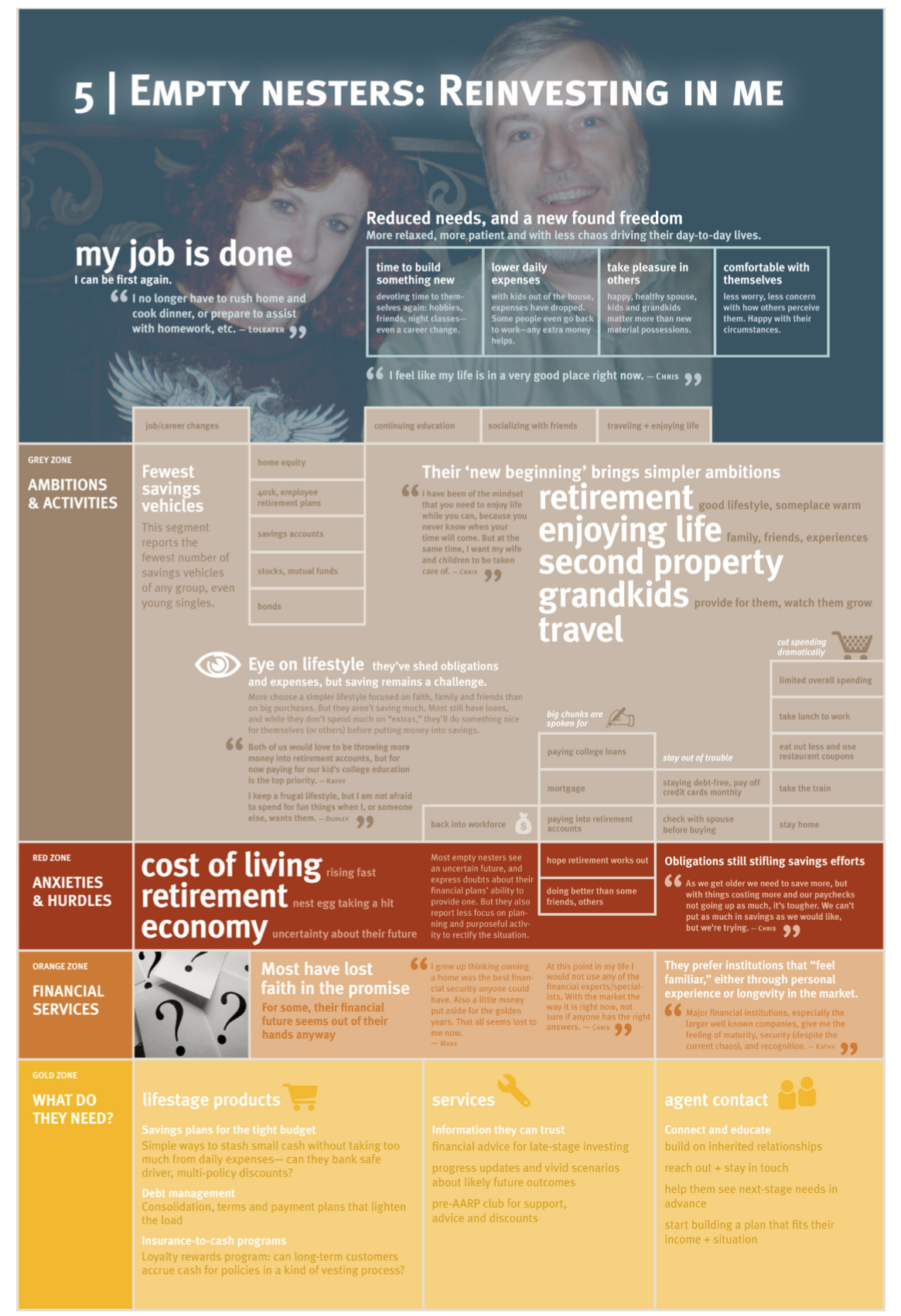
FIGURE 13-2. An example of a consumer insight map, created by Kim Erwin.

FIGURE 13-3. The structure of a consumer insight map results in a high density of contextual information.
Isometric Projections
An isometric projection is a specific type of spatial map. It’s a method of illustrating three-dimensional objects in two dimensions. Isometry is achieved with rotated angles of objects on the diagram. When all line angles are kept the same, a sense of a plane is created.
A simple example of an isometric projection appears in Figure 13-6. This was created by Chiara Diana and Roberta Tassi while at the Domus Academy of Research & Consulting. The project’s intent was to improve the experience of tourists visiting Rome. In particular, they sought to attract people to lesser-known sites of the city.

In this example, the plane on which the elements sit isn’t explicitly represented, for instance, with a shape or border. Instead, the parallel angles of all of the elements creates a consistent 3D effect. Light shadows amplify the illusion of a spatial model.
In another example of isometric maps, Figures 13-7a–d show a series of diagrams created by Paul Kahn, Julia Moisand Egea, and Laurent Kling, one of which is shown in Chapter 1 (see Figure 1-7). These illustrate the ecosystem of content production at the Institut National de Recherche et de Sécurité (INRS), a large French government organization.
In Figure 13-7a, the plane of the isometric projection is represented with colored areas, which the designers call carpets. Each of these represents a different department within the organization. Content formats and systems are overlaid on the carpets for a base diagram of the organization.
Figures 13-7b–d show variations of the base diagram with additional layers and types of information. Figure 13-7b shows the flow of content between departments, in particular the duplication of content from one to another. Figure 13-7c uses the same model to look at research activities across the organization, using a different color scheme across the diagram. Figure 13-7d shows access to the websites, also using a different color scheme.


FIGURE 13-7b. Overlays showing the duplication of content on external sites.

FIGURE 13-7c. Extending the base map to show various search engines and indexes.

FIGURE 13-7d. This version shows that a portion of the website was duplicated to make it available to Google for search indexing.
Figure 13-8 shows an interesting example that combines two different diagram structures. This diagram was created by Mark Simmons, along with Aaron Lewis, as part of their master’s work for the Sustainable Product-Service System Innovation program at Blekinge Tekniska Högskolan in Karlskronn, Sweden.

FIGURE 13-8. A combination of a spatial map (top half) and a chronological diagram (bottom half) for person-to-person car sharing.
The top part of the diagram shows a spatial map of the dynamics of peer-to-peer car sharing. The bottom half takes touchpoints from the spatial map and arranges them in a chronological customer journey.
Both are generalized depictions that highlight critical questions within the service ecosystem. From the spatial map on the top, for instance, it becomes apparent that getting the borrower to and from the owner’s car is a logistical hurdle.
From the chronological map on the bottom there is a better sense of the interaction between the borrower, the owner, and the car sharing service. It shows how most of the interaction happens between the borrower and the owner, and the platform makes that match. Each of the two representations brings unique insight.
Ecosystem Models
Cloudwash is an experimental prototype of a reimagined washing machine created by Berg, a cloud services integrator (a now defunct firm). The system integrates a variety of services involved in washing clothes, such as contacting a plumber, scheduling use of the washing machines, and ordering detergent (Figures 13-9).

FIGURE 13-9. Cloudwash integrates a range of services from multiple providers. (Photos by Timo Arnall, copyright Berg.)
Berg has no direct stake in those services, yet the envisioned system combines them seamlessly. This type of ecosystem thinking looks at the jobs to be done and brings the pertinent services together in a single experience.
Ecosystem models provide a holistic view of an individual’s experience, helping conceive systems such as Cloud Wash. The visualizations expose otherwise invisible aspects of an experience, leading to opportunities for innovation.
Figure 13-10 shows an example of an ecosystem map appearing in the book Service Design, by Andy Polaine, Lavrans Løvlie, and Ben Reason (Rosenfeld Media, 2013). This is a visualization of a car sharing service created for FIAT.
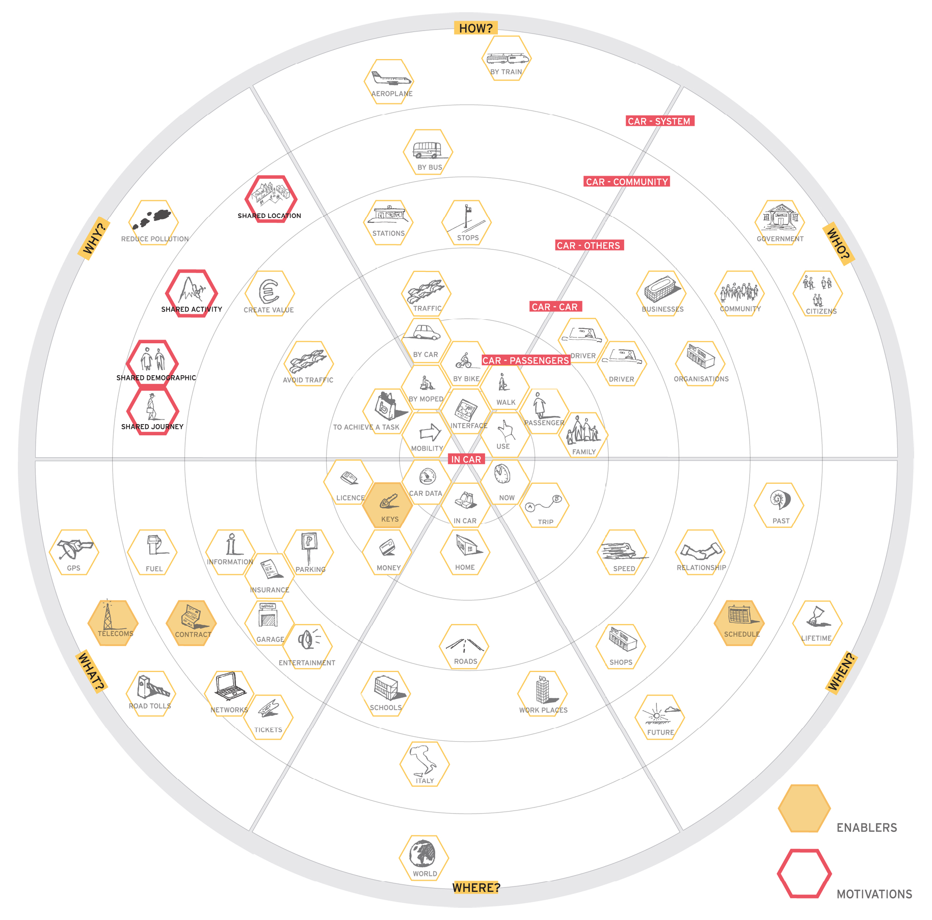
The center of the diagram illustrates the relationship of the driver to the car. Moving outward, the relationships start including passengers, other cars, other services, communities, society, and the Earth. The concentric circles are then divided into slices for the categories who, when, where, what, why, and how. Touchpoints are added to represent different interactions in the ecosystem. Such diagrams allow teams to see and discuss the various relationships in a tangible way.
Elements of Spatial Maps and Ecosystem Models
The final type of diagram in Part 3, spatial maps, contrast both chronological and hierarchical models. They show relationship and insights through a physical layout of information.
Spatial arrangements of information provide a broad overview of an ecosystem. Taking a step back, viewers can get the big picture quickly; or, they can zoom in to a section for more detail. Frequently, overlays or variations of the diagram provide different snapshots of insight that tell multiple stories of value creation.
Table 13-1 summarizes the main aspects that define spatial maps using the framework outlined in Chapter 2.
|
Point of view |
Include perspectives of multiple actors and multiple interaction types with the organization |
|
Structure |
Spatial |
|
Scope |
Holistic, capturing elements of experiences across many levels of interaction |
|
Focus |
Focus on actor relationships, tasks, goals, and interaction types Range from specific to very broad, may include considerations of community and society |
|
Uses |
Gaining a broad understanding of existing experiences across actors and touchpoints Highlighting gaps and inefficiencies in a system with overlays of information Building and understanding strategy Innovating new, meaningful experiences |
|
Strengths |
Rely on a metaphor people can relate to Provide a holistic overview Compact format that stakeholders can easily grasp Engaging and suitable for workshops |
|
Weaknesses |
Lack sequence or chronology of information Can take a long time to create Hard to create together as a group Lack detail, omit indication of emotions and feelings |
TABLE 13-1. A summary of the main dimensions of spatial maps.
Further Reading
Kim Erwin. “Consumer Insight Maps: The Map as Story Platform in the Design Process,” Parsons Journal for Information Mapping (Winter 2011)
Professor Erwin presents a technique that directly draws on the predictable structure of geographic maps, called consumer insight maps. This framework helps teams make sense of experiences in a direct and immediate way. She focuses on four aspects of cartographic maps to incorporate in her visualizations: zones, elevations, topographies, and blueprints. The spatial combination of information results in a platform for delivering powerful, visual stories that speak to diverse stakeholders.
Isabel Meirelles. Design for Information (Rockport, 2013)
This is an excellent book on information design in general. The author offers very detailed discussions of spatial maps and isometric projections. This book contains a wealth of illustrations and case studies.
Kerry Bodine. “How to Map Your Customer Experience
Ecosystem,” Forrester Reports (May, 2013)
This is a brief report from Forrester that defines what a customer experience ecosystem map is, how it is used, and what the benefits are. Only a few limited examples are included, however.
Sofia Hussain. “Designing Digital Strategies, Part 1: Cartography,” UX Booth (Feb 2014) and “Designing Digital Strategies, Part 2: Connected User Experiences,” UX Booth (Jan 2015)
In this pair of articles, design expert Sofia Hussain discusses approaches to mapping ecosystems. She favors circular diagrams that get away from a linear, left-to-right depiction of chronology. The focus on behaviors and motivations recalls Young’s mental model diagrams. Hussein’s maps are very compact and present a clear overview at a glance.
Gigamapping: Canadian Governance in the Digital Era
A Gigamap is a large-scale visualization of the systemic relationships within a complex domain. Gigamaps can appear like infographics at first, but in fact they are time-intensive team constructs based on qualitative research. It takes time to learn the system methods, which is why Gigamaps are taught as a studio practice and are developed through iterative research.
For the Governance case, a team of faculty and grad students working with Greg van Alstyone of OCADU’s Strategic Innovation Lab (sLab) facilitated a series of civic and expert engagements. This was part of ongoing research on future governance, led by PI Evert Lindquist of University of Victoria.
One of our contributions was to iteratively develop a Gigamap over the series of workshops, a later version of which is shown in Figure 13-11.

FIGURE 13-11. A Gigamap of Canadian governance in the digital era.
The diagram has three primary zones of information.
At the top are inset systemigrams representing key citizen issues: access, privacy, and open data.
In the middle we see a spatial metaphor for the current government ecosystem, the challenges it faces in the future, and a vision for transformed societal governance on the right.
The bottom of the Gigamap shows “waves of change,” or the forces future decision makers must contend with over the next two decades. This reflects the Three Horizons model of foresight and captures the progression from today’s tensions toward a long view of a preferred future.
Compelling maps of social systems require a project team to conduct a deep dive of research in the domain, engage stakeholders and experts to understand the salient drivers, and critique the developing artifact in iterative studio sessions to evolve the underlying system theory that best explains the observations.
For this project, we held several workshops from 2014 to 2015 that contributed narratives and “subsystems” to the map, developed in-studio with a graduate student team. Sessions included:
- A Canadian-wide stakeholder workshop in December 2014, with “lightning talks” by experts on Open Space, and small group workshops.
- In January we engaged 35 civic innovators in small group sessions to elicit influence maps on the important systemic relations (designwithdialogue.com).
- A major symposium held in Ottawa collected ideas from participants, which were further developed in a subsequent workshop at the Institute on Governance.
Figure 13-12 shows a version of a Gigamap template used to engage participants during sessions at early stages of the project. The intent was to reveal to participants an understanding of the spectrum of changes influencing and transforming governance in the digital era.

Overall, the issue is not one of “digital governance.” Instead, our focus is on the systemic shifts anticipated within federal, provincial, and local governance and citizen experience driven by the rapid alterations brought on by digital cultures. We used the Gigamap as a primary means of cultivating a long-term perspective and guide multisector vision building.
About the Contributor
Dr. Peter Jones is an associate professor at OCAD University, Toronto, where he teaches in the Master of Design Strategic Foresight and Innovation program. Peter teaches innovation research and systemic design and guide research in the Strategic Innovation Lab (sLab). sLab contributors to the case project included SFI graduate Kelly Kornet and sLab director Greg van Alstyne.
Peter is managing partner of the Redesign Network (redesignnetwork.com) and the author of Design for Care (Rosenfeld Media, 2013). You can follow him on Twitter at @redesign.
Diagram and Image Credits
Figures 13-2 and 13-3: Consumer insight maps and template by Kim Erwin, appearing in her article “Consumer Insight Maps: The Map as Story Platform in the Design Process,” Parsons Journal for Information Mapping (Winter 2011). http://piim.newschool.edu/journal/issues/2011/01/pdfs/ParsonsJournalForInformationMapping_Erwin-Kim.pdf
Figures 13-4 and 13-5: Diagrams of Collaboratonia created by Patrick Kovacich, used with permission
Figure 13-6: Diagram by Chiara Diana and Roberta Tassi, used with permission
Figures 13-7a through 13-7d: Isometric maps created by Paul Kahn, Julia Moisand Egea, and Laurent Kling, used with permission, originally appearing in Paul Kahn and Julia Moisand. “Patterns That Connect: The Value of Mapping Complex Data Networks,” Information Design Journal (2009)
Figure 13-8: Diagram created by Mark Simmons and Aaron Lewis, CC BY-SA 3.0, used with permission
Figure 13-9: Photos of the Cloudwash prototype by Timo Arnall, copyright Berg, used with permission. I’d like to thank Sofia Hussain for pointing the example out in her presentation at the UX STRAT 2014 conference.
Figure 13-10: Ecosystem diagram by Andy Polaine, Lavrans Løvlie, and Ben Reason, appearing in Service Design (Rosenfeld Media, 2013), used with permission
Figures 13-11 and 13-12: Example of a Gigamap diagram thanks to Peter Jones, Greg van Alsty, and Evert Lindquist, used with permission