20. Using Interactive Buttons
Overview of Interactive Buttons
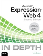
Interactive buttons are a convenient way to add graphical navigation links that provide interactivity and are easily editable as your site changes over time (see Figure 20.1).
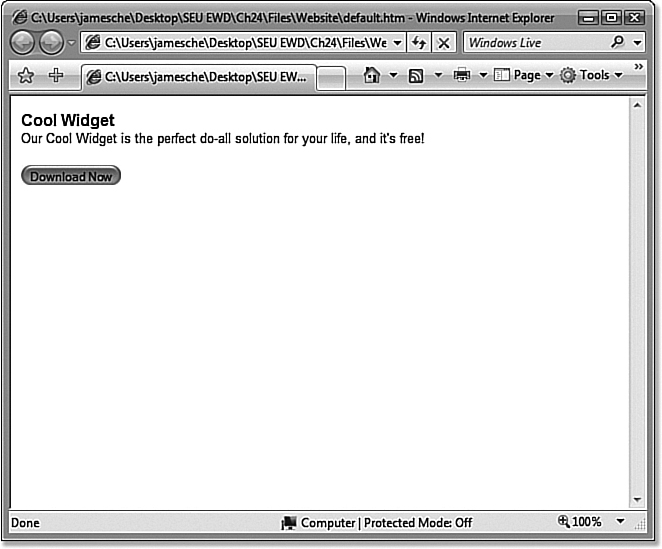
Figure 20.1. Interactive buttons aren’t appropriate for site-wide navigation, but they are a nice solution if you’re looking for attractive navigation buttons.
Interactive buttons use a series of images and some JavaScript to swap out images as you interact with a button by hovering over it or clicking it. Because interactive buttons use standardized Dynamic HTML code, they work on all modern browsers, assuming JavaScript is enabled.
Inserting and Configuring Interactive Buttons
One of the first things you’re likely to notice about interactive buttons is that there are a lot of choices in button style. As shown in Figure 20.2, you have a large list from which to choose, including 31 categories and well over 100 styles.
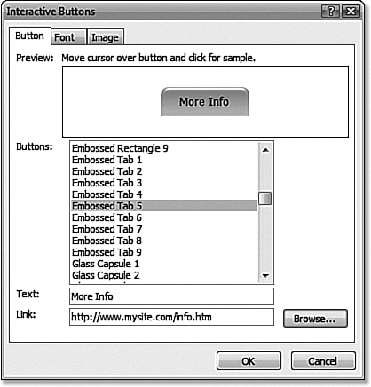
Figure 20.2. Expression Web gives you many styles of interactive buttons from which to choose.
To insert an interactive button, select Insert, Interactive Button. The Interactive Button dialog consists of three tabs: the Button tab, the Font tab, and the Image tab.
 Note
NoteBecause of the many security threats that exist on the Internet, some people disable scripting in the browser in an attempt to add a degree of protection from rogue scripts. Although doing so isn’t advised and provides minimal protection at best, you must still consider such possibilities when designing your site.
Interactive buttons will not swap images if scripting is disabled, but buttons will still appear and the links associated with buttons will still work.
The Button Tab
The Button tab, shown in Figure 20.2, allows you to select a button style and configure basic properties of the button. You can specify the text that appears on the button as well as the URL to which the button should link. If you enter a lot of text for the button, the text can exceed the width of the button. In such cases, you can either change the font size using the Font tab or modify the size of the button itself using the Image tab.
To get a good idea of how your button will appear on the page, Expression Web provides a Preview window. Hover over a button in the Preview window to see the interaction. By clicking a button, you can see how the button will change its appearance when clicked.
 Tip
TipThe text you enter for an interactive button is actually embedded into the images that will make up the button when you save your page. If you want to edit the text, you need to do it using the Interactive Buttons dialog in Expression Web.
The Font Tab
The Font tab, shown in Figure 20.3, provides configuration settings for the font that appears on an interactive button. In addition to the font, you can choose font style (default, italic, bold, or both bold and italic) and font size.
Figure 20.3. The Font tab provides all the tools you need to configure the font for an interactive button.
Font colors can also be configured on the Font tab, as shown in Figure 20.4. You can configure the colors for three button states:
• Original state—The state of the button when the mouse is not hovering on it and it is not being clicked
• Hovered state—The state of the button when the mouse pointer is hovered over it
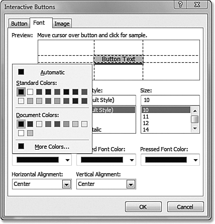
Figure 20.4. The font color can be configured for the different states of an interactive button.
The Preview window shows how a button changes as you interact with it with your mouse. However, any links you have configured will not be active in the Preview window.
• Pressed state—The state of the button when the button is clicked
To configure the alignment of a button’s text, select the desired alignment (left, center, or right) from the alignment drop-downs. You can configure both the horizontal and vertical alignment of the text.
If your page already has a color scheme defined, the Interactive Buttons dialog will pick up your color scheme in the Document Colors section shown in Figure 20.4. This lets you easily keep within your color scheme.
The Image Tab
The Image tab, shown in Figure 20.5, provides settings for controlling the size and format of the images that make up an interactive button.
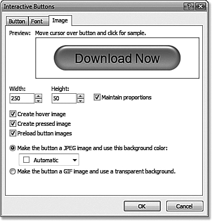
Figure 20.5. The Image tab is where you configure the images that make up an interactive button.
To control the width and height of an image, enter a pixel value in the Width and Height text boxes. Arrow buttons are provided for precise size adjustments. When the Maintain Proportions check box is checked, a change in height will cause a proportionate change in width, and vice versa. Removing the check from the Maintain Proportions check box allows you to make uniquely shaped buttons, as shown in Figure 20.6.
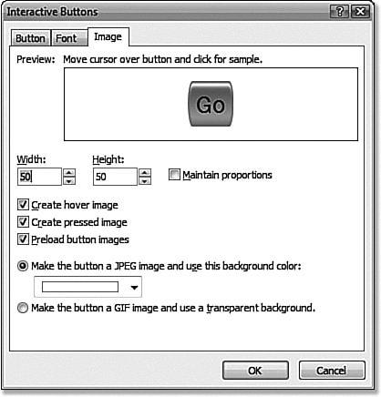
Figure 20.6. The Embossed Capsule button style can be made more unique by specifying an equal height and width.
 Caution
The Preview window on the Font tab provides alignment lines to aid in font formatting. To ensure that your text appears correctly, make sure it doesn’t extend outside the font alignment lines.
By default, Expression Web creates images to be displayed when an interactive button is hovered over and when it is clicked. The Create Hover Image check box allows you to choose whether Expression Web will create the hover image. If the check box is unchecked, the interactive button will not change when it is hovered over. Similarly, the Create Pressed Image check box controls whether an image will be created for the pressed state of an interactive button.
 Interactive Button Images Broken
When the Preload Button Images check box is checked, Expression Web adds a script to the page to preload the images that make up the interactive button. By preloading images, users of your site will not have to wait for the images to load when they hover over or click a button. When images are not preloaded, users will experience a delay before the new image is displayed. Therefore, it is recommended that you leave this check box checked.
The background color on a JPEG image is visible only if you select a button type that does not have right-angled edges.
The Image tab contains options for the types of images Expression Web uses to build your interactive button. You can choose between JPEG and GIF images.
 For information on choosing between different image formats, see Chapter 9, “Using Graphics and Multimedia.”
When the Make the Button a JPEG Image and Use This Background Color radio button is selected, Expression Web saves your images in the JPEG format and uses the background color you specify. Selecting the Make the Button a GIF Image and Use a Transparent Background radio button causes Expression Web to save your images in the GIF format and use a transparent background. However, as shown in Figure 20.7, the GIF option can cause jagged edges on buttons with rounded corners, so use it carefully.
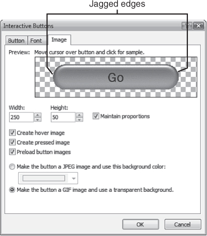
Figure 20.7. The GIF option can create some jagged edges, so be careful when selecting it.
Saving an Interactive Button
Because Expression Web builds interactive buttons using image files, when you save a page on which an interactive button has been inserted, you are prompted to save the images, as shown in Figure 20.8.
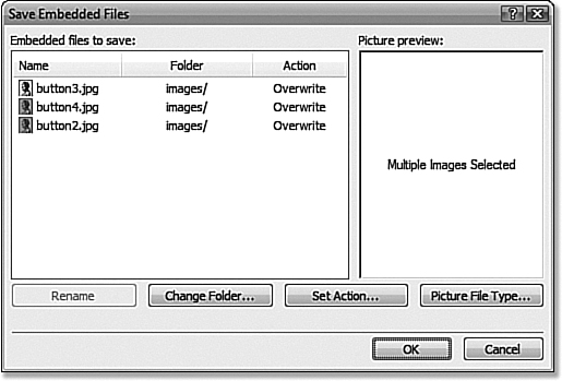
Figure 20.8. Expression Web saves images that make up an interactive button when you save the page.
For more information on the Save Embedded Files dialog, see Chapter 9, “Using Graphics and Multimedia.”
It might seem as though there is a connection between image files and an interactive button, but there isn’t. Therefore, if you remove an interactive button from a page, you want to manually delete the image files from your site so they don’t take up unnecessary disk space.
To move the images created by an interactive button after you’ve added the button, simply drag and drop the image files into the desired folder from within the folder list. Expression Web automatically updates the links so that the interactive button still works correctly.
Editing an Interactive Button
Editing an interactive button is easily accomplished by double-clicking the interactive button in Design View. The Interactive Button dialog is displayed and you can edit all the properties of the button.
When you edit an interactive button, Expression Web always prompts you to resave the images that make up the button even if the change you have made does not affect the images. In fact, if you open the Interactive Button dialog and click OK without making any changes, Expression Web still prompts you to resave the images. In all cases, allowing Expression Web to resave and overwrite the existing images will cause no problems.
You can also edit an interactive button by right-clicking the button and selecting Button Properties from the menu that appears.
If you choose a different image format when editing an interactive button, Expression Web will not delete the images you previously saved in the original format.
Practical Uses for Interactive Buttons
I began this chapter by saying that interactive buttons don’t fit the bill as a site-wide navigation tool. I stand by that statement, but that doesn’t mean there aren’t some practical reasons for using interactive buttons.
Many of the examples in this chapter showed an interactive button being used as a Download Now button. Everyone who uses the Web downloads software from time to time, and there’s nothing more frustrating than searching a page for a link to download a file you need. An interactive button is the perfect choice because it stands out and is easily created.
Another great use of interactive buttons is for the creation of tabbed navigation within a page, as shown in Figure 20.9. This type of interface is easily created using tables and interactive buttons.
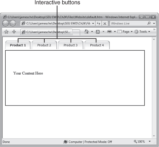
Figure 20.9. Interactive buttons are a great choice for creating tabbed “dialogs” on pages.
For more information on using Tables, see Chapter 5, “Using Tables.”
In short, anytime you need a few buttons on your site, interactive buttons are a great choice. Be creative with interactive buttons, but don’t burden yourself by using them for site-wide navigation. If you do, you’ll find yourself struggling to manage the images that are created and your navigation won’t look as professional as it should. A much better choice for this task is a CSS menu system such as the ones you can create with the Ajatix Pure CSS Menu add-in for Expression Web. You can find Ajatix’s add-in at http://www.ajatix.com/pure-css-menu/expression-web-add-in.html.