21. Using Behaviors
Understanding and Working with Behaviors
Behaviors make it easy for web designers to add interactive and dynamic features to a site. You can insert behaviors that range from simple, such as calling a client-side script, to complex, such as configuring a DHTML menu for your site.
Using the Behaviors Panel
Behaviors are inserted from the Behaviors panel, shown in Figure 21.1. The Behaviors panel is the perfect place for behaviors because it allows you to work with them without the interface getting in the way. That’s important because behaviors cannot be inserted and forgotten. After you insert a behavior, there’s plenty of tweaking you can do, and not having to dismiss a dialog between each change makes working with behaviors more efficient.

Figure 21.1. The Behaviors panel lets you conveniently insert and work with behaviors.
To access the Behaviors panel, select Panels, Behaviors. Click the Insert button and you’ll see a collection of 13 behaviors you can insert into your page. Whether a specific behavior is available for insertion depends on what is selected on the page when you click the Insert button.
In some situations, you might need to insert more than one behavior for a single element. For example, when you are implementing rollover buttons, you need a Swap Image behavior and a Swap Image Restore behavior for the image. Behaviors are processed from top to bottom. When you insert more than one behavior on a single HTML element, depending on the type of behavior, you can change the order of precedence using the up and down arrow buttons in the Behaviors panel. Select a behavior and click the up arrow to move the behavior up in the list and the down arrow to move it down in the list.
How Behaviors Work
Behaviors are implemented using events and actions. An event is a message that is intercepted by the web browser when a certain action takes place. For example, when you click a hyperlink, an onclick event is sent to the browser. An action is what the browser does in response to the event. Behaviors allow you to add interactive scripts to your pages to take advantage of events.
The number and type of events available depend on the element you select before inserting a behavior. When you insert a behavior, Expression Web adds attributes to the closest HTML element to the left of the insertion point. (The Tag label in the Behaviors panel indicates the element to which the behavior will be applied.)
 Note
NoteThe events available in the Behaviors panel are documented on Microsoft’s MSDN site. To access the documentation, browse to http://msdn2.microsoft.com/en-us/library/ms533051.aspx.
Adding Behaviors Within a Paragraph
Behaviors are easily applied to hyperlinks, images, and other page elements because these elements are already associated with an HTML tag to which the behavior can be applied. However, when you want to define a behavior for one or more words within a paragraph, it becomes a bit more complicated. If you simply select the words and apply a behavior, you will find that the behavior is applied to the entire paragraph and not just the selected words.
 Caution
After a behavior has been applied to an element, there is no visual indicator that it has been applied. Because of this, you can easily inadvertently apply a behavior to an HTML element only to find that another behavior has been applied to that element’s parent. In these cases, the parent’s behavior will take precedence.
To apply a behavior to one or more words within a paragraph, you can enclose those elements within a span tag. The easiest way to do this is to select the word or words you want to use, switch to Split View, and enclose those words in a span tag, including a unique ID. For example, to use the words “click here” in a paragraph as the link for a behavior, change the code from this:
<p>For more information, click here.</p>
to this:
<p>For more information, <span id="mylink">click here</span>.</p>
Switch back to Design View. You can now click the span Quick Tag Selector to select the words “click here” before inserting your behavior. Your behavior will then be applied to those words. Without using this method, the behavior would affect the entire paragraph.
 For more information on the Quick Tag Selector, see Chapter 8, “Using the Quick Tag Tools.”
 Tip
TipBehaviors are implemented in Expression Web using a combination of a JavaScript source file and an HTML file. If you have the coding knowledge necessary, you can edit these files to enhance a behavior to suit your specific needs. These files are located by default in the Microsoft ExpressionWeb 4enBehaviorsACTIONS folder inside the Program Files folder.
Expression Web Behaviors
Expression Web’s behaviors offer a way to add interactivity and dynamic elements to your pages without having to know programming. Behaviors should work in all common browsers without problems because Microsoft uses standard DHTML and scripting techniques to ensure maximum compatibility.
Keep in mind that there is no way for Microsoft to test compatibility for every possible configuration, so be sure you test your pages before publishing your site.
The Call Script Behavior
The Call Script behavior runs a line of script when the event you specify is raised. You will likely want to write some script first and then call it using this behavior, but you don’t have to take that approach. If you have only one line of script to run, you can enter that line in the Call Script dialog and Expression Web will run it when the designated event occurs.
Suppose you’ve written a script called showInfo that you want to run when an image is clicked on your page. To do this with the Call Script behavior, perform these steps:
1. Select the image.
2. If the Behaviors panel is not visible, select Panels, Behaviors.
3. Click the Insert button and select Call Script.
4. Type showInfo(); in the Call Script dialog, as shown in Figure 21.2.
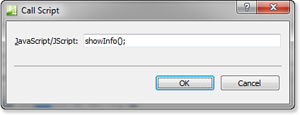
Figure 21.2. The Call Script behavior enables you to easily call a script when a specified event is triggered.
5. Click OK.
The event defaults to onclick, but you can choose another event if necessary by selecting the event from the drop-down in the Behaviors panel.
For more information on creating and using scripts in your pages, see Chapter 22, “Client Scripting.”
The Change Property Behavior
The Change Property behavior, shown in Figure 21.3, enables you to change any property on any HTML element on your page. (A property is a style applied to a particular page element.) The Change Property dialog allows you to configure some default properties such as font styles, borders, visibility, and so on, but you can also change other properties that aren’t listed by clicking the Add button in the Change Property dialog.
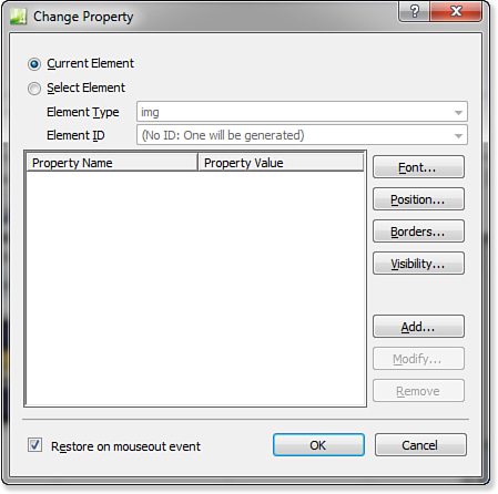
Figure 21.3. The Change Property behavior is useful for adding interactivity to your page.
For more information on using styles, see Chapter 18, “Managing CSS Styles.”
Using the Change Property behavior, it is easy to add professional-quality interactivity to your site with minimal effort. For example, suppose you have a series of graphics in a page, and each graphic links to a page of your site. When a user of your site hovers the mouse over each graphic, you want a text description of the link to appear on the page, and when the mouse leaves the graphic, you want the text description to disappear. The Change Property behavior allows you to easily implement this functionality without writing a single line of code.
To create an example of interactivity using the Change Property behavior, perform these steps:
1. Insert a table 400 pixels wide that contains three columns and three rows.
For more information on inserting and configuring tables, see Chapter 5, “Using Tables.”
2. Add some graphics of your choice to each corner cell in the table. Feel free to use clip art if you have no graphics handy.
3. Resize the center cell so it is 150 pixels wide and 200 pixels high. (See Figure 21.4 for an example of what the table should look like at this point.)
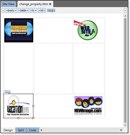
Figure 21.4. The table has four graphics and space in the middle for layers that will contain text.
4. Insert a layer. Position and size it so it fits within the center cell. Name the layer layer1.
For more information on using layers, see Chapter 23, “Using Layers.”
Be careful not to nest the layers underneath each other. If a new layer appears nested under an existing layer, drag it inside the Layers panel so it is at the same level as the other layers.
5. Insert three more layers and position them directly on top of layer1. The easiest way to accomplish this is to copy layer1 and then paste the other layers. Name the other layers layer2, layer3, and layer4, respectively.
6. Select layer1 from the Layers panel and enter some text of your choice.
7. Change the visibility of layer1 to hidden by clicking the eye icon so the eye is closed.
8. Select layer2 and enter some text of your choice.
9. Change the visibility of layer2 to hidden.
The Visibility property defaults to Inherit, which means the element will be visible only if the element in which it is contained is visible.
10. Repeat steps 8 and 9 for the other two layers. (See Figure 21.5 for the completed Layers panel.)

Figure 21.5. The four layers for the rollover text are all invisible, which is signified by the closed eye icon.
11. Select the upper-left image. From the Behaviors panel, select Insert, Change Property.
12. In the Change Property dialog, click the Select Element radio button.
13. Choose div from the Element Type drop-down, and then select layer1 from the Element ID drop-down.
14. Click the Visibility button and click the Visible radio button. Click OK.
15. Check the Restore on Mouseout Event check box.
16. Click OK.
17. In the Behaviors panel, change the onclick event to onmouseover.
Complete steps 11–17 for the other images and add a Change Property behavior for layer2, layer3, and layer4, just as we did for layer1. Save the page and preview it in your browser. You have just created a professional-quality effect with a few clicks of the mouse. Figure 21.6 shows the completed Change Property dialog box for one of the layers.
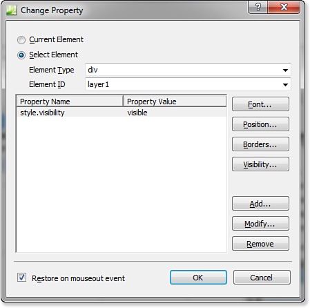
Figure 21.6. The completed Change Property dialog box shows the property change for layer1.
The Change Property Restore Behavior
The Change Property Restore behavior is meant to be used in combination with the Change Property behavior. It restores the most recent properties changed by the Change Property behavior to their previous values. (When you selected the Restore on Mouseout Event check box in step 17 of the previous section, “The Change Property Behavior,” Expression Web automatically inserted a Change Property Restore behavior to restore the property.)
No dialog exists for this behavior. As seen in Figure 21.7, when you insert the Change Property Restore behavior, Expression Web tells you what it will do and then adds it to the Behaviors panel. You can easily determine which properties are being restored by double-clicking the Change Property behavior listed directly under the newly inserted Change Property Restore behavior.

Figure 21.7. The Change Property Restore behavior requires no user input.
The Go To URL Behavior
The Go To URL behavior, shown in Figure 21.8, simply redirects users to a specified URL when the event you choose occurs.

Figure 21.8. The Go To URL behavior does just what its name implies.
The Jump Menu Behavior
The Jump Menu behavior allows you to easily add a drop-down box to a page. When an item is selected in the drop-down, the user’s browser goes to the URL specified for that item.
To create a jump menu, select Insert, Jump Menu from the Behaviors panel to activate the Jump Menu dialog (see Figure 21.9). You don’t need to select anything first. Expression Web inserts a drop-down list for the jump menu at the insertion point’s location.
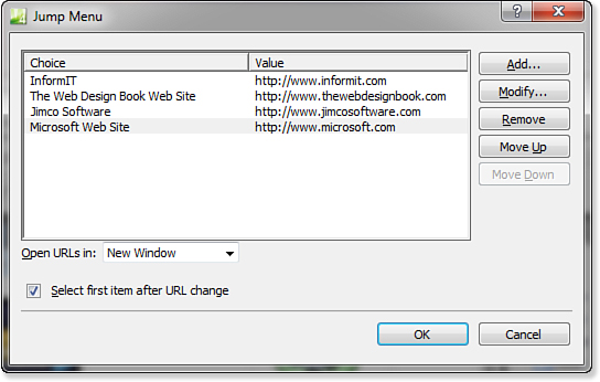
Figure 21.9. Items are added to a jump menu by specifying the text to appear and the URL to which the item should link.
Click the Add button. Enter the text that you want to appear in the drop-down list in the Choice field and the URL to which you want that item to link in the Value field. Click OK to add the item to the jump menu.
After you have added one or more items to your jump menu (more than one item is recommended), you can configure that item to open in either the default target for the page or in a new window.
By checking the Select First Item After URL Change box, you can force the jump menu to return to the first item in the list when clicking the Back button in your browser after jumping to a URL.
The Jump Menu Go Behavior
The Jump Menu Go behavior is designed to be used with the Jump Menu behavior. When you don’t want your Jump Menu behavior to jump as soon as a new item is selected in the drop-down list, you can use the Jump Menu Go behavior as a trigger for the menu.
To use the Jump Menu Go behavior, insert a Jump Menu behavior and then insert or select an element (such as an image that says “Go!”) to use for your trigger. Select Insert, Jump Menu Go from the Behaviors panel and select the jump menu from the drop-down, as shown in Figure 21.10.

Figure 21.10. Using the Jump Menu Go behavior enables you to create a trigger for your jump menu.
After you’ve done that, you must stop the jump menu from jumping as soon as you select an item. The Jump Menu event defaults to onchange, but if you leave the event set to onchange, you won’t have the opportunity to use the Jump Menu Go component because the menu will jump as soon as you select an item. To change the jump menu so it doesn’t jump when you select a different item, select the jump menu’s drop-down list, and then select the Jump Menu behavior in the Behaviors panel. Click the Delete button in the panel to delete the onchange event from the panel. (Don’t press the Delete key on your keyboard.) This removes the entire entry for the jump menu, but don’t worry. After doing this, your Jump Menu Go behavior will be the trigger for the jump menu.
The Open Browser Window Behavior
The Open Browser Window behavior, shown in Figure 21.11, allows you to configure a hyperlink to open in a new browser window.
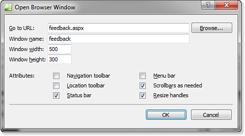
Figure 21.11. Easily create pop-up windows with specific configurations using the Open Browser Window behavior.
You can control the following attributes for the new window:
• Window Name—A unique name for the new browser window so you can refer to it with other behaviors or your own scripts
• Window Width—The width of the new window in pixels
• Window Height—The height of the new window in pixels
• Navigation Toolbar—The toolbar that contains the Forward button, Back button, Home button, and so on
• Location Toolbar—The toolbar that contains the address bar
• Status Bar—The bar at the bottom of the new window
• Menu Bar—The menu bar at the top of the new window
• Scrollbars as Needed—Turns on scrollbars if the content of the new window is larger than the window itself
• Resize Handles—Allows for resizing of the new window by dragging the edges
Internet Explorer 6.0 and later versions do not allow for new windows to be opened without a status bar by default. Therefore, even if you leave the status bar check box unchecked, most users will still see a status bar displayed.
When adding the Open Browser Window behavior to text, it’s most useful to use the Change Property and Change Property Restore behaviors to change the pointer to a hand when users hover over your link.
To implement this, add your Open Browser Window behavior first. Then add a Change Property behavior and add your own property by clicking the Add button. Use style.cursor for the Property Name and hand for the Property Value. Make sure you also check the Restore on Mouseout Event box so that Expression Web will add the Change Property Restore behavior.
 Open Browser Window Pops Up Behind Existing Window
The Play Sound Behavior
The Play Sound behavior, shown in Figure 21.12, enables you to play a sound when the selected event is triggered. The Play Sound behavior supports WAV files, MIDI files, RealAudio files, AIFF sound files, AU sound files, MPEG files (such as MP3), Windows Media files, and AAC files.
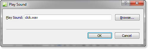
Figure 21.12. The Play Sound behavior enables you to play a sound when a particular event is triggered.
The Popup Message Behavior
The Popup Message behavior, shown in Figure 21.13, provides a dialog in which you can enter a message that should be displayed in an alert dialog in the browser. When the selected event is triggered, the text you enter appears in an alert dialog with an OK button.
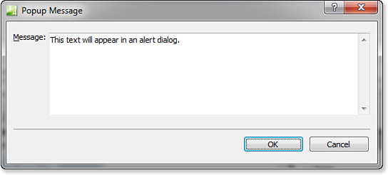
Figure 21.13. The Popup Message behavior makes creating JavaScript pop-up messages simple.
The Preload Images Behavior
The Preload Images behavior, shown in Figure 21.14, allows you to preload images when a page initially loads. The most common use of preloading images is when swapping images on mouse rollover buttons. In these situations, you want the image that displays when the user points to the button to load as soon as the page loads, even though it is not initially visible. If you don’t preload such images, the user will experience a delay while the image loads the first time he or she points to the button.
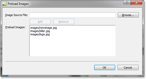
Figure 21.14. The Preload Images behavior makes preloading images a snap.
If you choose an event that doesn’t require user interaction, your popup will likely be blocked by popup blockers.
To preload one or more images, insert the Preload Images behavior, click the Browse button, browse to your image, and then click OK. After you have selected your image, click the Add button to add it to the Preload Images list. You can add as many images as you want to the list.
Be aware that preloading images doesn’t make them free as far as bandwidth is concerned. You will still want to keep your image files as small as possible.
The Set Text Behavior
The Set Text behavior consists of four separate behaviors: Set Text of Frame, Set Text of Layer, Set Text of Status Bar, and Set Text of Text Field.
Set Text of Frame
The Set Text of Frame behavior sets the HTML of the frame you specify when the selected event is triggered. Suppose, for example, you have a frames page that consists of miscellaneous content on the left, main content on the right, and a small navigation frame on top of the main content frame. Using the Set Text of Frame behavior, you can easily implement a bread crumb effect in the navigation frame, as shown in Figure 21.15.
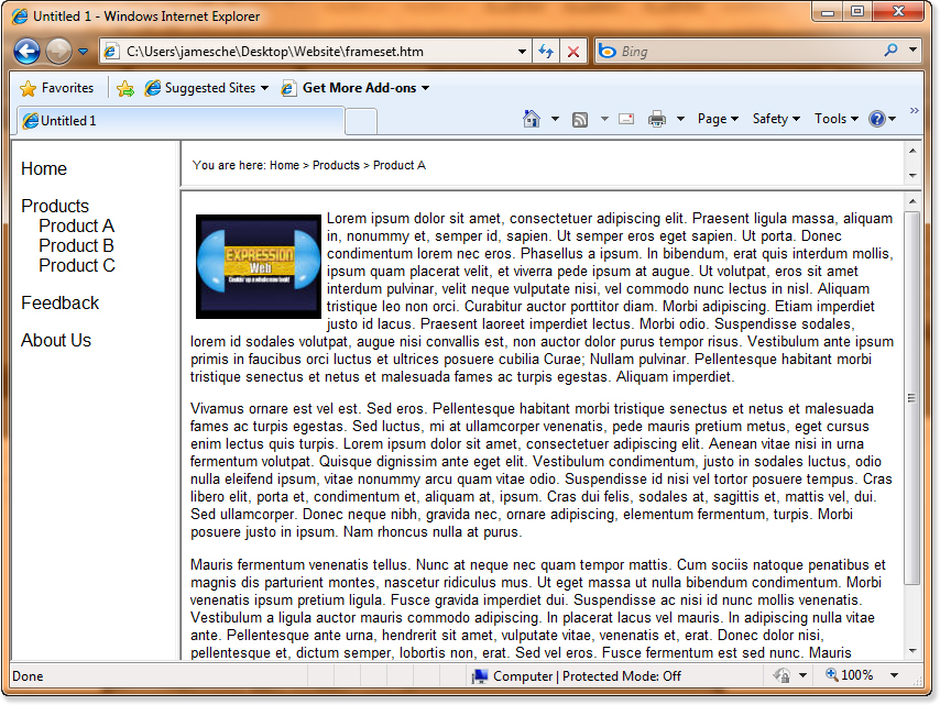
Figure 21.15. A bread crumb effect is simple to implement with the Set Text of Frame behavior.
To insert the Set Text of Frame behavior, open a page containing a frame and select the HTML element containing the event with which you want to trigger the behavior. Select Insert, Set Text, Set Text of Frame from the Behaviors panel. Select the frame into which you want to enter HTML, enter the HTML code that you want to appear in the frame, and click OK.
If you set the background color for the frame page or inline frame and want it to be preserved, be sure you check the Preserve Background Color box before clicking OK, as shown in Figure 21.16. Otherwise, the background color reverts to the default for the browser you are using.
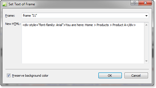
Figure 21.16. The Set Text of Frame behavior enables you to maintain the current background color after setting a frame’s HTML.
When hovering over a hyperlink, most browsers display the URL for the hyperlink. For security reasons, you probably won’t be able to use the Set Text of Status Bar behavior to show text in the status bar when hovering over a hyperlink.
Set Text of Layer
The Set Text of Layer behavior enables you to specify the HTML to be rendered in the specified layer when the selected event is triggered. The bread crumb effect shown previously in Figure 21.15 can be implemented using the Set Text of Layer behavior by using a layer to hold your bread crumb navigation information instead of a frame.
For more information on using layers in Expression Web, see Chapter 23, “Using Layers.”
To insert a Set Text of Layer behavior, shown in Figure 21.17, open a page containing a layer and select the HTML element containing the event with which you want to trigger the behavior. Select Insert, Set Text, Set Text of Layer, enter the HTML you want to have rendered in the layer, and click OK.
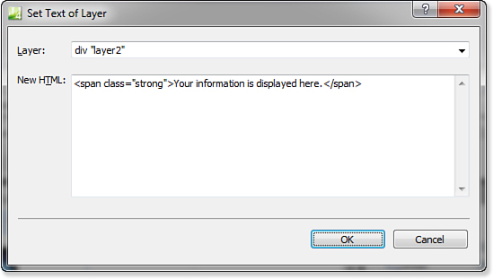
Figure 21.17. The Set Text of Layer behavior enables you to easily set the HTML to be used to render the content of a layer.
Set Text of Status Bar
The Set Text of Status Bar behavior allows you to easily change the text that appears in the Status Bar at the bottom of the browser window. This can be useful to display messages of interest to visitors of your site. For example, you can use this behavior to display a descriptive message when a user hovers over hyperlinks on your page.
To insert the Set Text of Status Bar behavior, select the HTML containing the event with which you want to trigger the behavior and then select Insert, Set Text, Set Text of Status Bar. Enter the message you want displayed in the Status Bar and then click OK, as shown in Figure 21.18.

Figure 21.18. The Set Text of Status Bar behavior lets you easily change the text displayed in the Status Bar—just enter your text and click OK.
Set Text of Text Field
The Set Text of Text Field behavior, shown in Figure 21.19, sets the text that appears in a text box or text area field. This behavior can be used when you need to set the value for a form field based on a particular event.
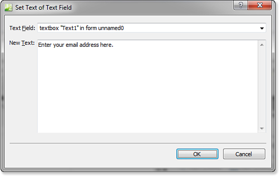
Figure 21.19. The Set Text of Text Field behavior sets the text of text boxes and text areas.
To insert the Set Text of Text Field behavior, open a page that contains a text box or text area field and select Insert, Set Text, Set Text of Text Field. Enter the text you want to appear in the text field and click OK.
The Swap Image Behavior
The Swap Image behavior allows you to swap one image for another when a specified event occurs. The most common use of this behavior is to create rollover buttons. In fact, when you insert an interactive button, Expression Web uses the Swap Image behavior to implement the interactivity of the button.
For more information on interactive buttons, see Chapter 20, “Using Interactive Buttons.”
To use the Swap Image behavior, open a page containing one or more images, select the image you want to swap, and select Insert, Swap Image from the Behaviors panel. The Swap Images dialog contains a list of all images in the document (see Figure 21.20). The image you selected is highlighted, but you can configure a swap image for as many images as you want before clicking OK. Just keep in mind that you are configuring one event, so if you configure a swap image for img1, img2, and img3 and attach it to the onmouseover event for img1, all three images will swap when you roll over img1.
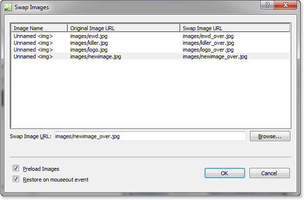
Figure 21.20. The Swap Image behavior makes rollover button creation simple.
It is best to use two images of the same size for your rollovers. The Swap Image behavior uses the image dimensions of the original image for the swap image. If the proportions are different or if Expression Web is forced to resize an image, you are going to get less than optimal results.
The Swap Images dialog also provides a check box labeled Preload Images. Checking this box automatically inserts a Preload Images behavior to preload all the swap images you configured. Restore on Mouseout Event automatically inserts a Swap Image Restore behavior, which we will talk about next.
The Swap Image Restore Behavior
The Swap Image Restore behavior works much like the Change Property Restore behavior. It restores the images that were swapped in the entry immediately below it in the Behaviors panel. It is used only after applying the Swap Image behavior.
This behavior is automatically inserted if the Restore on Mouseout Event box is checked when configuring a swap image in the Swap Images dialog.
When to Use Behaviors
Generic scripts such as those produced by Expression Web behaviors are convenient and allow you to quickly add scripting capability to your pages. However, such convenience comes at a cost. Because the scripts used to implement behaviors have to work in all scenarios and with all pages, they are significantly more bloated than targeted, custom created scripts. Larger scripts mean larger pages, and hence, longer download times.
You are also locked into a specific implementation when using behaviors. In other words, by using prebuilt scripts, you lose a significant amount of flexibility and functionality. You can certainly modify the scripts used by behaviors, but you’re much better off simply writing your own or paying a JavaScript developer to write some for you.
Another alternative is to search the Internet for script samples, but be sure to test such samples in all browsers.
Because of these concerns, behaviors are best used for small tasks and not for things like a menu system. That said, small tasks such as those appropriate for behaviors, are also often easily solved with your own scripts, which can make the use of behaviors unnecessary. In the end, the decision is yours and should be based on how much time you want to allocate to filling a particular need.