Chapter 18. LightSwitch Extensibility: Themes, Shells, Controls, and Screens
Visual Studio LightSwitch offers all you need to build high-quality business applications. You can connect to new or existing data sources, you have ready-to-use screen templates with built-in validation, you have queries, and so on. Sometimes, however, you must add functionalities that are not available out of the box, to solve specific business requirements.
For example, a manager might need to display a chart for analyzing product shipment workflow, or a customer wants to use a different presentation interface tailored to their needs (replacing the default shell). Microsoft is aware of this, and the Visual Studio LightSwitch team built the development environment on an extensible architecture, based on (but not limited to) frameworks such as the Managed Extensibility Framework (MEF) and architectural patterns like the Model-View-View Model (MVVM).
So, the LightSwitch environment and generated applications can be extended in six different extensibility points. This chapter explains how to create LightSwitch extensions related to user interface extensibility points and is intended for professional developers with Silverlight or Windows Presentation Foundation (WPF) skills and experience and who want to optimize their LightSwitch productivity.
Then, in the next chapter, you complete your journey through LightSwitch extensibility, as you discover other data and data-access extensions.
To create extensions for Visual Studio LightSwitch, you need the following software:
• Visual Studio 2010 Professional or higher, with Service Pack 1.
• The Visual Studio 2010 SDK Service Pack 1.
• The Extensibility Toolkit, an extension developed by the LightSwitch team that makes it easier to create extensions based on project templates for Visual Studio 2010. You can download the Extensibility Toolkit from the IDE via the Extension Manager tool or from the extensibility page of the LightSwitch Developer Center (http://msdn.microsoft.com/en-us/lightswitch/hh304488).
All the topics discussed in this chapter require these configurations, so ensure you have successfully installed all the requirements.
Skills Required in this Chapter
This chapter explains how to create extensions for Visual Studio LightSwitch with Visual Studio 2010 and is intended for professional developers. You need to be familiar with a lot of concepts related to some .NET technologies. For example, you need to know what the Extensible Application Markup Language (XAML) is and how data binding works in Silverlight. A basic knowledge of the MVVM pattern will help you understand concepts related to custom shells. With regard to Silverlight, you will create custom data sources with WCF RIA Services, so knowing how these works will make things easier for you; the section on creating custom data sources explains how to wrap stored procedures from SQL Server databases, which involves at least a basic knowledge of the ADO.NET Entity Framework. It is worth mentioning that extensions that you create with this configuration can be installed and used by LightSwitch developers in their projects without needing Visual Studio 2010 Professional. Installing and using extensions was explained back in Chapter 7, “Customizing Applications with Buttons, COM Automation, and Extensions.”
Understanding the Extensibility Model
The extensibility model in LightSwitch relies on the Managed Extensibility Framework (MEF), a set of .NET libraries that simplifies building extensible applications with composition techniques according to a plug-in model. MEF is an open source project available on the CodePlex website that you can use to build your own extensible applications. You can check out MEF at http://mef.codeplex.com.
With regard to UI-related extensions, the LightSwitch architecture offers view models that can be bound to controls. To distribute extensions, starting with Visual Studio 2010, Microsoft introduced a new VSIX file format, which is based on the Open XML packaging conventions and which makes it easier to share extensions with other developers. This file format is so important in Visual Studio LightSwitch because extensions for LightSwitch are packaged and deployed via VSIX installers. You now learn what kinds of extensions are available in LightSwitch and, therefore, what kinds of extensions you will find across the Internet.
Creating Themes
The first kind of extension discussed in this chapter is the theme. With themes, you can provide different styles, colors, fonts, and font size to common UI elements. A theme differs from a custom shell in that a theme just overrides the default style, color, and font definitions for the currently selected shell, whereas a custom shell allows redrawing the UI completely. Technically speaking, a theme is a Silverlight resource dictionary, entirely written in XAML code. Each item in the resource dictionary is identified via an x:Key attribute, which lets LightSwitch understand how and where to apply the given resource (for example, a font definition or a color brush). Creating themes with the Extensibility Toolkit is an easy task, although it requires a little bit of familiarity with styles in Silverlight or WPF.
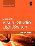
The LightSwitch team released the Metro theme for LightSwitch, which restyles the user interface of LightSwitch applications with a modern, custom theme that recalls the Windows Phone 7 operating system and the Microsoft Zune client. You are strongly encouraged to download the theme, either from the Extension Manager or from the Visual Studio Gallery (http://bit.ly/pRCHdz). By downloading, installing, and using this extension, you will gain a fuller understanding about what you can do with themes (other than just creating a contemporary UI style). Figure 18.1 shows what the Invoice Management application example looks like after the Metro theme was applied.
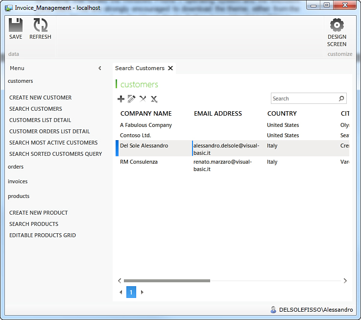
Figure 18.1. The Metro theme gives your applications a modern look.
Do not forget to browse the Visual Studio Gallery to check out other available themes from the developer community.
Before creating a theme, you now learn about creating an extension and other general concepts that you will use with all the available extension types. In fact, some concepts related to the Visual Studio project templates for LightSwitch extensibility are common to each extension, so it is important for you to read this section carefully.
Creating a New Extensibility Project
As a general rule, to create an extensibility project for LightSwitch, you follow these steps:
1. Select File, New, Project.
2. When the New Project dialog appears, select the LightSwitch templates folder and then the LightSwitch Extension Library template for the programming language of your choice (see Figure 18.2).
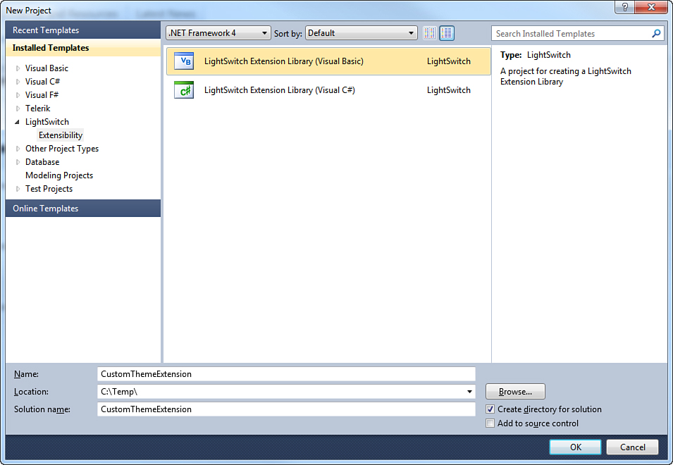
Figure 18.2. Creating a new extensibility project.
3. Name the new project, and then click OK. In the current example, the project is called CustomThemeExtension.
At this point, Visual Studio generates a new solution containing seven projects, as you can see by opening Solution Explorer (see Figure 18.3).
Figure 18.3. The new solution consists of seven projects.
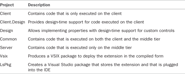
Table 18.1 describes each project in the solution.
Table 18.1. Projects for Extensibility Solutions
In basic terms, an extensibility project offers a common infrastructure for all the available extensibility points in LightSwitch so that you can add multiple extensions into one project (although in this book, new projects are created for each extension so that you can test the code separately and focus more easily on the specific extensibility point). You have to specify later the type of extension you want to create. You do not usually interact with all the available projects, but only with those specific to the kind of extension that you are working on.
Setting Extension Properties
Any extension for Visual Studio 2010, including LightSwitch, is deployed through a VSIX package. This kind of package contains information useful to identify the extension type and the author in both the Visual Studio Gallery and the Extension Manager tool. Visual Studio offers a convenient designer to set up this information quickly.
You might argue that setting deployment information later in this chapter would make sense. However, whenever you test your extensions in the development process, Visual Studio LightSwitch shows in the Extensions tab of the Application Designer the current information from the extension. Therefore, the availability of meaningful identifiers and author information enhances the testing experience (including the fact that you can see how information will appear to the end user). You will understand more fully the importance of this note when testing the extension example.
To open this designer, double-click the source.extension.vsixmanifest file in Solution Explorer under the VSIX project. This file contains the deployment manifest that is later compiled into the extension library. When you perform this action, Visual Studio shows a special designer where you can set product information, as shown in Figure 18.4.
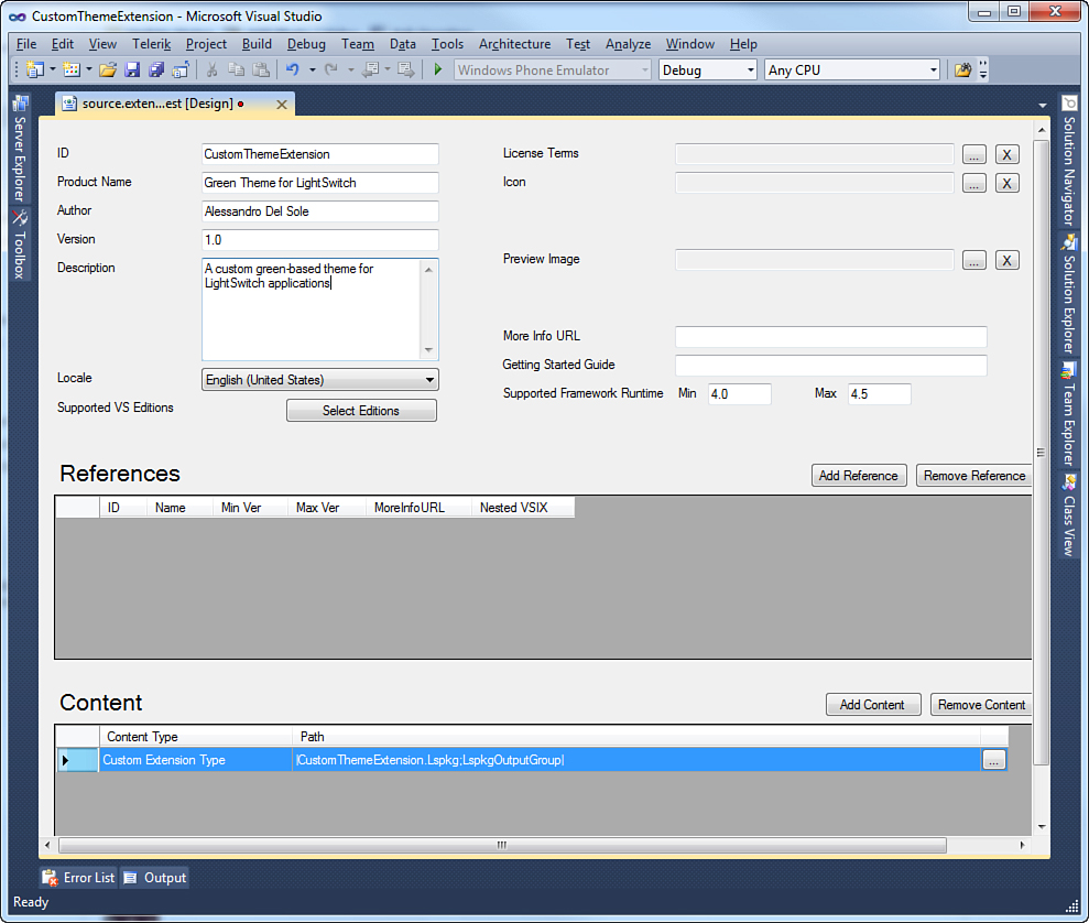
Figure 18.4. The VSIX manifest designer.
If you have previously developed extensions for Visual Studio 2010, the designer is not new to you. Most of the manifest properties are self-explanatory, and the mandatory information is automatically supplied with autogenerated values. Some clarification is important, however, for the following:
• Version: This property is particularly important for extension updates. By incrementing the version number, the Extension Manager tool can inform the end user about updates.
• Supported VS Editions: This allows specifying what editions of Visual Studio can receive the extension. Remember to leave unchanged the default selection on Visual Studio 2010 only. Other editions, such as Visual Studio 2010 Express, cannot receive LightSwitch extensions.
• Icon and Preview Image: These help to identify the extension visually. In particular, Icon helps identify the extension within the IDE, and Preview Image enables you to supply an image that is shown in the Extension Manager.
Also notice how you can specify a license agreement. This is particularly important if building extensions is your business, as discussed in more detail at the end of this chapter. You can disregard both the References and Content boxes. In the first box, you can specify a reference to another extension, but this is not relevant for LightSwitch extensions. In the second box, you can package another extension into one VSIX package (a scenario not covered in this book). Now it is time to create the new theme.
Adding a Theme to the Extensibility Project
Suppose you want to create a new theme based on a palette of green tones. Your first steps is to add a theme to the Lspkg project. (This is common to all the extensibility points.) Right-click this project in Solution Explorer, and then select Add, New Item. In the Add New Item dialog, select the Theme template. Call the new item GreenTheme.xaml, and then click Add (see Figure 18.5).
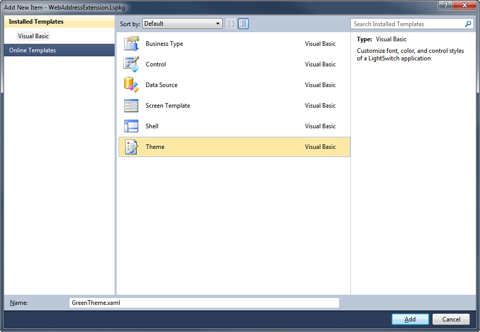
Figure 18.5. Adding a new theme to the extensibility project.
When you click Add, Visual Studio generates definition and metadata files for the extension in the Common project. In particular, the definition file has a .lsml extension and takes the name from the extension name (in this case, GreenTheme.lsml) and is located in the MetadataThemes subfolder. Double-click this file in Solution Explorer so that it opens in the XML editor. The only edit that you might want to do at this point is to replace the value for the Description attribute. Replace it with Custom Green Theme. Listing 18.1 shows the full code for the definition file.
Listing 18.1. The Definition File for the Custom Theme
<?xml version="1.0" encoding="utf-8" ?>
<ModelFragment
xmlns="http://schemas.microsoft.com/LightSwitch/2010/xaml/model"
xmlns:x="http://schemas.microsoft.com/winfx/2006/xaml">
<Theme Name="GreenTheme">
<Theme.Attributes>
<DisplayName Value="GreenTheme"/>
<Description Value="Custom Green Theme"/>
</Theme.Attributes>
</Theme>
</ModelFragment>
You now need to edit the theme’s code file, which is called GreenTheme.xaml and is available in the Presentation project. This file is a Silverlight resource dictionary and contains the definition of the default LightSwitch theme, which includes styles for the common parts of the UI. Visual Studio also generates a code-behind file, but you are not required to (nor should you) edit the code, because it is for LightSwitch use only. So, double-click GreenTheme.xaml in Solution Explorer to open it in the XAML code editor. Notice that it is quite a long code file and full of style definitions. Fortunately, it is divided by area, and clear comments within the code help you understand which styles will be affected by every group of code lines. For example, consider the following lines:
<!-- Font Style: ToolTip -->
<!-- Style used for tooltips -->
<FontFamily x:Key="ToolTipFontFamily">Segoe UI, Arial</FontFamily>
<sys:Double x:Key="ToolTipFontSize">11</sys:Double>
<FontWeight x:Key="ToolTipFontWeight">Normal</FontWeight>
<FontStyle x:Key="ToolTipFontStyle">Normal</FontStyle>
<SolidColorBrush x:Key="ToolTipFontBrush" Color="#FF404040"/>
<SolidColorBrush x:Key="ToolTipFontBackgroundBrush" Color="White"/>
The comments explain that the group of lines relates to tooltips styling. The code establishes how the font is formatted (FontFamily, FontWeight, the size via a Double type) and the color for the foreground and background of the tooltip (the SolidColorBrush objects). So, if you want to provide a different style for the font within tooltips, you just change property values, such as the font name, the size, or the color for brushes. As for solid-color brushes, when you are changing the color, IntelliSense helps you choose a new color, as shown in Figure 18.6.
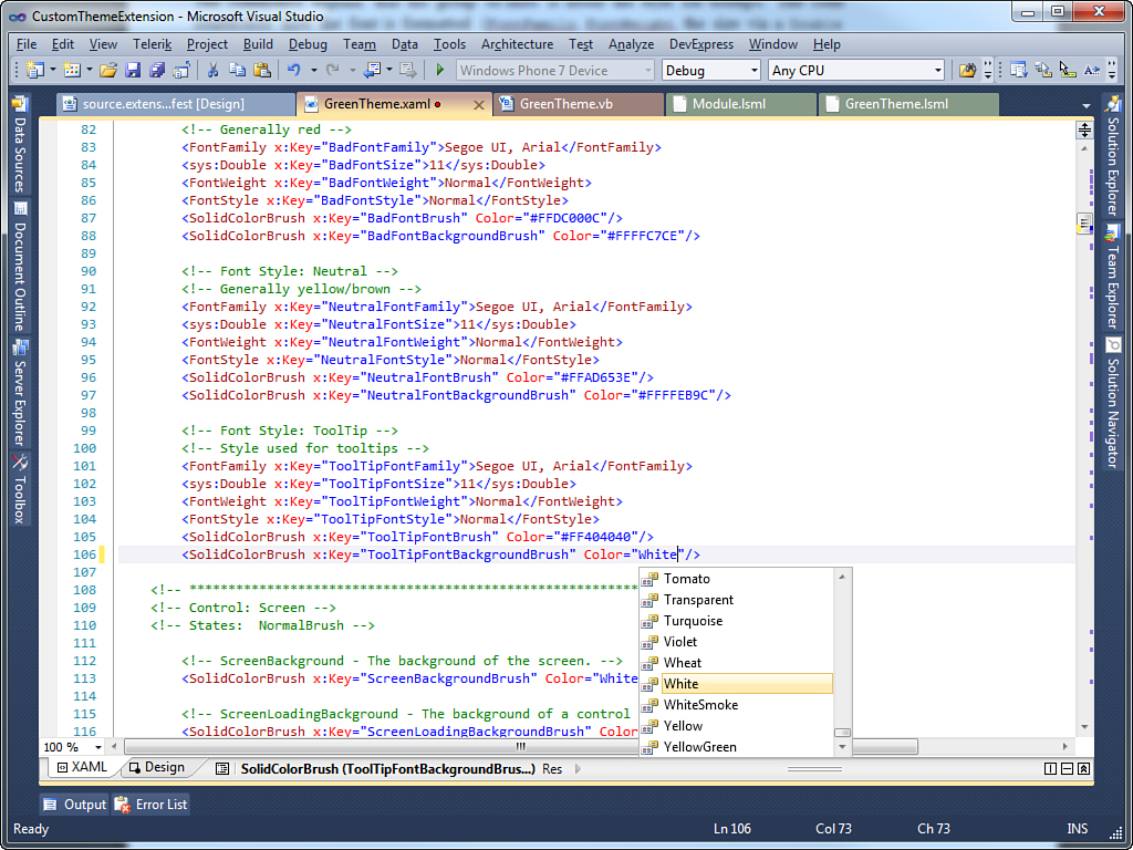
Figure 18.6. IntelliSense makes it easy to choose solid colors.
The following code relates to screens, and the names of properties are self-explanatory:
<!-- Control: Screen -->
<!-- States: NormalBrush -->
<!-- ScreenBackground - The background of the screen. -->
<SolidColorBrush x:Key="ScreenBackgroundBrush" Color="White"/>
<!-- ScreenLoadingBackground-The background of a control that is loading -->
<SolidColorBrush x:Key="ScreenLoadingBackgroundBrush" Color="#FFF7F7F7"/>
<!-- ScreenControlBorder -The border of a control that is not based on another control already defined -->
<SolidColorBrush x:Key="ScreenControlBorderBrush" Color="#FFA5ACB5"/>
In this group of lines, you can see how different brushes are applied to the screen’s background according to its state, such as the normal state or the loading state. Also, the code applies a color to the border for the screen perimeter.
As you walk through the code, you will notice that in most cases, the default theme uses SolidColorBrush objects to style elements with a single color. This is Silverlight, so here you can use more-complex brushes, such as LinearGradientBrush or RadialGradientBrush, as well. Just remember that in most cases, users prefer simple-to-understand graphic interfaces over incredible-looking ones.
Your goal is to walk through the code and replace color values and font definitions with custom ones. Before restyling the theme with custom values, it is a good idea to explain how to speed up editing the theme by using the design tools in Visual Studio 2010 and a specialized application for designers: Microsoft Expression Blend 4. You can apply what you learn in the following sections when you design custom shells, too.
Editing Themes with Visual Studio 2010
The Silverlight and WPF designers have been dramatically enhanced in Visual Studio 2010 and offer the best integrated support ever for design-time operations, such as assigning colors to brush objects. This kind of support is available for resource dictionaries, as well. For instance, selecting a different solid color or a gradient color is easy in Visual Studio 2010. Select any SolidColorBrush object in the XAML code, and then open the Properties window. If you click the value for the Color property, a special color picker appears from which you can select the solid color via a palette or a drop-down list, as shown in Figure 18.7.
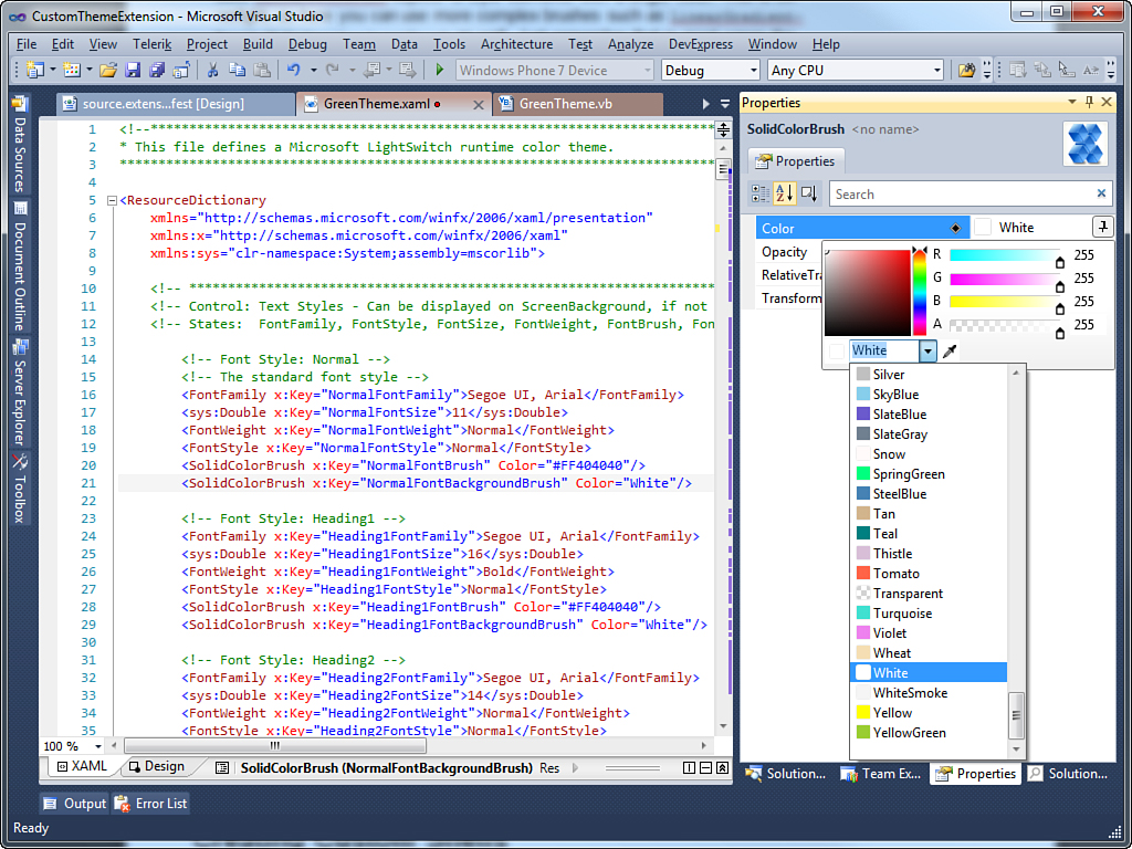
Figure 18.7. Selecting solid colors with design-time tools.
You can also click the Color Eyedropper button, near the Color drop-down list, to pick up a color anywhere on your desktop. Background styles for buttons use LinearGradientBrush objects, instead of solid colors. For these kinds of objects, you need to select the GradientStops property in the Properties window. Each GradientStop is made of a solid color, which you can edit through the Collection Editor dialog, as shown in Figure 18.8.
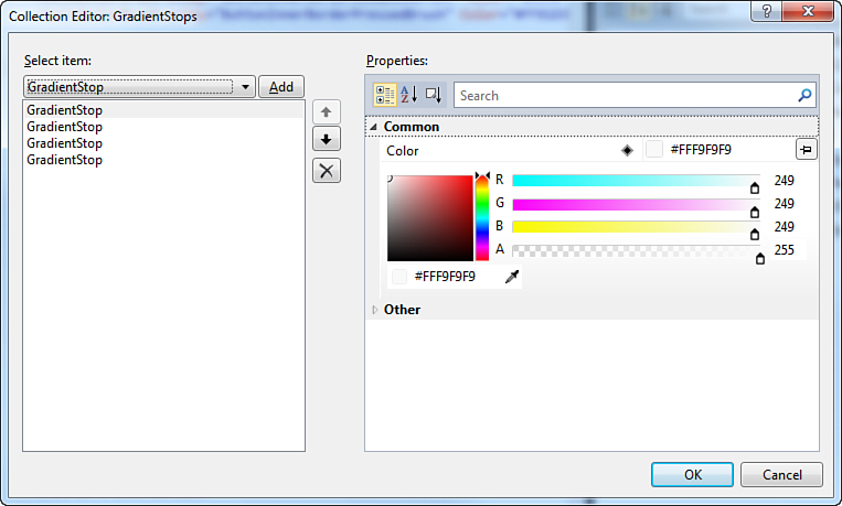
Figure 18.8. Editing GradientStops.
Although the integrated tools do a great job, Visual Studio is an environment for developers, so some limitations apply to resource dictionaries, such as styling fonts. When you are working with resource dictionaries, you cannot edit font properties visually in the Properties window; you can only do so manually in the code editor or by using tools such as Find and Replace. In most cases, this will not be a problem. If you have professional design skills, however, there is a better way to do this: with Expression Blend 4 from Microsoft.
Editing Themes with Expression Blend 4
Microsoft Expression Blend 4 (from the Expression Suite) is a specialized tool for professional designers working on both WPF and Silverlight applications. Different from Visual Studio, where you focus on writing code, in Blend a number of tools make it easy to design sophisticated user interfaces. A trial edition is available at www.microsoft.com/expression/products/blend_overview.aspx. In Expression Blend, you use design tools and your mouse to create the UI, and the application generates the XAML code for you. For instance, Visual Studio does not provide design-time tools to create animations, whereas Blend does. Writing the XAML code for a long and complex animation can be seriously difficult, and this is where Blend comes in: You draw the animation, and it generates the XAML code. You can use Expression Blend 4 to edit resource dictionaries for LightSwitch themes, as well. From Visual Studio, right-click GreenTheme.xaml and select Open in Expression Blend. After a few seconds, the file opens in Blend. Because the theme file does not contain user controls, you are warned that the resource dictionary cannot be edited in design view, but this is not a problem. On the right side of the window, display the Resources tab and select the GreenTheme.xaml file. At this point, you see the full list of elements defined in the resource dictionary and can easily replace their values for both colors and fonts. Figure 18.9 shows what Blend looks like at this point.
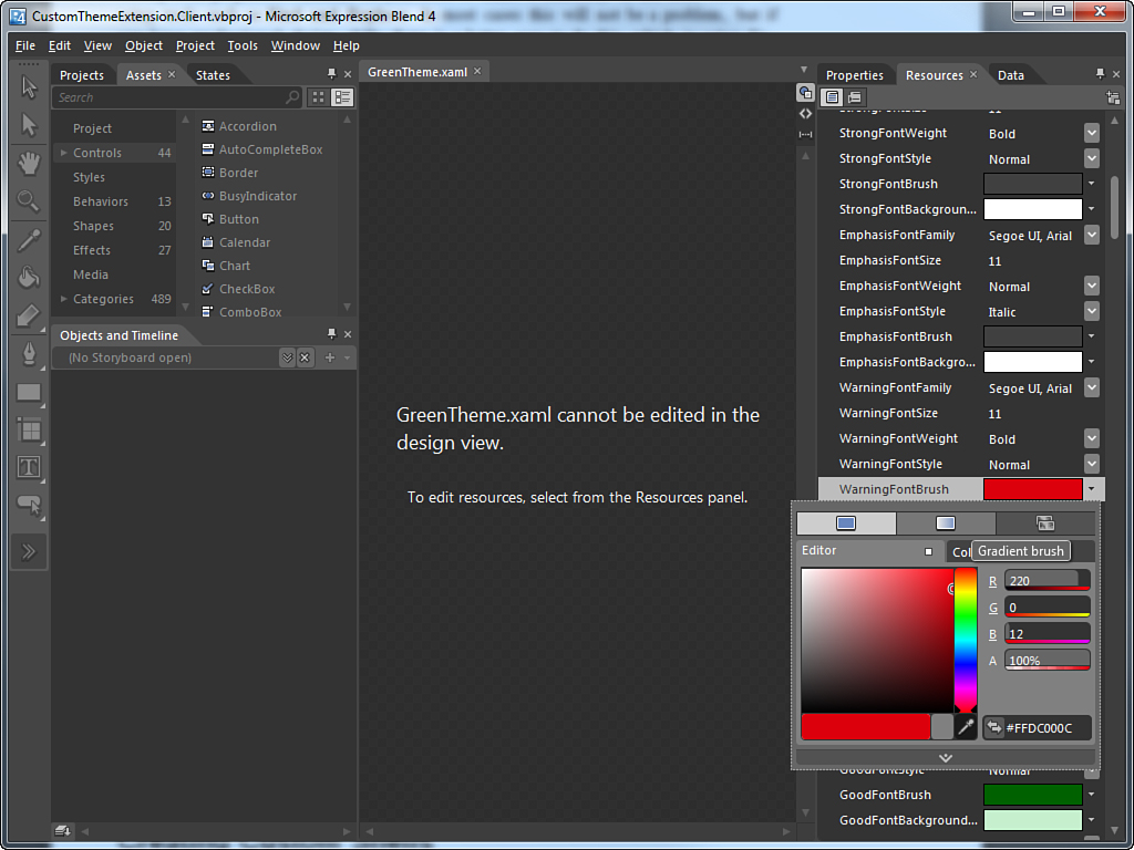
Figure 18.9. Using Microsoft Expression Blend 4 to edit the theme.
With regard to colors, you can also see that you can switch between solid colors and gradient colors by clicking the Gradient Brush button in the color designer. This makes it easier to design a more complex gradient. As for fonts, when you select the Font drop-down list, you see the list of available fonts and a preview of what the font looks like. When you have finished, save your changes and close Blend. When returning to Visual Studio 2010, you are warned that the XAML file has been edited outside the IDE and are asked to reload it, so agree to reload. Now that you have tools to edit themes, it is time to create the “green” theme for your LightSwitch applications.
Making the Green Theme
The full source code for this example is not included in this section. Instead, you can download the code from this book’s website. The full code consists of more than 300 lines of code (which would cover more than 20 pages here). So, only significant code snippets are presented here.
Whatever tool you decide to use to edit your theme, it is quite simple to replace default fonts and colors. For instance, the following code shows how to replace the Segoe UI default font with Comic Sans MS, of a different size, and for the standard font style:
<!-- Font Style: Normal -->
<!-- The standard font style -->
<FontFamily x:Key="NormalFontFamily">Comic Sans MS, Arial</FontFamily>
<sys:Double x:Key="NormalFontSize">14</sys:Double>
<FontWeight x:Key="NormalFontWeight">Normal</FontWeight>
<FontStyle x:Key="NormalFontStyle">Normal</FontStyle>
<SolidColorBrush x:Key="NormalFontBrush" Color="#FF404040"/>
<SolidColorBrush x:Key="NormalFontBackgroundBrush" Color="White"/>
The following code shows how to replace the default style for the Button control with custom colors:
<!-- Control: Button -->
<!-- States:
NormalBrush, FocusedBrush, MouseOverBrush, DisabledBrush, PressedBrush -->
<!-- ButtonBorder -->
<SolidColorBrush x:Key="ButtonBorderBrush" Color="#FF167239"/>
<SolidColorBrush x:Key="ButtonBorderFocusedBrush" Color="#FF3CB13E"/>
<SolidColorBrush x:Key="ButtonBorderMouseOverBrush" Color="#FF40B13C"/>
<SolidColorBrush x:Key="ButtonBorderDisabledBrush" Color="#FF7EB47F"/>
<SolidColorBrush x:Key="ButtonBorderPressedBrush" Color="#FF2AA147"/>
<!-- ButtonInnerBorder - Appears just inside the border -->
<SolidColorBrush x:Key="ButtonInnerBorderBrush" Color="#FFB3EF79"/>
<SolidColorBrush x:Key="ButtonInnerBorderFocusedBrush" Color="#FF40D04F"/>
<SolidColorBrush x:Key="ButtonInnerBorderMouseOverBrush" Color="#FF40D04F"/>
<SolidColorBrush x:Key="ButtonInnerBorderDisabledBrush" Color="#FFB3EF79"/>
<SolidColorBrush x:Key="ButtonInnerBorderPressedBrush" Color="#FF40D04F"/>
<!-- ButtonBackground -->
<LinearGradientBrush
x:Key="ButtonBackgroundBrush" StartPoint="0,0" EndPoint="0,1">
<GradientStop Color="#FFCAF7AB" Offset="0"/>
<GradientStop Color="#FFC1EDA3" Offset="0.49"/>
<GradientStop Color="#FF67F753" Offset="0.5"/>
<GradientStop Color="#FF448B15" Offset="1"/>
</LinearGradientBrush>
<LinearGradientBrush
x:Key="ButtonBackgroundFocusedBrush" StartPoint="0,0" EndPoint="0,1">
<GradientStop Color="#FFF9F9F9" Offset="0"/>
<GradientStop Color="#FFEBEBEB" Offset="0.49"/>
<GradientStop Color="#FFDBDBDB" Offset="0.5"/>
<GradientStop Color="#FFE7E7E7" Offset="1"/>
</LinearGradientBrush>
<LinearGradientBrush
x:Key="ButtonBackgroundMouseOverBrush" StartPoint="0,0" EndPoint="0,1">
<GradientStop Color="#FFEAF6FD" Offset="0"/>
<GradientStop Color="#FFD9F0FC" Offset="0.49"/>
<GradientStop Color="#FF9BF9D9" Offset="0.5"/>
<GradientStop Color="#FF2DF97B" Offset="1"/>
</LinearGradientBrush>
<SolidColorBrush x:Key="ButtonBackgroundDisabledBrush" Color="#FFF4F4F4"/>
<LinearGradientBrush
x:Key="ButtonBackgroundPressedBrush" StartPoint="0,0" EndPoint="0,1">
<GradientStop Color="#FFE5F4FC" Offset="0"/>
<GradientStop Color="#FFC4E5F6" Offset="0.49"/>
<GradientStop Color="#FF98EF9D" Offset="0.5"/>
<GradientStop Color="#FF33B24C" Offset="1"/>
</LinearGradientBrush>
<!-- ButtonText -->
<SolidColorBrush x:Key="ButtonTextBrush" Color="#FF0C4326"/>
<SolidColorBrush x:Key="ButtonTextMouseOverBrush" Color="#FF0C4326"/>
<!-- ButtonGlyph - The foreground color of a non-icon glyph such as a down arrow. -->
<SolidColorBrush x:Key="ButtonGlyphBrush" Color="#FF0C4326"/>
<!-- ButtonGlyphBorder - The border around the glyph -->
<SolidColorBrush x:Key="ButtonGlyphBorderBrush" Color="#FF36A565"/>
<!-- ButtonFocusBorder - Some themes may display a rectangle around the text content
but inside of the border when the button has keyboard focus. -->
<SolidColorBrush x:Key="ButtonFocusBorderFocusedBrush" Color="Transparent"/>
<!-- ButtonBackgroundOverlayEffect - A translucent overlay over the background. -->
<SolidColorBrush x:Key="ButtonBackgroundOverlayEffectBrush"
Color="Transparent"/>
<!-- ButtonBackgroundWaveEffect - A translucent path over the background. -->
<SolidColorBrush x:Key="ButtonBackgroundWaveEffectBrush"
Color="Transparent"/>
<!-- ******************************************************************* -->
After your edits over the theme, you can test it inside the experimental instance of Visual Studio 2010.
What Can I Actually Restyle with Themes?
Remember that you are not limited to just restyling fonts and common elements of the user interface of a shell. With themes, you can also restyle all the available controls in LightSwitch. The Metro theme for LightSwitch mentioned is a great example because it shows how to restyle a lot of UI elements, including the Data Grid control and the Modal window. Review the source code for this theme if you want to learn advanced customization techniques. The code is available at http://code.msdn.microsoft.com/LightSwitch-Metro-Theme-b1bfce24.
Testing the Custom Theme
Press F5 so that Visual Studio 2010 launches the so-called experimental instance of the IDE. The experimental instance receives the fully functional extension and keeps it available only for debugging purposes. When the experimental instance of Visual Studio is running, follow these steps:
1. Create a new LightSwitch project or open an existing project.
2. Open the Application Designer and display the Extensions tab. Your custom extension is visible in the list of available extensions, so select it. Figure 18.10 demonstrates this. Now you understand better why you had to edit the VSIX package properties before testing.
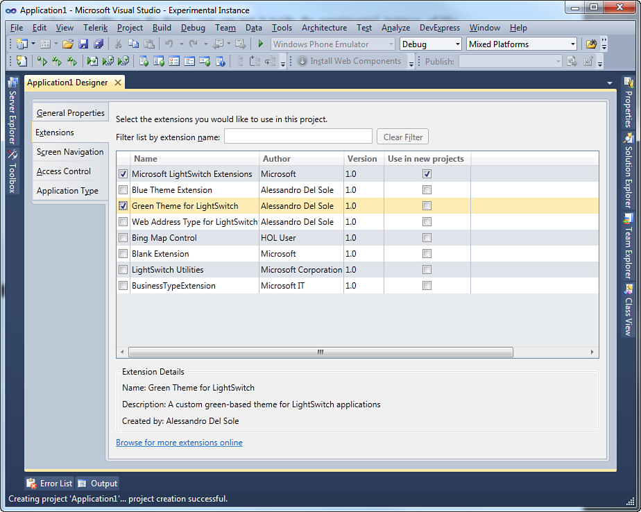
Figure 18.10. Enabling the new theme.
3. Display the General Properties tab in the Application Designer, and then pick the new theme in the Theme combo box (see Figure 18.11).
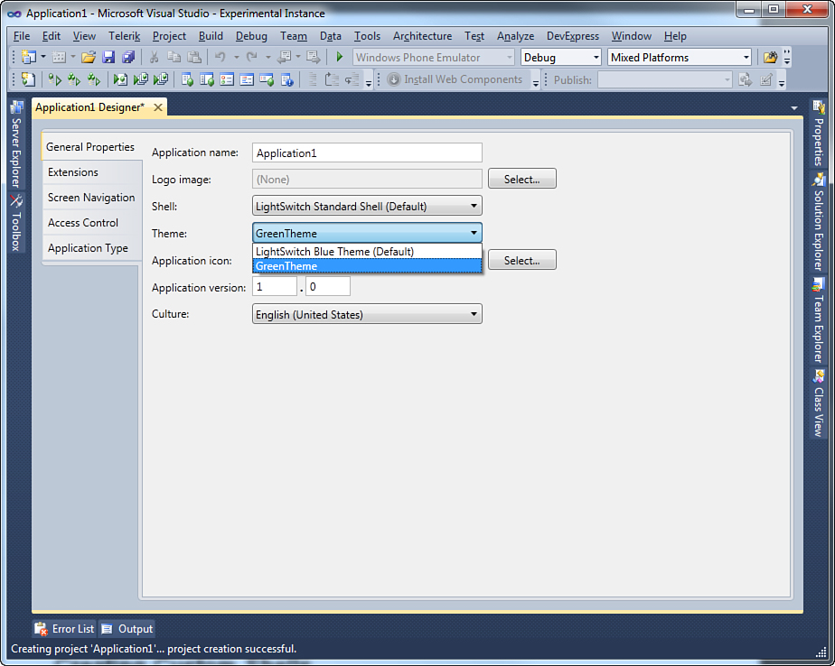
Figure 18.11. Applying the custom theme to the application.
When you are ready, run the application. Figures 18.12 and 18.13 show a couple examples of the new theme applied to the application (for example, the Ribbon Bar, a data-entry screen with validation errors, and a search screen).
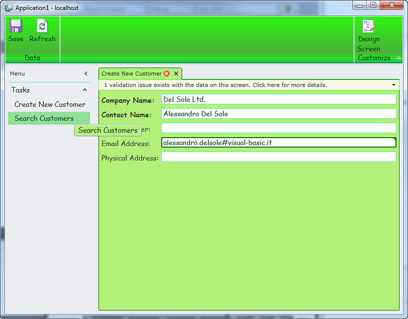
Figure 18.12. The new theme applied to the Ribbon Bar, Tasks panel, and a data-entry screen.
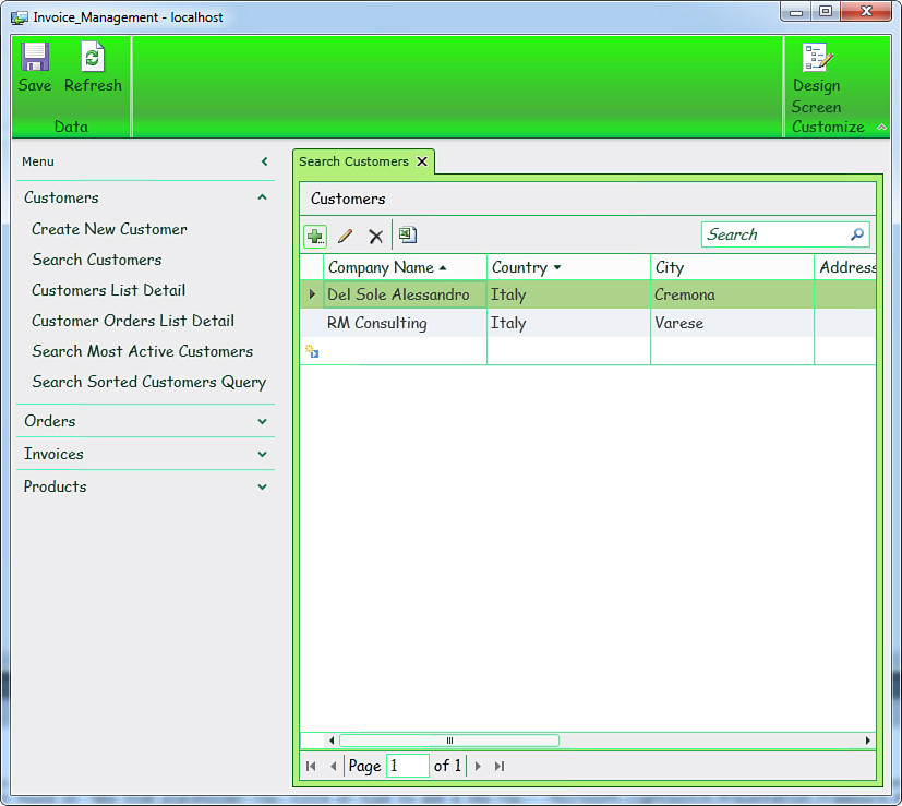
Figure 18.13. The new theme applied to a search screen.
Notice that the only part not covered by the new theme is related to the shell, which is covered in the next section.
Debugging Lightswitch Extensions
The experimental instance also enables you to debug extensions and is particularly useful to debug designer code. However, if you want to debug code that runs at runtime only, you do not necessarily need the experimental instance (which can be very slow in some circumstances). In this chapter, the experimental instance (that is, pressing F5) is used both for the sake of simplicity and so that we cover every possible debugging scenario. The MSDN documentation covers debugging extensions at http://msdn.microsoft.com/en-us/library/hh304424.aspx.
Creating Custom Shells
One of the biggest benefits of LightSwitch extensibility is that you can completely redesign the user interface by creating custom shells. Before working on a LightSwitch shell, however, you should have some experience with Silverlight. In fact, this section assumes that you already understand some concepts (for example, what a data template is).
Data Templates Official Reference
You might want to look at the MSDN documentation about data templates in Silverlight 4, which is available at http://msdn.microsoft.com/en-us/library/system.windows.datatemplate(v=vs.95).aspx. This is useful if you have no experience with data templates and is also useful as a reference if you have used this kind of object before.
The shell of a LightSwitch application is made of several components, generally the following:
• The Ribbon Bar, which contains shortcuts to common actions. This is also referred to as the Command Panel.
• The Active Screens Content area, which is the part of the shell that hosts screens.
• The Screen Validation area, which is where notifications of validation failures are displayed to the end user.
• The Navigation area, which is the part of the shell that displays the screen navigation schema and shortcuts for accessing screens.
• The Logo area, which is where you can add a custom logo. This is not available in the default shell and is totally optional in custom shells.
• The User Information area, which displays information on the currently logged user.
Figure 18.14 shows the default shell.
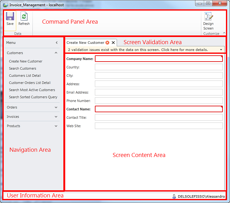
Figure 18.14. The default shell’s composition.
At a higher level, the shell of a LightSwitch application relies on the Managed Extensibility Framework, described at the beginning of this chapter. Basically, a shell is made of three main parts:
• An MEF part, which is responsible for connecting shells to the application. MEF parts implement the Microsoft.LightSwitch.Runtime.Shell.IShell interface, which requires implementing all required objects for a shell. When you create an extensibility project and add a shell, Visual Studio automatically generates a MEF part stub for you.
• A Silverlight user control, which represents the UI of the shell. Each area in the shell is represented by a Silverlight panel that is data-bound to a specific view model and that nests the appropriate controls. These are usually bound to commands exposed by view models. This is all accomplished in XAML code.
• The code-behind for the XAML, which takes actions over controls and which interacts with the LightSwitch runtime.
To create custom shells, it is not necessary to have deep knowledge of either the MEF of the MVVM pattern; you just need to know some basic concepts that you can later study further with the help of the MSDN documentation.
You can find a full, introductory series (by this author) about the MVVM pattern applied to WPF applications at http://community.visual-basic.it/AlessandroEnglish/archive/2010/08/13/31861.aspx. Concepts described in this series can be applied to Silverlight 4, as well, and are useful to understand how LightSwitch binds UI controls to commands from view models.
In this chapter, you learn how to build a custom shell starting from the sample shipping with the Microsoft documentation for LightSwitch extensibility. You are encouraged to download the sample and open it inside Visual Studio 2010. The shell sample is available at http://bit.ly/qWS2H0. The sample shell from Microsoft includes a number of objects and resources that you will typically implement in your own shells. We examine these here because it is always better to focus on readily reusable items than it is to reinvent the wheel.
Creating Extensibility Projects for Custom Shells
To build a custom shell, you still create a new extensibility project as you did previously, and then in the Lspkg project you add an item of type Shell, as shown in Figure 18.15.
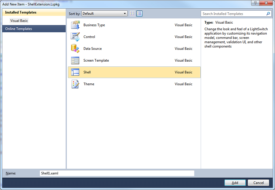
Figure 18.15. Adding a new shell to an extensibility project.
After you add a new shell to the solution, Visual Studio performs the following actions for you:
• In the Client project, it adds a reference to the System.Windows.Controls and Microsoft.LightSwitch.ExportProvider assemblies. In particular, the first assembly enables you to use primitive Silverlight controls to define your shell.
• In the same project, it adds an MEF part stub under the PresentationShell Components subfolder. This is the class that implements the IShell interface and that is responsible for making the shell recognizable by the LightSwitch runtime.
• In the same project, it adds a Silverlight user control (an .xaml file with its code-behind) under the PresentationShell subfolder. The name of this file recalls the name of the shell you specified when adding the new item.
The MEF part stub does not usually need to be edited because its purpose is simply to collect information from the various components and send these to the LightSwitch runtime. You might be interested in editing information that will be visible to the end user. The Common project contains a ModuleResources.resx resource file that stores the display name and description for the shell. You just need to replace this information with your own details; because these are referenced in the module definition (.lsml) file, you do not need to make any other edits. As a general rule, you will typically work with the Client project. Remember these following points:
• You are allowed to use controls other than primitives from the System.Windows.Control namespace. This means that in custom shells, you can use controls from other libraries.
• You usually also include in the Client project converter classes and XAML resources.
• You must write code to handle the behavior of screens.
The shell sample that ships with the extensibility documentation includes all the necessary items to build a fully functional shell, so starting from the next section, you learn how to edit that existing shell.
Editing the Official Sample from Microsoft
As mentioned previously, the sample shell that ships with the extensibility documentation from Microsoft offers a number of components that you need to implement in your own shells, so this is why it is used as a reference. This section focuses on customizing the shell from a graphical perspective, thus redrawing the UI with different controls in XAML code. The sample shell contains the following components:
• A code file called Converters in the ShellExtension.Client project under PresentationShellsComponents, which contains a number of converter classes utilized in the XAML code to display screen-related information the appropriate way, including validation messages, validation status, and user information.
• A code file called MyScreenObject. This defines a class that implements both the IScreenObject and INotifyPropertyChanged interfaces and is important because it exposes screen-related information under the form of properties, such as display name, description, validation results, and detail collections. In addition, this class appropriately handles new screen instances and provides notifications of changes over validation results. You will always need to implement a class like this in your shells.
• A file called TextBlockStyle.xaml. This is totally optional and contains a style definition for TextBlock controls, used in the sample shell. You are free to omit custom control styles in your own shells.
Now you start focusing on the XAML code that defines the UI for the shell. In simple terms, you apply a different template to the buttons in the Ribbon Bar, and then you place the Navigation area in a different position and use an Accordion control from the Silverlight Toolkit to represent the screen navigation. The Silverlight Toolkit was identified as a prerequisite in Chapter 16, “Customizing Applications with Custom Controls,” so you should already have this installed. If you want to take a look at the final result, see Figure 18.17. Before going on, add a reference to the following assemblies to the Client project: System.Windows.Controls.Toolkit.dll, System.Windows.Controls.Layout.Toolkit.dll, and System.Windows.Controls.Toolkit.Internals.dll.
Understanding View Models
Each of the six parts that make a LightSwitch shell, mentioned at the beginning of this section, is represented by a view model. View models are nothing but .NET classes exposing commands that are data-bound to controls in the UI, according to their specific area of interest. All the view models are available through a special object called ComponentViewModelService, exposed by the Microsoft.LightSwitch.Runtime.Shell.Helpers namespace. Table 18.2 describes view models available in LightSwitch.
Table 18.2. View Models in LightSwitch
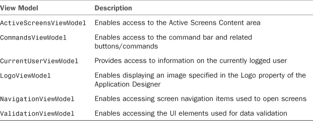
You can easily bind your controls to the desired view model and gain access to specific functionalities offered by that view model. This is accomplished by adding a ShellHelper attached property to the bound controls and is covered momentarily.
Styling the Root Container
The shell’s UI is made of a Silverlight user control in the ShellSample.XAML file. As usual, this requires you to organize controls within panels. By default, a shell offers a Grid panel called LayoutRoot. You can replace the background color with a different one, such as a gradient, and reorganize rows as follows:
<Grid x:Name="LayoutRoot" >
<Grid.Background>
<LinearGradientBrush EndPoint="0.5,1" StartPoint="0.5,0">
<GradientStop Color="#FF050A58" Offset="0" />
<GradientStop Color="#FF050A58" Offset="1" />
<GradientStop Color="#FF88B1B9" Offset="0.616" />
<GradientStop Color="#FF41CBCB" Offset="0.349" />
</LinearGradientBrush>
</Grid.Background>
<Grid.RowDefinitions>
<RowDefinition Height="Auto" />
<RowDefinition Height="Auto" />
<RowDefinition Height="*" />
<RowDefinition Height="Auto" />
</Grid.RowDefinitions>
</Grid>
The background linear gradient has been simply drawn with the design tool available in the Properties window in Visual Studio 2010.
Understanding and Styling the Command Panel
The Command Panel in a LightSwitch shell can be implemented through the CommandsViewModel object. This has a property called ShellCommands, which is a collection of commands, such as Save and Refresh. For this reason, you need to bind the command collection to an items control, such as the ListBox, and then provide a data template to represent every single bound command. The following code partially overrides the code in the Microsoft sample:
<!-- The command panel is a horizontally oriented list box whose data context -->
<!-- is set to the CommandsViewModel. The ItemsSource of this list box is data
<!-- bound to the ShellCommands property. This results in each item being -->
<!-- bound to an instance of an IShellCommand. -->
<!-- -->
<!-- The attribute 'ShellHelpers:ComponentViewModelService.ViewModelName' is -->
<!-- the manner by which a control specifies the view model that is to be set -->
<!-- as its data context. In case, the view model is identified by the name 'Default.CommandsViewModel'. -->
<ListBox x:Name="CommandPanel" Grid.Column="0" Grid.Row="0"
Grid.ColumnSpan="2"
ShellHelpers:ComponentViewModelService.ViewModelName="Default.CommandsViewModel"
ItemsSource="{Binding ShellCommands}">
<ListBox.Background>
<LinearGradientBrush EndPoint="0.5,1" StartPoint="0.5,0">
<GradientStop Color="#FF0B647C" Offset="0" />
<GradientStop Color="#FF0C6C89" Offset="1" />
<GradientStop Color="#FF85CDE2" Offset="0.5" />
</LinearGradientBrush>
</ListBox.Background>
<ListBox.ItemsPanel>
<ItemsPanelTemplate>
<StackPanel Orientation="Horizontal" />
</ItemsPanelTemplate>
</ListBox.ItemsPanel>
<ListBox.ItemTemplate>
<DataTemplate>
<!-- Each item in the list box will be a button whose content is the --> <-- following: -->
<!-- 1. An image, which is bound to the Image property of the --> <-- IShellCommand -->
<!-- 2. A text block whose text is bound to the DisplayName of the --> <-- IShellCommand -->
<StackPanel Orientation="Horizontal">
<!-- The button be enabled/disabled according to the IsEnabled --> <-- property of the -->
<!-- IShellCommand. The handler for the click event will execute --> <-- the command. -->
<Button Click="GeneralCommandHandler"
IsEnabled="{Binding IsEnabled}"
ToolTipService.ToolTip="{Binding DisplayName}"
Margin="1">
<Button.Background>
<LinearGradientBrush EndPoint="0.5,1"
StartPoint="0.5,0">
<GradientStop Color="#FF050A58" Offset="0" />
<GradientStop Color="#FF050A58" Offset="1" />
<GradientStop Color="#FF88B1B9"
Offset="0.616" />
<GradientStop Color="#FF41CBCB"
Offset="0.349" />
</LinearGradientBrush>
</Button.Background>
<Grid>
<Image Grid.Row="0"
Source="{Binding Image}"
Width="32"
Height="32"
Stretch="UniformToFill"
Margin="0"
VerticalAlignment="Top"
HorizontalAlignment="Center" />
</Grid>
</Button>
</StackPanel>
</DataTemplate>
</ListBox.ItemTemplate>
</ListBox>
The main points of interest, especially in comparison with the Microsoft sample, are the following:
• The ShellCommands collection populates the ListBox.ItemsSource property. This enables nested ListBoxItem elements to receive elements from the collection.
• An instance of a command exposes two properties, Image and DisplayName. The first one has been used as the button’s content, and the second one has been moved to be a tooltip that appears when the mouse passes over the button. In the Microsoft sample, it was instead part of the button’s content. With this edit, the button will display just the button icon and the description only when appropriate.
• When the user clicks a button, the instance invokes the GeneralCommandHandler method in the code-behind. This looks like this:
Private Sub GeneralCommandHandler(sender As Object, e As RoutedEventArgs)
' This function will get called when the user clicks one of the buttons on
' the command panel. The sender is the button whose data context is the
' IShellCommand.
'
' In order to execute the command (asynchronously) we simply call the
' ExecuteAsync method on the ExecutableObject property of the command.
Dim command As IShellCommand = CType(sender, Button).DataContext
command.ExecutableObject.ExecuteAsync()
End Sub
The code converts the button’s DataContext into an instance of the IShellCommand object, which represents a command bound to the button. Then it simply calls the ExecuteAsync method from the IShellCommand.ExecutableObject property to execute the action.
Understanding and Styling the Screen Area
In the original solution, the Screen Content area is represented by a TabControl. Except for the background color, no changes will be made to the original XAML code, which is presented here for learning purposes. Basically, each screen in the application is contained inside a TabItem control. This is usually the most suitable control for displaying and organizing screens, but you could eventually replace it with another headered control. The XAML code defines a TabControl, but the actual generation of the nested TabItems is performed at runtime, when the user requests to open a new screen. The definition for the TabControl is pretty simple:
<!-- Each screen will be displayed in a tab in a tab control. The individual
<!-- TabItem controls are created in code. -->
<controls:TabControl x:Name="ScreenArea"
Grid.Column="0"
Grid.Row="2"
Background="Transparent"
SelectionChanged="OnTabItemSelectionChanged">
</controls:TabControl>
We are replacing the Background property value with Transparent. This replaces the style that was coming originally from a resource dictionary and it allows showing the background of the shell when no screen is running. Also, the code specifies an event handler for SelectionChanged, which is discussed momentarily (along with other methods). This is not the only piece of XAML code related to the screen area. In fact, if you take a look at the control’s resources, you can find a DataTemplate that establishes how the header of TabItem controls will appear. The following code overrides the Microsoft sample code by providing different brushes and different content for the closing button:
<!-- Template that is used for the header of each tab item -->
<DataTemplate x:Key="TabItemHeaderTemplate">
<Border BorderBrush="#FF050A58">
<StackPanel Orientation="Horizontal" Background="#FF41CBCB">
<TextBlock Style="{StaticResource TextBlockFontsStyle}"
Text="{Binding DisplayName}"
Foreground="{StaticResource ScreenTabTextBrush}" />
<TextBlock Style="{StaticResource TextBlockFontsStyle}" Text="*"
Visibility="{Binding IsDirty,
Converter={StaticResource WorkspaceDirtyConverter}}"
Margin="5, 0, 5, 0" />
<TextBlock Style="{StaticResource TextBlockFontsStyle}"
Text="!"
Visibility="{Binding ValidationResults.HasErrors,
Converter={StaticResource _ ScreenHasErrorsConverter}}"
Margin="5, 0, 5, 0" Foreground="Red" FontWeight="Bold">
<ToolTipService.ToolTip>
<ToolTip Content="{Binding ValidationResults,
Converter={StaticResource ScreenResultsConverter}}" />
</ToolTipService.ToolTip>
</TextBlock>
<Button Height="16"
Width="16"
Padding="0"
Margin="5, 0, 0, 0"
Click="OnClickTabItemClose">
<Button.Content>
<Image Source="/ShellExtension.Client;component/Presentation/Images/109_AllAnnotations_Error_16x16_72.png"/>
</Button.Content>
</Button>
</StackPanel>
</Border>
</DataTemplate>
Notice how the various TextBlock controls are bound to properties from the ActiveScreensViewModel object, such as DisplayName, IsDirty (which specifies the screen has pending changes), ValidationResults (which contains the list of validation messages), and HasErrors (which notifies the user if the screen has data errors). Then, notice how the button’s content has been replaced with an Image control. In the original code, it was represented by the letter X, but you can change this with a small icon similar to the one you use when closing windows. The icon has been taken from the Visual Studio 2010 Image Library. To use an image as the button (or other control) content, follow these steps:
1. Create a new subfolder called Images under the Presentation folder in the Client project. This is optional but makes your project more maintainable.
2. Right-click the new folder, and then click Add, Existing Item. Select the image you want to add from disk. Visual Studio 2010 automatically includes the image as a resource by setting its Build Action to Resource.
3. Point to the image via a packed URI, as in the Image.Source property in the earlier code.
You use the so-called packed URIs to refer to resources that are embedded in your Silverlight (or WPF) applications. The syntax for packed URIs is not that difficult. Look at the Image.Source property in the latest code snippet and notice how the first part represents the project’s name. Then, ;component is fixed. Next, you specify the path for the resource, including subfolders. A good explanation about packed URIs is available in the MSDN documentation about WPF at http://msdn.microsoft.com/en-us/library/aa970069.aspx.
The code-behind defines a lot of methods and event handlers related to the screen area and screen management. Moreover, the original code ships with detailed comments, which are preferred over redundant descriptions. The first interesting event handler is OnTabItemSelectionChanged, which is responsible for setting the currently opened screen as the active screen in the ActiveScreensViewModel, so that the CommandsViewModel is also updated to reflect the current screen (see comments):
Private Sub OnTabItemSelectionChanged(sender As Object,
e As SelectionChangedEventArgs)
' When the user selects a tab item, we need to set the "active" screen
' in the ActiveScreensView model. Doing this causes the commands view
' model to be updated to reflect the commands of the current screen.
If e.AddedItems.Count > 0 Then
'Retrieves the current TabItem
Dim selectedItem As TabItem = e.AddedItems(0)
If selectedItem IsNot Nothing Then
'Retrieves the screen instance in the current TabItem
Dim screenObject As IScreenObject = CType(selectedItem.DataContext,
MyScreenObject).RealScreenObject
'Sets the screen instance as the current screen in the View Model
Me.ServiceProxy.ActiveScreensViewModel.Current = screenObject
End If
End If
End Sub
Now take a look at how we are overriding the constructor. This basically subscribes to service notifications about changes in the screen’s status. Because the new shell’s Grid does not have the same properties as the original one, some lines of code were removed:
<SuppressMessage("Microsoft.Usage",
"CA2214:DoNotCallOverridableMethodsInConstructors",
Justification:="False positive. The LayoutRoot property is not in the base
class, but is part of Me in another partial class")>
Public Sub New()
InitializeComponent()
' Use the notification service, found on the service proxy,
' to subscribe to the ScreenOpened,
' ScreenClosed, and ScreenReloaded notifications.
Me.ServiceProxy.NotificationService.Subscribe(
GetType(ScreenOpenedNotification), AddressOf Me.OnScreenOpened)
Me.ServiceProxy.NotificationService.Subscribe(
GetType(ScreenClosedNotification), AddressOf Me.OnScreenClosed)
Me.ServiceProxy.NotificationService.Subscribe(
GetType(ScreenReloadedNotification), AddressOf Me.OnScreenRefreshed)
' Initialize the double-click timer (which is
' used for managing double clicks on an item in the navigation area).
Me.doubleClickTimer = New DispatcherTimer()
Me.doubleClickTimer.Interval = New TimeSpan(0, 0, 0, 0, 200)
AddHandler Me.doubleClickTimer.Tick, AddressOf Me.OnDoubleClickTimerTick
End Sub
Notice how the constructor is registering to some delegates to receive notifications and how it is starting a timer to manage double-clicks in the Navigation area.
A Step Further: Saving User Settings
The original sample code from Microsoft shows how to save user preferences related to the size of the application’s window. This is done by invoking the IServiceProxy.UserSettingsService.SetSetting and IServiceProxy.UserSettingsService.GetSetting methods. The original invocations, respectively, save and load the size of Grid.Column objects, but in the new example there are no grid columns. So, for the sake of clarity, the code has been removed. However, you can easily restore it and point to Grid.Row objects instead. This is left to you as an exercise.
A simple handler stops the timer when required:
Private Sub OnDoubleClickTimerTick(sender As Object, e As EventArgs)
Me.doubleClickTimer.Stop()
End Sub
The next handler is called OnClickTabItemClose and is raised when the user attempts to close the active screen (see comments):
Private Sub OnClickTabItemClose(sender As Object, e As RoutedEventArgs)
' When the user closes a tab, we simply need to close the corresponding
' screen object. The only caveat here is that the call to the Close
' method needs to happen on the logic thread for the screen. To do this
' we need to use the Dispatcher object for the screen.
Dim screenObject As IScreenObject = TryCast(CType(sender,
Button).DataContext, IScreenObject)
If screenObject IsNot Nothing Then
screenObject.Details.Dispatcher.EnsureInvoke(
Sub()
screenObject.Close(True)
End Sub)
End If
End Sub
Following are three methods: OnScreenOpened, OnScreenClosed, and OnScreenRefreshed. Each is invoked at a particular moment in the screen’s lifetime. These methods are taken from the original sample exactly as you see them, so you do not need to make any replacements at this particular point: Just study them. This is the code for all the three methods, including the original, detailed comments:
Public Sub OnScreenOpened(n As Notification)
' This method is called when a screen has been opened by the runtime.
' In response to this, we need to create a tab item and set its content
' to be the UI for the newly opened screen.
Dim screenOpenedNotification As ScreenOpenedNotification = n
Dim screenObject As IScreenObject = screenOpenedNotification.Screen
Dim view As IScreenView = Me.ServiceProxy.ScreenViewService.
GetScreenView(screenObject)
' Create a tab item and bind its header to the display name of the screen
Dim ti As TabItem = New TabItem()
Dim template As DataTemplate = Me.Resources("TabItemHeaderTemplate")
Dim element As UIElement = template.LoadContent()
' The IScreenObject does not contain properties indicating if the
' screen has changes or validation errors. As such, we have created a
' thin wrapper around the screen object that does expose this
' functionality. This wrapper, a class called MyScreenObject,
' is what we'll use as the data context for the tab item.
ti.DataContext = New MyScreenObject(screenObject)
ti.Header = element
ti.HeaderTemplate = template
ti.Content = view.RootUI
' Add the tab item to the tab control.
Me.ScreenArea.Items.Add(ti)
Me.ScreenArea.SelectedItem = ti
' Set the currently active screen in the active screens view model.
Me.ServiceProxy.ActiveScreensViewModel.Current = screenObject
End Sub
Public Sub OnScreenClosed(n As Notification)
' A screen has been closed and therefore removed from the application's
' collection of active screens. In response to this, we need to do
' two things:
' 1. Remove the tab item that was displaying this screen.
' 2. Set the "current" screen to the screen that will be displayed
' in the tab item that will be made active.
Dim screenClosedNotification As ScreenClosedNotification = n
Dim screenObject As IScreenObject = screenClosedNotification.Screen
For Each ti As TabItem In Me.ScreenArea.Items
' We need to get the IScreenObject from the instance of MyScreenObject.
Dim realScreenObject As IScreenObject = CType(ti.DataContext,
MyScreenObject).RealScreenObject
If realScreenObject Is screenObject Then
Me.ScreenArea.Items.Remove(ti)
Exit For
End If
Next
' If there are any tab items left, set the current tab to
' the last one in the list AND set the current screen to be the
' screen contained within that tab item.
Dim count As Integer = Me.ScreenArea.Items.Count
If count > 0 Then
Dim ti As TabItem = Me.ScreenArea.Items(count - 1)
Me.ScreenArea.SelectedItem = ti
Me.ServiceProxy.ActiveScreensViewModel.Current = CType(ti.DataContext,
MyScreenObject).RealScreenObject
End If
End Sub
Public Sub OnScreenRefreshed(n As Notification)
' When a screen is refreshed, the runtime actually creates a
' new IScreenObject for it and discards the old one. So in response to
' this notification what we need to do is replace the data context for
' the tab item that contains this screen with a wrapper (MyScreenObject)
' for the new IScreenObject instance.
Dim srn As ScreenReloadedNotification = n
For Each ti As TabItem In Me.ScreenArea.Items
Dim realScreenObject As IScreenObject = CType(ti.DataContext,
MyScreenObject).RealScreenObject
If realScreenObject Is srn.OriginalScreen Then
Dim view As IScreenView = Me.ServiceProxy.
ScreenViewService.GetScreenView(srn.NewScreen)
ti.Content = view.RootUI
ti.DataContext = New MyScreenObject(srn.NewScreen)
Exit For
End If
Next
End Sub
The Screen Content area is basically the only place in the shell where you need to manage view models in code from start to end.
Understanding and Styling the Navigation Area
The Navigation area is the key topic in the current explanation of a custom shell. In fact, the original code, which implements a TreeView control to display the screen navigation and shortcuts to open screens, will be replaced with a totally different control. The NavigationViewModel is the object that provides access to the screen navigation. It exposes a property called NavigationItems; this is a collection of screen navigation groups, such as Tasks, Administration, and your custom groups. This property exposes a property called DisplayName, which contains the name of the navigation group, and another property called Children. The latter contains the list of screens per group. Because Children is a collection nested inside the NavigationItems collection, they form a hierarchical structure of objects. For this reason, you need a control that can display hierarchical information. The TreeView is probably the most commonly used control to represent hierarchical data, but the beauty of XAML is that it enables you to define custom data templates inside different headered controls to represent this kind of information. The Silverlight Toolkit offers a control called Accordion, which looks similar to an Expander but that scales better in custom shells. Assuming you added references to the toolkit assemblies as explained at the beginning of this section, you now need to add the following XML namespace declaration at the top of the UserControl element:
xmlns:toolkit="clr-namespace:System.Windows.Controls;assembly=
System.Windows.Controls.Layout.Toolkit"
The following code demonstrates how to use an Accordion to display navigation groups’ names (see the first DataTemplate with a TextBlock bound to the DisplayName property) and nested screen names. For the latter, a ListBox is used as the DataTemplate for the Accordion.ContentTemplate, and the ListBox’s DataTemplate uses a TextBlock bound to the DisplayName property of each screen.
<!-- Navigation view is a simple tree view whose ItemsSource
property is bound to the collection returned from the
NavigationItems property of the Navigation view model. -->
<toolkit:Accordion x:Name="ScreenTree" Grid.Column="0" Grid.Row="1"
ExpandDirection="Right"
Background="{StaticResource NavShellBackgroundBrush}"
SelectionMode="One"
ShellHelpers:ComponentViewModelService.ViewModelName=
"Default.NavigationViewModel"
ItemsSource="{Binding NavigationItems}">
<toolkit:Accordion.ItemTemplate>
<DataTemplate>
<TextBlock Style="{StaticResource TextBlockFontsStyle}"
Text="{Binding DisplayName}"
Foreground="{StaticResource NormalFontBrush}"/>
</DataTemplate>
</toolkit:Accordion.ItemTemplate>
<toolkit:Accordion.ContentTemplate>
<DataTemplate>
<ListBox ItemsSource="{Binding Children}"
BorderThickness="0" Height="40">
<ListBox.ItemsPanel>
<ItemsPanelTemplate>
<StackPanel Orientation="Horizontal"/>
</ItemsPanelTemplate>
</ListBox.ItemsPanel>
<ListBox.ItemTemplate>
<DataTemplate>
<TextBlock
Style="{StaticResource TextBlockFontsStyle}"
Text="{Binding DisplayName}"
Foreground="{StaticResource
NormalFontBrush}" FontSize="16"
MouseLeftButtonDown=
"NavigationItemLeftButtonDown" />
</DataTemplate>
</ListBox.ItemTemplate>
</ListBox>
</DataTemplate>
</toolkit:Accordion.ContentTemplate>
</toolkit:Accordion>
Notice that the ItemsPanelTemplate for the ListBox is using a StackPanel aligned horizontally. This will make screen names scroll horizontally and stay on one line.
Accordion.Itemtemplate and Accordion.Contenttemplate
If, after looking at the latest code, you are wondering about the difference between the ItemTemplate and ContentTemplate properties for the Accordion control, this is the explanation: You use the ItemTemplate to define how a collapsible group is represented. The ContentTemplate represents how the content of each group will be shown in the UI.
From the procedural code perspective, you just need to handle the NavigationItemLeftButtonDown event, which is raised when the user requests to open a screen by clicking its name in the Navigation area. The following code demonstrates how the method is implemented:
Private Sub NavigationItemLeftButtonDown(sender As Object,
e As MouseButtonEventArgs)
If Me.doubleClickTimer.IsEnabled Then
Me.doubleClickTimer.Stop()
' If the item clicked on is a screen item, open the screen.
Dim screen As INavigationScreen = TryCast(CType(sender,
TextBlock).DataContext, INavigationScreen)
If screen IsNot Nothing Then
screen.ExecutableObject.ExecuteAsync()
End If
Else
Me.doubleClickTimer.Start()
End If
End Sub
The point of interest in this code is the TryCast instruction that retrieves the screen instance by converting the DataContext of the selected TextBlock into an INavigationScreen object. Then, the screen is opened by invoking the ExecuteAsync method from the INavigationScreen.ExecutableObject property.
Understanding and Styling the User Information Area
The User Information area displays information on the current user. In the default shell, such information is not shown when anonymous authentication is selected. You can override the default behavior and always display this information by taking advantage of the CurrentUserViewModel without any limitations. There are no substantial differences from the shell sample code from Microsoft and the following, except for the position within the Grid and the foreground color:
<!-- The name of the current user is displayed in the lower left corner of the shell. -->
<Grid Grid.Column="0" Grid.Row="3">
<Grid.ColumnDefinitions>
<ColumnDefinition Width="Auto" />
<ColumnDefinition Width="Auto" />
</Grid.ColumnDefinitions>
<TextBlock Grid.Column="0"
Style="{StaticResource TextBlockFontsStyle}"
Text="Current User: " Foreground="White"/>
<!--This TextBlock has its data context set to the CurrentUserViewModel, from which
the CurrentUserDisplayName property is used to provide the name of the user displayed. -->
<TextBlock Grid.Column="1"
Style="{StaticResource TextBlockFontsStyle}"
ShellHelpers:ComponentViewModelService.ViewModelName=
"Default.CurrentUserViewModel"
Text="{Binding CurrentUserDisplayName,
Converter={StaticResource CurrentUserConverter}}"
Foreground="Orange"/>
</Grid>
Notice how a TextBlock is bound to the CurrentUserDisplayName property; this returns the name of the currently logged user or a null object in case of anonymous authentication. The CurrentUserConverter converter class converts such a null object into a human-readable text message.
Displaying Your Company’s Logo
In custom shells, you have an opportunity to display a logo (for example, your company’s logo). You just need to add an Image control and bind it to the LogoViewModel object. With this data binding, you avoid the need of hard-coding the logo image filename, and users are free to select their preferred logo in the Application Designer. In other words, you just make your shell ready to accept an image logo from the end user. Talking in terms of code, you can extend the Grid control for the current user information with another Column and with an Image control:
<Grid Grid.Column="0" Grid.Row="3">
<Grid.ColumnDefinitions>
<ColumnDefinition Width="Auto" />
<ColumnDefinition Width="Auto" />
</Grid.ColumnDefinitions>
<TextBlock Grid.Column="0"
Style="{StaticResource TextBlockFontsStyle}"
Text="Current User: " Foreground="White"/>
<!--This TextBlock has its data context set to the CurrentUserViewModel, from which
the CurrentUserDisplayName property is used to provide the name of the user displayed. -->
<TextBlock Grid.Column="1"
Style="{StaticResource TextBlockFontsStyle}"
ShellHelpers:ComponentViewModelService.ViewModelName=
"Default.CurrentUserViewModel"
Text="{Binding CurrentUserDisplayName,
Converter={StaticResource CurrentUserConverter}}"
Foreground="Orange"/>
<Image
ShellHelpers:ComponentViewModelService.ViewModelName=
"Default.LogoViewModel"
Source="{Binding Logo}" Grid.Column="2" />
</Grid>
The Image.Source property is bound to the Logo property in the view model. This property is populated with the image that you set for the Logo property in the General Properties of the Application Designer. Of course, you are free to place the logo to different positions in your shell.
Testing the Custom Shell
Now that you have assembled all the shell parts, you can press F5 to test the shell in a new experimental instance of Visual Studio 2010. After creating a new (or opening an existing) LightSwitch project and enabling the extension called ShellExtension, select the custom shell in the General Properties tab of the Application Designer. In the same tab, choose an image file to use as a logo. This must be a .jpg or .png file. Figure 18.16 shows what the custom shell looks like at this point.
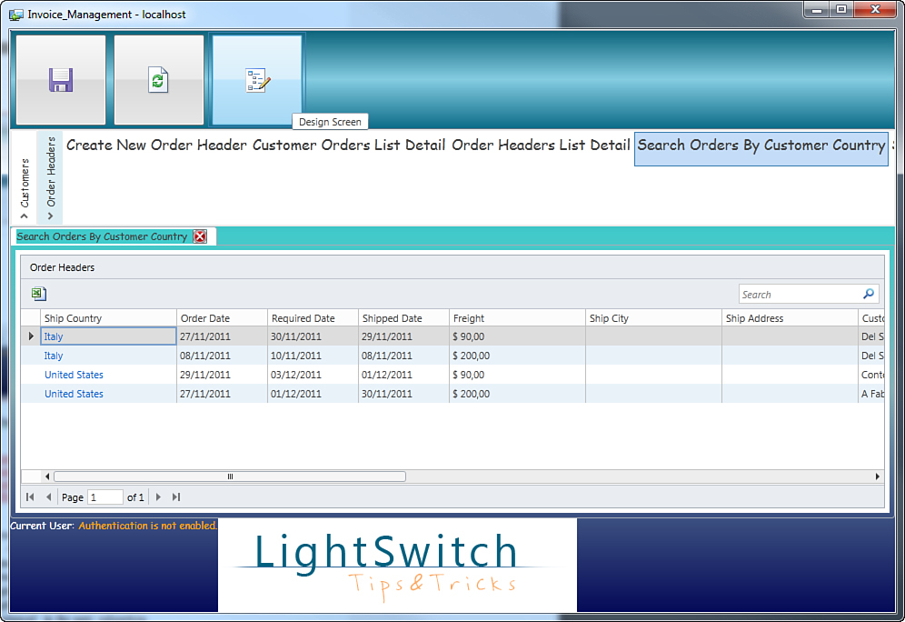
Figure 18.16. The new shell applied to the application.
You can easily focus your attention on the Screen Navigation area, represented by the Accordion control. Also, notice the screen’s closing button, whose content is an image instead of the original letter X. Finally, notice the tooltip when you pass the mouse pointer over a button, instead of having the text inside the button’s content. Using this shell is really easy because you just need to open screens from within the Accordion. Although nice, you can do even better. You can completely restyle some controls, as explained in the next subsection.
Restyling Controls in the Shell
You can use all your advanced Silverlight and WPF skills to restyle controls inside a shell. This can be done also for themes, but we prefer to show for shells. For instance, a good idea is to restyle buttons in the Command Panel to provide a more appealing look and feel. A British author called Alan Beasley wrote an article for The Code Project website in which he offers 10 ready-to-use modern button styles. The article is available at www.codeproject.com/KB/expression/10FreeButtons.aspx.
After you have downloaded the code, locate the button’s style called RaisedRimButton and paste it into your TextBlockStyle.xaml file, inside the root ResourceDictionary. Next, place the following style and size assignment in the Button declaration related to the ListBox.ItemTemplate’s DataTemplate for the Command Panel:
Style="{StaticResource RaisedRimButton}" Width="100" Height="100"
If you now test the extension again, you will get an amazing result, as shown in Figure 18.17.
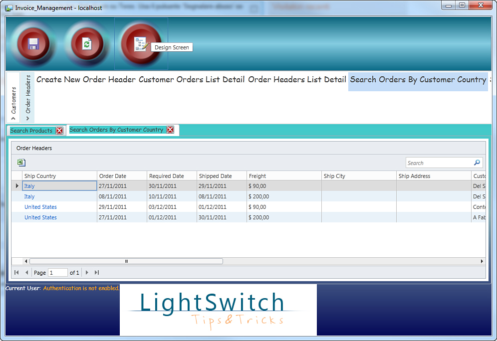
Figure 18.17. Restyling controls in a custom shell.
Similarly, you could restyle the Accordion, its items’ style, or any other control in the UI, including LightSwitch built-in controls (as mentioned in the section about themes). Just remember that fantasy must be controlled: In most cases, end users prefer simple styles to easily associate controls to specific tasks. After this discussion about shells, it should be clear how the MVVM pattern makes the LightSwitch architecture very powerful and enables professional developers to easily leverage built-in objects by just binding controls to the existing view models.
Sharing Custom Controls
Back in Chapter 16, you learned how to customize LightSwitch applications by writing and embedding custom Silverlight controls. That kind of approach is particularly useful if you are reusing existing controls or writing new ones that you plan to use across different Silverlight applications, including LightSwitch. Actually, you have an opportunity to elaborate custom Silverlight controls to make them LightSwitch-ready, meaning that you can add design-time support, fields to be displayed in the Properties window, and you can also make them suitable for addition to the Screen Designer; all these possibilities are specific to LightSwitch. This section explains how to make Silverlight controls ready for use in Visual Studio LightSwitch (adding design-time and programmability support). The example that is explained is based on the Chart control for products in stock shown in Chapter 16; the difference is here the control accepts any collection, and the user can supply property values via the Properties window in the Screen Designer.
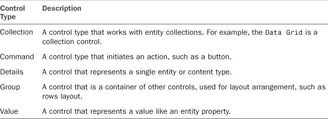
Available Control Types
LightSwitch supports different kinds of controls (for example, controls for manipulating a single entity, an entity collection, a property value, or layout controls). Available controls are of type IContentItem and are described in Table 18.3.
Table 18.3. Available Control Types
Of course, in this book it is not possible to show how to create every possible control type. What you learn here is to implement a collection control and thus provide design-time support. The reason for this is that at the time of this writing, the MSDN documentation does not have a tutorial on collection controls. Also, it is normal for you to work with data collections other than single entities, so it is a good opportunity to learn something new. At the end of this section, you get a useful summary of available resources and tutorials about custom controls in the MSDN documentation.
Creating Control Extensions
You create control extensions by adding an item of type Control to the Lspkg project of an extensibility solution. That said, follow these steps:
1. Create a new extensibility solution in Visual Studio 2010 and call it ChartControlExtension.
2. Add a new item of type Control to the Lspkg project; call the new control ChartControl, as shown in Figure 18.18.
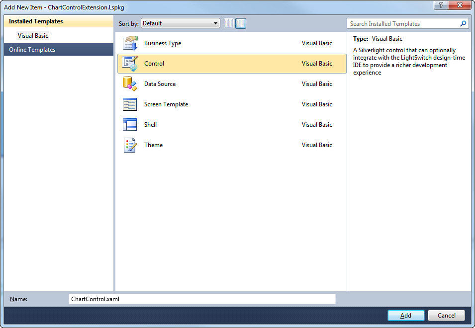
Figure 18.18. Adding an item of type Control to the project.
3. In the Client project, ensure that a reference to the Common project has been added. If not, add it manually. Also, add a reference to the following assemblies of the Silverlight Toolkit: System.Windows.Controls.Toolkit.dll, System.Windows.Controls.DataVisualization.Toolkit.dll.
Once the control is added, in the Client project you can see a XAML file under the PresentationControls folder. (This also implies that you can add multiple controls to the same solution.) This is where you implement the UI of the control; in the Common project, instead, you will work with the module definition (.lsml) file to provide integration with the IDE.
Replacing the Control Icon
Both the Client.Design and Design projects contain the control icon that is used by the LightSwitch Screen Designer to identify the control itself. When you create a custom control, Visual Studio generates an icon for you under the form of a 16×16 .png image file. Although optional in the current example, in your real-world project you should replace the default icon with a custom one, with the same features.
Adding String Resources
Some settings of controls and of control properties can be assigned with strings. To make localization easier, you have an opportunity to use string resources. The Common project contains a resources file called ModuleResources.resx. Double-click this file, and in the Resources Designer add the name/value pairs as summarized in Table 18.4 and represented in Figure 18.19. (The Comment field is totally optional.)
Table 18.4. Adding Localizable String Resources for Control Properties
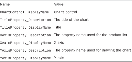
Figure 18.19. Adding localizable strings.
You will use these resources in a few moments inside the control metadata definition file.
Implementing the Metadata Definition and Properties for Design-Time Support
Implementing a Chart control to display the list of products as in Chapter 16 was very easy because you knew the name of the underlying collection and the name of properties required for data binding. However, things change if you want to make your control reusable across multiple applications and different, unknown collections of objects. For example, you need to tell LightSwitch that the control will use a collection, and you might want to let users choose the title for the chart (and the name of properties that will be used to draw objects on the chart). To accomplish this, you can implement properties in your custom control definition so that these display in the Properties window of the Screen Designer. The user can supply values that will be then utilized by the custom control. All the work is done inside the definition file that you find in the Common project, under the MetadataControls subfolder. In the current example, this file is called ChartControl.lsml. Double-click it in Solution Explorer to open the code editor for this file. The first thing you have to do is set the SupportedContentItemKind property for the Control element, as follows:
SupportedContentItemKind="Collection"
This ensures that the control will receive an entity collection. You can then edit the DisplayName property with a meaningful description; Chart Control is enough. Next, you add properties that the user can set in the Properties window for the Screen Designer. The first property to implement is called TitleProperty; the user will set the chart’s title, and then this will be data-bound to the appropriate property in the charting controls. You define properties inside a Control.Properties element. The following code demonstrates how to implement the Title property:
<Control.Properties>
<ControlProperty Name="TitleProperty"
PropertyType=":String"
CategoryName="Appearance"
EditorVisibility="PropertySheet">
<ControlProperty.Attributes>
<!-- Reference localized strings in ModuleResource.resx -->
<DisplayName Value="$(TitleProperty_DisplayName)" />
<Description Value="$(TitleProperty_Description)" />
</ControlProperty.Attributes>
<!-- Define the default value of this
property to be an empty string. -->
<ControlProperty.DefaultValueSource>
<ScreenExpressionTree>
<!-- Only a constant expression is supported here. -->
<ConstantExpression ResultType=":String"
Value="Products in stock"/>
</ScreenExpressionTree>
</ControlProperty.DefaultValueSource>
</ControlProperty>
</Control.Properties>
Following are important considerations about this code snippet:
• The PropertyType attribute specifies the data type that the property supports—in this case, String.
• CategoryName allows specifying the area of the Properties window where the property will be displayed. Supported values are Default, Appearance, Sizing, and Validation.
• EditorVisibility allows specifying the way a property is treated at design time. Assigning this with PropertySheet means that it will be edited inside the specified (or default) editor for the property type. NotDisplay means that the property will not be editable in the Properties window.
• You can specify the DisplayName and Description for the property by adding a ControlProperty.Attributes element; both can be set with a literal or by pointing to strings inside the extension’s resources, as in the current example.
• You can provide a default property value by adding a ControlProperty.DefaultValueSource element, which contains a ScreenExpressionTree where the default value is expressed through a ConstantExpression element. This contains the value type (ResultType) and the value content (Value). In this case, the property offers a default value for the chart’s title.
Continuing with this lesson, add two other properties called XAxisProperty and YAxisProperty that the user will assign with the property names that will be used for drawing the chart. The implementation for both properties can be found in the full source code for the definition file, which is reported in Listing 18.2.
Listing 18.2. Implementing Properties in the Control Definition File
<?xml version="1.0" encoding="utf-8" ?>
<ModelFragment
xmlns="http://schemas.microsoft.com/LightSwitch/2010/xaml/model"
xmlns:x="http://schemas.microsoft.com/winfx/2006/xaml">
<Control Name="ChartControl"
SupportedContentItemKind="Collection"
DesignerImageResource="ChartControlExtension.ChartControl::ControlImage">
<Control.Attributes>
<DisplayName Value="Chart Control" />
</Control.Attributes>
<Control.Properties>
<ControlProperty Name="TitleProperty"
PropertyType=":String"
CategoryName="Appearance"
EditorVisibility="PropertySheet">
<ControlProperty.Attributes>
<!-- Reference localized strings in ModuleResource.resx -->
<DisplayName Value="$(TitleProperty_DisplayName)" />
<Description Value="$(TitleProperty_Description)" />
</ControlProperty.Attributes>
<!-- Define the default value of this property to be an empty string. -->
<ControlProperty.DefaultValueSource>
<ScreenExpressionTree>
<!-- Only a constant expression is supported here. -->
<ConstantExpression ResultType=":String" Value="Products in stock"/>
</ScreenExpressionTree>
</ControlProperty.DefaultValueSource>
</ControlProperty>
<ControlProperty Name="XAxisProperty"
PropertyType=":String"
CategoryName="Appearance"
EditorVisibility="PropertySheet">
<ControlProperty.Attributes>
<!-- Reference localized strings in ModuleResource.resx -->
<DisplayName Value="$(XAxisProperty_DisplayName)" />
<Description Value="$(XAxisProperty_Description)" />
</ControlProperty.Attributes>
<!-- Define the default value of this property to be an empty string. -->
<ControlProperty.DefaultValueSource>
<ScreenExpressionTree>
<!-- Only a constant expression is supported here. -->
<ConstantExpression ResultType=":String" Value="ProductName"/>
</ScreenExpressionTree>
</ControlProperty.DefaultValueSource>
</ControlProperty>
<ControlProperty Name="YAxisProperty"
PropertyType=":String"
CategoryName="Appearance"
EditorVisibility="PropertySheet">
<ControlProperty.Attributes>
<!-- Reference localized strings in ModuleResource.resx -->
<DisplayName Value="$(YAxisProperty_DisplayName)" />
<Description Value="$(YAxisProperty_Description)" />
</ControlProperty.Attributes>
<!-- Define the default value of this property to be an empty string. -->
<ControlProperty.DefaultValueSource>
<ScreenExpressionTree>
<!-- Only a constant expression is supported here. -->
<ConstantExpression ResultType=":String" Value="UnitsInStock"/>
</ScreenExpressionTree>
</ControlProperty.DefaultValueSource>
</ControlProperty>
</Control.Properties>
</Control>
</ModelFragment>
Now it is time to design the user interface of the custom control.
Designing the Control’s User Interface
In Solution Explorer, double-click the file called ChartControl.xaml in the Client project. The XAML code for the control is based on the example from Chapter 16, but it is a simplified version because it includes only the PieSeries control, not the TreeMap one. Listing 18.3 shows the code for the control implementation.
Listing 18.3. Implementing the Control’s UI
<UserControl x:Class="ChartControlExtension.Presentation.Controls.ChartControl"
xmlns="http://schemas.microsoft.com/winfx/2006/xaml/presentation" x:Name="Chart1"
xmlns:x="http://schemas.microsoft.com/winfx/2006/xaml"
xmlns:local="clr-namespace:ChartControlExtension.Presentation.Controls"
xmlns:toolkit="http://schemas.microsoft.com/winfx/2006/xaml/presentation/toolkit">
<Grid DataContext="{Binding Value}" x:Name="LayoutRoot">
<toolkit:Chart x:Name="MainChart"
Background="LightSkyBlue"
Title="{Binding ElementName=Chart1, Path=ChartTitle}"
BorderBrush="#000099"
BorderThickness="2"
Grid.Column="0" >
<toolkit:Chart.Series>
<!-- I need a way to populate ValuePath properties with user
values, as it happens for the Title property above -->
<toolkit:PieSeries x:Name="PieSeries1"
ItemsSource="{Binding}"
IsSelectionEnabled="True"/>
</toolkit:Chart.Series>
</toolkit:Chart>
</Grid>
</UserControl>
Notice how the Title property of the Chart control is bound to a ChartTitle property from the user control. This is a dependency property that is added in the code-behind and that is mapped to the TitleProperty property from the extension definition file. Note that the IndependentValuePath and DependentValuePath properties for the PieSeries are not set in XAML, because they will be assigned in procedural code.
Implementing Dependency Properties
Assumptions about Dependency Properties
Dependency properties are a key concept in Silverlight and WPF and are basically special properties with built-in support for data binding and change notification. This chapter does not explain dependency properties, and instead assumes your prior knowledge about them. You can find further information in the MSDN Library at http://msdn.microsoft.com/en-us/library/cc221408(v=vs.95).aspx.
You can easily bind properties set in the control definition file to properties in your user control by implementing dependency properties. These are very useful because they automatically reflect changes to the screen content when you set control properties in the Screen Designer. In this particular example, you implement two dependency properties: The first one is for setting the chart’s title, and the second one is used to retrieve the ContentItem type for the control. Details are provided where appropriate. Open the code-behind for the ChartControl.xaml file. The first dependency property that you implement is called ChartTitleProperty and is bound to the chart’s title. This is the code for the property:
Public Shared ReadOnly ChartTitleProperty As DependencyProperty = _
DependencyProperty.Register("ChartTitle",
GetType(String), GetType(ChartControl),
New PropertyMetadata(Nothing))
Public Property ChartTitle As String
Get
Return CStr(MyBase.GetValue(ChartTitleProperty))
End Get
Set(value As String)
MyBase.SetValue(ChartTitleProperty, value)
End Set
End Property
This is a basic implementation that registers a property called ChartTitle. This is exactly the property that has been bound in the XAML code via the {Binding ElementName=Chart1, Path=ChartTitle} markup extension.
The second dependency property exposes an object of type IContentItem. This object is really important because it represents a piece of content inside a screen and not only allows accessing UI properties in LightSwitch but also data associated with the UI (including single entities and collections). Table 18.5 summarizes the most important members from IContentItem.
Table 18.5. Most Important Members of IContentItem
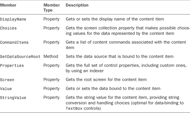
You will use IContentItem to access your custom control from a LightSwitch perspective rather than a pure Silverlight one. For example, consider the implementation of the following dependency property called ContentItemProperty and especially of the ContentItem_Changed callback:
Public Shared ReadOnly ContentItemProperty As DependencyProperty = _
DependencyProperty.Register("ContentItem",
GetType(IContentItem), GetType(ChartControl),
New PropertyMetadata(AddressOf ContentItem_Changed))
Public Property ContentItem As IContentItem
Get
Return CType(MyBase.
GetValue(ContentItemProperty), IContentItem)
End Get
Set(value As IContentItem)
MyBase.SetValue(ContentItemProperty, value)
End Set
End Property
Private Shared Sub ContentItem_Changed(d As DependencyObject,
e As DependencyPropertyChangedEventArgs)
Dim control = DirectCast(d, ChartControl)
Dim item = control.ContentItem
DirectCast(control.MainChart.Series(0),
PieSeries).DependentValuePath = _
CStr(item.
Properties("ChartControlExtension:ChartControl/YAxisProperty"))
DirectCast(control.MainChart.Series(0),
PieSeries).IndependentValuePath = _
CStr(item.
Properties("ChartControlExtension:ChartControl/XAxisProperty"))
End Sub
By accessing the Properties property from the IContentItem instance, you can easily retrieve all the properties exposed by the custom control, including XAxisProperty and YAxisProperty, whose values are exactly what you need to assign the IndependentValuePath and DependentValuePath properties from the PieSeries control. This makes it possible for the user to specify property names from the source collection in the Properties window. Then, these names are assigned to the appropriate chart properties. It is worth emphasizing the following conversion:
DirectCast(control.unitsInStockChart.Series(0), PieSeries)
Normally you access the PieSeries by just using the named instance, such as control.PieSeries1. Unfortunately, this approach returns a null object; this is a known issue with Chart controls from the Silverlight toolkit, and the code shown here is a good workaround. The next step is to finalize data-binding between properties in the control’s constructor, as follows:
Public Sub New()
InitializeComponent()
MyBase.SetBinding(ChartControl.ChartTitleProperty,
New Binding("Properties[ChartControlExtension:ChartControl/TitleProperty]"))
MyBase.SetBinding(ChartControl.ContentItemProperty, New Binding())
End Sub
With the code in the constructor, the ChartTitleProperty is bound to the related property in the control definition. This is useful so that each time the user changes the property value in the Properties window, this is automatically reflected to the screen, including in Immediate Customization mode. The ContentItemProperty is instead bound to the root data source of the control, which is the screen collection.
Immediate Customization and Dependency Properties
It is best practice to implement dependency properties to wrap related properties from the control definition file so that the screen automatically reflects user settings. In the current example, this has been done with regard to the ChartTitleProperty dependency property. You might want to consider implementing dependency properties for all the other members such as XAxisChartProperty and YAxisChartProperties, which has not been done here so that we could show an example of IContentItem instead. For instance, you could write a callback for those dependency properties and assign at that point the value paths for the PieSeries control.
Making the Control Programmable
In most cases, you want other developers to be able to interact with your control at runtime. To make this possible, you need to implement the IContentVisual interface. This requires implementing a method called Show, which can be left empty in this case, and a property called Control. This is how you implement such an interface:
Partial Public Class ChartControl
Implements IContentVisual
'.....
Public ReadOnly Property Control As Object _
Implements Microsoft.LightSwitch.
Presentation.IContentVisual.Control
Get
Return Me
End Get
End Property
Public Sub Show() Implements Microsoft.LightSwitch.
Presentation.IContentVisual.Show
End Sub
End Class
In this way, developers can interact with the control instance via the IContentItemProxy interface.
Testing the Custom Control
After setting the VSIX properties as in the previous extension examples, you can test the extension inside the experimental instance of Visual Studio 2010. Once it is running, open the Invoice Management application and enable the extension in the Application Designer. Finally, open the Screen Designer for the Editable Products Grid screen. When ready, follow these steps:
1. Drag the Products query from the upper-left corner of the designer into the Rows Layout element.
2. Select Chart Control from the drop-down list of the Products element (see Figure 18.20).
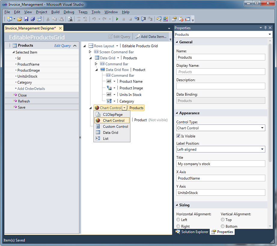
Figure 18.20. Setting Chart control properties.
3. Select the nested Rows Layout | Product element, and in the Properties window uncheck Is Visible. Then, delete the Command Bar element.
4. Select Chart Control, and in the Properties window fill in the Title property value, as shown in Figure 18.20. This figure also demonstrates how properties can be set at design time (because of the implementation of the control definition file).
If you run the application and open the Editable Product Grid screen, you will see how the Chart control shows the products currently available in stock (see Figure 18.21).
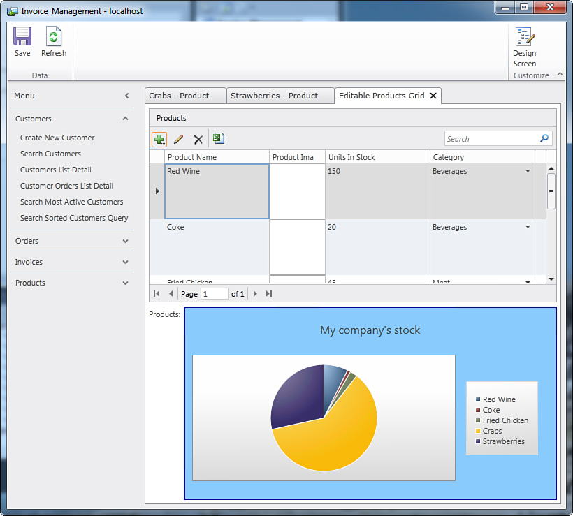
Figure 18.21. The custom control displays a chart based on products.
You can easily check how the chart can be generated dynamically by accessing the Customization Mode (click the Design Screen button), replacing UnitsInStock with another property like Category and then saving your changes. You could also try to add the Chart control to map a completely different entity collection, such as Invoices, to demonstrate the amount of invoices per customer.
Suggestions for Further Implementations
If you want to enhance the current control example, you might want to consider adding more properties to the control definition file. For example, you could consider properties that will be mapped to the Background, BorderBrush, and BorderThickness properties of the Chart control and create custom editors for them. Supplying a custom editor is explained in an MSDN tutorial at http://msdn.microsoft.com/en-US/library/hh304425. Finally, you could add logic to check whether the property values supplied by the user are valid.
MSDN Documentation About Key Topics on LightSwitch Controls
This section covered the basics of creating custom controls, but there is a lot more to know about these special kinds of extensions. The MSDN documentation provides the necessary information and great tutorials about basic and advanced topics on development of controls, including the following:
• Walkthrough: Creating a Detail Control Extension: This tutorial provides the most important information on LightSwitch control development and is available at http://msdn.microsoft.com/en-US/library/hh290136.
• Additional LightSwitch Control Concepts: This tutorial explains how to leverage viewers and editors for your control, and how to add display mode support. It is available at http://msdn.microsoft.com/en-US/library/hh304425.
• Defining, Overriding, and Using LightSwitch Control Properties: This explains how to get the most out of custom properties, and how to override built-in control properties to reach complex results. It also shows advanced techniques to get property values and to make properties attachable and inheritable. It is available at http://msdn.microsoft.com/en-US/library/hh304431.
After learning about custom controls, it is time to move to the next extensibility point: screen templates.
Creating Screen Templates
Visual Studio LightSwitch ships with a number of built-in screen templates that can satisfy the most common needs in business applications. In addition, an extensibility point means that you can create custom screen templates to satisfy additional, specific needs. When creating a new screen template, you design its visual tree; LightSwitch is responsible for loading and binding data to the user interface.
An example that satisfies common and specific at the same time is not easy, so in this section you learn what you need to build your own screen template by building a master-details screen template. Suppose you want to create a common screen with two Data Grid controls. The first Data Grid shows the list of customers, and the second one shows the list of orders related to the currently selected customer. As usual, you first create a new extensibility project for LightSwitch. For consistency with this chapter, name the new project ScreenTemplateExtension. When the new project is ready, right-click the Lspkg project in Solution Explorer and then click Add, New Item. Select the LightSwitch Screen Template in the Add New Item dialog, as shown in Figure 18.22. Name the new item MasterDetailScreenTemplate and click Add.
Figure 18.22. Adding a new screen template to the extensibility project.
Before continuing, prepare the extension for testing by replacing default property values in the VSIX designer. Double-click the source.extension.vsixmanifest file in Solution Explorer and specify the property values described in Table 18.6.
Table 18.6. Deployment Manifest Properties for the Custom Screen Template
When creating a screen template, you focus your attention on the Design project. This contains the following items:
• A code file where you have to write the screen’s visual tree definition. This is located under the ScreenTemplates subfolder. In the current example, the code file is called MasterDetailScreenTemplate.vb.
• An icon representing the screen template, of size 24x24, and of type Portable Network Graphics. This is located under the ResourcesScreenTemplateImages folder and, in the current example, is called MasterDetailScreenTemplateSmall.png.
• A larger image representing the screen template, of size 245x178, also of type Portable Network Graphics. This is also located under the Resources ScreenTemplateImages folder and, in the current example, is called MasterDetailScreenTemplateLarge.png.
Usually, the image files represent your screen template in the LightSwitch Add Screen dialog, so it is an opportunity to provide a graphical idea about what your screen looks like. The default image files retake the List and Details built-in screen look and feel, so you should edit such files with an image editor to provide the most appropriate layout. For the current example, we do not edit the default images, but you should do so with real-world extensions. Now it is time to examine how a screen template is made and how to design a custom one.
Designing Custom Screen Templates
A screen template is made of several factory classes, but you do not need to know all of them in detail. What you need to know is that your screen template is represented by a class that must implement the IScreenTemplate interface from the Microsoft.LightSwitch.Designers.ScreenTemplates.Model namespace. Such an interface requires you to implement a method called Generate, where you design the content tree for your screen and which is invoked when a new instance of the screen must be generated at runtime. This method is actually the piece of code that takes the most time when creating a screen template. Other than this, the IScreenTemplate interface requires implementing a number of read-only properties, which are described in Table 18.7.
Table 18.7. Properties to Be Implemented According to the IScreenTemplate Interface
The place where the IScreenTemplate interface must be implemented is a code file available in the Design project, under the ScreenTemplates folder. This file was generated by LightSwitch for you and if you followed the project naming for the current example (MasterDetailScreenTemplate.vb). If you chose a different project name, the MasterDetail prefix is replaced with the name of choice. Fortunately, when you add a screen template to the solution, Visual Studio LightSwitch automatically implements the IScreenTemplate interface for you and provides stubs for all the properties listed in Table 18.7, including an empty definition for the Generate method. In addition, some factory code is automatically generated that you do not need to change. This is included in the Constants and IScreenTemplateFactory Members regions, and for the sake of simplicity, it is not discussed here. You can check it out in the official MSDN documentation.
Implementing the IScreenTemplate Properties
The IScreenTemplate Members region in the code file contains a default property definition that you must replace with your own. The following code provides an example:
Public ReadOnly Property Description As String _
Implements IScreenTemplateMetadata.Description
Get
Return _
"Screen template for tabular representations of master-
details relationships"
End Get
End Property
Public ReadOnly Property DisplayName As String _
Implements IScreenTemplateMetadata.DisplayName
Get
Return "Master Detail Screen"
End Get
End Property
Public ReadOnly Property PreviewImage As Uri _
Implements IScreenTemplateMetadata.PreviewImage
Get
Return New Uri _
("/ScreenTemplateExtension.Design;
component/Resources/ScreenTemplateImages/
MasterDetailScreenTemplateLarge.png",
UriKind.Relative)
End Get
End Property
Public ReadOnly Property RootDataSource As RootDataSourceType _
Implements IScreenTemplateMetadata.RootDataSource
Get
Return RootDataSourceType.Collection
End Get
End Property
Public ReadOnly Property ScreenNameFormat As String _
Implements IScreenTemplateMetadata.ScreenNameFormat
Get
Return "{0}MasterDetail"
End Get
End Property
Public ReadOnly Property SmallIcon As Uri _
Implements IScreenTemplateMetadata.SmallIcon
Get
Return New Uri _
("/ScreenTemplateExtension.Design;
component/Resources/ScreenTemplateImages/
MasterDetailScreenTemplateSmall.png",
UriKind.Relative)
End Get
End Property
Public ReadOnly Property SupportsChildCollections As Boolean _
Implements _
IScreenTemplateMetadata.SupportsChildCollections
Get
Return True
End Get
End Property
Public ReadOnly Property TemplateName As String _
Implements IScreenTemplateMetadata.TemplateName
Get
Return MasterDetailScreenTemplate.TemplateId
End Get
End Property
Focus your attention on the following points:
• The RootDataSource property returns the type RootDataSourceType.Collection. This enables the screen to display entity sets or queries returning several results. If you want your screen template to be able to display single entities instead, replace Collection with one of the supported values listed in Table 18.4.
• The SupportsChildCollections property returns True, which means that the screen template can load and display related collections of entities. You can move this to False if you do not need to return related objects.
• Both the PreviewImage and SmallIcon properties point to resources embedded into the extension, so they are using the so-called packed URIs.
• The TemplateName property simply returns a constant called TemplateId. Such a constant is defined in the Constants region, and you do not need to change it.
It is now time to generate the actual content tree for the screen by implementing the Generate method.
Generating the Screen Content Tree
The screen content tree is the set of controls that the template must offer to the end user. Generating the screen content tree is accomplished by implementing the IScreenTemplate.Generate method. The code for the Generate method can be very complex, depending on the number of controls and screen properties that you want to include in your template. In this section, the various steps are represented by several code snippets that you need to write in sequence, but at the end a full code listing is provided for your convenience. The first thing you notice about the method definition is that it receives an argument of type IScreenTemplateHost:
Public Sub Generate(host As IScreenTemplateHost) _
Implements IScreenTemplate.Generate
End Sub
This argument holds a reference to the screen generator host, which provides functionalities that make the code generation for screens easier for the runtime infrastructure. Basically, you need to interact with the host to add controls and screen properties. For instance, the first thing you might want to do inside the method body is add a root element for the screen. This is accomplished by creating an instance of the ContentItem class and by adding such an instance to the host. The following code demonstrates this:
Dim primaryDataControl As ContentItem = host.AddContentItem( _
host.ScreenLayoutContentItem,
host.MakeUniqueLegalNameForContentItem("My Root Data"),
host.PrimaryDataSourceProperty)
The AddContentItem method adds the content as the root element in the screen (ScreenLayoutContentItem) for the primary data source (PrimaryDataSourceProperty). It also sets a unique identifier for the content item, which is what you see in the Screen Designer (MakeUniqueLegalNameForContentItem). The next step is to add a control to display the primary collection from your data source. What you need to do is add the appropriate control and set some of its properties, such as the resize mode and the display name, as follows:
'Specifies the control that will be used first
host.SetContentItemView(primaryDataControl,"Microsoft.LightSwitch:DataGrid")
'Generates child controls (DataGridRow controls in this case)
host.ExpandContentItem(primaryDataControl)
'Specifies the control resize mode on screen
host.SetControlPropertyValue(primaryDataControl,
"Microsoft.LightSwitch:RootControl", "VerticalAlignment", "Top")
host.SetControlPropertyValue(primaryDataControl,
"Microsoft.LightSwitch:RootControl", "HeightSizingMode", "Auto")
'Sets the display name, as it appears in the Screen Designer
host.SetDisplayName(primaryDataControl, "Main Screen Data")
Here are a few considerations (in addition to the comments in the code itself):
• SetContentItemView specifies the first data-bound control in the content tree. The first method argument is the previously created instance of ContentItem and basically represents the control’s host. The second method argument represents the control used to display data. In this case, a Data Grid is used because you are creating a screen to show collections. You can replace it with different LightSwitch controls.
• ExpandContentItem generates a view for displaying children from a collection or one entity. In this case, invoking ExpandContentItem will automatically generate as many DataGridRow controls as there are elements in the bound collection.
• SetControlPropertyValue enables you to specify values for screen properties as they appear in the Properties window in the IDE. In the current example, this method is used to set both the VerticalAlignment and HeightSizingMode properties with the specified values. Notice that properties can be set at different levels in the inheritance hierarchy. In the current example, all controls inherit from RootControl, which provides properties common to all the derived controls.
You can find further information about the SetControlPropertyValue method and properties that can be set with this method in the MSDN documentation at http://msdn.microsoft.com/en-us/library/hh304431.aspx.
The next step is to control properties in the collection associated with the screen. For instance, you can enable or disable paging, sorting, and search. Also, you can set in code the page size. The following code demonstrates how to convert the host’s PrimaryDataSourceProperty property into an object of type ScreenCollectionProperty and how to control paging, sorting, and searching:
'Sets properties for the collection bound to the screen
Dim collectionProperty As ScreenCollectionProperty = _
DirectCast(host.PrimaryDataSourceProperty, ScreenCollectionProperty)
collectionProperty.DisablePaging = False
collectionProperty.PageSize = 100
collectionProperty.DisableSearch = False
collectionProperty.DisableSorting = True
Notice how paging is enabled and how the page size is set to 100 items per page. Also, notice how the code is enabling search but disabling sorting. In theory, the code you have seen so far is enough to display a collection of items, but the screen template must be able to display related collections. Because of this, you need to write some code to display all the available related collections via appropriate controls. You can do so by adding a Tabs Layout to the screen and a Data Grid for each tab. Each Data Grid is then data-bound to a child, related collection. The code that performs this action is the following:
'Add a tabs group to the screen
Dim tabsGroup As ContentItem = host.AddContentItem(host.
ScreenLayoutContentItem,
"TabsGroup", ContentItemKind.Group)
host.SetContentItemView(tabsGroup, "Microsoft.LightSwitch:TabsLayout")
For Each p As ScreenCollectionProperty In host.ChildCollectionProperties
'Display each child collection as a grid
Dim currentTab As ContentItem = host.AddContentItem(tabsGroup,
host.MakeUniqueLegalNameForContentItem("Tab"), p)
host.SetContentItemView(currentTab, "Microsoft.LightSwitch:DataGrid")
host.ExpandContentItem(currentTab)
Next
The code performs the following steps:
1. It creates a new instance of ContentItem and adds such an instance to the screen content tree. The new item is a Tabs Group, and the view that LightSwitch is going to generate for the new item is a Tabs Layout.
2. It iterates the host’s ChildCollectionProperties to find related collections. For each child collection, it generates a new tab and adds this to the screen content tree.
3. It adds a Data Grid inside each tab, and for each one it automatically expands the view.
It is interesting to see how the code specifies the required controls, which is done by writing the namespace that contains the control followed by a colon and then by the name of the control (for example, Microsoft.LightSwitch:DataGrid). This identifier is known as ViewID in the LightSwitch terminology and enables you to use all the available controls in your screen templates. The full list of ViewIDs (and consequently of all built-in controls that you can use) is available at http://msdn.microsoft.com/en-us/library/hh304428.aspx. From the pure screen content tree perspective, you have nothing else to do at this point, but you can improve the screen generation by specifying custom code-behind.
Adding Code to the Screen
When a screen is generated, LightSwitch adds some default, support code. You can customize your screen template by adding additional custom code, which the final developer can edit and customize. Whichever kind of additional functionalities you want to provide, you want to keep two fundamental concepts in mind:
• The code must be provided under the form of a single string.
• The code must be available for both Visual Basic and Visual C#.
After you have your code string, you send it to the screen by invoking the host’s AddCodeBehind method, which receives just one argument of type String. Of course, your code must check for the programming language used, to supply the appropriate code string. This can be accomplished by retrieving the value of the host’s ScreenCodeBehindProperty, of type System.Management.CodeLanguage. This is an enumeration offered by the .NET Framework, not LightSwitch specific, and lists several programming languages, including VB and CSharp. A suggested technique from the LightSwitch team is to add a dictionary collection at the class level, and populate such a dictionary with the code you want, as in the following example:
Private Shared _codeTemplates As
New Dictionary(Of CodeLanguage, String)() From
{
{CodeLanguage.CSharp, _
"" _
+ "{0}namespace {1}" _
+ "{0}{{" _
+ "{0} public partial class {2}" _
+ "{0} {{" _
+ "{0}" _
+ "{0} partial void {2}_InitializeDataWorkspace(global::System.Collections.Generic.List _ <global::Microsoft.LightSwitch.IDataService> saveChangesTo)" _
+ "{0} {{" _
+ "{0} this.ShowMessageBox(""Hello LightSwitch"");" _
+ "{0} }}" _
+ "{0}" _
+ "{0} }}" _
+ "{0}}}"
}, _
{CodeLanguage.VB, _
"" _
+ "{0}Namespace {1}" _
+ "{0}" _
+ "{0} Public Class {2}" _
+ "{0}" _
+ "{0} Private Sub {2}_InitializeDataWorkspace(ByVal saveChangesTo As
Global.System.Collections.Generic.List(Of _ Global.Microsoft.LightSwitch.IDataService))" _
+ "{0} Me.ShowMessageBox(""Hello LightSwitch"")" _
+ "{0} End Sub" _
+ "{0}" _
+ "{0} End Class" _
+ "{0}" _
+ "{0}End Namespace" _
}
}
Notice how the code adds some code-behind for the InitializeDataWorkspace method where it simply shows a welcome message box, but you are not limited to this. You can provide custom code-behind for each available method. Notice how the {1} literal refers to the application’s root namespace and the {2} literal to the class name. These are taken from the result of the invocation of the AddScreenCodeBehind method that you have to add in the Generate method, as follows:
'Code Generation
Dim codeTemplate As String = ""
If _codeTemplates.TryGetValue(host.ScreenCodeBehindLanguage,
codeTemplate) Then
host.AddScreenCodeBehind(String.Format(codeTemplate,
Environment.NewLine,
host.ScreenNamespace,
host.ScreenName))
End If
The code invokes the TryGetValue method from the Dictionary class to retrieve the value for the specified key, which in this case is represented by the host’s ScreenCodeBehindLanguage property. If the value for the key matches the corresponding CodeLanguage value, the language is stored into the codeTemplate variable. Then, the AddScreenCodeBehind method is invoked by passing a string that is formatted according to the language (first argument for String.Format). The namespace and the classname for the screen are passed as an array of strings. Being the result of an invocation to String.Format, the code-behind can recognize the {1} and {2} literals. This is definitely another example of how to retrieve interesting information on the screen via the host. As mentioned previously, for your convenience, the entire screen template code is summarized in Listing 18.4.
Listing 18.4. Creating a Custom Screen Template
Imports System
Imports System.Collections.Generic
Imports System.ComponentModel.Composition
Imports System.Linq
Imports System.Management
Imports System.Text
Imports Microsoft.LightSwitch.Designers.ScreenTemplates.Model
Imports Microsoft.LightSwitch.Model
Imports Microsoft.LightSwitch.Model.Storage
Namespace ScreenTemplates
Public Class MasterDetailScreenTemplate
Implements IScreenTemplate
#Region "IScreenTemplate Members"
Private Shared _codeTemplates As Dictionary(Of CodeLanguage,
String) = New Dictionary(Of CodeLanguage, String)() From
{
{CodeLanguage.CSharp, _
"" _
+ "{0}namespace {1}" _
+ "{0}{{" _
+ "{0} public partial class {2}" _
+ "{0} {{" _
+ "{0}" _
+ "{0} partial void {2}_InitializeDataWorkspace(global::System.Collections.Generic.List _ <global::Microsoft.LightSwitch.IDataService> saveChangesTo)" _
+ "{0} {{" _
+ "{0} this.{3} = ""Hello World"";" _
+ "{0} }}" _
+ "{0}" _
+ "{0} }}" _
+ "{0}}}"
}, _
{CodeLanguage.VB, _
"" _
+ "{0}Namespace {1}" _
+ "{0}" _
+ "{0} Public Class {2}" _
+ "{0}" _
+ "{0} Private Sub {2}_InitializeDataWorkspace(ByVal saveChangesTo As
Global.System.Collections.Generic.List(Of _ Global.Microsoft.LightSwitch.IDataService))" _
+ "{0} Me.{3} = ""Hello World""" _
+ "{0} End Sub" _
+ "{0}" _
+ "{0} End Class" _
+ "{0}" _
+ "{0}End Namespace" _
}
}
Public Sub Generate(host As IScreenTemplateHost) _
Implements IScreenTemplate.Generate
Dim primaryDataControl As ContentItem = host.AddContentItem(host.
ScreenLayoutContentItem,
host.MakeUniqueLegalNameForContentItem("My Main Data"),
host.PrimaryDataSourceProperty)
'Specifies the control that will be first used
host.SetContentItemView(primaryDataControl,
"Microsoft.LightSwitch:DataGrid")
'Generates child controls (DataGridRow controls in this case)
host.ExpandContentItem(primaryDataControl)
'Specifies the control resize mode on screen
host.SetControlPropertyValue(primaryDataControl,
"Microsoft.LightSwitch:RootControl", "VerticalAlignment", "Top")
host.SetControlPropertyValue(primaryDataControl,
"Microsoft.LightSwitch:RootControl", "HeightSizingMode", "Auto")
'Sets the display name, as it appears in the Screen Designer
host.SetDisplayName(primaryDataControl, "Main Screen Data")
'Sets properties for the collection bound to the screen
Dim collectionProperty As ScreenCollectionProperty = _
DirectCast(host.PrimaryDataSourceProperty, _ScreenCollectionProperty)
collectionProperty.DisablePaging = False
collectionProperty.PageSize = 100
collectionProperty.DisableSearch = False
collectionProperty.DisableSorting = True
'Get the data type of the our property
Dim collectionDataType As IEntityType = _
CType(host.FindGlobalModelItem(Of ISequenceType) _
(collectionProperty.PropertyType).ElementType, IEntityType)
'Add a tabs group to the screen
Dim tabsGroup As ContentItem = _
host.AddContentItem(host.ScreenLayoutContentItem,
"TabsGroup", ContentItemKind.Group)
host.SetContentItemView(tabsGroup, "Microsoft.LightSwitch:TabsLayout")
For Each p As ScreenCollectionProperty In _host.ChildCollectionProperties
'Display each child collection as a grid
Dim currentTab As ContentItem = _
host.AddContentItem(tabsGroup,
host.MakeUniqueLegalNameForContentItem("Tab"), p)
host.SetContentItemView(currentTab,
"Microsoft.LightSwitch:DataGrid")
host.ExpandContentItem(currentTab)
Next
'Code Generation
Dim codeTemplate As String = ""
If _codeTemplates.TryGetValue(host.ScreenCodeBehindLanguage,
codeTemplate) Then
host.AddScreenCodeBehind(String.Format(codeTemplate,
Environment.NewLine,
host.ScreenNamespace,
host.ScreenName))
End If
End Sub
Public ReadOnly Property Description As String _
Implements IScreenTemplateMetadata.Description
Get
Return "Screen template for tabular representations of master- _details relationships"
End Get
End Property
Public ReadOnly Property DisplayName As String _
Implements IScreenTemplateMetadata.DisplayName
Get
Return "Master Detail Screen"
End Get
End Property
Public ReadOnly Property PreviewImage As Uri _
Implements IScreenTemplateMetadata.PreviewImage
Get
Return New Uri("/ScreenTemplateExtension.Design;component/Resources/ScreenTemplateImages/ _MasterDetailScreenTemplateLarge.png",
UriKind.Relative)
End Get
End Property
Public ReadOnly Property RootDataSource As RootDataSourceType _
Implements IScreenTemplateMetadata.RootDataSource
Get
Return RootDataSourceType.Collection
End Get
End Property
Public ReadOnly Property ScreenNameFormat As String _
Implements IScreenTemplateMetadata.ScreenNameFormat
Get
Return "{0}MasterDetail"
End Get
End Property
Public ReadOnly Property SmallIcon As Uri _
Implements IScreenTemplateMetadata.SmallIcon
Get
Return New Uri("/ScreenTemplateExtension.Design;component/Resources/ScreenTemplateImages/ _MasterDetailScreenTemplateSmall.png",
UriKind.Relative)
End Get
End Property
Public ReadOnly Property SupportsChildCollections As Boolean _
Implements IScreenTemplateMetadata.SupportsChildCollections
Get
Return True
End Get
End Property
Public ReadOnly Property TemplateName As String _
Implements IScreenTemplateMetadata.TemplateName
Get
Return MasterDetailScreenTemplate.TemplateId
End Get
End Property
#End Region
#Region "Constants"
Friend Const TemplateId As String = _"ScreenTemplateExtension:MasterDetailScreenTemplate"
#End Region
End Class
<Export(GetType(IScreenTemplateFactory))>
<Template(MasterDetailScreenTemplate.TemplateId)>
Friend Class MasterDetailScreenTemplateFactory
Implements IScreenTemplateFactory
#Region "IScreenTemplateFactory Members"
Public Function CreateScreenTemplate() As IScreenTemplate Implements IScreenTemplateFactory.CreateScreenTemplate
Return New MasterDetailScreenTemplate()
End Function
#End Region
End Class
End Namespace
Adding code-behind is the last step in the current example, so now it is time to test it. Later in this section, you learn some useful tips to enrich your screen templates.
Testing the Screen Template
Because of the nature of screen templates, a good example for testing it is to reconsider the Northwind Traders application created back in Chapter 8, “Aggregating Data from Different Data Sources.” First, press F5 to start the experimental instance of Visual Studio 2010. Next, open Northwind Traders application. Enable the extension in the Application Designer, as shown in Figure 18.23.
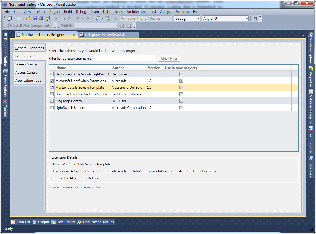
Figure 18.23. Enabling the screen template extension.
Now open Solution Explorer, right-click the Screens folder, and then select Add Screen. In the Add New Screen dialog, you now see the new screen template, as shown in Figure 18.24.
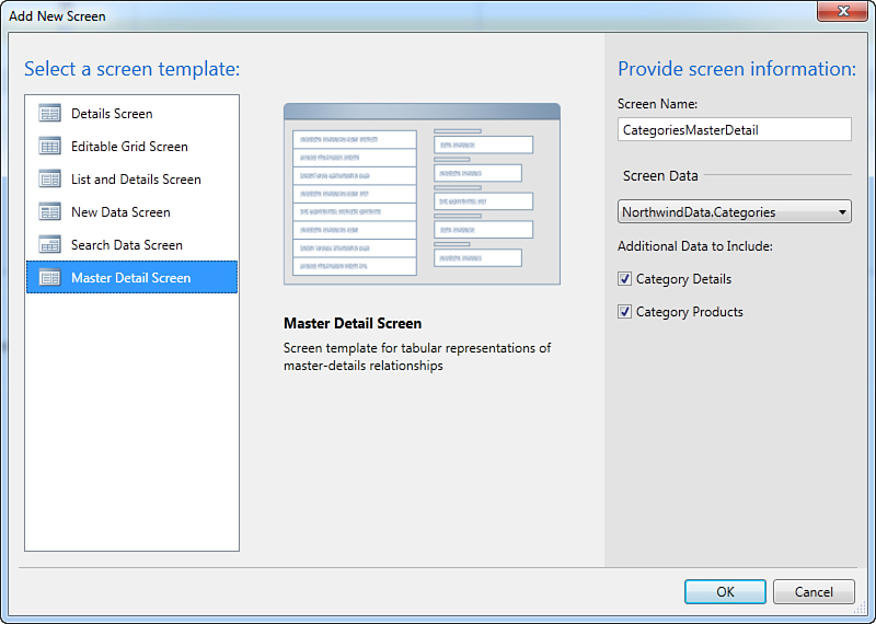
Figure 18.24. The new screen template is available in the Add New Screen dialog.
You add the new screen works just as you do built-in templates. So, select your data source, such as the Categories table, which has child collections. Ensure that the Category Products check box is checked and notice how the Screen Name field has been automatically filled the usual way. Remember that in the current example, the preview image is the same as for the List and Details screen template, but it will be different after you draw a custom image. When you add the screen, you will see its visual tree in the Screen Designer, as shown in Figure 18.25. Notice how the design view effectively reflects the amount of code you wrote before (in particular, the main Data Grid for the Categories collection and the Tabs Layout group, which includes a second Data Grid for the Products child collection).
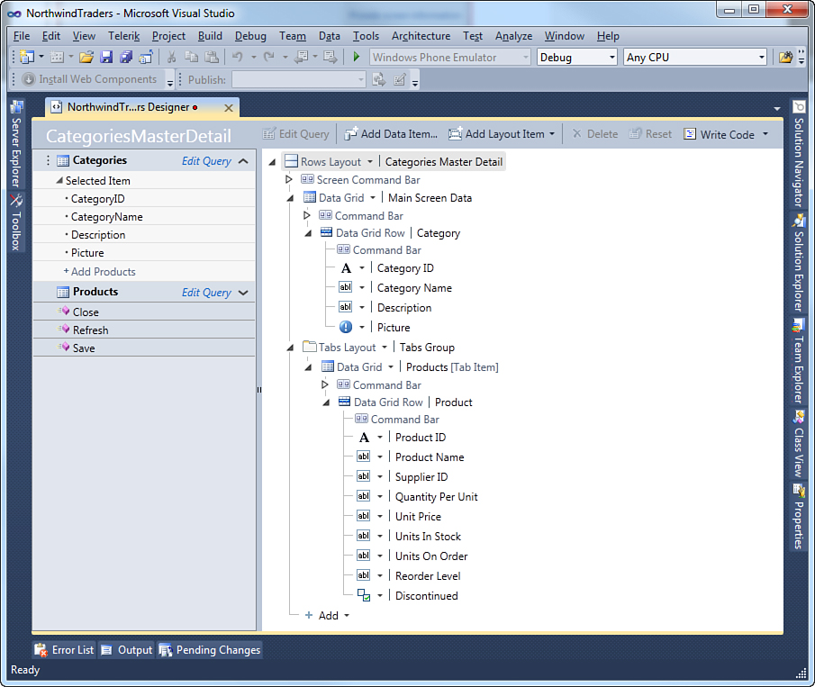
Figure 18.25. The Screen Designer for the screen based on the custom template.
Of course, you can edit the screen in the designer by taking advantage of all the tools you have seen so far. You can click Write Code to see how the custom code-behind has been included in the new screen. If you now run the application and open the new screen, you get the master collection in the upper Data Grid. Every time you click a row, the second Data Grid is updated to display the related collection, as shown in Figure 18.26.
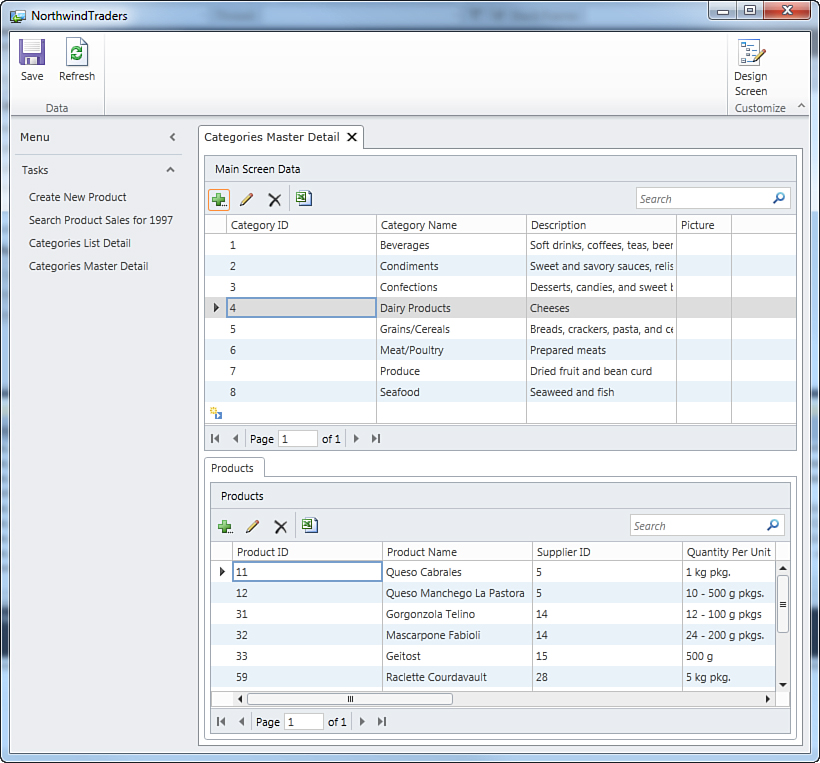
Figure 18.26. The new custom screen in action.
With a relatively little effort, you have created a custom screen template that takes advantage of all the LightSwitch infrastructure, including automatic data binding. In the next section, you find some useful tips to more fully customize screen templates.
Screen Templates Tips and Tricks
This subsection contains some code examples that you can reuse in your screen templates.
Selected Item and Entity Details
You can easily retrieve the instance of the selected item in the main collection and show its details. This first requires retrieving the type of the collection and then creating an expression that retrieves the selected item; then you can add a ContentItem that points to the expression, specifying the data type so that the generated screen content can correctly bind the entity details. To retrieve the collection type, you need to get an instance of the IEntityType type, which you can retrieve as follows:
'Get the data type of the our property
Dim collectionDataType As IEntityType = _
CType(host.FindGlobalModelItem(Of ISequenceType) _
(collectionProperty.PropertyType).ElementType, IEntityType)
The key element is the collectionProperty variable, of type Microsoft.LightSwitch.Model.Storage.ScreenCollectionProperty. This represents the collection currently bound to the screen, and its type is retrieved by first invoking the host’s FindGlobalModelItem method over the ElementType property and then converting the method result into an IEntityType. When you obtain the instance of IEntityType, you will be able to investigate the collection’s type properties, such as the name, methods, and members. IntelliSense helps you understand available information when using the collectionDataType variable. The next step is to create a so-called expression. For instance, consider the following code:
'Create an expression that represents accessing the selected item
'on our collection property
Dim chain As ChainExpression = _ host.CreateChainExpression(host.
CreateMemberExpression(collectionProperty.Id))
host.AppendMemberExpression(chain, "SelectedItem")
'Add a content item representing the selected item and set its
'view to a RowsLayout
Dim detailControl As ContentItem = host.AddContentItem(host.
ScreenLayoutContentItem, "ItemDetail",
ContentItemKind.Details, chain, collectionDataType)
host.SetContentItemView(detailControl, "Microsoft.LightSwitch:RowsLayout")
host.SetControlPropertyValue(detailControl,
"Microsoft.LightSwitch:RootControl",
"VerticalAlignment", "Top")
host.ExpandContentItem(detailControl)
The first two lines of code obtain the instance of the selected item by invoking the host’s CreateMemberExpression method, which receives the Id of the selected collection item as an argument. The result of this method is passed to the host’s CreateChainExpression method, and the result is stored into a chain variable of type ChainExpression. With AppendMemberExpression, you basically assign a name to the newly created expression. Next, the code adds a new content item; what is worth noting here is the ContentItemKind object, set on Details. Notice how AddContentItem points to the chain variable, which represents the selected item in the collection, and to the collection data type. This correctly binds the selected item to the details content item. Finally, as you learned previously, the code sets some properties for the content item and expands its view. If you place this code right before the snippet that adds the tabs group in the Generate method and run the application again, you will see that details for the selected item are shown together with child collections (see Figure 18.27).
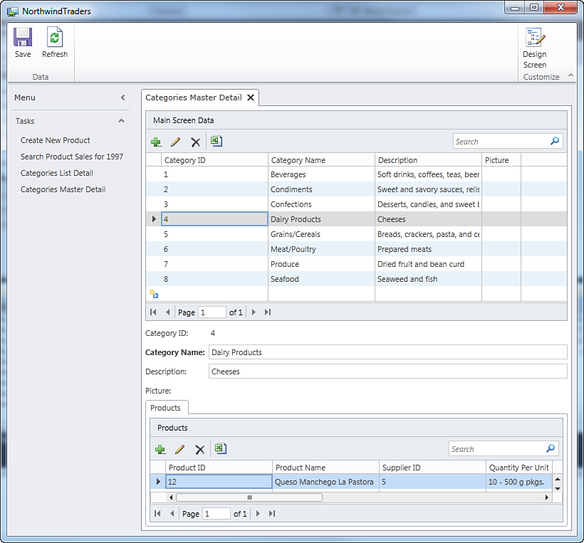
Figure 18.27. Showing details for the selected item.
So, you can create complex visual trees in your screen templates to present data in different ways. You can also add custom controls, such as the Chart control described previously, including them in the extensibility solution and then pointing to them with their qualified name. For example, if Microsoft.LightSwitch:DataGrid allows you to add a Data Grid, you can add a ChartControlExtension.Presentation.Controls:ChartControl to add a chart.
Adding Local Screen Members
As you learned throughout this book, you can add local members to a screen, such as properties and methods. This can be also done in custom screen templates and requires a few lines of code. Of course, end-user developers can use the designer to add their own local members, but you might want to provide some built-in members, especially if you want to add parameterized queries. Adding a local member is an easy task and requires an instance of the Microsoft.LightSwitch.Model.Storage.ScreenProperty class for local properties and of the Microsoft.LightSwitch.Model.Storage.ScreenMethod class for methods. For example, the following code creates a new local property of type String, called MyLocalScreenProperty:
'Add a screen member
Dim myScreenProperty As ScreenProperty = _
CType(host.AddScreenProperty("Microsoft.LightSwitch:String",
"MyLocalScreenProperty"),
Storage.ScreenProperty)
The local property is added to the screen content tree by the host’s AddScreenProperty method. This returns an object of type ScreenPropertyBase, a base class from which ScreenProperty derives; so the result of such an invocation must be explicitly converted into a ScreenProperty type. The conversion result is the instance that you need to work with the local property. Adding a method follows a similar process, but the objects involved are the ScreenMethod class and the host’s AddScreenMethod method. The following code adds a new local method called MyScreenMethod that accepts one parameter of type Integer and that returns a String:
Dim myScreenMethod As ScreenMethod =
CType(host.AddScreenMethod("myScreenMethod"),
ScreenMethod)
myScreenMethod.ReturnType = "Microsoft.LightSwitch:String"
myScreenMethod.Parameters.Add(New ScreenMethodParameter _
With {.Name = "Id",
.ParameterType = "Microsoft.LightSwitch:Integer"})
So, both the ReturnType and Parameters properties from the ScreenMethod class allow you to specify the default settings for the new method. The end user is responsible for writing the method body, or you could provide the code-behind as demonstrated earlier.
Here we cover just some common scenarios that you might want to implement in your own screen templates. The Extensibility Toolkit documentation that relates to this particular point of extensibility contains a number of useful code samples that cover complex scenarios such as parameters and custom search.
Now you know the basics of how to build your own screen templates, and so you can proceed to the final step in our LightSwitch development journey together: deploying extensions.
Summary
Extensibility is a key topic in the Visual Studio LightSwitch development experience. This chapter provided the basics of the extensibility architecture; then it covered some of the available extensibility points, in particular those points that you can use to enrich the user experience and layout of your applications (themes, shells, screen templates, and controls). You saw how amazing it is to restyle completely the layout of your application and how you can add new screens to satisfy specific needs of your business. The next chapter moves one step further and explains the remaining extensibility points: business types and custom data sources.