
Visio is another Microsoft Office Suite product which helps to present data in a graphical manner. In this recipe, we will create PivotDiagram based on NAV data.
- Start Microsoft Office Visio and create a new file by navigating to Business | PivotDiagram.
- You will receive the Data Selector dialog box as shown in the following screenshot:
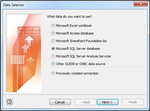
- Select the option Microsoft SQL Server database and click on Next.
- Provide the server name and login credentials, and then click on Next.
- Select NAV database and the
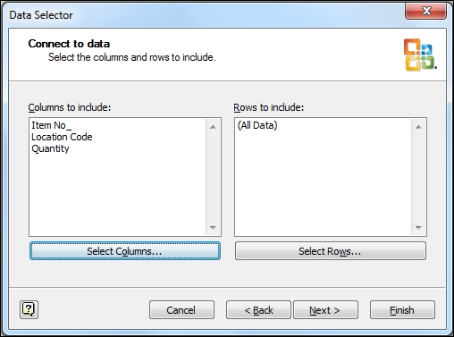
Item Ledger Entrytable, and then click on Finish. - From the Select Data Connection dialog box, click on Next to choose the table fields.
- To choose a column, click on Select Columns and select the Item No., Location Code, and Quantity fields, then click on Finish:
- Visio will import data and add three shapes to page with the PivotDiagram option window:

- Select a primary shape and from the Add Category area, select Location code.
- Select the Blue location and from the Add Category area, select Item No.
Creating charts in Visio is very easy and similar to Excel PivotTable. First we create a connection with our dataset. Once we define the dataset, Visio will save connection information and offer these connection settings each time a new file is created.
After setting up the connection, it's time to select the specific data column to analyze. Once we finish, Visio will generate a page with three shapes, a legend about the data source, a title box, and the primary shape that imports the dataset. This Primary shape aggregates all the data in the data source.
To see the data by location, we first select the primary shape. Then from the PivotDiagram option's Add Category section, click on Location Code. Each child box corresponds to a location. To analyze further, we add item details for the location Blue.
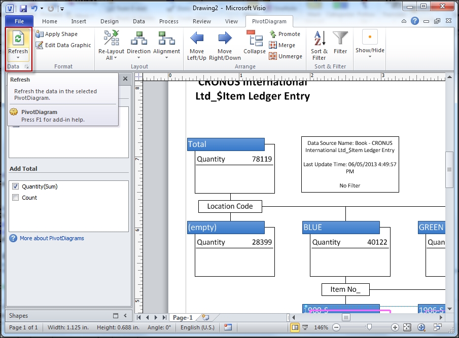
We may want to refer to these Visio diagrams again in future; we can refresh the data to reflect the changes in the underlying data sources. In the ribbon from the PivotDiagram tab, click on the Refresh button, as shown in the following screenshot. The data only updates in one direction. From the SQL data source to diagram, any change in the Visio diagram does not affect data source.
We can even add themes to our diagram. To find out more about Visio, visit the following URL:
http://office.microsoft.com/en-in/visio-help/basic-tasks-in-visio-HA102749197.aspx