
Chapter 12
Building inferential statistical formulas
In this chapter, you will:
Learn about inferential statistics and how they apply to business
Build formulas to show the relationship between two sets of data
Extract sample data from a larger population
Use probabilities to make decisions under uncertainty
Infer characteristics of a population using confidence intervals and hypothesis testing
In Chapter 11, “Building descriptive statistical formulas,” you learned how to measure useful statistical values such as the count, mean, maximum, minimum, rank, and standard deviation. These so-called descriptive statistics tell you a great deal about your data, but business analysis and decision-making require more than just descriptions. As an analyst or manager, you also need to draw conclusions about your data. Fortunately, Excel is up to that challenge by offering many worksheet functions that enable you to construct formulas that help you make inferences, such as whether two sets of data are related, the probability of an observation occurring, or whether there’s enough evidence to reject a hypothesis about some data. This chapter introduces you to these worksheet functions, and you learn even more in Chapter 13, “Applying regression to track trends and make forecasts.”
Understanding inferential statistics
Descriptive statistics consists of measures such as count, sum, mean, rank, and standard deviation that tell you something about a data set. The assumption underlying descriptive statistics is that you’re working with a subset of a larger collection of data. In the language of statisticians, descriptive statistics operate on a sample of some larger population.
Inferential statistics is a set of techniques that enable you to derive conclusions—that is, make inferences—about the entire population based on a sample. It’s important to understand that inferring population characteristics based on a sample is inherently uncertain. Certainty only comes when you measure the population as a whole, such as when the government performs a census. These sorts of large-scale experiments are almost always impractical (too time-consuming and expensive), so samples of the population are observed. That injects uncertainty into the process, but one of the key characteristics of inferential statistics is that it gives you multiple ways to measure that uncertainty.
In statistics, a variable is an aspect of a data set that can be measured in some way (counted, averaged, and so on). The following are all statistical variables:
In company financial data, the revenues generated over a fiscal year
In a database of historical economic data, the annual interest rate
In a series of coin tosses, the collection of flips that turn up “tails”
Much of inferential statistics involves interrogating the relationship between variables such as these. Note, however, that not all variables are inherently interesting, at least from a statistical point of view. For example, a table of invoices might include a Units Ordered column, a Unit Price column, and a Total Price column that’s calculated by multiplying the units ordered by the unit price. In this example, there’s no point analyzing the “relationship” between the units ordered and total price variables because that relationship is purely arithmetic (and hence trivial).
Of more interest to us are three other types of variable:
Independent variable: These are values that are generated without reference to or reliance upon another process. For example, if you’re analyzing revenues per month, the months represent the independent variable.
Dependent variable: These are values that are generated due to some other process. In the revenues per month example, the revenues represent the dependent variable.
Random variable: These are values that are generated by a chance process. For example, the results of a coin toss represent a random variable. Random variables can be either discrete, which means the variable only has a finite number of possible values, or continuous, which means the variable has an infinite number of possible values.
Sampling data
If you have a population data set, you might find that it’s too large or too slow to work with directly. To speed up your work, you can generate a sample from that population and then use the rest of this chapter’s inferential statistics functions and formulas to draw conclusions about the entire population based on your sample. There are two main types of sample you can generate:
Periodic: A sample that consists of every nth observation from the population. If n is 10, for example, the sample would consist of data points 10, 20, 30, and so on.
Random: A sample that consists of n values chosen randomly from the population.
If you have the Analysis ToolPak add-in installed (see Chapter 4’s “Loading the Analysis ToolPak” section), the Data Analysis command (on the Data tab, select Data Analysis) comes with a Sampling tool that can generate either a periodic or a random sample.
The Sampling tool gets the job done, but you can also generate custom samples using formulas. One way to do this is to use Excel’s OFFSET() function, which returns a reference to a cell or range that’s a specified number of rows and columns from a given reference:
OFFSET(reference, rows, cols[, height, width])
reference |
The cell or range that acts as the starting point for the offset. |
rows |
The number of rows up or down that you want the result offset from the upper-left cell of reference. |
cols |
The number of columns left or right that you want the result offset from the upper-left cell of reference. |
height |
The number of rows in the result; if omitted, the height is the number of rows in reference. |
width |
The number of columns in the result; if omitted, the width is the number of columns in reference. |
The next two sections show you how to use OFFSET() to extract a sample from a population.
Extracting a periodic sample
If you want to extract every nth data point from the population for your sample, use Excel’s OFFSET() function as follows:
The reference argument is the first data cell in the population range.
The rows argument is the period—that is, n—multiplied by the sample data point’s position in the resulting range. For example, if n is 10, then the first rows value is 10 * 1, the second is 10 * 2, and so on. To generate the sample data positions (1, 2, and so on) automatically, use the ROW() function, which returns the row value of the current cell. For example, if the formula for your first sample data point is in cell A1, ROW() returns 1, so you can use ROW() as is. If, instead, the formula for the first sample point is in A2, ROW() returns 2, so you’d need to use ROW() - 1.
The cols argument is 0.
The height and width arguments are omitted.
For example, check out the Invoices worksheet shown in Figure 12-1.

Here’s an OFFSET() formula that extracts every 10th value from the Quantity column—column Q—of the Invoices table, assuming the first formula is in cell A5 (hence the need for ROW() – 4):
=OFFSET(Invoices!$Q$2, 10 * (ROW() – 4), 0)
Assuming you store the value for n in cell A3, here’s a more general formula that works for any sample size:
=OFFSET(Invoices!$Q$2, $A$3 * (ROW() – 4), 0)
Note the use of the absolute cell addresses, which means you can fill this formula down to create as many data points as you need for your sample. Ideally, your sample should include every nth item from the population. If you fill this formula past that number, Excel generates a #VALUE! error (or just the value 0). That’s no big deal, but if you prefer to avoid the error, use an IF() test to check whether the sample number—that is, $A$3 * ROW() – 4—is greater than the number of items in the population, as given by the COUNT() function (or COUNTA(), if your population data includes nonnumeric items). Here’s the full formula:
=IF($A$3 * (ROW() – 4) <= COUNT(Invoices!Q:Q), OFFSET(Invoices!$Q$2, $A$3 * (ROW() – 4),
0), "Out of range!")
If the condition returns TRUE, the formula runs the OFFSET() function to extract the sample data point; otherwise, it displays “Out of range!”. Figure 12-2 shows this formula in action.

Extracting a random sample
To extract random data points from the population for your sample, use the OFFSET() function as follows:
The reference argument is the first data cell in the population range.
The rows argument is a random number between 1 and the number of items in the population. This is a job for the RANDBETWEEN() function:
RANDBETWEEN(0, COUNT(population_range) - 1)The cols argument is 0.
The height and width arguments are omitted.
Given the Invoices worksheet shown earlier in Figure 12-1, here’s an OFFSET() formula that extracts a random value from the Quantity column—column Q—of the Invoices table:
=OFFSET(Invoices!$Q$2, RANDBETWEEN(0, COUNT(Invoices!Q:Q - 1), 0)
Figure 12-3 shows this formula at work.

Determining whether two variables are related
One of the fundamental statistical questions you can ask is: Are two variables related? That is, do the two variables tend to move in the same direction (when one goes up or down, so does the other) or in the opposite direction (when one goes up, the other goes down, or vice-versa)? For example, when advertising expenses increase, do sales also rise? When interest rates fall, does gross domestic product tend to rise?
To answer these types of questions, statisticians turn to measures of association, each of which provides a numerical result that tells you whether two variables are related. If the variables tend to move in the same direction, they’re said to have a direct relationship; if the two variables tend to move in the opposite direction, they’re said to have an inverse relationship. Some measures of association can also tell you the relative strength of that relationship.
The next two sections cover two measures of association that you can calculate in your Excel statistical models: covariance and correlation.
Calculating covariance
Covariance is a measure of association that tells you whether two variables “move” together: that is, have either a direct or an inverse relationship. In Excel, you measure covariance using the following worksheet functions:
COVARIANCE.S(array1, array2)
COVARIANCE.P(array1, array2)
array1 |
The range or array that contains the values of the first variable. |
array2 |
The range or array that contains the values of the second variable. |
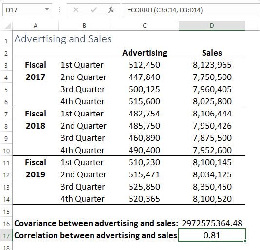
Use COVARIANCE.S() when your variables represent a sample of a population; use COVARIANCE.P() when your variables represent the entire population. For example, Figure 12-4 shows advertising and sales numbers over 12 fiscal quarters. Are these two variables related? To find out, you can use the following formula:
=COVARIANCE.S(C3:C14, D3:D14)

The result, as you can see in cell D16 in Figure 12-4, is a large positive number. What does that mean? Strangely, the number itself isn’t all that meaningful. Here’s how to interpret the covariance result:
If the covariance value is a positive number, it means the two variables have a direct relationship.
If the covariance value is a negative number, it means the two variables have an inverse relationship.
If the covariance value is 0 (or close to it), it means the two variables are not related.
Therefore, you can say that advertising and sales have a direct relationship with each other. What you can’t say is how strong or weak that relationship might be. To get that, you have to turn to a different measure of association.
Calculating correlation
Correlation is a measure of association that tells you not only whether two variables have either a direct or an inverse relationship, but also the relative strength of that relationship. In Excel, you measure correlation using the following worksheet function:
CORREL(array1, array2)
array1 |
The range or array that contains the values of the first variable. |
array2 |
The range or array that contains the values of the second variable. |
The CORREL() function calculates the correlation coefficient. The coefficient is a number between –1 and 1 that has the following properties:
Correlation Coefficient |
Interpretation |
1 |
The two variables have a direct relationship that is perfectly and positively correlated. For example, a 10% increase in advertising produces a 10% increase in sales. |
Between 0 and 1 |
The two variables have a direct relationship. For example, an increase in advertising leads to an increase in sales. The higher the number, the stronger the direct relationship. |
0 |
There is no relationship between the variables. |
Between 0 and –1 |
The two variables have an inverse relationship. For example, an increase in advertising leads to a decrease in sales. The lower the number, the stronger the inverse relationship. |
–1 |
The variables have an inverse relationship that is perfectly and negatively correlated. For example, a 10% increase in advertising leads to a 10% decrease in sales (and, presumably, a new advertising department). |
For example, consider again the advertising and sales numbers shown earlier in Figure 12-4. To calculate the correlation between these variables, use the following formula:
=CORREL(C3:C14, D3:D14)
The result, as you can see in cell D17 in Figure 12-5, is 0.81, which tells you not only that advertising and sales have a direct relationship, but also that this relationship is relatively strong.
![]() Warning
Warning
There’s an old saying in statistical circles: Correlation doesn’t imply causation. That is, just because two variables have a strong (direct or indirect) relationship, it doesn’t follow that one variable is the cause of the other. The most you can say is that the two variables tend to vary together.
Working with probability distributions
When you’re working with a variable, you’re dealing with a collection of observations, such as sales or coin tosses. However, before looking at the values of a variable’s actual observations, much statistical analysis begins by looking at all the possible values that the variable can have:
For a coin toss, the possible values are heads or tails.
For a die roll, the possible values are one through six.
For student grades, the possible values are 0 through 100.
For a playing card selection, the 52 possible values are two through ten, jack, queen, king, and ace, with each of these available in four suits: clubs, diamonds, hearts, and spades.
If you then assign a probability to each of these values, the resulting set of probabilities is known as the variable’s probability distribution. This could be a table that lists each possible value and its probability, or it could be a function that returns the probability for each possible value. One key point for a probability distribution is that the sum of all the probabilities must add up to 1.
Calculating probability
To determine the probability of a single variable value, you divide the number of observations for that value by the total size of the sample:
=observations / sample size
For example, if you’re tossing a coin, the possible observations are heads and tails. This is a sample size of two, so the probability of tossing heads is 1/2, or 0.5, as is the probability of tossing tails.
If your variable consists of multiple, mutually exclusive events—such as multiple coin tosses—then you need some way of calculating combined probabilities. For example, if you’re rolling two dice—call them Die A and Die B—the possible observations are two heads, heads on Die A and tails on Die B, tails on Die A and heads on Die B, and two tails.
To calculate combined probabilities, there are two possibilities:
The probability of one observation or another occurring: Use the rule of addition, which means that you add the probabilities of the possible observations. In the two-coin toss example, to calculate the probability of tossing one heads and one tails, you add the probability of heads on Die A and tails on Die B (0.25) and the probability of tails on Die A and heads on Die B (0.25): 0.25 + 0.25 = 0.5.
The probability of one observation and another occurring: Use the rule of multiplication, which means that you multiply the probabilities of the possible observations. In the two-coin toss example, to calculate the probability of tossing two heads, you multiply the probability of getting a single heads (0.5) by itself: 0.5 * 0.5 = 0.25.
For more complex observations, one useful approach is to use the FREQUENCY() function to create a frequency distribution, as I describe in Chapter 11, then calculate the probability for each bin. Figure 12-6 shows such a probability distribution for a set of student grades.

The probability of getting a grade less than 50 is 0.04, while the probability of getting a grade between 50 and 59 is 0.09. Therefore, using the rule of addition, the probability of getting a grade less than 60 is 0.04 + 0.09 = 0.13.
That works, but what if you want to answer more specific questions, such as what is the probability of getting a grade between 70 and 75, or between 66 and 82? You could fiddle with the bins on your frequency distribution, but let me show you a more flexible method.
First, list all the possible grades. You could start at 0, but it’s probably more practical to start with the smallest grade. Now calculate the frequency of each grade in the sample. The COUNTIF() function works nicely for this. For example, suppose you have the grade 50 in cell I13 and the grades sample is in the range C3:C48. Then the following formula returns the number of times the grade 50 appears in the sample:
=COUNTIF($C$3:$C$48, I13)
Once you’ve filled this calculation to cover all the grades, create a new column that calculates the probability for each grade. Figure 12-7 shows how I’ve set this up.

To calculate the probability of a grade falling within any range, you could add up the probabilities yourself. However, it’s almost always easier and more flexible to let Excel’s PROB() worksheet function do the heavy lifting here:
PROB(x_range, prob_range, lower_limit[, upper_limit])
x_range |
A range or array containing the possible observations. |
prob_range |
A range or array containing the probability values for each observation in x_range. |
lower_limit |
The lower bound on the range of values for which you want to know the probability. |
upper_limit |
The upper bound on the range of values for which you want to know the probability; if omitted, the returned value is the probability that an observation equals the lower_limit. |
For example, here’s a formula that uses PROB() to calculate the probability that a student grade falls between 66 and 82:
=PROB(I3:I63, K3:K63, 66, 82)
Discrete probability distributions
If you’re working with discrete variables, there are some probability distributions that you can take advantage of to quickly calculate probabilities. These are the binomial, hypergeometric, and Poisson distributions, and I cover them in the next three sections.
The binomial distribution
The binomial distribution is a probability distribution for samples that have the following characteristics:
There are only two possible observations, and these are mutually exclusive. Examples include coin tosses (heads and tails), die rolls (for example, even numbers and odd numbers), and sales calls (the sale is made or not). By convention, these observations are labelled success and failure.
Each observation is independent of the others. That is, the outcome of a given trial doesn’t affect the outcome of any subsequent trial. For example, coming up heads on a coin toss has no effect on whether you turn up heads or tails on the next coin toss.
The probability of the success observation is constant from one trial to the next. For example, the probability of turning up heads on a coin toss remains 0.5 no matter how many trials you perform.
If your variable conforms to this so-called Bernoulli sampling process, then you’ve got yourself a binomial distribution, and you can calculate probabilities based on this distribution using Excel’s BINOM.DIST() function. Specifically, given the number of trials in a sample and the probability of getting a success observation in each trial, you use BINOM.DIST() to calculate the probability of generating a particular number of success observations. Here’s the syntax:
BINOM.DIST(number_s, trials, probability_s, cumulative]
number_s |
The number of success observations for which you want to calculate the probability. |
trials |
A total number of trials in the sample. |
probability_s |
The probability of getting a success observation in each trial. |
cumulative |
A logical value that determines how Excel calculates the result. Use FALSE to calculate the probability that the sample has number_s successes; use TRUE to return the cumulative probability that the sample contains at most number_s successes. |
For example, suppose you know that the probability of a salesperson making a sale is 0.1. What is the probability of that salesperson making 3 sales in 10 sales calls? The following formula answers this question (with a result of 0.057):
=BINOM.DIST(3, 10, 0.1, FALSE)
The hypergeometric distribution
A common variation on the Bernoulli sampling process that I describe in the previous section is to extract a sample from a population by taking items out and not replacing them for the next trial. This takes us out of the binomial distribution because the probability of success does not remain constant with each trial (because we’re removing items and not putting them back). This variation is saddled with the unlovely name hypergeometric distribution (so-called because of the form of its mathematical equation).
For example, suppose you have two political parties: the Circumlocutionists and the Platitudinists. In a population of 10,000, you know that 5,200 are Circumlocutionists and 4,800 are Platitudinists. Given a sample size of 10, what is the probability that six will be Circumlocutionists? To find out, use the HYPGEOM.DIST() function:
HYPGEOM.DIST(sample_s, number_sample, population_s, number_pop, cumulative)
sample_s |
The number of sample success observations for which you want to calculate the probability. |
number_sample |
The size of the sample. |
population_s |
The number of success observations in the population. |
number_pop |
The size of the population. |
cumulative |
A logical value that determines how Excel calculates the result. Use FALSE to calculate the probability that the sample has sample_s successes; use TRUE to return the cumulative probability that the sample contains at most sample_s successes. |
Here’s the formula that answers the example question (which returns the probability 0.22):
=HYPGEOM.DIST(6, 10, 5200, 10000, FALSE)
The Poisson distribution
Another variation on the Bernoulli process is to assume that the sampling occurs during a time interval instead of via separate trials. The observations are still independent of each other. This is known in the stats trade as a Poisson distribution. How is it useful? If you know the mean number of observations that occur in a specified interval, then the Poisson distribution calculates the probability that a specified number of observations will occur in a randomly selected interval of the same duration.
For example, suppose a manager knows that her store receives an average of 50 customers per hour. What is the probability that her store will receive just 40 customers in the next hour? To calculate this, you use the POISSION.DIST() function:
POISSON.DIST(x, mean, cumulative)
x |
The number of observations for which you want to calculate the probability. |
mean |
The average number of observations. |
cumulative |
A logical value that determines how Excel calculates the result. Use FALSE to calculate the probability of x observations; use TRUE to return the cumulative probability that at most x observations will occur. |
Here’s the formula that answers the example question (which returns the probability 0.021):
=POISSON.DIST(40, 50, FALSE)
Understanding the normal distribution and the NORM.DIST() function
The next few sections require some knowledge of perhaps the most famous object in the statistical world: the normal distribution (also called the normal frequency curve). This distribution refers to a set of values that have the following characteristics:
The mean occurs in the middle of the distribution at the topmost point of the curve.
The curve is symmetric around the central mean, meaning that the shape of the curve to the left of the mean is a mirror of the shape of the curve to the right of the mean.
The frequencies of each value are highest at the mean, fall off slowly on either side of the mean, and stretch out into long tails on either end.
The middle part of the curve to the left and right of the mean has a concave shape, whereas the parts further left and further right have a convex shape. These changes from concave to convex occur at one standard deviation to the left and to the right of the mean and are known as saddle points.
Approximately 68% of all the values fall within one standard deviation of the mean (that is, either one standard deviation above or one standard deviation below).
Approximately 95% of all the values fall within two standard deviations of the mean.
Approximately 99.7% of all the values fall within three standard deviations of the mean.
Figure 12-8 shows a chart that displays a typical normal distribution. In fact, this particular example is called the standard normal distribution, and it’s defined as having mean 0 and standard deviation 1. The distinctive bell shape of this distribution is why it’s often called the bell curve.

Calculating standard scores
All normal distributions are bell curves, meaning they all have a shape similar to the one shown in Figure 12-8, but each is uniquely defined by its mean and standard deviation. How do you analyze or interpret a value from one of these other normal distributions? The answer is to convert the value to a standard score—also called a Z-score—which tells you where the value would appear in the standard normal distribution. By doing this with values from different normal distributions, you can compare those values apples-to-apples.
To convert a value from a normal distribution to a standard score, use the following formula:
=(value – mean) / standard deviation
Here, value is the value you want to convert, whereas mean and standard deviation are, respectively, the arithmetic mean and standard deviation of value’s normal distribution.
For example, suppose you have two manufacturing groups named East and West, each of which is subdivided into multiple workgroups. Suppose you’re tracking defects in these groups, and these defects have normal distributions as follows:
The West group’s defects have a mean of 9.0 and a standard deviation of 2.97.
The East group’s defects have a mean of 7.54 and a standard deviation of 2.47.
If West workgroup A and East workgroup M both tallied 8 defects, are these workgroups even, or is one better than the other?
To answer that question, calculate the standard score for both workgroups:
West Workgroup A standard score: (8 - 9) / 2.97 = -0.34
East Workgroup M standard score: (8 - 7.54) / 2.47 = 0.19
Workgroup A is below the mean on the standard normal distribution, while workgroup M is a bit above the mean. Because these are defects we’re talking about, fewer is better, so we can say, all else being equal, that workgroup A’s defects total is “better” than workgroup M’s.
Calculating normal percentiles with NORM.DIST()
Figuring standard scores, as I describe in the previous section, enables you to interpret a value in terms of the standard normal distribution. Another useful bit of data analysis you can perform with the normal distribution is to calculate the percentile of a value. The percentile refers to the percentage of values in the data set that are at or below the value in question.
To calculate a value’s percentile in the normal distribution, use Excel’s NORM.DIST() function, which returns the probability that a given value exists within a population:
NORM.DIST(x, mean, standard_dev, cumulative)
x |
The value you want to work with. |
mean |
The arithmetic mean of the distribution. |
standard_dev |
The standard deviation of the distribution. |
cumulative |
A logical value that determines how the function results are calculated. If cumulative is TRUE, the function returns the cumulative probabilities of the observations that occur at or below x; if cumulative is FALSE, the function returns the probability associated with x. |
Returning the defects example from the previous section, what is the percentile for West workgroup A? Recall that this workgroup had 8 defects, and the West group has a mean of 9 and a standard deviation of 2.97. The answer is 0.368 as generated by the following formula:
=NORM.DIST(8, 9, 2.97, TRUE)
To generate the values in the standard normal distribution shown earlier in Figure 12-8, I used a series of NORM.DIST() functions with mean 0 and standard deviation 1. For example, here’s the formula for the value 0:
=NORM.DIST(0, 0, 1, TRUE)
With the cumulative argument set to TRUE, this formula returns 0.5, which makes intuitive sense because, in the standard normal distribution, half of the values fall below 0. In other words, the probabilities of all the values below 0 add up to 0.5.
Now consider the same function, but this time with the cumulative argument set to FALSE:
=NORM.DIST(0, 0, 1, FALSE)
This time, the result is 0.39894228. In other words, in this distribution, about 39.9% of all the values in the population are 0.
The shape of the curve I: The SKEW() function
How do you know if your data set’s frequency distribution is at or close to a normal distribution? In other words, does the shape of your data’s frequency curve mirror that of the normal distribution’s bell curve?
One way to find out is to consider how the values cluster around the mean. For a normal distribution, the values cluster symmetrically about the mean. Other distributions are asymmetric in one of two ways:
Negatively skewed: The values are bunched above the mean and drop off quickly in a “tail” below the mean.
Positively skewed: The values are bunched below the mean and drop off quickly in a “tail” above the mean.
Figure 12-9 shows two charts that display examples of negative and positive skewness.

In Excel, you calculate the skewness of a data set by using the SKEW() function:
SKEW(number1[,number2,...])
number1, number2,... |
A range, an array, or a list of values for which you want the skewness |
The closer the SKEW() result is to 0, the more symmetric the distribution is, so the more like the normal distribution it is.
The shape of the curve II: The KURT() function
Another way to find out how close your frequency distribution is to a normal distribution is to consider the flatness of the curve:
Flat: The values are distributed evenly across all or most of the bins.
Peaked: The values are clustered around a narrow range of values.
Statisticians call the flatness of the frequency curve the kurtosis. A flat curve has a negative kurtosis, and a peaked curve has a positive kurtosis. The further these values are from 0, the less the frequency is like the normal distribution. Figure 12-10 shows two charts that display examples of negative and positive kurtosis.

In Excel, you calculate the kurtosis of a data set by using the KURT() function:
KURT(number1[,number2,...])
number1, number2,... |
A range, an array, or a list of values for which you want the kurtosis |
Determining confidence intervals
A confidence interval for a population mean is a measure of the probability that the population mean falls within a specified range of values. The confidence interval calculation typically requires four things:
A mean value calculated from a sample of the population.
A standard deviation value for the population.
A range of values, which is determined on the low end by subtracting the confidence interval from the sample mean, and on the high end by adding the confidence interval to the sample mean.
A confidence level, which is a percentage that specifies the probability that the actual population mean lies within the range (it is within the sample mean plus or minus the confidence interval). The calculation itself uses the significance level, which is 100% minus the confidence level.
If your population is a normal distribution, you calculate the confidence interval using the CONFIDENCE.NORM() worksheet function:
CONFIDENCE.NORM(alpha, standard_dev, size)
alpha |
The significance level |
standard_dev |
The standard deviation of the population |
size |
The sample size |
For example, suppose you sample the commute times for 250 employees and calculate a sample mean of 44.7 minutes, with a population standard deviation of 8. To determine the confidence interval for the population mean using a 95% confidence level, you’d use the following formula:
=CONFIDENCE.NORM(0.05, 8, 250)
The result is 0.99, which means you can be 95% confident that the population mean falls within the range 43.71 and 45.69.
If your population distribution is a bell curve, but you have a small sample size (say, at most a few dozen observations) and you don’t know the population standard deviation, then you’re dealing with a t-distribution. In this case, you calculate the confidence interval by using the CONFIDENCE.T() function:
CONFIDENCE.T(alpha, standard_dev, size)
alpha |
The significance level |
standard_dev |
The standard deviation of the sample |
size |
The sample size |
For the employee commute times example, suppose you only have a sample of size of 25, and you don’t know the population standard deviation, but you calculate the sample standard deviation to be 8.91. To determine the confidence interval for the population mean using a 95% confidence level, you’d use the following formula:
=CONFIDENCE.T(0.05, 8.91, 25)
The resulting confidence interval is 3.68. Assuming the sample mean is 44.7, you can be 95% confident that the population mean falls within the range 40.99 and 48.35.
Hypothesis testing
One common technique in inferential statistics is hypothesis testing, where you posit a hypothesis about a population parameter (such as its mean value) and then test that so-called null hypothesis to find out whether it should be rejected.
If you know the standard deviation of the population, then given a sample data set you can perform such a test in Excel by using the Z.TEST() function:
Z.TEST(array,x[,sigma])
array |
A reference, a range name, or an array of sample values for the data against which you want to test x. |
x |
The null hypothesis value you want to test. |
sigma |
The population standard deviation. If you omit this argument, Excel uses the sample standard deviation. |
Z.TEST() returns the p-value, which is the probability that, if the null hypothesis is true, the value of x will be greater than its hypothesized value. Note that the probability that the value of x is less than its hypothesized value is given by the formula 1 – p-value.
For example, suppose you have a pizza business and your company goal is to average 30 minutes for delivery. If delivery times exceed that duration, then an automatic (and expensive) review procedure kicks in. So, you take a sample of delivery times and your sample shows an average of 30.7 minutes. Your null hypothesis, then, is that overall delivery times are greater than the desired 30 minutes. Does it follow from the data that you should accept the null hypothesis?
To find out, first you need to set up the test as follows:
Assume you know the standard deviation for delivery times is 3.
Decide on the significance level you want to use. A probability above this level means you can’t reject the null hypothesis. In this example, I’m going with a 10% level of significance.
Assume your sample delivery times reside in the range A3:A27 (see this chapter’s example workbook).
Given all that, here’s the formula that returns the p-value for the z-test:
=Z.TEST(A3:A27, 30, 3)
The result is 0.129, or 12.9%. Because this is greater than the significance level of 10%, I can’t reject the null hypothesis.
I should also mention the t-test, which is similar to the z-test, but is handy when you don’t know the population’s standard deviation (which is commonly the case). There are two types of t-test you can run:
Two-sample: Determines the probability that, given two samples from the same population, the population mean inferred from those samples is the same. There are two variations on this scenario: one where sample variances are equal, and one where the variances are unequal.
Paired two-sample: Determines the probability that, given two samples, one each from a different population, those populations have the same mean.
For both scenarios, use Excel’s T.TEST() function:
T.TEST(array1, array2, tails, type)
array1 |
A reference, a range name, or an array of values for the first set of data. |
array2 |
A reference, a range name, or an array of values for the second set of data. |
tails |
The number of distribution tails: Use 1 for a one-tailed distribution (that is, one mean is either less than or greater than the other); use 2 for a two-tailed distribution (that is, one mean is not equal to the other). |
type |
The type of t-test you want to run: Use 1 for paired two-sample t-test; use 2 for a two-sample t-test where the samples have equal variances; use 3 for a two-sample t-test where the samples have unequal variances. |
For example, if you have two samples from the same population in ranges A3:A27 and B3:B27, what is the probability that the population means inferred by the samples aren’t equal? Here’s a formula that calculates the p-value:
=T.TEST(A3:A27, B3:B27, 2, 3)
Again, you compare the result with a significance level (such as 5% for a one-tailed distribution, or 10% for a two-tailed distribution). If the calculated p-value is less than your significance level, then you must infer that the population means are not the same.