Chapter 28
Sharing Dashboards with Power BI
Power BI Desktop is a new application that lets you share interactive dashboards based on your Excel data. Authoring of dashboards is quick; you are basically building pivot charts by dragging fields to a PivotTable Fields list.
Charts are automatically interactive; if you select something in one chart, all the other charts will filter to the selected item. You can create hierarchies to allow people to drill down into the data.
With a monthly subscription, you can publish your dashboards to the Power BI servers. You can invite others in your company to consume your reports on their computers or mobile devices.
Getting Started with Power BI Desktop
Getting started with Power BI Desktop is free. You will need a work email account. Hotmail or Gmail will not qualify. Start at PowerBI.Microsoft.com, and sign up and download Power BI Desktop for free.
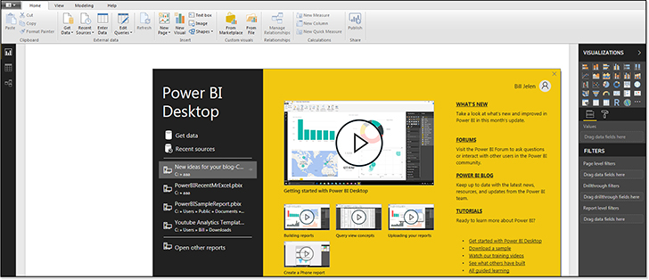
When you first open Power BI, you will sign in with the account credentials that you created. You are then presented with a start screen with a number of tutorials, as shown in Figure 28.1.
Preparing Data in Excel
Before you can use Power BI, you need to prepare the data you want to use in it. To do this, build an Excel workbook with each of your data sets formatted as a table. Using the sample files for this book, you would perform the following steps to create a data model in PowerBIData.xlsx:
Select each of the three data sets and format as a table using Ctrl+T.
Name the tables
Sales,Geography, andCalendar.Caution
It is tempting to do a lot of pre-work in Excel, such as defining relationships, marking data categories, creating synonyms, and defining hierarchies. However, it is best to do this work in Power BI Desktop because all of these settings are lost when you select Home, Get Data, From Excel. If you choose File, Import, Excel Workbook Contents, more of your Excel work will get imported, but the hierarchies will still be lost.
Tip
If you do already have queries and relationships defined in your Excel file, you should choose File, Import, Excel Workbook Contents as described below instead of choosing Get Data, Excel.
Importing Data to Power BI
The most obvious way to get Excel data into Power BI is not the best. If you choose Home, Get Data, from Excel, you can import the data, but any queries, relationships, KPIs, and Synonyms will be lost.
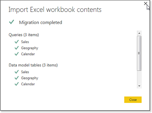
First, Power BI Desktop has an icon where the File menu should be. It is good to see the Power BI team learned nothing from the mistakes in Office 2007. Click on the File icon to the left of the Home tab. Choose Import, Excel Workbook Contents. Browse to and select your Excel workbook.
An oddly old message appears that reads, “We don’t work directly with Excel workbooks, but we know how to extract the useful content from them.” Click Start.
At the end of the importing process, a message will show you the migration is complete and report what has been imported (see Figure 28.2).
Troubleshooting
There are multiple ways to get Excel data into Power BI Desktop, and the most obvious way is not always best.
A large Get Data icon appears on the Home tab. If you open the drop-down menu associated with this icon and choose Excel, Power BI will import only the data from the Excel file, ignoring the data model and any Power Query queries.
If you choose File, Import, Excel Workbook Contents, then Power BI will import the Data Model, Power Query definitions, Data Model calculated columns, measures, KPIs, Data Categories, and Relationships.
Again, keep in mind that the File menu is to the left of the Home tab and does not read, “File.” Instead, the File menu appears with an icon that looks like a piece of notebook paper.
Note
Power BI Desktop offers a full version of Power Query. Use the Home, Edit button to launch Power Query.
Getting Oriented to Power BI
Welcome to a new, unfamiliar world. Power BI opens with a vast expanse of white nothing covering the middle 80 percent of your screen. A common reaction is: “What do I do now?”
Let’s take a look at various elements in the Power BI screen.
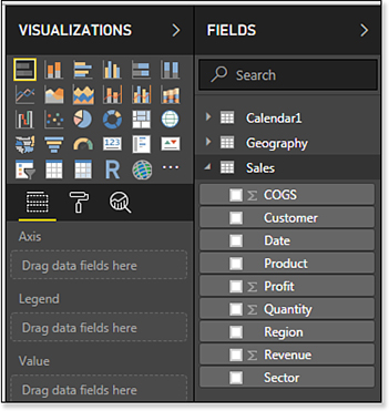
In the top right are two panels called Visualizations and Fields (see Figure 28.3).
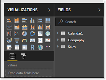
The Fields panel is essentially like the top part of the PivotTable Field list. If you import the workbook associated with this chapter, you start out seeing table names Calendar1, Geography, and Sales; you can use the triangle icon to expand any table and see the fields in that table.
Note
Note that Power BI automatically renames an Excel table named “Calendar” as “Calendar1” because there is already a DAX function named CALENDAR.
The Visualizations panel starts with about 30 built-in data visualizations. You can add more visualizations using the icon with three dots. Below the panel of visualizations is the Values area. This is like the bottom half of the PivotTable Fields list. You will drag fields here to create a visualization. The Paint Roller icon leads to various formatting choices that are available for a visualization.
In the lower left of the Power BI Desktop screen is a tab labeled Page 1 and a plus sign, which allows you to add more pages (see Figure 28.4). These are like worksheet tabs in Excel; you can build a report with multiple pages of dashboards.
In the top left of the screen, there are three icons labeled Report, Data, and Relationships (see Figure 28.5).
The Report view is where you will build your dashboard.
The Data view shows you the data loaded in Power BI and is very similar to the Manage Data Model screen in Power Pivot.
The Relationships view is similar to the Diagram view in Power Pivot.
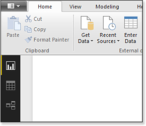
Figure 28.5 Where is your data? Click the second icon along the left.
Preparing Data in Power BI
To create effective reports in Power BI, you want to create some relationships and further customize your data.
Click on the Relationships icon. (See the bottom icon in Figure 28.6.)
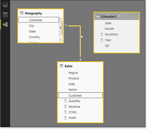
In the Relationships view, you will see that Power BI Desktop automatically detected a relationship between the Sales table and the Geography table. Hover over the line between the tables and Power BI Desktop will show you that the Customer field is used to create the relationship in both tables.
You will also note that Power BI could not figure out that the Calendar1 table should be related to the Sales table.
And, if you resize the tables, you will see the Sigma icon next to Quantity, Revenue, COGS, and Profit. This is correct and means that Power BI will summarize those fields. However, Power BI is also planning on totaling the MonthNo and Year fields in the Calendar table. This is not correct.
You need to define a relationship between the Sales and Calendar1 table. Click on Date in the Sales table. Drag and drop that field on the Date field in Calendar1 to create the relationship.
To prevent the Year field from showing up as a Sum Of Year, follow these steps:
Click on the Data icon, which is the second of three icons along the left side of the screen. In the Data view, you will see the values from one of your tables. To switch to another table, select the table from the Fields panel on the right side of the screen. As an Excel pro, looking on the right side of the screen seems foreign. You would think that there should be tabs at the bottom of the screen for the three data tables.
Click on the heading for MonthNo to select that column.
Go to the Modeling tab in Power BI. Change the Default Summarization from Sum to Don’t Summarize (see Figure 28.7).
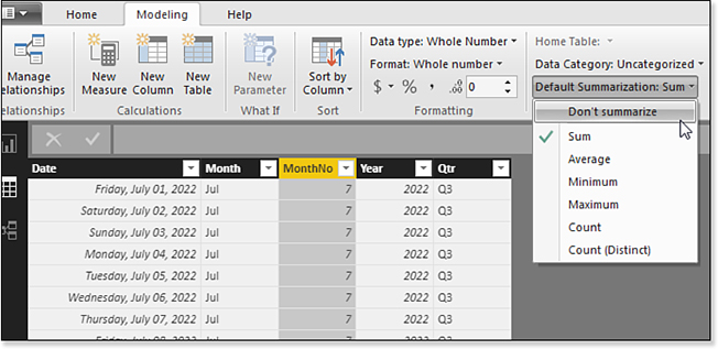
Figure 28.7 By default, Power BI Desktop wants to sum any field that is completely numeric. Override this behavior for years, months, account numbers, and so on. Repeat Steps 2 and 3 for any other numeric columns that should not be summarized. In the current data, it is the Year field. In other data, you might find numeric account numbers, cost centers, or item numbers.
Assign categories to any geography or image URL fields. Power BI Desktop can plot your data on a map if you have fields like city, zip code, or state. Using the Data view, display the Geography table. Click on each heading for City, State, Country, and choose the appropriate data type using the Data Category drop-down on the Modeling tab (see Figure 28.8).

If you want to display images in your report, include a column with the URL for each image. Choose the Image URL category for that column. When you display the field in a table, the image from that URL will appear.
Building an Interactive Report with Power BI Desktop
Now that your data has been set up in Power BI Desktop, it is time to begin creating charts and tables that will appear in the dashboard.
Building Your First Visualization
Click the Report icon (this is the top of the three icons along the left side of Power BI Desktop). The large empty white canvas appears in the center of your screen.
Look in the Visualizations panel. There are many built-in tools available. To get your feet wet, choose the first item—a stacked bar chart (see Figure 28.9).
Notice that the field areas changes from Values to Axis, Legend, and Value. Every time that you choose a visualization type, the list of field types will change.
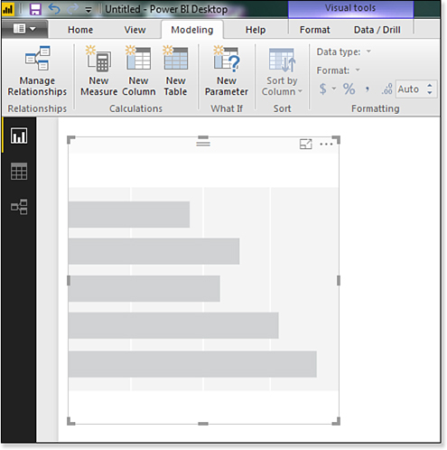
When you choose a Bar Chart from the visualizations panel, a tile placeholder appears on the canvas, as shown in Figure 28.10. You can resize this tile using any of the eight resize handles. Or, drag by the Title Bar area (it is in the vicinity of the two horizontal bars near the top center) to move it to a different location.
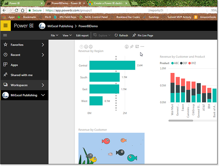
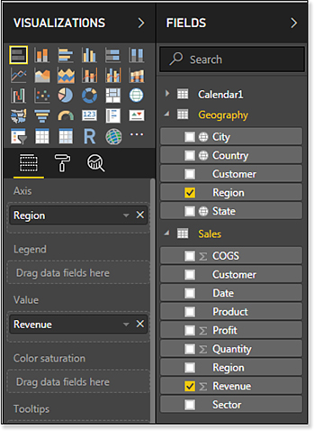
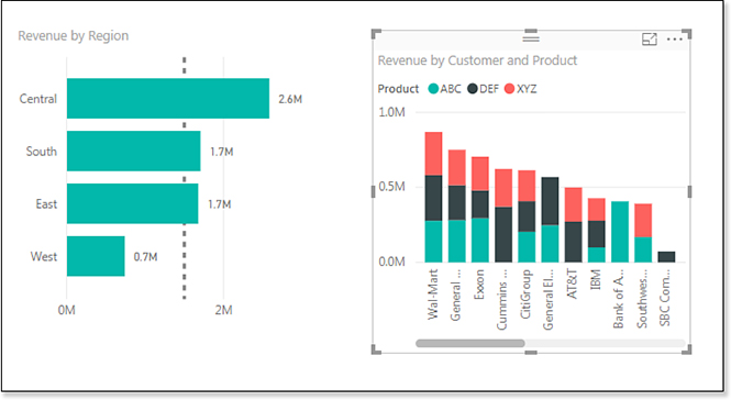
To add fields to the visualization, choose Revenue from the Sales table, and choose Region from the Geography table. Region will move to the Axis drop zone. Revenue will move to the Values drop zone (see Figure 28.11).
At the top of the drop zones, you will see a paint roller icon; click it to find formatting options for the chart. These options will be different depending on the type of visualization.
In Figure 28.12, the data labels have been turned on. The remaining options in the figure let you customize the appearance of the data labels.

You might experiment with the Show Background options. You can color the tile with any theme color and set the transparency for the color.
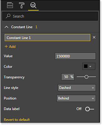
The third icon is the Analysis icon. This looks like a search box with a chart trend line in the magnifying glass. For the Bar Chart visualization, the only choice is to add a Constant Line. Some companies might have the need to show a line at an arbitrary position. In Figure 28.13, the settings to draw a dotted line at $1.5 Million is shown.
With the settings in Figures 28.11 through Figures 28.13, you will get the chart shown in Figure 28.14.

There are two different ways to sort this chart. Use the Three Dots icon in the top right of the chart to choose if regions should be sorted alphabetically or by revenue. (See Figure 28.15.)

The other icon to the left of the Ellipsis icon is a Full-Screen icon. Instead, you can use the Spotlight selection in the menu, which causes all other charts to fade into the background and keeps the current chart as the focus.
Building Your Second Visualization
This will seem very simple, but it trips me up every time. In order to create a second tile in your report, you must click away from the first tile. It is easy; simply click anywhere in the white nothingness of the report canvas.
However, if you forget to click away and click the Column Chart visualization, you will change the current chart from a bar chart to a column chart. I don’t know why I constantly forget this step, but I constantly forget this step.
Click in the white space of the report. Choose a Column chart from the Visualization panel. Drag Revenue to the Values area. Drag Customer to the Axis area. Drag Product to the Legend area.
The result shown in Figure 28.16 is a column chart with customers along the bottom. The three product lines are stacked for each column. In this particular data set, there are ten big customers and a bunch of tiny customers. You could resize the column chart to be very wide and show the long tail of small customers. Also, you can drag the right edge of the chart in to show only the ten largest customers. A scrollbar would let someone drag over to see the small customers.
Cross-Filtering Charts
Here is where the magic of Power BI starts to kick in. Let’s face it, you could have created both of the previous charts in Excel. The Constant Line would have required some Andy-Pope-style charting tricks, but it could have been done. The magic is how every chart in Power BI can filter the other charts.
Click on the bar for Central region in the first chart. The second chart will update. Central region customers will stay bright. Other customers will fade to a lighter color (see Figure 28.17).

Creating a Drill-Down Hierarchy
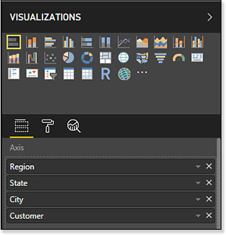
Interactive hierarchies are very easy to set up in Power BI Desktop. Click the first bar chart to select it. Display the Fields section in the Visualizations pane. The Axis contains the Region field. Drag three more fields from the geography table and drop them beneath Region: State, City, and Customer (see Figure 28.18).
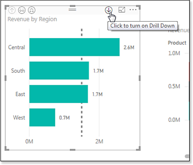
Nothing appears to change in the chart, but you have set up a cool drill-down feature.
Once the hierarchy has been created, a new Drill Down icon appears in the top right of the chart. Click the icon shown in Figure 28.19 to enable Drill Down mode.
Once Drill-Down mode is active, click on Central in the bar chart to see a new chart of all of the states in the Central region.
Notice how the column chart updates to show only customers in the Central region (see Figure 28.20).

From Figure 28.20, you could continue to click on Arkansas and drill-down to Bentonville. Click Bentonville and drill-down to Wal-Mart. Because that is not very interesting, click the Drill-Up icon in the top left of the chart to return to all regions.
Then, click South. Click on Texas. The results in Figure 28.21 show the City level: Dallas, Irving, and Houston.
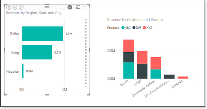
The choices from the point shown in Figure 28.21 are very subtle. You could click on one of the three cities to show the customers in that city. Or, you could decide you want to see all of the customers in any of the three cities. The second icon in the top left appears as two down-arrows. Click that icon to move one level down the hierarchy without any further filtering. You will see Exxon, AT&T, Southwest, SBC, and Compaq.
To return to the Region level, press the Drill Up icon several times.
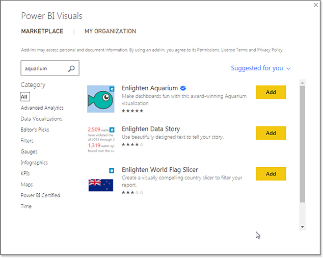
Importing a Custom Visualization
You can add new visualizations to Power BI Desktop. The last icon in the Visualizations area is three dots. Click those dots and choose Import From Marketplace.
You can browse a variety of free visualizations. In Figure 28.22, click the Add button next to the Enlighten Aquarium.
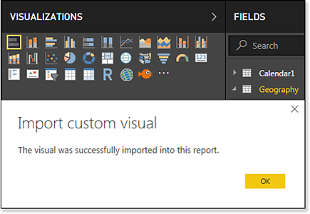
After adding the Enlighten Aquarium visualization, you will see a new fish icon in the Visualizations pane (see Figure 28.23).
Click a blank area of your report canvas. Add a new visualization by clicking the fish icon in the Visualizations pane.
The field drop zones are now labeled Fish and Fish Size. Drag Customer to the Fish area and Revenue to the Fish Size area.
An aquarium appears in your report with various-sized fish swimming back and forth (see Figure 28.24). Click on the biggest fish; it will stop swimming, and an information panel appears with Wal-Mart and 869,454.
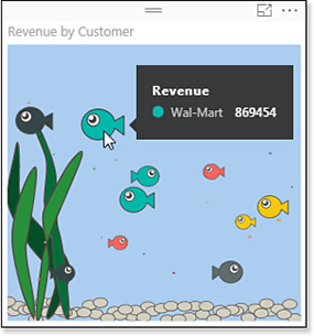
The aquarium will respond to cross-filtering. If you filter the bar chart to just South, only the five fish from the South region will be swimming.
Note
In May 2018, Microsoft announced that you would soon be able to add the Power BI Custom Visuals to Office 365 versions of Excel. I cannot wait for the day when all of my column charts will be replaced with aquarium charts.
Publishing to Power BI
Now that your data has been set up in Power BI Desktop, you can share it with others by publishing to Power BI.
Power BI runs in any modern browser. There are dedicated apps for the iPad, iPhone, and Android phones. The default report is designed for a computer screen.
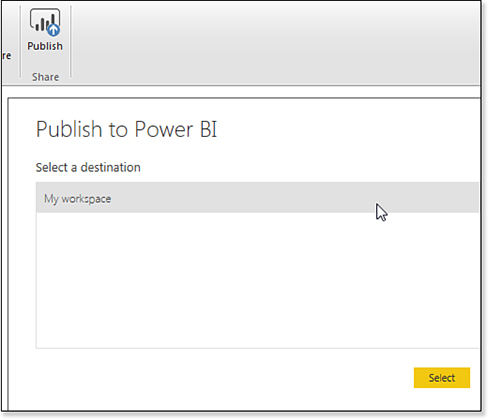
Publishing to a Workspace
On the Home tab in Power BI, choose Publish. The Publish To Power BI dialog will ask you which workspace to use (see Figure 28.25).
After publishing, you can choose to view in Power BI or to see Insights. Figure 28.26 shows your report running in Chrome.