
Chapter 15
Using Pivot Tables to Analyze Data
Creating Your First Pivot Table
Dealing with the Compact Layout
Finishing Touches: Numeric Formatting and Removing Blanks
Three Things You Must Know When Using Pivot Tables
Calculating and Roll-Ups with Pivot Tables
A pivot table enables you to summarize thousands or millions of records of data to a one-page summary in just a few clicks.
Suppose you have 400,000 records of transactional data. It is easy for some people to look at this and figure out that it represents $x million. But to learn some things about the data, you need to do some more analysis to spot trends in the data. A pivot table enables you to analyze trends in data without having to worry about formulas.
By using a pivot table, it is possible to create many views of your data, including the following:
Breakdown of sales by product
Sales by month, this year versus last year
Percentage of sales by customer
Customers who bought XYZ product in the East region
Sales by product by month
Top five customers with products
Of course, these are just examples. You can use pivot tables to slice and dice your data in almost any imaginable way.
Pivot tables were introduced in Excel 95 and have been evolving ever since:
Excel 2019 introduces Pivot Table Defaults. A huge number of default settings in pivot tables are annoying. You can now fix these settings once, and all future pivot tables will have your favorite settings.
Excel 2019 gives you the ability to turn off automatic date grouping, which was introduced in Excel 2016.
Office 365 in 2018 has a new Artificial Intelligence feature (called either Insights or Ideas depending on your version of Office 365). Excel will use artificial intelligence to analyze your data and suggest up to 30 pivot tables or pivot charts.
Excel 2016 includes a feature to automatically roll date fields up to months, quarters, and years.
The add-in formerly known as Power Map is now built in to Excel as 3D Maps.
Excel 2013 added a new entry point for pivot tables called Recommended Pivot Tables. This feature shows you various thumbnails of pivot tables before you begin creating one.
Excel 2013 added the capability to create a data model from several different tables. You can create a relationship between tables without using
VLOOKUPs and base pivot tables on the model.Timelines are a visual date filter introduced in Excel 2013. They join slicers, the visual filter introduced in Excel 2010. The best feature of timelines and slicers is the capability for them to drive multiple pivot tables built from the same data set.
Power Pivot is a powerful add-in for Excel 2016 that enhances pivot tables. If you are using Excel 2016 Pro Plus or Office 365 Pro Plus or later, you have access to this add-in. Power Pivot enhances the ability to build multi-table models and provides key performance indicators (KPIs) and the DAX formula language.
Excel 2010 introduced new calculations such as Rank, Percent Of Parent, and Running Percentage Of Total.
Excel 2010 introduced the option to replace blanks in the outer row fields by repeating item labels from above.
Excel 2007 simplified the pivot table interface and added new filters.
Creating Your First Pivot Table
Pivot tables are best created from transactional data—that is, raw data files directly from your company’s IT department.
To create the best pivot tables, make sure your data follows these rules:
Ensure each column has a one-cell heading. Keep the headings unique; don’t use the same heading for two columns. If you need your headings to appear on two rows, type the first word, press Alt+Enter, and then type the second word.
If a column should contain numeric data, don’t allow blank cells in the column. Use zeros instead of blanks.
Do not use blank rows or blank columns.
If totals are embedded in your report, remove them.
The workbook should not be in Compatibility mode. Many pivot table features from Excel 2007–2019 are disabled if the workbook is in Compatibility mode.
If you add new data to the bottom of your data set each month, you should strongly consider converting your data set to a table using Ctrl+T. Pivot tables created from tables automatically pick up new rows pasted to the bottom of the tables after a refresh.
If your data has months spread across many columns, go back to the source software program to see if a different view of the data is available with months going down the rows.
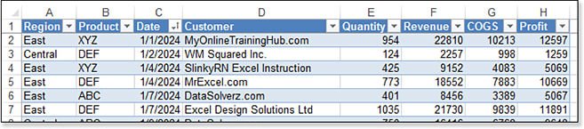
For most of this chapter, the pivot tables shown in the figures are from the data set in Figure 15.1. This data set has two years of transactional data. There is a single text column of Customer. There is a single date column. Numeric columns include Quantity, Revenue, COGS, and Profit.
Browsing Ten “Recommended” Pivot Tables
You can save a few mouse clicks by starting with the Recommended PivotTable dialog box.
Select a single cell in your data. On the Insert tab, choose Recommended PivotTables. Excel displays a dialog box with ten pivot tables down the left side. Click each pivot table to see a preview of the pivot table in the dialog box (see Figure 15.2). When you find one that is close, click OK to create that pivot table on a new worksheet.
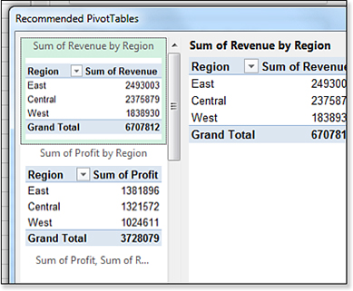
Is it worthwhile to use the Recommended PivotTables dialog box? The ten suggestions are not perfect, but many near the top of the list are a great starting point. Provided that you want your pivot table to appear on a new worksheet, and provided that you are building a pivot table from a single table, then you lose nothing by using Insert, Recommended PivotTable, OK instead of Insert, PivotTable, OK. At the very least, you start with two common fields in your pivot table and are usually two mouse clicks closer to being finished with the pivot table.
Note
The Excel 2013–era Recommended Pivot Table feature morphed into a much better artificial intelligence tool in 2018. The tool was initially called Insights but then changed to Ideas. The feature sends 250,000 cells to an artificial intelligence server and returns more than 30 recommended pivot charts. Unfortunately, this feature is exclusive to Office 365 and will not be available in Excel 2019.
The rules for choosing the recommended pivot tables are fairly complex. I believe some of the rules for deciding on the top 10 pivot tables are as follows:
If you have a numeric field with a label of Revenue, that field is always given priority and appears in the first few pivot tables.
If you use Sales instead of Revenue, Excel looks for a field called Profit.
If Excel does not recognize any of the numeric field headings, it looks for the field with the largest total or the field on the right for the first few recommended pivot tables.
Excel analyzes the text fields to determine the number of unique values for each field. The two fields with the fewest unique values are often suggested as the row fields in the first four pivot tables.
Three of the ten pivot tables offer multiple numeric fields going across the report. At least one of those offers a Count or Average of one field.
The final three pivot tables might contain an attempt to offer a cross-tab report, with fields in Row and Column, or with two fields in the row field. This logic is the weakest. In 50+ experiments, the logical combinations of Customers and Products or Region and Product only appeared in 6% of the trials. Hopefully, the Excel team can refine this logic over time.
Starting with a Blank Pivot Table
The traditional method for creating a pivot table is to create a blank one. Choose one cell in your data. Select PivotTable from the Insert tab. Excel displays the Create PivotTable dialog box, as shown in Figure 15.3.
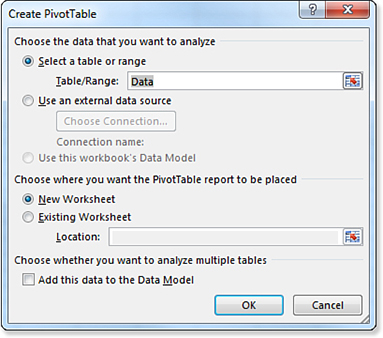
This dialog box box confirms the range of your data. Provided you have no blank rows or blank columns, Excel normally gets this right. In Figure 15.3, the underlying data has been made into a table using Ctrl+T and renamed as Data. You could instead choose to use an external data source.
Using the Create PivotTable dialog box, you have the choice of creating the pivot table on a new blank worksheet or in an existing location. You might decide to put the pivot table in J2 on this worksheet, or next to another existing pivot table or pivot chart if you plan on building a dashboard of several pivot tables.
You can build a pivot table from a relational model by checking the Add This Data to the Data Model check box. For details on building a pivot table from two or more tables, see Chapter 17, “Mashing Up Data with Power Pivot.”
Adding Fields to Your Pivot Table Using the Field List
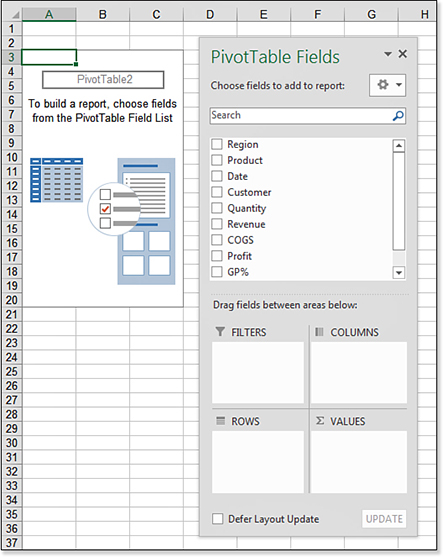
If you started with a blank pivot table, you see a PivotTable Fields panel that looks like Figure 15.4. The graphic shown in columns A:C is a placeholder to indicate where the pivot table will appear after you choose some fields. The PivotTable Fields area has a list of fields from your original data set at the top and four drop zones at the bottom. To build your report, you add fields to the drop zones at the bottom.
Note
The field list is generally docked to the right side of the Excel window. The figures in this book show the field list as undocked. To undock the field list, drag the title bar away from the edge of the window. It is hard to re-dock the field list. You must grab the left side of the title bar and drag the field list more than 50 percent off the right side of the Excel window.
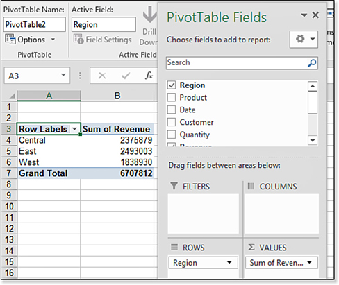
If you built your pivot table using the Recommended PivotTables dialog box, you already see a few fields in the drop zones and a few fields in the report. Figure 15.5 shows the initial pivot table and field list when you choose Sum Of Revenue By Region.
Changing the Pivot Table Report by Using the Field List
If you are starting with Figure 15.4, check the Region, Product, and Revenue fields. If you are starting with Figure 15.5, check the Product field.
When you check a text or date field, that field automatically moves to the Rows drop zone in the PivotTable Fields list. When you check a numeric field, that field moves to the Values drop zone and is changed to Sum of Field.
By choosing Region, Product, and Revenue, you see Sum of Revenue by region and product, as shown in Figure 15.6.
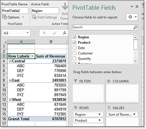
You can further customize the pivot table by moving fields around in the drop zones. For example, drag the Region field so it is below the Product field in the Rows drop zone. The report updates to show Region within Product, as shown in Figure 15.7.
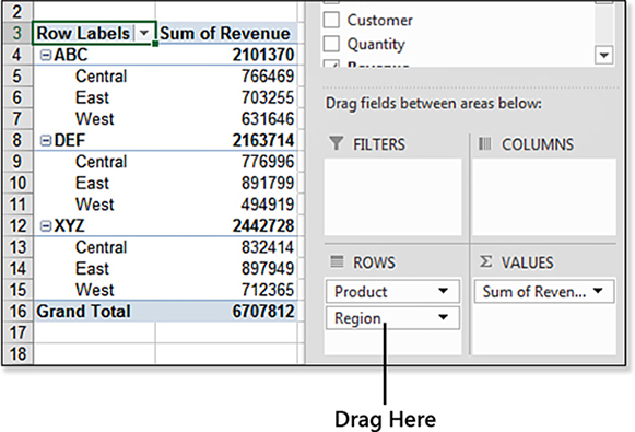
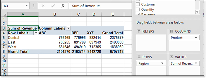
Drag the Region field from the Rows drop zone to the Columns drop zone, and you have a cross-tab report, as shown in Figure 15.8.
Dealing with the Compact Layout
If you’ve been using pivot tables for many versions of Excel, you have to wonder about the bizarre layout of the pivot table shown previously in Figure 15.6. The totals appear at the top of each group instead of at the bottom. Two fields—Region and Product—appear in column A. Collapse buttons appear next to the regions.
This is a report layout called Compact Form. Introduced in Excel 2007, it is beautiful if you plan to present your pivot table in an interactive touch-screen kiosk complete with slicers. However, if you plan to reuse the results of the pivot table, the Compact Form is horrible. Every pivot table you create in the Excel interface starts with Compact Form. Here is how to go back to the Tabular Form layout:
Make sure that the active cell is inside the pivot table.
Go to the Design tab in the ribbon. Open the Report Layout drop-down. Select Show in Tabular Form. As shown in Figure 15.9, the totals move back to the bottom of each region. Also, Product moves to column B.
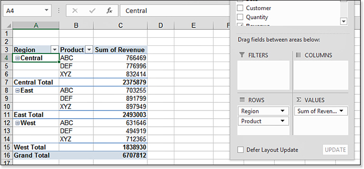
Figure 15.9 Change from Compact Form to Tabular Form to put each field in a new column. Open the Report Layout drop-down and select Repeat All Item Labels. This eliminates the blanks in column A of the pivot table, as shown in Figure 15.10. This is a feature that has been badly needed in Excel for 15 years. It was finally added to Excel 2010.
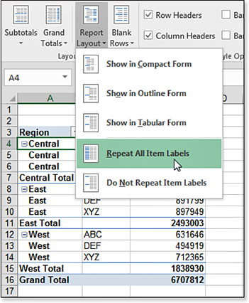
Figure 15.10 Using Repeat All Item Labels fills in blanks in the row area.
Rearranging a Pivot Table
The drop zone sections of the PivotTable Fields list box are as follows:
Filter—You use this section to limit the report to only certain criteria. This section is virtually replaced by the slicer feature.
 To learn more about filtering pivot tables, see Chapter 16, “Using Slicers and Filtering a Pivot Table.”
Rows—This section is for fields that appear on the left side of the table. By default, all text fields move here when you select the check boxes in the top of the field list.
Columns—This section is for fields that stretch along the top rows of columns of your table. Old database geeks refer to this as a crosstab report.
Values—This section is for all the numeric fields that are summarized in the table. By default, most fields are automatically summed, but you can change the default calculation to an average, minimum, maximum, or other calculation.
You can add fields to a drop zone by dragging from the top of the PivotTable Fields list to a drop zone or by dragging from one drop zone to another. To remove a field from a drop zone, drag the field from the drop zone to outside of the PivotTable Fields list.
Finishing Touches: Numeric Formatting and Removing Blanks
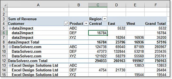
After you arrange your data in the report, you want to consider formatting the numeric fields. For example, the pivot table in Figure 15.11 has Customer and Product in the Rows drop zone, Region in Columns, and Revenue in Values. It would be helpful if the numbers were formatted with commas as thousands separators. Also, consider changing the words “Sum of Revenue” to something less awkward, such as “Total Revenue” or even “Revenue.”
Follow these steps to apply a numeric format to the Revenue field:
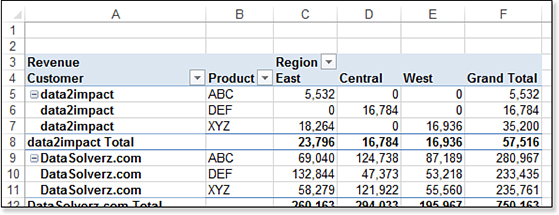
Select cell A3 with the Sum Of Revenue heading. Type Revenue followed by a space and press Enter.
Right-click any number in the pivot table and choose Number Format. The familiar Format Cells dialog box appears.
Select the Number category. Select 0 decimal places, and add a thousands separator. Click OK to close the Format Cells dialog box. Click OK to close the Value Field Settings dialog box.
Right-click any cell in the pivot table and choose PivotTable Options.
On the Layout & Format tab of the PivotTable Options dialog box, type
0next to For Empty Cells Show.
Figure 15.12 shows the new number format applied to the pivot table, along with the empty cells replaced with zero.
Three Things You Must Know When Using Pivot Tables
Pivot tables are the greatest invention in spreadsheets. However, you must understand the following three issues, presented in order of importance.
Your Pivot Table Is in Manual Calculation Mode Until You Click Refresh!
Most people are shocked to learn that changes to underlying data do not appear in a pivot table. After all, you change a cell in Excel, and all the formulas derived from the cell automatically change. You would think that the same should hold true for pivot tables, but it does not. Pivot tables are fast because the original data from the worksheet is loaded into a pivot cache in memory. Until you click the Refresh icon on the Analyze ribbon, Excel does not pick up the changes to the underlying data.
If You Click Outside the Pivot Table, All the Pivot Table Tools Disappear
If your field list disappeared and the Options and Design tabs are missing, it is likely that you clicked outside of the pivot table.
I’ve argued with Microsoft that because nothing is on the worksheet other than the pivot table, I am still looking at the pivot table even when I click outside of the pivot table. I continue to lose this argument, however. If the field list disappears and the tabs are gone, click back inside your pivot table.
You Cannot Change, Move a Part of, or Insert Cells in a Pivot Table
Many times, pivot tables get you very close to the final report you want, and you just want to insert a row or move one bit of the table. You cannot do this. If you try, you will be greeted with the ubiquitous message: “We can’t make this change for the selected cells because it will affect a PivotTable.” This is a fair limitation. After all, Excel needs to figure out how to redraw the table when you move something in the field list.
The solution is to copy the entire pivot table and then use Paste Values to convert the report to regular Excel data. You can either put this on a new worksheet or paste the entire table back over itself. If you go to a new worksheet, you can continue to modify the original pivot table. If you paste values over the original worksheet, the pivot table converts to a range, and you cannot pivot it further.
Calculating and Roll-Ups with Pivot Tables
Pivot tables offer many more calculation options than those shown so far in this chapter. One of the most amazing features is the capability to roll daily dates up to months, quarters, and years.
In Excel 2016, Excel could automatically create roll-ups from daily dates. If you have a data source with one or more years of dates, simply dragging the date field to the pivot table would create new virtual fields for Years, Quarters, and Months.
This new feature was not predictable and confusing. In Excel 2019, the feature is turned off by default, and you must go to File, Options, Data, and uncheck Disable Automatic Date Grouping Of Date/Time Columns In PivotTables to use the feature.
The example in the next section assumes the AutoGroup feature is disabled.
Grouping Daily Dates to Months, Quarters, and Years
Good pivot tables start with good transactional data. Invariably, that transactional data is stored with daily dates instead of monthly summaries.
To produce a summary by month, quarter, and year, follow these steps:
Start with data that contains daily dates. Build a pivot table with daily dates going down the row field, Region in the columns, and Sum Of Revenue in the value area.
Select one cell that contains a date. On the Analysis tab, choose Group Field.
In the Grouping dialog box, choose Months, Quarters, and Years. Click OK.
Figure 5.13 shows a pivot table with daily dates rolled up to months, quarters, and years.
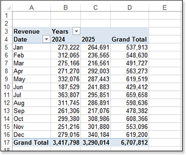
For an interesting alternative to the report in Figure 15.13, follow these steps:
Uncheck the Region and Quarter fields to remove them from the report.
Drag the Years field from the Rows area to the Columns area.
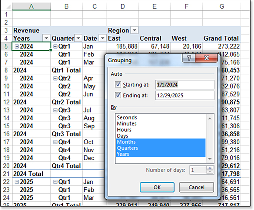
Figure 15.13 Roll your daily dates up to months, quarters, and/or years.
You now have a pivot table that provides totals by month and quarter and compares years going across the report (see Figure 15.14). Notice that your pivot table field list includes three fields related to dates: The years and quarters fields are virtual fields. The original Date field includes the months. This was a brilliant design decision on Microsoft’s part because it allows years and months to be pivoted to different sections of the pivot table.
Adding Calculations Outside the Pivot Table
Figure 15.15 shows % Growth instead of Grand Total in column D. However, after you group the dates in the pivot table, you are prevented from adding a calculated item inside the pivot table, so you must turn back to regular Excel to provide the % Growth column.
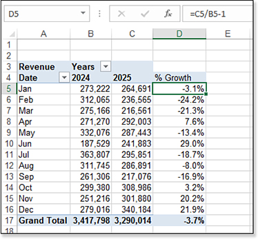
However, it is not simple for Excel to create that column. In particular, step 3 trips up most people. Follow these steps:
Right-click the Grand Total in D4 and choose Remove Grand Total.
Type a heading of % Growth in D5
In cell D5, type
=C5/B5-1. You really have to type this formula! Do not touch the mouse or the arrow keys while you are building the formula, or you will be stung by theGetPivotData bug.Format cell D5 as a percentage with one decimal place.
Double-click the fill handle in D5 to copy the formula down to all rows.
Changing the Calculation of a Field
By default, a numeric column will be added to the pivot table with a default calculation of Sum. Excel offers ten other calculations, such as Average, Count, Max, and Min.
For this section, the figures start with a completely new pivot table. You can follow along with these steps:
Delete the worksheet that contains the pivot table from the previous examples. This clears the pivot cache from memory.
Select one cell on the Data worksheet.
Choose Insert, PivotTable.
Add a check next to the Region, Product, and Revenue fields.
Drag Revenue to the Values area two more times. They will appear in the pivot table as Sum Of Revenue2 and Sum Of Revenue3.
On the Design tab, choose Report Layout, Show In Tabular Form.
You will have the pivot table shown in Figure 15.16.
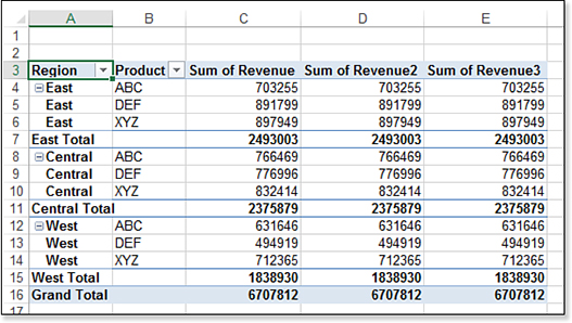
Figure 15.16 This new pivot table starts with three numeric columns that default to Sum.
In column D, you would like a count of the number of records. Follow these steps to change column D to a count of the number of records:
Double-click the Sum Of Revenue2 heading in D3. This opens the Value Field Settings dialog box.
In the Value Field Settings dialog box, choose Count instead of Sum.
In the Custom Name field, type
Number of Ordersor any other name that makes sense to you.Click OK. Column D now shows a count of records instead of a sum (see Figure 15.17).
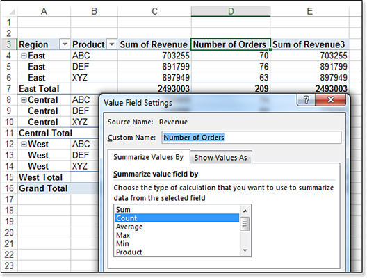
Figure 15.17 Change column C to show a count instead of a sum.
To change column E to show average revenue per order, follow these steps:
Double-click the Sum Of Revenue3 heading in E3. Change the calculation to Average.
Change the Custom Name field to “Avg Revenue.”
Click the Number Format button.
Choose Currency with two decimal places.
Click OK twice to close the Format Cells and the Value Field Settings dialog box boxes. Excel now shows Avg Revenue in column E.
You can use a similar method to change to any of the 11 calculations offered in the Summarize Values By tab.
That’s not all—there are more ways to show the values, as discussed in the next section.
Showing Percentage of Total Using Show Value As Settings
In addition to the 11 ways to summarize values, Excel 2019 offers 14 calculation options on the second tab of the Value Field Settings dialog box. To experiment with these 14 calculations, drag the Revenue field to the Values drop zone two more times. Follow these steps:
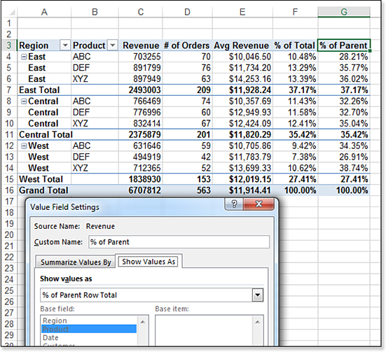
Double-click the heading in F3 to pen the Value Field Settings. Select the second tab in the Value Field Settings dialog box. Choose % Of Column Total from the drop-down. Change the Custom Name to % Of Total. Click OK.
Double-click G3, and select the second tab in the Value Field Settings dialog box. Choose % Of Parent Row Total from the drop-down. Change the Custom Name to % Of Parent and click OK.
Figure 15.18 shows the result. In row 4, the $703,255 of revenue in C4 is 10.48% of the grand total revenue. The calculation in G4 shows that the revenue in C4 is 28.21% of the East region revenue shown in C7.
Showing Running Totals and Rank
Other options in the Show Values As drop-down include running totals and a ranking. These work best when there is only one field in the row area.
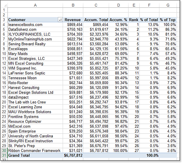
Delete the worksheet that contains the existing pivot table. Build a new pivot table with Customer in the Rows area. Drag Revenue six times to the Values area.
Initially, the customers are sorted alphabetically. Open the Row Labels drop-down in cell A3. Choose More Sort Options. In the Sort (Customer) dialog box, choose Descending (Z to A) By. In the drop-down, choose Sum Of Revenue. Click OK. The pivot table shows the largest customers at the top.
To change the calculation in each column, follow these steps:
Select cell B3, and type the new name, Revenue, with a leading space. Choose Currency with 0 decimal places. Click OK.
Double-click cell C3. On the Show Values As tab, choose Running Total In. In the Base Field list, choose Customer. Change the Custom Name to
Accum. Total. Click Number Format. Choose Currency with 0 decimal places. Click OK twice.Double-click cell D3. Click Field Settings. On the Show Values As tab, choose % Running Total In. In the Base Field list, choose Customer. Change the Custom Name to Accum %. Click Number Format. Choose Percentage with two decimal place. Click OK twice.
Double-click cell E3. Click Field Settings. On the Show Values As tab, choose Rank Largest To Smallest. In the Base Field list, choose Customer. Change the Custom Name to Rank. Click OK.
Double-click cell F3. Click Field Settings. On the Show Values As tab, choose % of Column Total. Change the Custom Name to % of Total. Click Percentage 1 decimal place. Click OK twice.
Double-click cell G3. Click Field Settings. On the Show Values As tab, choose % Of. In the Base Field list, choose Customer. In the Base Item field, you can choose (previous), (next), or a specific customer. Because the largest customer is leanexcelbooks.com, choose that customer as the Base Item setting. Change the Custom Name to % of Top. Choose the Number Format button. Click Percentage 1 Decimal Place. Click OK twice.
The resulting pivot table in Figure 15.19 shows examples of the 14 Show Values As options. Note that many of the options require the choice of a base field. A few also require that you select a base item.
Troubleshooting
Excel offers many different ways of ranking ties. Pivot tables do not follow any of the existing methods and introduce a new method.
Say that you have five sales reps with sales of 1000, 800, 800, 400, and 200. The RANK.EQ function will rank two people in second place and no one in third place. The RANK.AVG function will rank both reps with sales of 800 with the tie in the 2.5 place. Pivot table ranks follow neither rule. In a pivot table, people would be ranked, 1, 2, 2, 3, 4; no one would be ranked fifth.
Using a Formula to Add a Field to a Pivot Table
The previous examples took an existing field and used the Show Values As setting to change how the data is presented in the pivot table. In this example, you learn how to add a brand-new calculated field to the pivot table. Follow these steps:
Select one of the numeric cells in the pivot table.
On the Analyze tab in the ribbon, choose Fields, Items & Sets. Choose Calculated Field from the drop-down. (If this option is not available, choose a cell in the value area of the pivot table.) Excel displays the Insert Calculated Field dialog box. The default field name of Field 1 and the default formula of
=0appear in the dialog box.Type a new name, such as
GP%.The Formula field starts out as an equal sign, a space, and then a zero. You have to click in this field and press backspace to remove the zero.
Build the formula by double-clicking Profit, typing a slash, and then double-clicking Revenue. The dialog box should look like Figure 15.20. Click OK.
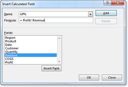
Figure 15.20 Build a calculated field. The headings for calculated fields always appear strange. Select a cell in column H and choose Field Settings. Change the Custom Name from Sum of GP% to
GP%with a leading or trailing space. Change the Number Format to Percentage with one decimal. Click OK twice. The final pivot table is shown in Figure 15.21.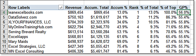
Figure 15.21 This pivot table includes four value fields plus two calculated fields.
Formatting a Pivot Table
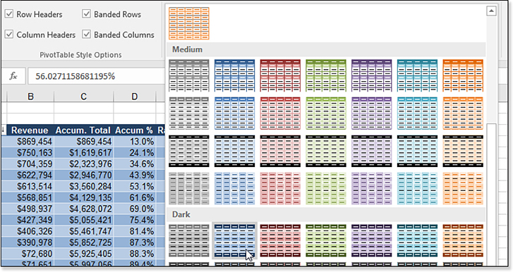
Excel offers a PivotTable Styles gallery on the Design tab. Instead, if you try to format individual cells in a pivot table, you will experience frustration. After you rearrange the pivot table, your manual formatting will be lost.
The PivotTable Styles gallery on the Design tab contains 73 built-in styles for a pivot table. The 73 styles are further modified by using the four check boxes for Banded Rows, Banded Columns, Row Headers, and Column Headers. Multiply that by the 20 color themes on the Page Layout tab, and you have 23,360 different styles. Multiply by the three report layouts, two options for blank rows, Grand Totals On or Off for Rows or Columns, Subtotals Above or Below, and you have more than a million styles available for your pivot table.
You can also build new styles. For example, if you would like the banded rows to be two rows tall, you can design a style for that.
To format a pivot table, select Banded Rows, Row Headers, and Column Headers from the Design tab of the ribbon. Then open the Styles gallery. Figure 15.22 shows some of the choices available in the gallery.
Setting Defaults for Future Pivot Tables
Once you get some experience with pivot tables, you might find that you have favorite settings that you apply to every pivot table. A new feature in Excel 2019 lets you specify the defaults for future pivot tables.
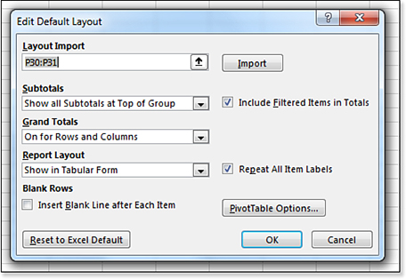
To find the feature, choose File, Options, Data. The first choice is Edit Default Layout.
My favorite choices are:
Change the Report Layout to Show In Tabular Form.
Choose the checkbox for Repeat All Item Labels.
I prefer Include Filtered Items In Totals, although this only affects pivot tables based on the Data Model.
These settings are shown in Figure 15.23.
For settings not shown in the Edit Default Layout dialog box, click the PivotTable Options button in the Edit Default Layout dialog box. This can be confusing: if you click PivotTable Options from the Edit Default Layout dialog box, any changes you make to the PivotTable Options dialog box shown in Figure 15.24 will become the default pivot table. However, if you open the PivotTable Options by right-clicking a pivot table or using the Options button in the Design tab of the Ribbon, you will only change the current pivot table.
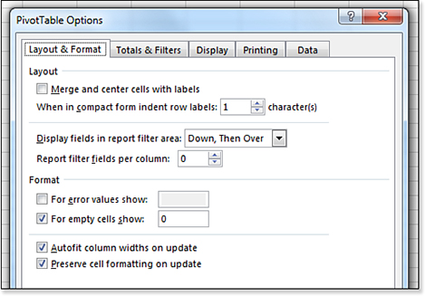
In Figure 15.24, I change the For Empty Cells Show setting to zero. Other people suggest using the Classic PivotTable Layout from the Display tab.
If you already have an existing pivot table with your favorite settings, you can import those settings as a default using the Import button in the Edit Default Layout dialog box.
Note
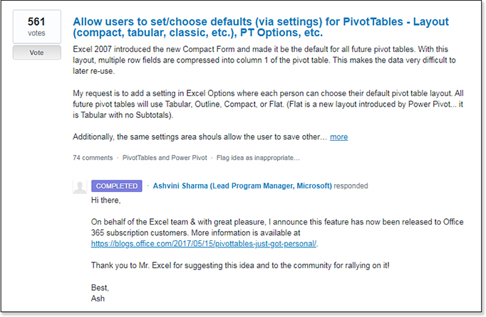
The Pivot Table Defaults feature shows how Excel.UserVoice.com can be an effective way to lobby for feature changes in Excel. I wrote up the idea for Pivot Table Defaults at Excel.UserVoice.com and asked others to vote. After getting several hundred votes, the Excel team added the feature. Note that I had been using my access as an Excel MVP to request this feature for five years, and I got nowhere. Once I posted it to Excel.UserVoice.com, and other people started agreeing with me, the Excel team was moved to act.
So, if you have something driving you crazy in Excel, write up your idea. Ask your co-workers to vote. It seems like 20 votes is enough to have your idea bubble up in the results, which means more people will see—and hopefully, vote—for your idea.
Figure 15.25 shows my original request.
Finding More Information on Pivot Tables
More information about pivot tables is available in these locations:
Chapter 16 covers slicers and other ways to filter a pivot table.
Chapter 17 covers creating pivot tables from multiple tables using Power Pivot.
Chapter 24, “Using 3D Maps,” covers creating a pivot table on a map using 3D Maps.
For even more information on pivot tables, check out my upcoming new book on the subject: Excel 2019 Pivot Table Data Crunching (Que, ISBN 978-1-5093-0724-1), coauthored by Mike Alexander, in early 2019.