Figure 2-3: Periodic system of visualisation methods.
What science has to say
Scientists Ralph Lengler and Martin J. Eppler of the University of Lugano define visualisation methods as follows:
‘A systematic, rule-based, external, permanent and graphic representation which presents information in a way which promotes and further develops insight and understanding or communicates experience.’
Lengler and Eppler started the Visual Literacy project and developed a periodic system (see Figure 2-3) that provides an overview of the different kinds of visualisation and their methods.
Figure 2-3 displays the periodic system of visualisation methods (on the internet at www.visual-literacy.org
). By clicking on each of the elements displayed in the periodic system at the website you can call up examples and further information.
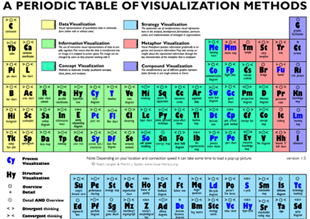
Lengler and Eppler distinguish between the following kinds of visualisation methods:
![]() Methods for visualising quantitative data: For example, a pie chart, which may already be familiar to you from Excel files.
Methods for visualising quantitative data: For example, a pie chart, which may already be familiar to you from Excel files.
![]() Methods for visualising information: Information is more than just data. Data contain no hint as to their use. Information is typically connected with a particular situation and possesses context.
Methods for visualising information: Information is more than just data. Data contain no hint as to their use. Information is typically connected with a particular situation and possesses context.
One example of an information visualisation technique is the so-called pie model (see Figure 2-4, taken from www.visual-literacy.org/periodic_table/periodic_table.html#
).
![]() Methods for visualising concepts: These methods extend the ways of visualising information by containing further clarification.
Methods for visualising concepts: These methods extend the ways of visualising information by containing further clarification.
Mind Maps, the focus of this book, are an example of this.
![]() Methods for visualising strategies: A portfolio diagram is an example of this kind of visualisation technique (see Figure 2-2).
Methods for visualising strategies: A portfolio diagram is an example of this kind of visualisation technique (see Figure 2-2).
![]() Methods for visualising metaphors: For example, the graphic representation of a bridge, tree or iceberg metaphor.
Methods for visualising metaphors: For example, the graphic representation of a bridge, tree or iceberg metaphor.
![]() Combined visualisation methods: This involves combining several visualisation methods in a single image.
Combined visualisation methods: This involves combining several visualisation methods in a single image.
Figure 2-4: Example of a pie chart.
..................Content has been hidden....................
You can't read the all page of ebook, please click here login for view all page.