
22
Angular Components
Angular components are the building blocks you use to create Angular applications. Angular components allow you to build self-contained UI elements for an application. Components allow you to control how your application looks and functions through TypeScript code and an HTML template. This chapter discusses how to create Angular components using a TypeScript class that defines the look and behavior of UI elements.
Component Configuration
An Angular component consists of two main parts: the definition in the decorator section and the class section, which defines the logic. The decorator section is used to configure the component, including things like the selector name and HTML template. The class section enables you to give the component its logic, data, and event handlers, as well as export it to be used in other TypeScript files.
With these two sections you can create a basic component. The following example shows what a component might look like:
Import {Component} from '@angular/core';
@Component({
     selector: 'my-app',
     template: '<p>My Component</p>'
})
Export class AppComponent{
    Title = 'Chapter 1 Example';
}
To create a component, you import Component from Angular and apply it to a TypeScript class that you can then use to control the look and functionality of the component. Within the @Component decorator are several component configuration options you need to understand. The following list includes some of the most important options available:
selector: This option allows you to define the HTML tag name used to add the component to the application via HTML.
template: This option allows you to add inline HTML to define the look of the component. This is for when there won’t be very much code to add, and it’s helpful for when you don’t want extra files.
templateUrl: This option allows you to import an external template file rather than inline HTML. This is helpful for separating a large amount of HTML code out of a component to help with maintainability.
styles: This option allows you to add inline CSS to your component. Use it when only minor style changes are needed.
stylesUrls: This option allows you to import an array of external CSS stylesheet(s). You should use this rather than styles when importing external CSS files.
viewProviders: This is an array of dependency injection providers. It allows you to import and use Angular services that provide application functionality such as HTTP communications.
Defining a Selector
In a component, a selector tells Angular where to apply the component in HTML. You apply Angular to a component to HTML by giving it a selector and then using the selector name as a tag name in your HTML file. This makes the functionality of the Angular component available in HTML. The following is an example of a selector:
@Component({
     selector: 'angular-rules'
})
You can then add the selector to HTML files by using the following syntax:
<angular-rules></angular-rules>
Note
It’s important to note that when defining a selector name, there can’t be any white spaces. For example, you can’t name a selector angular rules, but you can name it angular-rules or angular_rules.
Building a Template
You use a template to define how an Angular component should look. Templates are written in HTML, but they allow you to include Angular magic to do some pretty cool things. Angular allows for both inline templates and external template files.
You can add a template to the Angular @component decorator. For a single-line template, you can use either single or double quotes to wrap it. For a multiple-line template, you use backquotes (`); you generally find the backquote key in the upper left of your keyboard, on the same key as the tilde symbol (~). Using the backquote is very important as it will break your code if it’s not correct. Here is an example of a single-line template compared to a multiple-line template:
@Component({selector: 'my-app',template: '<h1>Hello World!</h1>'})@Component({selector: 'my-app',template: `<h1>Hello World!</h1>`})
Note
For the template and styles configuration options, you need to use the backquote (`), generally located on the same key as the tilde symbol (~).
The same principles you use for templates also apply to CSS. You use the keyword styles to tell a component about inline styling. The only major difference is that styles takes in an object of strings instead of just one string. The following example shows some inline styling:
@Component ({
    selector: 'my-app',
    template: '<p>hello world</p>',
styles: [`
        P {
            color: yellow;
            font-size: 25px;
        }
    `]
})
Note
You need to use the backquote key for a multiple-line stylesheet.
Using Inline CSS and HTML in Angular Applications
You’ve learned how to implement HTML and CSS in an Angular component. This section builds an example based on that knowledge.
In this exercise you will see how Angular components use and include external templates and stylesheets. The purpose of this exercise is to illustrate how this use of templates allows for more readable and manageable code.
The code in Listing 22.1 is the Angular component. Line 1 imports the component necessary to define the component. Lines 3 through 18 define the component. The component has a very simple template, as shown in lines 5 through 7, and some CSS styling in lines 8 through 13 to go with it.
Figure 22.1 shows the finished Angular component rendered.
Listing 22.1 intro.ts: A Simple Angular Template and Styling to Display a <span> Element
01 import { Component } from '@angular/core';
02
03 @Component({
04   selector: 'app-root',
05   template: `
06     <span>Hello my name is Brendan</span>
07   `,
08   styles:[`
09     span {
10       font-weight: bold;
11       border: 1px ridge blue;
12       padding: 5px;
13     }
14   `]
15 })
16 export class AppComponent {
17   title = 'Chapter 22 Intro';
18 }

Figure 22.1 Implementing a basic Angular web application that loads an HTML template and styles to the view
Using Constructors
When you use Angular, you often need to have default values and an initial setup for your component variables. Angular uses constructors to give its components default values. This section goes over how to create and implement them.
Constructors go in the Component class. Their purpose is to set default values and initial configuration of variables for that class so that when those variables are used within the component, they are never uninitialized. The following is an example of constructor syntax:
export class constructor {
     name: string;
     constructor(){
          this.name = "Brendan";
     {
}
Now that you’ve learned what a constructor is and what it looks like, let’s get into an example that uses one. This simple exercise uses a constructor to define the current date at the time the component is created.
Listing 22.2 shows an Angular component with a selector named simple-constructor and a simple template. Note the {{today}} on line 6 is a form of data binding, which is discussed in more detail in Chapter 24, “Data Binding.” For now, you should focus on how the constructor works.
Figure 22.2 shows the rendered Angular component.
Listing 22.2 constructor.component.ts: A Simple Component that Displays the Date
01 import {Component} from '@angular/core';
02
03 @Component({
04   selector: 'simple-constructor',
05   template: `
06     <p>Hello today is {{today}}!</p>
07   `,
08 })
09 export class UsingAConstructor {
10   today: Date;
11   constructor() {
12     this.today = new Date();
13   }
14 }
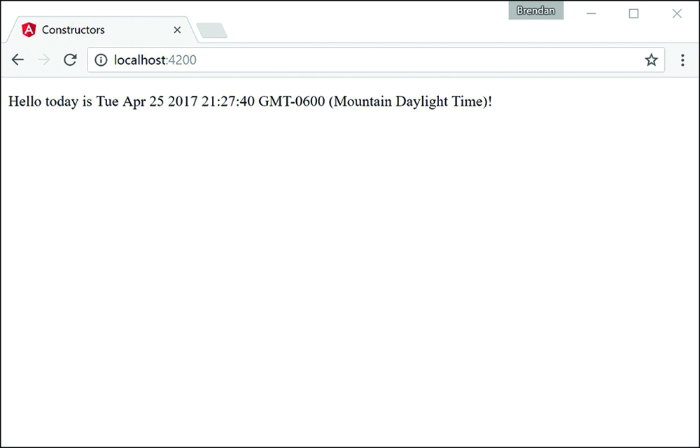
Figure 22.2 Implementing a basic Angular web application that uses a constructor to define default variables
Using External Templates
Another way to incorporate templates and stylesheets into Angular components is through a separate file. Using this method is handy because it helps you separate what the files do. It also makes the component easier to read. Under your @Component decorator, you place the keyword templateUrl followed by the path from the root of the application to your template HTML file. Here is an example.
@Component ({
     selector: 'my-app',
     templateUrl: "./view.example.html"
})
You use the keyword styleUrls to tell the component about external stylesheets. The difference with the external stylesheets is that you pass in an array of one or more stylesheets. The following example shows how to import external stylesheets:
@Component ({
    selector: 'my-app',
    templateUrl: "./view.example.html"
styleUrls: ["./styles1.css", "./styles2.css"]
})
Note
The styleUrls configuration option takes in an array of comma-separated strings.
Earlier in this chapter, in the “Building a Template” section, you learned how to implement external HTML and CSS files into an Angular component. The example in this section builds on that knowledge and walks you through an Angular application that incorporates external HTML and CSS files.
Listing 22.3 shows an Angular component with the selector named external, and templateUrl and styleUrls, which link the external files you need for this application.
Listing 22.4 shows an external template named externalTemplate.html. The component uses this file to render the view on the browser.
Listing 22.5 shows an external stylesheet named external.css. The component applies this file to the component template file.
Figure 22.3 shows the finished Angular component rendered.
Listing 22.3 external.component.ts: An Angular Component with External File Dependencies
01 import { Component } from '@angular/core';
02
03 @Component({
04   selector: 'app-root',
05   templateUrl: './app.component.html',
06   styleUrls: ['./app.component.css']
07 })
08 export class AppComponent {
09   title = 'Chapter 22 Using External templates and styles';
10 }
Listing 22.4 externalTemplate.html: An HTML Template File for the Component to Pull In and Use
01 <h1>Congratulations</h1>
02 <p>
03   You've successfully loaded an external html file.
04   <span>
05     If I'm red then You managed to get the styles in there as well
06   </span>
07 </p>
Listing 22.5 external.css: A CSS Stylesheet for the Component to Apply to Its Template
01 span{
02   color: red;
03   border: 2px solid red;
04 }
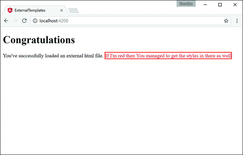
Figure 22.3 Implementing a basic Angular web application that loads an external HTML template and stylesheet to the view
Injecting Directives
Dependency injection can be a difficult concept to fully grasp. However, it is a very important part of Angular, and when you understand the basics, the Angular implementation becomes quite clear. Dependency injection is a well-known design pattern in many server-side languages, but had not been used extensively in a JavaScript framework until Angular came along.
The idea of Angular dependency injection is to define and dynamically inject a dependency object into another object, which makes available all the functionality provided by the dependency object. Angular provides dependency injection through the use of providers and an injector service.
In Angular, to use dependency injection on another directive or component, you need to add the directive’s or component’s class name to the declarations metadata in the @NgModule decorator within the module for the application, which takes in an array of directives imported into your application. The following is the syntax of the declarations array.
...
declarations: [ OuterComponent, InnerComponent ],
...
Building a Nested Component with Dependency Injection
You’ve learned what dependency injection is and how to use it for components and directives. This section shows you how to use what you’ve learned to create a nested component. This section walks you through an Angular application that incorporates a component that has a second component within it.
Listing 22.6 shows the outer.component.ts file, which loads an external template and stylesheet.
Listing 22.7 shows the outer.html template file that the outer.component.ts file loads. Notice that the HTML tag nested is a custom HTML tag that you use to load the inner component. You do this exactly the same way you load the outer component in the main HTML file.
Listing 22.8 shows the outer.css file that gives the outer component and its child components default styles. These styles are inherited by the inner component.
Listing 22.9 shows the inner.component.ts file. This is the inner component that the outer component has injected. Notice that the selector for this component, which was used to load this directive within the outer component, is nested.
Figure 22.4 shows the completed application in the browser window.
Listing 22.6 outer.component.ts: The Outer Component for the Application
01 import { Component } from '@angular/core';
02
03 @Component({
04   selector: 'app-root',
05   templateUrl: './app.component.html',
06   styleUrls: ['./app.component.css']
07 })
08 export class AppComponent {
09   title = 'Nested Example';
10 }
Listing 22.7 outer.html: An HTML Template for the Component to Apply the View
01 <div>
02   <h1>the below text is a nested component</h1>
03   <nested></nested>
04 </div>
Listing 22.8 outer.css: A CSS Stylesheet for the Outer Component to Apply to Its Template
01 div {
02   color: red;
03   border: 3px ridge red;
04   padding: 20px;
05 }
06 nested {
07   font-size: 2em;
08   font-weight: bolder;
09   border: 3px solid blue;
10 }
Listing 22.9 inner.component.ts: The Nested Component
01 import {Component} from '@angular/core';
02 @Component({
03   selector: 'nested',
04   template: `
05     <span>Congratulations I'm a nested component</span>
06   `,
07   styles: [`
08     span{
09       color: #228b22;
10     }
11   `]
12 })
13 export class InnerComponent {}
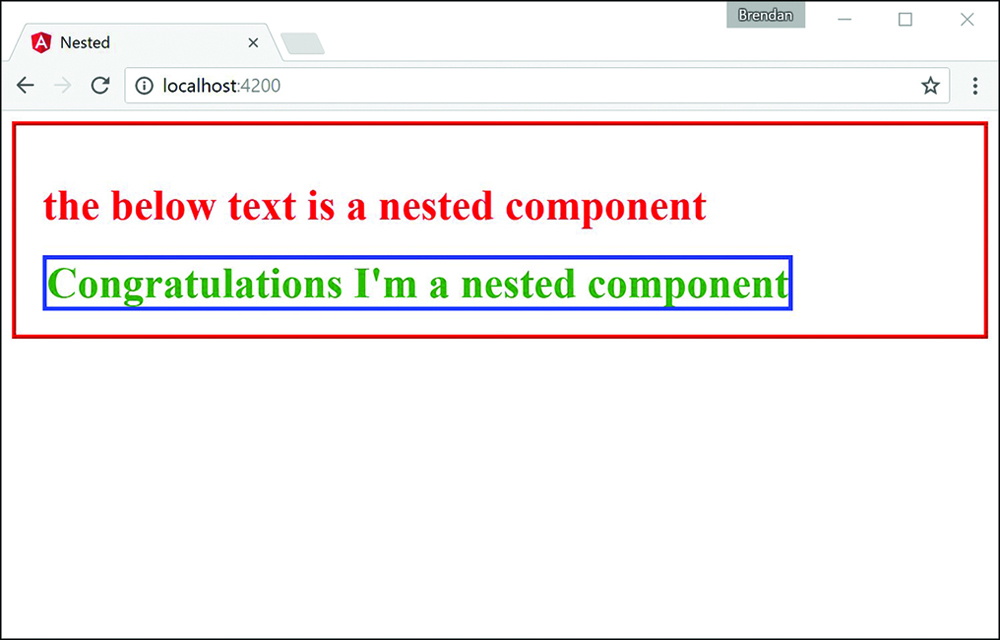
Figure 22.4 Displaying nested components
Passing in Data with Dependency Injection
Dependency injection is a powerful tool that allows you to build a reusable directive to be used within any application that imports that directive. Sometimes data needs to be passed through the application to the directive that’s being injected. This is made possible through Angular inputs.
In Angular, to input data to another directive or component, you need to import the Input decorator from @angular/core. The following code shows the syntax:
import {Component, Input} from '@angular/core';
When the Input decorator has been imported, you can begin to define what data you would like to have input into the directive. Start by defining @input(), which takes in a string as a parameter. The HTML uses that string to pass in the data to the imported directive. Do this by using the following syntax:
@Input('name') personName: string;
Creating an Angular Application that Uses Inputs
Now that you have learned how to use inputs with dependency injection, it’s time to get started on an example. This section walks through an Angular application that passes data to a directive from another directive.
Listing 22.10 shows the person.component.ts file, which is the entry point for the application that will pass data into the input.component.ts file.
Listing 22.11 shows the input.component.ts file. It is the component that will take in and handle the inputs from an external directive.
Figure 22.5 shows the completed application in the browser window.
Listing 22.10 person.component.ts: A Component that Imports input.component and Passes Data to It through the Selector
01 import { Component } from '@angular/core';
02 import {myInput} from './input.component';
03 @Component({
04   selector: 'app-root',
05   template: `
06     <myInput name="Brendan" occupation="Student/Author"></myInput>
07     <myInput name="Brad" occupation="Analyst/Author"></myInput>
08     <myInput name="Caleb" occupation="Student/Author"></myInput>
09     <myInput></myInput>
10   `
11 })
12 export class AppComponent {
13   title = 'Using Inputs in Angular';
14 }
Listing 22.11 input.component.ts: A Component that Takes Data through Its Selector to Modify What Is Displayed via HTML
01 import {Component, Input} from '@angular/core';
02 @Component ({
03   selector: "myInput",
04   template: `
05     <div>
06       Name: {{personName}}
07       <br />
08       Job: {{occupation}}
09     </div>
10   `,
11   styles: [`
12     div {
13       margin: 10px;
14       padding: 15px;
15       border: 3px solid grey;
16     }
17   `]
18 })
19 export class myInputs {
20   @Input('name') personName: string;
21   @Input('occupation') occupation: string;
22   constructor() {
23     this.personName = "John Doe";
24     this.occupation = "Anonymity"
25   }
26 }
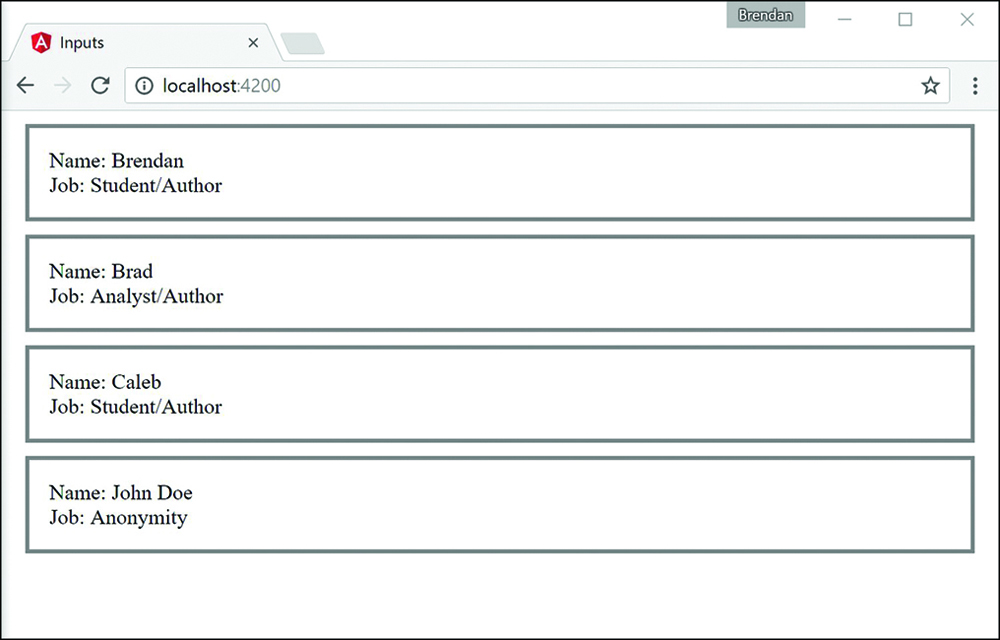
Figure 22.5 Displaying information passed down through inputs
Summary
Angular components are the main building blocks of Angular applications. This chapter shows how to build a component, from the decorator to the class. It shows different ways of including templates and stylesheets. It also shows how to use dependency injection to incorporate external directives or components within each other.
Next
In the next chapter you will learn about expressions, and how Angular evaluates them and adds them dynamically to a webpage. Then you will learn about pipes and how they are used. You will then learn how to build your very own custom pipe.