
30
Having Fun with Angular
Angular provides a lot of functionality and is a well-featured framework. The previous chapters in this book have given you everything you need to understand what Angular has to offer. This chapter is a bit different from the previous ones. It provides some additional examples that expand on what you have learned so far. The examples in this chapter take bits and pieces from all the previous chapters and show you how to build fun and useful applications that demonstrate more of what Angular is capable of.
Implementing an Angular Application that Uses the Animation Service
Listings 30.1 through 30.6 show how to create an Angular application that uses the animation service to animate images. An image fades in and grows to the correct size when the mouse hovers over the image title. When the mouse leaves, the image shrinks and fades out of view.
The folder structure for this example is as follows:
./app.module.ts: App module that imports animations (see Listing 30.1)
./app.component.ts: Angular root component for the application (see Listing 30.2)
./app.component.html: Angular template file for app.component (see Listing 30.3)
./animated: Animated component folder
./animated/animated.component.ts: Angular component that handles animations (see Listing 30.4)
./animated/animated.component.html: Angular template for the animated component (see Listing 30.5)
./animated/animated.component.css: CSS file for the animated component (see Listing 30.6)
Listing 30.1 shows the application module. For the application to use the animation service, BrowserAnimationsModule needs to be loaded. Lines 3 and 16 show BrowserAnimationsModule being imported from @angular/platform-browser/animations and then added to the imports array to make animations available to the application.
Listing 30.1 app.module.ts: An Angular Module that Includes BrowserAnimationsModule
01 import { BrowserModule } from '@angular/platform-browser';
02 import { NgModule } from '@angular/core';
03 import { BrowserAnimationsModule } from
04 '@angular/platform-browser/animations';
05
06 import { AppComponent } from './app.component';
07 import { AnimatedComponent } from './animated/animated.component';
08
09 @NgModule({
10   declarations: [
11     AppComponent,
12     AnimatedComponent
13   ],
14   imports: [
15     BrowserModule,
16     BrowserAnimationsModule
17   ],
18   providers: [],
19   bootstrap: [AppComponent]
20 })
21 export class AppModule { }
Listing 30.2 shows an Angular component that acts as the root of the application. This component loads a template file that uses the animated component.
Listing 30.2 app.component.ts: An Angular Component that Acts as the Root to the Application
01 import { Component } from '@angular/core';
02 import { AnimatedComponent } from './animated/animated.component';
03
04 @Component({
05   selector: 'app-root',
06   templateUrl: './app.component.html'
07 })
08 export class AppComponent {}
Listing 30.3 shows an Angular template that loads the animated component four times and passes in an image URL to the input src. It also adds a title to the input title.
Listing 30.3 app.component.html: An Angular Template that Uses the animated Component
01 <animated title="Arch"
02           src="../../assets/images/arch.jpg">
03 </animated>
04 <animated title="Volcano"
05           src="../../assets/images/volcano.jpg">
06 </animated>
07 <animated title="Flower"
08           src="../../assets/images/flower.jpg">
09 </animated>
10 <animated title="Sunset"
11           src="../../assets/images/jump.jpg">
12 </animated>
Listing 30.4 shows an Angular animated component which handles the animation of an image that is passed in via an input. Lines 1 through 3 import animate, keyframes, state, style, transition, and trigger from @angular/core to make animations for this application possible.
Lines 9 through 36 define the animations metadata for the component. Lines 10 through 23 show the trigger for the animation called fadeState, which when activated calls two states, inactive and active, and two transitions, inactive => active (which creates a 500 ms ease-in animation) and active => inactive (which creates a 500 ms ease-out animation).
Lines 24 through 34 show the trigger bounceState, which contains the transition void => *. This transition creates an animation that causes the menu items to bounce down and up when the application is first loaded. Lines 45 through 47 define the enter method, which sets the variable state to active. Lines 48 and 49 define the leave method, which sets the variable state to inactive.
Listing 30.4 animated.component.ts: An Angular Component that Uses the Animation Service
01 import { Component, OnInit, Input,
02          animate, keyframes, state,
03          style, transition, trigger } from '@angular/core';
04
05 @Component({
06   selector: 'animated',
07   templateUrl: './animated.component.html',
08   styleUrls: ['./animated.component.css'],
09   animations: [
10     trigger('fadeState', [
11       state('inactive', style({
12         transform: 'scale(.5) translateY(-50%)',
13         opacity: 0
14       })),
15       state('active', style({
16         transform: 'scale(1) translateY(0)',
17         opacity: 1
18       })),
19       transition('inactive => active',
20                  animate('500ms ease-in')),
21       transition('active => inactive',
22                  animate('500ms ease-out'))
23     ]),
24     trigger('bounceState', [
25       transition('void => *', [
26         animate(600, keyframes([
27           style({ opacity: 0,
28                   transform: 'translateY(-50px)' }),
29           style({ opacity: .5,
30                   transform: 'translateY(50px)' }),
31           style({ opacity: 1,
32                   transform: 'translateY(0)' }),
33         ]))
34       ])
35     ])
36   ]
37 })
38 export class AnimatedComponent implements OnInit {
39   @Input ("src") src: string;
40   @Input ("title") title: string;
41   state: string = 'inactive';
42   constructor() { }
43   ngOnInit() {
44   }
45   enter(){
46     this.state = 'active';
47   }
48   leave(){
49     this.state = 'inactive';
50   }
51 }
Listing 30.5 shows an Angular template that displays a title and an image. Line 1 shows the Angular animation @bounceState being used; it is passed in the variable state from the component to determine what animation sequence should be used. Lines 7 and 8 show @fadeState being implemented; it also has state passed in to determine the animation sequence.
Listing 30.5 animated.Component.html: An Angular Template That Displays Image Titles with Images That Are Animated
01 <div [@bounceState]='state'>
02   <p
03      (mouseenter)="enter()"
04      (mouseleave)="leave()">
05     {{title}}
06   </p>
07   <img src="{{src}}"
08        [@fadeState]='state' />
09 </div>
Listing 30.6 shows a CSS file that styles the titles for the images and sets the dimensions for the images.
Listing 30.6 animated.component.css: A CSS File That Styles the animated Component
01 div {
02   display: inline-block;
03   padding: 0px;
04   margin: 0px;
05 }
06 p {
07   font: bold 16px/30px Times New Roman;
08   color: #226bd8;
09   border: 1px solid lightblue;
10   background: linear-gradient(white, lightblue, skyblue);
11   text-align: center;
12   padding: 0px;
13   margin: 0px;
14   vertical-align: top;
15 }
16 img {
17   width: 150px;
18   vertical-align: top;
19 }
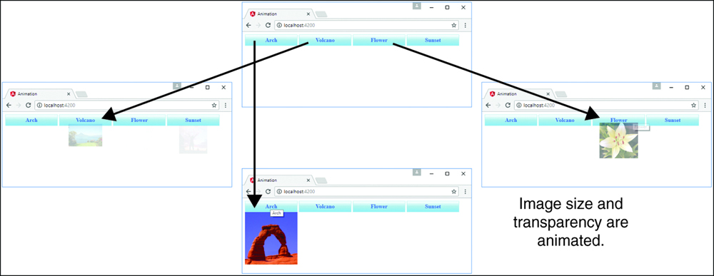
Figure 30.1 shows how the images animate in size and opacity when you click on the image name.
Implementing an Angular Application that Zooms in on Images
Listings 30.7 through 30.11 show you how to create an Angular application that displays images that can be zoomed in on (via browser events) when they are clicked.
The folder structure for this example is as follows:
./app/app.component.ts: Root component for the application (see Listing 30.7)
./app/app.component.html: Angular template for the root component (see Listing 30.8)
./app/zoomit: Folder containing the zoomit component
./app/zoomit/zoomit.component.ts: Angular component called zoomit (see Listing 30.9)
./app/zoomit/zoomit.component.html: Angular template for the zoomit component (see Listing 30.10)
./app/zoomit/zoomit.component.html: CSS file for the zoomit component (see Listing 30.11)
./assets/images: Folder where the image files for the example will be kept
Listing 30.7 shows an Angular component that acts as the root of the application. This component loads a template file that uses the zoomit component.
Listing 30.7 app.component.ts: An Angular Component That Acts as the Root to the Application
01 import { Component } from '@angular/core';
02 import { ZoomitComponent } from './zoomit/zoomit.component';
03
04 @Component({
05   selector: 'app-root',
06   templateUrl: './app.component.html'
07 })
08 export class AppComponent {}
Listing 30.8 shows an Angular template that creates three zoomit components by passing in the image URL as the attribute zsrc.
Listing 30.8 app.component.html: An Angular Template That Implements the Component zoomit
01 <hr>
02 <zoomit zsrc="../../assets/images/volcano.jpg"></zoomit>
03 <hr>
04 <zoomit zsrc="../../assets/images/flower2.jpg"></zoomit>
05 <hr>
06 <zoomit zsrc="../../assets/images/arch.jpg"></zoomit>
07 <hr>
Listing 30.9 shows the Angular zoomit component, which handles zooming in on a section of an image by using browser events. Lines 13 through 16 define the ngOnInit method, which generates a URL to get an image based on the name of the image passed into the component via the zsrc input. ngOnInit then sets a default position. Lines 18 through 23 define the imageClick event, which takes in a parameter event. Then it gets the element from the event object and uses that to set new x and y coordinates as the basis for the zoom of the image.
Listing 30.9 zoomit.component.ts: An Angular Component That Uses Browser Events to Zoom In on Part of an Image
01 import { Component, OnInit, Input } from '@angular/core';
02
03 @Component({
04   selector: 'zoomit',
05   templateUrl: './zoomit.component.html',
06   styleUrls: ['./zoomit.component.css']
07 })
08 export class ZoomitComponent implements OnInit {
09   @Input ("zsrc") zsrc: string;
10   public pos: string;
11   public zUrl: string;
12
13   ngOnInit() {
14     this.zUrl = 'url("' + this.zsrc + '")';
15     this.pos = "50% 50%";
16   }
17
18   imageClick(event: any){
19     let element = event.target;
20     let posX = Math.ceil(event.offsetX/element.width * 100);
21     let posY = Math.ceil(event.offsetY/element.height * 100);
22     this.pos = posX +"% " + posY + "%";
23   }
24 }
Listing 30.10 shows an Angular template that displays an image and a zoomed-in portion of the image next to it, using the coordinates generated from the imageClick function.
Listing 30.10 zoomit.component.html: An Angular Template That Displays an Image as Well as a Zoomed-In Portion of That Image
01 <img src="{{zsrc}}" (click)="imageClick($event)"/>
02 <div class="zoombox"
03      [style.background-image]="zUrl"
04      [style.background-position]="pos">
05 </div>
Listing 30.11 shows a CSS file that styles the application by adding a border to the zoomed-in image. It also sets width and height to 100px.
Listing 30.11 zoomit.component.css: A CSS File That Styles the Application
01 img {
02   width: 200px;
03 }
04 .zoombox {
05   display: inline-block;
06   border: 3px ridge black;
07   width: 100px;
08   height: 100px;
09   background-repeat: no-repeat;
10 }
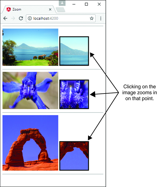
Figure 30.2 shows how the custom component displays a zoomed-in portion of the image. When you click on the image, the position of the zoom is changed.
Implementing an Angular Application that Enables Drag and Drop
Listings 30.12 through 30.20 show how to create an Angular application that displays images that can have descriptive tags dragged and dropped onto them.
The folder structure for this example is as follows:
./app/app.component.ts: Root component for the application (see Listing 30.12)
./app/app.component.html: Angular template for the root component (see Listing 30.13)
./app/app.component.css: CSS file for app.component (see Listing 30.14)
./app/drop-item: Folder containing the drop-item component
./app/drop-item/drop-item.component.ts: Angular component called drop-item (see Listing 30.15)
./app/drop-item/drop-item.component.html: Angular template for the drop-item component (see Listing 30.16)
./app/drop-item/drop-item.component.css: CSS file for the drop-item component (see Listing 30.17)
./app/drag-item: Folder containing the drag-item component
./app/drag-item/drag-item.component.ts: Angular component that allows the dragging of an element (see Listing 30.18)
./app/drag-item/drag-item.component.html: Angular template for the drag-item component (see Listing 30.19)
./app/drag-item/drag-item.component.css: CSS file for the drag-item component (see Listing 30.20)
./assets/images: Folder where the image files for the example will be kept
Listing 30.12 shows an Angular component that implements the drag-item and drop-item components to apply tags to images. Lines 12 through 24 define the constructor, which initializes a list of tags available to be dragged onto an image.
Listing 30.12 app.component.ts: An Angular Component That Acts as the Root to the Application
01 import { Component } from '@angular/core';
02 import { DragItemComponent} from './drag-item/drag-item.component';
03 import { DropItemComponent} from './drop-item/drop-item.component';
04
05 @Component({
06   selector: 'app-root',
07   templateUrl: './app.component.html',
08   styleUrls: ['./app.component.css']
09 })
10 export class AppComponent {
11   tagList: string[];
12   constructor() {
13     this.tagList = [
14       'Nature',
15       'Landscape',
16       'Flora',
17       'Sunset',
18       'Desert',
19       'Beauty',
20       'Inspiring',
21       'Summer',
22       'Fun'
23     ]
24   }
25   ngOnInit() {
26   }
27 }
Listing 30.13 shows an Angular template that implements the drag-item and drop-item components, which allow tags to be dragged and dropped onto images.
Listing 30.13 app.component.html: An Angular Template That Implements the drag-item and drop-item Components
01 <h1>Tagging Images</h1>
02 <hr>
03 <div class="tagBox">
04     <span *ngFor="let tagText of tagList">
05         <drag-item [tag]="tagText"></drag-item>
06     </span>
07 </div>
08 <hr>
09
10 <drop-item
11 [imgsrc]="'../../assets/images/arch.jpg'">
12 </drop-item>
13 <drop-item
14 [imgsrc]="'../../assets/images/lake.jpg'">
15 </drop-item>
16 <drop-item
17 [imgsrc]="'../../assets/images/jump.jpg'">
18 </drop-item>
19 <drop-item
20 [imgsrc]="'../../assets/images/flower.jpg'">
21 </drop-item>
22 <drop-item
23 [imgsrc]="'../../assets/images/volcano.jpg'">
24 </drop-item>
Listing 30.14 shows a CSS file that styles the application to give direct styles to the drop-item custom HTML tag.
Listing 30.14 app.component.css: A CSS File That Styles the Application
01 .tagBox {
02   width: 320px;
03   padding: 5px;
04 }
05 drop-item{
06   display: inline-block;
07   vertical-align: top;
08   margin-bottom: 5px;
09 }
Listing 30.15 shows the Angular component drop-item, which uses browser events to allow an element to be dropped onto the component element. Lines 11 through 13 define the constructor that initializes the tags variable as an empty array.
Lines 16 through 18 define the allowDrop method, which takes an event object as a parameter. The preventDefault method is invoked on the event object. Lines 19 through 25 define the onDrop method, which takes in an event object as a parameter. preventDefault is called on the event object. Then the variable data is assigned tagData from the event to allow Angular to add that data to the tags array and to the list on the image.
Listing 30.15 drop.component.ts: An Angular Component That Allows for an Item to Be Dropped on the Element
01 import { Component, OnInit, Input } from '@angular/core';
02
03 @Component({
04   selector: 'drop-item',
05   templateUrl: './drop-item.component.html',
06   styleUrls: ['./drop-item.component.css']
07 })
08 export class DropItemComponent implements OnInit {
09   @Input() imgsrc: string;
10   tags: string[];
11   constructor() {
12     this.tags = [];
13   }
14   ngOnInit() {
15   }
16   allowDrop(event) {
17     event.preventDefault();
18   }
19   onDrop(event) {
20     event.preventDefault();
21     let data = JSON.parse(event.dataTransfer.getData('tagData'));
22     if (!this.tags.includes(data.tag)){
23       this.tags.push(data.tag);
24     }
25   }
26 }
Listing 30.16 shows an Angular template that displays an image and any tags assigned to that image.
Listing 30.16 drop.component.html: An Angular Template That Displays an Image and Any Image Tags Dropped onto That Image
01 <div class="taggedImage"
02      (dragover)="allowDrop($event)"
03      (drop)="onDrop($event)">
04   <img src="{{imgsrc}}" />
05   <span class="imageTag"
06         *ngFor="let tag of tags">
07     {{tag}}
08   </span>
09 </div>
Listing 30.17 shows a CSS file that styles the application by adding custom styles to the tags attached to the image.
Listing 30.17 drop.component.css: A CSS File That Styles the Application
01 img{
02     width: 100px;
03 }
04 .taggedImage{
05     display: inline-block;
06     width: 100px;
07     background: #000000;
08 }
09 .imageTag {
10     display: inline-block;
11     width: 100px;
12     font: 16px/18px Georgia, serif;
13     text-align: center;
14     color: white;
15     background: linear-gradient(#888888, #000000);
16 }
Listing 30.18 shows the Angular component drag-item, which uses browser events to allow elements to be dragged. Lines 14 through 17 define the onDrag method, which takes an event object as a parameter. This method adds data to the dataTransfer item on the event object to allow the tag data to be transferred when the element is dropped.
Listing 30.18 drag.component.ts: An Angular Component That Allows an Element to Be Dragged
01 import { Component, OnInit, Input } from '@angular/core';
02
03 @Component({
04   selector: 'drag-item',
05   templateUrl: './drag-item.component.html',
06   styleUrls: ['./drag-item.component.css']
07 })
08 export class DragItemComponent implements OnInit {
09   @Input() tag: string;
10   constructor() {
11   }
12   ngOnInit() {
13   }
14   onDrag(event) {
15     event.dataTransfer.setData('tagData',
16        JSON.stringify({tag: this.tag}));
17   }
18 }
Listing 30.19 shows an Angular template that displays a draggable tag.
Listing 30.19 drag.component.html: An Angular Template That Displays an Image Tag
01 <div class="tagItem"
02      (dragstart)="onDrag($event)"
03      draggable="true">
04   {{tag}}
05 </div>
Listing 30.20 shows a CSS file that styles the application by adding custom styles to the tags.
Listing 30.20 drag.component.css: A CSS File That Styles the Application
01 .tagItem {
02     display: inline-block;
03     width: 100px;
04     font: 16px/18px Georgia, serif;
05     text-align: center;
06     background: linear-gradient(#FFFFFF, #888888);
07 }
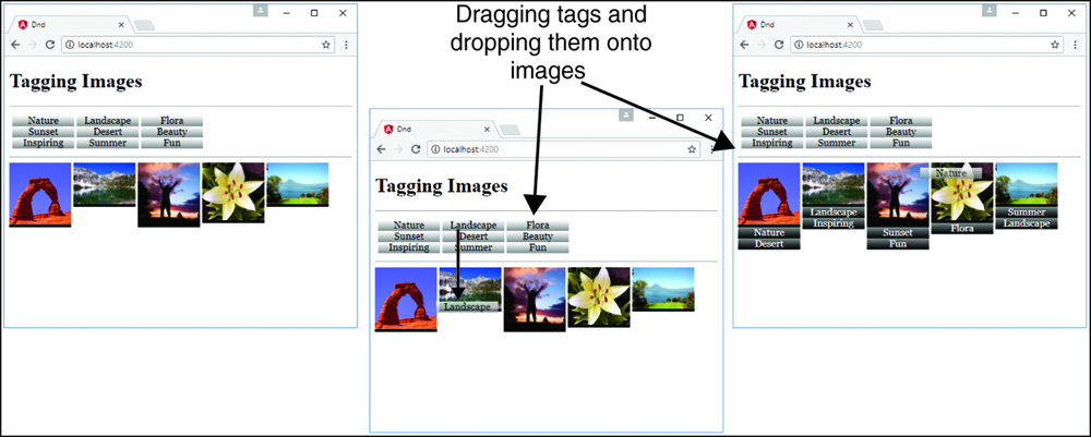
Figure 30.3 shows how the drag-item and drop-item components work in a browser: When you drag a tag onto an image, the tag is added to the list below.
Implementing a Star Rating Angular Component
Listings 30.21–30.29 show how to create an Angular application that creates a star rating system so a user can give ratings to items attached to the component (images in this case).
The folder structure for this example is as follows:
./app/app.module.ts: Root component for the application (see Listing 30.21)
./app/mockbackend.service.ts: Angular template for the root component (see Listing 30.22)
./app/app.module.ts: CSS file for app.component (see Listing 30.23)
./app/app.component.ts: Root component for the application (see Listing 30.24)
./app/app.component.html: Angular template for the root component (see Listing 30.25)
./app/app.component.css: CSS file for app.component (see Listing 30.26)
./app/rated-item: Folder containing the rated-item component.
./app/rated-item/rated-item.component.ts: Angular component that lets the user rate items (see Listing 30.27)
./app/rated-item/rated-item.component.html: Angular template for the rated-item component (see Listing 30.28)
./app/rated-item/rated-item.component.css: CSS file for the rated-item component (see Listing 30.29)
Listing 30.21 shows the application module. This module uses InMemoryWebApiModule, which allows for the creation of a mock database. Line 18 shows the implementation of InMemoryWebApiModule.
Listing 30.21 app.module.ts: An Angular Module That Implements InMemoryWebApiModule
01 import { BrowserModule } from '@angular/platform-browser';
02 import { NgModule } from '@angular/core';
03 import { HttpModule } from '@angular/http';
04 import { InMemoryWebApiModule } from 'angular-in-memory-web-api';
05
06 import { AppComponent } from './app.component';
07 import { RatedItemComponent } from './rated-item/rated-item.component';
08 import { MockbackendService } from './mockbackend.service';
09
10 @NgModule({
11   declarations: [
12     AppComponent,
13     RatedItemComponent
14   ],
15   imports: [
16     BrowserModule,
17     HttpModule,
18     InMemoryWebApiModule.forRoot(MockbackendService)
19   ],
20   providers: [],
21   bootstrap: [AppComponent]
22 })
23 export class AppModule { }
Listing 30.22 shows an Angular service that acts as a mock database for the application. Lines 4 through 29 create an array of items that can be retrieved and updated via HTTP requests.
Listing 30.22 mockbackend.service.ts: An Angular Mock Back-end Service
01 import { InMemoryDbService } from 'angular-in-memory-web-api';
02 export class MockbackendService implements InMemoryDbService{
03   createDb() {
04     const items = [
05       {
06         id: 1,
07         title: "Waterfall",
08         url: "../../assets/images/cliff.jpg",
09         rating: 4
10       },
11       {
12         id: 2,
13         title: "Flower",
14         url: "../../assets/images/flower.jpg",
15         rating: 5
16       },
17       {
18         id: 3,
19         title: "Pyramid",
20         url: "../../assets/images/pyramid.jpg",
21         rating: 3
22       },
23       {
24         id: 4,
25         title: "Lake",
26         url: "../../assets/images/lake.jpg",
27         rating: 5
28       }
29     ]
30     return {items};
31   }
32 }
Listing 30.23 shows an Angular service that uses HTTP to retrieve and update the items in the mock database. Lines 6 through 11 define the RatedItem interface with strictly typed variable names. Lines 19 through 24 define the constructor that creates an instance of http and a new observable called itemObservable.
Once a response is received from the observable, the getItems method is called. Lines 27 and 28 define the getObservable method, which returns itemObservable. Lines 30 through 38 define the getItems method, which uses an HTTP get to retrieve the items list from the mock database; it then assigns the items variable to the response and emits that response to the observer.
Lines 39 through 47 define the updateRating method, which takes two parameters: item and newRating. It assigns the item rating newRating and uses an HTTP put request to update the item in the database.
Listing 30.23 ratings.service.ts: An Angular Service That Uses HTTP to Retrieve a List of Items with Ratings
01 import { Injectable, OnInit } from '@angular/core';
02 import { Http } from '@angular/http';
03 import { Observable } from 'rxjs/observable';
04 import 'rxjs/add/operator/toPromise';
05
06 export class RatedItem {
07   id: number;
08   url: string;
09   title: string;
10   rating: number;
11 }
12
13 @Injectable()
14 export class RatingsService {
15   url = 'api/items';
16   items: RatedItem[];
17   public itemObservable: Observable<any>;
18   observer;
19   constructor(private http: Http) {
20     this.itemObservable = new Observable(observer => {
21       this.observer = observer;
22       this.getItems();
23     })
24   }
25   ngOnInit(){
26   }
27   getObservable(){
28     return this.itemObservable;
29   }
30   getItems(){
31     this.http.get(this.url)
32              .toPromise()
33              .then( response => {
34                this.items = response.json().data;
35                this.observer.next(this.items);
36              })
37              .catch(this.handleError);
38   }
39   updateRating(item, newRating){
40     item.rating = newRating;
41     const url = `${this.url}/${item.id}`;
42     this.http
43       .put(url, JSON.stringify(item))
44       .toPromise()
45       .then(() => this.getItems())
46       .catch(this.handleError)
47   }
48   private handleError(error: any): Promise<any> {
49     console.error('An error occurred', error);
50     return Promise.reject(error.message || error);
51   }
52 }
Listing 30.24 shows an Angular component that handles getting the items from RatingsService. Lines 21 through 27 define ngOnInit, which invokes the getObservable method on RatingsService to assign the items observable to itemsObservable. The items variable is then assigned the response received from itemsObservable.
Listing 30.24 app.component.ts: An Angular Component That Acts as the Root to the Application
01 import { Component } from '@angular/core';
02 import { RatedItemComponent } from './rated-item/rated-item.component';
03 import { Observable } from 'rxjs/observable';
04 import { RatingsService } from './ratings.service';
05
06 @Component({
07   selector: 'app-root',
08   templateUrl: './app.component.html',
09   styleUrls: ['./app.component.css'],
10   providers: [ RatingsService ]
11 })
12 export class AppComponent {
13   title = 'app';
14   itemsObservable: Observable<any>;
15   items: any[];
16   constructor(
17     public ratingsService: RatingsService
18   ){
19     this.items = [];
20   }
21   ngOnInit(){
22     this.itemsObservable = this.ratingsService.getObservable();
23     this.itemsObservable.subscribe(
24       itemList => {
25         this.items = itemList;
26       });
27   }
28 }
Listing 30.25 shows an Angular template that implements the rated-item component to display a list of rated items. rated-item takes two inputs: item and RatingsService.
Listing 30.25 app.component.html: An Angular Template That Creates a List of Rated Items, Using the Component rated-item
01 <h1> Rated Images </h1>
02 <hr>
03 <div class="item"
04      *ngFor="let item of items">
05     <rated-item
06       [item]="item"
07       [ratingsService]="ratingsService">
08     </rated-item>
09 </div>
Listing 30.26 shows a CSS file that styles the item class on app.component.html.
Listing 30.26 app.component.css: A CSS File That Styles the Application
01 .item{
02     border: .5px solid black;
03     display: inline-block;
04     width: 175px;
05     text-align: center;
06 }
Listing 30.27 shows an Angular component that displays a rated item. Lines 13 through 15 define the constructor method, which initializes the starArray value.
Lines 18 through 20 define the setRating method, which takes the parameter rating. The method invokes the updateRating method on the ratings service and takes the parameters item and rating, which the ratings service uses to update the rating of the item.
Lines 21 through 27 define the getStarClass method, which takes the parameter rating. This method is used to assign the class of each star to accurately represent the rating of the item.
Listing 30.27 rated-item.component.ts: An Angular Component That Displays an Image as Well as a Rating for the Image
01 import { Component, OnInit, Input } from '@angular/core';
02 import { RatingsService } from '../ratings.service';
03
04 @Component({
05   selector: 'rated-item',
06   templateUrl: './rated-item.component.html',
07   styleUrls: ['./rated-item.component.css']
08 })
09 export class RatedItemComponent implements OnInit {
10   @Input ("item") item: any;
11   @Input ("ratingsService") ratingsService: RatingsService;
12   starArray: number[];
13   constructor() {
14     this.starArray = [1,2,3,4,5];
15   }
16   ngOnInit() {
17   }
18   setRating(rating){
19     this.ratingsService.updateRating(this.item, rating);
20   }
21   getStarClass(rating){
22     if(rating <= this.item.rating){
23       return "star";
24     } else {
25       return "empty";
26     }
27   }
28 }
Listing 30.28 shows an Angular template that displays a title, an image, and a rating. Lines 8 through 12 create the stars, which are used to visualize the rating. When a user clicks on a new rating, the overall rating is adjusted, using the setRating method. The getStarClass method determines whether the stars are filled in or blank.
Listing 30.28 rated-item.component.html: An Angular Template That Displays a Title and an Image as Well as a Rating for the Image
01 <p class="title">
02 {{item.title}}
03 </p>
04 <img src="{{item.url}}" />
05 <p>
06 Rating: {{item.rating}}
07 </p>
08 <span *ngFor="let rating of starArray"
09 (click)="setRating(rating)"
10 [ngClass]="getStarClass(rating)">
11
12 </span>
Listing 30.29 shows a CSS file that styles the application by setting the dimensions of the rated item and adding stars to give that item a visualized rating.
Listing 30.29 rated-item.component.css: A CSS File That Styles the Application
01 * {
02     margin: 5px;
03 }
04 img {
05     height: 100px;
06 }
07 .title{
08   font: bold 20px/24px Verdana;
09 }
10 span {
11     float: left;
12     width: 20px;
13     background-repeat: no-repeat;
14     cursor: pointer;
15 }
16 .star{
17     background-image: url("../../assets/images/star.png");
18 }
19 .empty {
20     background-image: url("../../assets/images/empty.png");
21 }
Figure 30.4 shows the star rating component in the browser. Clicking on a star changes the rating in the mock back-end service, which updates the UI component.
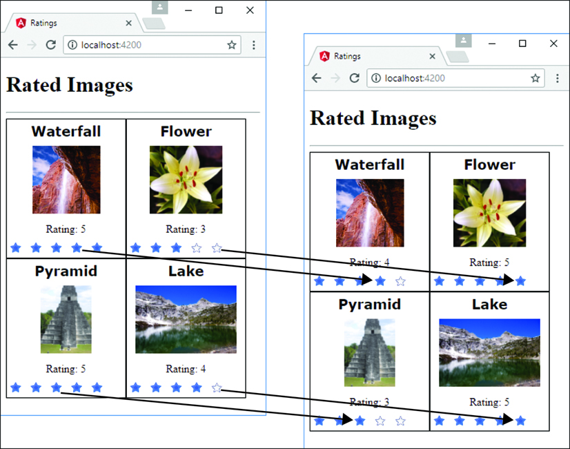
Figure 30.4 Using Angular components and services to implement star ratings on images with a mock back end
Summary
In this chapter, you got a chance to see how to extend what you have learned in the rest of the book to build some cool Angular components. You have seen how to implement animations, create a star rating component, and implement drag-and-drop capability. These are just some of the many ways to use Angular in real-world web applications. If you are interested in learning more about Angular, https://angular.io is a great resource.