
Chapter Five Animation
Animation, of course, refers to things that move on the slide. Transition refers to the animation that can appear when one slide disappears and the next one appears.
I realize there are presentation gurus who insist that animation on slides is one of the greatest sins on earth. But the fact remains that we like a little animation. We like to spark things up a bit with moving parts. We like cool transitions.
And certain animations and transitions, respectfully implemented, can serve to clarify and enhance a presentation. That’s the key—respectful and relevant implementation. Certainly there are millions of presentations that make your eyes cross because every single word comes flying in from around the corner, twirls in place, and slowly alights on the page. Again and again and again and again.
The problem with animations and transitions is not that they exist, but simply that they are misused. So in this chapter we’ll look at ways to use these energetic features appropriately so they actually strengthen the communication rather than get in the way.
Animation creates a focus
This is the important principle to keep in mind: animation creates a focal point. So do not use it if it calls unwarranted attention to something, such as dorky clip art. Do not bring every piece of text swooshing in. Do not use the typewriter animation to make me sit through watching every one of your bullet points type onto the screen. Please.
Use an animation or transition when you want to call attention to something.
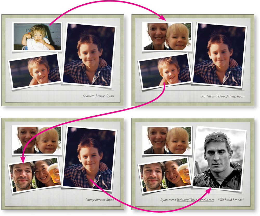
I gave a talk to a group who wanted to know my story. I used a template and inserted photos of my kids when they were little, when I first started writing computer books. I copied that slide three times.
In the second slide, I replaced the baby photo of Scarlett with a current photo of Scarlett and her daughter. I used a dissolve transition so all that appeared to change on that slide was her face and the text. The dissolve focused on Scarlett.
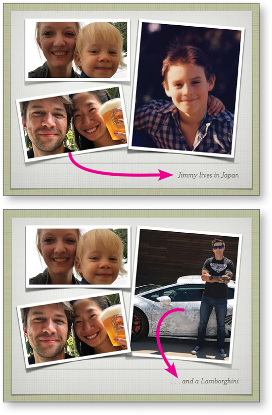
In the third slide, I replaced Jimmy’s face, and in the fourth slide, Ryan’s. As each face changed, it became the focus because of the transition.
A problem that appeared in this sequence is that the text on each slide was ignored—when there’s a human face to watch, that’s what we watch.
So I added a nice little text animation (the text swings into place) so after a couple of seconds of me talking about this child, the comment appeared in a little animation and called attention to itself. Appropriately.
While my kids were growing up, there were also lots of dogs in the house and they showed up in my books along with my kids. So I displayed a photo of the dogs (right).
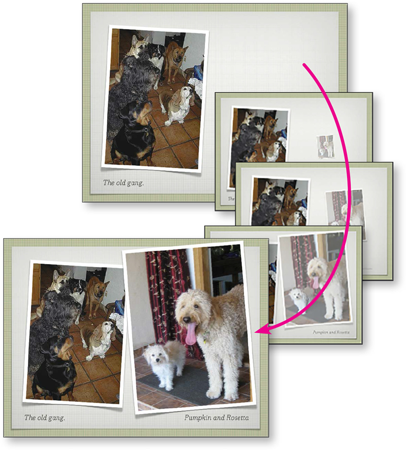
Those dogs are all gone, but I brought in a photo of the two we have now. After a couple of seconds of the original dogs, a nice little animation brought the two new dogs forward. Nothing obnoxious—it just refocused the audience’s attention. And the animation I chose reinforced the message of these dogs entering our lives.
Transitions and animations as complements
In this talk about various themes in Macbeth, I used transitions between and animations on every slide. They were carefully designed to be subtle and to complement the information, not to distract. Below are several sets of slides from the presentation.
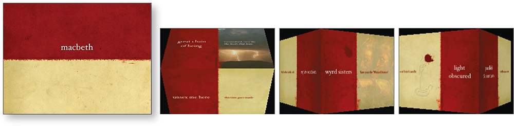
This is a Keynote theme called Barcelona that I bought at KeynotePro.com. Using the various cube transitions in Keynote, I could make the red panel always lead to the next red panel around the edge of the cube so the transitions were predictable (less distracting) but still interesting and a signal.
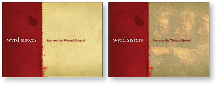
Attendees had handouts that included all the lines in the play we were going to talk about, so the slide presentation simply introduced each section.
As I’m talking (standing next to the screen), a spooky image relevant to the topic slowly appears in the space.
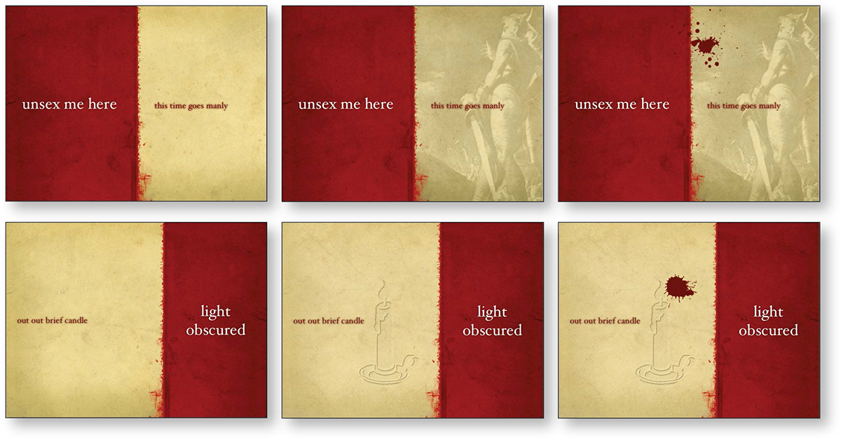
Occasionally a splat of blood appears on a slide, either quickly as if thrown, or slowly as if just appearing.
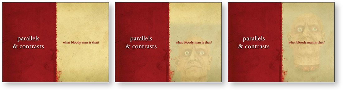
As I’m talking, a disembodied head slowly and quietly rises into the space.
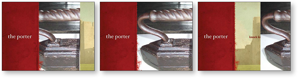
When discussing the Porter who lets in the tailor to cook his goose, an antique tailor’s goose (a pressing iron) moves into the screen, stops for a second, and moves off.

When discussing the prevalence of items in threes, a number 3 curls in around the side and in a moment gets spattered with blood.
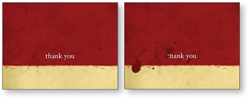
After my “thank you” slide appears, it gets splotched with blood. Blood is a big motif in Macbeth, so to reinforce that imagery, it appears quite a bit in this presentation.
The blood splotches are from the “Supplemental Material” that is included with the Barcelona theme. They’re actually ink blots, but they work quite well as blood.
Clearly transition between major topics
Slide transitions can be particularly useful as visual cues to signal transitions between major topics. I generally use a dissolve/reveal transition between most slides because I like its non-invasive feeling, but when I’m ready to move into another area, I use a transition that clearly cues the audience to what’s happening.
For instance, after two or three intro slides, I often use a dramatic transition, like Keynote’s doorway (shown below), into the body of the presentation. This alerts the audience that now we’re getting down to business. When I use a dramatic transition this way, I stick to that same transition between other major topics (not between every slide) so the audience instantly understands its meaning; that is, I don’t use every fancy possibility in the application.

The slide turns into a doorway to introduce the main presentation.
You can surely imagine how obnoxious it would be if every slide used such a dramatic transition.
Use transitions to keep your audience on track
Use appropriate but less dramatic transitions to guide your audience through the presentation. With conscientious thoughtfulness, you can use transitions to clue the audience as to when you are continuing in the same theme, making a shift in the topics, a segue, or a sharp turn.

These slides are a segment of Grandma Weber’s philosophy of life as told through pie. Slides unobtrusively dissolve from one to the next; the audience has no disruption in the flow of the talk. Until ...
The slide above shoved to the left so it appeared to push the strawberry pie slide out of the way.
After a couple of seconds explaining the sprinkling device, a duplicate of the strawberry pie shoved to the right, pushing the sprinkler out of the way.
Visually, it clearly appeared that the sprinkling device interrupted for just a few seconds and she immediately went back to the main presentation. The audience didn’t have to worry that they were wandering down a new line of thought. She continued this technique throughout the presentation, interjecting bits of related information, and it did not give the impression of redirecting the flow.
Use animation to illustrate and clarify
If animation can help to clarify an idea, by all means use it. The example below shows the six-mile route that a person in 1600 could use to get from the cave at Pembroke Castle to Milford Haven, Wales. During the presentation, you could explain it, but it’s much more memorable to see it in action.
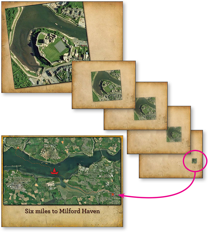
This inset of Pembroke Castle moves down into place on the map, shown below; it appears to do so on one slide.
The “Magic Move” transition in Keynote took a close-up inset from a map and placed it into context on the larger map.
Then in the animation, a little boat appears that travels the six miles by water to Milford Haven, along the dotted red line you see above (although the dotted line is not visible when the boat is moving).
This is relevant animation that clarifies this point in the talk and makes it visually apparent, rather than just talking about the six-mile boat journey.
Animate a chart for clarity
Sometimes a chart or graph can benefit by a little animation to focus on a certain element. For instance, perhaps you want to point out the rapid growth of a particular stock during a particular time period; you could show the chart with bars representing these stocks and animate that one bar/stock as it grows above the others. Or perhaps, in a pie chart, each piece pulls itself out from the pie as you discuss it.
Remember, use animation to clarify with relevant focus. Don’t just randomly make things twitch.
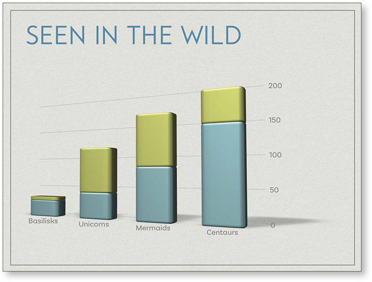
A chart can be made to grow in front of you, appear in pieces at your command, separate parts can animate, and more, but all animation should be in the service of clear communication, not just random visual noise.
Concerns about animation
There are two important things to remember about transitions and animation.
One: The movement calls attention to itself, so only animate when you have something special that you want to call attention to.
When deciding whether or not to add animation to a slide, take a minute to put into words why you need to do that. If you cannot verbalize a good reason, let go. Don’t do it.
For instance, does the silly clip art man doing cartwheels across the page clarify a point you’re making? No? Get rid of him. But does a crowd scene that gets larger and larger clarify something in your presentation about population growth? Then by all means, have fun with it!
Two: It’s possible to use too much animation and too many different and crazy transitions. Yes, by limiting them the audience doesn’t get to see every amazing transition that your software has to offer, but too bad for them. They’ll get over it. They might even thank you.
The power of animation and transitions is that they catch the eyes of the audience. As a presenter, you generally want most of the attention on you, so avoid a competing situation—when there is action on the slide, stop talking. Let the audience enjoy it for a few seconds before getting back to business.