
Chapter Eight Repetition
Repetition is a feature that unifies a designed piece, especially when there are multiple parts, such as lots of slides in a presentation.
Repetition in its simplest form is consistency—you want to create a consistent look throughout your presentation. You might repeat the font choice and size; perhaps there are certain colors you can repeat; you might have graphic styles, placement of items, the arrangement of text and graphics, etc. Anything that appears more than once in your collection of slides, you can use to create a repetitive element.
Most of the time you’ll be working with the existing items on your slides, but sometimes you can create repetitive items specifically as unifying design elements. For instance, perhaps your talk is about astronomy and you have a particular star symbol you use in your introduction; you might use that star symbol as a repetitive element (in various sizes and colors, even) on slides here and there throughout your deck.
Repeat to create a consistent look
The simplest use of repetition is to create a consistent look throughout your deck of slides. This doesn’t mean that every slide looks exactly the same; it just means that you are conscious of creating a collection that looks like everything belongs together.
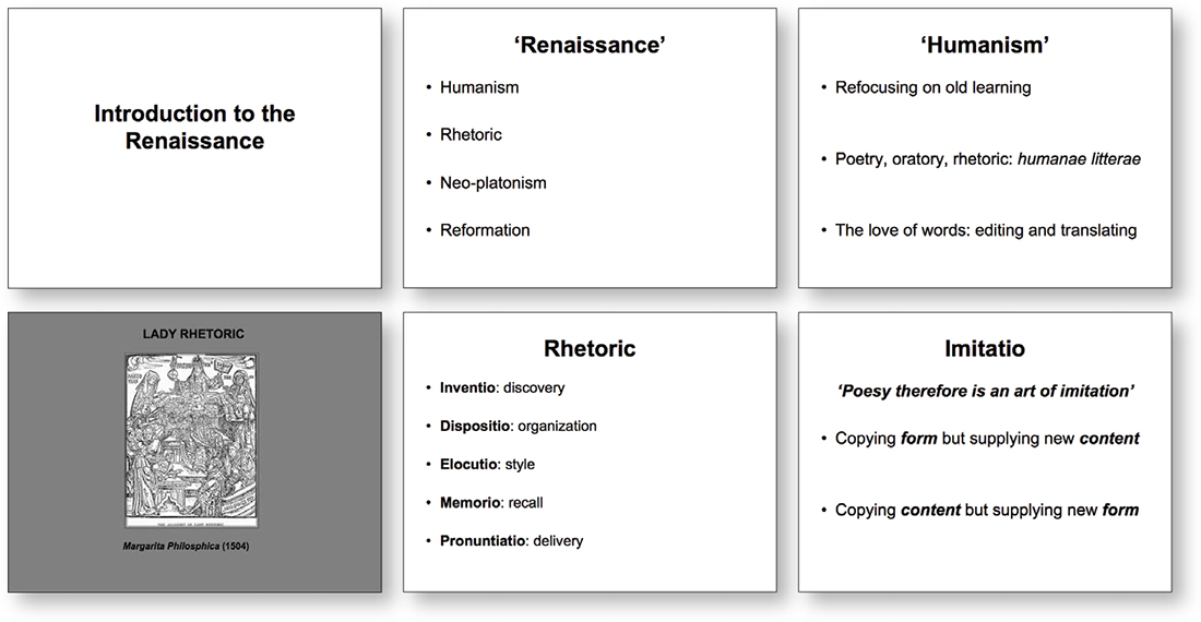
In these slides (six out of thirty-seven), the font and the white background might be considered repetitive elements, except they have no character. And there are several inconsistencies that are not intentional: the sizes of the fonts, the spaces between the lines, the positions of the text, the one slide with a dull gray background.

To begin, we’ll just do one thing: give it a relevant background that is intentional, not the default. (I changed the font on the intro slide in Chapter 4.)
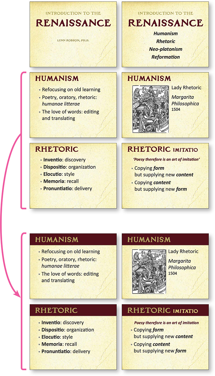
Here we’re starting to develop some repetitive design elements (some consistency) using the fonts, the spacing, the alignments.
This slide deck contains 37 slides so there will be constant adjustments as we go through it, working to create repetitive and consistent elements.
You read the previous chapter on Contrast, so you can see how we added contrast as a repetitive element.
Not only is this more interesting to look at, but can you see how it is also shaping up to communicate more clearly? The different sections are more apparent.
To ensure that attendees notice when the main head changes, the designer might add a subtle animation to the new heading the first time it appears to call attention to it.
Repeat a style
Let’s redesign these three slides with the ideas of both contrast and repetition in mind. Because the topic of games is so visual, we’ll use inexpensive photos from someplace like CreativeMarket.com or iStockphoto.com.
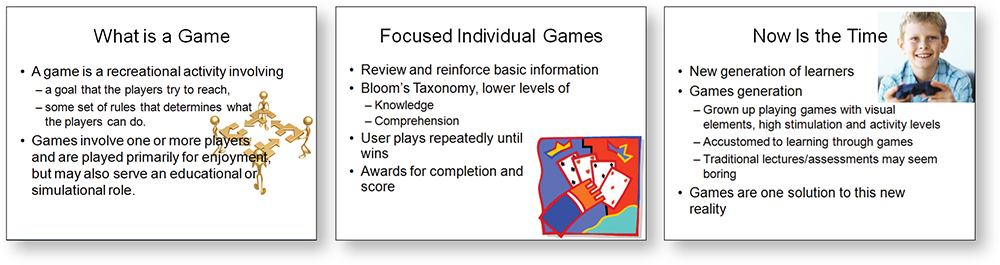
But first, let’s edit: What needs to be on the slides, what will you be speaking aloud, and what will be on the handout that the audience takes home? The only thing that needs to be on each of these slides is the headline. You will talk about the other points, plus they have a handout to follow along with and write notes on. You can create more slides to elaborate on the bullet points (as shown on the following page).

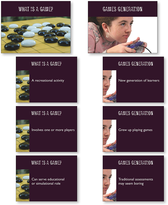
Let’s start with an introductory slide that’s on the screen while you’re being introduced and while you make your introductory remarks (see Chapter 6 on Plot).
Each slide unobtrusively dissolves into the next.
The text that’s on the original slide (top left) is the text that you will be speaking, so you don’t want it on the slide! Key points and your elaboration are on the handouts or in the posted notes.
Strong visuals of games and humans reinforce your talk without distracting from it.
That might look like a huge switcheroo, going from the original slides to the finished product. But it isn’t, really. You just have to make a commitment to 1) edit the text so only what is really necessary is on the slide (remember, your slides are designed to augment your talk), and 2) invest a couple of dollars in images that reinforce your presentation.* Collecting fonts helps, too.
* To find these images, we went to iStockphoto.com and searched for board games and solitaire and video games, separately. There were hundreds of images to choose from. It took ten minutes and cost $12.
In this example, the font is Profumo, not Arial or Times, thus the font, the dark horizontal bars, and the large photos act as repetitive elements. By making the headlines graphically interesting, they become elements that act as a repetitive, unifying feature. And by using the photographs in a similar way, they also become repetitive, unifying elements. Notice she didn’t use a photo here and dorky clip art there, but maintained a consistent style.
Well, you might say, the original slides also have repetitive type treatments and a repetitive use of clip art. And you’re absolutely correct. The difference is that the repetition on the original slides is weak; it’s not conscious or consistent or even nice looking. And the three graphic images have no consistency in style, color, or placement. There is nothing binding those three graphics together.
Our minds really like organization. As I’m sitting in a presentation and listening to the speaker, my mind wants to be interrupted as little as possible. With consistent and repetitive (and relevant) elements in a slideshow, I feel calm and safe and it gives me more trust in the presenter. Do we judge a book by its cover? Of course we do, and we unconsciously judge a presentation by the way it looks and the way it makes us feel while we’re watching and listening. We are visual creatures.
If this is a deck that will be posted online, either include the speaker notes or make more slides to tell the story without you.
Repeat the image, but differently
Repetition doesn’t mean repeating exactly the same thing every time. You can repeat the same style of imagery, the same color, the same placement, anything that creates a repetitive pattern to unify the slides. Below, to expand on the topic of “What is a Game?,” we used a small piece of the original graphic in those individual slides. This helps the audience follow along; it creates not only unity but clarity.
Use a dissolve transition with slides like these so the audience doesn’t have to watch the heading and photo redraw on every screen—only the bullet copy appears to change.
Unity with variety
If an element has a strong visual appeal, you can repeat it in different ways and still provide unity. Or if you have elements that are obviously part of a set (geometric figures, perhaps), you can use them in a variety of ways. Perhaps you have a circle motif going on—the circle is such a strong shape that you can use it in various sizes and colors and placements, and it still creates a unified look. Perhaps you have photos of houses as a theme—use all different sorts of houses. The stronger your repetitive elements are, the greater you can vary them and still maintain a consistent look and feel.

If your visuals are strong images, you can use them in a huge variety of ways—big, small, different colors, different placements, with different fonts, etc.
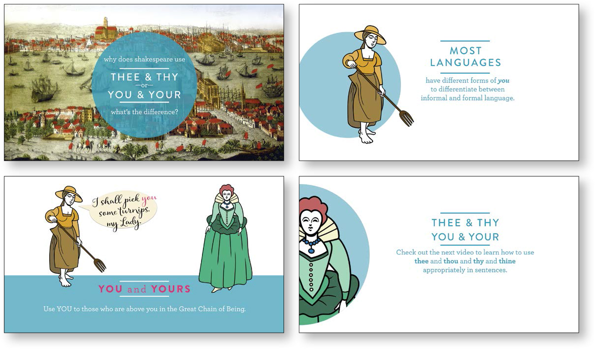
The intro and overview slides set up a style from which the presenter can deviate in many ways and still maintain consistency through repetition of the circular shape, the color, the fonts, the font format, the illustrations.
Design the repetitive elements
Find the items in your presentation that are already repetitive, then use those items as design elements. Do you have a series of quotes? Perhaps oversized quote marks can become a repetitive element that calls attention to the clever remark. Do you have a phrase you keep coming back to? Perhaps a special type treatment for it can become a repetitive element.
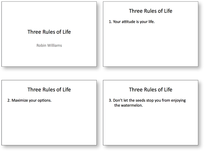
This short presentation uses the default slides in PowerPoint. At least the font is nice—this Calibri is much nicer than Arial.
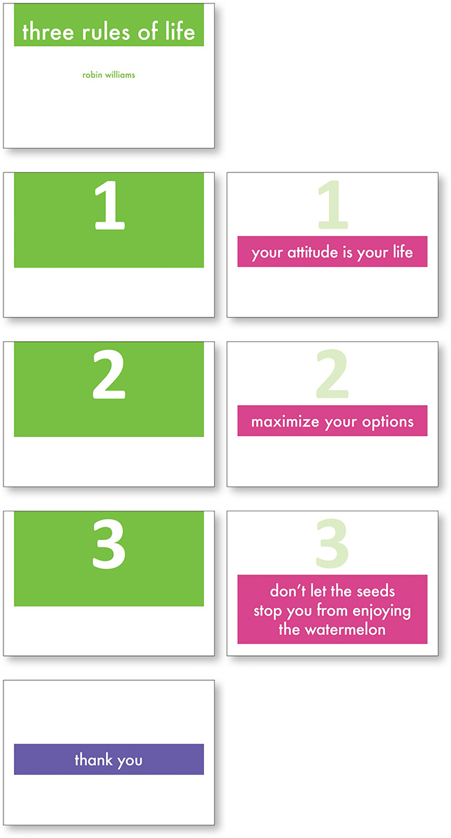
Generally, you don’t want to focus on the numbers in a numbered list because you would call too much attention to them. But in this case, the number is part of the point, so let’s make it a repetitive design element. (And let’s add some contrast in the process.)
This is based on a Keynote template.
The number 1 slide (below, left) dissolves into the next slide (to its right) where the number itself is faded back and the rule is highlighted. Thus the numbers become one of the design elements that tie everything together.
The color of this last slide is different from the others, but the shape of the box, the font, the color of the font, and the placement are all repetitive. When you have a strong repetition, you can break out of it and it looks purposeful rather than a mistake.
Repetition doesn’t mean sameness
The principle of repetition doesn’t mean everything is the same. You can easily have several different backgrounds, different fonts, different colors, different styles, etc., in the same deck of slides. The point to remember is that repetition is a unifying element. If you have a strong theme running through your slides, you can break out of it to focus on a new topic or a sideline, then return to your main look. Or use a variation of your main theme for subtopics.
Repetition helps the audience keep track of what you’re doing without having to think about it; it provides a solid visual ground upon which to base your presentation; it makes the audience feel safe and taken care of; it makes you look organized and sure of yourself.
However, repeating your company logo on every page is NOT an example of repetition—it’s an example of unnecessary and annoying clutter.

This is the light table in Keynote (use the Slide Sorter in PowerPoint) for most of a deck. You can see the repetitive elements used throughout the entire deck, as well as for individual segments. Each variation in the repetitive look was designed to augment the communication and understanding.