
Chapter Nine Alignment
Alignment organizes the various elements on your page and presents a structured and coherent look. It cleans up the page and helps to communicate more clearly.
The concept of alignment calls for conscious decisions about where you place items on the slide. Don’t ever stick something on the page in some random spot! Every item needs to be connected to something else on that individual slide, and your collection of slides should have consistent alignments throughout the deck. No more sticking things in empty corners—make sure elements are aligned.
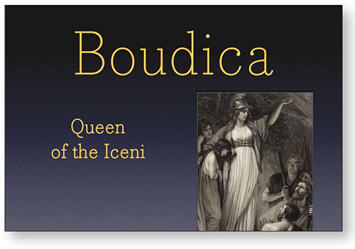
The three items on this slide have no connection to each other—each one is just tossed onto the page thoughtlessly or randomly.
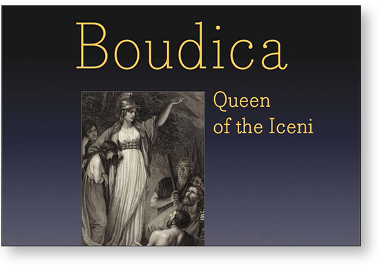
If we just do one thing—align each item with something else—see how the slide is instantly more organized.
The photo is aligned to the edge of the heading. The smaller text is aligned with the top of the photo, and is now flush left so its left edge aligns with the edge of the photo.
Alignment cleans up individual slides
Even if you have a lot of text on your slide (not recommended but sometimes you might feel it’s necessary, or perhaps it is intended as a stand-alone deck that you post or email), alignment is the most important tool you have to make all that potential busyness appear calm and collected.
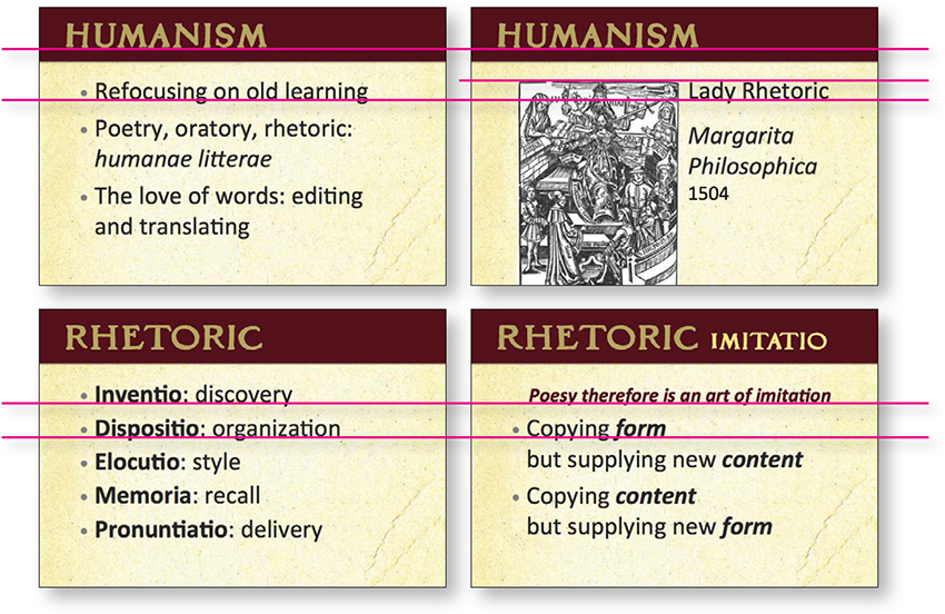
If you take a pencil and draw lines along all the edges or the centers of center-aligned text, you see a lot of lines. That’s what’s making it look messy.

But if we just align the objects and the text, it’s amazing how it cleans up.
And a clean slide is a more communicative slide.
We changed those small blue boxes to match (repeat) the shape of the bar across the top; getting rid of those fussy corners on the small shapes helps tidy up the slide.
You can see that every item on the page is now aligned with something else.
Yes, the slide still has too much text (which makes it too small to read but might be useful if posted online). At least it is now clean and organized, which helps immensely.
Alignment cleans up your deck
In a collection of slides, alignment not only makes individual slides cleaner and more organized, it makes your entire presentation cleaner and more organized as you repeat the alignments throughout the deck.
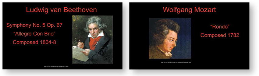
The elements on these slides were thrown on to the page with no thought to their placement. The look is chaotic. (The excessive red doesn’t help. And get rid of lengthy and complex web addresses that no one can read or write down: if it’s important, put it in the handout; if posted online, make the address larger and build it into the design of the slides.)

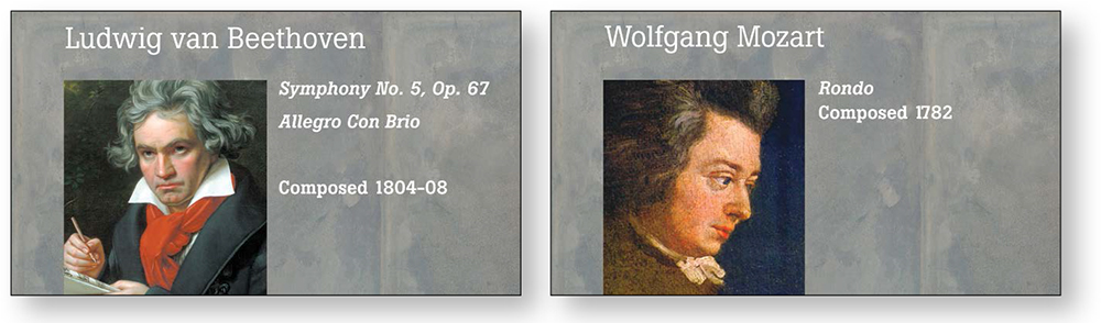
Now there are consistent alignments. You can practically see the invisible line running under the headlines. The smaller text is aligned flush left, and that strong flush left is aligned against the strong line of the portraits. The portraits themselves are now all the same size and aligned with each other as the slides progress.
Always consider another background besides black. Perhaps solid black really is what you need for your presentation, but at least try other colors. There are lots of rich, dark colors and textures to choose from in this world. Or maybe it doesn’t need to be dark! Lighten up!
Alignment unifies your deck
The example below is the same one you saw in the previous chapter where we applied repetition. But alignment is also a big factor in this example—rarely will you use just one of these principles. You can see that having guidelines to keep items aligned across slides can unify the entire collection.
Few of the items are aligned on the individual slides or throughout the collection of slides. This is because the defaults are set to move the text up and down from the middle—see Chapter 12 to learn how to control that.
If you draw lines between the items on the individual slides, you see they are now more unified by alignment.
Alignment makes you look smarter
It’s true. You are your slides. If they are sloppy and unclear, they automatically transfer the impression to your audience that you are sloppy and unclear or that your information is not sound. It’s not a conscious decision on the part of the audience—it just happens. So look smarter and be smarter. Align those objects!

Again, you can see that not one of these five items on the slide has any relationship with any other item. And the text is rather small.

Now you can draw lines between the graphic elements and see how they are connected—their eyes are even aligned. You can also see that we cropped the image of Iago so we could make him larger.

Let’s also see how it looks without a black background.
Alignment is a great organizer
Alignment is the single most important guideline to follow to visually organize the material on your slides.
I hope you are starting to see how nothing is aligned or connected to anything else on these slides—it’s all a random hodgepodge.
The template background is very interruptive. If you plan to show a lot of images, let them speak for themselves.

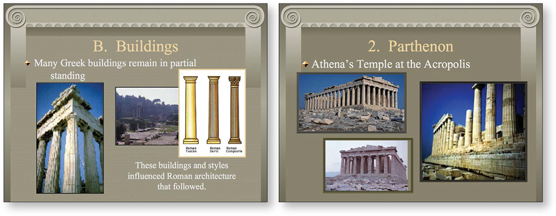
Okay, I cheated. I couldn’t stand it. Simply aligning those three low-resolution inconsistent images on the original slides did not help at all. It seems the point of this presentation is to show me the architecture; if so, then show me the architecture. Find some high-quality images (see the end of Chapter 15) and get rid of superfluous stuff, like the pseudo-Greek border.
The text is aligned across the slides, creating a consistent structure throughout the presentation.
Alignment continued
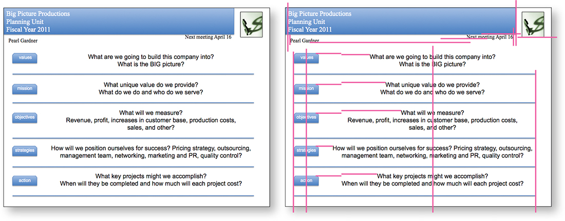
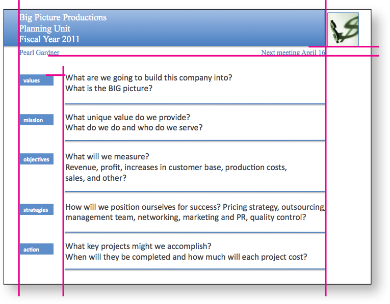
Remember these slides from Chapter 3? We can clean them up with alignment and make them even clearer. No data was changed—elements are simply lined up and consistent so the viewer knows where to find the information.
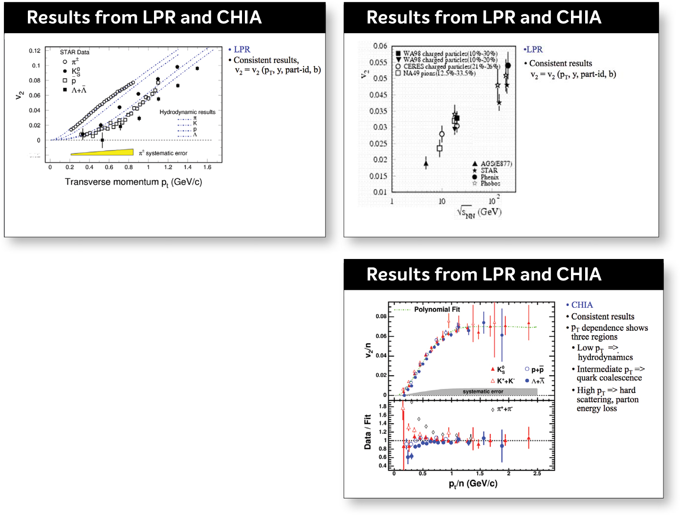
Slides like these are the most difficult to work with, and perhaps the audience for these has greater tolerance for the look that inevitably results.
You can also see where contrast is now used to strengthen the slide and its impression.
Alignment will need adjusting
When developing your presentation, you’ll probably find that you need to adjust your alignments as you go along in order to keep them consistent across slides. Learn to use your software to set up your own master page that suits your material. If you’re using PowerPoint or Keynote, it often makes up its own mind about the sizes of fonts and the placement, so I remind you once again to learn to control your software—don’t let it control you. See Chapter 12 for some basic tips.
Intentionally break the alignment!
Sometimes you will have a few slides that can’t fit into the alignment you set up, and that’s perfectly okay. Or perhaps you really want a different look for a few slides. If you have created a strong alignment throughout the majority of the deck, then when you intentionally break out of that alignment it will look intentional instead of random and chaotic. Now, this doesn’t give you license to arbitrarily ignore how you place items on the slide—you must be able to put into words exactly why you decided to break the alignment for that particular slide and why it’s okay, why it enhances the communication.