
Chapter Eleven Handouts
Handouts are a critical part of many presentations. There are times when it’s not necessary to provide a handout—perhaps you are giving a keynote address and it’s more like a speech with visuals, or you’re delivering a philosophical commentary with lots of discussion.
But quite often, your audience wants something tangible they can take back to the office, school, or home. Handouts make it easier for attendees to follow along, to take notes, and to get an idea of when your presentation will end.
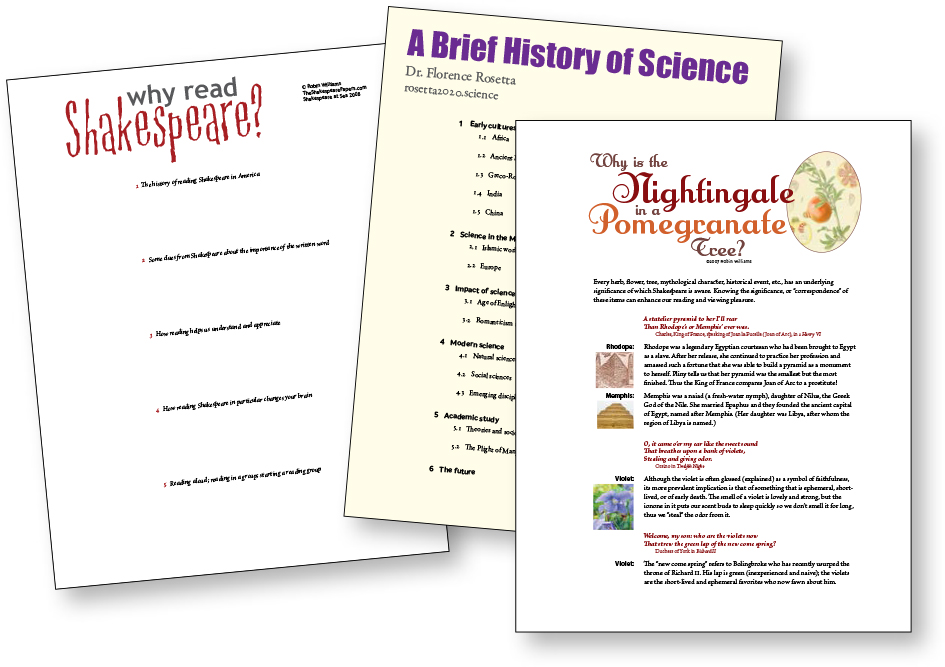
If you have charts or tables of data, create a handout so everyone can actually see the charts and make notes on them.
If you provide directions on how to do something, make a handout (we humans can rarely write down directions correctly while hearing them in a talk).
If you have contact information, resources, or web addresses, make a handout—never expect people to write down a complex web address correctly.
Visually, make your handout connect with your slide presentation so your audience remembers who you are. That is, pull in the same colors and fonts that they saw on the screen. And you can put your logo on the handout; it’s the perfect and preferred place for it because your audience members will keep it.
Why include handouts
You may have heard this rule: “Never provide handouts because it will distract listeners from your talk as they try to read ahead on the handout and listen to you at the same time.” Or, “If they have a handout, why would they listen to you?”
Balderdash.
Trust me, I can find plenty to distract myself with besides your handout. I’ve got my cell phone with access to the web and email and social media galore. I’ve got my laptop with access to the work that I’m behind on. I’ve got a note pad and pen—you might think I’m busily scribbling notes, but I’m actually sketching an outline for a novel. And I’ve got the coffee cart down the hall and no one’s going to stop me from walking out and getting a cup. So don’t flatter yourself that your handout will distract me from your talk.
Quite the contrary. Your thoughtfully created handout tells me you respect me enough to have created it for me, and that in turn makes me pay a little more attention.
As an attendee, I want to take notes. I want to circle key points on your handout and make notes to myself about what to check up on, what to report back with, what to add to my own report, etc. I want to write down interesting things you say. Taking notes while someone is talking is a skill we learned long ago—that’s how we got through school. And if your handouts are created thoughtfully, the attendees can follow along with you on the handout, only making notes where necessary for their own enlightenment.
To design your handout, use the same principles of design you read about in Chapters 7 through 10 on contrast, repetition, alignment, and proximity.
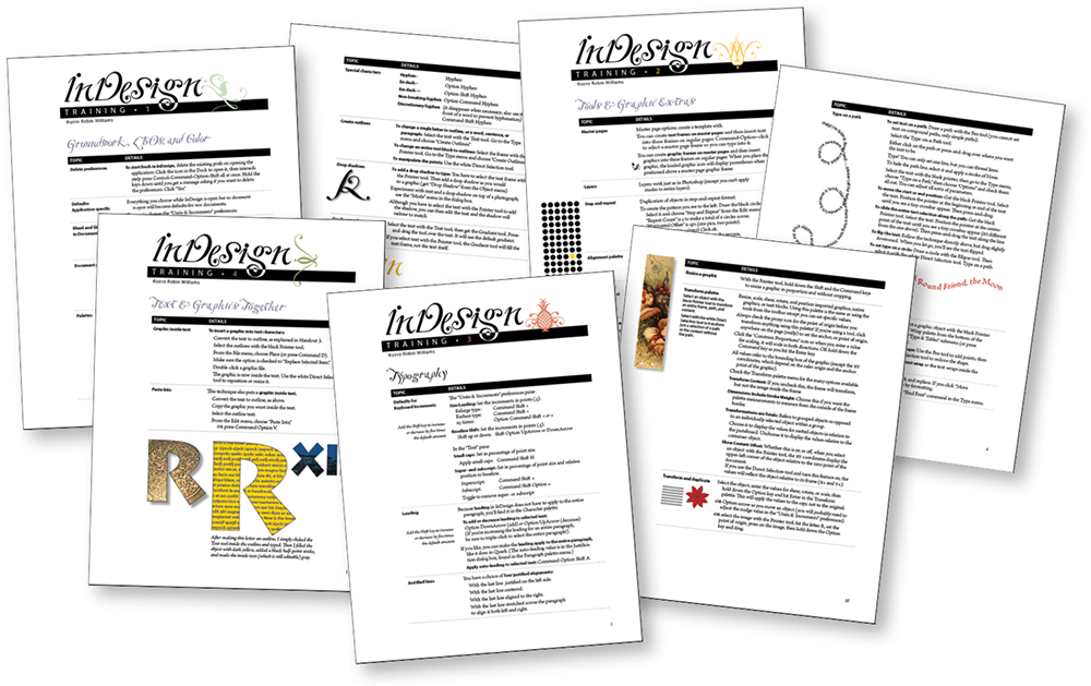
Handouts can be very simple (merely an outline to follow along), or a list of highlights and resources, or they might be complex and useful enough for other instructors to use as teaching materials.
It’s a permanent record
What your audience sees on the overhead screen is temporary, and there is no guarantee they will remember it correctly; what you give them to take back to the office is permanent.
Your presentation software, of course, lets you print your slides in a variety of ways—with notes, without notes, notes only, slides only, etc. This can be handy, but not particularly effective. For instance, if you’ve expanded the number of slides so you can present each item clearly, you might have so many slides that each handout would be twenty or thirty pages. And if you’ve created your presentation to augment your speaking points instead of putting your entire talk on the slides, the slides alone won’t mean much to someone else.
So that means it’s an extra load of work to create a useful piece to leave behind. But if you create something valuable, it increases the effectiveness and impact of your entire presentation. Your attendees will appreciate it and you will look like a professional. They will have something that reminds them of you, and the influence of your presentation will last much longer.
Remember in Chapter 4 where I encourage you to let go of putting your logo on every slide? The slides are transitory, but your logo and other branding elements on a nicely designed handout is valuable.
Very often you will be giving the same presentation more than once, so the work you do on the handout will be amortized over the number of presentations. Plus if you put that much trouble into a presentation, you’re more likely to want to do it again! And each time it gets better.
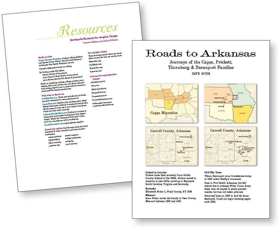
If you have maps or charts that you want people to actually read, put them in a handout.
When I teach workshops, I cannot expect attendees to remember everything I say. I have a moral obligation to leave behind something useful. Many conferences, of course, require you to provide handouts along with your talk, and that’s great.
Post your speaker notes
When you post presentations online at sites like SlideShare.net, you can include your speaker notes. The automated notes that are created from the text on the slide are not helpful—there’s no extra information besides what’s on the slide so I still have no clue what you were talking about.
Remember, the point of the speaker notes is to provide me, the viewer, with further insights that elaborate on your amazing presentation! And by putting these insights into the speaker notes, you don’t have to put everything you know on those tiny slides.
When you do NOT need handouts
There are plenty of times when you will post your deck online for students or employees or coworkers or for a general audience. Many of these decks do indeed need to have all the text on the slides because that is the only way people will see them. And that’s fine and great! Just make sure your slides are readable; don’t crowd the information; don’t make any of the text so small that you can’t even read it on the screen in front of you.
If your slideshow is only going to be online, without your dynamic presence, it is even more critical that it represent you well, that it makes you look like a professional. We react to the visual impact, and that visual impact is instantaneous. Which of the two title slides below would you more likely choose to explore? More importantly, which one inspires you with more confidence?

Avoid non-personal intro slides like the top one when giving a presentation that relates to humans. This free family image is from Bing.com/images, using the filter, “Free to share and use commercially,” as shown in Chapter 15.
Some designers are equally inept at following rules and breaking them. Good designers can do either.
Jim Alley, Savannah College of Art and Design