Chapter 8
Working with titles and captions
Titles can be used to identify a speaker, a place, a time or sometimes as translation. In fact, titles have many uses and there is not the space to cover all of them here. Rather, a guide is offered to the sensible use of titles and some of the pitfalls that can be encountered.
For the purposes of this book, titles will be defined as text keyed over a moving background image. Captions will be defined as a composite of text over a colour background, a graphic or a still frame. This is by no means a universally accepted set of definitions as, in many areas, titles and captions can be and are used interchangeably. A third category is sub-titles, which are usually used to provide a text translation or can be used for programmes for the hard of hearing.
The essential criterion for any title is that it can be read. That should be obvious, but there are a number of factors that need to be considered. Most importantly, to read a title takes time and the title must be legible.
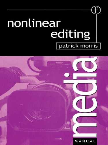
On the matter of time, a good working guide for a name super is to allow a minimum on-screen duration of four seconds. If an address is being shown, for competition replies, for example, then read out the address twice to set a duration for its on-screen time – the information should be displayed on-screen for a sufficient length of time for the viewer to be able to write it down.
Legibility is frequently little more than common sense, but it helps if you know the language of the skill area you are working in. Like many specialized disciplines graphics has its own language and that language will be reflected in the software application used to generate graphics or text. Some of the most important terms are:
• point size;
• kerning;
• leading;
• font: serif, sans serif.
Titles and captions
(1) As a guide, name supers need a minimum of 4 seconds on-screen to be read reliably by a diverse audience.
(2) Address captions need a little extra time to allow viewers time to find pencil and paper and actually write down the address.
(3) The five-by-five guide is a reliable way of displaying text information on screen.
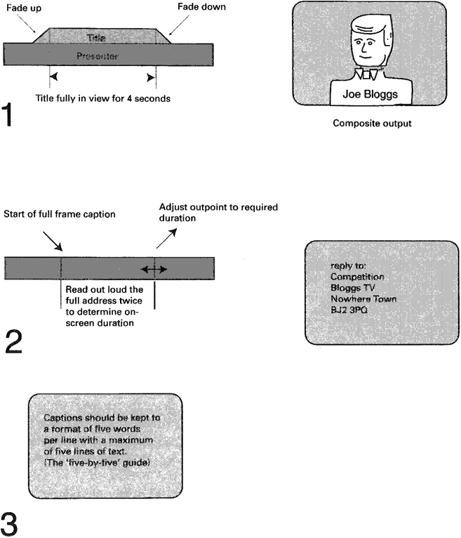
Point size
Text is usually defined by a point size, ranging from 6 point up to over 100 point. For print a common point size chosen is 12 point but for video, which is viewed at a greater distance than print, a point size of 12 will be too small to read. For video, point sizes of 24 and above are more acceptable.
Kerning
With some fonts the positioning of individual characters in a word will look unevenly spaced. Kerning allows for adjustment between individual characters. This can be done either on a word-by-word basis or on a character-by-character basis.
Leading
Leading allows for the adjustment of spaces between lines of text.
Font: serif, sans serif
One of the defining characteristics of fonts is based on whether the strokes that build up each text character have ‘tails’ or not. Those fonts offering tails are known as serifed fonts and those without are sans serif.
Remember that the screen you are using is a computer monitor and not a TV monitor. Also, it is probably a lot larger than that which many viewers will be using. With that in mind be cautious about using small point sizes and keep away from what might be called ‘fussy’ fonts. These are fonts that have elaborate but very thin ‘twirls’. These thin aspects of a font, which might look fine on a computer screen, may be lost or poorly reproduced on the lower resolution of a TV monitor.
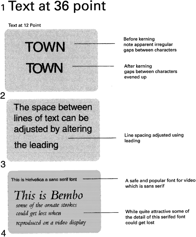
A good, solid and safe sans serif font is Helvetica. If serifed fonts are being used then use some form of text border or drop shadow, or a strap of some sort, to provide improved legibility. This is particularly important when using name supers. If an interviewee is wearing a white shirt and the name super is also in white, for example, without a border or drop shadow the text will be difficult to read.
Font characteristics
(1) Text size defined by point size.
(2) Kerning allows for adjustment of the space between characters.
(3) Leading alters the spaces between lines of text.
(4) Fonts – sans serif and with serif.
Style
Style is a very personal aspect of both text presentation and graphic design. In general, text is best presented in a consistent style. Keep to the same font, point size, use of shadow or a strap throughout the programme.
If text information keeps occurring in different styles the inconsistency could detract from the content of the text. Viewers may ask, ‘Does a different colour of text signify something new?’ So, if you are using pink colour fill for female interviewees and blue for male interviewees don’t change your mind halfway through the programme!
With graphics imported from other applications, watch out for designs that have a lot of thin horizontal lines. These will ‘buzz’ on an interlaced television screen and need to be avoided. It may look good on the computer screen with its progressive scan, but the TV system may well display such graphics in an unsatisfactory manner. If possible a graphics workstation should have a TV monitor attached so that design criteria can be viewed prior to sending to a video edit suite.
Text style
(1) Drop shadow.
(2) Text with border.
(3) Text on a strap. Traditionally name supers and sub-titles are placed in the lower third of the screen. All text needs to be within the safe title area.
Working with third party graphics applications
The desktop computer at the core of many nonlinear editing systems provides the opportunity for additional software packages to be added or integrated to the post-production process. The most common type of additional software is graphics applications. There is not the space here to consider in depth this type of third patty application but there are a number of general issues that need to be considered.
There are two main types of graphics: bitmap (or raster graphics) and vector graphics.
Bitmap
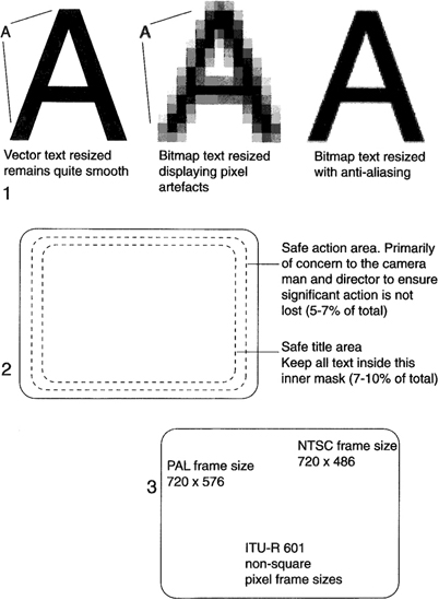
Bitmap graphics are quite commonly found in many graphics applications and are created by defining blocks (pixels) of information based on a grid. Bitmaps offer good colour range and subtleties of shading, but they do suffer from digital artefacts if resized. In particular, if a bitmap image is enlarged, a noticeable jaggedness will become observable.
Computer-generated pixels are square, though the digital standard for video (lTU-R 601) defines pixels as non-square. The number of bits allocated to each pixel defines the colour depth of each pixel. So a pixel defined by 4 bits can only have 16 colours. Computer graphics will usually offer up to 24 bits per pixel (or 32 if an alpha channel is supported). Unfortunately, the colour space on computers is based on RGB but the television industry has adopted the ITU-R 601 Y, Cr, Cb (luminance, red and blue colour difference signals). What this means is that colours created in a graphics package may not be accurately reproduced when imported to a nonlinear video editing system. In addition, allowances need to be made to accommodate the difference in aspect ratio of the two pixel systems (square and non-square). The PAL pixels are wider than they are tall and for NTSC the pixels are taller than they are wide.
As most computers create bitmap images using square pixels, the need to size graphic images prior to importing cannot be ignored. If no intervention is applied a circle generated in a square pixel environment will appear elliptical when imported to a non-square system.
On systems using an ITU-R 601 compliant capture card the frame size is 720 x 576 (PAL) and 720 x 486 (NTSC).
Bitmap images
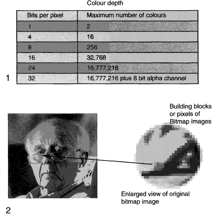
(1) Colour depth is determined by the number of bits per pixel.
(2) Building blocks or pixels of a bitmap image.
Vetor graphics
Vector graphics (or object oriented images) are created by using mathematical formulae to generate curves and shapes. In essence, two or more points are joined mathematically, the shapes being produced having smooth curves with well-defined edges. Vector graphics are scalable without the problems of bitmap images, in that a resized vector graphic will not exhibit jagged edges and lines.
Any vector graphic going into a video application will have to be rasterized (or bitmap converted) prior to importing.
Anti-Analog
The pixel building blocks of text will create a stepped pattern between the edge of the text and the background. To smooth out these aliasing edges, several mathematical processes have been developed to help reduce the stepped or jagged look of text. A common scheme of anti-aliasing is to add a three-pixel transition between the foreground and background as a means of softening the harshness of an edge.
Safe title area
Marty domestic televisions do not reproduce the entire image that is transmitted. This is mainly due to something known as overscan. What is important is that allowance should be made for any text that needs to be reproduced and read. It is usual to find a mask available within a graphics package that will define what is known as safe title area. All text should be generated to fall within the defined safe title area mask. The safe title area mask will show a usable text screen area that is approximately 10% less than the full active frame size. In the case of a widescreen shot which will be delivered on a Digital Terrestrial Transmission system the network concerned may well insist on a smaller safe title area than one would expect for the widescreen production. This compromise safe title area is approximately the same as the normal 4:3 safe title area. If in doubt, check with the transmitting network. Unfortunately, the safe title area varies from network to network.
Vector graphics
(1) Vector graphics is a mathematical process offering resizing capabilities without distortion. Vector graphics must be converted to bitmap for use in video. Bitmapped images exhibit digital artefacts when resized. Anti-aliasing can improve the look of resized bitmap images.
(2) Safe titie area mask for standard 4:3 TV monitor.
(3) Digital frame size for 4:3 aspect ratio.
Saving time
One area where time can be saved is in the generation of basic text. Text such as name supers and end credit rollers can be typed up on an office computer and then saved as a .txt file. Any spell-checking can be done at this stage. This file can then be imported, copied and pasted into the graphics programme of the nonlinear system for formatting and editing into the programme. Using the nonlinear suite as an electronic typewriter is not particularly cost effective as it stops the editing process.
File type and cross-ptatform compatibility
Several file formats exist that offer cross-platform compatibility. Examples are GIF (Graphics Interchange Format), TIF (Tagged Image Format) and JPG (Joint Photographic Experts Group).
However, it is always prudent to stay within a common platform, as it is possible for some degree of degradation to occur when importing graphics from a different computer platform. This is particularly so when trying to convert a vector-based file format to a bitmap image to run on a different platform.
Summary
Graphics are becoming such a common part of the toolkit that editors need to be familiar with both their creation and their use:
While beauty is in the eye of the beholder, in most cases keep the design simple and bold. Remember that any text must be legible.
Having one box that does everything is not necessarily the panacea one might assume. While it may appear cost effective to have editing and graphics generation all on one system, remember that these systems are not truly multitasking. So if the editor is designing or creating graphics he or she is not editing.
If a separate graphics workstation is used then try to keep to native file types. While cross-platform compatibility does exist, there is always the possibility of some image degradation.
Cross-platform compatability
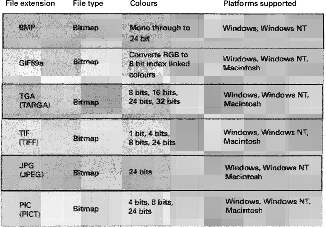
The above list is by no means exhaustive but does indicate a number of files that have cross-platform capability. The GIF89a with only 256 colours (max.) does support alpha channels. The Macintosh PICT file format also supports alpha channels. Wherever possible it is recommended to stay in the same platform for image creation and subsequent import into a digital nonlinear system.