
In This Chapter
Seeing reds, greens, and in-betweens
Sailing with the Photoshop color correction armada
Fixing flesh tones
In the end (and the middle and the beginning), your image in Photoshop is nothing but little squares of color. Each square — each pixel — can be exactly one color. Which color for which square is up to you. I'll say it again: There is no car or circle or tree or Uncle Bob in your Photoshop image — just a bunch of little squares of color.
In this chapter, I explain how those squares of color are formulated, how Photoshop works with those formulations, and — most important — how you can manipulate the colors of those squares. Toward the end of the chapter, you read about one of the biggest color-related challenges in Photoshop: achieving accurate skin color.
Photoshop works with digital images (including digital photos, images that have been digitized with a scanner, and artwork that you create from scratch in Photoshop). The digits are the computer code used to record the image's information. The number of pixels, the color of each pixel, and any associated information are all recorded in a series of zeros and ones on your hard drive. Color, therefore, is nothing more than numbers — at least as far as Photoshop is concerned. For you and me, however, color is far more than binary code on a hard drive. It's the image, the artwork, the message. The artwork is the color, and color is the artwork, pixel by pixel.
Photoshop records the color of each pixel in your image in any of several different ways. Every pixel in any given image has all color recorded in a single color mode, which is the actual color format for the image file. While working with your image, however, you can define specific colors in any of a variety of color models, which are sort of the formula or recipes with which you mix color. And an image can have only one color depth, which is the limitation on the number of colors in an image.
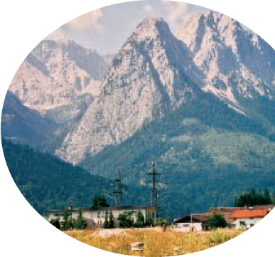
Before I get into too many details, you need to understand one of the basic concepts of color: gamut. Consider gamut to be the range of colors that can be theoretically reproduced in a specific color mode or with a specific color profile. A wide gamut, therefore, has many more colors available than does a limited gamut. Those extra colors are generally the brighter, more vibrant colors . . . the ones that make an image come alive. The red/green/blue (RGB) color mode generally offers you a wider range of colors than does cyan/magenta/yellow/black (CMYK). See, for example, the comparison in Figure 6-1. And keep in mind that the specific color profile (the working space that you select; see Chapter 4) also has an impact on the colors in your image.

If you'll be printing to an inkjet printer, sending photos to a lab for prints, or posting your image on the Web, you need RGB color mode. (Despite the CMYK inks that you load into your inkjet printer, the printer's software expects and must receive RGB color data.) If you're prepping an image for inclusion in a page layout document destined for a commercial offset press, you need CMYK. You select the image's color mode from the Image
RGB: RGB is the color mode for digital photos, computer monitors, the World Wide Web, and inkjet printers. All colors are recorded as proportions of the three component colors, red, green, and blue. RGB color is recorded in the three color channels (described a bit later in this chapter). RGB is an additive color mode — that is, the more of each component color you add, the closer you get to white.
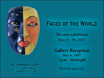
CMYK: CMYK is used primarily for printing on a commercial offset press, but you might need it for a color laser printer or a high-end inkjet printer with which you use a RIP (raster image processor, which is a specialized bit of hardware or software that lets your inkjet pretend it's a printing press). CMYK is the color mode of magazines, books, and other mass-produced printed material, such as the example in Figure 6-2. CMYK is a subtractive color mode — that is, the less of each component color you have, the closer you are to white.
Grayscale: When most people talk about a black-and-white photo, they really mean grayscale. The image does contain black and white but also a wide range of grays in between. You might use grayscale mode for Web-based images or for prints. Keep in mind that unless your inkjet printer is designed to reproduce grayscale images with black and gray inks (or black and light-black inks), you probably won't be happy with grayscale output. Using just one black ink doesn't reproduce the full range of grays in the image. Using the color inks adds a tint to the image. You do have an alternative for grayscale images: Send them to the local photo lab for printing.
Indexed Color: Using a color table, or a list of up to 256 specific colors, Indexed Color mode is for the Web. You save GIF and perhaps PNG-8 images in Indexed Color, but only those file formats require such a limited number of colors. Things like buttons on your Web page, which need only a couple of colors, should be created as GIFs using Indexed Color mode. That keeps the file size down, reducing the amount of space the image requires on your Web server and also speeding the download time (how long it takes for the image to appear on your site-visitor's monitor).
Lab: Also known as L*a*b and CIELAB (and pronounced either lab, as the dog or a research facility, or verbally spelled out, as el-ay-be), this is a color mode that you might use when producing certain special effects or using certain techniques in Photoshop, but it's not one in which you'll save your final artwork. The three channels in a (or "an") Lab image are
Lightness, which records the brightness of each pixel
a, which records the color of the pixel on a green-to-red axis
b, which records each pixel's color value on a blue-to-yellow axis
You shouldn't print Lab images on an inkjet or post them on your Web site. You might see (not in this book!) a tip that you should convert your RGB or CMYK images to Lab mode before using one of Photoshop's Sharpen filters. Bah! Apply the Unsharp Mask filter, choose Edit

Duotone: Duotone (including tritone and quadtone) is a very specialized color mode, exclusively for commercial printing, that uses only two (or three or four) inks spread throughout your image. Although that might sound good for an inkjet printer, in fact, Duotone is not an acceptable color mode for inkjets. Duotone images require that specific premixed inks are poured into the presses, which isn't something that you can do to your inkjet.
Multichannel: Like Duotone, the Multichannel color mode is restricted to commercial printing because it depends on specific premixed colors of ink that are applied to the paper. Unlike Duotone, in which the inks are generally spread across the page, Multichannel images use certain inks in certain areas. You might need Multichannel mode when creating a logo for a client.
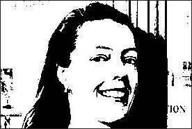
Bitmap: Bitmap color mode is true black and white (as you see in Figure 6-3). Each pixel is either black or white. The placement of the black and white pixels produces shading, but the image doesn't really have any gray pixels. You might use Bitmap mode to create images for some wireless devices, use on the Web, or commercial print, but that's about it.
Warning
Converting between color modes or gamuts (done with the Image
Although the image itself has a single color mode, you can use any of the available color models when defining a color in Photoshop. Say, for example, that you're preparing to use the Brush tool to paint some artistic elements for your latest project. The project is in RGB mode because you'll be printing it with your inkjet printer. You can use the Color panel to define your foreground color any way you please — RGB, CMYK, Grayscale, Lab, or even HSB (hue/saturation/brightness, which isn't available as a color mode, just a color model). It doesn't matter how you set up the Color panel, which you do through the panel's menu, as shown in Figure 6-4. When you add the color to your image, Photoshop uses the nearest RGB (or CMYK) equivalent.

Notice that the Color panel menu in Figure 6-4 doesn't list Duotone or Multichannel. Those are color modes only, not color models. A couple of other things to note about working with the Color panel: The warning triangle visible in Figure 6-4 in the lower-left corner of the panel indicates that the selected color is outside the CMYK color gamut. (Clicking the swatch to the right would select the nearest equivalent color. If, that is, you were actually working in CMYK mode.) Also note that the background swatch is selected in the panel, highlighted with a black outline — click the foreground swatch to make changes to the foreground color.
Color depth is the actual number of different colors that you have available. (Remember that each pixel can be only one color at any time.) When you work in 8-bit/channel color, simply called 8-bit color, each of the component colors is recorded with exactly 8 bits of information in the computer file. (At the beginning of this chapter, I mention digits. These are the actual numbers — the zeros and ones recorded on the hard drive to track each pixel's color.) In an 8-bit RGB image, each pixel's color is recorded with three strings of eight characters. When you work with 16-bit/channel, or 16-bit color, each of the component colors is recorded with 16 characters. The larger numbers mean more possible ways to record each color, which means more possible variations of color, as well as files that take up more space on your hard drive.
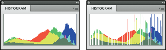
What that means to you, in practical terms, is possibly a better-looking image when working in 16-bit color. You'll have smoother transitions between colors throughout your image, no banding in gradients (those annoying areas in a gradient where you can actually see one color stop and the next color start), and no splotchy shadows. Posterization, which I explain in Chapter 5, is the degradation of your image's appearance when similar colors are forced to the same color, making transitions between colors more abrupt. Many tonal and color corrections that produce posterization in your 8-bit images won't harm a 16-bit image in the least. Take a look at Figure 6-5. To the left, a Levels adjustment is increasing a 16-bit image's tonal range. When the same adjustment is applied to an 8-bit version of the image, some rather substantial posterization becomes visible in the Histogram panel (represented by the gaps in the histogram).
So, should you use 16-bit color all the time? No. You can't post a 16-bit image on the Web, and 16-bit color is rarely used for CMYK images. Digital photos taken in JPEG format are 8-bit because that file format doesn't support 16-bit color. And with most inkjet printers, you won't see any improvement in the final print. You might, however, see a dramatic increase in printing time because there's twice as much image data to process.
If you shoot in 16-bit color, whether TIFF or Raw, it makes sense to process the image in 16-bit color. When the image is perfect, you might want to convert a copy of the file to 8-bit color for printing (Image
One other note on color depth: Photoshop can work with 32-bit/channel images. These monstrous files are called high dynamic range (HDR) images and are typically constructed by combining different exposures of the same photo. In Photoshop, you can work with two or more exposures in the Merge to HDR feature (presented in Chapter 10). You probably will never be called upon to create an HDR image for any of the esoteric 3D or video programs that use them, but you might find some benefit in combining multiple exposures of a difficult shot. Afterward, so that you have a file of reasonable size and access to more of Photoshop's features, use the Image
All your image's color data is saved in the Channels panel. When you're working with RGB or CMYK images, each color channel holds information for one of the component colors (red/green/blue or cyan/magenta/yellow/black). Each channel is a grayscale version of the image as a whole, using shades of gray, from white to black, to indicate where that channel's color appears (and how strongly) in the image. In RGB images, the lighter the pixel in a channel, the more of that color. When you work with a CMYK image, the light-dark in a channel is reversed, with darker areas showing where more of that color is applied.
Sometimes you have an image that needs some help in the color department. It might have been shot with an incorrect camera setting, it might have a color cast (an unwanted tint of a specific color), or it might just be dull and dingy. Photoshop provides you with an incredible array of commands and tools to make the colors in your images look just right. You'll hear the term color correction being tossed about, but not all images have incorrect color. Some have very good color that can be great color. Instead of color correction, I like to think in terms of color improvement. And just about every image can use a little tweaking to improve its color.
How do you know when the color is right? Your primary tool for the job is in your head. Literally. Make your decisions based primarily on what your eyes tell you. Sure, you can check the Info panel and the Histogram panel to make sure that your shadows are black and your highlights are white, but adjust your images until they look good to you — until you're satisfied with the color.
Warning
That little bomb symbol to the left of this paragraph is a little scary, but it does get your attention, doesn't it? This isn't a your-computer-will-blow-up sort of warning but more of a you-don't-want-to-waste-your-time-and-effort warning. Do your tonal adjustments before you start working with the image's colors. Go through the procedures in Chapter 5 first and then use the techniques here. Why? If you get perfect hue and saturation and then start making tonal adjustments, you're likely to knock your colors out of whack again. And, of course, there's also the possibility that adjusting your image's tonality will make the colors look perfect!
As you work with your various color adjustments in Photoshop, a couple of panels can help you track the changes you're making. When selected through the Photoshop Window menu or toggled open with the F8 key, the Info and Histogram panels appear, by default, in the upper-right corner of your screen. You might want to drag one or the other out of the nested set so that both are visible at the same time. (Click the panel's tab and drag it away.) Keeping an eye on your Info and Histogram panels while you're dragging sliders and entering numbers into various fields can help you spot potential problems as they develop.
The Histogram is useful for tracking changes in the distribution of pixels at various tonal ranges. You can read more about it in Chapter 5. The Info panel, while you've got an adjustment dialog box open, shows you "before" and "after" color values. Wherever you move the cursor in the image window (it will appear as the Eyedropper tool), the Info panel shows you the result of the adjustment — the consequences of your action, so to speak. You can also hold down the Shift key to change to the Color Sampler tool. Clicking in the image with the Color Sampler adds up to four markers in the image. The color values under those markers appear in the Info panel and, like the cursor location, show before/after values as you're making changes (see Figure 6-6).

"Here, Spot!": What is a spot color?
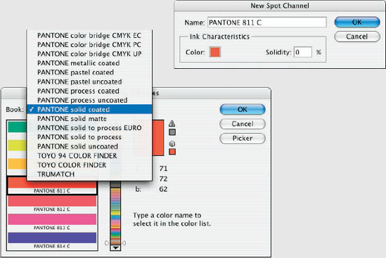
Spot colors in your image are printed by using premixed inks of exactly that color. (I'm talking commercial printing press here, not your run-of-the-mill inkjet printer.) To properly prepare a spot color for press, it needs to be in its own spot channel, which is a separate color channel in which you show where and how the ink will be applied. (Channels in your image are eventually used to create the actual printing plates that pick up ink and put it on paper.) Because spot channels are used with CMYK images, dark represents more. Where you need the spot color at 100% strength, paint directly in the spot channel with black. In areas where you want only a light tint of the spot color, use a light gray.
You create your spot channel by selecting the Spot Channel command from the Channels panel menu. Click the color swatch in the New Spot Channel dialog box to open the color libraries. (If you see the regular Color Picker, click the Color Libraries button.) Select the appropriate book (collection of colors; see the figure here) for your project, and then select your color. Click OK in the New Spot Channel dialog box to accept the color, do not change the name of the spot channel, and then click OK. You can now paint or copy/paste into that new channel.
When saving images with spot channels, you can use the PSD file format (if the image will be placed into an InDesign document), PDF, TIFF, or DCS 2.0. Check with the person handling the layout or the print shop to see which is required.
Photoshop offers over a dozen different commands that you can use to improve the appearance of your images, all of which are easily accessed through the Image

The three "auto" adjustments, found in the Image menu rather than Image
The Brightness/Contrast adjustment works with the tonality of an image rather than color. While making adjustments to the tonal range may improve the overall appearance of your photo, don't rely on this feature for color adjustment.
The Levels adjustment, which is discussed in detail in Chapter 5, uses three slider controls to individually adjust the shadows, highlights, and overall tonality of your image. It's generally used to control the brightness/darkness of the image by making changes to the RGB (or CMYK) channel, but it can be used for color correction by adjusting the color channels individually.
The Curves command is also discussed at length in Chapter 5. However, for color correction (rather than tonal adjustment), you want to work on each channel individually, choosing each in turn from the pop-up menu at the top of the Curves dialog box (see Figure 6-8).
Although working on each channel with Curves can be very effective, it can also be rather time consuming, with lots of flipping back and forth among the channels as one adjustment makes another channel correction look like a bad decision. While it may be inconvenient, Curves is a very powerful color correction tool.
Note, in Figure 6-8, the Preset pop-up menu at the top of the Curves dialog box. In that menu, you'll find some ready-made Curves adjustments that — if they don't solve the problem immediately — give you some pretty good starting points. In addition to color correction presets such as Darker, Lighter, Increase Contrast, and Strong Contrast, you'll find special effects like Cross Process (developing film in the wrong chemicals — intentionally) and Color Negative (which, unfortunately, creates the appearance of a scanned negative rather than removing the orange from an actual scanned negative).

The Exposure adjustment, discussed in Chapter 5, is a tonal adjustment that simulates a change in the camera's exposure setting when taking a photo.
Note
New in Photoshop CS4, the Vibrance adjustment gives you control over both vibrance (the saturation of near-neutral colors) and saturation (the saturation of colors throughout the image). You can increase Vibrance to make the near-neutral colors most saturated, or you can reduce Vibrance to make those colors even more neutral, while increasing Saturation to make the brighter colors in your image stand out even more.
Often overlooked and rarely exploited to the fullest, Hue/Saturation is a very powerful tool. Using the three sliders together, you can adjust the hue to eliminate a color cast, increase saturation so that your colors appear richer and more vibrant, and adjust lightness to improve your image's tonality. (See Figure 6-9.) Keep in mind that when you adjust something that's very dark, start with the Lightness slider so that you can evaluate the other changes (Hue and Saturation) properly. Remember, too, that you can apply Hue/Saturation (like a number of other adjustments) to a specific range of colors in the image, selected in the pop-up menu at the top of the dialog box.
Using the pop-up menu at the top, you can elect to apply an adjustment to only a certain part of the color in your image. Once a color is selected, the eyedroppers become active, to add to or subtract from the range of color being adjusted, and sliders become active between the gradients at the bottom, giving you yet another way to control the range of color being adjusted.
Note
New in Photoshop CS4 and visible in Figure 6-9 is the Adjustments panel, which you now use to add adjustment layers to your images. (It's discussed in more depth in Chapter 8.) The content of the panel offers the same options as the Image

The Color Balance command (as shown in Figure 6-10) presents you with three sliders that you use to make changes to the balance between your color opposites. If the image is too blue, you drag the third slider away from Blue and toward Yellow. (This is also a great way to remember which colors are opposite pairs!)
You can control the highlights, midtones, and shadows of your image individually by using radio buttons at the bottom of the Color Balance dialog box. And, in almost all cases, you'll want to leave the Preserve Luminosity check box marked so that the brightness of the individual pixels is retained.
You can also use Color Balance to throw an image out of whack for special effects or (getting back to the adjustment's roots) compensating for a color cast being introduced by the printing device.

The Black & White adjustment creates outstanding grayscale copies of your color images. This feature provides even more control than using Channel Mixer with the Monochrome box checked. As you can see in Figure 6-11, you can control the amount of each major range of color used to create the grayscale copy. In this particular example, the original consists primarily of greens and browns, so the top three sliders are key. Reducing Reds and increasing Yellows both lighten the browns and greens and increases contrast among the brown tones.
Tip
Note the Tint check box near the bottom of the dialog box. With Tint selected, you can easily create sepia or Duotone looks for your images. If you'll be printing on an inkjet printer (rather than sending the file to your photo lab), be sure to use a Black & White adjustment layer rather than the menu command. Your inkjet printer may introduce an unwanted color shift. If so, you can reopen the adjustment layer and work with the Hue and Saturation sliders to compensate.

The Photoshop Photo Filter is actually an image adjustment rather than a filter. The filter in the name refers to those actual photographic filters that you screw onto the end of a lens. This adjustment is a great way to correct problems with temperature in an image — the perceived warmth or coldness of an image. When the camera takes a picture under unexpected lighting conditions, a color problem is apparent. (Say, for example, that the camera is set to Daylight when shooting indoors.) When an image is too blue, it's too cool; conversely, an image that's orangey is too warm. (Remember that these are perceptual evaluations — blue light is technically hotter than yellow or red light.)
In Photo Filter, you select a preset filter from a pop-up menu or select a color of your choice. As you can see in Figure 6-12, both preset filters and custom colors can be effective in neutralizing a color cast. (You could, of course, also use these filters to add a color cast . . . if you wanted to, that is.)
Designed to repair a defective channel in an image, Channel Mixer lets you use sliders to replace some or all of the intensity of one color channel with content from the others. Should you come across an image with damage in one channel, you can certainly use the Channel Mixer adjustment to work on it (with some degree of success). You reduce the value of the target channel by dragging the slider to the left. You then drag one or both of the other sliders toward the right. Generally speaking, you want to add an amount (combined between the two other channels) just about equal to what you subtract from the target channel.

Tip
If you drag a slider to the left past 0 (zero), you invert the content of the channel. You can produce some incredible (and incredibly weird) effects with this technique, partially inverting one or two channels. When you get a chance, give it a try. Using the Monochrome check box in Channel Mixer gives you an alternative to Black & White for a controlled grayscale effect.
More creative than corrective, the Invert command (no dialog box) simply reverses the colors in your image or the selected area. Although inverting areas of an image (like desaturating) can draw attention to the subject of the image, it's an edgier technique and generally requires touch-up after inverting. You'll find that any specular highlight — a pure-white area (mainly reflections) — becomes a distracting black spot.
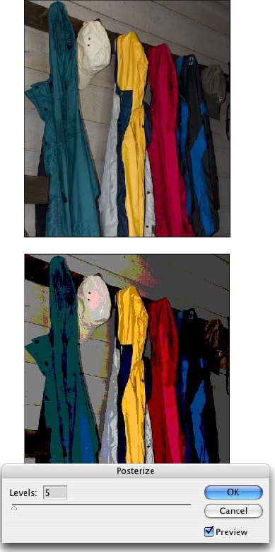
The Posterize command forces your image's broad range of colors into a few selected colors (as shown in Figure 6-13). You automatically get black and white, and then a limited number of additional colors, based on the content of the original. You pick the number of colors that you want to use, and Photoshop picks which colors to use. You can use as few as two colors (plus black and white) or as many as 255, which pretty much gives you your original image. Posterize can create a rather pleasing rendering of a photo with very few colors.
Tip
When experimenting with Posterize, click in the Levels field and use the up- and down-arrow keys to preview different numbers of colors. Start low and work your way up. If you see something that you like, you can stop or you can keep going and come back to that number later — the image will look exactly the same when you try that number again.
Threshold converts each pixel to either black or white (no colors, no grays). You adjust the border between black and white with a slider or by entering a value in the Threshold Level box. For an eye-catching special effect, open a color image and make a selection of the background (or the subject!) and apply Threshold, mixing color and black and white.
Tip
Sometimes, when adjusting color in an image, you need to find the darkest and lightest pixels in an image (for use with the eyedroppers in the Curves dialog box, for example). Open Threshold, drag the slider all the way to the left, then slowly back to the right. The first black spot you see is the darkest in the image. Add a color sampler (so you can find the spot again) by Shift+clicking in the image. Drag the slider all the way to the right and then slowly back to the left to find and mark the lightest pixels. After placing your color samplers, click Cancel.
Again, more creative than corrective, the Gradient Map feature re-creates your image by using a gradient. The leftmost color stop (the anchor points where a gradient color is assigned) in the gradient is mapped to the shadows, the right-most to the highlights, and any color stops in between are appropriately assigned to the rest of the tonal range. In Figure 6-14, you can see how a two-color gradient (upper left) lacks detail compared with the four-color gradient being created for the lower image.
Generally speaking, you use darker colors for the color stops on the left and lighter colors for the color stops on the right (although you can create extremely interesting effects by mixing things up). Using a black-to-white gradient produces a grayscale image.
To edit the gradient, simply click directly on the sample gradient in the Gradient Map dialog box. Click to add color stops, drag to move color stops, and click the color swatch near the bottom to change the color of the selected stop. (You can find more detailed information on creating and working with gradients in Chapter 14.)

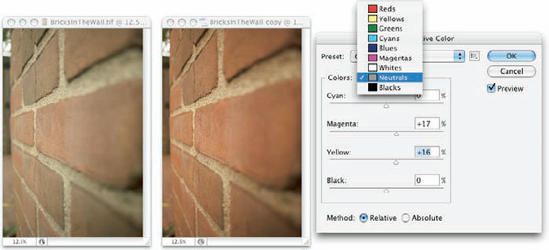
Although designed to help you compensate for the vagaries of printing presses, Selective Color can do other great things for you! The command's dialog box, shown in Figure 6-15, has a pop-up menu that offers the six basic colors of Photoshop, as well as Whites, Neutrals, and Blacks. You select which range of colors to adjust and then drag the sliders. You can work on one set of colors, switch to another and make adjustments, switch to another, and so on without having to click OK in between. For example, you can adjust the reds in the image and leave the blues untouched, or you can adjust the reds and then tweak the blues without having to exit the dialog box.
When you have reasonably small adjustments to make, select the Relative radio button at the bottom. If you have substantial changes — rather radical alterations — select the Absolute radio button.
The Shadow/Highlight adjustment is discussed at length in Chapter 5 as a tonal-correction tool, the job for which it was designed. However, keep in mind that the Shadow/Highlight dialog box also includes the Color Correction slider. After you lighten shadows or tone down highlights, you can increase or decrease the saturation of the colors in the adjusted areas of your image with the Color Correction slider.
Variations is a semi-automated way to make adjustments to your image's color and tonal range. It's discussed in detail later in this chapter.
The Photoshop Desaturate command creates a grayscale representation of a color image without changing the color mode. However, with no dialog box or adjustments, it doesn't offer the control you get by using Black & White.
Now this is a feature to savor! There you are, adding Cousin Joe to the family reunion photo because he wasn't bailed out in time, and you see that the lighting is all kinds of different and he sticks out like a sore thumb (or bum). Or you return from a major shoot only to find that something wasn't set correctly in the camera, and all your images have a nasty color cast.
Match Color lets you adjust one image to another (and you can even use selections to identify areas to adjust or areas of the images to use as the basis for adjustment), but keep in mind that you get better results with images that are already rather similar. You can also fix one shot and use that shot as a standard by which others are corrected. (Like most image adjustments, you can record a change in an Action and use Photoshop's Batch command to apply that adjustment to a series of images. Read more about Actions in Chapter 16.) Take a look at Figure 6-16 to see the Match Color dialog box.

Because the Match Color dialog box is such a powerful tool, it's worth taking at look at what's going on there:
Ignore Selection when Applying Adjustment: If you have an active selection in the target layer or image (for calculating the adjustment, see the upcoming bullet on that) and you want the adjustment to be applied to the entire target, select this check box. If the box is left clear, the adjustment is applied only within the selection. Note that you can use selections to apply Match Color to only a portion of your image, such as flesh tones, or you can adjust sections of the image one at a time.
Luminance: After the preview shows in your image window, you can tone down or brighten up the target area with the Luminance slider.
Color Intensity: Think of this slider as a saturation adjustment.
Fade: Using Fade lets you blend the adjustment, reducing its intensity.
Neutralize: If a color cast is introduced by the adjustment, selecting the Neutralize check box might eliminate it.
Use Selection in Source to Calculate Colors: You can make a selection in the image to which you're trying to match (the source) and use the colors within that selection as the basis for the Match Color calculation.
Use Selection in Target to Calculate Adjustment: You can make another selection in the target layer or image that presents Match Color with a sample of those pixels to use for calculating the adjustment.
Source: The Source pop-up menu lists all the open images that can be used as a basis for adjustment. Only images of the same color mode and color depth get listed. Think of source as the image whose colors you're trying to match. (The selected image or the active layer within an image is what you're adjusting.)
Layer: When a multilayer image is selected in the Source pop-up menu, you can designate which layer (or a merged copy of the layers) is the actual source.
Load Statistics/Save Statistics: If you're doing a series of images and you want to speed things up, click the Save Statistics button to record the adjustment you're making and then use the Load Statistics button with other images.
In Figure 6-16, an area of water is selected in the target image and a comparable area of water is selected in the source image. (The selection in the source image is visible in Figure 6-16 for illustrative purposes only — a selection in an inactive image window isn't normally visible.) With the two selections, I tell Match Color to adjust the target image based on the difference between the water color in the two images. Using selections prevents any skewing of the adjustment that would be caused by the colors in the sail (source image) and the trees (target image). But with the Ignore Selection When Applying Adjustment check box enabled as well, I make sure the entire target image is adjusted, not just the areas within the selection.
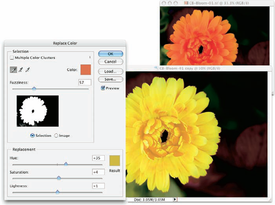
Sort of a cross between the Select
The Replace Color dialog box, as shown in Figure 6-17, has two separate parts: Selection and Replacement. Click with the left eyedropper in either the preview area or in the image windows and adjust the Fuzziness slider (how much variation counts as "selected") to make your initial selection. Use the middle eyedropper to add colors or shades of your initial color, and use the right eyedropper to subtract from the selection. Choose only variations of one color. Then drag those Hue, Saturation, and Lightness sliders in the Replacement section of the dialog box to produce your new look.
Tip
Rather than switching eyedroppers back and forth, use the left eyedropper and the Shift key (to add) or the Option/Alt key (to subtract). You can also hold down the Shift key and drag through an area to select all the colors in the area. If you accidentally select some colors you don't want, release the Shift key and click once to start over.
Note
New in Photoshop CS4's Replace Color is the Multiple Color Clusters check box (to the upper-left in Figure 6-17). When this option is active, Replace Color looks at each range of color you add to the selection as a separate entity. This enables much better technical control over the colors selected, but may not be appropriate for most uses of Replace Color, in which you generally want smooth and complete transformation of all of the selected colors.
The Variations feature, which you find in the Image

Much like getting new eyeglasses, using Variations is a matter of "Which looks better, this or this?" When you click one of the images, it moves to the Current Pick position, and a new set of variations is automatically generated. The blue areas that you see in some of the options in Figure 6-18 indicate areas where colors will be clipped — forced into black in the shadows or to white in the highlights — which results in a loss of detail in the image. You can disable that feature by clearing the Show Clipping check box in the upper right. Also note that you can adjust the shadows, midtones, and highlights independently, and you can also control (to some degree) the amount of variation from sample to sample.
Tip
Start with the Fine/Coarse slider set somewhere in the middle and get reasonably close to a great image, correcting midtones, shadows, highlights, and then saturation. Now drag that slider to the Fine setting and zero in on a perfect image.
Sometimes different areas of an image require different corrections or adjustments. You can, for example, "paint" corrections into specific areas of a channel by using the toning tools in Photoshop's Toolbox. The image in Figure 6-19 has a distinct problem (okay, well, maybe a few problems). In the lower left is a light-green blob that needs to be eliminated if there's any chance of salvaging this photo. By using the Burn tool on one channel at a time, you can darken that specific area of each channel — each channel according to its needs.
On the left, you can see the distinct light area in the thumbnail of each channel. On the right, after using the Burn tool, those lighter areas are gone, and so is the, the . . . what could it have been? Was it perhaps swamp gas? Ectoplasm? A UFO? Anyway, it's gone now, and the tabloids won't pay millions of dollars for the photo.
In addition to the Burn tool, you can use the Dodge, Blur, Sharpen, and Smudge tools. You can use the Brush tool and paint with black, white, or gray. You can use Levels or Curves on an individual channel or even a selection within one or more channels. When fine-tuning (or salvaging) an image, don't be afraid to work in one channel at a time, perfecting that channel's contribution to the overall image.
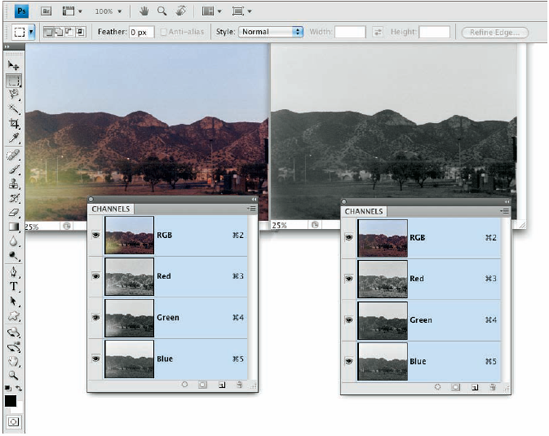
Take another look at the two Channels panels shown in Figure 6-19. Obviously that's a composite image because there's only one Channels panel in Photoshop, right? On the right, the Green channel is active (you can tell because it's highlighted), and only the Green channel is visible (only it shows the eyeball icon to the left). The other channels are invisible, and you see only the grayscale representation from the Green channel in the image window. On the left, however, only the Red channel is active, but all the channels are visible. Any change I make to that image in that state is applied only to the Red channel. But because all channels are visible, I can see the overall impact on my image.
Tip
Sometimes you want only one channel visible, such as when you're trying to balance the tonal range throughout the channel, for example. But most of the time, you want to see what's going on in the image as a whole. Click the one channel (or Shift+click two channels) in which you need to work. Then click in the left column next to the composite channel at the top to make all channels visible.
One of the toughest and yet most important jobs in Photoshop is making sure that skin looks right. People come in a wide variety of colors and shades and tints, and all people vary in color in different places on their bodies and at different times of the year. (The top and bottom of your forearm are likely different colors, and the difference is generally much greater in summer than in winter.) There are even some exceptions to those broad generalities. Making skin tones look great is often a major, yet often critical, challenge.
When you have skin in your image, it's generally part of the focus of the image — the person whom you're photographing. And even when a person isn't the subject of the image, skin attracts attention in the image. The eye naturally goes to people in just about any image (perhaps not first, but eventually).
You'll also find that unnatural variations in skin color are very noticeable. Consider how often you think to yourself that someone looks a little pale, or flushed, or sunburned, or tanned, or just plain sick. You're making that judgment call based to a large degree on the appearance of the skin.
Keeping in mind that the numbers shown in Figure 6-20 are general guidelines and that real people vary quite a bit, I've prepared for you some target values for skin tones. Use these formulas loosely when using the techniques in this chapter to adjust the color in your images, keeping in mind the individual you photographed and the lighting at the time.

Note that the numbers are CMYK, even for use with RGB images. Open the Info panel menu, choose Panel Options, and set the Second Color Readout to CMYK. Remember, too, that you can use the Color Sampler tool to add placeholders in the image, monitoring the changes that you're making in the Info panel. Set the color sampler readings to CMYK in the Info panel itself by clicking the eyedropper symbol to the left of the color mode listed for each sampler.
Note
Promise me that you'll keep in mind that these numbers are for reference only, okay? Your individual image determines what the correct adjustment should be. You can use these numbers as a starting point, but trust your eyes and evaluate your image as you work.