Chapter 12. Colors & Blending Modes
Liv Friis-larsen © ShutterStock.com
IN THIS CHAPTER
Using the Swatches palette 189
Copying colors as hexadecimals 191
In the first part of this chapter, you’ll learn how to choose colors to use with various tools and commands. The last part of this chapter is a reference guide to the blending modes, which are available for tools, layers, and commands. In other chapters, you’ll learn how colors are applied.
Choosing colors
The current Foreground color is applied when you draw strokes with the Brush or Pencil tool, create type, enlarge the canvas area, or use other tools and commands. The current Background color is applied by other procedures, such as when you apply a transform command to, or move a selection on, the Background.
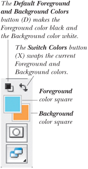
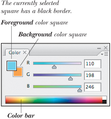
These two colors are displayed in the Foreground and Background color squares on the Tools palette A and Color palette. B (Written with an uppercase “F” or “B,” these terms refer to the two colors, not to the foreground or background areas of a picture.) On the following pages, you’ll learn the following methods for choosing Foreground and Background colors:
• Enter values or click the large color square in the Color Picker
• Pluck a color from an image with the Eyedropper tool
• Choose a premixed color from a matching system via the Color Libraries dialog box
• Enter values or move sliders on the Color palette
• Click a swatch on the Swatches palette
A The color controls on the Tools palette.
B Use the Color palette to mix colors.
To choose a color using the Color Picker:
- Do one of the following:
Click the Foreground or Background color square on the Tools palette.
Click the Foreground or Background color square on the Color palette, if it’s already selected (has a black border).
Double-click the Foreground or Background color square on the Color palette, if it’s not already selected.
Note: If the square you click contains a custom color from a matching system, the Color Libraries dialog box opens. Click Picker to get to the Color Picker dialog box.
- Optional: In the Photoshop Color Picker, check Only Web Colors to make only Web-safe colors available.
- Do one of the following:
Click a color on the vertical color slider to choose a hue, then click a variation of that hue in the large square. A
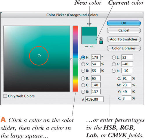
To mix a specific process color for print output, enter C, M, Y, and K percentages from a printed color matching system swatchbook (you can use the scrubby sliders).
For onscreen output, enter R, G, and B values (0–255). Entering 0 in all three fields produces black; entering 255 in all three fields produces white.
- Click OK. The color will appear in the Foreground or Background color square on the Tools and Color palettes. To save the color to the Swatches palette for future use, see page 189.
• To access your system’s color picker, in Preferences > General, choose Color Picker: Windows/Apple; or to use the Photoshop Color Picker (the default picker), choose Adobe. Only one color picker can be accessed at a time.
• You can also enter numbers in the H, S, and B or L, a, and b fields.
An out-of-gamut icon ![]() in the Color Picker or Color palette signifies that the current color is outside the printable gamut, meaning it can’t be printed with inks. If you’re planning to print your Photoshop file, you should change any out-of-gamut color to an in-gamut color or click the exclamation point to let Photoshop substitute the closest printable color (shown in the swatch next to or below the exclamation point). Keep in mind that when your image is converted to CMYK Color mode, all the image colors are brought into the printable gamut. The out-of-gamut range is defined by the CMYK output profile, which is specified in Edit > Color Settings on the Working Spaces: CMYK menu.
in the Color Picker or Color palette signifies that the current color is outside the printable gamut, meaning it can’t be printed with inks. If you’re planning to print your Photoshop file, you should change any out-of-gamut color to an in-gamut color or click the exclamation point to let Photoshop substitute the closest printable color (shown in the swatch next to or below the exclamation point). Keep in mind that when your image is converted to CMYK Color mode, all the image colors are brought into the printable gamut. The out-of-gamut range is defined by the CMYK output profile, which is specified in Edit > Color Settings on the Working Spaces: CMYK menu.
A non-Web-safe icon ![]() in the Color Picker signifies that the chosen color isn’t Web-safe. Click the swatch below the cube to have Photoshop substitute a similar Web-safe color. Note that with the proliferation of 16-bit monitors, you probably won’t need to restrict yourself to Web-safe colors.
in the Color Picker signifies that the chosen color isn’t Web-safe. Click the swatch below the cube to have Photoshop substitute a similar Web-safe color. Note that with the proliferation of 16-bit monitors, you probably won’t need to restrict yourself to Web-safe colors.
Custom colors are formulas specified by third-party companies (such as PANTONE and FOCOLTONE). For each color library or system, you can buy a printed matching system guide or fan book. For Web publishing or small-scale desktop printing, you don’t need to refer to such a printed book, but commercial printing is an entirely different story. In the latter case, you can’t just go picking colors willynilly based on whether they look good onscreen, because even the most carefully calibrated display won’t show matching system colors with perfect accuracy.
Before choosing colors in Photoshop for print output, the first step is to ask your commercial printer which brand of ink they’re planning to use. Get the printed fan book for that system, and flip through it to decide which colors you’re going to use. To choose those colors in Photoshop, you’ll use the Color Libraries dialog box.
To choose a color from a color library:
- Do one of the following:
Click the Foreground or Background color square on the Tools palette.
Click the Foreground or Background color square on the Color palette, if it’s already selected (has a black border).
Double-click the Foreground or Background color square on the Color palette, if it’s not already selected.
- If the color square you clicked on isn’t a custom color, the Color Picker dialog box will open. Click Color Libraries to open the Color Libraries dialog box.
- From the Book menu, choose the matching system that your commercial printer recommends. A
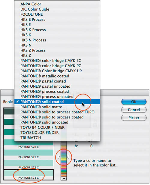
A Choose a matching system from the Book menu, then type a number without clicking anywhere first.
B Or click a color on the vertical color slider, then click a swatch at left. - Do either of the following:
Without clicking anywhere, type the number assigned to the desired color (refer to your swatch book); that swatch will become selected.
Click a color on the vertical color slider, then click a swatch on the left side of the dialog box. B
- Click OK.
• To load a library of matching system colors onto the Swatches palette, see page 190.
For Web output, you can mix RGB or HSB colors directly on the Color palette, by using the color bar, sliders, or fields.
To choose an RGB or HSB color using the Color palette:
- Click the Foreground or Background color square, if the desired square isn’t already selected. A

- From the top of the Color palette menu, choose a color model for the sliders. B For Web output, choose RGB Sliders, HSB Sliders (hue, saturation, and brightness), or Web Color Sliders (for Web-safe colors).
- Do any of the following:
Move any of the sliders.
Click on or drag across the color bar.
Enter values in the fields.
• To choose a different spectrum style for the color bar or to quickly access the Make Ramp Web Safe command, right-click/Control-click the color bar.
• Alt-click/Option-click the color bar to choose a color for whichever color square isn’t currently selected.
• If Dynamic Color Sliders is checked in Preferences (Ctrl-K/Cmd-K) > General, colors inside the slider bars will update interactively as you drag in the color bar.
• In the RGB model, white (the presence of all colors) is produced when all the sliders are at the far right, black (the absence of all colors) is produced when all the sliders are at the far left, and gray is produced when all the sliders are aligned vertically with one another at any other location.
Using the Swatches palette
You may want to detach the Swatches palette from the Color palette group before following these instructions.
To choose a color from the Swatches palette:
To choose a color for the currently selected color square, click a color swatch.
To choose a color for the square that isn’t currently selected, Ctrl-click/Cmd-click a color swatch.
• To append other libraries of swatches to the palette or replace the existing swatches, follow the instructions on the next page.
Colors you add to the Swatches palette stay there unless you delete them or reset the palette, and are available for all your documents.
To add a color to the Swatches palette:
- Mix or choose a Foreground color by using the Color palette or the Color Picker.
- On the Swatches palette, do either of the following:
Click the blank area below the swatches on the palette (paint bucket pointer) A or right-click/Control-click any existing swatch and choose New Swatch. Name the swatch, then click OK.
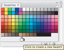
A To add a color to the Swatches palette, click the blank area below the swatches.
To create a new swatch without entering a custom name, click the New Swatch of Foreground Color button
 at the bottom of the Swatches palette.
Regardless of which method you use, the new swatch will appear as the last swatch on the palette.
• To rename a swatch, double-click it, change the name, then click OK. To see the swatch name, use the tool tip, or choose Small List or Large List from the palette menu.
You can’t undo the deletion of a swatch, so proceed with caution.
To delete a color from the Swatches palette:
Alt-click/Option-click the swatch to be deleted (scissors pointer), or right-click/Control-click a swatch and choose Delete Swatch.B
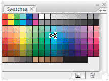
B Alt-click/Option-click a swatch to delete it.
If you save the current swatches as a library, you’ll be able to load that group of swatches onto the palette whenever you need it.
To save the current swatches as a library:
- Make sure all the colors you want to save in the new library are on the Swatches palette, then choose Save Swatches from the palette menu.
- In the File Name/Save As field, enter a name for the library (keep the .aco extension).
- Choose a location in which to save the library (see the sidebar on this page).
- Click Save.
• To edit an existing user-created library, follow the instructions above, except retype the same name for the library. When the alert dialog box appears, click Replace.
You can load any user-created library or any of the preset swatch libraries that ship with Photoshop into the Swatches palette. You can either replace the existing swatches with the new ones or append the additional swatches while keeping the existing ones on the palette.
To replace or append a swatches library:
- From the lower portion of the Swatches palette menu, choose the desired library name.
- Do either of the following:
Click Append to add the new library of swatches to the current palette.
Click OK to replace the current swatches with the new ones. A prompt may appear, giving you the option to save the existing swatches on the palette as a library. A
• If you want to use your current swatches in another Creative Suite 3 application, save them via the Save Swatches for Exchange command on the Swatches palette menu.
• If you do interior design work, you may already know that some paint companies let you download swatches from their website (such as benjaminmoore.com, under Professional > Architects and Designers). Install the files in the default location, as listed in the sidebar at right, then relaunch Photoshop. The new category of swatches can be loaded from the Swatches palette menu.
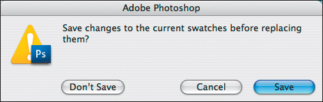
A This prompt will appear in the Mac OS if you replace your current Swatches palette colors with a new library and the current swatches haven’t yet been saved. In Windows, the buttons are Yes, No, and Cancel.
You’ll need to follow these instructions to load a swatches library only if the library isn’t in the default location (as listed in the sidebar below); otherwise, follow the previous set of instructions.
To load a swatches library:
- From the Swatches palette menu, choose Load Swatches.
- Locate and click the desired library.
- Click Load. The newly loaded swatches will appear below the existing swatches.
To restore the default swatches:
• Choose Reset Swatches from the Swatches palette menu, then click OK. A prompt may appear, giving you the option to save the existing swatches as a library.
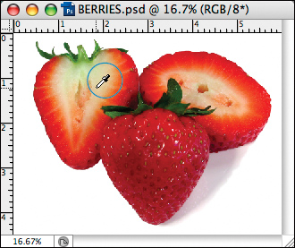
Using the Eyedropper tool
Being able to pluck a color from an image is useful for color matching, when, say, retouching a photo or adding type. For this, you use the Eyedropper tool.
To choose a color from an image using the Eyedropper:
- Choose the Eyedropper tool (I or Shift-I).

- When you do either of the following, the sampled color will appear in the currently selected color square on the Tools and Color palettes:
Click a color in any open document window. A
Drag in any document window. The Foreground color square will change dynamically as you drag. Release the mouse when the pointer is over the desired color.
• Alt-click/Option-click or drag in the document window with the Eyedropper tool to choose a Background color when the Foreground color square is selected or a Foreground color when the Background color square is selected.
Andrew F. Kazmierski © ShutterStock.com
Copying colors as hexadecimals
For Web output, you can copy colors as hexadecimal values from a file in Photoshop and paste them into an HTML file.
To copy a color as a hexadecimal value:
Method 1
- Choose the Eyedropper tool (I or Shift-I).
- Right-click/Control-click a color in the document window, then choose Copy Color as HTML. The color you selected will be copied to the Clipboard as a hexadecimal value.
- To paste the color into an HTML file, display the HTML file in your HTML-editing application, then choose Edit > Paste (Ctrl-V/Cmd-V).
Method 2
- Choose a Foreground color via the Color palette, Color Picker, or Swatches palette.
- From the Color palette menu, choose Copy Color as HTML. The Foreground color will be copied to the Clipboard as a hexadecimal value.
- To paste the color into an HTML file, open the destination application, display the HTML file, then choose Edit > Paste (Ctrl-V/Cmd-V).
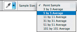
B Choose a Sample Size for the Eyedropper tool from the Options bar (or from the context menu).
Choosing blending modes
The blending mode A that you choose for a tool or a layer affects how that tool or layer modifies underlying pixels. You can choose from a list of blending modes in many locations in Photoshop, such as the Options bar (for most painting and editing tools), the Layers palette, and the Layer Style dialog box.
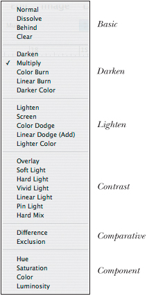
A The blending modes are organized in groups based on their function.
In the text that accompanies the figures in this section, the colors of underlying pixels are called the base colors; the color that you choose for a layer or apply with a tool (such as the Brush), and that you choose a mode for, is called the blend color. In the images, we used the same three color squares, as shown in the first figure below. To avoid confusion, we kept the blend layer opacity at 100% (except for Dissolve mode).
• For most blending modes, Photoshop compares the colors of the two layers (or the layer and the paint color being applied by a tool) on a channel-by-channel basis. For example, the lightness of a pixel in the Red channel of the blend layer would be compared to the lightness of a corresponding pixel in the Red channel of the base layer.
• When choosing an Opacity percentage for a tool via the Options bar, keep in mind that the impact of the tool is also affected by the opacity of the layer that you apply strokes to. For example, strokes applied with the Brush tool at a 50% opacity on a layer opacity of 50% will appear lighter than the same strokes on a layer opacity of 100%.
Basic blending modes replace the base colors

Liv Friis-larsen © ShutterStock.com
Normal
All base colors are modified. When an image is in Bitmap or Indexed Color mode, this mode is called Threshold.
Dissolve (50% Fill)
Creates a chalky, dry-brush texture using the blend color. The higher the pressure or opacity of the tool or the higher the opacity of the layer, the more solid the color.
Darken blending modes darken the base colors
Darken
The blend color darkens lighter pixels in the base colors; darker pixels aren’t changed. Contrast is lowered in the blend color.
Color Burn
Increases contrast in the base colors by making the shadow areas darker and the highlights lighter.

Darker Color★
The blend color replaces base colors lighter than itself without affecting darker base colors. The blend color is fully opaque. Use to “paint out” light colors on a figure or object without having to use a selection.

Multiply
A dark blend color produces darker base colors; a light blend color merely tints the base colors. All base colors are darkened. (Good for creating semitransparent shadows.)
Linear Burn
Uses the blend color to darken the base colors by decreasing the brightness.

The light blue strokes were applied to a blank layer above the image layer. Darker Color blending mode is chosen for the layer that contains the brush strokes.
Lighten blending modes lighten the base colors
Lighten
Modifies only base colors that are darker than the blend color, not base colors that are lighter than the blend color.
Color Dodge
A light blend color lightens the base colors by decreasing the layer’s contrast; a dark blend color tints the base colors slightly.
Lighter Color★
The blend color replaces base colors darker than itself without affecting lighter base colors. The blend color will be fully opaque. Use to “paint out” dark colors around a light figure or object without having to use a selection.
Screen
A light blend color produces lighter, bleached base colors; a dark blend color lightens the base colors less.

Linear Dodge
A light blend color lightens the base colors by increasing the layer’s brightness; a dark blend color tints the base colors slightly.

The light blue strokes were applied to a blank layer above the image layer. Lighter Color blending mode is chosen for the layer that contains the brush strokes.
Contrast blending modes increase or decrease overall contrast
Overlay
Multiplies (darkens) dark base colors and screens (lightens) light base colors while preserving luminosity (light and dark) values. Black and white pixels aren’t changed, so details are preserved.
Hard Light
Screens (lightens) the base colors if the blend color is light; multiplies (darkens) the base colors if the blend color is dark. Increases contrast in the blend color. Good for composite effects or for painting glowing highlights.
Linear Light
Burns (darkens) the base colors by decreasing its brightness if the blend color is dark; dodges (lightens) the base colors by increasing brightness if the blend color is light.
Soft Light
Softens and fades by lowering contrast in the blend color. Preserves luminosity values in the base colors.
Vivid Light
Burns (darkens) the base colors by increasing contrast if the blend color is dark; dodges (lightens) the base colors by decreasing contrast if the blend color is light.
Pin Light
The blend color replaces the base colors, depending on its relative brightness. A blend color lighter than 50% gray replaces only dark base colors; a blend color darker than 50% gray replaces only light base colors.
Hard mix
Posterizes (reduces) the base colors to approximately 5–8 flat colors. A dark blend color produces more black in the base colors; a light blend color produces more white in the base colors.
Comparative blending modes invert the base colors
Difference
Inverts the base and blend colors. The lighter the blend color, the more saturated the inverted color.
Exclusion
Grays out the base colors where the blend color is dark; inverts the base colors where the blend color is light. Lowers contrast.
HSL modes apply a specific color component
Hue
Applies the hue of the blend color without changing saturation and luminosity values in the base colors.
Saturation
Applies the saturation of the blend color without changing hue and luminosity values in the base colors.
Color
Applies the saturation and hue of the blend color without changing light and dark (luminosity) values in the base colors. Details are preserved, making this a good mode to use for tinting.
Luminosity
Replaces luminosity values in the base colors with luminosity values from the blend color without changing hue and saturation values in the base colors.