Chapter 13. Color Adjustments
© 2007 JupiterImages.com
IN THIS CHAPTER
Converting layers to grayscale 200
Using the Color Balance command 203
Using the Hue/Saturation command 205
Applying Auto Color Correction 206
From professional-level correction to exotic color shifts, Photoshop has an adjustment command to suit your needs. First try to figure what needs correcting, then decide which command will help you achieve your goal. For figurative photography, that goal will probably be color fidelity, whereas for a montage, you might aim for a unified color “temperature” that strikes the right mood. Some commands (such as Color Balance and Levels), are easier to get the hang of than others (Curves, Hue/Saturation), but when you forego simplicity, you gain more options and greater control.
In lieu of choosing adjustment commands directly from the Image > Adjustments submenu, we urge you to apply them via individual adjustment layers. An adjustment layer affects all the visible layers below it but doesn’t actually change pixels until you merge it with the underlying layer (if you’re not comfortable using adjustment layers yet, see pages 172–175).
Important note: Make sure your monitor is calibrated before performing any color adjustments! See pages 33–35. Also, unless we’re working with a CMYK scan, we always perform our color adjustments in RGB Color mode (digital camera images are already in this mode). Should you need to make adjustments for a specific CMYK output device, it’s a good idea to copy your original file first.
Setting the Stage for Color Adjustments
The first thing we suggest you do before performing color corrections is to put your workspace in Maximized screen mode (use the Screen Mode menu at the bottom of the Tools palette). The document window will expand to meet the edges of your palette docks and a neutral gray backdrop will display around your image, enabling you to better judge your color adjustments. In this mode, you can zoom in and out via keyboard shortcuts (see pages 85–86).
Or if you prefer to work on a neutral gray background without the window border, choose Full Screen Mode With Menu Bar. Use the Hand tool (H) ![]() to reposition the image on the gray background.
to reposition the image on the gray background.
• To get back to Standard screen mode, press Shift-F.
Creating fill layers
Like an adjustment layer, a fill layer affects the layers below it, except in this case it applies a solid color, gradient, or pattern. Like adjustment layers, fill layers can be edited or removed easily, and their content can be changed at any time. We’ll explore two common uses for fill layers: applying a pattern/texture (below) and applying a color tint (next page).
To add a texture using a pattern fill layer:
- On the Layers palette, click the layer that you want the fill layer to appear above. A
A The original image
- From the New Fill/Adjustment Layer menu
 on the Layers palette, choose Pattern. The Pattern Fill dialog box opens.
 - Click the pattern thumbnail. B The Pattern picker opens.
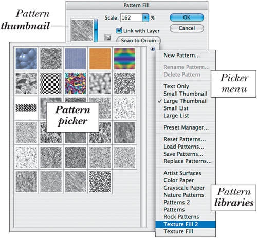
B Using the Pattern picker menu, you can open a new pattern library and append it to the current picker. (We’re choosing the Texture Fill 2 library.)
- From the picker menu (click the arrowhead), choose a pattern library. When the alert prompt appears, click Append to add the library to the current picker.
- Click a pattern thumbnail in the picker. You can move the pattern by dragging in the document window.
- Click OK.
- With the fill layer still selected, change the layer blending mode and opacity. C
• Click the fill layer, then paint with black in the layer mask to block the effect of the fill layer, with white to restore it, or with a low-opacity brush to block it partially.
• To create a custom pattern, select an area of an image layer with the Rectangular Marquee tool (Feather value of 0), choose Edit > Define Pattern, enter a Name, click OK, then deselect all (Ctrl-D/Cmd-D). Your new pattern will appear on the Pattern picker. You can also use the Pattern Maker filter to create custom patterns (see pages 343–344).
• To limit the effect of an adjustment layer to just the layer directly below it, Alt-click/Option-click the line between the two (this creates a clipping mask).
C A pattern fill layer (Weave 5, Scale 162) above the image layer is creating the paper texture. The fill layer Opacity is 50%.
If you apply a color to a layer (or to a selection on a layer) via a Solid Color fill layer, you’ll have the option to edit or remove it at any time. When first applied, a Solid Color fill layer is completely opaque. If you wish, you can use the opacity controls on the Layers palette to lighten the fill layer or change the blending mode for the fill layer to make it interact differently with the underlying layers. This is a simple but effective way to correct a color cast or to apply a color tint to a whole image—or more typically, to part of an image.
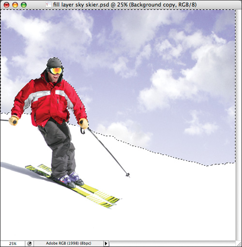
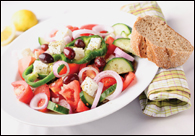
To apply a tint using a color fill layer:
- Optional: To restrict the color/tint to part of the image, create a selection. A
Galina Barskaya © ShutterStock.com
(We chose the Quick Selection tool (W)
 and a brush Diameter of 10 px on the Options bar, then dragged across the sky. Next, we clicked the sky area below each arm, then Alt/Option dragged to deselect any selected snow areas.)
 - From the New Fill/Adjustment Layer menu on the Layers palette, choose Solid Color. The Color Picker dialog box opens. B
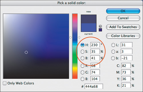
B Choose a color in the Color Picker (we chose H: 230, S: 35, B: 41).
- Choose a color for the tint. Don’t sweat it: You can change this color later if you wish. Click OK.
- Optional: With the fill layer selected, choose a blending mode via the Layers palette. C You could also lower the layer opacity to lighten the color fill.
• To change the tint for a color fill layer, double-click the adjustment layer thumbnail; the Color Picker reopens.
• Although you can apply a tint, gradient, or pattern, respectively, via the Color Overlay, Gradient Overlay, or Pattern Overlay layer effect, you can’t limit layer effects to a specific area with a mask, whereas you can limit areas with the mask on a fill layer.
• You can also apply a tint via a Photo Filter adjustment layer (see page 250).
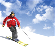
C Via a Solid Color fill layer, we applied a blue tint to the selection to enliven the sky. (We also changed the adjustment layer blending mode to Vivid Light to restore some definition to the clouds.)
Converting layers to grayscale
We’ll show you three ways to strip color from a layer without changing the document color mode. Our favorite method is the Black & White command. By using this command to convert color in a layer to grayscale, you can control how the R, G, B and C, M, Y color channel values contribute individually to the resulting gray levels. Although we use the word “conversion” in these instructions, it’s not a true conversion, as this command preserves the original document color mode.
To convert an RGB image to grayscale using the Black & White command: ★
- Click a layer or the Background. A
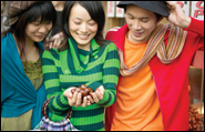
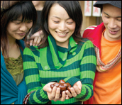
A The central figure commands our attention in this color image because of her position and outstretched hands, the light on her face and hands, and the stripes on her sweater.
- From the New Fill/Adjustment Layer menu on the Layers palette, choose Black & White. The Black & White dialog box opens and the image becomes grayscale.
- To control the grayscale conversion of an RGB image, try adjusting the Reds, Greens, and Blues sliders first. If you like, you can click Auto to have the program choose settings for you, then use that conversion as a starting point for the adjustments. B Move the Reds, Greens, and Blues sliders to control how each color is converted to a particular gray level (A–B, next page). Drag a slider to the left to produce a darker gray for that color or to the right to produce a lighter gray.
• If you want to preserve the existing overall light/dark balance in the image, keep the combined sum of the Reds, Greens, and Blues values close to 100%; if you want to alter the overall tone, ignore the combined total (C–D, next page).

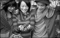
B The Auto setting in the Black & White adjustment layer produced an adequate grayscale conversion, but we’ll adjust the gray values next to draw more attention to the central figure, as in the color image.

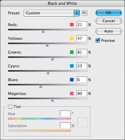
A We reduced Reds and Yellows to darken the man’s jacket, reduced Cyans and Blues to darken the women’s clothing, and reduced Greens to darken the stripes on the sweater.
B With the slider settings shown at left, the three figures are darker and more uniformly gray except for the face and cupped hands of the central figure, which are lighter. Now the focus is where we intend it to be, but the central figure could use more punch.
C We reduced Reds, Yellows, and Blues to darken the outer figures and increased Greens to lighten the stripes on the sweater.
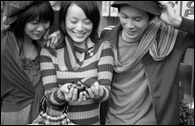
D As an experiment, we used the slider settings shown at left to enhance the contrast in the striped sweater. Now the central figure clearly commands the most attention, as in the color version.
- Fine-tune the conversion by adjusting the Yellows, Cyans, and Magentas sliders. You can use the Yellows slider to lighten/darken a portrait or to correct a landscape image that contains a lot of green.
- Move the mouse over a gray area in the image that you want to adjust. Press the mouse, and it becomes a scrubby slider, which in turn shifts the slider for the most dominant color in that area (the swatch for that slider will also be highlighted).
• To reset an individual slider to its default setting, Alt-click/Option-click its color swatch. To reset all the sliders to their defaults, hold down Alt/Option and click Reset. Neither reset can be undone.
- Optional: To apply a tint to the whole image, check Tint, move the Hue slider to choose a color, and move the Saturation slider to control the color intensity. (Or click the color swatch in the Tint area to open the Color Picker, drag the vertical Hue slider to choose a color, then drag horizontally in the large square to set the Saturation, and vertically to set the Brightness.)
- Click OK.
- Optional: To restore some of the original color uniformly to the whole layer, lower the opacity of the adjustment layer. Or to restore color by hand, click the adjustment layer mask, choose the Brush tool, make the Foregound color black, then draw strokes on the image.
Save Your Adjustment Settings ★
The Custom dialog box settings for your adjustment layer will be lost if you choose None or another preset from the Preset menu. To save your custom settings for future access, from the Preset Options menu, ![]() choose Save Preset (keep the .blw extension and keep the default Black and White folder as the location). The preset will appear on the Preset menu.
choose Save Preset (keep the .blw extension and keep the default Black and White folder as the location). The preset will appear on the Preset menu.
• Choose Load Preset from the Preset Options menu to load a saved preset. Choose Delete Current Preset to delete the currently listed user preset.
Here are two simpler methods for converting a layer to grayscale.
To convert a layer to grayscale:
- Click a layer or the Background.
- Choose Image > Adjustments > Desaturate (Ctrl-Shift-U/Cmd-Shift-U). Easy does it.
To convert a color layer to grayscale and restore the color selectively:
- Click a layer in a color document.
- From the New Fill/Adjustment Layer menu on the Layers palette, choose Hue/Saturation. The Hue/Saturation dialog box opens.
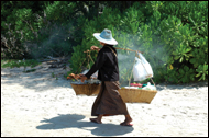
- Move the Saturation slider all the way to the left (to –100), then click OK. A
Liv Friis-larsen © ShutterStock.com
- Choose the Brush tool.
 Press D for default colors, then press X to swap them.
 - Click the adjustment layer, then apply strokes where you want to restore the original colors. B–C To restore colors partially, lower the brush opacity; to restore grayscale areas, press X and paint with white. To restore color uniformly to the whole layer, lower the adjustment layer opacity.
B We applied brush strokes to the adjustment layer mask to restore color in the center of the image.
C The color is visible only in the center of the image.
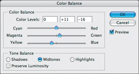
Using the Color Balance command
You can use the Color Balance command to apply a warm or cool cast to an image or to neutralize an unwanted cast. Each slider in the dialog box affects a pairing of cool/warm colors, so you’ll be able to see how the overall image is affected as you add or reduce individual colors. For example, moving a slider toward green reduces magenta, adding yellow reduces blue, and so on.
(Note: With this command, you adjust a whole tonal range at a time: shadows, midtones, or highlights. To make adjustments to a narrower tonal range, use Curves or Hue/Saturation.)
To use the Color Balance command to make an image cooler or warmer:
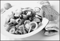
- Click a layer or the Background A, and show the Histogram palette.

Laura Frenkel © ShutterStock.com
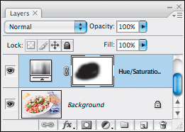
- From the New Fill/Adjustment Layer menu on the Layers palette, choose Color Balance. The Color Balance dialog box opens.
- In the Tone Balance area, click a range to adjust: Shadows, Midtones, or Highlights B–C (and A–D, next page).
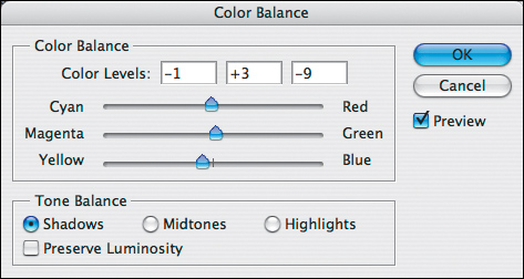
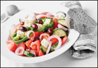
B Increasing Yellow and Green via the Color Balance dialog box removed Magenta from the Shadows, and increasing Cyan and Green neutralized the Shadows.
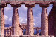
C A Shadows adjustment (using the settings shown above) produced a subtle change. If you look carefully at the dark shadows on the columns, you’ll see that they’re slightly more gray than before.
A Adding Yellow and Green removed Magenta from the Midtones too, and adding Green also helped lighten the Midtones.

B An adjustment to the Midtones using the settings shown at left added blue to the sky and distant landscape and made the stone lighter and more neutral. However, the highlights still contain too much Magenta.

C Adding Yellow and Green removed Magenta from the Highlights, adding Green helped lighten the Highlights, and adding Red warmed the yellow-green of the stone.
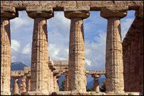
D An adjustment to the Highlights using the settings shown at left finished neutralizing the Magenta cast. Now the clouds are whiter and the stone is a warm, natural-looking cream.
Optional: Keep Preserve Luminosity checked to preserve lightness values as you make corrections; or keep this option unchecked to apply soft color adjustments when adjusting highlights, such as in skin tones. (For the image shown on this page and next, our adjustments were more successful with this option off.)
- In the Color Balance area, cool colors are paired opposite warm colors. Move a slider toward any color you want to add more of or away from any color you want to reduce, noting how the image is affected.
• To make the image warmer or cooler, move multiple sliders toward similar colors. For example, to add a cool cast, you could move the first slider toward Cyan and the third slider toward Blue.
- Click any other Tone Balance button, then adjust the color sliders for that range, unchecking and rechecking Preview as you do this to evaulate your adjustments.
- Click OK.
Using the Hue/Saturation command
For making precise hue and saturation corrections without having to make a selection, the Hue/Saturation command is a better choice than Levels or Curves. It lets you target a specific range of colors, then shift just those colors to a different hue or adjust their saturation or lightness. This command is especially handy for swapping out colors in a product or fashion shot.
To apply the Hue/Saturation command:
- Click a layer. A
Liv Friis-larsen © ShutterStock.com
- From the New Fill/Adjustment Layer menu on the Layers palette, choose Hue/Saturation. The Hue/Saturation dialog box opens. Check Preview.
- To specify the range of colors to be adjusted, do either of the following:
To change all the document colors, keep Master as the choice on the Edit menu.
To limit the adjustment to a color range, B choose that range from the Edit menu, then pinpoint the color to be edited by clicking in the document window. The menu will list the color you clicked, and the adjustment slider will shift over to that color on the color bar.
• To see which image colors are in the chosen range, drag the Hue slider to one extreme end or the other. Colors in the chosen range will shift in hue (this is called a “false” preview). Drag the Hue slider back to 0 before proceeding. This technique works for any Edit range except Master.
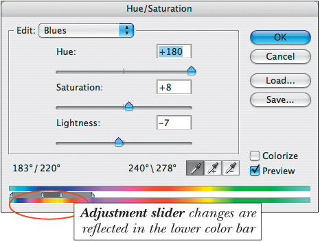
B In the Hue/Saturation dialog box, choose a preset color range from the Edit menu first. We chose Edit: Blues, clicked the blue of the napkin to select that color range, moved the Hue slider into the yellow range, increased the Saturation, and lowered the Lightness.
- To adjust the image, do any of the following:
Move the Hue slider to shift the selected colors to a different hue.
Move the Saturation slider to adjust the saturation.
Move the Lightness slider to lighten or darken. After adjusting the Lightness, you may need to increase the Saturation to revive any colors that are too light or dark.
- Click OK. C
• You don’t need to use this command to correct out-of-gamut colors for print output. That correction will occur when the document is converted to CMYK Color mode.
C Now the napkin is yellow.
Applying Auto Color Correction
The Auto Color Correction Options command adjusts the color, tonal range, and contrast in an image using preset algorithms (formulas) or, better yet, by using target values that you specify for the midtones. To achieve good results, we recommend the latter approach.
To apply Auto Color Correction options:
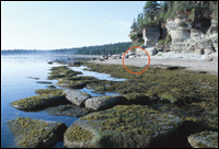
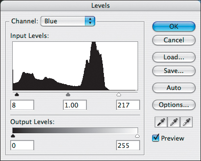
- Open an image, A and show the Histogram palette. Click an image layer, then choose Image > Adjustments > Levels. The Levels dialog box opens.
© 2007 JupiterImages.com
- Click Options. The Auto Color Correction Options dialog box opens. B Move it out of the way, if necessary, so you’ll be able to monitor the Levels histogram as you choose options.
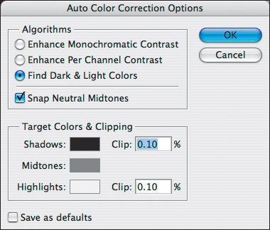
B In the Auto Color Correction Options dialog box, we’ll specify target values via the Target Colors & Clipping options.
- Click the Find Dark & Light Colors algorithm (the algorithms are described in the sidebar on the next page).
- Check Snap Neutral Midtones. Photoshop will adjust any colors that are close to neutral to match the Midtones target color swatch in the dialog box.
- To change which color values are assigned to midtones, click the Midtones swatch. The Select Target Midtone Color dialog box opens. C
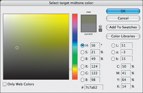
C This dialog box opens when you click the Midtones swatch. We’re choosing a warmer yellow-green for the moss, sand, and evergreens in our photo.
- Click the H button in the HSB group. On the vertical Hue bar, click a red-yellow hue to warm up the overall temperature of your image, or a green-blue hue to cool it down. To change the midtone brightness, drag the circle slightly upward or downward in the large square (keep the B value around 45–55), or to apply your chosen color to the midtones, drag the circle slightly to the right (keep the S value around 10–30). Note how the histogram updates in the Levels dialog box as you do this.
Note: Midtones is the only swatch you need to adjust; the other two swatches will adjust automatically when the document colors are converted to a printer profile.
- Click OK three times: to close the Select Target Midtone Color dialog box, the Auto Color Correction Options dialog box, and finally the Levels dialog box (A, next page). When the alert dialog box appears, click No (we’d rather choose settings on a case-by-case basis than establish global default settings).
• For the most control when redefining the midtone color, we recommend editing the Midtones swatch via the Auto Color Correction Options dialog box, as per the instructions on the previous page. A less reliable method would be to adjust the midtones using the gray point (middle) eyedropper in the Levels or Curves dialog box—less reliable because the results vary depending on where you click. If you can locate (and click) a neutral gray area, fine and dandy, but doing that is harder than it sounds. B–C
• We don’t recommend using a Levels adjustment layer for the Auto Color Correction because it doesn’t give you the editing flexibility that you’d expect: If you reopen the Auto Color Correction Options dialog box, the settings are reset to their defaults. We also don’t recommend checking Save As Defaults, which would apply the same settings to all your photos.

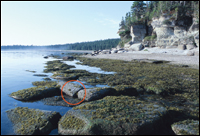
A As a result of a Midtones adjustment by way of the Auto Color Correction Options dialog box, the image now has a warmer, more naturalistic tone.
B Clicking in the original image with the gray eyedropper from the Levels dialog box in the location shown above set the midtone color to a cool gray, which wasn’t the change we were aiming for.
C Clicking in the original image in the location shown above with the gray eyedropper from Levels also failed to correct the cool cast in the midtones.
When we need to apply comprehensive color adjustments, we turn to Levels or Curves because with these commands, we can make corrections to individual color channels. Which one should you use? It depends on what needs correcting. Before opening either dialog box, study the image to figure out what the exact problem is. Is it under- or overexposed? If so, we suggest using Levels because it lets you correct broad ranges of color, especially in the midtones. Or perhaps the image has an unnatural color cast. For this, Curves would be a better choice because it lets you correct not only a broad color range (such as the color in a sky) but also a specific color cast, say, in the midtones.
We’ll discuss the Levels command first. The instructions below are general, whereas the captions below the figures apply specifically to that image.
Using the Levels command
To adjust colors in an RGB image using the Levels command:
- Study the image and try to figure out which color component(s) (R, G, and/or B) need correction. A You’ll adjust those colors in step 4.
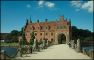
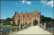
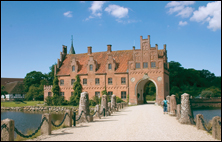
A The original image is underexposed and has a greenish cast.
- From the New Fill/Adjustment Layer menu on the Layers palette, choose Levels. The Levels dialog box opens. Check Preview.
- Correct any exposure problems in the full RGB channel first (see B–C and pages 180–181).
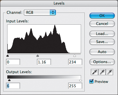
B In the Levels dialog box, we moved the gray Input Levels slider to the left to lighten the midtones, moved the white Input Levels slider inward to brighten the highlights, and moved the black Output Levels slider inward to lighten the shadows.
C Adjustments to the RGB channel (see the previous figure) made the image lighter. So far, so good.
- To begin removing a color cast, do as follows:
Choose Red from the Channel menu.
To reduce red in the midtones, move the gray Input Levels slider to the right (this increases green and blue); or to increase red, move the slider to the left.
To add red to the highlights, move the white Input Levels slider to the left. To reduce red in the shadows, move the black Input Levels slider to the right.
- Choose the Green channel, then the Blue channel, and in each case increase/decrease the amount of that color by moving the sliders as in the previous step (A–D, next page).
• Don’t overadjust any single channel or you’ll throw off the color balance of the whole image. Also, we don’t recommend moving the Output Levels sliders to adjust an individual color channel; this can actually create a color cast.
A Red channel: We added red to the midtones (moved the gray Input Levels slider to the left) and removed red from the shadows (moved the black slider to the right).
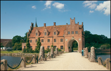
B Adjustments to the Red channel removed a greenish cast from the bricks and stones, but that area now looks too rosy, and the sky and water still look dull. For the Green channel (not shown), we moved the gray slider to 1.04 to make the bricks less pink.
C Blue channel: We moved the black Input Levels slider to the right to remove blue from the shadows and moved the white Input Levels slider to the left to add blue to the highlights (sky, path, and water).
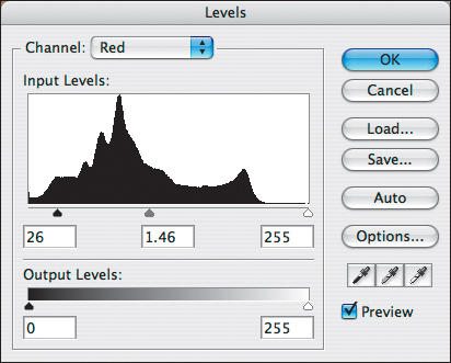
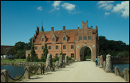
D Adjustments to the Blue and Green channels successfully removed the green cast, but the castle, path, and other stone work are still too pink. In the next section, we’ll use Curves for the same correction, which will work better for this image.
- To finalize the correction, switch back and forth between the color channels to readjust them, if necessary, then click OK.
- Optional: To remove the adjustment in specific areas, with the adjustment layer mask selected, paint on the image with the Brush tool, Foreground color black.
• As contrast increases, so does color saturation. To reduce oversaturation from a Levels or Curves adjustment layer, choose Luminosity as the blending mode for the adjustment layer.
Using the Curves command
The Curves command is even more powerful than Levels because it lets you make adjustments to a narrowly defined tonal range, such as highlights, quarter tones, midtones, three-quarter tones, or shadows. As with Levels, you can apply precise corrections to the composite channel (all the channels combined) or to individual color channels.
To adjust the color in an RGB image using the Curves command: ★
Part 1: Apply tonal adjustments
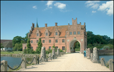
- Open an image that needs color adjustment. A (We’ll apply Curves to the same image that we used for our Levels adjustment so you can compare the results from the two commands.)
A The original image is underexposed and has a greenish cast.
- From the New Fill/Adjustment Layer menu on the Layers palette, choose Curves. The Curves dialog box opens. (If you’re following along with our illustrations, expand the dialog box to display the Curve Display Options, then check the four Show options; see the sidebar at right.)
- First, adjust the shadows and highlights by doing any of the following:
The Input sliders affect the lightest and darkest tonal values in the image. To increase the contrast, drag the black shadow Input slider and white highlight Input slider inward to align with the ends of the histogram. B★ This will darken the shadows and brighten the highlights (the steeper the curve, the greater the contrast).
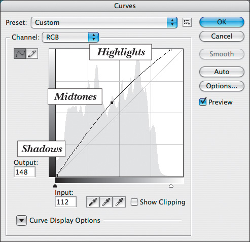
B In the Curves dialog box, we moved the white slider inward toward the right end of the histogram to brighten the highlights and moved the middle of the curve upward to lighten the midtones.
To set the lightest/darkest values (and thus increase the contrast) in Threshold mode—a high-contrast display of clipping—Alt-drag/Option-drag the black slider until a few areas of black appear and Alt-drag/Option-drag the white slider until a few areas of white appear.★ (The Levels dialog box has this feature, too.)
To lessen the contrast, drag the lower left part of the curve upward (to lighten the shadows) and drag the upper right part of the curve downward (to lessen the highlights). The middle of the curve should now be less steep.
- A point is created when you move any part of the curve. As you do this, note the Input value, which is the current brightness value of the pixel you’re adjusting, and the Output value, which is the value of that pixel after adjustment. If the Output value is higher than the Input value, you’ve lightened that pixel; if Output is lower than Input, you’ve darkened it.
To lighten the midtones, drag the middle of the curve upward; to darken the midtones, drag the middle of the curve downward. A–B
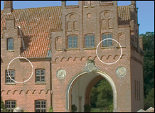
A On the RGB channel curve, we added a point to the lower left to lighten the shadows in the trees, a point in the middle to lighten the midtones on the brick and stone, the currently selected point to lower the light on the bricks, and a point in the upper right to recover details in the sky and path.
B Our adjustments to the RGB channel improved the light/dark balance, but the image still has a greenish cast and could use more saturation.
You can use the arrow keys to nudge a selected point. To remove a point, click it, then press Backspace/Delete; or Ctrl-click/Cmd-click it.
• To associate a part of the curve with a color area in an RGB image, press the mouse on the image—a small circle will appear on the curve—then Ctrl-click/Cmd-click the image to make a corresponding point appear on the curve. (We placed the selected point shown in A by Ctrl-clicking/Cmd-clicking a light area of the brick; now we can adjust the lightness of that area.)
Note: When moving a point, be careful not to create a sharp bend in the curve, or you’ll posterize the colors in the areas corresponding to that part of the curve. C–D To straighten out a curve to remove the posterization, move the point back toward the diagonal baseline.
C This curve bends too sharply; colors corresponding to that part of the curve will be posterized.
D The gray areas in the brick are posterized from the sharp curve.
Don’t click OK yet. To correct the color, follow the instructions on the next page.

Part 2: Correct the color
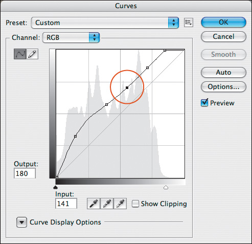
- With the Curves dialog box still open, from the Channel menu, choose Red to adjust that channel separately.
- Drag the midpoint of the curve upward to add more red to the midtones, or downward to reduce red (this adjustment will also affect red in the shadows and highlights slightly). Usually this midtone adjustment is all that’s required.
You can also add/reduce red in the shadows by dragging the lower part of the curve or add/reduce red in the highlights by dragging the upper part of the curve. A–B
• Don’t add too many points; try to keep your color curve as smooth as possible.
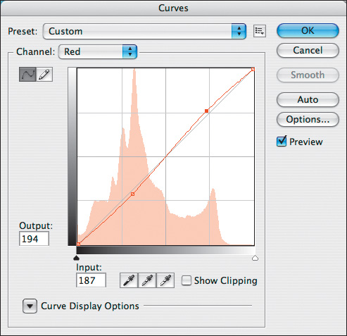
A We dragged the bottom part of the curve downward slightly to reduce red in the shadows and moved the upper part of the curve upward to add red to the highlights.

B Our adjustments to the Red channel via the Curves command were successful. We were able to add red just where we need it: the light areas on the building facade, sky, and path.
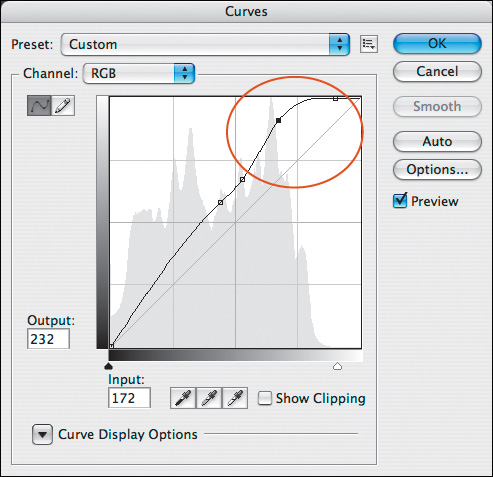
- Choose the Green channel, then the Blue channel, increasing or decreasing the amount of each color in the image by moving the curves, as in the previous step.
- Switch back and forth between color channels to readjust them as needed, then click OK (A–E, next page).
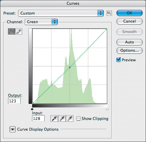
A We dragged the Green channel curve downward slightly to reduce green throughout the image.
B Reducing green via adjustments to the Green channel added more red and blue to the image, which was our aim.

C We dragged the lower part of the Blue curve downward to reduce blue in the shadows and raised the upper part to increase blue in the sky.
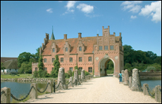
D This is the cumulative result of all our adjustments in the Curves dialog box.

E For comparison, this is the final result of our adjustments using the Levels command.
- Optional: You can lower the opacity of the Curves adjustment layer to lessen its impact. Or to remove the adjustment in specific areas, click the adjustment layer mask, then paint on the image with the Brush tool, with the Foreground color set to black.
• Ctrl-Shift-click/Cmd-Shift-click in the document window to place a corresponding point on all the color channel curves (alas, no point will be placed on the RGB curve).
• The Preset menu and Preset Options button are described in the “Save Your Adjustment Settings” sidebar on page 201.
To correct several images using the same adjustment layer:
- Say you have a series of photos that were shot under the same lighting conditions and require the same color correction. Adjust one of the photos via an adjustment layer.
- Open all the files that need correction.
- Drag and drop the adjustment layer from the Layers palette of the document you corrected into the document window of the other open images. A
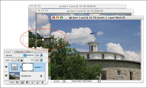
A We’re dragging a Levels adjustment layer from the Layers palette in one document into another open document behind it. A copy of the adjustment layer will appear in the target document.