
8. Adjusting Lighting and Color
In This Chapter
Understanding Tonal Correction
Adding a Color Tint to an Image
Managing Color Settings in Elements
Almost any photograph can benefit from some simple color and lighting corrections. For example, you might find that a vivid sunset you photographed ends up looking rather dull and ordinary, or that a portrait taken outdoors is too dark to discern any details. Luckily, you’re never stuck with a set of inferior images. Photoshop Elements provides a powerful set of lighting and color correction tools, with both automatic and manual adjustments, so you can fine-tune your images as much as you want.
In this chapter, I’ll review Photoshop Elements’ lighting and color correction tools and discuss which ones you may want to use, and when you’ll most likely want to use them. I’ll also show you how to help colors display and print accurately (also known as color management) and how to correct colors and tonal values in your images.
Understanding Tonal Correction
Before we jump into buttons and sliders, let’s step back and take a quick look at what we’re doing. Tonal correction tends to be one of the least understood (and most intimidating) features of Elements. That’s a shame, because there’s really no magic involved.
In plain terms, correcting tonal range simply comes down to adjusting brightness and contrast. Elements offers several ways to make automatic brightness and contrast adjustments.
Understanding histograms
The histogram is a graphic representation of the tonal range of an image. The lengths of the bars represent the number of pixels at each brightness level: from the darkest on the left to the lightest on the right. If the bars on both sides extend all the way to the left and right edges of the histogram box, the darkest pixels in the image are black, the lightest pixels are white, and the image is said to have a full tonal range ![]() .
.

![]() A photo displaying full tonal range and its accompanying histogram. Note how the histogram extends all the way to the left and right, indicating that pure blacks are present in the darkest shadow areas and pure whites are present in the lightest highlight areas. The fairly uniform peaks and valleys throughout the middle portion of the histogram also indicate sufficient pixel data present in the midtones.
A photo displaying full tonal range and its accompanying histogram. Note how the histogram extends all the way to the left and right, indicating that pure blacks are present in the darkest shadow areas and pure whites are present in the lightest highlight areas. The fairly uniform peaks and valleys throughout the middle portion of the histogram also indicate sufficient pixel data present in the midtones.
If, as in many images, the bars stop short of the edges, the darkest and lightest pixels are some shade of gray, and the image may lack contrast. In extreme circumstances, the bars may be weighted heavily to the left or right, with the tonal range favoring either the shadows or highlights ![]() . Whatever the tonal range, the brightness and contrast of an image can be adjusted using sliders located beneath the histogram in the Levels dialog or the Levels adjustment layer (see “Adjusting Levels Manually,” a few pages ahead).
. Whatever the tonal range, the brightness and contrast of an image can be adjusted using sliders located beneath the histogram in the Levels dialog or the Levels adjustment layer (see “Adjusting Levels Manually,” a few pages ahead).

![]() Here’s the same image, this time too bright and with insufficient contrast. Note the lack of data on the left end, indicating a lack of black pixels, and the abundance of data on the right, indicating very light tones.
Here’s the same image, this time too bright and with insufficient contrast. Note the lack of data on the left end, indicating a lack of black pixels, and the abundance of data on the right, indicating very light tones.
Adjusting Lighting
No matter what the photo is, I always start editing by adjusting the lighting. Often a few pulls of a slider can bring out detail that otherwise appears muddy or faint.
Adjusting levels automatically
Although I recommend adjusting levels manually, the auto commands can be a good jumping-off point before launching into more controlled, manual image correction.
The auto commands tend to be most successful when applied to a photograph that contains an average tonal range; one where most of the image detail is concentrated about halfway between the darkest and lightest values. Severely overexposed or underexposed images may be beyond help. If the camera or scanner didn’t capture the detail in the first place, it’s not there to be corrected.
To apply Auto Levels to an image
Do one of the following:
1. In the Layers panel, click the Create Adjustment Layer button and choose Levels.
2. In the Adjustments panel that appears, click the Auto button.
Or
• From the Enhance menu, choose Auto Levels, or press Ctrl+Shift+L/Command-Shift-L.
Photoshop Elements instantly adjusts the image’s tonal range ![]() .
.

![]() The photo on the top lacks sufficient tonal range, particularly in the highlight and lighter midtone areas. The photo on the bottom, corrected with the Auto Levels command, reveals more detail in both the shadow and highlight areas because the pixels have been distributed across the full tonal range.
The photo on the top lacks sufficient tonal range, particularly in the highlight and lighter midtone areas. The photo on the bottom, corrected with the Auto Levels command, reveals more detail in both the shadow and highlight areas because the pixels have been distributed across the full tonal range.
If you’re not happy with the result, select Edit > Undo Auto Levels, or press Ctrl+Z/Command-Z.
To apply Auto Contrast to an image
1. From the Enhance menu, choose Auto Contrast, or press Alt+Ctrl+Shift+L/Command-Option-Shift-L.
Photoshop Elements instantly adjusts the image’s contrast ![]() .
.

![]() The photo on the top lacks sufficient contrast, so detail is lost in both the shadow and highlight areas. The photo on the bottom, corrected with Auto Contrast, reveals detail not present in the original.
The photo on the top lacks sufficient contrast, so detail is lost in both the shadow and highlight areas. The photo on the bottom, corrected with Auto Contrast, reveals detail not present in the original.
2. To undo, choose Edit > Undo Auto Contrast, or press Ctrl+Z/Command-Z.
As mentioned earlier, the auto commands work best in specific circumstances (as when the image’s tonal range favors the midtones) and should be used sparingly. The Auto Levels command, in particular, can yield surprising and unexpected color shifts. In some instances it seems to overcompensate by swapping out one undesirable color cast for another, whereas in others it may ignore the color altogether and throw the contrast way out of whack. Give these auto commands a try, but be prepared to commit that Undo keyboard shortcut to memory.
If you’re looking for adjustments without all the detail, the Quick edit environment groups a cross-section of some of the more commonly used commands and functions into one convenient, interactive workspace. See Chapter 5 for more information.
Adjusting levels manually
Is your image washed out or too dark? Adjusting the levels by hand gives you more control, and can result in dramatic improvements.
To adjust the tonal range
1. Do one of the following:
• In the Layers panel, click the Create Adjustment Layer button and choose Levels. The Adjustments panel opens with Levels settings ![]() .
.

![]() The Levels controls in the Adjustments panel.
The Levels controls in the Adjustments panel.
• From the Enhance menu, choose Adjust Lighting > Levels, or press Ctrl+L/Command-L to open the Levels dialog.
2. Drag the slider on the left until it rests directly below the left edge of the histogram ![]() . The image darkens as the darkest pixels in the image move closer to black.
. The image darkens as the darkest pixels in the image move closer to black.

![]() Moving the left slider underneath the left edge of the histogram spreads the darker pixels more evenly into the dark areas of the midtones and shifts the darkest pixels to black.
Moving the left slider underneath the left edge of the histogram spreads the darker pixels more evenly into the dark areas of the midtones and shifts the darkest pixels to black.
3. Drag the slider on the right until it rests directly below the right edge of the graph. The image lightens as the lightest pixels move closer to white.
4. Drag the middle slider to the left or right to adjust the brightness level of the pixels that fall in the midtones ![]() .
.

![]() The right slider affects the lightest pixels in the image. Moving the right slider underneath the right edge of the histogram spreads the lighter pixels more evenly into the light areas of the midtones and shifts the lightest pixels to white, resulting in more detail in the highlight areas.
The right slider affects the lightest pixels in the image. Moving the right slider underneath the right edge of the histogram spreads the lighter pixels more evenly into the light areas of the midtones and shifts the lightest pixels to white, resulting in more detail in the highlight areas.
5. If you’re using the Levels dialog, click OK to close it.
These adjustments apply to the entire color range of the image. To modify just the reds, greens, or blues, choose one from the drop-down menu above the histogram.
What about the Brightness/Contrast adjustments? I never use them. Brightness/Contrast indiscriminately lightens or darkens pixels across the entire tonal range, typically creating more problems than it solves.
Adjusting shadows
Another way to fix images with overexposed background images and underexposed foreground subjects is the Shadows/Highlights dialog. Although you could adjust the midtones using a Levels adjustment layer, Elements uses its smarts in this feature to avoid making the image appear flat.
To lighten detail in shadow
1. From the Enhance menu, choose Adjust Lighting > Shadows/Highlights.
The Shadows/Highlights dialog appears ![]() .
.

![]() The Shadows/Highlights dialog.
The Shadows/Highlights dialog.
2. Do one or all of the following:
• Drag the Lighten Shadows slider to the right to lessen the effect of the shadows, or to the left to introduce shadow back into the image.
• Drag the Darken Highlights slider to the right until you’re satisfied with the detail in the foreground or other brightly lit areas.
• Drag the Midtone Contrast slider to the right to increase the contrast, or to the left to decrease the contrast.
3. Click OK to close the dialog and apply the changes ![]() .
.

![]() The top photo is underexposed in the foreground, so detail in the girl’s face is hidden in shadow. In the bottom photo, making adjustments with the Lighten Shadows and the Midtone Contrast sliders selectively brightens and enhances detail in both her face and shirt.
The top photo is underexposed in the foreground, so detail in the girl’s face is hidden in shadow. In the bottom photo, making adjustments with the Lighten Shadows and the Midtone Contrast sliders selectively brightens and enhances detail in both her face and shirt.
I’ve found in many (if not most) images imported from a digital camera, the Shadows/Highlights dialog defaults work surprisingly well on their own, requiring just minor slider adjustments.
In any case, use the Midtone Contrast slider sparingly. A little goes a long way, and adjustments of more than plus or minus 10 percent can quickly wash out or flatten an image’s details.
Fixing lighting using Photomerge Exposure
Another way to deal with photos that contain over- or underexposed areas is to run them through the Photomerge Exposure feature. When you’re shooting, especially in difficult lighting situations, put your camera into its bracketing mode, which captures successive shots and applies a different level of exposure compensation for each; typically, you’ll get three shots with EV (Exposure bias Value) settings of –1, 0, and +1. Capture them in burst mode to minimize movement between shots.
To fix lighting using Photomerge Exposure (Automatic mode)
1. Open two or more related images with different exposures ![]() and select them in the Photo Bin.
and select them in the Photo Bin.

![]() I shot three different exposures to capture detail in the foreground and the background.
I shot three different exposures to capture detail in the foreground and the background.
2. Choose Enhance > Photomerge > Photomerge Exposure. Or, switch to the Guided Edit mode and click Exposure under the Photomerge heading.
Elements examines the files and opens the Photomerge Exposure interface in Automatic mode ![]() .
.

![]() The automatic merge did a pretty good job, but the colors are a bit too saturated.
The automatic merge did a pretty good job, but the colors are a bit too saturated.
3. Use the following controls to adjust the appearance ![]() :
:

![]() Adjust the blend settings to balance highlights, shadows, and saturation.
Adjust the blend settings to balance highlights, shadows, and saturation.
• Highlight adds more details to highlight areas, which can make the image darker.
• Shadows lightens or darkens shadow areas.
• Saturation boosts or tones down the colors.
You can also switch from Smart Blending to Simple Blending, but doing so disables the additional controls.
4. Click Done.
To fix lighting using Photomerge Exposure (Manual mode)
1. If you’re not happy with the automatic results, or you want more control over how the feature is applied, click the Manual tab.
2. In the Photo Bin, click a photo that has a good foreground exposure. That becomes the Source image.
3. Drag a photo with good background exposure to the Final pane ![]() .
.

![]() The image with the yellow border here has a better sky, so I’m using it as the background.
The image with the yellow border here has a better sky, so I’m using it as the background.
4. With the Selection Tool active, paint the foreground area you want to appear against the background image ![]() . Use the Eraser Tool to clean up edges of your selection.
. Use the Eraser Tool to clean up edges of your selection.

![]() Paint an area from the foreground image to selectively choose what appears in the final image.
Paint an area from the foreground image to selectively choose what appears in the final image.
5. Use the Opacity slider to control how much the areas are blended—this is helpful if the foreground image is too bright, for example.
6. Click the Edge Blending checkbox to smooth the areas that overlap in the final image.
7. Click Done to create a new merged image ![]() .
.

![]() The final image retains the dramatic background and sheds more light on the poor soul who woke up early to capture this photo.
The final image retains the dramatic background and sheds more light on the poor soul who woke up early to capture this photo.
For best results, mount your camera on a tripod to take shots destined for the Photomerge Exposure tool.
When taking pictures of people, a fast burst rate is essential; differences in body position between images creates a blurred, ghosting effect.
Adjusting Color
Color cast refers to a general shift of color to one extreme or another: An image can be said to have a yellow or red cast, for instance. Although sometimes introduced into images intentionally (to create a certain mood or effect), color casts are usually unhappy accidents. They can result from any number of circumstances, from a scanner in need of calibrating to light from a fluorescent bulb.
Elements gives you several ways to deal with color cast or adjust colors that are a little out of whack.
To adjust color with the Auto Color Correction command
From the Enhance menu, choose Auto Color Correction, or press Ctrl+Shift+B/Command-Shift-B.
That’s it. Photoshop Elements performs some elegant, behind-the-scenes magic, examining the image’s color channels and histogram and performing a little math, and voilà—no more color cast ![]() .
.

![]() Choose Auto Color Correction from the Enhance menu to automatically remove color cast from your image.
Choose Auto Color Correction from the Enhance menu to automatically remove color cast from your image.
To remove a color cast
1. If you’re specifically adjusting for an image’s color cast, another option to try is to choose Enhance > Adjust Color > Remove Color Cast.
2. Using the eyedropper provided, click an area of the image that should be white, gray, or black.
3. Click OK to accept the adjustment.
I’m constantly amazed at how well Auto Color Correction works, and usually give it a try even if I don’t perceive a color cast. It almost always offers some degree of improvement to the color.
RGB stands for red, green, and blue, which are the three color channels your eyes perceive, the three color phosphors used in your computer monitor to display color, and the three channels digital cameras record ![]() . The combination of these channels creates the full-color image you see. Many correction tools allow you to adjust these colors independently.
. The combination of these channels creates the full-color image you see. Many correction tools allow you to adjust these colors independently.

![]() Grayscale versions of each channel’s hues.
Grayscale versions of each channel’s hues.
To adjust hue and saturation
1. Do one of the following:
• In the Layers panel, click the Create Adjustment Layer button and choose Hue/Saturation.
• Choose Enhance > Adjust Color > Adjust Hue/Saturation, or press Ctrl+U/Command-U to open the Hue/Saturation dialog.
2. Adjust the Saturation slider to increase or decrease the saturation ![]() .
.

![]() Increasing the saturation can punch up the colors in a photo.
Increasing the saturation can punch up the colors in a photo.
3. If the hue is slightly off, or if you want to pull the colors in one direction (suppose you want more blues, for example), adjust the Hue slider.
4. Use the Lightness slider to increase or decrease the brightness of the effect.
5. To adjust the hue, saturation, or lightness of a particular range of colors, choose from the drop-down menu at the top of the panel ![]() . (“Master” refers to the entire image.)
. (“Master” refers to the entire image.)

![]() Adjust particular color ranges instead of the entire spectrum.
Adjust particular color ranges instead of the entire spectrum.
To adjust color using color curves
1. Choose Enhance > Adjust Color > Adjust Color Curves to open the Adjust Color Curves dialog.
2. To go with one of Elements’ suggestions, click one of the styles at left ![]() . You can also drag the sliders under Adjust Sliders to manually tweak highlights, midtone brightness and contrast, or shadows. The points on the color curve to the right represent each setting.
. You can also drag the sliders under Adjust Sliders to manually tweak highlights, midtone brightness and contrast, or shadows. The points on the color curve to the right represent each setting.

![]() The Adjust Color Curves feature provides one more way of fine-tuning an image’s color.
The Adjust Color Curves feature provides one more way of fine-tuning an image’s color.
3. Click OK to apply the color changes.
To adjust color in an image based on skin tones
1. Choose Enhance > Adjust Color > Adjust Color for Skin Tone.
2. Check that the Preview checkbox is selected, and then move the cursor onto the photo until it becomes an eyedropper. Click with the eyedropper on any part of a person’s skin ![]() .
.

![]() The eyedropper samples skin tones in a photo and then makes a best-guess color correction.
The eyedropper samples skin tones in a photo and then makes a best-guess color correction.
Photoshop Elements adjusts the color in the entire image, but pays special attention to the skin tones.
3. If you’re not satisfied with the results, click a different area of skin, or use the sliders to fine-tune the color change ![]() .
.

![]() Use dialog sliders to make manual skin tone corrections.
Use dialog sliders to make manual skin tone corrections.
4. Click OK to close the dialog and set the color changes.
Converting to Black and White
Taking a color photograph and making it black and white (well, technically grayscale) can involve more than just draining the color. The RGB values can be adjusted to highlight different tones in the final image and the contrast can be changed—edits you could perform separately later. But the Convert to Black and White dialog rolls them into one place and throws in some handy presets, too.
To convert an image to black and white
1. Open the image you want to convert.
2. Choose Enhance > Convert to Black and White (or press Ctrl+Alt+B/Command-Option-B) to open the similarly named dialog ![]() .
.

![]() The Convert to Black and White dialog includes many adjustments you likely would have made anyway.
The Convert to Black and White dialog includes many adjustments you likely would have made anyway.
3. Optionally, choose a preset from the Select a style list that matches the type of image you’re editing ![]() .
.
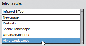
![]() Elements includes several preset styles that can get you started.
Elements includes several preset styles that can get you started.
4. If you want to change the black and white photo’s appearance, use the Adjust Intensity sliders ![]() .
.
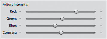
![]() Experiment with the Adjust Intensity sliders to get the look you want.
Experiment with the Adjust Intensity sliders to get the look you want.
5. When you’re satisfied with the result in the preview, click OK. The photo is converted to black and white ![]() .
.

![]() You may not be Ansel, but you’re getting there.
You may not be Ansel, but you’re getting there.
Duplicate the layer the image is on in the Layers panel before you open the Convert to Black and White dialog, and then apply the command to that layer. The feature applies only to the active layer, not the entire image as if you had switched to Grayscale mode.
Removing Color
Unlike converting to black and white (which removes all color information from an image), you can use the Remove Color command to remove color from just a portion of an image. This feature can be used to great effect for highlighting or dimming specific areas, creating neutral fields in which to place type, or as a first step before applying a colorization or color tint effect.
To apply the Remove Color command
1. Using any of the selection or marquee tools, select the area of your image from which you want to remove the color ![]() .
.

![]() Select the area you want to convert to grayscale.
Select the area you want to convert to grayscale.
2. Choose Enhance > Adjust Color > Remove Color, or press Ctrl+Shift+U/Command-Shift-U.
All color is removed from the selected areas of the image and replaced by levels of gray ![]() .
.

![]() The color in the selection is removed.
The color in the selection is removed.
You can also control how much color to remove from an image or selection by decreasing saturation. In the Layers panel, create a new Hue/Saturation adjustment layer. Then, move the Saturation slider to the left until you achieve the desired effect ![]() . The value 0 on the saturation scale represents normal color saturation, whereas –100 (all the way to the left) represents completely desaturated color, or grayscale.
. The value 0 on the saturation scale represents normal color saturation, whereas –100 (all the way to the left) represents completely desaturated color, or grayscale.

![]() Use the Saturation slider in the Adjustments panel to control the amount of color you remove from an image.
Use the Saturation slider in the Adjustments panel to control the amount of color you remove from an image.
Replacing Color
The Replace Color command does just what you would expect it to do, and does it very well indeed. In a nutshell, it allows you to select a specific color, either across an entire image or in an isolated area of an image, and then change not only the color but its saturation and lightness values as well. Eyedropper tools let you add and subtract colors to be replaced, whereas a slider control softens the transition between the colors you choose and those around them. I’ve seen this used to great effect on projects as varied as experimenting with different color schemes before painting a house’s trim to changing the color of a favorite uncle’s tie so that it no longer clashes with his suit.
To replace color across an entire image
1. Choose Enhance > Adjust Color > Replace Color.
2. In the Replace Color dialog, click the Selection radio button under the image preview box ![]() .
.

![]() Options under the image preview box let you choose whether to view your color selections or just the image.
Options under the image preview box let you choose whether to view your color selections or just the image.
When the Replace Color dialog is open, your pointer will automatically change to an eyedropper tool when you move it over your image.
3. With the eyedropper tool, click in the image to select the color you want to change ![]() .
.

![]() Click the actual image in the image window to make a color selection.
Click the actual image in the image window to make a color selection.
The color selection appears as a white area in the image preview of the Replace Color dialog ![]() .
.
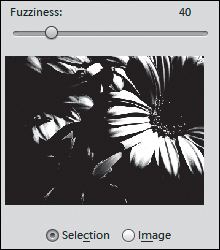
![]() The image preview area of the Replace Color dialog shows selected colors as white or shades of gray.
The image preview area of the Replace Color dialog shows selected colors as white or shades of gray.
4. To expand the selection and include similar colors, drag the Fuzziness slider to the right. To contract the selection and exclude similar colors, drag the Fuzziness slider to the left.
You may want to expand or contract your selection beyond the limits of the Fuzziness slider. If parts of a selection fall too heavily in shadow or highlight, or have very reflective surfaces, you may need to make additional color selections or deletions.
5. To add a color to the selection, Shift-click the eyedropper tool in another area of the image. To subtract a color from the selection, press Alt and click.
The dialog contains separate add and subtract eyedropper tools, but the keyboard shortcuts provide a much more efficient way to modify your color selections.
6. With the Preview checkbox selected, drag the Hue, Saturation, and Lightness sliders ![]() until you achieve the desired color effect.
until you achieve the desired color effect.

![]() Drag the Hue, Saturation, and Lightness sliders until you capture the right color effect. You may have to experiment a little until you get it just right.
Drag the Hue, Saturation, and Lightness sliders until you capture the right color effect. You may have to experiment a little until you get it just right.
These sliders operate just like those in the Hue/Saturation dialog. The Hue slider controls the actual color change; the Saturation slider controls the intensity of the color, from muted to pure; and the Lightness slider controls the color’s brightness value, adding either black or white.
7. Click OK to close the Replace Color dialog and view your corrected image.
Adding a Color Tint to an Image
Using a technique called colorization, you can add a single color tint to your images, simulating the look of a hand-applied color wash or the warm, antique glow of an old sepia-toned photograph.
To colorize an area of an image
1. Using any of the selection or marquee tools, select the area of your image you want to colorize. If you want to colorize an entire image, it’s not necessary to make a selection.
2. Do one of the following:
• In the Layers panel, click the Create Adjustment Layer button and choose Hue/Saturation.
• From the Enhance menu, choose Adjust Color > Adjust Hue/Saturation, or press Ctrl+U/Command-U to open the Hue/Saturation dialog.
3. Click the Colorize checkbox ![]() to convert all the color in the image to a single hue.
to convert all the color in the image to a single hue.

![]() The position of the Hue slider determines the color your tinted image will be.
The position of the Hue slider determines the color your tinted image will be.
4. Drag the Hue slider right or left until you arrive at the color you like.
5. Drag the Saturation slider to adjust its values.
6. Drag the Lightness slider to adjust the color’s brightness values.
7. If you opened the Hue/Saturation dialog, click OK to close it.
When you’re applying a color tint to just a portion of your image, creating a new Hue/Saturation adjustment layer in the Layers panel is definitely the way to go ![]() .
.

![]() When selectively colorizing your image, you’ll get more flexibility by using an adjustment layer.
When selectively colorizing your image, you’ll get more flexibility by using an adjustment layer.
Managing Color Settings in Elements
No matter how your images got into the computer, whether from a digital camera, a scanner, or downloaded from the Internet, the version of the image stored on your hard disk can only approximate the colors of the original scene. A computer is only capable of dealing with numbers, so it somehow has to come up with numerical equivalents of the colors perceived by our eyes.
Computers use number systems, called color models, to display and reproduce color. Almost everything you do in Elements is in RGB (red, green, and blue; see the sidebar “Your Friend, Roy G. Biv (RGB)” earlier in the chapter), but it’s also possible to convert images to grayscale, bitmap (black and white only), and indexed color (used for some Web images). One color mode not supported is CMYK (cyan, magenta, yellow, and black), which is used in professional publishing. If you need to output images in CMYK, you must get the full version of Photoshop CS.
This information is important because cameras, displays, and printers often don’t process color information in the same way. However, you can take a couple of steps to help ensure that the color you view on your computer monitor will be close to what Elements outputs for screens or for print.
Calibrating your display
Fortunately, color management in Elements is simple and doesn’t require any labor-intensive chores on your part.
You should first make sure the colors you see on the monitor are reasonably accurate and represent what others will see on their monitors. Calibrating your monitor is a particularly good idea if you have an older monitor or have inherited it from a friend or relative (you don’t know what they might have done to the monitor settings). If you have a newer monitor, it probably came with an accurate calibration from the factory.
Windows 7 and Mac OS X both include color calibration tools in the Displays preferences. Or, turn to tools such as Datacolor’s Spyder (spyder.datacolor.com).
Choose color settings in Elements
If you prefer, you can also choose color settings optimized for either Web graphics or color printing.
To choose color settings
From the Edit menu, choose Color Settings.
The Color Settings dialog appears with three color management options plus the option to choose No Color Management ![]() .
.
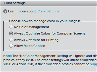
![]() Choose a color management option best suited to the final output of your image.
Choose a color management option best suited to the final output of your image.
• Always Optimize Colors for Computer Screens displays images based on the sRGB (standard RGB) color profile and is the default setting. It’s a good all-around solution, particularly if you are creating images to be viewed primarily onscreen.
• Always Optimize for Printing displays color based on the AdobeRGB profile. Although the image you see onscreen may display with only subtle color differences (as compared to sRGB), you will generally get truer, more accurate color when you send the image to print.
• Allow Me to Choose will default to sRGB, but if the image contains no color profile, you’ll have the option of choosing AdobeRGB.